Author Archives: annemacleod2013

Unknown's avatar

About annemacleod2013

I am currently studying with OCA on the Painting Degree pathway

Exhibition visit Duncan Shanks Sketchbooks: The Poetry of Place


20150718_124955

I visited the Duncan Shanks Sketchbooks Exhibition : Poetry of Place, at the Hunterarian Gallery in Glasgow.  I had never heard of him before, as apparently he shuns publicity, and I probably wouldn’t have visited if it wasn’t for a friend who suggested it because he sketches in the South Lanarkshire area where she lives.

20150718_124948

“Working in harmony with nature in my notebooks has been an act of faith and an adventure which has taken me to and beyond the poetry of a place on a personal odyssey.”  Duncan Shanks 2014

When I saw the sketchbooks of Duncan Shanks, it was somewhat of a eureka moment for me.  All the exercises I’ve done so far for my OCA course, all my research of other artists, finally made sense when I saw his sketches.  So this is what is meant by knowing your subject inside out and using materials as second nature to bring it to life.  Absolutely stunning work; every sketch a stand alone piece of work, regardless of whether it was intended as a prelude to a finished piece of work or not.  There is a vibrancy to it and a liveliness, and whilst the sketches are figurative and describe the landscape perfectly, the colours he sees in the familiar countryside are surprising; bright oranges, pinks, reds and blues.  It is almost abstract, he simplifies shapes and patterns, however the image still remains true to nature.

20150718_12402920150718_12410320150718_12412720150718_12420920150718_12423920150718_12501020150718_12433220150718_125028

20150718_124118

20150718_124149

20150718_124216

20150718_124346

20150718_124337

“Painting, like nature, cannot be rushed and, working with landscape, I have learned to be patient.  It is a journey which doesn’t readily reveal it’s destination.”  Duncan Shanks


http://www.gla.ac.uk/hunterian/visit/exhibitions/focus/duncanshankssketchbooks/

Painting Demonstration by Carol Dewart

About Carol Dewart

Born – Scotland 1957, BA (Hons) in Drawing and Painting, Glasgow School of Art, 1981.  Winner of Emmy Sachs award / received a John and Mabel Craig Award. Postgraduate year, Drawing and Painting, Glasgow School of Art, 1982.  Awarded Travelling Scholarship.  During my time at Glasgow School of Art, I also studied Embroidery and Weaving for one year under the guidance of Chrissie White and Hannah Frew Patterson.  This has had a major influence on my work and, by integrating the use of various mediums, textiles and stitch work; my paintings strive to give a more textural observation of the landscape.  After Graduation, I stopped working for a time to raise a family, but I have now returned to full-time painting in Cardross, Argyll and Bute.  In 1998, I was commissioned by Dumbarton District Council to create a wall hanging and related paintings for the refurbishment of the Denny Civic Theatre, Dumbarton.  Member of the Paisley Art Institute and winner of the Concept Art Prize (Paisley Art Institute 2012).

Although this was a painting demonstration, I’ve included I’m including it in my Drawing blog because I was impressed by her sketchbooks, and the painting she did demonstrated good composition.

She had a square canvas, which she had already painted with black acrylic.  To this she added strips of masking tape for the tree trunks.  She then tore strips of newspaper which she taped to the canvas horizontally and used this so as to have a random uneven edge.  She was using Liquetix Acrylics because she likes the colours, but uses most makes.  Her colours were very bold; mauves, light green, light yellow, not natural to a landscape.  She added patches of pinks and turquoise.  She then removed the masking tape on the tree trunks and used the edge of a credit card mixed with 3 colours to add texture to them.  She said she was using the black background for demonstration purposes only because of the time restraints and normally she would spend a long time working up a back ground.  She worked on the whole of the painting.  Any colour added  would be balanced by adding to another area on the canvas.

2015-03-09 22.37.42

20150316_170356

My sketch of Carol’s painting

I was even more impressed with Carol’s sketchbooks.  They were full of colour and texture.  There was fabric, thread and wire, and I wondered if this was influenced by her studies in Textiles at Art college.  She said she uses felt tip pens a lot in her sketchbook for speed and convenience and this is something I would like to try myself.

20150309_200636


References

http://www.caroldewart.co.uk/a1-page.asp?ID=1548&page=3

Drawing with experimental media

Over the next few weeks you’ll experiment extensively to build up your sensitivity to the properties of materials.  Use your sketchbook and supplementary sheets to collect information about materials and what you can use to draw with.  Push forward your experiments by using the new methods you discover to make fuller drawings.  Use a new technique randomly scribbling a square, for example can help you see it’s potential, but using it to complete a task pushes you to learn more actively by solving any problems you encounter along the way.

april 2015 613april 2015 612

These drawings were done using a stick with mud for the tree,  rubbing daffodil petals on the paper for the flowers and rubbing blades of grass onto the paper for, well, the grass.  It was a lot of effort for very little result (as well as a lot of strange looks in the park).

april 2015 607

This was done in a similar way with tulip petals and leaves, with a similar, disappointing result.

april 2015 653

This was done using different coloured mail varnishes on black paper.  Quite a nice result and one I may try again.

2015-05-15 15.52.20

This was done with Typex correction fluid on brown parcel paper.

Aim: When you think of drawing, what’s the first thing that comes into your mind?  We might initially think of pencils and maybe a Renaissance masterpiece.  In fact pencils are quite a modern invention and most Renaissance drawings were done with a stick of silver and a pot of ink.  Your sketchbook should be filling up with drawings in a variety of media by now, but for this project you’ll extend that exploration even further. 

.

Contextual focus point: Cornelia Parker


Research the work of Cornelia Parker.  Make notes in your own words in response to the following:

What do you think Parker is trying to do in her piece Poison and Antidote Drawing (2010)?

Poison and Antidote Drawing is created using rattlesnake venom and black ink, anti-venom and white ink.  Parker often uses bits of her subject to make her art work.  Why do you think she does this?

‘ I’ve made poison and antidote drawings using snake venom from a rattlesnake farm in Texas mixed with black ink, and anti-venom with white ink, to make Rorschach blots.  The resulting drawings are a combination of ‘good and evil’.’ (Maslen and Southern, 2014:54)

She goes on to say ‘For me the concious part of making a drawing is deciding on a process, what the process then releases is something else.’

I think she has tried to create more than just a representation of an object, but instead the drawing is the object.  The title ‘Good and Evil’ itself conjures up a lot of ideas and the use of black and white ink emphasises this.  The positive and negative concepts are polar opposites of each other.

How do you think it feels to stand in the presence of art works that are constructed from original objects  of great cultural significance?  How does that differ from, say, standing in front of a painting of the same object?

Initially I thought it was a little self-indulgent.  I wonder if a drawing or painting should be a successful piece of art in its own right without there having to be an explanation of the process or of materials used.  I’ve pondered over this and decided the media and materials can give an art work a deeper meaning, which engages the viewer’s imagination and empowers and strengthens the artwork itself.

Bibliography

Maslen Mick and Southern Jack

(2014)

Drawing Projects; and exploration of the language of drawing

London

Black Dog Publishing

Assignment 2


Make a drawing of a subject of your choice using the subject itself, or tools constructed from the subject, dipped in ink or paint.

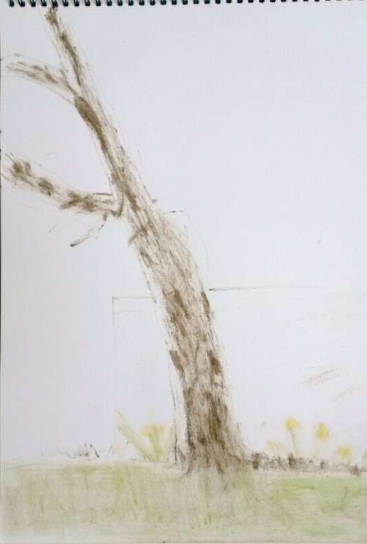
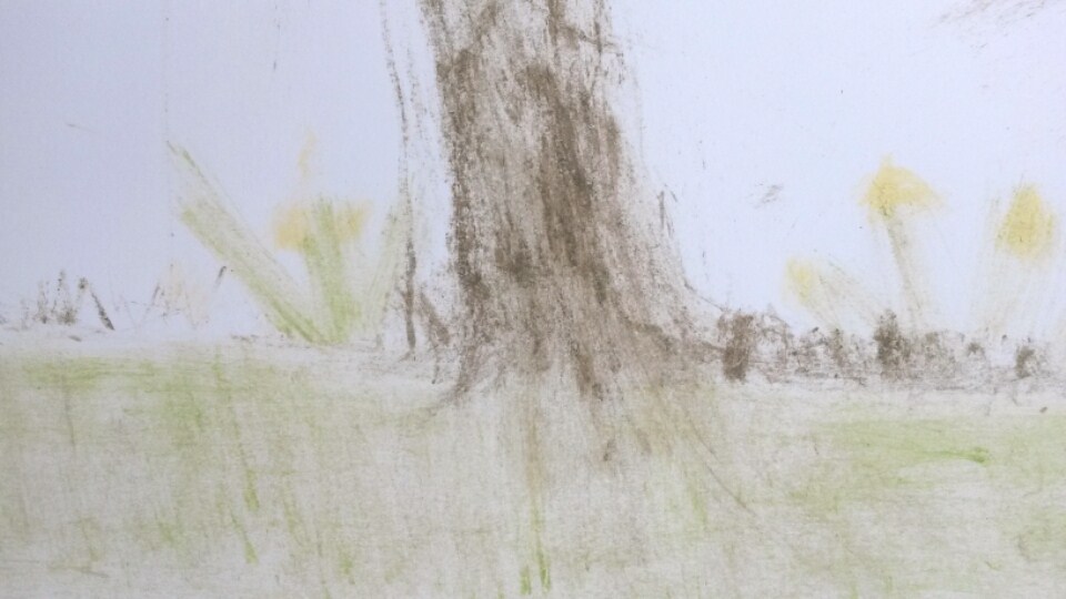
Nothing was immediately springing to mind for this assignment.  I had enjoyed drawing flowers for my still lifes for the exercises, so decided to try more of these drawings.

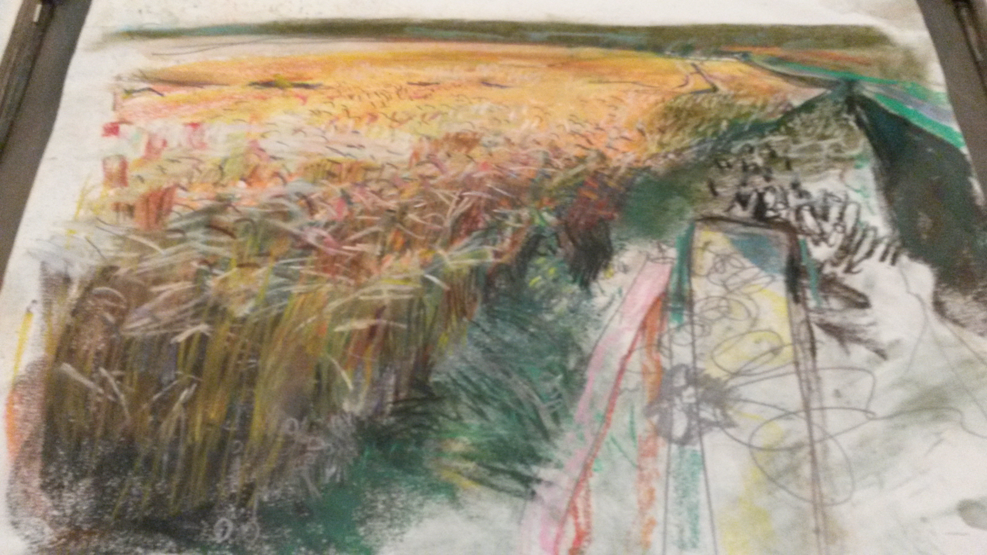
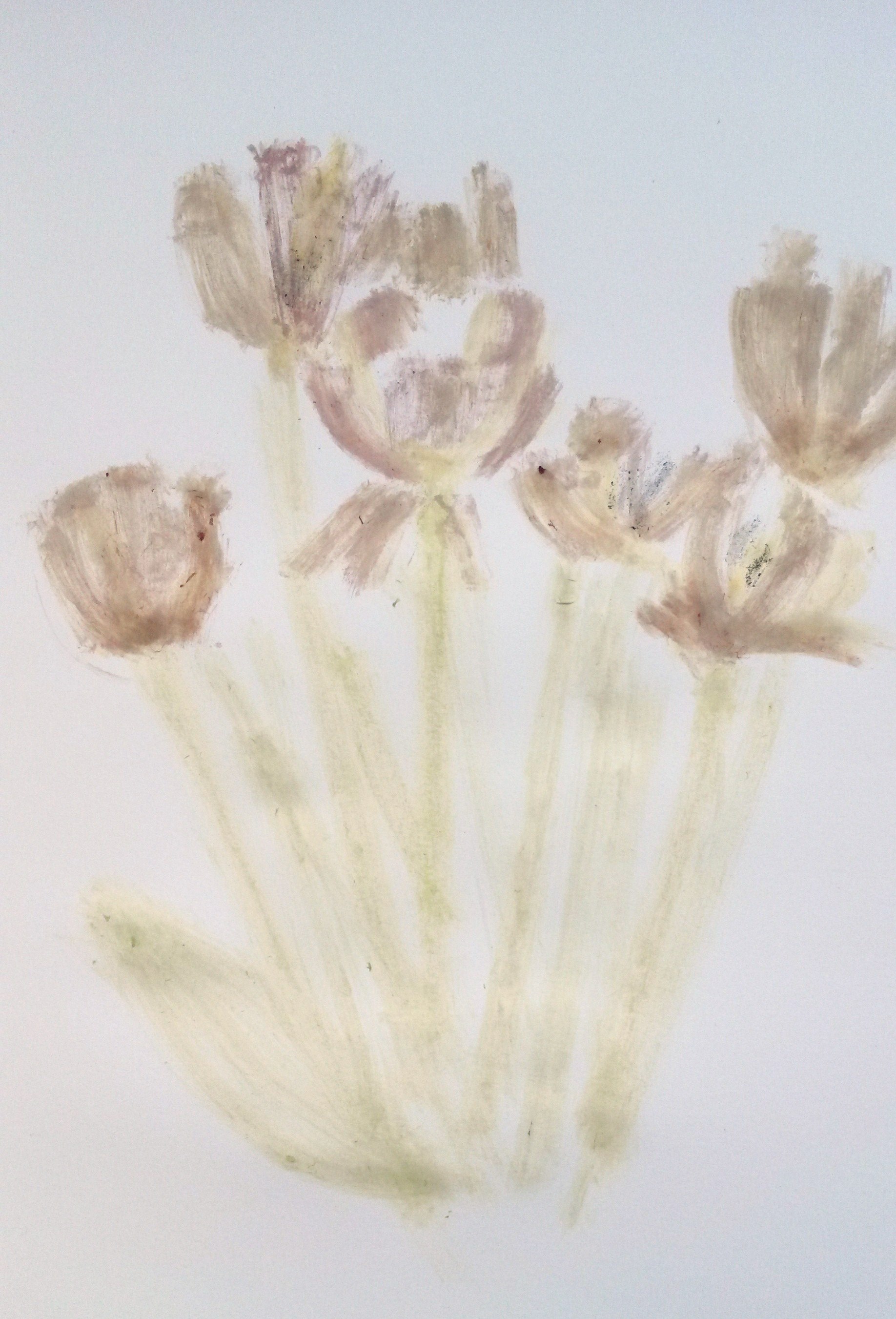
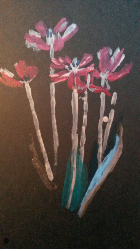
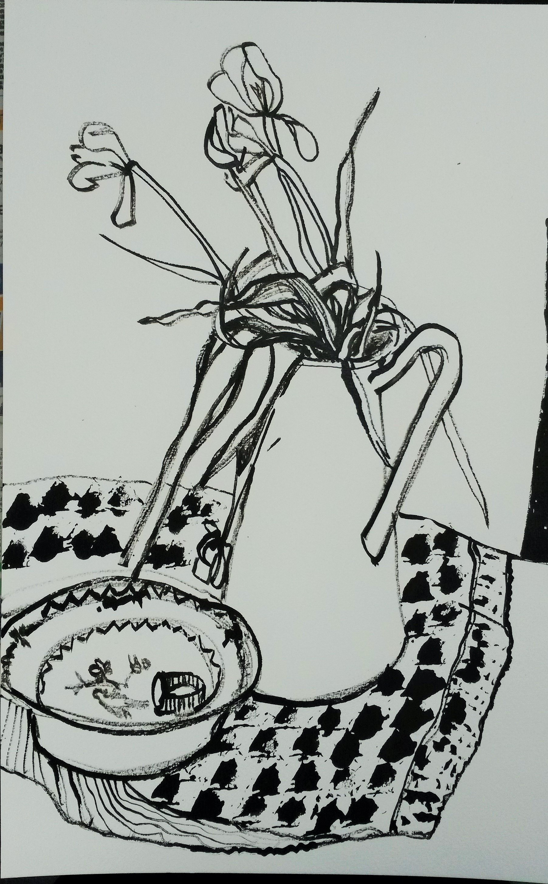
I set up a simple still life.  I still had the tulips, which were dying by now, but I drew them anyway because the drooping flowers added more interest.  I used a tulip stem dipped in black Winsor and Newton ink to draw the flowers.  For the pattern on the cloth beneath the jug I used a rose petal dipped in ink, repeated to represent a patterned cloth.  It wasn’t immediately obvious from looking at this that I had used anything other than a dip pen and the lines weren’t very delicate, instead they were  quite heavy and most un-flower like.

20150519_080505
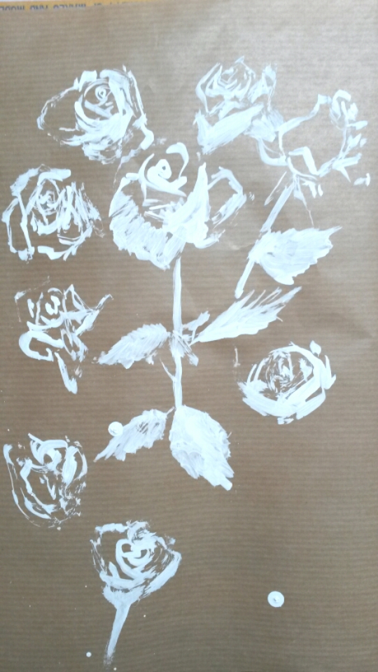
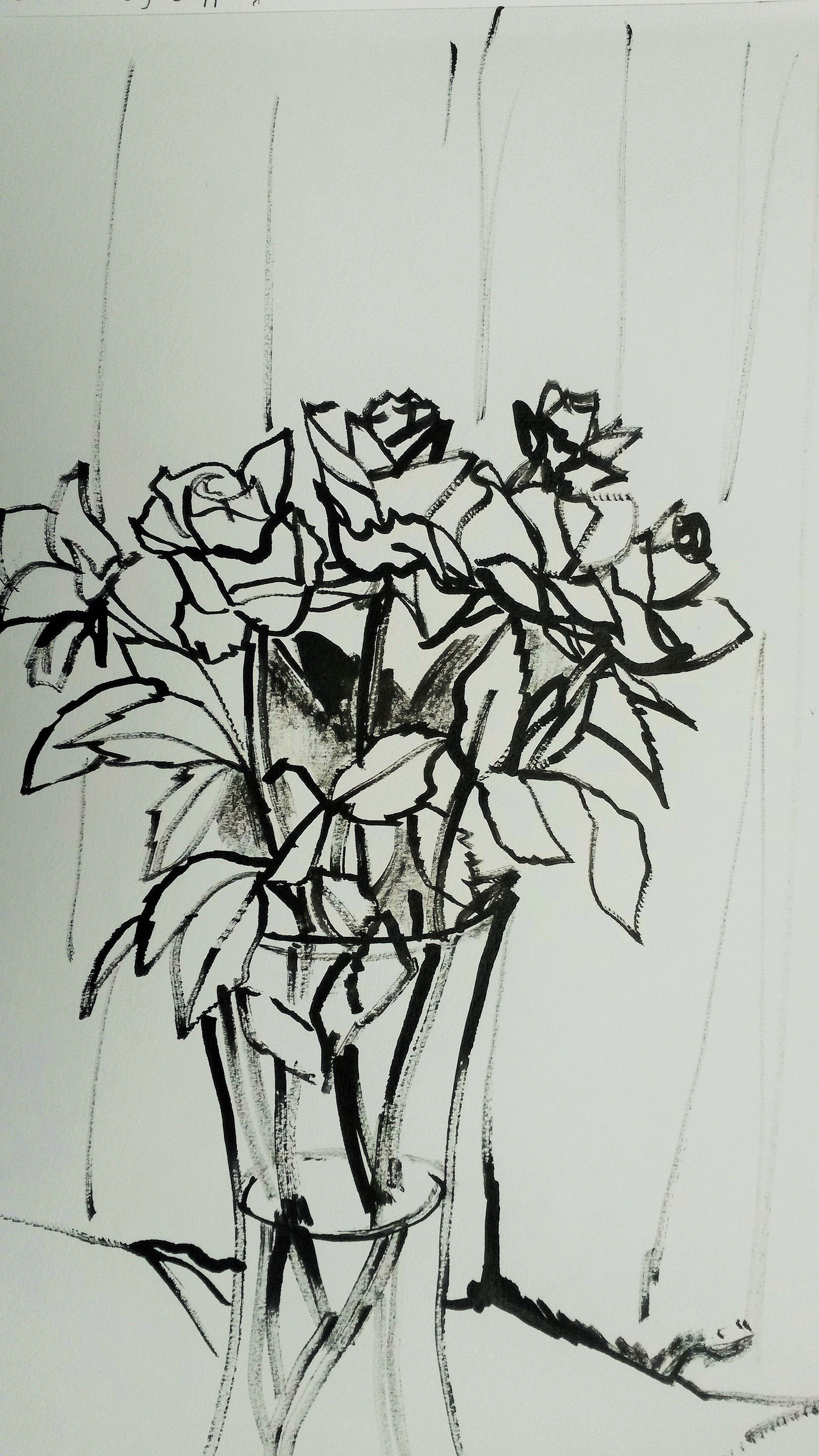
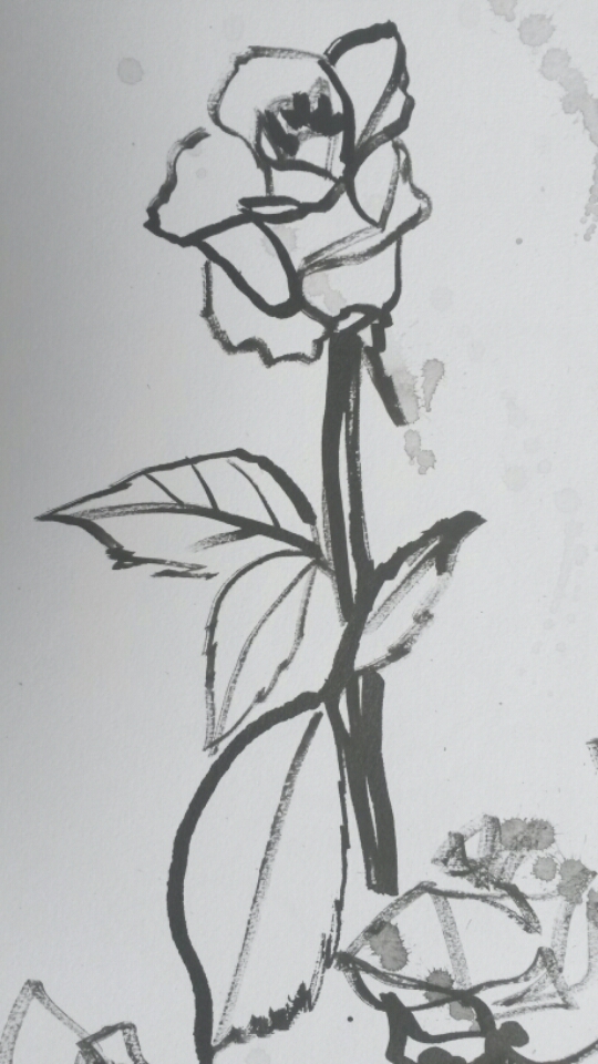
Next I tried drawing some roses using a rose stem dipped in ink.  The pattern on the cloth was made by dipping leaves into the ink and printing with them.

2015-05-03-14-50-12

Tulips drawn with tulip stems and ink

Initially I didn’t like this drawing, as I thought it was clumsy and un-flower like, however over time it has grown on me.  There is a spontaneity and looseness about it that I like.

20150515_102439

Again, I felt this drawing was a little static and the “essence”, or delicate qualities of the flower weren’t coming across.

2015-05-15 10.32.01

I tried some rapid, continuous line drawings to loosen up, still using the stem.

20150515_10241620150515_10224720150515_102348

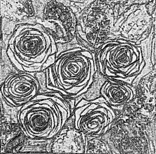
This helped, I think to add more life to the drawings.  Next I tried another continuous line drawing using the rose stem again.  I drew a small group of roses.  This had more life to it than the previous drawings.  I experimented by using a leaf print for the actual leaves and this worked well too.  I added a light wash of diluted black ink to lose the white of the paper.

2015-05-26 19.24.54

 Roses drawn with roses

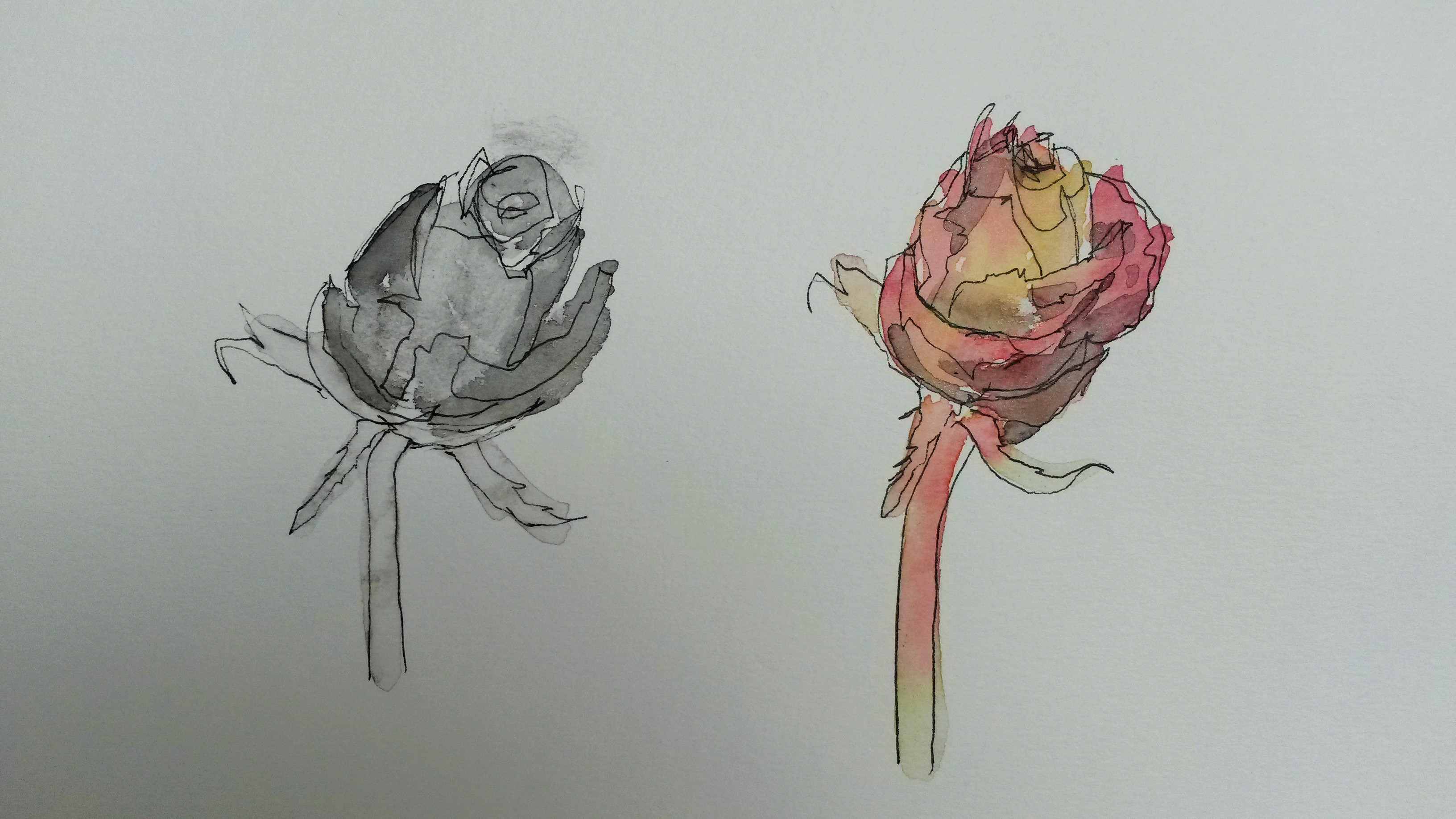
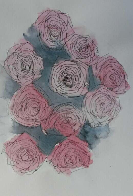
I decided to really get to know my subject by doing several studies and this helped me to familiarise myself with the subject.  I then tried adding colour by adding some watercolour to line drawn with water-soluble drawing pen.

2015-05-19 11.24.39

I was undecided about whether to have monotone or colour, so did a side by side comparison.

20150519_080611

Through these studies I became more confident drawing roses.  I grew to love the circular patterns the petals form and the rhythm and repetition.

2015-05-31 15.05.15

I did another black and white composition.  Although I liked the composition in this one, I felt the strong colour of the roses should be included.

2015-05-29 11.52.31

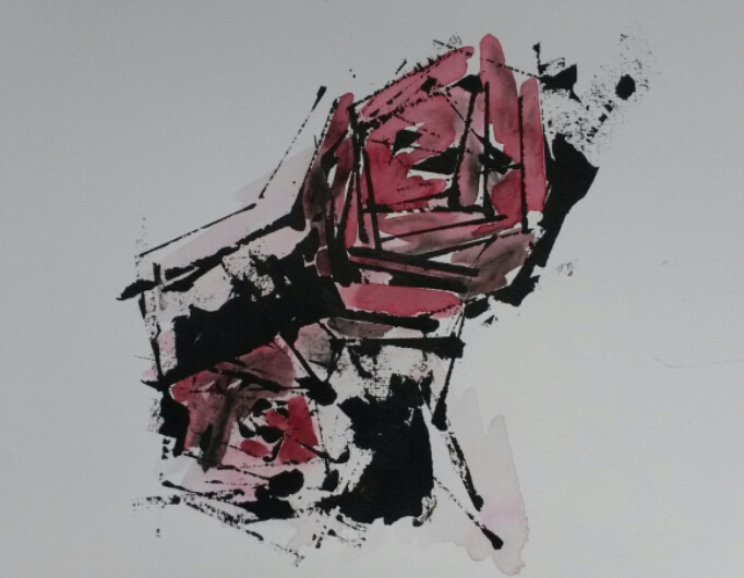
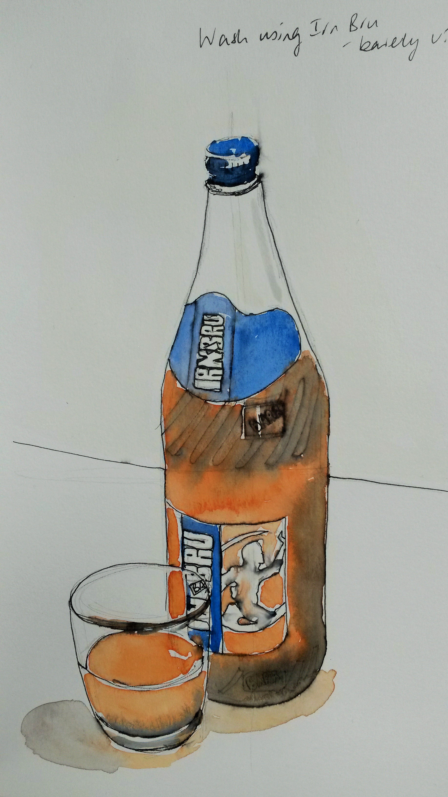
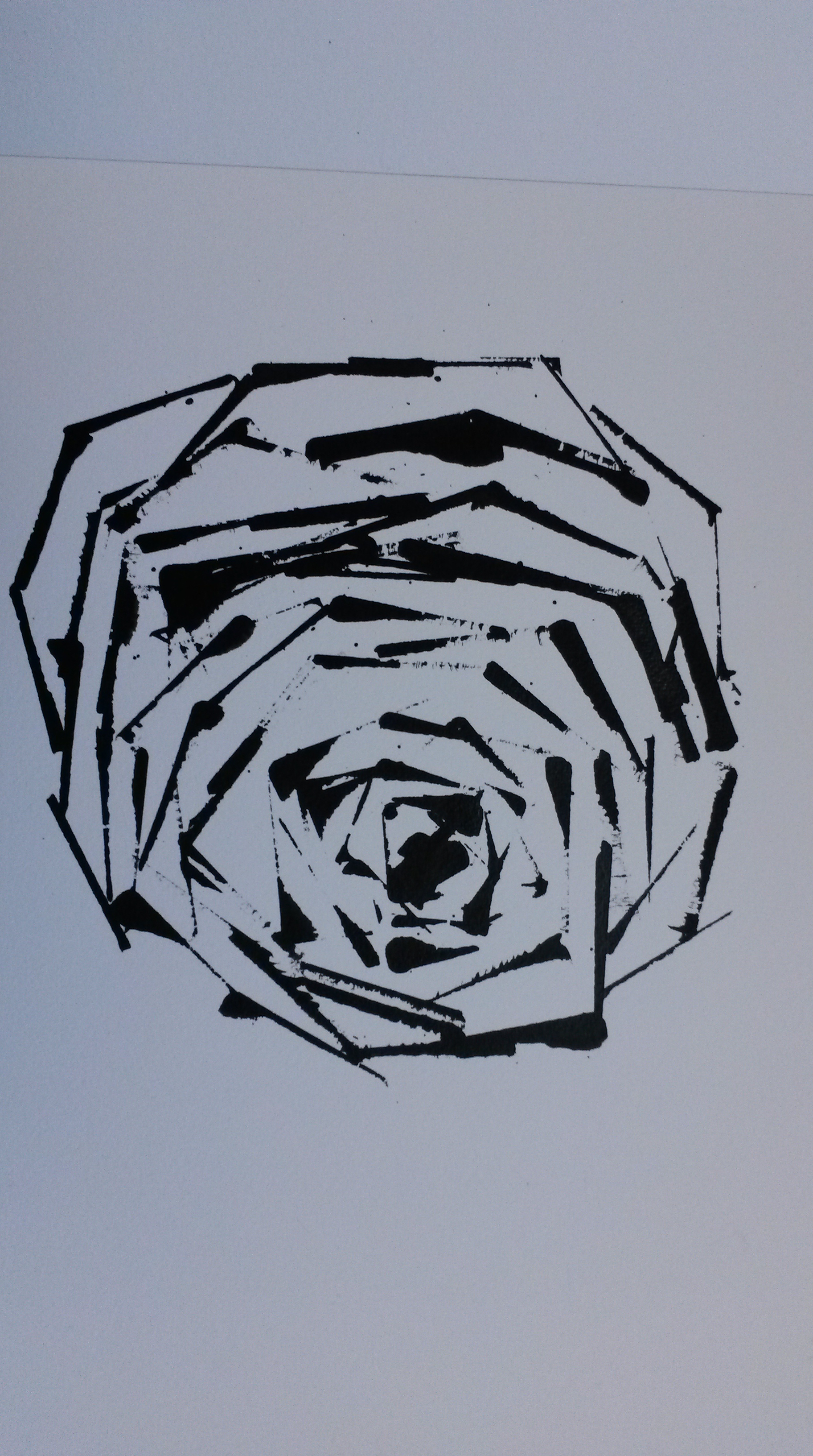
Although the brief is to draw a subject using a subject, I decided to try something a little different.  I wondered whether it would be possible to draw something as delicate and intricate as a rose using something with the exact opposite qualities.  I decided to draw a rose using only the straight lines of a credit card dipped in ink.

2015-05-30 17.21.26

I liked this result, so tried some more attempts.  I think it worked because the petals on roses are often quite angular.

2015-05-31 14.53.06

I added some watercolour to this, initially whilst the ink was still wet and this became muddy,so I waited until it was totally dry before adding a little more colour.

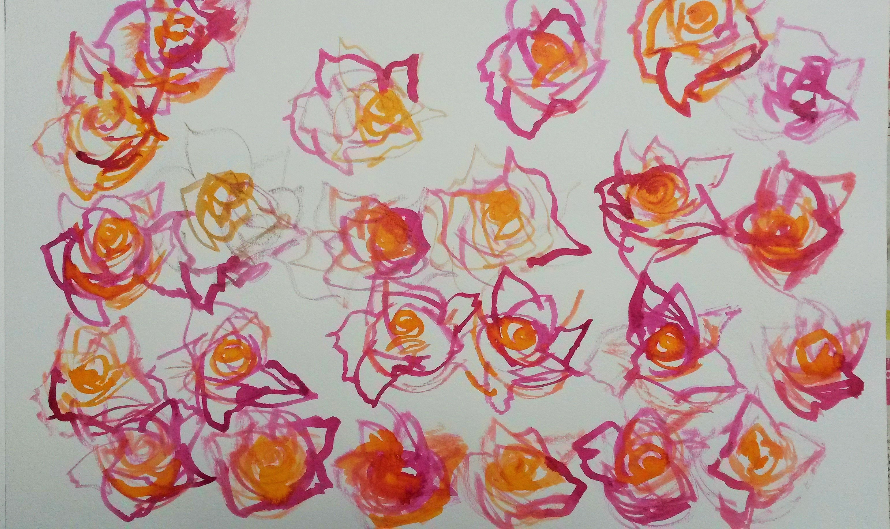
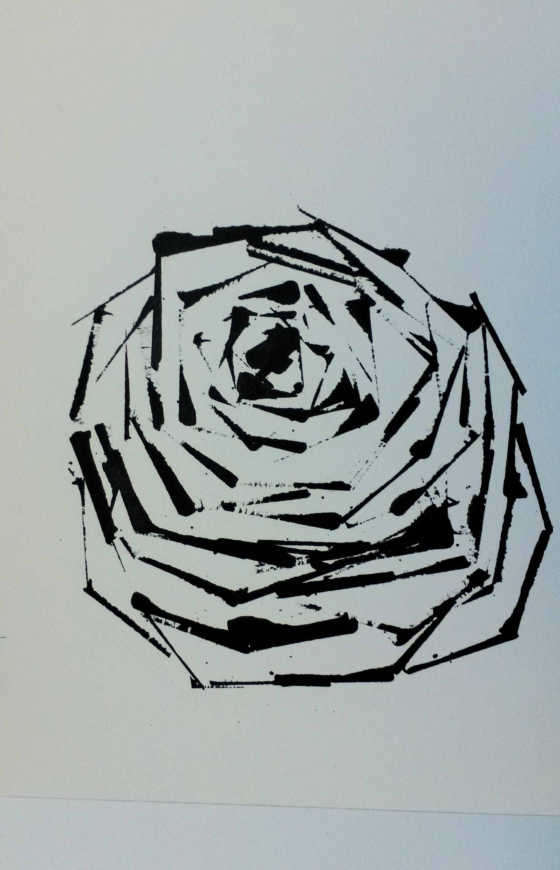
I tried on a bigger scale.

20150601_203151 (3)

I liked this (A3 size), so added more roses to it.

20150601_205122

I’m pleased with this, but still needed to decide whether to add colour, or keep it monotone. 

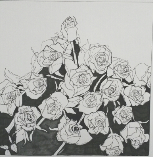
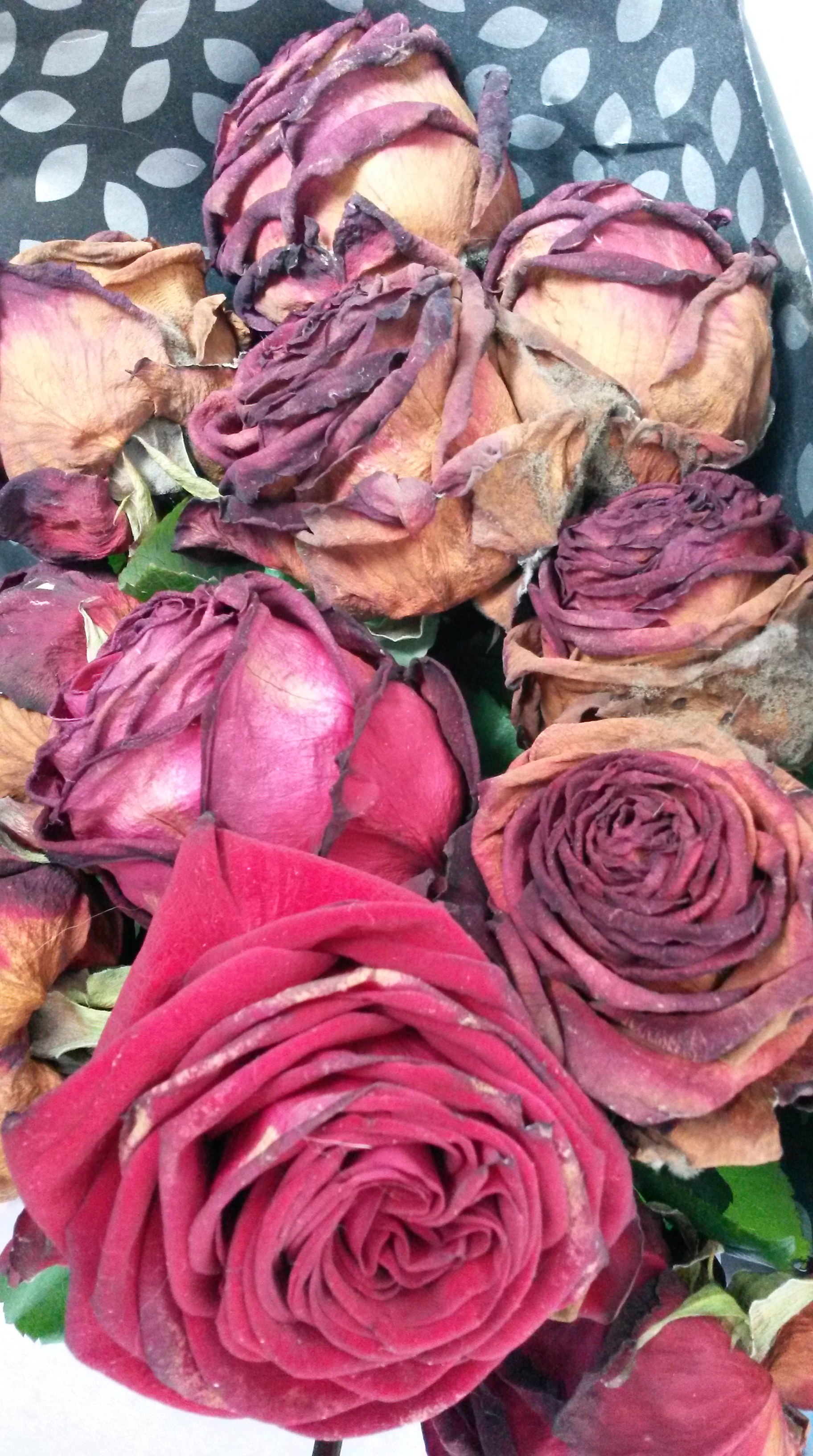
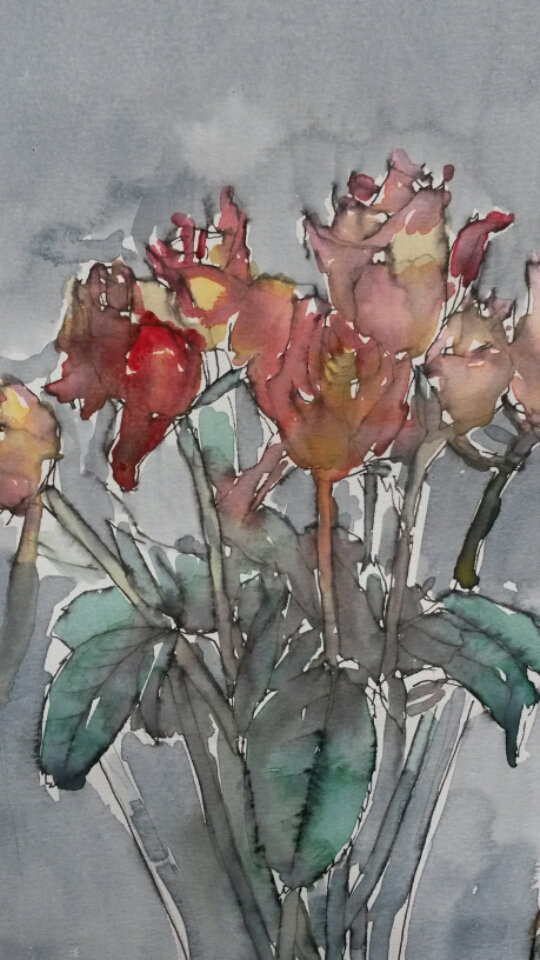
I decided to go back to drawing roses with roses.  By now my beautiful bouquet was almost dead (in some ways much more interesting to look at).

20150612_163436

I was able to work from the very many sketches I had now accumulated.  This was my first attempt;

20150612_170340

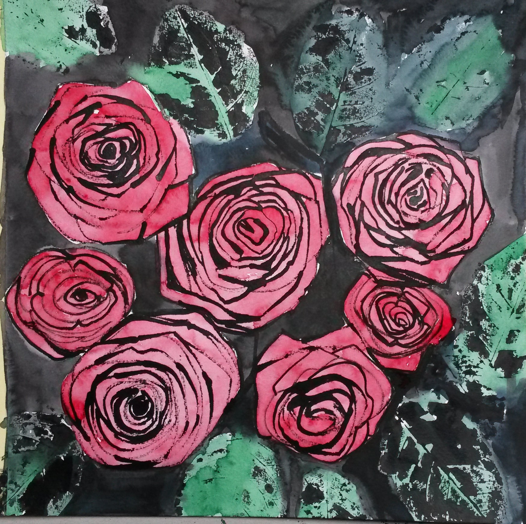
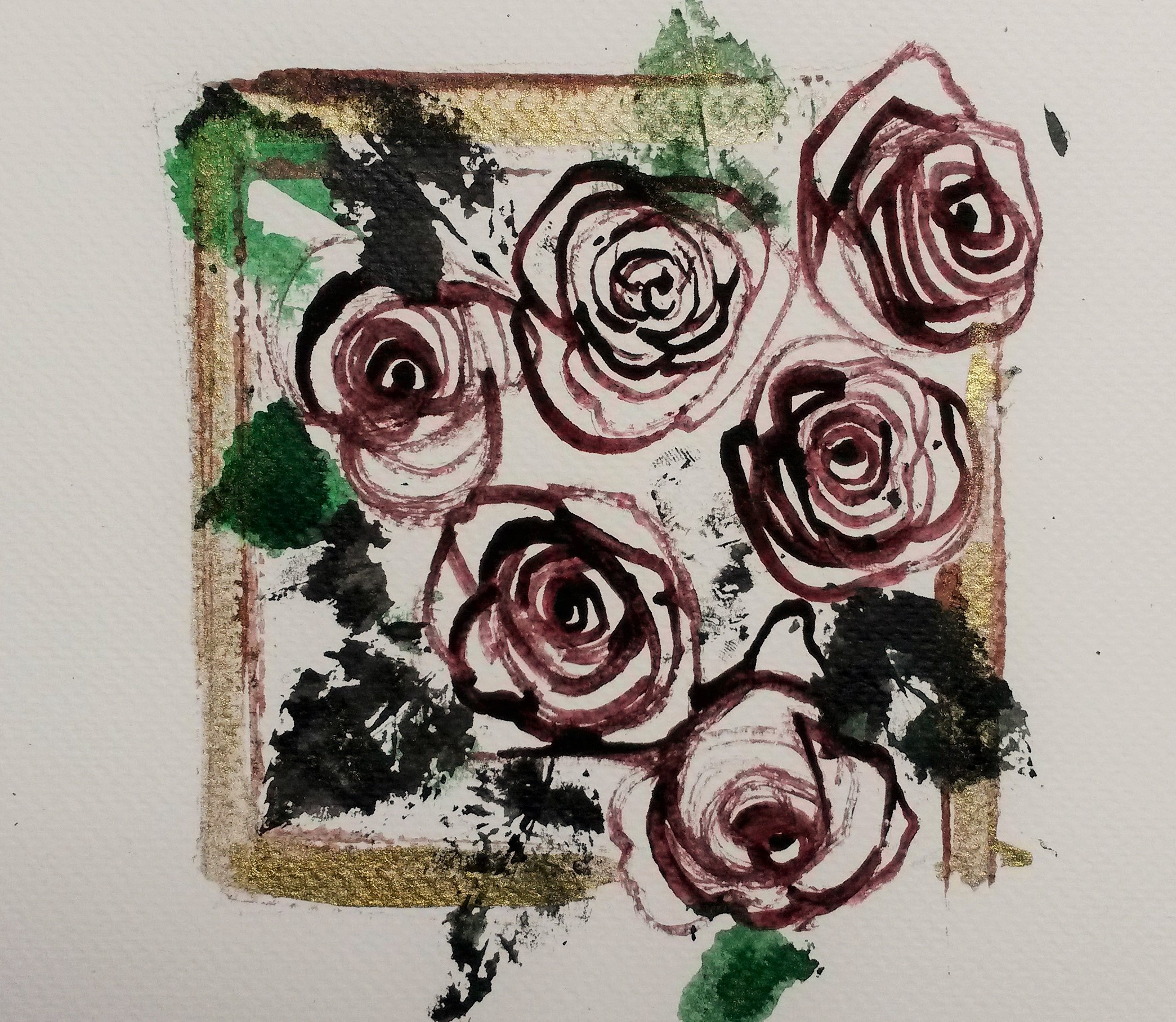
I drew the roses with rose stems, this time sharpened to a point.  I tried to vary the pressure and this resulted in thick and thin lines, which captured the thick and thin shadows of the petals well.  I dipped the leaves in black ink, in effect printing with them.  Once totally dry I added washes of watercolour in Alizarin Crimson and Viridian.  I liked elements of the drawing; I liked the roses and imprints of the leaves, but felt the colours looked washed out.  Using such a strong tone as the black ink affected the rest of the tonal values.  I tried adding more black ink, and then strengthening the watercolour washes.

2015-06-14 20.24.28

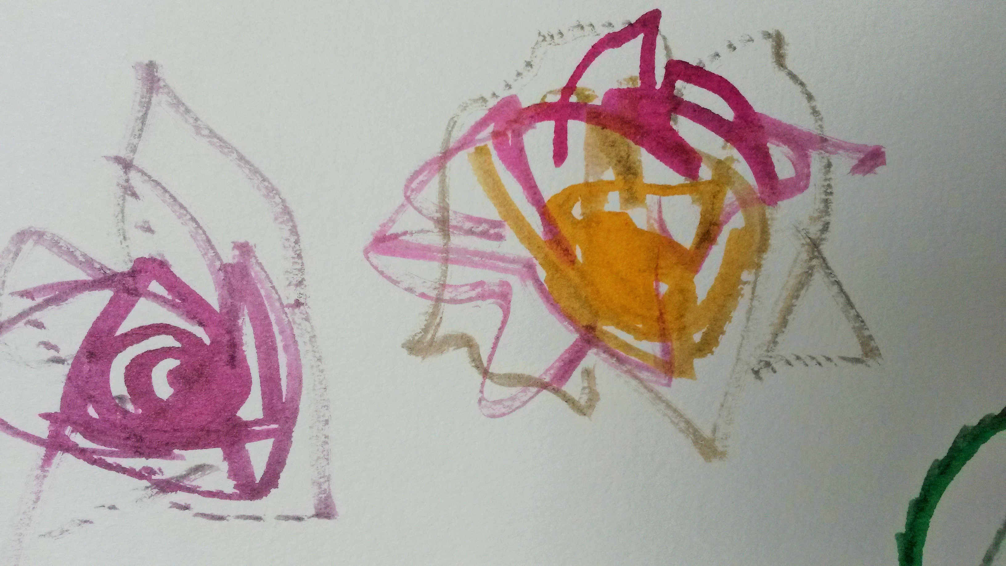
I liked the roses in this one; the darker wash adds form, but I still felt the black was too dark.  I made another attempt.

2015-06-14 20.23.04

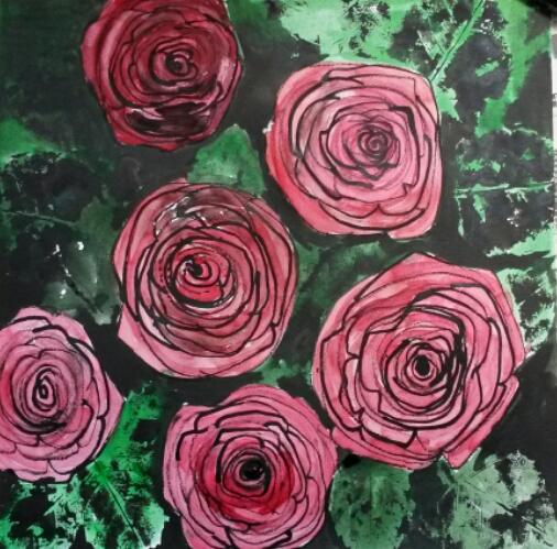
In this one I liked the leaves but not the roses, which I still felt were pale in tone in comparison to the black in the background.

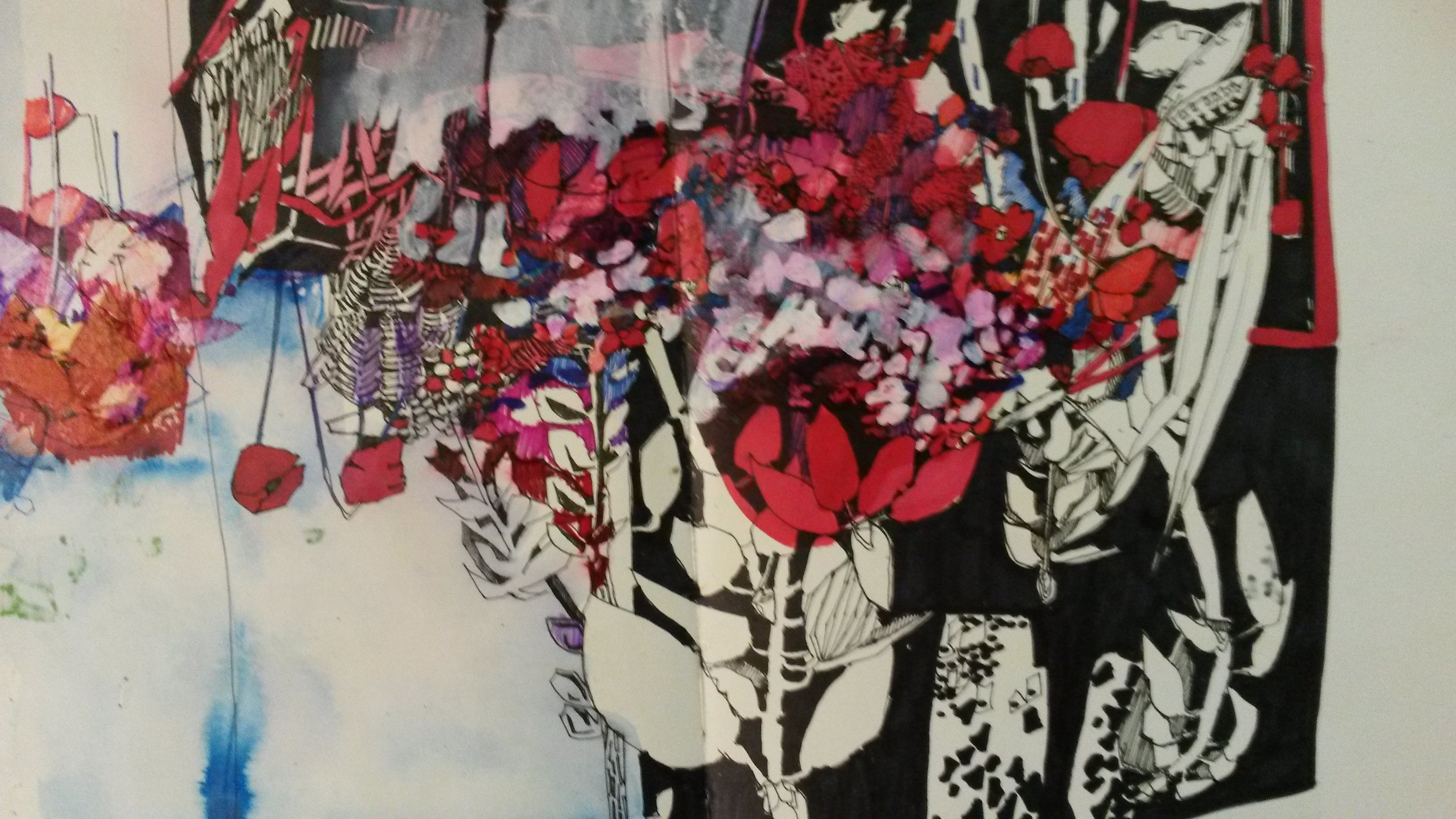
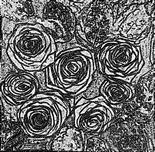
I also tried playing around with the original drawing on photo shop, and the results were interesting.

2015-06-12 23.59.25

2015-06-12 23.57.26

2015-06-12 23.54.54

 I liked the image above very much and kept it in mind for my next attempt.

 I thought that perhaps if I went to back to drawing from life it would help, so I bought new roses and tried putting them in a square vase.  From this I did the sketch below.

20150619_140856

I decided to have one final attempt at the final Assignment piece.

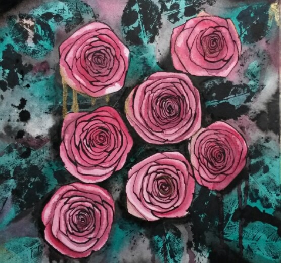
I made new “drawing tools” from rose stems, sharpening the edges with scissors.   I stretched some Saunders Waterford Watercolour paper and drew the roses, using my one last rose that hadn’t withered totally, my sketches and a photo I’d taken as references.

Once the roses were in place I printed with the rose leaves.

20150619_160934

I then began adding watercolour.  I used Viridian for the leaves.  I worked wet into wet and added Neutral for a deeper tones.  Even before I added the red for the roses I realised that if I didn’t use the same red in the foliage and background, the roses would look ‘ stuck on’, and not part of the rest of the painting.  I added some red to some of the leaves and mixed Viridian with Alizarin Crimson for some of the shadows.  This gave it more cohesion.  I added some gold ink as well, because it worked well in the little sketch I did.  Also, way back in the recesses of my mind, I had a vague recollection of my wedding invites having a rose printed on it with some gold on it somewhere.  I purposefully made some runs with the paint (remembering Project 3; Narrative), which adds a touch of sadness, and splattered some black ink to break up the background a little.

2015-06-21 17.18.34

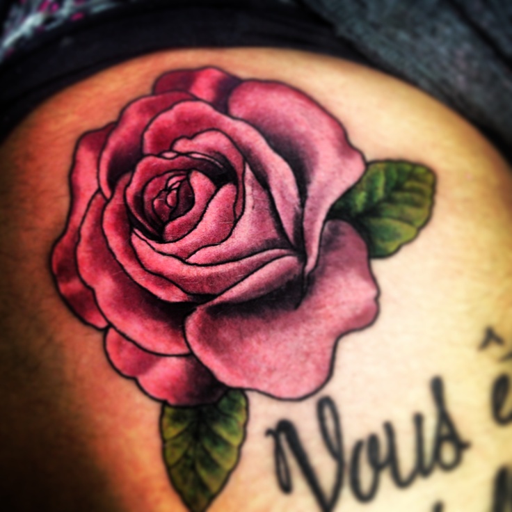
As to the success of the outcome, I find this part quite difficult to decide on.  I am pleased with some elements of it; I feel I know the anatomy of roses inside out, due to the relentless sketching of them.  I can draw them free hand now from my imagination.  I think whilst this drawing is realistic, it has an abstract feel to it.  I love the printed leaves and the marks they make.  I like the view-point of the composition, looking down onto the roses, allowing you to see the concentric circles, and repetition of patterns.  The black lines remind me of rose tattoos, and the image of a rose to me symbolises Love.

Roses have been long used as symbols in a number of societies. Roses are ancient symbols of love and beauty. “Rose” means pink or red in a variety of languages (such as the Romance languages and Greek).

rose tattoo

The simplified shapes remind me of Charles Rennie Mackintosh’s flowers, although obviously not in the same league as his.

http://www.achome.co.uk/pictorial/cmack52.htm

The things that I like less are the composition itself.  I prefer the drawings I’ve done so far from real still lives, they are more convincing, even when slightly abstracted.  The black lines are a bit static and cartoon like.

Remember to look again at the assessment criteria…Think about how well you have done against the criteria and make notes in your learning log.

Demonstration of technical and visual skills.

The technique I used was pretty much as directed in the brief.  Reading it again, perhaps I could have been more experimental with the tool making and tried other parts of the roses or other plants.  I also tried experimenting with drawing roses with straight lines using the credit card.  I did vary the pressure I used when drawing in order to try to vary the thickness of the lines.  I think I used good observational skills for the roses. I tried a few different compositions, originally starting with a still life of tulips before moving on to the roses with a view-point looking down on the roses.  The limited palette of complimentary colours red and green makes the roses stand out, as does the contrast between the tight, controlled forms of the roses and the looser, messier foliage.

Quality of Outcome

I have documented my progress from realistic still life to stylised, slightly abstracted design.  I persevered and made three attempts at the final assignment piece before achieving a drawing that I was happier with.  In the development from the initial still life to the final piece, I studied my subject thoroughly by way of a series of studies.  In the early sketches in particular, I just drew and drew my subject until I was able to sketch roses freehand, without having one in front of me.  This helped with the final piece as I felt I knew them inside out.  I feel I have demonstrated good draughtsmanship throughout this process.  The final assignment describes a rose realistically, whilst also exaggerating the repetition of the concentric circles and how they overlap in a stylised form.  I believe it is an original and interesting image to look at.

Demonstration of Creativity

I enjoyed the new experience of making drawing tools from flower stems, although to be honest I would probably have been happier drawing with the predictability and familiarity of a boring old pen.  I experimented with drawing a black and white composition as opposed to one in colour and used complimentary colours; red and green. I experimented with the use of printing with leaves, a process that I really enjoyed.  I tried different compositions until I decided on the view-point looking down as opposed to a conventional scene at viewed from the side.  I used my experience of painting with watercolour to try wet into wet washes,  runs and spatters with ink and paint, which contrast well with the tight drawing of the roses.  I abstracted the rose forms and emphasised the patterns of the petals. I don’t know that I have a personal voice yet.  I do know that I really like the precise, controlled line achieved when drawing with fibre pens, and perhaps this is a step in the right direction for me.

Context

I’ve really discovered the benefits of working with sketchbooks since I started my studies with OCA.  I think this shows in this assignment and I’ve documented the development process in my learning log.  My research into artists such as Cornelia Parker, as well as contemporary artists such as Angela Eames, has helped increase my knowledge of how a concept can evolve and develop, and this in turn impacts own my own work.  The OCA Study Days, such as the Two Roberts Exhibition, have helped me to become accustomed to the ‘language’ of art, and helped me articulate what an art work means or represents to me.  The more informed I become, the more outside influences shape my work, whether consciously or unconsciously.

Finally, I’ll include some feedback I received from my peers when I posted this assignment and supporting work on OCA sketchbooks page on Facebook

When I sought opinions as to which of the first two attempts appealed;

I like the second overall … just like the way the roses and leaves are done as very slightly abstract roses and the leaves are just fabulous.

I think the second for me due to the complementary red/green palette.

I like the darkness and stronger contrasts.

I like the contrast between detailed roses and the blurry leaves.

 This is great – the petals look so 3 dimensional.

These roses jump right out at you and I like the shade of green you have used for the leaves – gives it a really modern feel.

Following your rose exploration is really interesting, I find. Thanks for sharing the process and maybe post the whole series in one thread ?

I love these and now following our (sic) exploration.

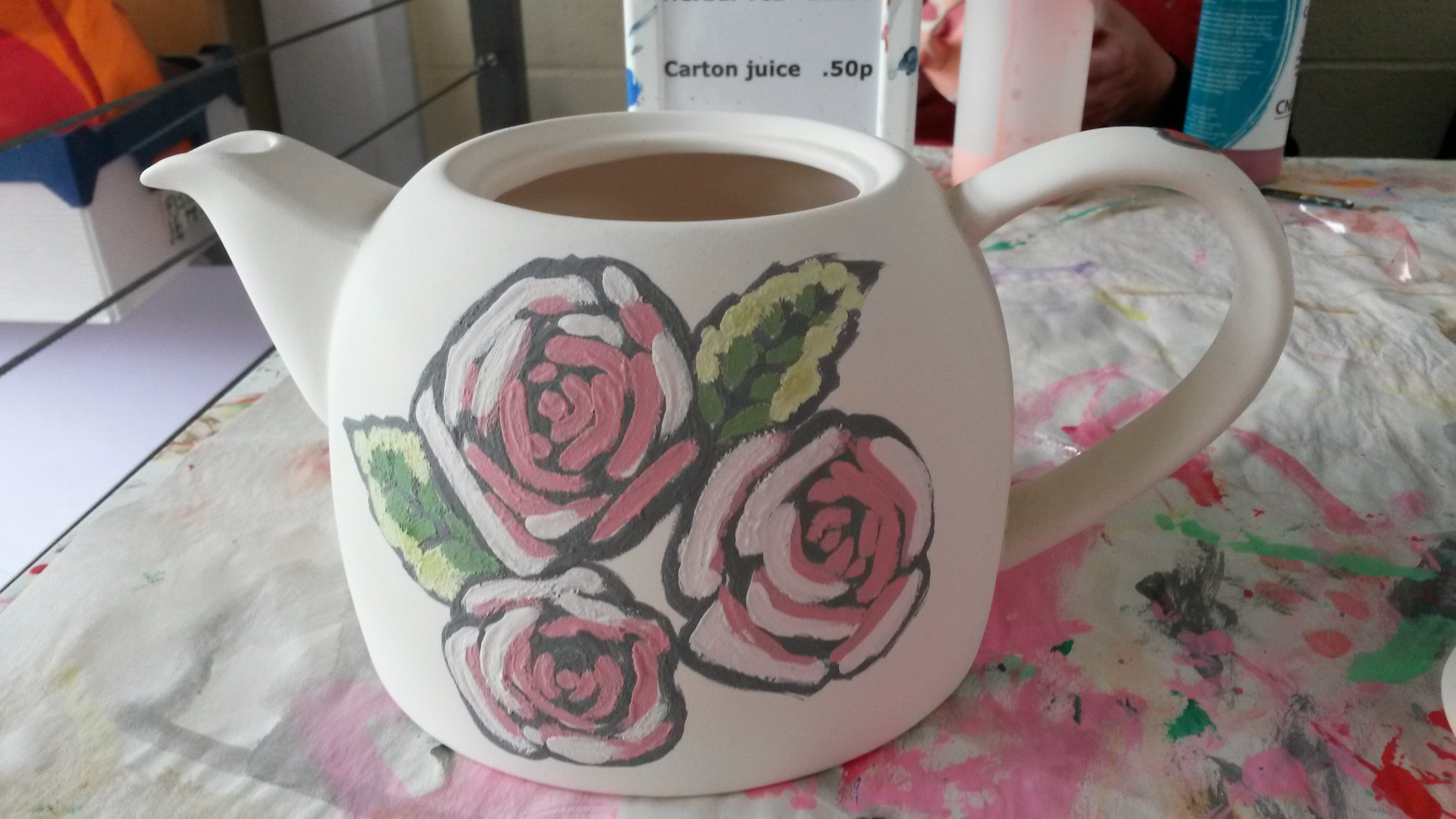
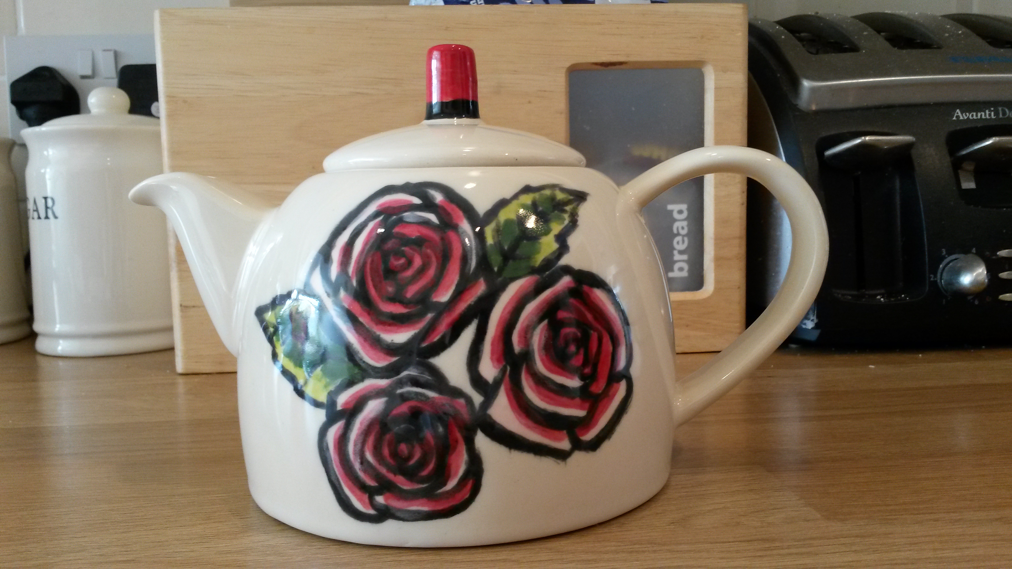
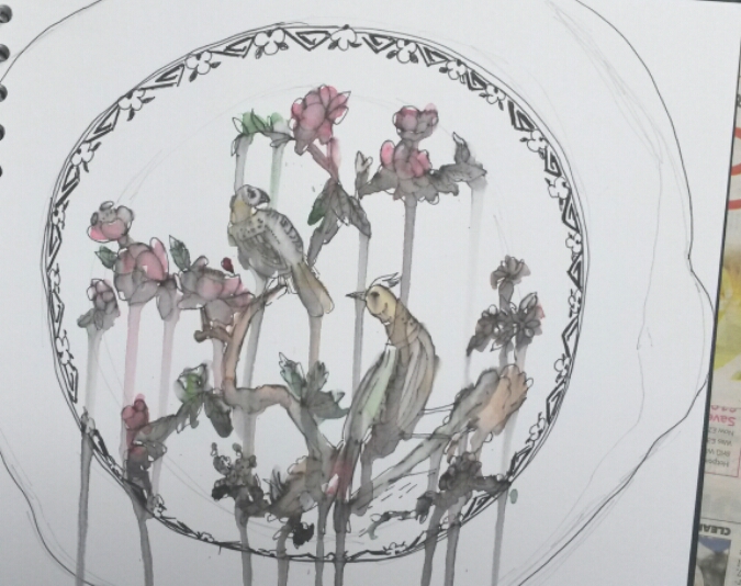
This is something I did much later after completion of Assignment 2

I took my daughter to a pottery painting place in the summer holidays and noticed they did glazed china painting too.  I came back at a later date and painted a tea pot using my painting for Assignment 2 for inspiration.

20150805_170008

It is the first time I’ve ever tried that. First I had to choose the colours, which is difficult because the colours darken once fired.  Each colour has to be painted on with at least three layers.  I then had to leave it for two weeks and come back once it was fired.

20150821_162050

I was really pleased with the finished piece, particularly as it was my own design.

https://en.wikipedia.org/wiki/Rose_(symbolism)

Project 2: Mark making materials

Build up a variety of surfaces using whatever comes to hand that has two differently coloured layers.  Make several drawings by scratching through the second layer.  You can use wax and acrylic paint, oil glazes on board, household paint on wood, varnish on metal.  Vary the scale of drawings depending on your support.  Choose a subject from your sketchbook or learning log and push through to make complete drawings, not just squares of texture with random marks.  That way you’ll really learn what the materials can do.

This immediately made me think of the pictures children make by covering a sheet of paper with coloured wax crayon, covering it all with black crayon, then scraping off the black, usually drawing fireworks.  So that is exactly what I did first.

2015-04-25 09.40.36

For my next one I was thinking that I would leave the circular area around the tree white, then have the surrounding area blue.  I had done a watercolour painting like this previously.  I used black oil pastel, instead of wax crayon to get better coverage.  Unfortunately the black oil pastel stained the white paper and scraping it only exacerbated the problem, so there is too little contrast between the black and the tree.

20150421_202916

For my next one I used white oil pastel and light and dark blue for a kind of sky effect, again using black oil pastel.

2015-04-27 16.58.14

I decided to try different media, so for the next one I covered the paper with different colours of acrylic paint.  Once dry I covered with black oils pastel and again scraped off.  This gave quite a subdued effect, as I think the black oil pastel stained the acrylic paint, but I think it gives a mysterious atmosphere to it.

2015-05-05 12.59.57

Next I covered the paper with black oil pastel the painted over it with acrylic paint, then scraping the paint to draw the tree.

20150506_213726

This worked really well, the strong colours of the acrylic contrast well with the black.

2015-05-15 15.53.21

This one was done with coloured wax crayons below and white acrylic paint on top, scraped off whist still slightly wet.

Part 2: Research point, mark making


Mark making may seem like play, but if you have any doubts about the validity of this kind of exercise, take a close look at some great masters of the past. … Many artists will have an old pot scourer, toothpick or hat pin in their tool box which they have learned over the years makes a certain kind of mark.  Next time you are in a gallery pay special attention to the variety of marks used and note your discoveries in your learning log… Try doing this with the drawings below.

Two thatched Cottages with Figures at the window, Rembrandt

I hadn’t used the zoom in facility on the Bridgeman site before, so this was quite interesting for me to try.  This is a line drawing using pen and brown ink.  The range of mark making in this drawing is quite amazing.  There is a wide range of thin and thick marks, all used with varying degrees of pressure and changing direction all the time.  The thatched roof, for example has quite strong, deliberate marks, all going in the one direction, with squiggles for the ends of the sheathes.  The wood of the barn has fine cross-hatching and the foreground has very loose lines describing the land.  Put all together it is a lively sketch, but which has substance and describes the scene wonderfully.

The Raising of Lazarus, Caravaggio

In contrast, this is a tonal drawing rendered using pen and brown india ink and black chalk on brown paper.  This has a fantastic depth to it and it is fascinating to examine up close enough to see it is all made up with lines.  The buildings in the back ground really appear to be in the distance by the use of aerial perspective, while the figures in the foreground really come forward, where the tones are stronger. Their clothes are drawn with fine lines all going in the direction of the folds and creases. The craggy face of the mountain behind them is described with contour lines and the detail in the foreground is described by the use of fine lines for the grass.

Looking at this has made me more aware of how marks are made and has made me want to get right up close to paintings and drawings in galleries.  For example on the OCA Study Visit to the Two Roberts Exhibition, several of the paintings had marks made which appeared to be scratched on.  An example of this is ‘Weaving Army Cloth’ by Robert Colquhoun.  In the book of the exhibition it says; ‘…themes of grief seemed to come naturally to Colquhoun.  The mustard-yellows, browns and greens established a feeling of anguish, a sense reinforced by the scoring and scratching of the paint surface.’ (Elliott, 2014:33).

The Two Roberts, Robert Colquhoun & Robert MacBryde, Patrick Elliott, National Galleries of Scotland 2014

Project 3: Narrative

Think of a person for whom you have strong feelings or hold a strong opinion.  Find an object or item of clothing that reminds you of that person.  Make a piece of artwork that uses the object to provide the imagery but uses the materials to give the viewer a sense of the person.  In effect, you’re making a portrait of a person as an item of clothing…..  Experiment widely and produce as many pieces as you need to until you arrive at something which you think fits.

When I read this, I immediately thought of my mother, who passed away last year.  I don’t have any of her clothing, but I have some belongings.  I decided to do a still life with some of her things that were normally at her bedside; a china bowel usually filled with boiled sweets, her watch, a vase of roses and a bottle of Irn Bru.  I decided to go off track from the brief slightly, and instead of describing my mother, I would try to describe my feelings towards her, i.e. grief, love, sadness etc.

I was thinking of doing a still life with things that remind me of my Mum.  I put a vase of roses next to a bottle of Irn Bru (which she was never without), and did a loose pen and wash sketch.  I wanted the colours to be sombre, so used Indigo in the back ground, and used lots of water so that the black ink of the drawing ran into the colours.

2015-05-16 16.15.122015-05-16 16.15.42

I struggled with the Irn Bru bottle a little, so had another go on its own this time.  I even tried a wash with Irn Bru, but disappointingly it disappeared completely.

20150519_080650

I’m also enjoying drawing the roses so have been experimenting with those too.

20150519_0806112015-05-19 11.24.39

The bowl was used by my mum as a sweetie bowl, so gave that a try too.

2015-05-26 19.26.36

I kept being drawn to the china bowl, as it reminds me so much of her, so I started another sketch of it on its own.

20150515_114800

This was done with a cheap black fibre tip that is water-soluble.

20150515_134801

To this I added watercolour washes with lots of water added, so that the paint ran down the paper.  I wanted to convey sadness and tears.  To test the success of this I posted it on the Facebook page OCA Sketchbooks and asked what mood or emotion it conveyed.   The responses I got were; sad, under the weather, sadness and lamenting, sad and gloomy, passage of time, very feminine + very emotionally depicted without over sentimentality, sad and lost, sadness, loss, faded memories and tears of grief, reminds me of Chinese or Japanese style, grief, inquiring, decorative, the runs are like tears and the colours are sombre so I immediately thought of weeping and sadness, you have conveyed the emotion in an effective (and affecting) way, sad, melancholy, weepy, really sad, nostalgia the sad kind. 

This is exactly what I was attempting, so I decided to leave it at that; one simple drawing of one object, rendered in such a way that it conveys my feelings towards the person it belonged to.


Part 2 Research Point


The artists below all make work which both creates and denies three dimensions at the same time.  Take a look at their websites then make notes in your learning log about these artists, your response to their work and how their work relates to what you’ve been attempting in this project.

Angela Eames : http://www.angela eames.com

The Fleshscape series reminds me of the exercise in Part 1; Project 4 The Human Form, where you had to devise a composition overlapping limbs.  She has zoomed in close up to parts of the human body, resulting in compositions not at first recognizable as the human body.

Other series, such as Dimensions, combine conventional drawings, for example scribbles with a biro and digital technology, such as 3d photography.  This helps to explore form, in a way not possible through conventional observation.  It challenges the viewer to make sense of the ‘hybrid’ image.

Other work, such as the Veil Series involve virtually building 3 dimensional structures, creating ambiguous images.

I think my conclusion on looking at the work of Angela Eames is that media can consist of anything you like.  It can be a drawing, in the traditional sense, or a digital drawing, it can be a photographic image or any variation or combination.  I think the important part is the outcome; is it interesting, does it engage the viewer, does it make you think, does it stir memories, is it pleasing to look at, or does it capture attention.

My response to it is that it doesn’t engage me.  The use of digital technology is interesting, but to me the results are too clinical and almost illustrative.

Michael Borremans: http://www.zeno-x.com/artists/michael_borremans.htm

Michael Borremans uses traditional media, such as oil on canvas and pencil on paper, and watercolour, in a traditional manner.  It is his subjects that grab the attention by being unconventional.  Examples of the subjects painted are figurative paintings where the person is in an unusual pose, such as a boy with sticks up his nose, figures chopped in half in the middle, the human body becomes an inanimate object, but is otherwise realistic looking.  In addition he uses framed LCD screens showing short film sequences.  The images appear a bit like a puzzle, where the viewer is trying to work out what’s happening and the scenes are often surreal.

My response to his work is that I can really appreciate the technical painting and drawing skills that he has.  I particularly like the oil paintings on canvas, which remind me of the old Masters, however the subjects leave me cold.  They do grab your interest, but for me, not long enough to want to keep looking.

Jim Shaw: http://www.simonleegallery.com/Artists/Jim_Shaw/Selected_Works

The work of American artist Jim Shaw is very contemporary.  The materials he uses are very innovative; everything from conventional materials such as oil pencil, acrylic, collage, ink, wood, resin, airbrush, digital print, enamel, the list goes on.  The combinations he uses are interesting together; oil paint with digital print for example, and the various substrates used add another dimension; oil on shaped wood, cardboard tubes, ragboard on plywood and linen etc.

As far as my response to his work goes; it ranges from awe at the complexity of the composition and detail in Blake/Boring, to total incomprehension of work such as Dream Object (“A room with waves of meat frozen crashed in the corner). I think the artist’s aim is to be provocative and is seeking originality, however it doesn’t engage me.

I think all three artists are endeavouring to combine traditional drawing as we think of it, with for example, graphite on paper and innovative materials and images.  Every subject has been done to death over the years and creating something new and fresh is becoming increasingly harder to do.  These artists are seeking new ways to say something original about how they view the world.