Author Archives: annemacleod2013

Unknown's avatar

About annemacleod2013

I am currently studying with OCA on the Painting Degree pathway

OCA Study Visit Scottish National Gallery of Modern Art 8th May 2015

This was to be a visit to the Roy Lichtenstein exhibition, however due to flooding the gallery was unfortunately closed, therefore we decided to head to Gallery 2 instead, where myself and another student decided to see the Two Roberts Exhibition, while another student and our tutor Olivia Irvine visited other rooms in the gallery.

Robert MacBryde was born in Maybole in Ayrshire in 1913, Colquhoun in Kilmarnock in 1914. From poor, working-class backgrounds, they met at Glasgow School of Art in 1933, and soon became lovers.  In 1941 they moved to London where they became part of the celebrated Soho set that included artists such as Bacon, Keith Vaughan and John Craxton, and the poets Dylan Thomas and George Barker. Colquhoun specialised in figure painting, MacBryde in still-life. Hard drinking, volatile and uncompromising, their lives were as passionate and compelling as their art.

The Lefevre Gallery on Bond Street held a string of successful shows of their work; the Museum of Modern Art in New York and the Tate acquired paintings. By 1950 they were among the most famous artists working in Britain. But as abstraction became the dominant force in European art in the late 1950s, and as their drinking increased, so their popularity suffered. Colquhoun died penniless in 1962, aged just 47; MacBryde was knocked over by a car and died in 1966. Few artists have catapulted to celebrity or descended into obscurity so swiftly: their remarkable careers lasted scarcely twenty years.

The first thing that I was struck by was the similarity between Colquhoun’s and MacByde’s paintings; in everything from the colours, subjects and style.  As I progressed through the exhibition I began to be aware of small differences, such as the texture in MacBryde’s paintings through use of brush strokes.  I wasn’t initially taken by the paintings, particularly the colours in the early works (again, both used the same colours), however the later works were more appealing to me.  I was interested to read that the dark shapes in the foreground were the shadows of people standing in front of it and this was often repeated.  I bought the guide book of the exhibition, so plan further research on these two interesting characters.

We headed for the National Gallery and stopped briefly at St Mary’s Cathedral to look at a painting The Presence by A E Borthwick and the Paolozzi windows.

polozzi 2

paolozzi3

paolozzi window1


We then went to the National Gallery to see the Royal Scottish Academy (RSA) Exhibition. Olivia was very familiar with the members and it was good to get an insight from her about their work.  I was most taken by the work of Michael Sandle Mount St Helens.  It was difficult to tell the medium, although there was some wet into wet, there was also definite strokes, so I thought it was perhaps ink, however researching it on-line I see that it was actually watercolour, part of a series of four, each 97cm x 147cm completed in the 1980s.  The scale was impressive and the image was powerful, and had a strong three-dimentionality about it, similar to the way that another sculptor; Henry Moore’s are.  The artist’s handwriting stated it was taken from newspaper photographs.

micaelsandle

20150508_15270120150508_152706

20150508_15261820150508_152656

I was inspired by the scale the power of the images aided by the monochrome, and yet there was a delicacy; gorgeous wet into wet, layers, mixed media, energy and life.  More and more on my Drawing Course I have been drawn by black and white, e.g. my barcode pictures, ink flowers drawings and assignment 6 figures, and this painting inspires me to be bolder, perhaps trying watercolours in monochrome in a similar way.

 Refs;

http://en.wikipedia.org/wiki/Robert_Colquhoun

https://www.nationalgalleries.org/whatson/on-now-coming-soon/the-two-roberts-robert-colquhoun-and-robert-macbryde/

http://www.royalscottishacademy.org/pages/exhibition_frame.asp?id=440

Project 1:Space, depth and volume

Method; Cover a whole sheet of paper with charcoal so that you have a blank black rectangle.  Make a drawing from a subject of your choice by drawing into the charcoal using a rubber or selection of rubbers.  When you’ve worked into the charcoal for about an hour using just a rubber (depending on how fast you work), go back to your charcoal and begin to redraw in darker tones using the side of the charcoal.  Continue in this way using the rubber as a white to the charcoal’s black and develop the drawing until you’re happy with it.  Try to avoid using outlines – instead use sweeps of the rubber or the side of the charcoal to build up patches of tone.  If you do use an outline, look at the two neighbouring tones, decide which is the darker and then blend the outline into that one.  Bear in mind that as you move along the object’s silhouette, the relationships might change and the outline might switch allegiance.

I have never tried this technique before.  I decided to set up a small still life with apples and a jug.  I used an A3 sketchbook and only had thin vine charcoal so I used it on it’s side to cover the page.  I found it difficult to draw without lines at first.  Similar to the way I found it difficult to paint the first time I did it without drawing an image first.  I did have to correct it a few times, which was easy as you just cover the mistake with charcoal.  Here is my first attempt.

april 2015 659

And here is my second;

april 2015 764

I was frustrated that I wasn’t getting any mid tones, just very dark or white, so I went on to You Tube and watched a tutorial, and quickly found that it was because I wasn’t blending the charcoal; just putting it on and taking it off again.

For my third attempt I set up a more challenging still life with a jug of white tulips, an apple and two patterned scarfs.

april 2015 758

I used a heavier weight of cartridge paper this time, and at first was a bit dismayed to realise it had a tooth to it, so the white came through when I put the charcoal on.  This time I blended the whole page of charcoal with a cotton wool pad.  I then took out the lightest areas with the putty rubber, again finding it tricky without drawing the whole composition in with lines.  I had to keep making corrections by covering it again in charcoal. I continued lifting out with the rubber and adding with the charcoal.  For the patterned scarfs I just simplified the design, implying shapes with the rubber.  I spent quite a long time on this and then left it to the next day to finish.  It is extremely messy work, and when I went to start the next day I found my cat had walked across the page!  Never one to miss an opportunity, I took some photos of her charcoal paw prints across the white desk to use in a later exercise; Found images.

I kept working, adding, taking away and correcting, and found it took a lot of patience to get a finished piece I was happy with.

april 2015 780

I am happy with this result and when I posted it on OCA Sketchbooks on Facebook, one of my fellow students commented that it had the look of a Scottish Colourists about it, which I was obviously pleased about.

Tutor Report Assignment 1

 Tutor report


Student name Anne Macleod Student number 497519
Course/Module Drawing 2 Assignment number 1


Overall Comments

Dear Anne, thank you for sending me your work, its great to see it. Thank you also for the outstanding clarity of presentation. You make it very easy for me to follow your ideas. Overall it is great to see you are pushing yourself and being very creative in your response to the projects. I feel that projects 1, 3 and your assignment pieces work especially well. Already I can see evidence that you are developing a strong personal voice, or voices, which I think will continue to grow naturally as you, go along. Your thoughtful progress through project one is an excellent exemplar of drawing as a tool for enquiry. As you say “a good start”

Assessment potential

 I understand your aim is to go for the PaintingDegree and that you plan to submit your work for assessment at the end of this course. From the work you have shown in this assignment, and providing you commit yourself to the course, I suggest that you are likely to be successful in the assessment.


Feedback on assignment

 This is a thorough an interesting project. Your process of evaluation is very articulate and self-aware. It is good to see you taking stock at intervals during the project and gathering comments from your peers. These are both very worthwhile activities. Overall I think this unit has revealed a number of strengths and possible directions for your work. I don’t think you need to decide now and it may be worth thinking about synthesizing some of the things learnt in the projects rather than choosing one route. The drawings you produced were fluent and effective and although you felt they didn’t develop enough, there is definite evidence that you headed towards a strong conclusion. As I looked at them I found myself wanting to know that they were still drawings of your bookshelf? Was this the case or had you moved away at that stage? For example the one with watercolour works well but the colours seemed a bit arbitrary. For me the work is most successful when (abstract or not) it has a strong basis in the experienced world. Your experimentations with other materials are good to see also. The later works look like you have mastered the tape and bent it to your needs. I think if you are interested in using found materials further it would be worth looking at the work of Cornelia Parker. She is an extreme case but her care in using and understanding the meanings held by materials is outstanding. Here is an image of a drawing made with canvas strips from a Turner painting.

cornelia parker

I thought the comment from a fellow student about topographical imagery was a good one and may be worth looking at further but maybe this is too literal. This is an early drawing by Whistler. There is more detail on this below.

whistler drawing

 Also have you seen the cross sections of old master paintings made by the national gallery? For me these could provide an interesting bridge between your “barcode” drawings and the beautiful renderings of pebbles.

tutor 2tutor 1

Projects & Learning Logs

Project One.

The thoughtful process exhibited here is very strong. I like that you deliberately started with subjects that you would usually avoid in your painting. The results show a strong sense of rhythm and an ability to use observation creatively. Your reference to bar codes is an interesting one as drawing too can be viewed as a way of coding reality. It reminds me of Torsten Lauschman’s video work Curtain, 2006 which was made by translating data into visual form.

http://www.torstenlauschmann.com/#/the-curtain-2006/4549785527

And Rachel Whiteread’s drawings of parquet floors.

racheal whitbread

 You might also want to look at the paintings Claude Heath makes from his drawings.

It also looks like your visit to the Alisdair Gray exhibition was very useful. His work as City Recorder does look interesting and I can see how your proposal for making paintings at your job centre makes perfect sense. To quote my overused phrase, go for it!

Project 2

As you note this project doesn’t work quite as well as project one. However it has strong qualities in terms of illustration. It might have benefited from an even more daring approach to composition. Have you come across the Diebenkorn retrospective at the Royal Academy? There are lots of images online. Compositionally they are quite dramatic.

 tutor 3

To be perfectly honest although strong in ways I am not sure Blackadder is the best example for a current student. Instead have a look at Kathy Prenderghast, Miranda Whall and Zoe Mendelson for a bit more challenge and relevance. If you like The Joy of Sex you might like the last two!

Project 3

These are very strong images; although the scale is difficult to judge on the blog what is most striking about them is the abstract quality of the marks when blown up. They look like a Cy Twombly. But then they coalesce into a beautifully observed figurative image. This is an idea that is definetly worth looking at further if you are excited by it. Your use of layering is also excellent, I think pastel is a difficult medium to use well.

If you are interested in exploring this further have a look at:

Gwen Hardie – meticulously painted enlarged images of the human body. Up close they hover between abstraction and alien landscapes.

paula macarthur

and Paula MacArthur, she also works on exploded imagery.

tutor 5


Project 4

Again you are very thorough in your approach to the project. I especially like the way you keep pushing until you have it right. Your forms are strong and you create a convincing impression of the weight of one object on another (possibly slightly more in the second drawing than the third). You have covered quite a lot of ground in the four projects (this is good) and all are successful. In a way this makes life more difficult in choosing a personal direction as any would do. At the moment just carry on as you are but try not to think of each project as necessarily being separate.


Suggested reading/viewing

In terms of viewing, I have mentioned lots of people above. Try to pick the ones you feel are most relevant for a closer look.

Paula MacArthur

Gwen Hardie

Kathy Prenderghast

Miranda Whall

Zoe Mendelson

Cy Twombly

Rachel Whiteread

Cornelia Parker


Pointers for the next assignment

In summary, don’t worry about a personal voice yet, but make sure you are drawing things that interest you, even if you have to twist the project a bit. Have a look at the artists above; Parker is particularly relevant for the next unit. Also a quick look at Claude Heath’s process between drawing and painting might be useful. Generally I would say keep going as you are. Your approach and enthusiasm is excellent.


Tutor Name Annabel Dover
 Date  7/04/15
 Next Ass due 7/06/15


Henri Matisse

Look at the work of Henri Matisse…What are the similarities and differences between Matisse and Blackadder?  Which artist do you feel more affinity with?  Consider making a second piece in response to Matisse’s more sophisticated use of space and pattern.

The similarities between Matisse and Blackadder are I think, that they aren’t concerned by a subject in a painting, and distinguishing it from a background, but view the composition as a whole with all parts having the same importance.  I think I’m drawn more to the work of Matisse.  I was fortunate last year to go to an exhibition where there reproductions of his “Cut outs”.  I wasn’t familiar with these, although the Blue Nude 11 figure was instantly recognisable.

I will return to this when time allows, to consider another attempt at the gift bag exercise.

Contextual focus point: Prunella Clough Tate Archive

I’ve not been successful in viewing any of Prunella Clough’s work in the flesh, so unfortunately all research has been looking at images on line.

I looked at Wire Tangle 11.  I’ve decided to look at it and decide what it says to me and how it may have been done, before I research what others have written.   It is a large piece; 101cm x 127cm and is painted with oil on canvas.  It literally looks like tangled wire.  It makes an interesting composition and the large “tangle” on the right leads eye round the whole drawing.  The back ground could be Frottage of a wooden structure.  The yellow diagonal lines are curious and so different from “the wire”, I’m not sure what to think.

I’ve read that she was fascinated by Post War industrial landscapes and the materials found there, such concrete, corrugated metal and the subject of this painting; tangled wire.  But the paintings aren’t figurative representations, but abstractions of these.  She was interested in patterns and forms of things which were man-made, and things that have served their purpose and been discarded.

Assignment One

For your first assignment, review your sketchbooks and project work so farThink about all you’ve learned about scale, cropping, selection, flexibility and judgement and make a decision about which area you’d like to develop for your assignment piece.  This could result in one drawing or a series of drawings.  Your subject can be anything you like but, whatever you choose, the relationships within your drawing(s) should set up an intriguing and engaging composition.

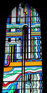
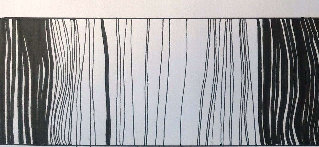
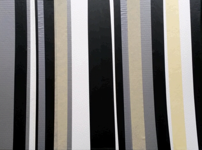
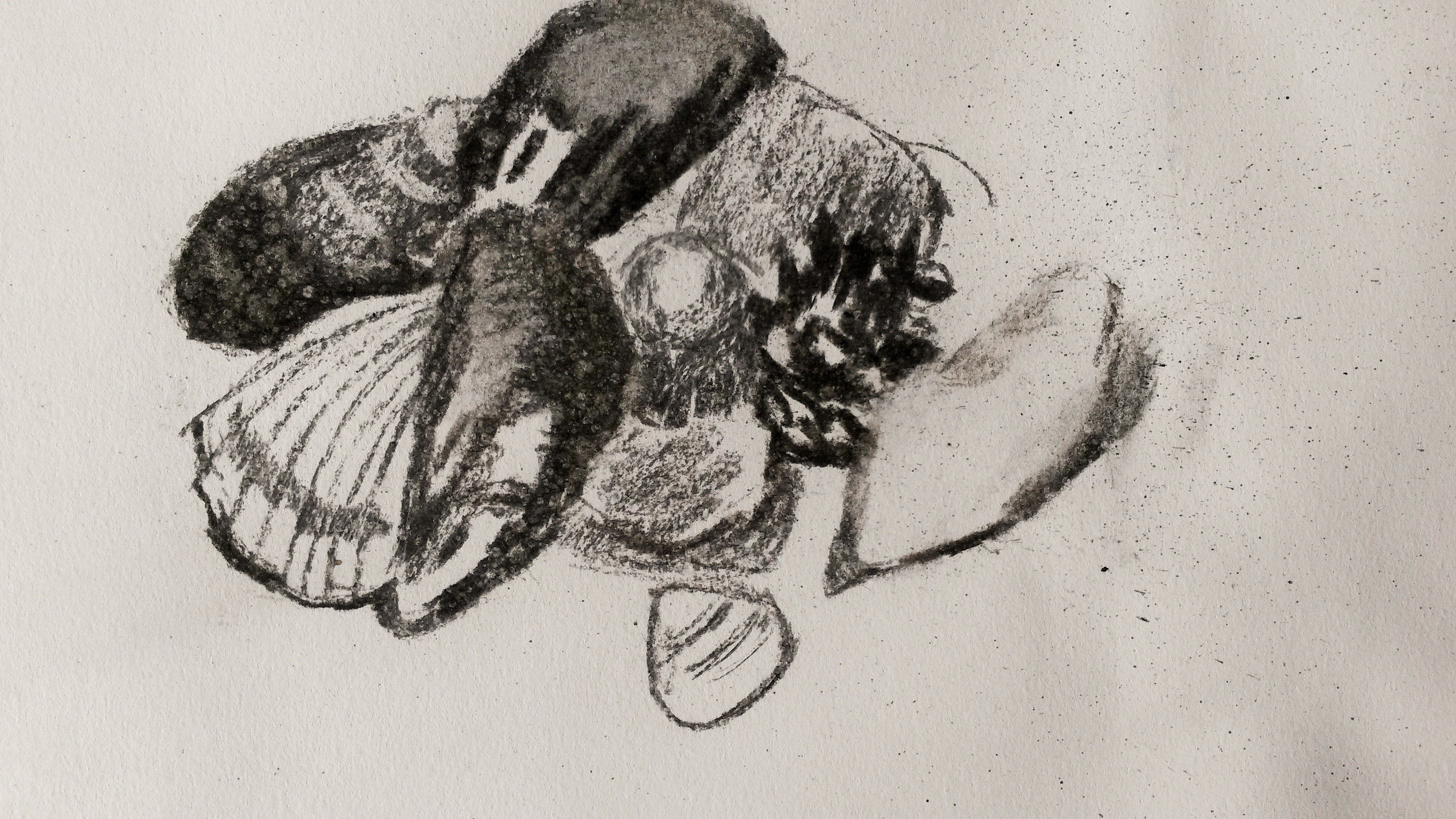
On reviewing my work, I felt that the first exercise Observational Drawing was the strongest.  I particularly liked the black and white striped ones.

drawing 2 016 - Copy

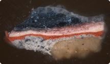
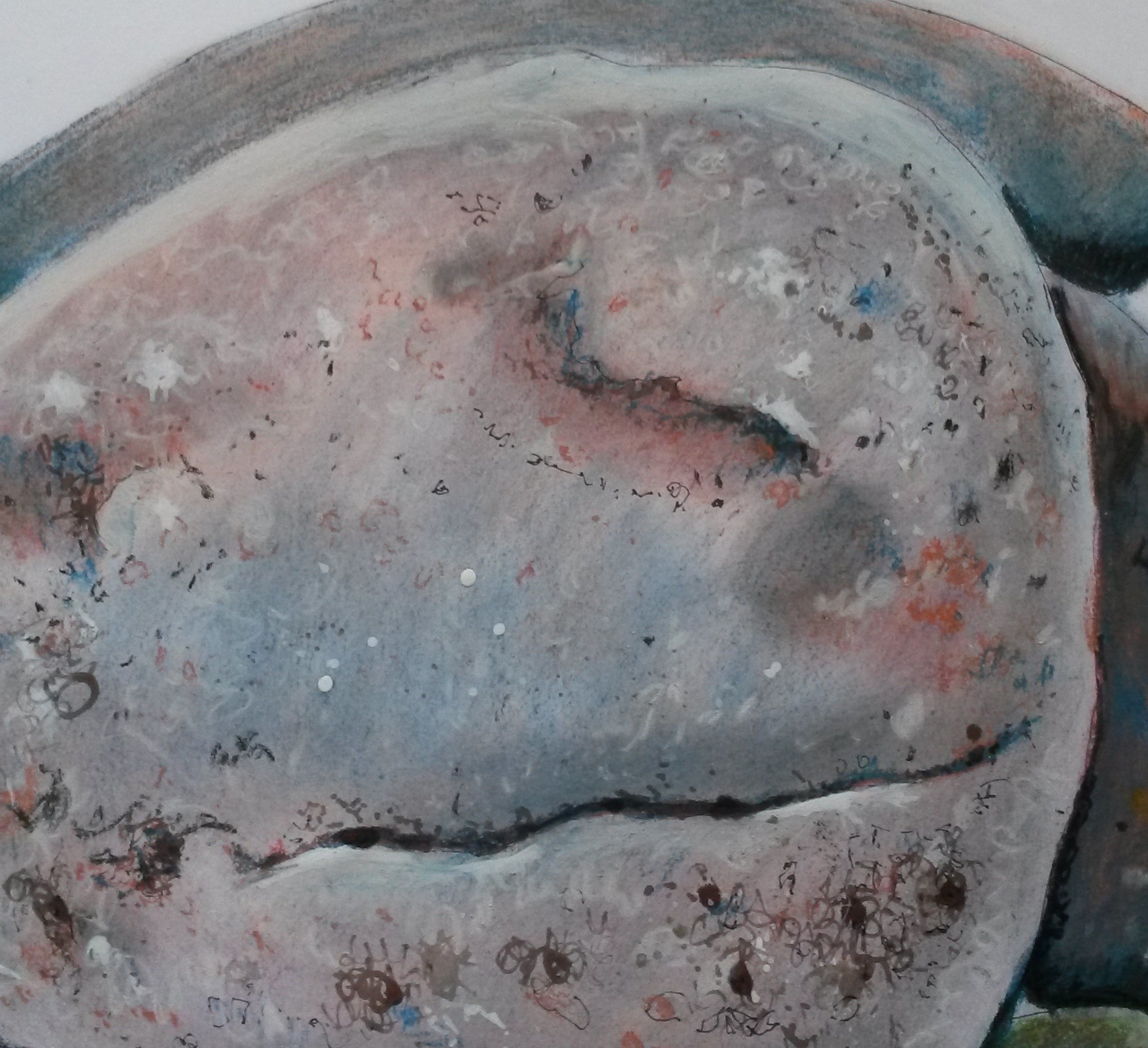
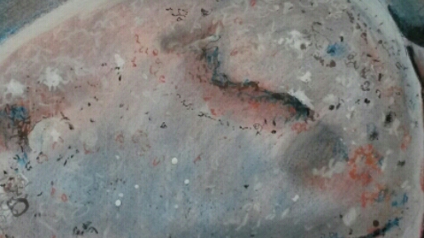
Extract from drawing 8 x 20cm

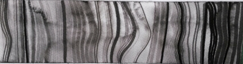
I decided to try this again but on a larger scale.  I had recently bought Winsor and Newton Watercolour markers so I decided to try these out too.  I used an A4 Winsor and Newton Water Colour Marker pad that I bought, which had 140lb pressed paper.

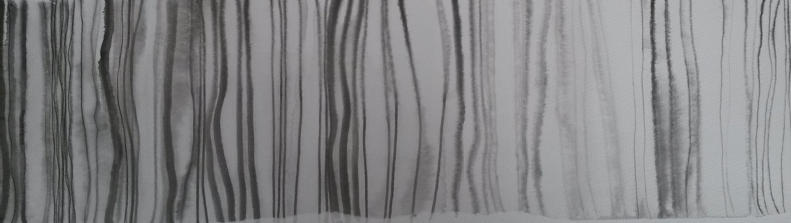
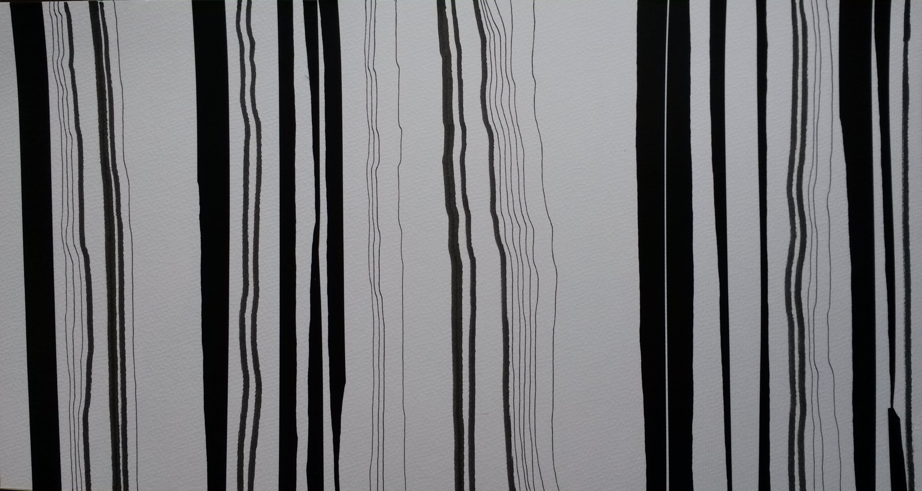
I did a long thin panel (8 x 30cm) using only black and white.  The black watercolour marker looks more dark grey than black.  The pens have one thick end and one thin, so I did a variety of lines.  I then wet the whole area and the pens did behave like watercolours and the black pigment ran.  The white became a light grey the lines had faded so that there was little contrast between the lines and spaces.  Once dry I drew over some of the lines again with black watercolour marker.

2015-03-16 17.09.04

8 x 30cm watercolour marker, water added

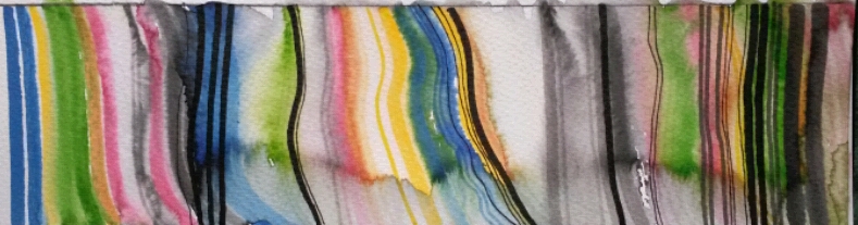
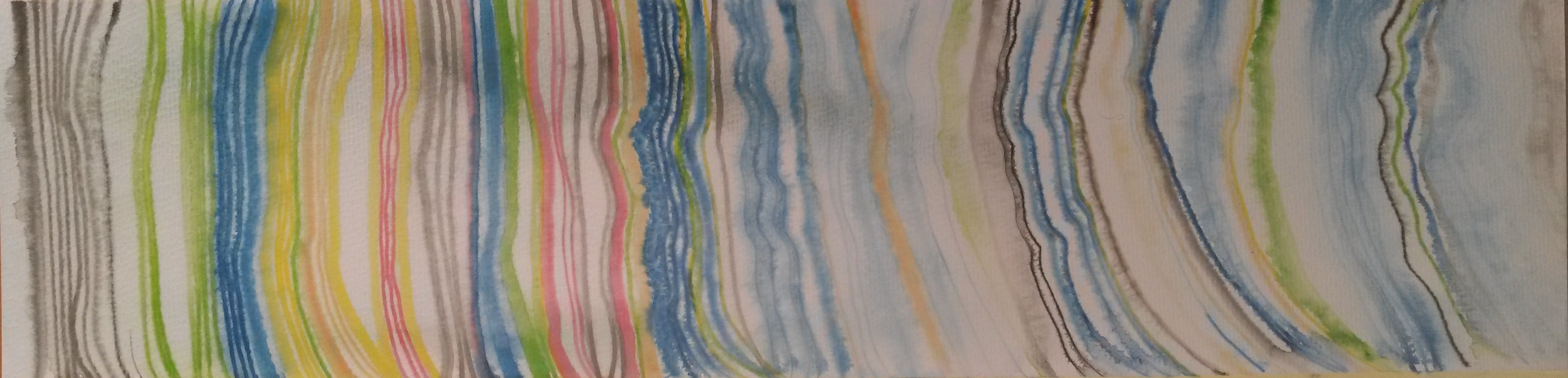
Although I liked the strong contrast of the black and white, I decided to try one in colour for comparison (and it would be an opportunity to try out the watercolour markers again).  Working on the same scale and same paper I used random colours in the same thick and thin striped way, still leaving some white space between.  Once done I added water again and the colours ran together beautifully.  Once fully dry, I added black lines this time using black Faber- Castel Pitt pen.

2015-03-16 17.10.15

8 x 30cm watercolour marker and black Pitt pen

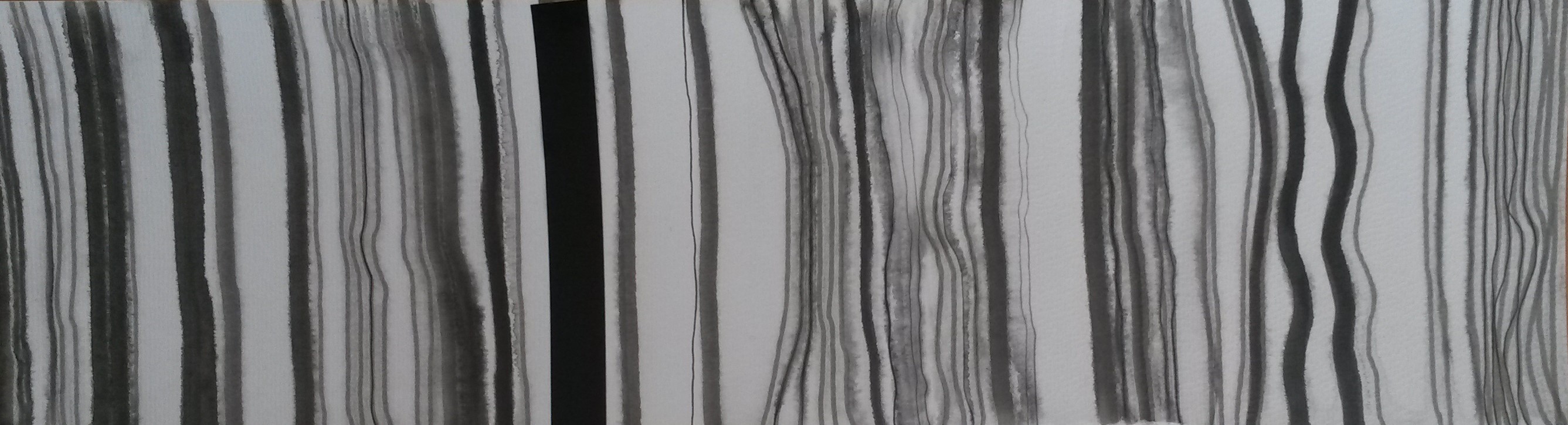
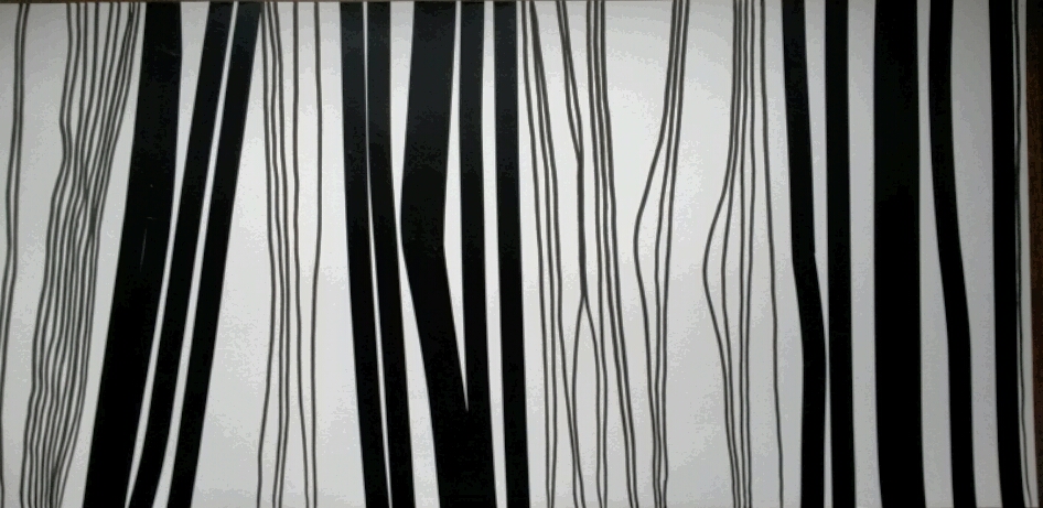
Next I decided to try it on a bigger scale.  I used watercolour board 15 cm x 53 cm.  I used black watercolour marker and worked in the same way as before.  As before I wet the whole area afterwards and the pigment ran.  Once dry I went over some of the lines with the watercolour marker again.  I was becoming a little frustrated that it was all becoming grey and washed out looking and I wanted to get the dark black back, so as an experiment I added a strip of black electrical tape.  Eureka, this contrasted well with the lighter wobbly drawn lines.  I added some very fine lines using Pitt pen

20150331_180032 (2)

15 x 53cm watercolour marker, Pitt pen and electrical tape

I did another one I the same size and in the same way.  This time I left most of it washed out looking, only adding some fine liner whilst still damp.  For some reason this one reminded me of the rings in the trunk of a tree.

20150331_180032 (3)

15 x 53cm watercolour marker

I then did one in the same size (15 x 53cm) in colour, washed out with some areas drawn in again.  I wasn’t keen on this one.

20150331_180105 (2)

15 x 53cm coloured watercolour marker

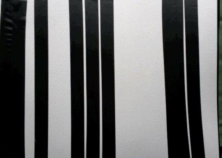
I decided to pursue the use of the electrical tape further.  The first one was very simple, just some strips of black electrical tape on a white A4 sketchbook.  This also reminded me of the keys on a piano.

2015-03-16 17.12.15

A4 electrical tape stripes

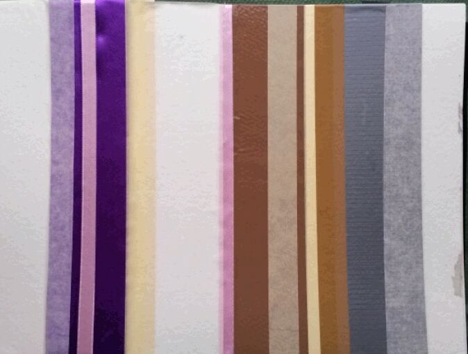
This wasn’t very interesting to look at.  I had a look around to see what other types of tape I could find.  I found parcel tape, masking tape, insulating tape and some coloured ribbon.

2015-03-16 17.11.14

A4 coloured tapes and ribbons

I tried another one with just black, grey, cream and white tapes.

2015-03-16 17.14.05

A4 Electrical tape and masking tape

I tried doing another one with more variation in it.

2015-03-16 17.15.03

A4 electrical and masking tape

I decided on reviewing all the pieces so far, that I liked the black and white ones best, and I liked the ones with a variety of thick and thin, straight and looser lines.  I decided to try the final piece in a much bigger scale.  The next one was 28 cm x 53cm, on watercolour paper, and the lines were made using black electrical tape, with some parts torn to give a ragged edge, and lines drawn with black marker and fine liner.

20150316_170457 (2)

28cm x 53cm electrical tape, marker and fine liner

For the final piece of the series I decided to go even bigger.  40cm x 84cm, again using electrical tape, torn in places and black marker on card.

2015-03-16 17.17.35

40cm x 84cm electrical tape and marker on card

I am fairly pleased with these outcomes, however I don’t know, on reflection, whether much has been achieved by increasing the size and use of other materials, and the ideas could have perhaps been developed further.  It is however only the first Assignment, so hopefully there is plenty of scope for improvement.

I also asked for feedback on these pieces from other OCA students using social media.  Here are some of their comments;

“Using tape reminds me of Monika Grzymala who uses tape to draw three-dimensionally into space.”

“being on level 1 I don’t quite get why this is drawing but love it for the visual effects and how the white sometimes becomes figure when otherwise we’re accustomed to see it as ground.  I particularly liked the watercolour washed out effects in one of the coloured ones.”

“..for me especially the top piece, the could almost be landscape drawings remind me of topographic maps.  I think they’re really interesting.”

“I particularly like the variety of the lines within the black and white ones, for me that adds interest.  They also appear more organic, which I prefer.”

“Did you know you can translate text into bar codes.  Your black and white ones have that cryptic look about them, like there’s a message.” I did look into this, but the mechanism needs to do this was too expensive for one project.

“This reminds me of Kenneth Noland and Morris Louis – I wasn’t familiar with these artist’s work, but having done some research I can see where the comment came from.  Their work comes under the label of; Post-painterly abstraction – Post-painterly abstraction is a blanket term covering a range of new developments in abstract painting in the late 1950s and early 1960s, characterised by a more rigorous approach to abstraction.  Their work is characterised by strong geometrical shapes, and Noland did a series of “Stripe” paintings, although his stripes were horizontal, not vertical, and this is something else that I could have tried.

Reflection

Before you send the assignment to your tutor, take a look at the assessment criteria for this course: ….Review how you think you’ve done against the criteria and make notes in your learning log.

  • Demonstration of technical and visual skills – materials, techniques, observational skills, visual awareness, design and compositional skills

I think that my use of materials; trying out electrical tape and ribbons etc was experimental.  I’ve never tried anything like that before.  Abstraction is an area quite new to me. I tried to think about composition in the shapes and sizes of the drawings, however I could have developed this further perhaps, for example trying out horizontal compositions.

  • Quality of outcome – content, application of knowledge, presentation of work in a coherent manner, discernment, conceptualization of thoughts, communication of ideas

I think, on reflection, the final pieces haven’t progressed very much from the original “bar code” drawings I did for Project 1.  Perhaps I could have developed my ideas further, or perhaps tried to look for other artists working in similar methods.  It is still only Assignment 1 so hopefully I will improve which each Assignment I do.

  • Demonstration of creativity –  imagination, experimentation, invention, development of a personal voice

I think I did experiment a little with use of materials, but perhaps this could have been taken further.  I think it was imaginative to abstract the original book-case drawings, and this is an area quite new to me.  I think it’s too early at this stage to talk of development of a personal voice.

  • Context reflection – research, critical thinking, (learning logs and, at second and third level, critical reviews and essays)

I have spent a lot of time writing up this blog and trying to describe the processes of completing the projects.  I have conducted the basic research as suggested and have begun to read the suggested book list, so this will be reflected in the blog in time.

References

http://www.tate.org.uk/learn/online-resources/glossary/p/post-painterly-abstraction

Project 4: The human form

Make a drawing of two combined body parts.  This might be two feet crossed over, folded arms or a hand resting on a waist.  Look at the curves and the rhythms set up by those curves.  Look at the muscles and bones under the skin and the tension and energy they give.

I decided, through lack of a model, to draw my own legs crossed at the ankles.  I set up a lamp to help add more dramatic tones.  I also put a white sheet of paper on the floor to take away any distraction from the flooring etc. 2015-03-02 19.59.55 (2) A3 charcoal drawing

Doing my first attempt, I felt a little rusty and thought about how it has been since I tried any life drawing.  I think I achieved good chiaroscuro, but the leg and foot don’t have very realistic form and you can’t see evidence of bone or muscle in the legs.  Originally, I had wanted to try other compositions, with crossed hands and arms, and I did get my daughter to take some photographs for me but I couldn’t get a good enough photograph, so I decided to carry on drawing my legs.

2015-03-02 19.58.48 (2)

A3 charcoal sketch

My second attempt was better,  there is better drawing of the muscle and bone.  I also tied using a putty rubber in this one for the lighter areas and I think this worked well.  The composition is much better too by making it a square, however the white paper showing the unfinished part lets it down.

2015-03-02 19.56.12 (2)

A3 charcoal drawing

I did a third and final attempt and I think the proportions are better in this one, it has good form and somehow the skin looks more flesh like.  There is good use of chiaroscuro, my only criticism is the proportions of the toes are wrong and they appear too long.  Other than that, I’m happy with it.

Reflection:  How far does your drawing direct the viewers gaze?  Did you manage to retain the tension in the limbs – or do they seem a bit floppy and directionless?  Have you managed to add an extra dimension to what  could otherwise be a technical or academic exercise?

I think I have achieved a good composition and the viewer’s eyes are directed into the composition.  I think I could probably have experimented a bit more by perhaps including more of the legs and used foreshortening.  I think I did retain the tension in the limbs and I don’t think it looks simply like a technical exercise.

Project 3: Changing the scale

Find a handful of small objects, e.g. pebbles, shells, buttons, toys.  Cluster these objects together and focus in on a cropped area.  Experiment with using a frame for this.  Make a large drawing which gives the impression of a landscape view or architectural detail, using these objects as your source material.  Tiny pebbles can become enormous rocks, shells can become cliffs and sea caves….By cropping your subject you’ll ensure that the whole composition has power and energy. 

I started this project by gathering together some shells and stones and drawing them in a normal scale with charcoal.

20150301_151223 (2)

I then focussed in on one smaller area and drew this in charcoal.

20150301_151250

From there I focussed on one area of a shell and drew it, this time with soft pastels.  This wasn’t very exciting looking.

20150306_145124

From there I tried enlarging some stones.  I worked on A3 size cartridge paper with black Pitt pen initially, then worked up the tones and colours with soft pastels.  I haven’t worked very much with pastels, so I was surprised by how much I started to enjoy the process of looking for hues in the stones, which all just initially looked dull grey.  When it came to adding texture, I felt I wasn’t achieving this with pastel alone, so I decided to try some new Winsor and Newton Inks I had just bought in White, Gold metallic Bronze and Nut Brown.  I used a dip pen and used scribbles and dots to get the effect I wanted.  It was very effective.

20150306_142629

A3 size, pastel and coloured inks

This image still looks like stones, albeit large ones so I played about with the image digitally.

20150306_142629 (2)

20150306_142629 (3)2015-03-06 14.47.22

I think perhaps because my viewpoint is looking down I don’t think the scene could be mistaken for a landscape unless it is a bird’s-eye view, such as on Google Earth, and the cropped image could be mistaken for a view of a dessert, rocky beach, or Mars, or it could be a view looking forwards on to a sheer cliff face.

I enjoyed the process so much, I decided to do another.  Much to my children’s annoyance, I used some mini cookies for the subject this time.  I worked pretty much, in the same way.

20150309_114424

A3 sketch, pastel and coloured inks

Much like the stones I felt the cookies needed cropped, so played about with them digitally.

20150309_114445

20150309_114433

.

Reflection: This project further demonstrates the potential of composition and your own role in the process of constructing or working with a subject.  Do you feel differently now about selecting subject matter and developing composition?

I do feel differently about selecting subject matter.  I would never have chosen a tiny stone before, or a cookie for that matter.  I would never have concentrated on the texture of a biscuit or looking for hues of colour in a grey stone.  I also feel the use of mixed media, such as pastel and coloured inks together has worked well.  I feel that I would give anything a go.  If I were to attempt this exercise again I would think about working on a much larger scale than A3, perhaps A2 or A1.

Part 1 Research; Elizabeth Blackadder

When I first read that I was to research Elizabeth Blackadder I was quite excited because I went to a retrospective exhibition of hers  at the Scottish National Gallery in September 2011.  “Great”, I thought, “I’ll dig out my notes from then”.  Unfortunately, these were of no help whatsoever, as I’ve waxed lyrical about all of her work, except for her still lives.  I recall that at the time I really enjoyed the exhibition, however I didn’t really understand her still lives.  I bought several postcards, including a still life; one of “Chinese Still Life with Arum Lilies”, painted in 1982.  I’ve written in my learning log at the time “I’ve included this because I dislike it, and moreover, don’t understand it; therefore this is an attempt to discover why she has chosen to paint it in this way.  My thoughts are that it appears to be a random collection of objects, painted in a way that gives them the appearance of being flat and without form.  There doesn’t appear to be any attempt at constructing a composition, and your eye wanders around the painting, not knowing where to go next.  The diagonal lines at the bottom right side are distracting and serve no apparent purpose.  The viewer appears to be looking down onto a table top; however the objects appear to be side on.”

In an effort to understand it I’ve recorded the following, taken from http://www.exploreart.com; “Her flowers and still life have broken from the traditional organisation of space to create a carefully composed arrangement of the objects against a flattened background, which is brought parallel to the picture plane.  In this way the eye is allowed to concentrate upon the quality of the painting and the details without distraction from three dimensional backgrounds.  The arrangement of the flowers or objects plays a major part in the compositions, and there is always a visual excitement when her three- dimensional objects meet her two dimensional space.” 

1980s she visited Japan on a number of occasions and many of her paintings at the time showed the influence of these trips.  First visiting in 1985 and returning the following year, Blackadder’s interest in Eastern techniques and subject matter was realised in a series of vibrant oils and watercolours shown at the Mercury Gallery in 1991. Her desire to avoid the technical vibrancy of Tokyo took Blackadder to the Zen gardens of Kyoto; in many ways, her work depicts the principles of Zen which give paramount importance to the idea of empty space. Blackadder also traveled to the United States of America.  Souvenirs of her travels would appear in many of her paintings.

2015-03-20 19.21.29

 So, in the spirit of looking at this painting again, with a fresh pair of eyes and a little information on what Elizabeth Blackadder’s interests and influences were at that time, here goes;  I now see an innovative approach to a traditional subject.  Special care and attention have been taken in choosing which objects to paint, which colours to choose and where to place them.  Instead of the traditional grouping of three objects together, there are pairs; two lilies, two boxes, two pairs of circular objects, two little chickens and other objects not the same, but placed together due to a similarity in shape, e.g. the bird and the coloured wrapped sweet.  These objects are lovingly depicted and are possible cherished souvenirs of her travels abroad.  We know she travelled to Japan at this time, and she may have been influenced by Zen gardens, where the focus is on open spaces.  The items are lined up, almost as if on parade, but because they are small in size, they don’t dominate the composition, but instead become part of the table top, almost like part of a design on a patterned cloth.

I’ve found through looking at this painting again, I have a better understanding of Elizabeth Blackadder’s composition in still life.

http://en.wikipedia.org/wiki/Elizabeth_Blackadder

Project 2; Using Space


Start by looking at the work of Elizabeth Blackadder

For your own still life, pin up coloured fabric or card onto a wall or door…..Gift bags or paper lanterns work well.  Enjoy the juxtaposition of bright colours and detail.  Make several drawings in colour, selecting areas and elements and refining to explore the composition.

I am fortunate in that I have been to a retrospective exhibition of Elizabeth Blackadder, however as I’ve written in the Research category, her still lifes, where areas are flattened with large areas of empty space, were my least favourite pieces.  I therefore decided to do exactly as asked in this exercise, in the hope that my understanding of the objective would increase as I progressed.

I pinned a large bright green tablecloth on to the wall, and to this I pinned small colourful gift bags.  I chose the table cloth because of the bright colour because I thought this would help push the focus on to the negative space between the bags.  The bags I chose were gold, green, red, blue and white, some with patterns.

I began with a drawing in felt tip pen of the whole composition.  It was done in the evening so the light source was above and this helped throw deep dark shadows underneath the bags.  unfortunately, the lovely light green pen I was using for the cloth ran out half way through the drawing, so I had to use coloured pencil instead.  When I’d finished I found that the dark tones for the shadows weren’t dark enough so I went over them with graphite pencil and then black ball point pen.

2015-03-09 12.20.28

Once finished I traced the whole composition and cropped it to make it a square composition.  I re did this in coloured pencil.

2015-03-09 12.10.39

I felt that this was still a composition where the focus was on the bags, not the back ground, so using the tracing paper again, I reversed the image and rotated it so that the edges of the bag were appearing in the corners of the square composition.  I coloured this with coloured ink.

2015-03-09 12.09.37

For the final piece, I kept this composition but made it larger; 33cm x 33cm and used rough watercolour paper and Winsor & Newton Drawing Ink.

20150301_151456 (4)

Reflection: Do you feel that you managed to instill energy or life into the whole drawing, or does it run out of steam towards the edges? 

I don’t feel that I’ve instilled energy or life into this drawing.  As stated in my research into Elizabeth Blackadder I feel I’m not appreciating her achievements in her innovative method of using space in her still lifes, therefore it’s difficult to emulate this. I think it’s been a useful exercise for me in the exploration of composition however, and another compositional drawing using objects that I would never have considered using before.