Protected: Assignment 6 Parallel Project
Enter your password to view comments.
Select a piece of music (preferably classical or at least rhythmically complex) and allow your movements to be affected or generated by it whilst producing a drawing. To begin with, generate your lines and marks solely in response to the music. After the first hour, develop this further. For example, you could introduce an observational element such as self-portraiture and begin to explore the interplay between gesture and representation. Alternatively, you might decide to video yourself making the work to emphasis the performative nature of gesture.
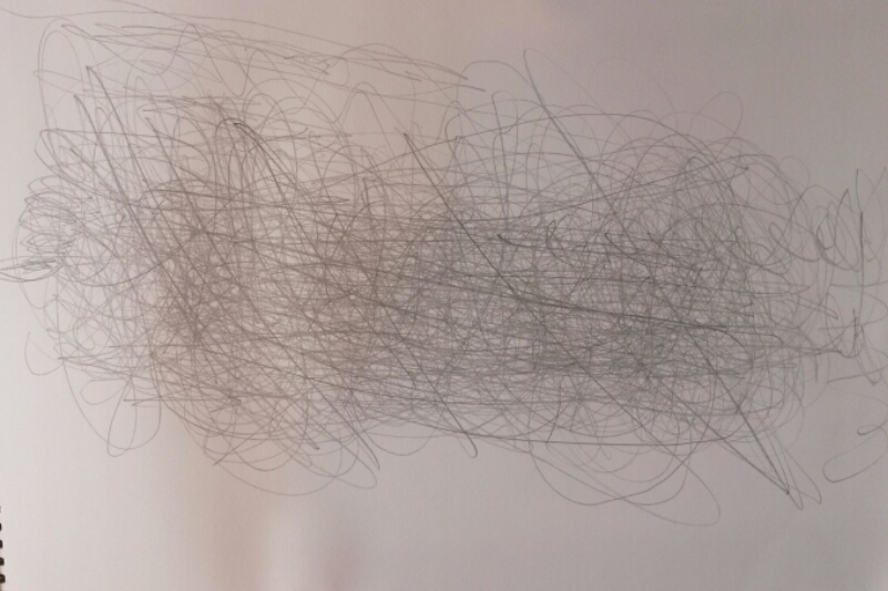
I don’t listen to a lot of classical music, so I first explored the classical music I had already on my iPod. I tried drawing to Carmina Burana by Carl Orff, Grieg’s In the Hall of the Mountain King and Fingal’s Cave by Mendelssohn. I settled on Prokofiev, Romeo and Juliet Op 64; Dance of the Knights because it had slow tempo and strong rhythm, I felt it was powerful and yet emotional and passionate.
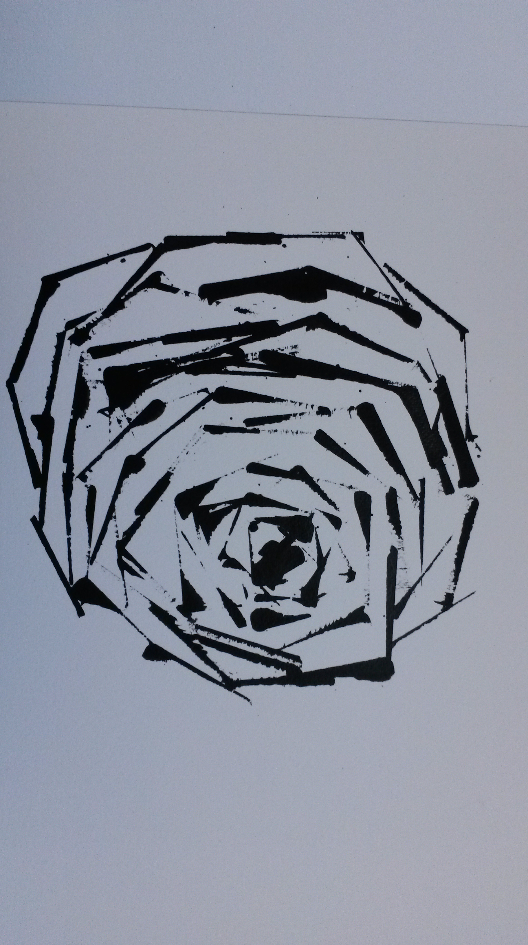
I began with a pencil, just trying to respond to the music. I ended up with lots of drawings like this;
A3 sketchbook
It’s not much to look at but the exercise was worthwhile, as I felt I was really ‘tuning in’ and responding to the music.
A3 marks with felt tip pen
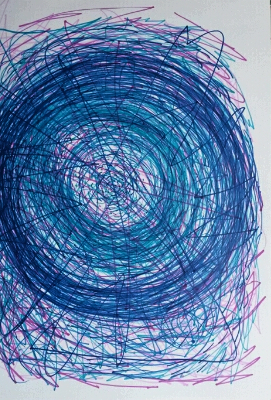
Then I tried felt tip pens. Perhaps the ‘drawing machine’s’ work was too fresh in my mind, as it was mostly circles that I produced. I was feeling very frustrated at this time because I couldn’t picture anything when listening to the music. I enjoyed listening to it and felt emotion but didn’t know how to translate this into a drawing. The contrast between black and white has worked well for me so far in this course, so I decided to play about with some black ink. The fluidity would respond better than a pen. I also thought about the video I had watched of Jackson Pollock painting and I thought about the rhythm and flow in his gestures and movements.
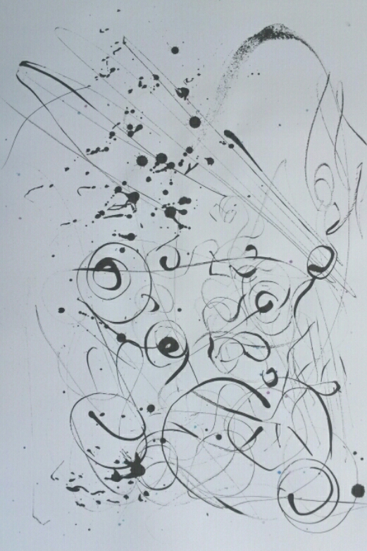
A3 black ink drawn with paintbrush handle
This was made by splashing black ink on the paper, then rendering marks with the wooden handle of a paint brush. I felt I was getting somewhere.
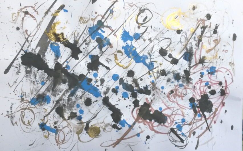
A3 black, blue, red and yellow ink
This one was created accidentally. I had everything ready and set out when I accidentally knocked the bottle of black ink over and it ran all over the page. This was quite exciting to watch and I decided to use this in the drawing. The repeated black marks are the tissue I soaked the ink up with, being daubed onto the paper in time to the music.
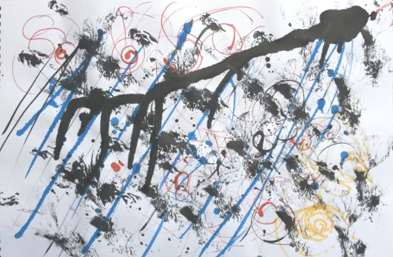
A3 black, blue, brown and gold ink
I used a similar process for this one, adding more colours to make it more interesting; sepia, blue, gold and pink. The process reminded me of the work of Jackson Pollock.
A3 coloured pastel and black ink
This was done by grabbing a fist of different coloured pastels and responding to the rhythm of the music. Then I splattered some black ink on and drew into this with the handle of a paint brush.
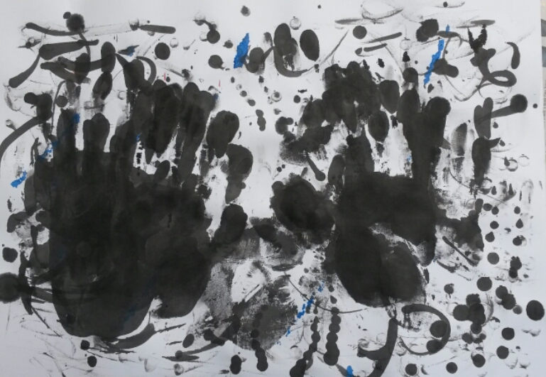
A3 black and blue ink
The music has a slow beat to it which reminds me of slow foot steps, but I didn’t like the thought of drawing with my feet, so dipped my hands in the ink instead and pressed down on the paper in time to the music.
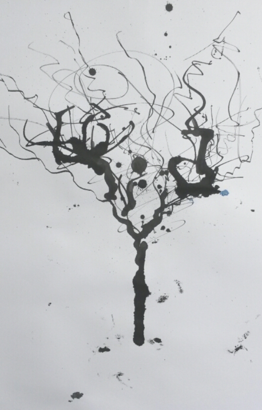
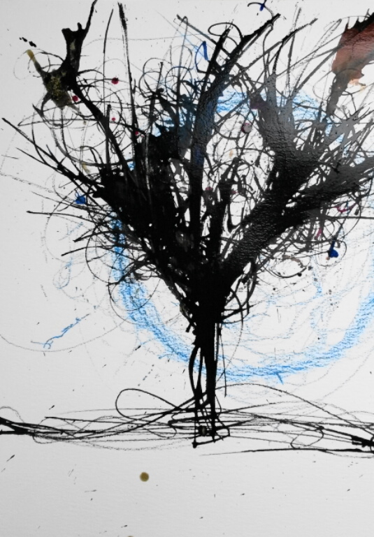
When ‘exploring the interplay between gesture and representation’, I decided to experiment with the idea of drawing a tree. I could imagine something organic growing, thrusting forth in time to the music.
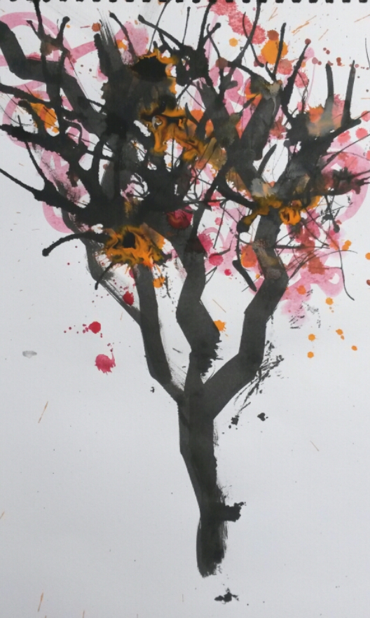
A3 black ink with watercolour
I made up little washes of watercolour and threw them on in time to the music. I chose the colours with Autumn in mind, but on reflection I decided I didn’t want natural colours; it wasn’t a natural, realistic result I was aiming for, I think the process merits more mysterious, magical colours, such as blue and gold. I also thought the colour in the watercolour washes wasn’t strong enough to compete with the black ink, so decided to use coloured inks in the next ones.
A3 black ink
This was done only with black ink again, but with more concentration given to the rhythm of the music. It is a lively sketch and has energy.
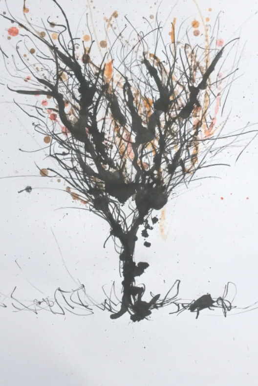
A3 black ink and watercolour
This is a combination of the sketchy drawing of the previous attempt, with a little colour added to make it more interesting.
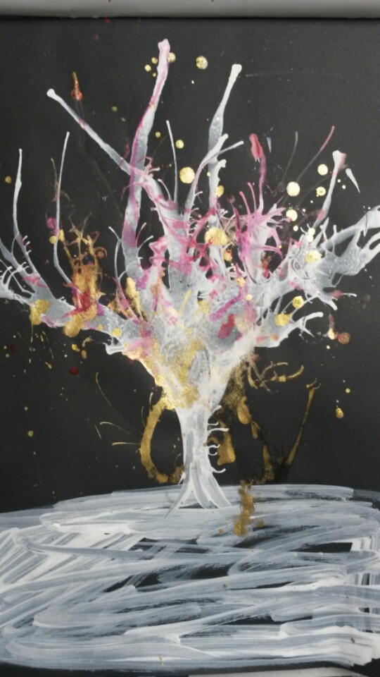
A4 white, red and gold ink
I tried out a smaller sketch on black paper using white, pink and gold ink, but I much prefer the contrast of the black ink against the white paper.
The tree reminded me of a watercolour painting I had done previously. I hadn’t consciously set out to do this.
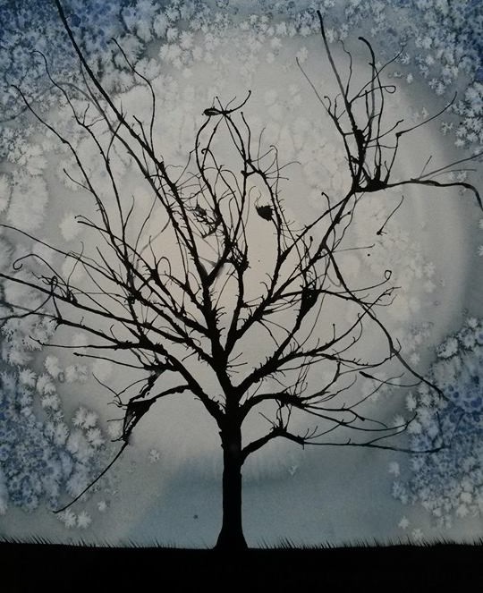
Watercolour and salt, paint blown with a straw
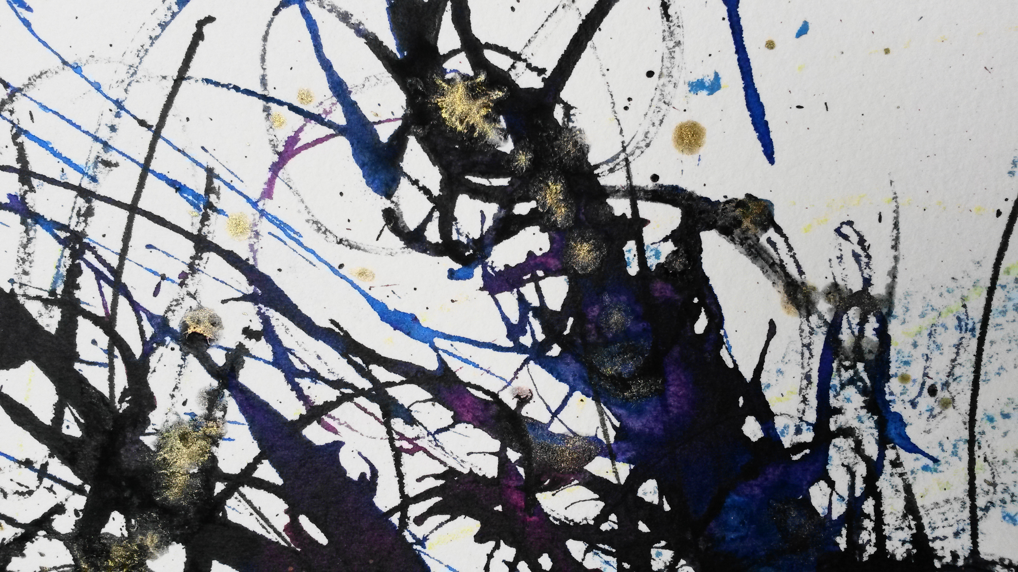
The circle of the moon in the painting reminded me of the circle of the drawing machine, so I decided it would be fitting to let my machine contribute to the final assignment piece. I used a large piece of rough watercolour paper (Saunders Waterford I think), and gave my machine some pale blue soft pastel. It obliged by drawing me a lovely blue edged moon. I set everything up in preparation; I had my inks ready, my straw (I used a straw in the watercolour painting to blow the paint to draw the branches, and decided to try this again) and I gathered some twigs from the willow tree in my garden to use instead of the paint brush handles. I had arranged for my 10-year-old daughter to record me on my phone. It began well, but as the drawing progressed and the twigs snapped as I was drawing with them and as I threw the inks at the paper my daughter’s nerves got the better of her and she kept giggling.
50cm x 66cm black, blue, pink and gold ink with blue pastel
This was my first attempt at the final assignment piece. I was reasonably pleased with it, but frustrated that I would need to do it all again in order to record it.
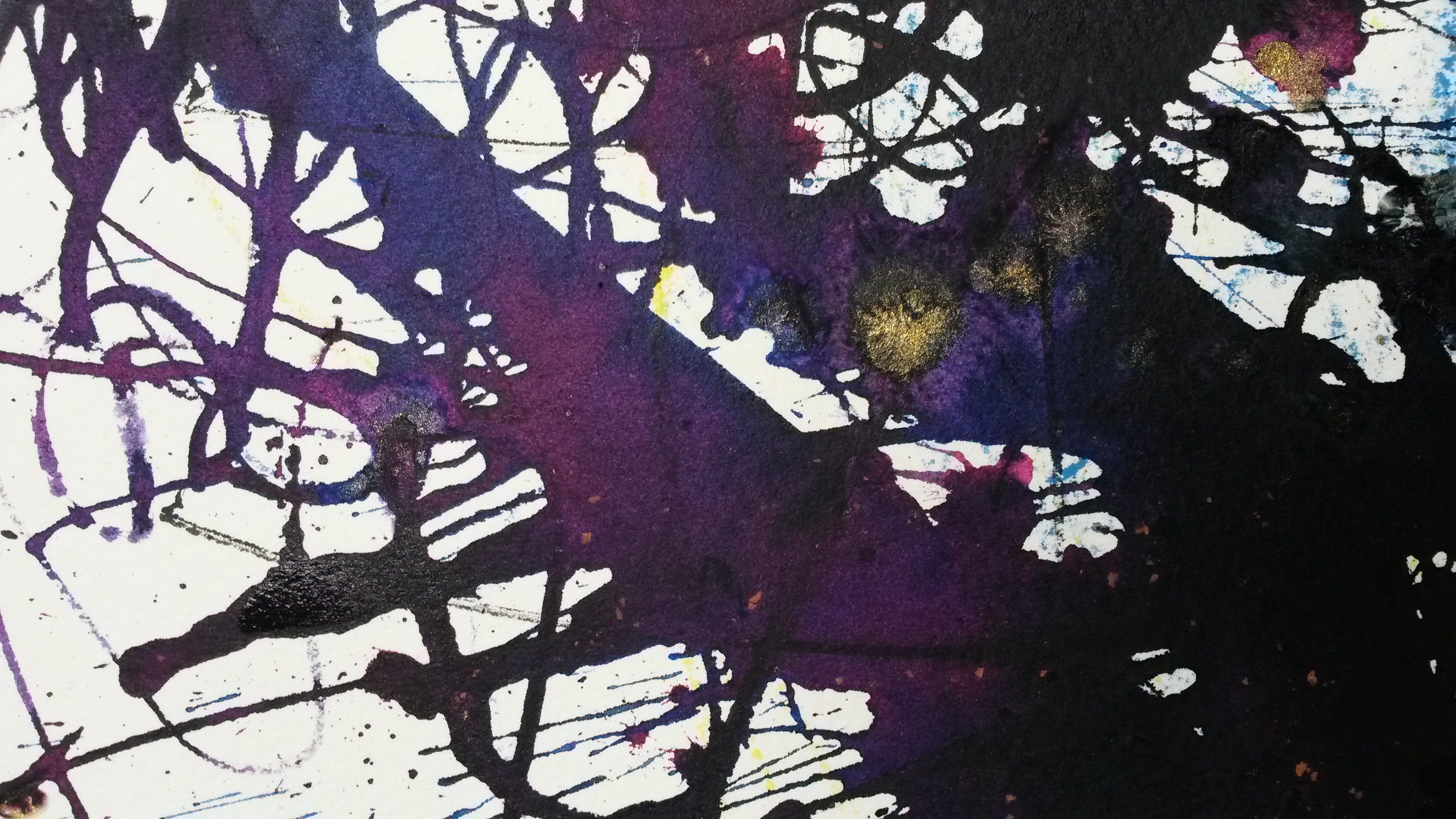
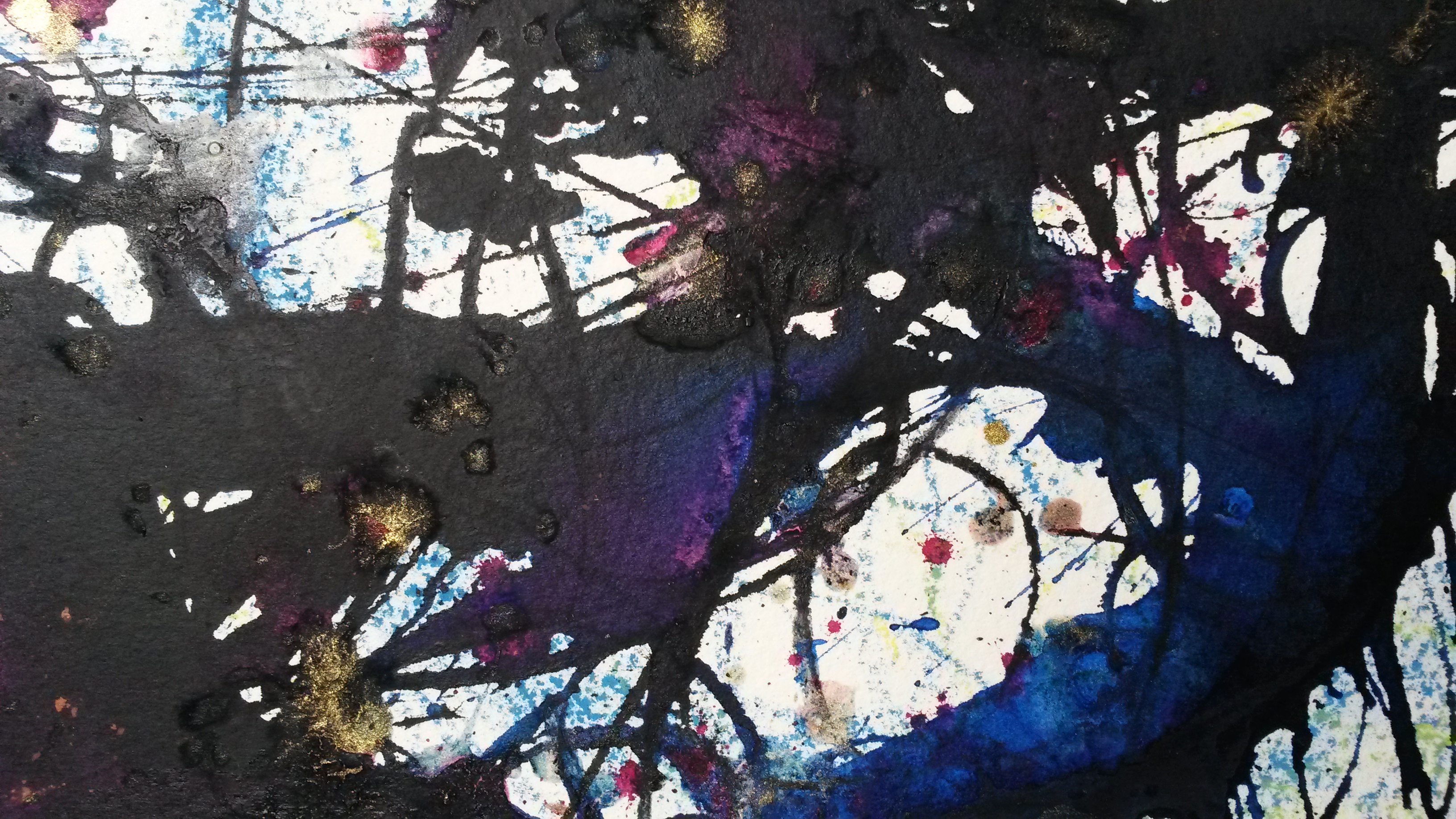
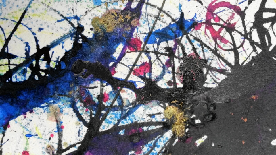
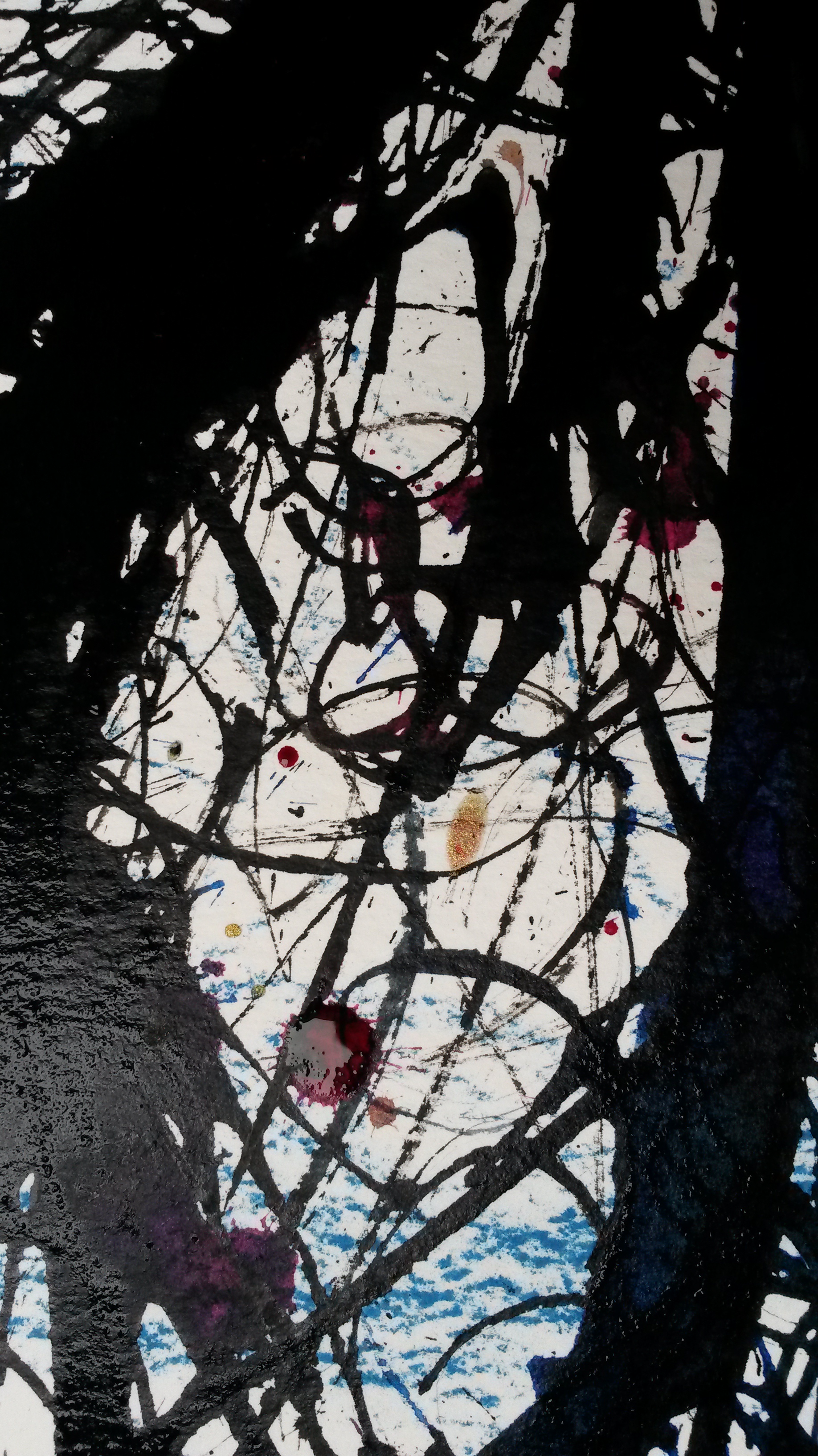
For the second attempt I got my husband to record it on a camcorder. I got my machine to draw my moon again, and this time I got it also to draw on the ground at the bottom.
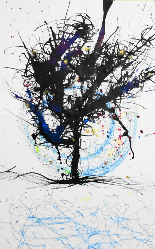
50cm x 66cm black, blue, pink and gold ink with blue pastel
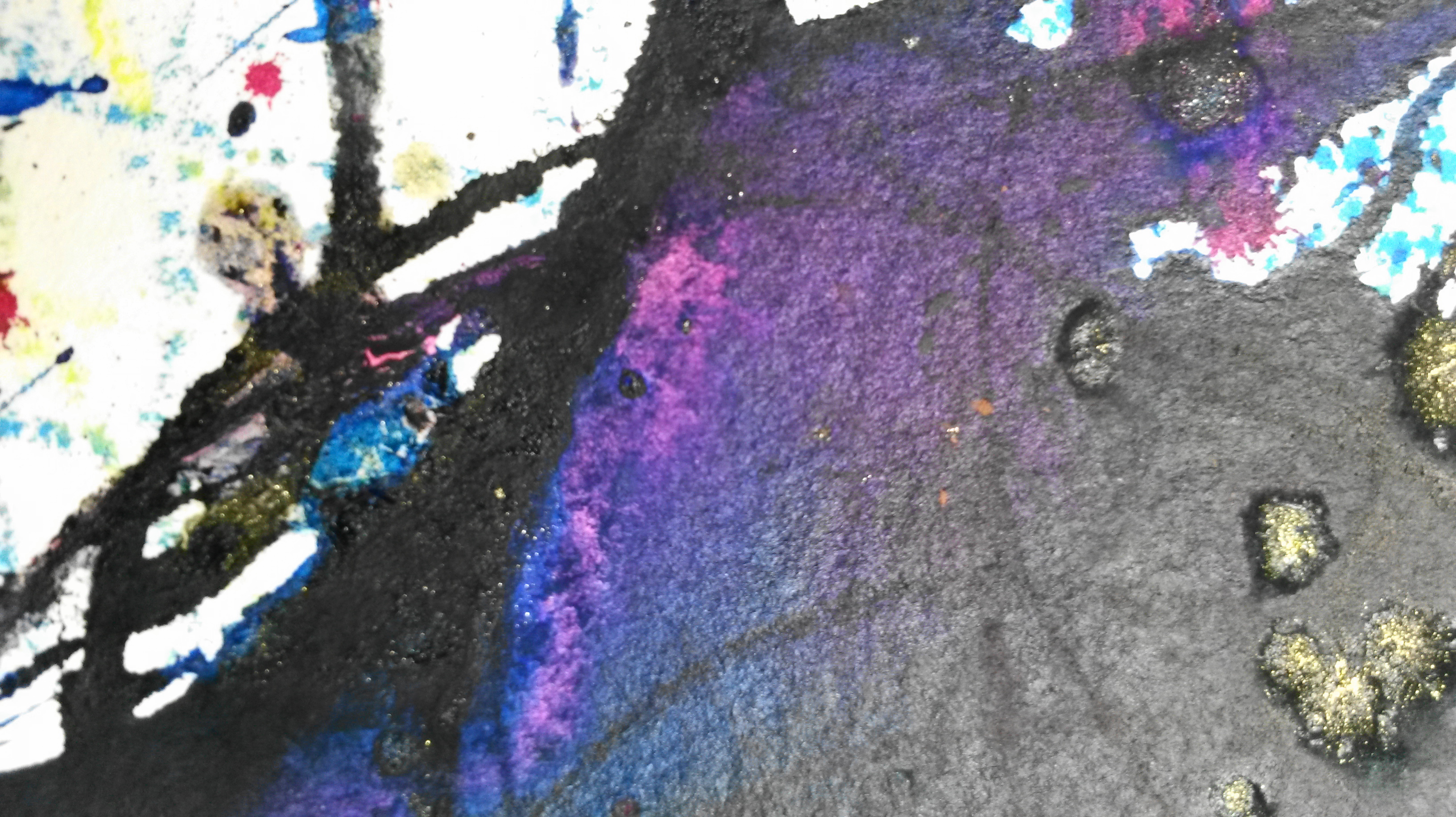
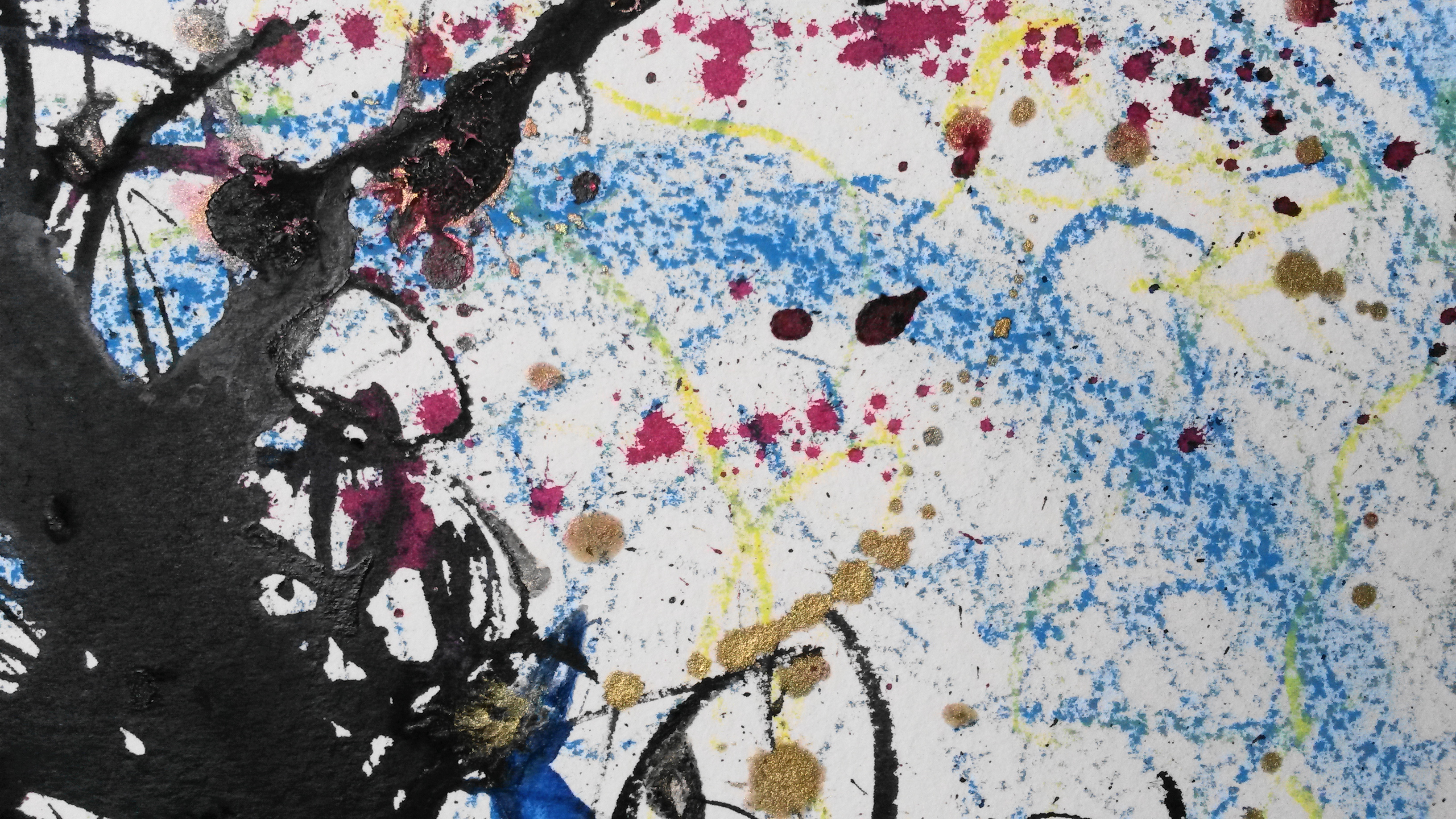
The photograph doesn’t do the colours in the finished piece justice so I took some zoomed in images, originally to show the colours better, however some of these work well in their own right and could be a series of abstract works on their own, without the original finished piece. It is not even necessary to know it is a tree.
The video of the making of the drawing can be viewed here; https://www.youtube.com/watch?v=UXmDTSkZ75A

Make a drawing of a subject of your choice using the subject itself, or tools constructed from the subject, dipped in ink or paint.
Nothing was immediately springing to mind for this assignment. I had enjoyed drawing flowers for my still lifes for the exercises, so decided to try more of these drawings.
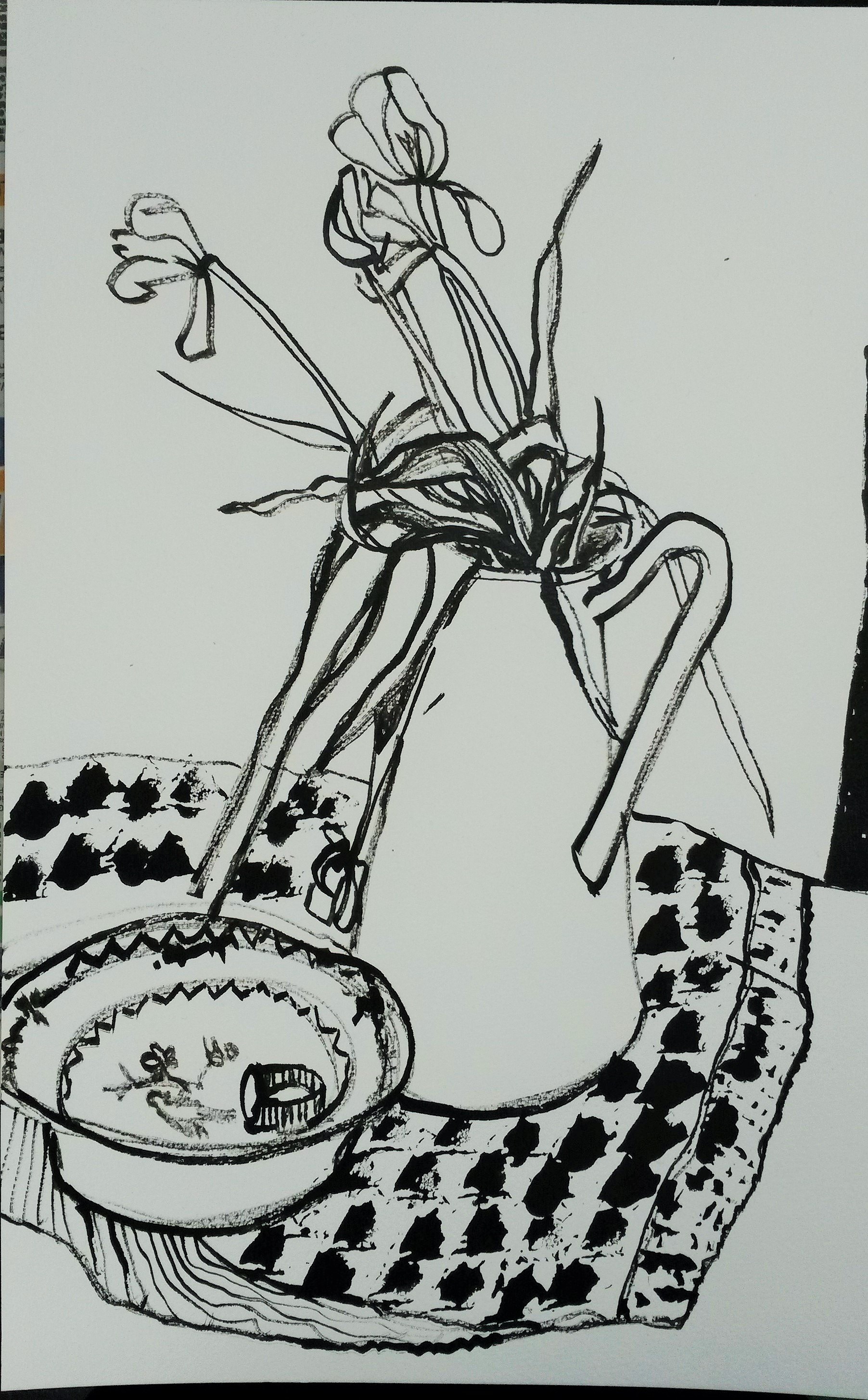
I set up a simple still life. I still had the tulips, which were dying by now, but I drew them anyway because the drooping flowers added more interest. I used a tulip stem dipped in black Winsor and Newton ink to draw the flowers. For the pattern on the cloth beneath the jug I used a rose petal dipped in ink, repeated to represent a patterned cloth. It wasn’t immediately obvious from looking at this that I had used anything other than a dip pen and the lines weren’t very delicate, instead they were quite heavy and most un-flower like.
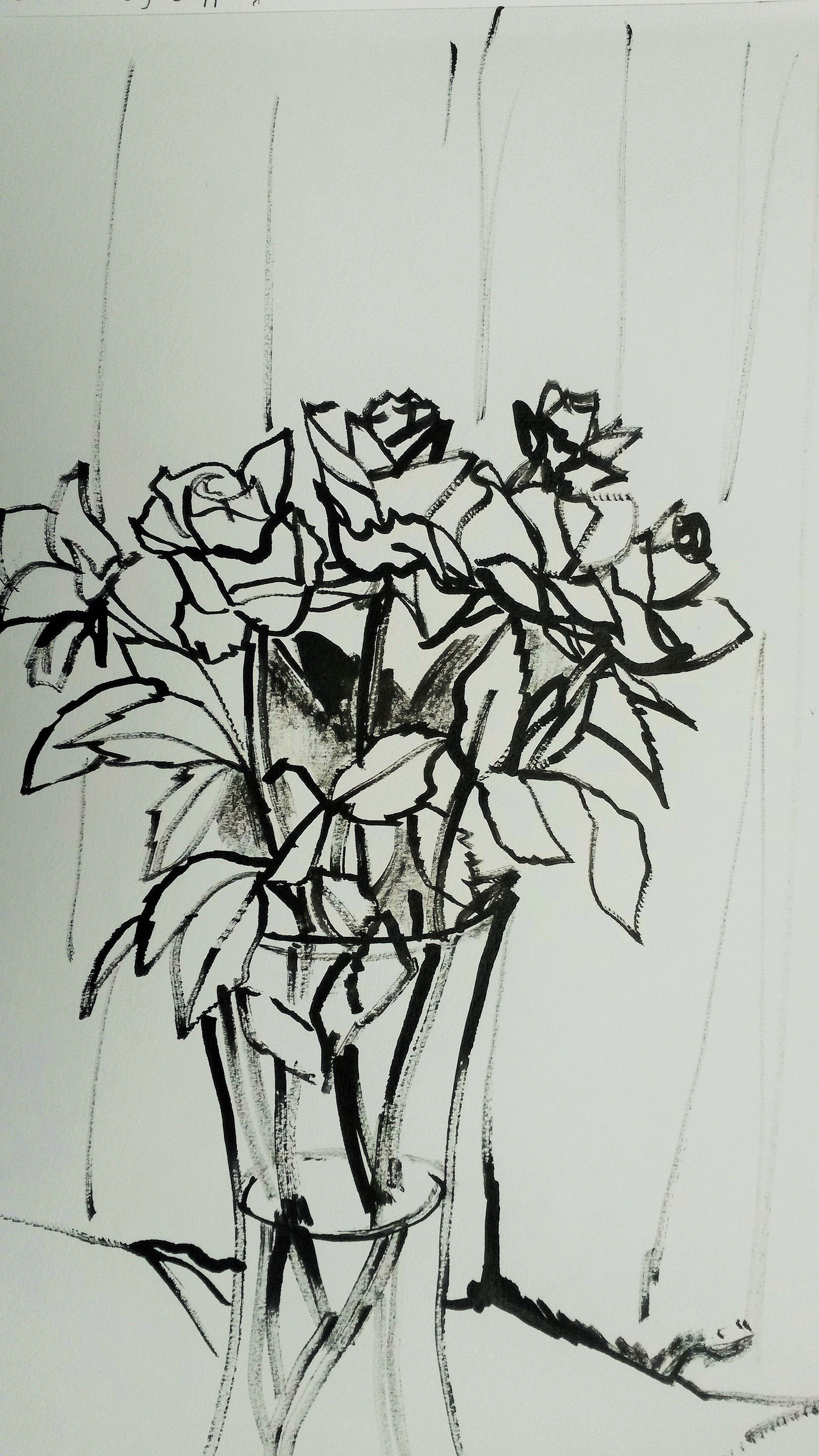
 Next I tried drawing some roses using a rose stem dipped in ink. The pattern on the cloth was made by dipping leaves into the ink and printing with them.

Tulips drawn with tulip stems and ink
Initially I didn’t like this drawing, as I thought it was clumsy and un-flower like, however over time it has grown on me. There is a spontaneity and looseness about it that I like.
Again, I felt this drawing was a little static and the “essence”, or delicate qualities of the flower weren’t coming across.
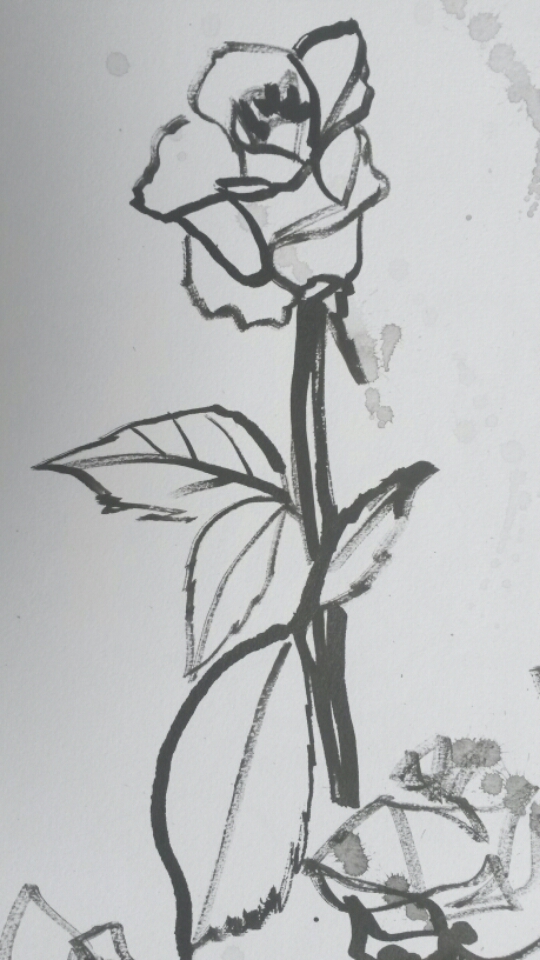
I tried some rapid, continuous line drawings to loosen up, still using the stem.

This helped, I think to add more life to the drawings. Next I tried another continuous line drawing using the rose stem again. I drew a small group of roses. This had more life to it than the previous drawings. I experimented by using a leaf print for the actual leaves and this worked well too. I added a light wash of diluted black ink to lose the white of the paper.

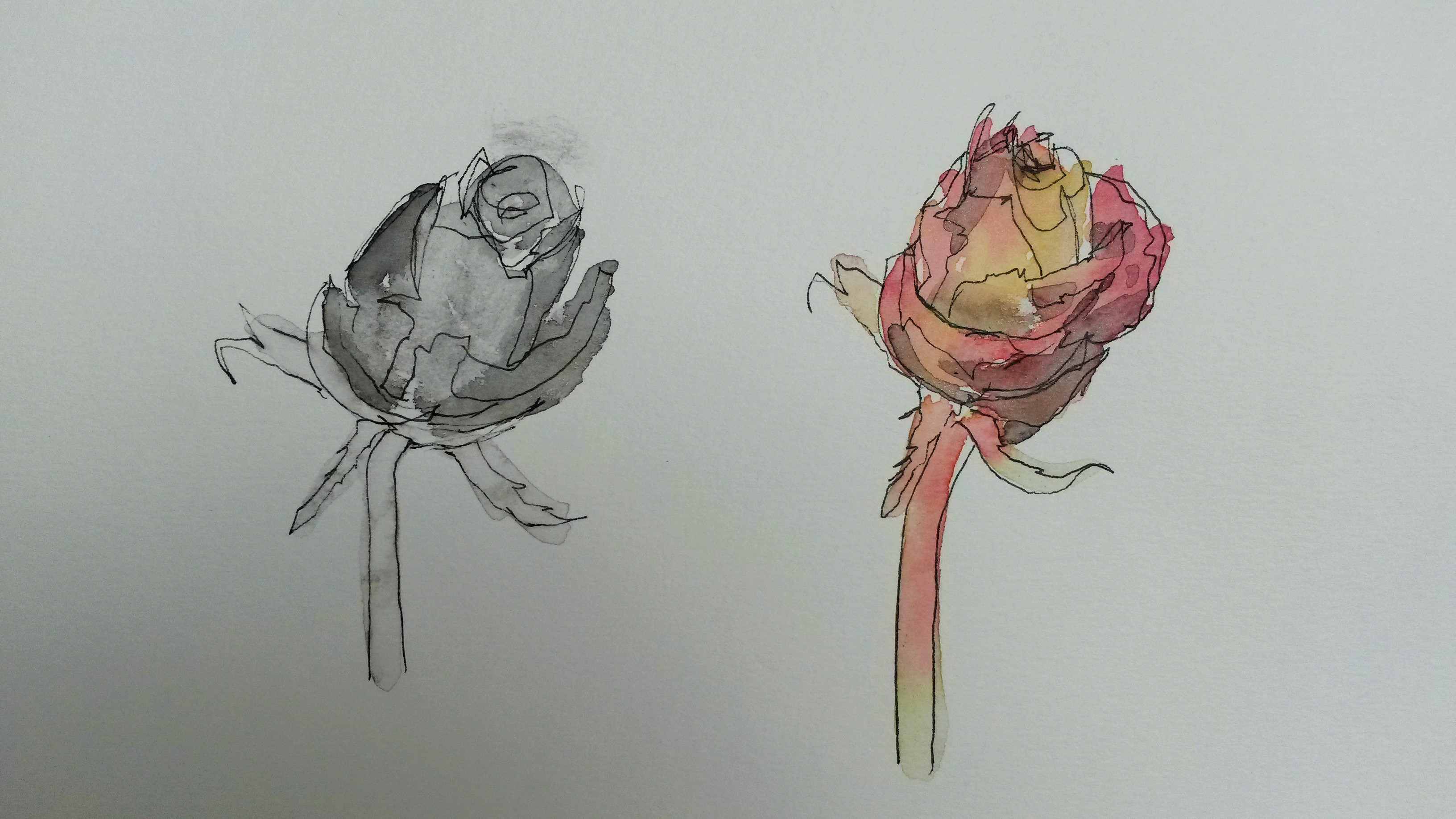
I decided to really get to know my subject by doing several studies and this helped me to familiarise myself with the subject. I then tried adding colour by adding some watercolour to line drawn with water-soluble drawing pen.

I was undecided about whether to have monotone or colour, so did a side by side comparison.
Through these studies I became more confident drawing roses. I grew to love the circular patterns the petals form and the rhythm and repetition.
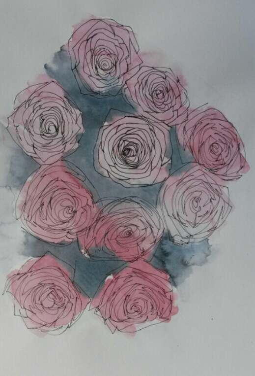
I did another black and white composition. Although I liked the composition in this one, I felt the strong colour of the roses should be included.
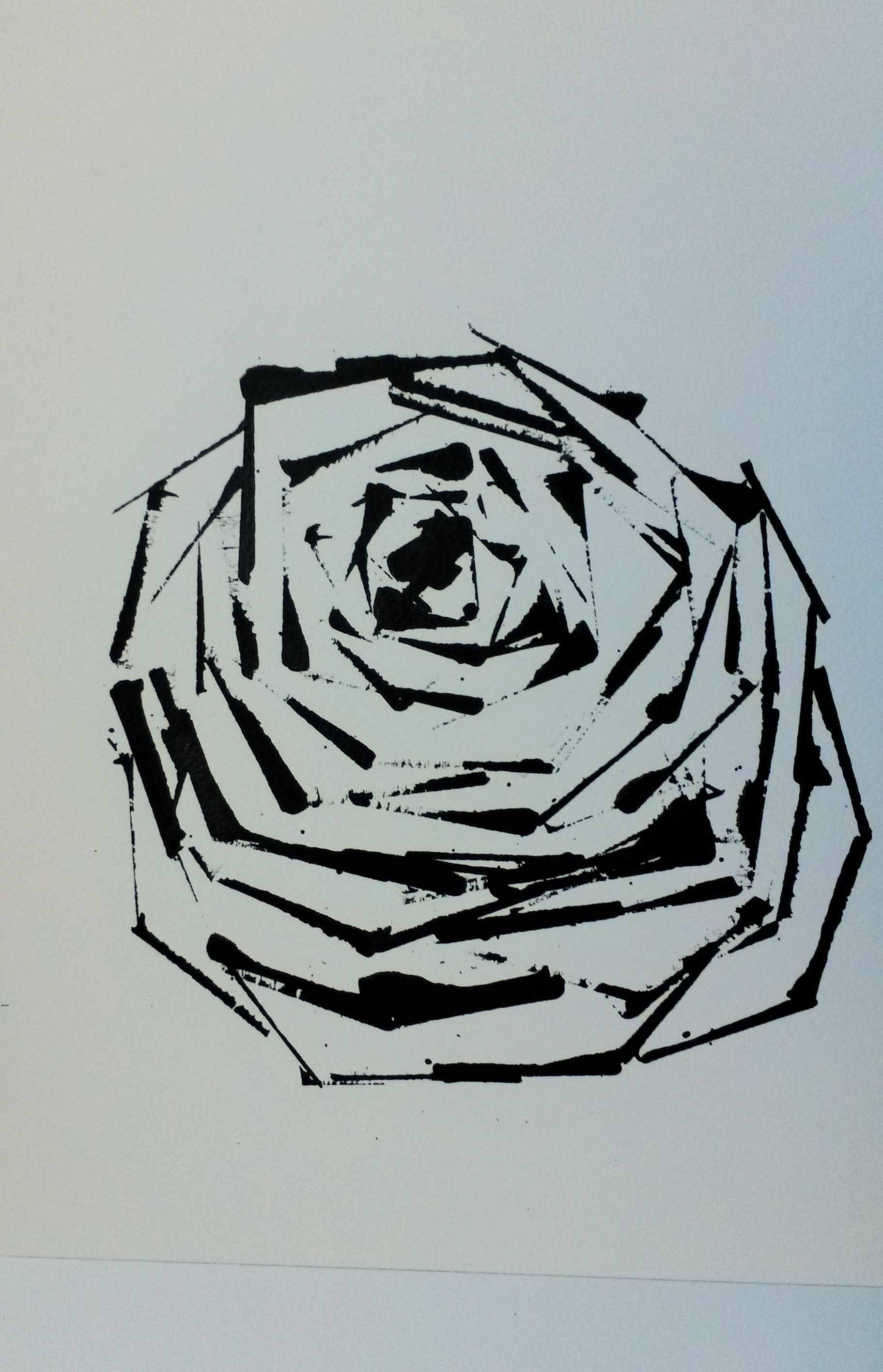
Although the brief is to draw a subject using a subject, I decided to try something a little different. I wondered whether it would be possible to draw something as delicate and intricate as a rose using something with the exact opposite qualities. I decided to draw a rose using only the straight lines of a credit card dipped in ink.

I liked this result, so tried some more attempts. I think it worked because the petals on roses are often quite angular.
I added some watercolour to this, initially whilst the ink was still wet and this became muddy,so I waited until it was totally dry before adding a little more colour.
I tried on a bigger scale.
I liked this (A3 size), so added more roses to it.

I’m pleased with this, but still needed to decide whether to add colour, or keep it monotone.
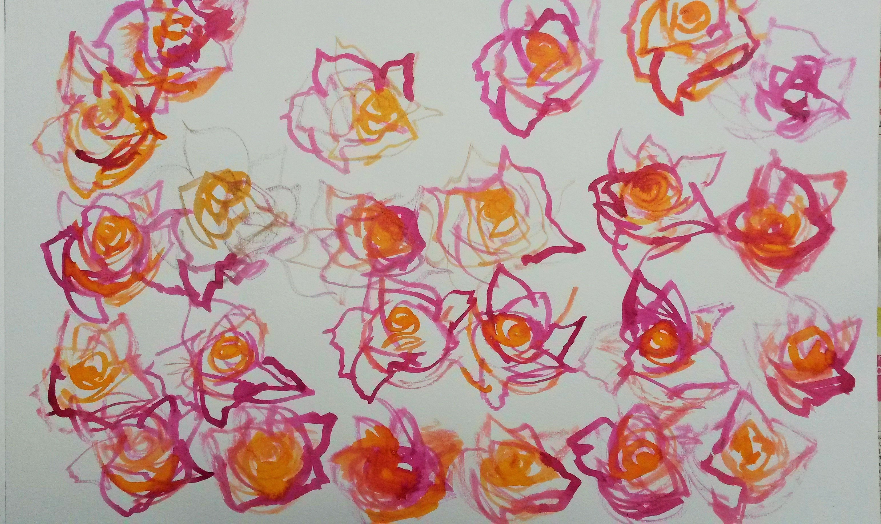
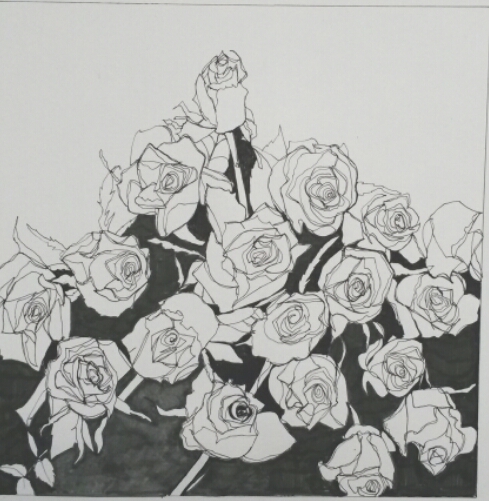
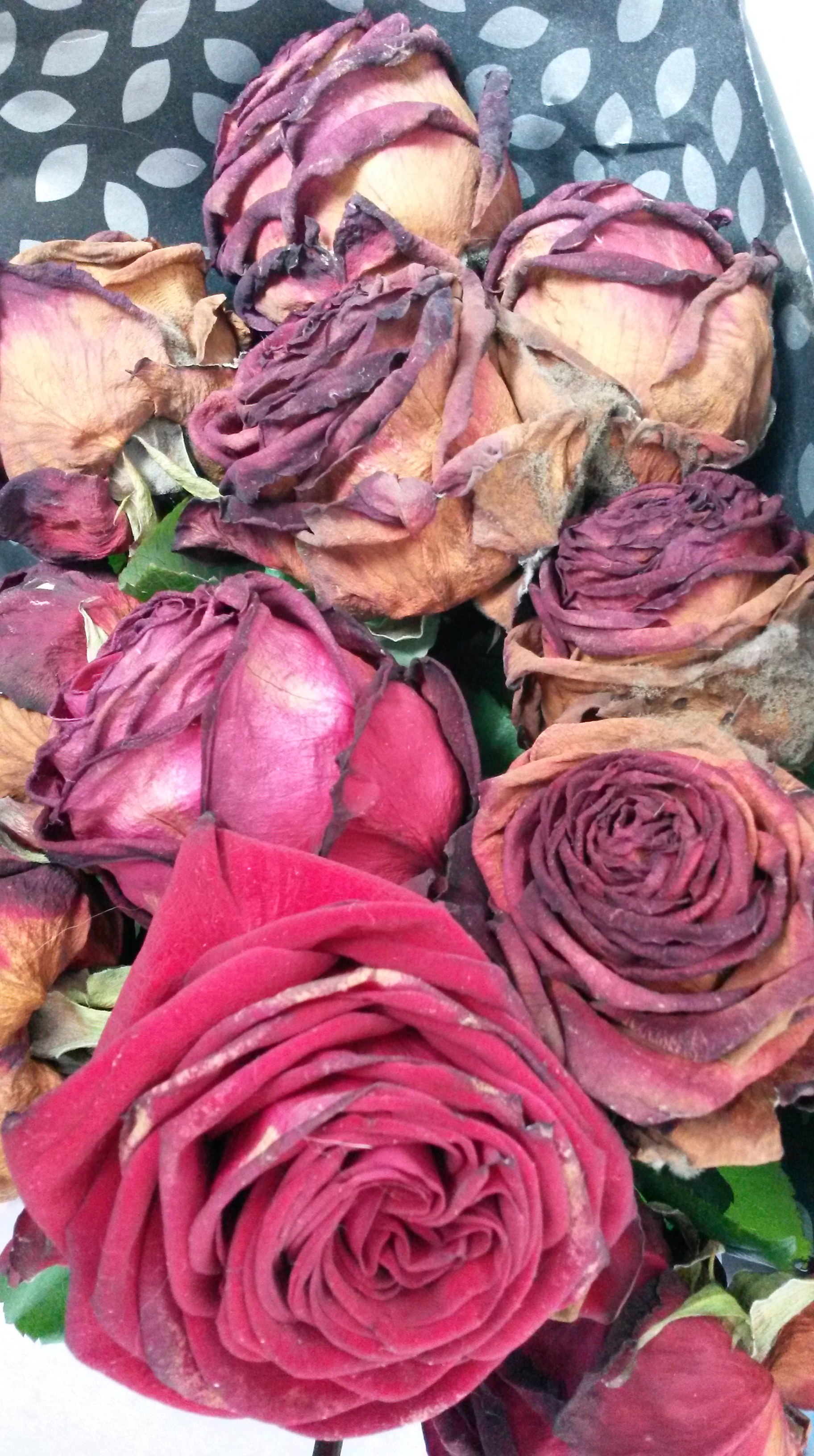
I decided to go back to drawing roses with roses. By now my beautiful bouquet was almost dead (in some ways much more interesting to look at).
I was able to work from the very many sketches I had now accumulated. This was my first attempt;
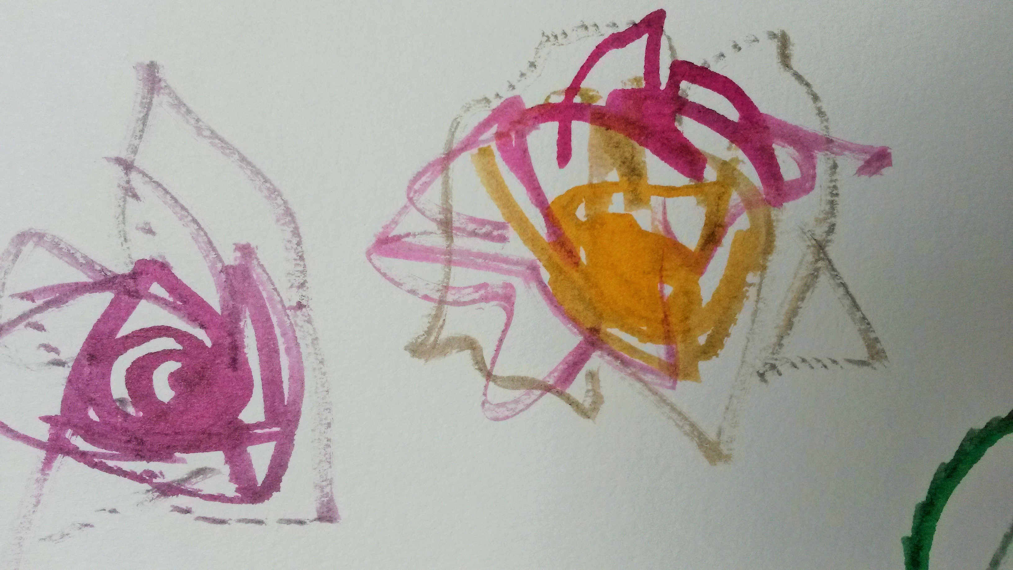
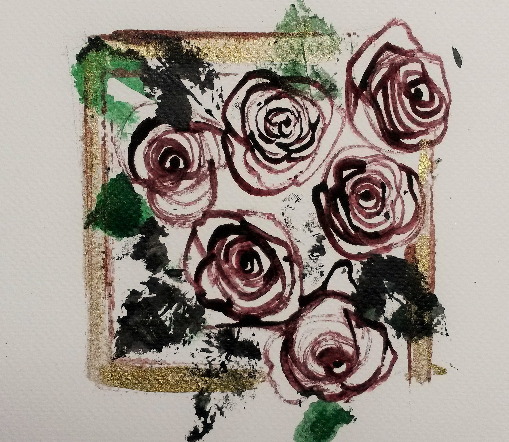
I drew the roses with rose stems, this time sharpened to a point. I tried to vary the pressure and this resulted in thick and thin lines, which captured the thick and thin shadows of the petals well. I dipped the leaves in black ink, in effect printing with them. Once totally dry I added washes of watercolour in Alizarin Crimson and Viridian. I liked elements of the drawing; I liked the roses and imprints of the leaves, but felt the colours looked washed out. Using such a strong tone as the black ink affected the rest of the tonal values. I tried adding more black ink, and then strengthening the watercolour washes.

I liked the roses in this one; the darker wash adds form, but I still felt the black was too dark. I made another attempt.
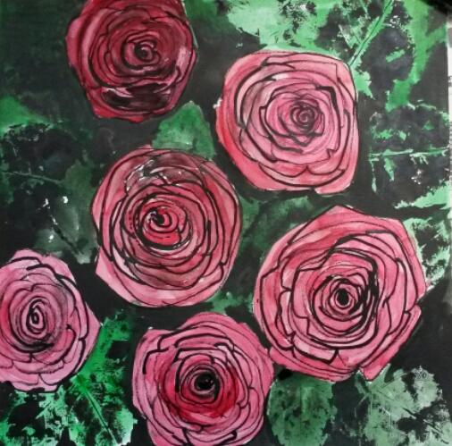
In this one I liked the leaves but not the roses, which I still felt were pale in tone in comparison to the black in the background.
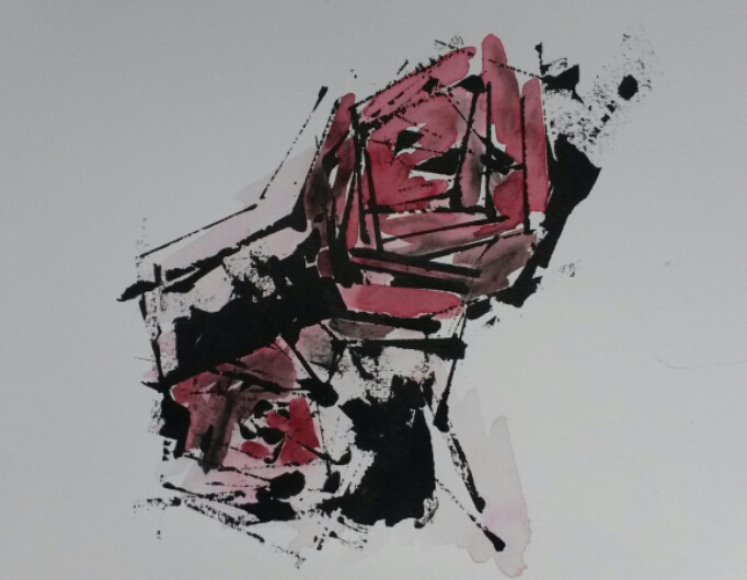
I also tried playing around with the original drawing on photo shop, and the results were interesting.

I liked the image above very much and kept it in mind for my next attempt.
I thought that perhaps if I went to back to drawing from life it would help, so I bought new roses and tried putting them in a square vase. From this I did the sketch below.
I decided to have one final attempt at the final Assignment piece.
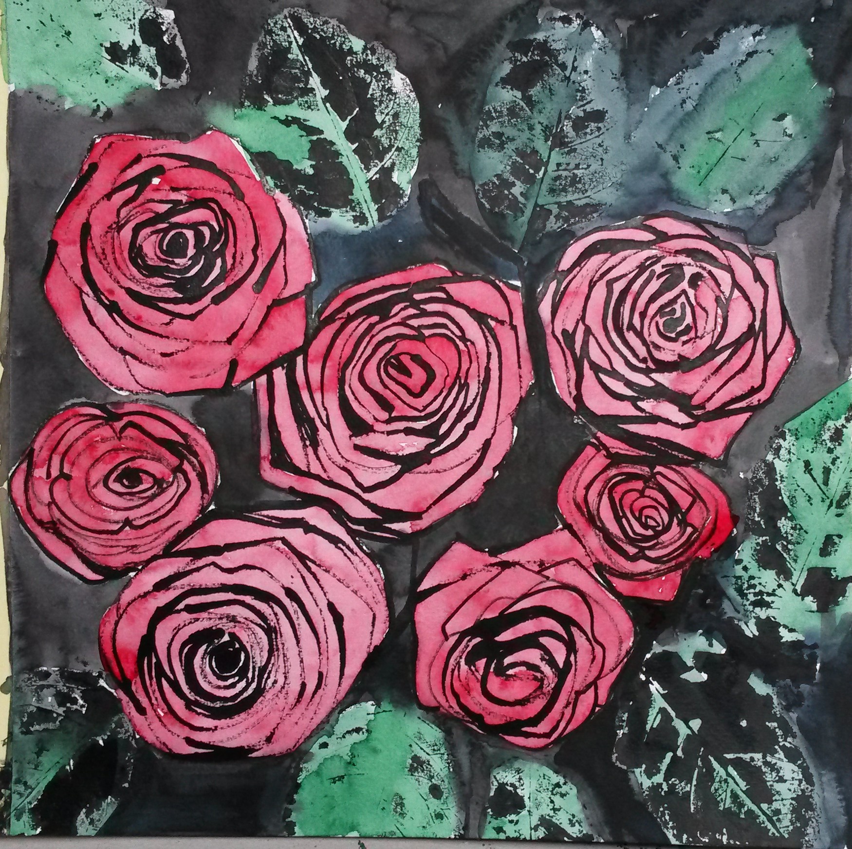
I made new “drawing tools” from rose stems, sharpening the edges with scissors. I stretched some Saunders Waterford Watercolour paper and drew the roses, using my one last rose that hadn’t withered totally, my sketches and a photo I’d taken as references.
Once the roses were in place I printed with the rose leaves.

I then began adding watercolour. I used Viridian for the leaves. I worked wet into wet and added Neutral for a deeper tones. Even before I added the red for the roses I realised that if I didn’t use the same red in the foliage and background, the roses would look ‘ stuck on’, and not part of the rest of the painting. I added some red to some of the leaves and mixed Viridian with Alizarin Crimson for some of the shadows. This gave it more cohesion. I added some gold ink as well, because it worked well in the little sketch I did. Also, way back in the recesses of my mind, I had a vague recollection of my wedding invites having a rose printed on it with some gold on it somewhere. I purposefully made some runs with the paint (remembering Project 3; Narrative), which adds a touch of sadness, and splattered some black ink to break up the background a little.
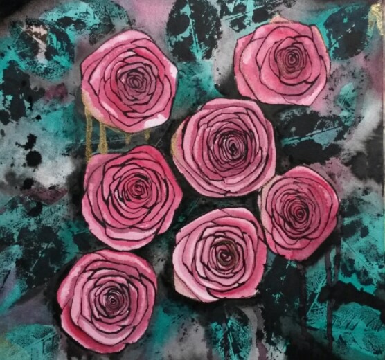
As to the success of the outcome, I find this part quite difficult to decide on. I am pleased with some elements of it; I feel I know the anatomy of roses inside out, due to the relentless sketching of them. I can draw them free hand now from my imagination. I think whilst this drawing is realistic, it has an abstract feel to it. I love the printed leaves and the marks they make. I like the view-point of the composition, looking down onto the roses, allowing you to see the concentric circles, and repetition of patterns. The black lines remind me of rose tattoos, and the image of a rose to me symbolises Love.
Roses have been long used as symbols in a number of societies. Roses are ancient symbols of love and beauty. “Rose” means pink or red in a variety of languages (such as the Romance languages and Greek).
The simplified shapes remind me of Charles Rennie Mackintosh’s flowers, although obviously not in the same league as his.
http://www.achome.co.uk/pictorial/cmack52.htm
The things that I like less are the composition itself. I prefer the drawings I’ve done so far from real still lives, they are more convincing, even when slightly abstracted. The black lines are a bit static and cartoon like.
Remember to look again at the assessment criteria…Think about how well you have done against the criteria and make notes in your learning log.
Demonstration of technical and visual skills.
The technique I used was pretty much as directed in the brief. Reading it again, perhaps I could have been more experimental with the tool making and tried other parts of the roses or other plants. I also tried experimenting with drawing roses with straight lines using the credit card. I did vary the pressure I used when drawing in order to try to vary the thickness of the lines. I think I used good observational skills for the roses. I tried a few different compositions, originally starting with a still life of tulips before moving on to the roses with a view-point looking down on the roses. The limited palette of complimentary colours red and green makes the roses stand out, as does the contrast between the tight, controlled forms of the roses and the looser, messier foliage.
Quality of Outcome
I have documented my progress from realistic still life to stylised, slightly abstracted design. I persevered and made three attempts at the final assignment piece before achieving a drawing that I was happier with. In the development from the initial still life to the final piece, I studied my subject thoroughly by way of a series of studies. In the early sketches in particular, I just drew and drew my subject until I was able to sketch roses freehand, without having one in front of me. This helped with the final piece as I felt I knew them inside out. I feel I have demonstrated good draughtsmanship throughout this process. The final assignment describes a rose realistically, whilst also exaggerating the repetition of the concentric circles and how they overlap in a stylised form. I believe it is an original and interesting image to look at.
Demonstration of Creativity
I enjoyed the new experience of making drawing tools from flower stems, although to be honest I would probably have been happier drawing with the predictability and familiarity of a boring old pen. I experimented with drawing a black and white composition as opposed to one in colour and used complimentary colours; red and green. I experimented with the use of printing with leaves, a process that I really enjoyed. I tried different compositions until I decided on the view-point looking down as opposed to a conventional scene at viewed from the side. I used my experience of painting with watercolour to try wet into wet washes, runs and spatters with ink and paint, which contrast well with the tight drawing of the roses. I abstracted the rose forms and emphasised the patterns of the petals. I don’t know that I have a personal voice yet. I do know that I really like the precise, controlled line achieved when drawing with fibre pens, and perhaps this is a step in the right direction for me.
Context
I’ve really discovered the benefits of working with sketchbooks since I started my studies with OCA. I think this shows in this assignment and I’ve documented the development process in my learning log. My research into artists such as Cornelia Parker, as well as contemporary artists such as Angela Eames, has helped increase my knowledge of how a concept can evolve and develop, and this in turn impacts own my own work. The OCA Study Days, such as the Two Roberts Exhibition, have helped me to become accustomed to the ‘language’ of art, and helped me articulate what an art work means or represents to me. The more informed I become, the more outside influences shape my work, whether consciously or unconsciously.
Finally, I’ll include some feedback I received from my peers when I posted this assignment and supporting work on OCA sketchbooks page on Facebook
When I sought opinions as to which of the first two attempts appealed;
I like the second overall … just like the way the roses and leaves are done as very slightly abstract roses and the leaves are just fabulous.
I think the second for me due to the complementary red/green palette.
I like the darkness and stronger contrasts.
I like the contrast between detailed roses and the blurry leaves.
This is great – the petals look so 3 dimensional.
These roses jump right out at you and I like the shade of green you have used for the leaves – gives it a really modern feel.
Following your rose exploration is really interesting, I find. Thanks for sharing the process and maybe post the whole series in one thread ?
I love these and now following our (sic) exploration.
This is something I did much later after completion of Assignment 2
I took my daughter to a pottery painting place in the summer holidays and noticed they did glazed china painting too. I came back at a later date and painted a tea pot using my painting for Assignment 2 for inspiration.
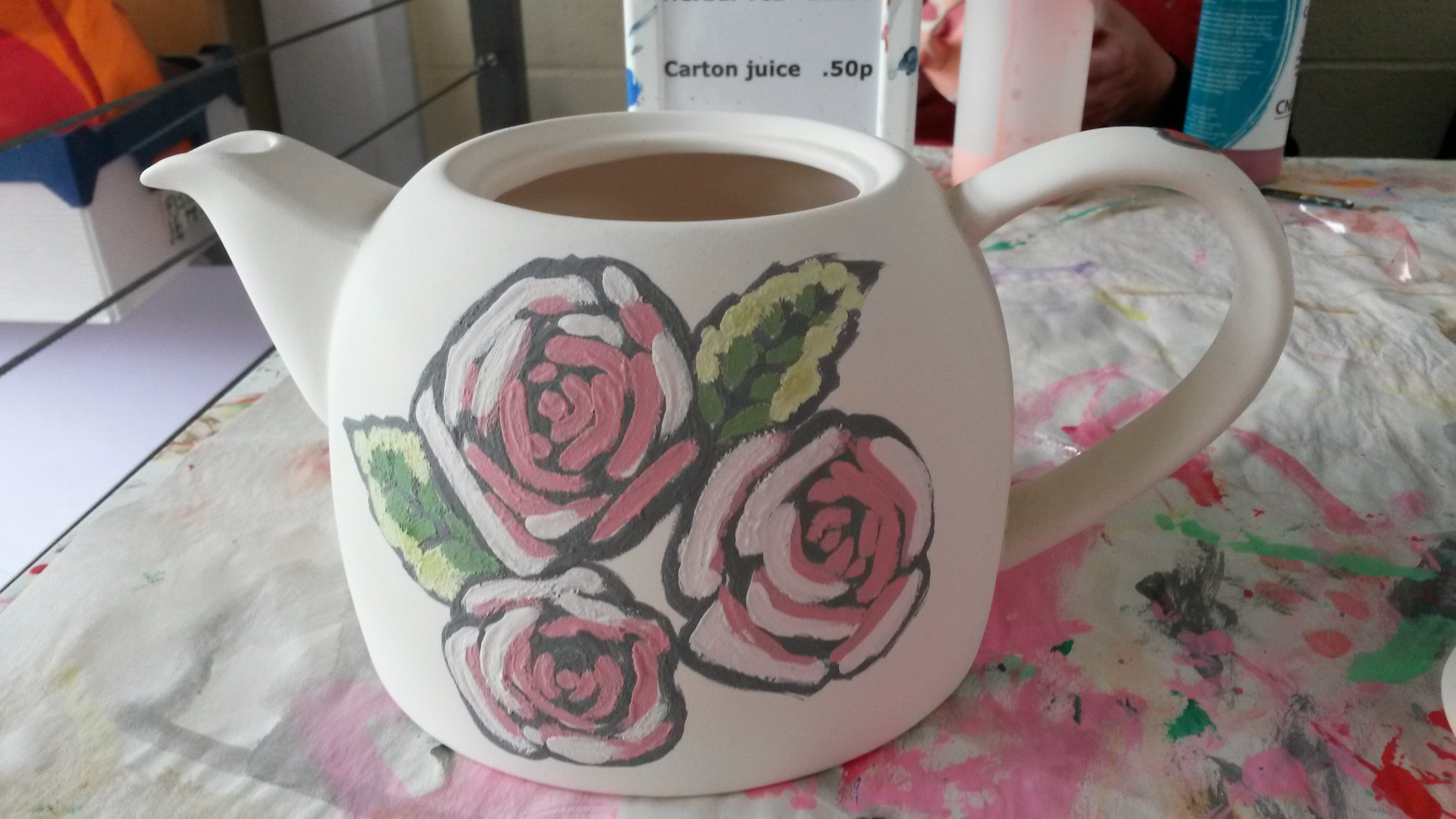
It is the first time I’ve ever tried that. First I had to choose the colours, which is difficult because the colours darken once fired. Each colour has to be painted on with at least three layers. I then had to leave it for two weeks and come back once it was fired.
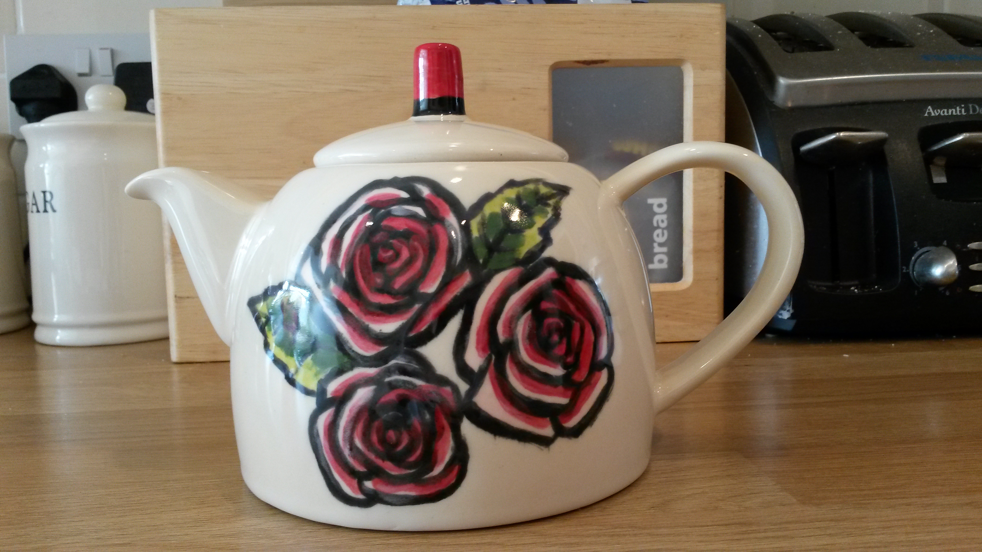
I was really pleased with the finished piece, particularly as it was my own design.
For your first assignment, review your sketchbooks and project work so far. Think about all you’ve learned about scale, cropping, selection, flexibility and judgement and make a decision about which area you’d like to develop for your assignment piece. This could result in one drawing or a series of drawings. Your subject can be anything you like but, whatever you choose, the relationships within your drawing(s) should set up an intriguing and engaging composition.
On reviewing my work, I felt that the first exercise Observational Drawing was the strongest. I particularly liked the black and white striped ones.
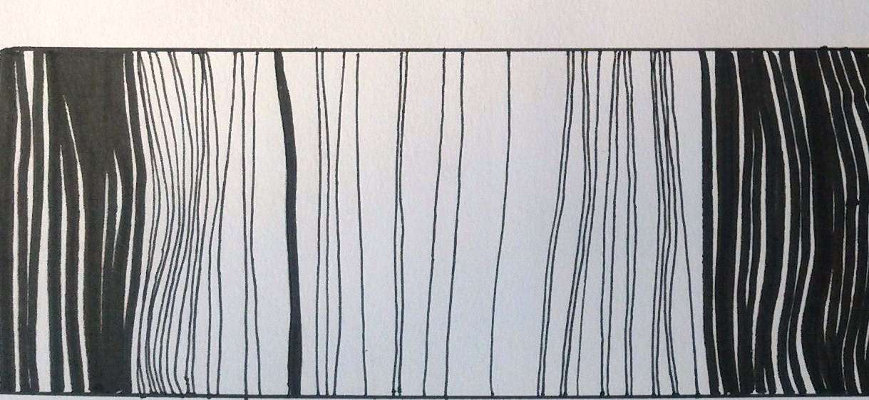
Extract from drawing 8 x 20cm
I decided to try this again but on a larger scale. I had recently bought Winsor and Newton Watercolour markers so I decided to try these out too. I used an A4 Winsor and Newton Water Colour Marker pad that I bought, which had 140lb pressed paper.
I did a long thin panel (8 x 30cm) using only black and white. The black watercolour marker looks more dark grey than black. The pens have one thick end and one thin, so I did a variety of lines. I then wet the whole area and the pens did behave like watercolours and the black pigment ran. The white became a light grey the lines had faded so that there was little contrast between the lines and spaces. Once dry I drew over some of the lines again with black watercolour marker.
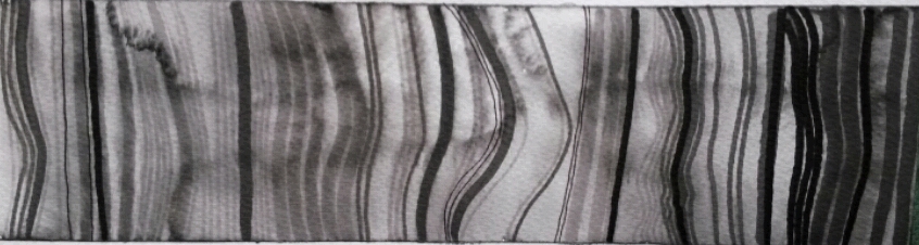
8 x 30cm watercolour marker, water added
Although I liked the strong contrast of the black and white, I decided to try one in colour for comparison (and it would be an opportunity to try out the watercolour markers again). Working on the same scale and same paper I used random colours in the same thick and thin striped way, still leaving some white space between. Once done I added water again and the colours ran together beautifully. Once fully dry, I added black lines this time using black Faber- Castel Pitt pen.
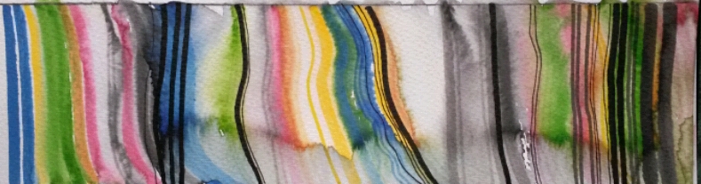
8 x 30cm watercolour marker and black Pitt pen
Next I decided to try it on a bigger scale. I used watercolour board 15 cm x 53 cm. I used black watercolour marker and worked in the same way as before. As before I wet the whole area afterwards and the pigment ran. Once dry I went over some of the lines with the watercolour marker again. I was becoming a little frustrated that it was all becoming grey and washed out looking and I wanted to get the dark black back, so as an experiment I added a strip of black electrical tape. Eureka, this contrasted well with the lighter wobbly drawn lines. I added some very fine lines using Pitt pen
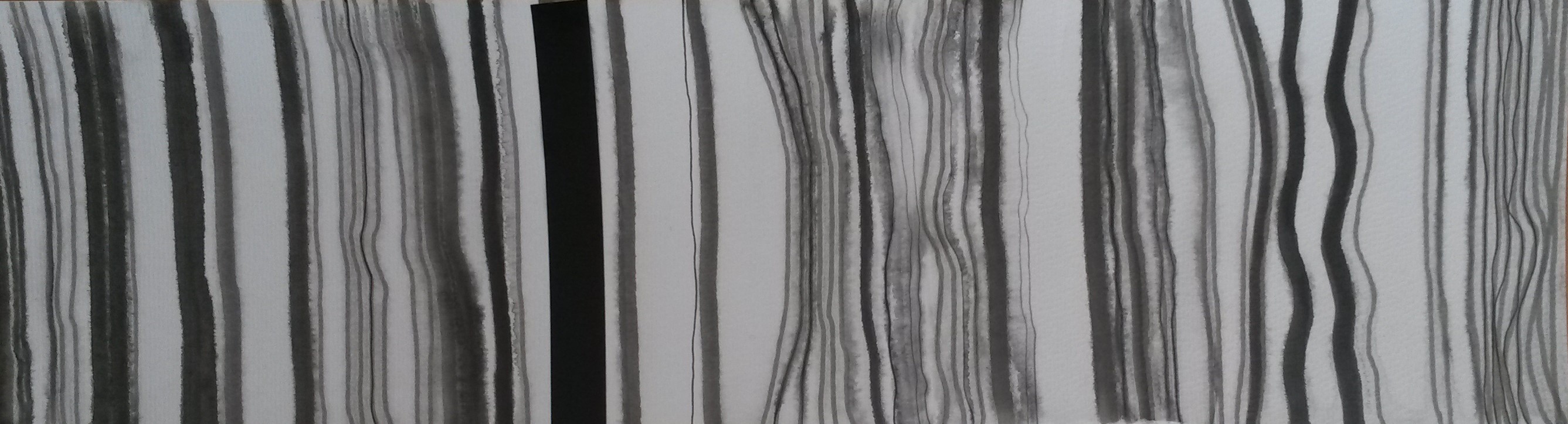
15 x 53cm watercolour marker, Pitt pen and electrical tape
I did another one I the same size and in the same way. This time I left most of it washed out looking, only adding some fine liner whilst still damp. For some reason this one reminded me of the rings in the trunk of a tree.
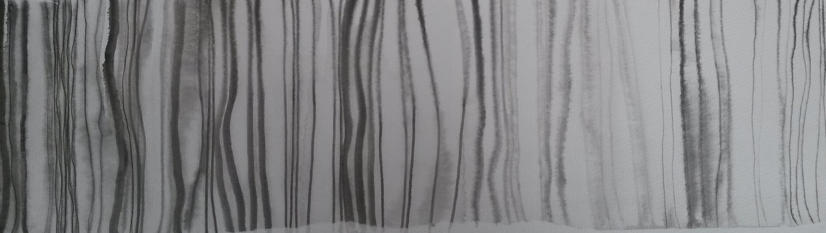
15 x 53cm watercolour marker
I then did one in the same size (15 x 53cm) in colour, washed out with some areas drawn in again. I wasn’t keen on this one.
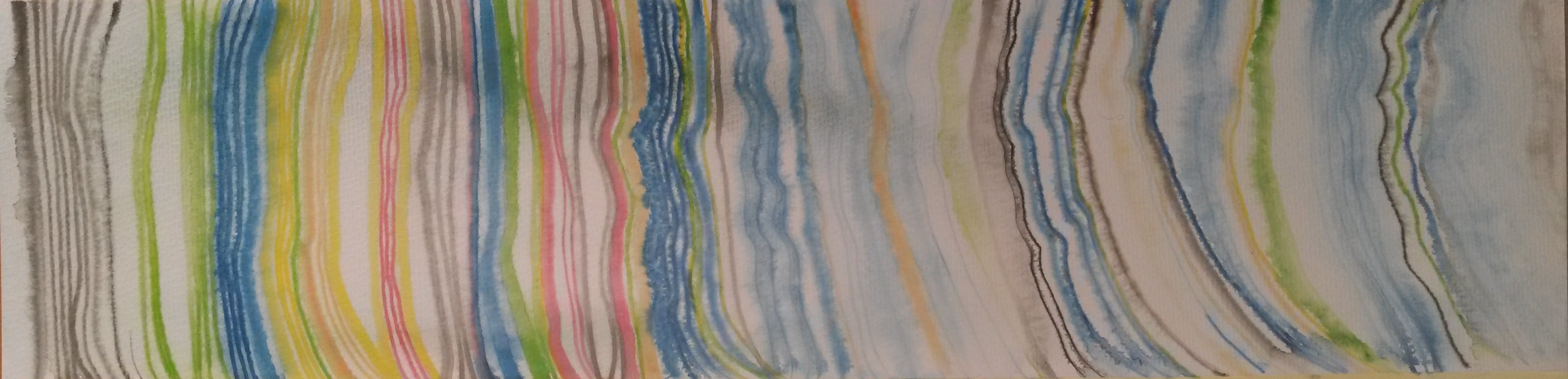
15 x 53cm coloured watercolour marker
I decided to pursue the use of the electrical tape further. The first one was very simple, just some strips of black electrical tape on a white A4 sketchbook. This also reminded me of the keys on a piano.
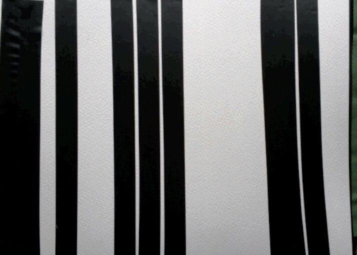
A4 electrical tape stripes
This wasn’t very interesting to look at. I had a look around to see what other types of tape I could find. I found parcel tape, masking tape, insulating tape and some coloured ribbon.
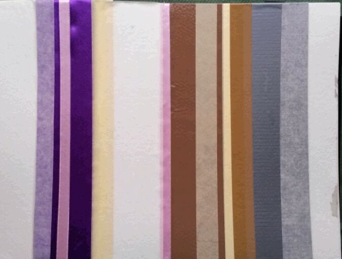
A4 coloured tapes and ribbons
I tried another one with just black, grey, cream and white tapes.
A4 Electrical tape and masking tape
I tried doing another one with more variation in it.

A4 electrical and masking tape
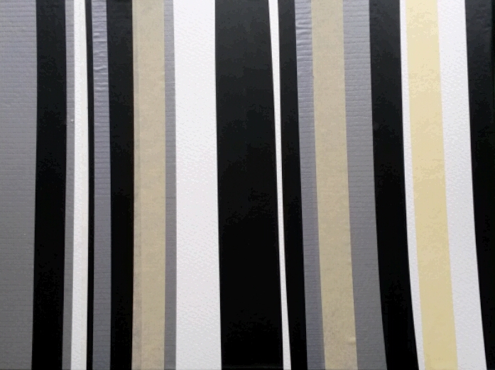
I decided on reviewing all the pieces so far, that I liked the black and white ones best, and I liked the ones with a variety of thick and thin, straight and looser lines. I decided to try the final piece in a much bigger scale. The next one was 28 cm x 53cm, on watercolour paper, and the lines were made using black electrical tape, with some parts torn to give a ragged edge, and lines drawn with black marker and fine liner.
28cm x 53cm electrical tape, marker and fine liner
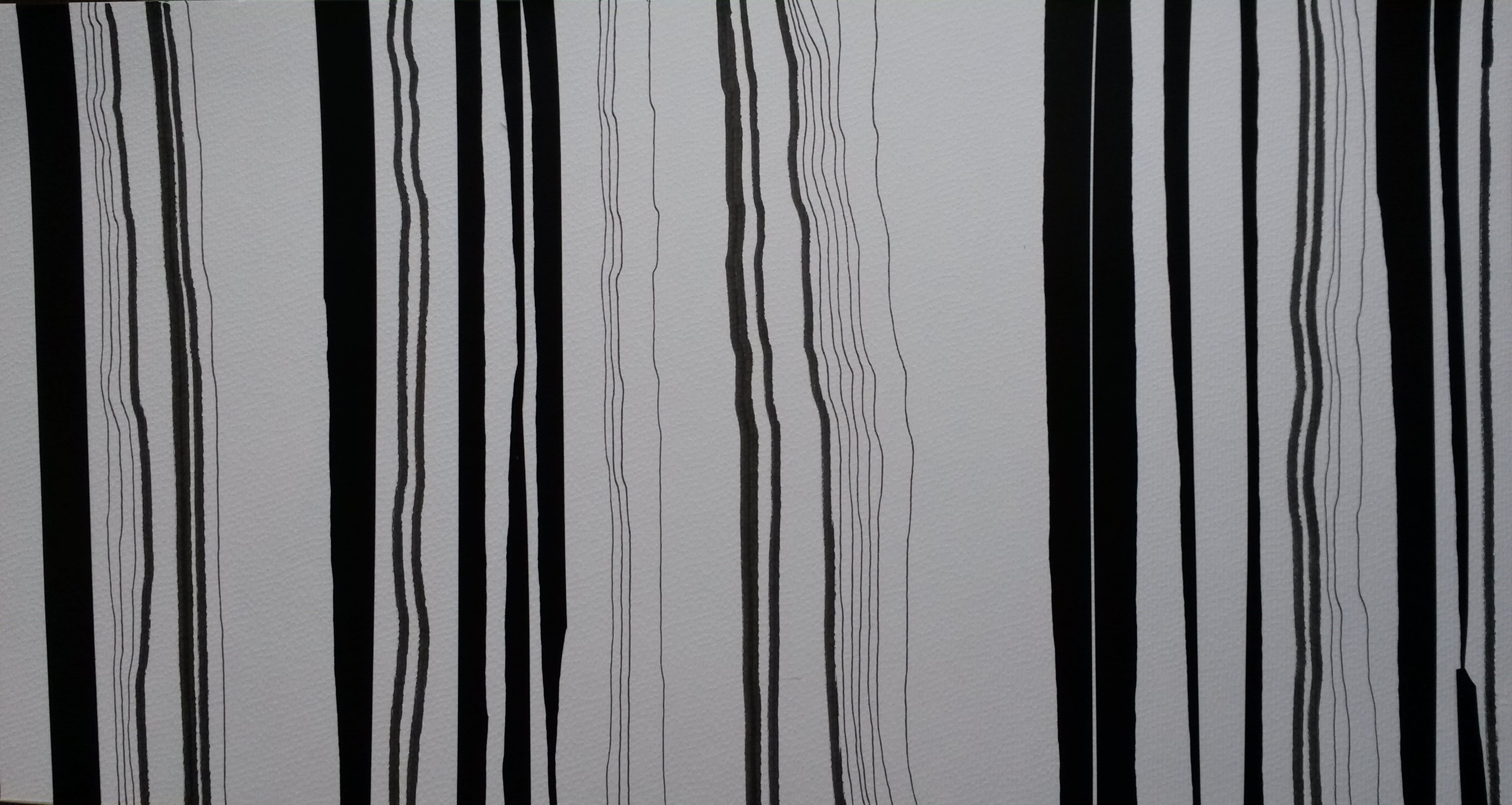
For the final piece of the series I decided to go even bigger. 40cm x 84cm, again using electrical tape, torn in places and black marker on card.
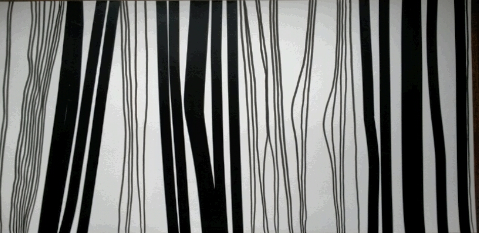
40cm x 84cm electrical tape and marker on card
I am fairly pleased with these outcomes, however I don’t know, on reflection, whether much has been achieved by increasing the size and use of other materials, and the ideas could have perhaps been developed further. It is however only the first Assignment, so hopefully there is plenty of scope for improvement.
I also asked for feedback on these pieces from other OCA students using social media. Here are some of their comments;
“Using tape reminds me of Monika Grzymala who uses tape to draw three-dimensionally into space.”
“being on level 1 I don’t quite get why this is drawing but love it for the visual effects and how the white sometimes becomes figure when otherwise we’re accustomed to see it as ground. I particularly liked the watercolour washed out effects in one of the coloured ones.”
“..for me especially the top piece, the could almost be landscape drawings remind me of topographic maps. I think they’re really interesting.”
“I particularly like the variety of the lines within the black and white ones, for me that adds interest. They also appear more organic, which I prefer.”
“Did you know you can translate text into bar codes. Your black and white ones have that cryptic look about them, like there’s a message.” I did look into this, but the mechanism needs to do this was too expensive for one project.
“This reminds me of Kenneth Noland and Morris Louis – I wasn’t familiar with these artist’s work, but having done some research I can see where the comment came from. Their work comes under the label of; Post-painterly abstraction – Post-painterly abstraction is a blanket term covering a range of new developments in abstract painting in the late 1950s and early 1960s, characterised by a more rigorous approach to abstraction. Their work is characterised by strong geometrical shapes, and Noland did a series of “Stripe” paintings, although his stripes were horizontal, not vertical, and this is something else that I could have tried.
Reflection
Before you send the assignment to your tutor, take a look at the assessment criteria for this course: ….Review how you think you’ve done against the criteria and make notes in your learning log.
I think that my use of materials; trying out electrical tape and ribbons etc was experimental. I’ve never tried anything like that before. Abstraction is an area quite new to me. I tried to think about composition in the shapes and sizes of the drawings, however I could have developed this further perhaps, for example trying out horizontal compositions.
I think, on reflection, the final pieces haven’t progressed very much from the original “bar code” drawings I did for Project 1. Perhaps I could have developed my ideas further, or perhaps tried to look for other artists working in similar methods. It is still only Assignment 1 so hopefully I will improve which each Assignment I do.
I think I did experiment a little with use of materials, but perhaps this could have been taken further. I think it was imaginative to abstract the original book-case drawings, and this is an area quite new to me. I think it’s too early at this stage to talk of development of a personal voice.
I have spent a lot of time writing up this blog and trying to describe the processes of completing the projects. I have conducted the basic research as suggested and have begun to read the suggested book list, so this will be reflected in the blog in time.
References
http://www.tate.org.uk/learn/online-resources/glossary/p/post-painterly-abstraction
