Protected: Project 2: An artist’s book
Enter your password to view comments.
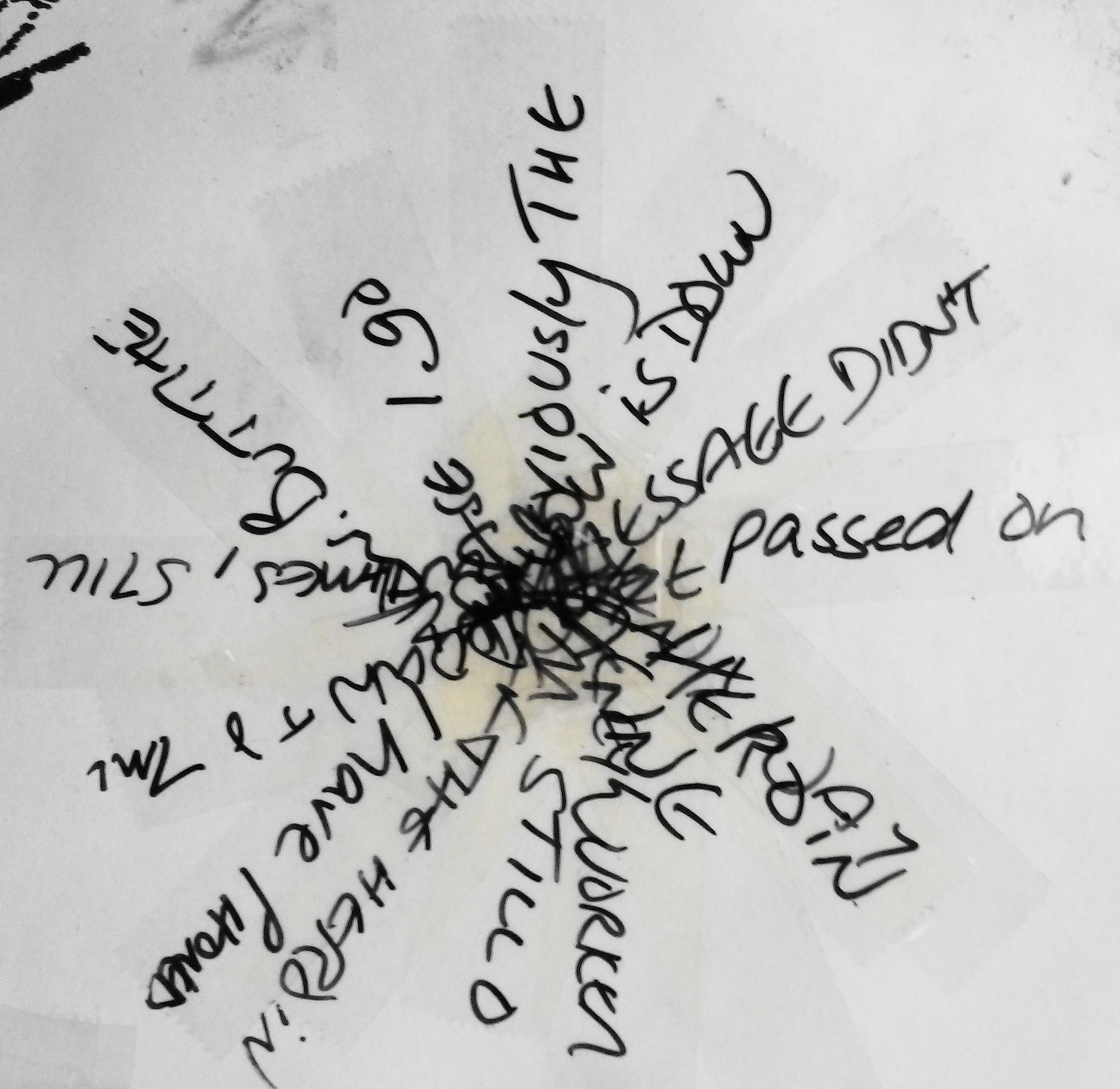
Make a drawing which forces the viewer to use time differently. This may mean a drawing which takes time to make sense of, or a drawing that creates a feeling of a certain pace. The drawing may need an investment of time by the viewer in some way. A drawing is a record of the time you spent making it, but the viewer also spends time looking at it, perhaps seeking meaning, enjoying its beauty or marvelling at the artist’s skill.
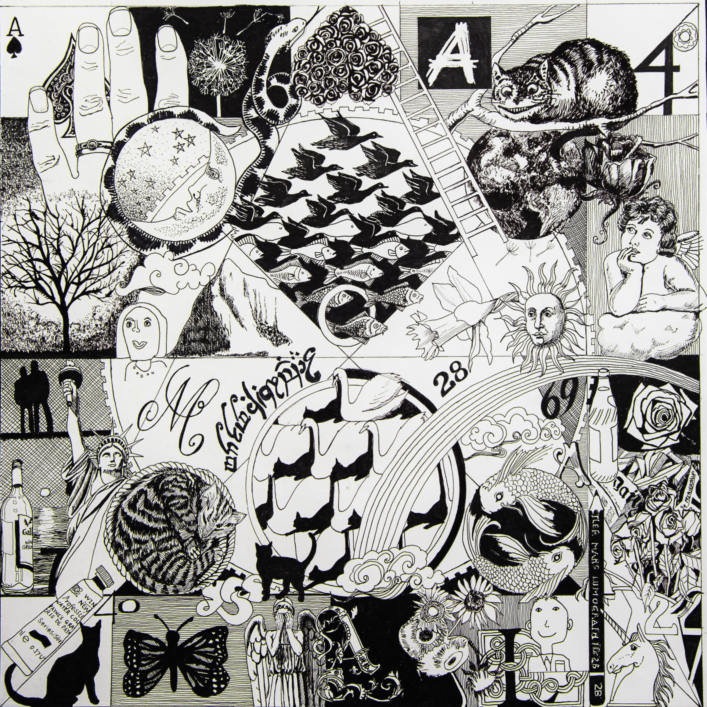
For this exercise I tried to think of a piece of work that I had spent a long time looking at. I thought again, about the Alisdair Gray Exhibition and decided to use one of his prints; Faust in His Study, 1958, 84 x 82 cm. There is a lot of detail in it, and the images are juxtapositioned in a way that keeps your eye moving around the composition, as you try to make sense of it all.
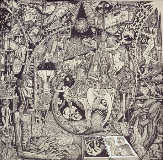
Alistair Gray Faust in His Study, 1958
The original ‘Faust in his Study’ was painted by Rembrandt circa 1652. It shows a scholar transfixed by an orb of light that holds a secret code. In Gray’s version, all the knowledge of life and experience teems through this incredibly detailed work, intertwining symbols of death, love and human endeavour alongside what lies beyond our world.
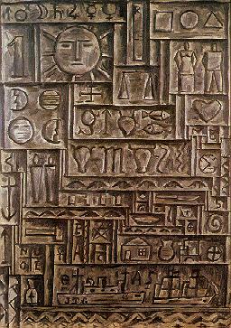
I was also influenced by a painting called Universal Art by Joaquin Torres-Garcia in 1943. Images of a man and a woman, the sun and moon, clocks houses, astrological signs and a Greek cross are arranged in a tight, grid-like pattern on the canvas. These references to man, nature, civilisation, astrology and religion suggest that this work is about the fundamental elements of human existence. (Phaidon, 1996:464).
I decided that I didn’t want my drawing to be as dark and disturbing as Gray’s. I wanted to use geometrical shapes in a similar way to his and keep the image monochrome. It’s hard to explain why, but I’ve found I’ve been drawn to black and white images throughout this course, right from the very beginning when I did the bar code drawings. When colour is added to a drawing it often adds a dimension that wasn’t there before. This can be used to advantage, such as the way Expressionists used it to evoke a mood or emotion, however a lack of colour can also be used to simplify, allowing the viewer to focus on line, shape and patterns without distraction.
I decided to make the drawing autobiographical, for ease, and to lessen the need for research. I began making notes on things I could include, not quite a mind map, but along the same lines.
I needed a compositional structure, so I used items from my studio desk for the geometrical shapes; a plate for the large circle and water pots for the smaller ones and squares. To that I began adding things from my list; a daffodil because I was born on St David’s day, my cat, the Pisces symbol etc. I decided I didn’t like the composition of this drawing. I didn’t like the rectangle composition and the semi circles at either side led your eye out of the composition (although Gray used this successfully).
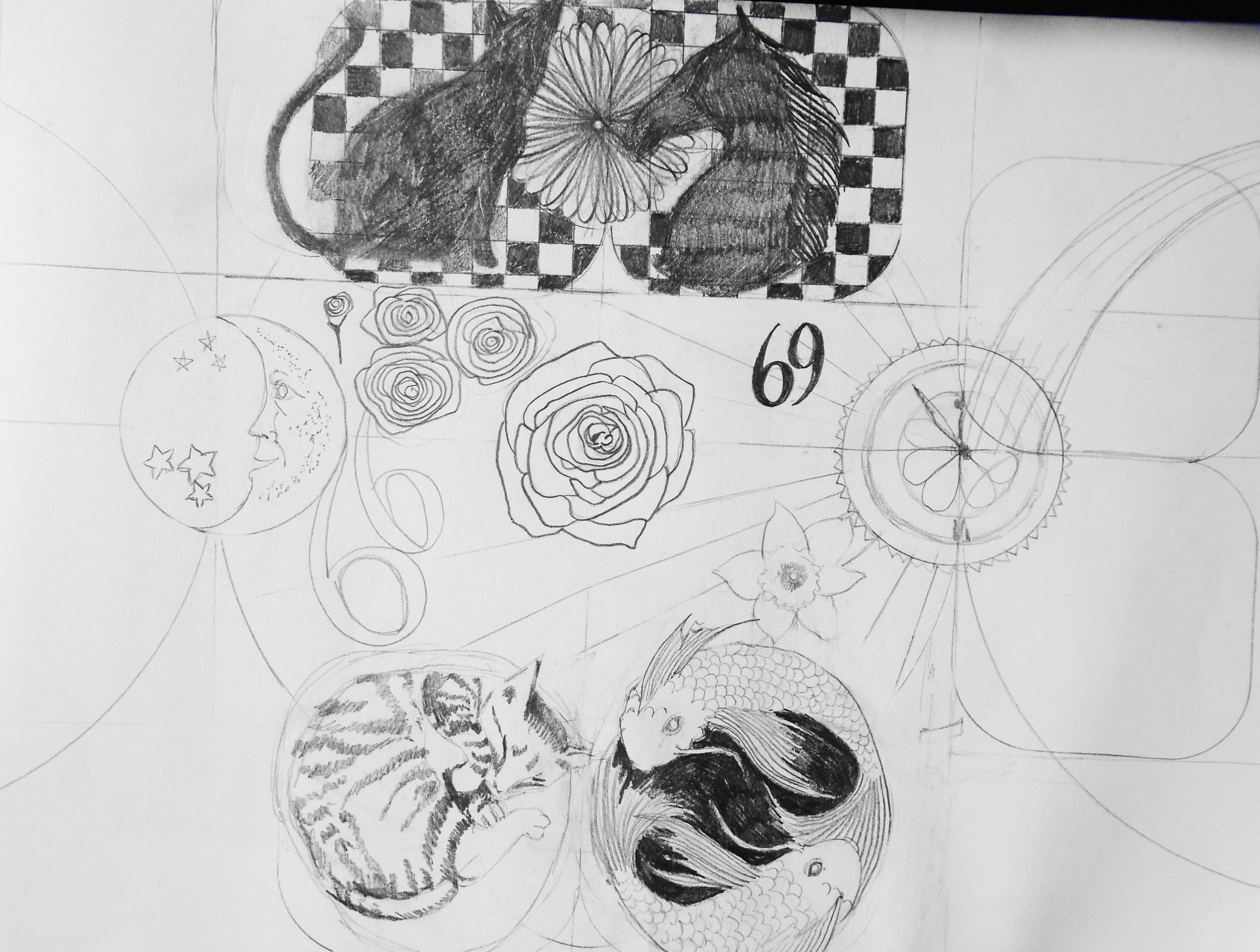
I started again this time with a square composition. I placed one large circle in the centre, quartered it diagonally and added four smaller circles. I then added horizontal and vertical lines. I drew everything in pencil initially. I started with the Pisces symbol, added a rainbow, sun, moon and stars, as did Gray. I began with fairly straightforward ideas; star sign, house numbers etc, but strangely it evolved to a deeper level, as more and more references to my late mother were added. It started out as images relating to my life and moved on to become philosophical with ponderings about life and death. Perhaps I was inadvertently influenced by Gray’s image more than I thought. It probably took me about 6 weeks to complete. I seriously underestimated how long it would take, drawing everything in pencil first, moving things around the composition until I was happy, then drawing in pen.
Autobiographic black drawing pen
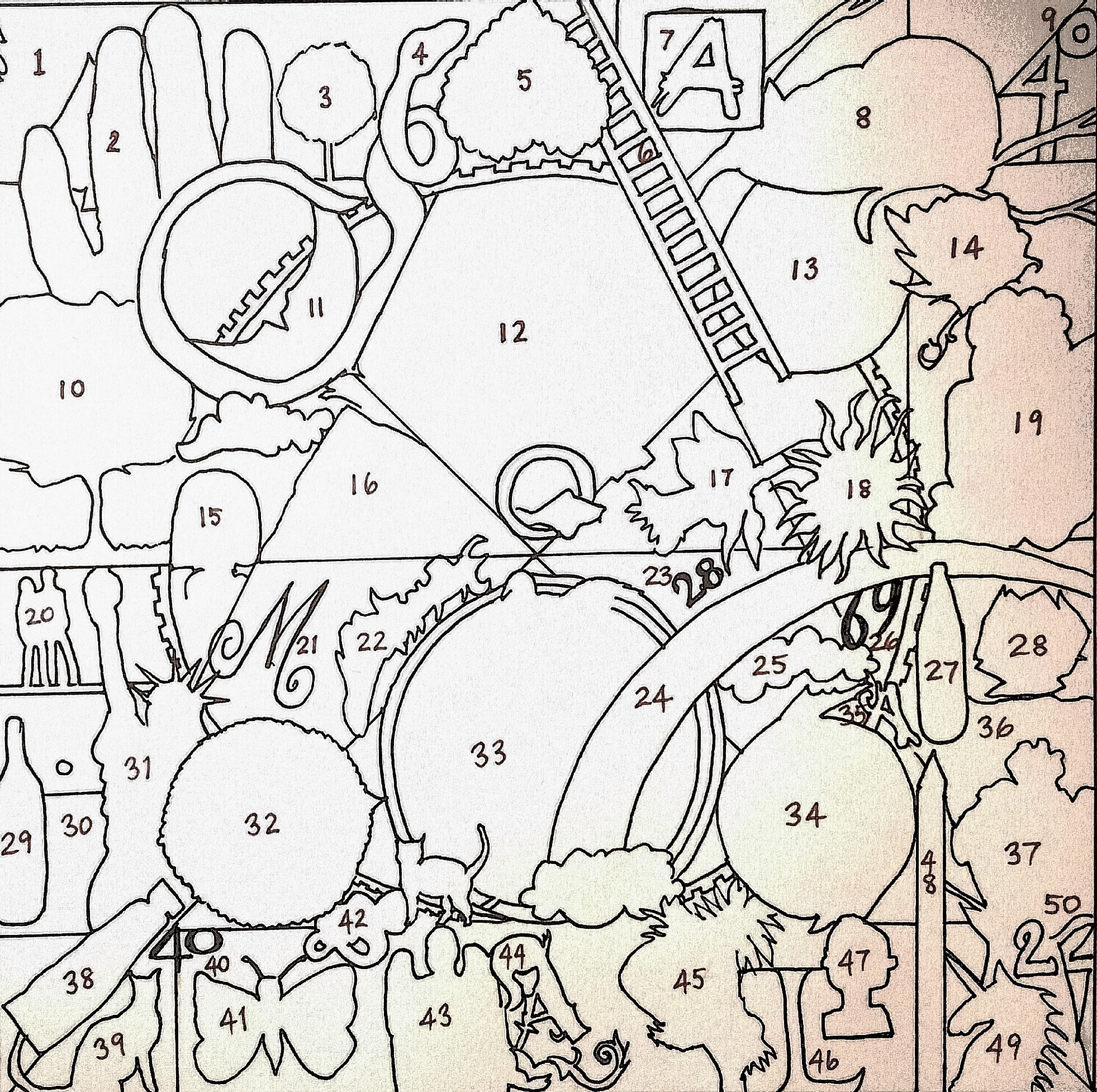
Here is a key to the references, working from top left to bottom right;
The number 50 is also relevant as I’ve just reached that milestone age.
I’ve taken so long with this drawing, as often happens; it’s hard to be objective about the outcome. Parts of it work better than others. I really like the bottom right corner. All the pieces slot together like a jigsaw, and the lines of the unicorn’s horn and the pencil continue the lines of the composition, with the impression of layers. The unicorn horn echoes the line of the spout of the jug, and the handle repeats the shape of the number two The top right doesn’t work so well. The sketchy drawing in the Earth and the rose make the images hard to make out. When I compare my drawing to Gray’s his is so much more sophisticated. Each element in his is integrated into the whole, things go under over and through others. Having a totally black background makes the white objects and people stand out more and having perspective at the bottom gives the whole thing a three dimensionality.
If I were to make a similar drawing again I would use a totally black back ground. I would decide on the theme from the out set. I would try to integrate the individual elements more using Gray’s techniques of having elements over, under and through. On the whole, I found it to be a successful exercise, although I wouldn’t rush to do another one, given the time commitment involved.
Reflect on the time spent by the viewer and how it relates to what you do as an artist.
It generated a lot of interest and discussion at my local art group and people did genuinely spend time looking at it and trying to figure it all out. People of a similar age to me could relate to the cherub scrap, and some commented that at first it appeared to be a random group of objects, however the more they looked, the more they could see connections.
In addition I posted photographs on an OCA Facebook page and asked for feedback. Here are some of the responses;
This very much an autobiographical piece loaded with personal symbolism and significance.
I looked at the whole photo first & thought I was just going to give it a glance. After a quick once over though I started wondering if it were a self-portrait / autobiography which made me look longer & harder, curious as to which part meant and then discovering little images I didn’t notice before.
I found your composition fascinating! I specially love the cat and Swan patterns and the fish and bird patterns so beautifully drawn. The detail is exquisitely executed. I could gaze at this for hours but only spent ten minutes so far I’m sure I will look again when I’m next in Front of my computer.
It feels like a diary of your life, everything that is significant and meaningful the detail is amazing
The dense complexity forces the viewer to spend time looking. The random association (or is it) generates narrative reading which also slows down the consumption of the piece. Additionally, the detail literally and metaphorically illustrates the passage of time in its construction. For me a smorgasbord of cultural influences and inspiration while at the same time being inspirational
Overall I find the composition fascinating – an image of chaos but of a life where the chaos is ordered and somehow slots into place. The life has travelled and studied different influences and there are indications of frustration and joy too and also finding places to rest peacefully
I found myself looking around – as if looking at a room full of objects – just trying to make sense of it and wondering what your thought processes were
This is very interesting, I have looked at it for a few minutes and feel I will need to look again, maybe more than once. To me it depicts a personal journey through good and bad times with lots of interesting references
an amazing amount of work to produce a complex image – compositionally I find it unsettling because there doesn’t seem to be a main focal point to the piece – that may be a deliberate intention on your part – I think revisiting this over several minutes the daffodil has become a quiet spot for me which helps me go back and consider the other imagery – don’t know if this reflection is what you were looking for – but am in awe of you spending so much time and care on a work
A from oca with the the cat from Alice and an angel forces speculation to generate narrative or personal meaning. Duchamp says; ” The viewer completes the picture
For me my eye rests on the tessellations as I can see influence of escher and I am a fan of Jinny Beyer (quilter). I am also drawn at the same time to the hand on the left and the Cheshire cat to the right with the clear indication of OCA … a story of life and happiness. I also really love the curled up cat … peaceful and safe. The whole composition is one of chaos but organised chaos as if it is different pieces of a life all finding their place
I agree with _____ about the amazing amount of work. I find it fascinating – so many images, from popular culture, but presumably full of personal meaning too. Looks like a lifetime encapsulated into one image. I did spend just about 4-5 mins on it, but could look at it over and over – like one of those very complicated album covers by a psychedelic band – keep staring and you’ll see much more! Could almost be a ‘trippy’ game board
In a way the artist has control over the viewer, they have the capacity to intrigue, arouse curiosity and grab the viewer’s attention. In a sense, this could be viewed as the artist having power over the viewer and the ability to ‘steal’ their time.
Rework
I was so proud of this drawing, that I got a friend who is a professional photographer to photograph it for me. My local art group enjoyed watching me draw this. They liked the concept and three members have made their own drawing about themselves.
My tutor thought that it would be easier to read my key, if I did a diagram, similar to the key of the Beatle’s Sergeant Pepper album cover. And it would also look more professional. So I did this key, which I may include as part of my assessment.
I agree it was a worthwhile exercise, and indeed, would probably cause the viewer to spend more time looking and interpreting, which fits the brief.
References
http://www.bbc.co.uk/programmes/articles/43Chdsg7qTVLdSmbGsHl7wz/alasdair-gray-at-80-seven-artworks
Chose a subject which has a substantial number of detailed parts. Think about whether these parts will be repeated (a plate of baked beans, for example)or all different (a hyper-realist drawing of pins and nails).
I wanted the drawing to be relevant to the theme based on my working environment, so I decided to do a tonal drawing in pencil, using an enlarged photograph of paper clips for reference. I chose paper clips because I didn’t want to work in colour. I gridded up the photograph, and altered the composition from rectangular to square. This was originally intended to be a study for a larger drawing, but I significantly underestimated how long it would take me to do. I felt my tonal drawing may be a bit rusty, so I wanted to do a smaller piece first, intending to complete a larger more finished piece.
I drew the image in line then began adding the darker tones. I quickly realised I had drawn the wire in the paper clips too thin and I had to correct the whole drawing as I went along. I used 2B, 5B and 8B pencils and a putty rubber to lift out highlights.
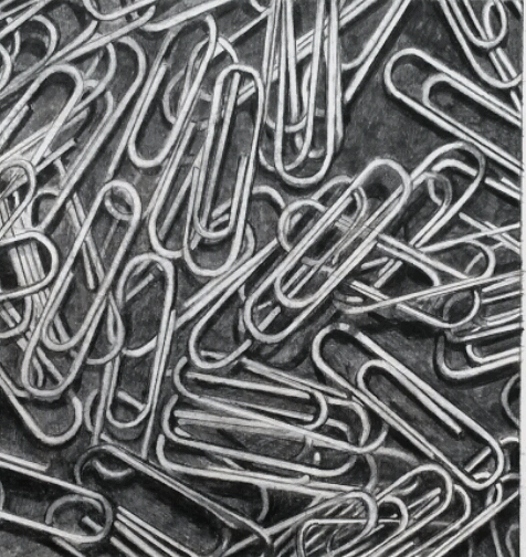
Tonal drawing in pencil 21 cm x 21 cm
In the end, my smaller drawing, intended as a study has become my final piece. If I had more time I would complete another drawing, on a larger scale again. I am happy with the outcome. When I posted it on an OCA Facebook page the feedback was that it looked like a photograph and this was my intention.
Drawing moving figures or a changing scene can be extremely challenging. A large part of that challenge, however, is your own conception of the purpose. By taking a step back from trying to pin the action down to a static conclusion, and instead making a drawing which is a record of the movement and action itself, we can begin to reflect on how to balance movement and form to create a dynamic image.
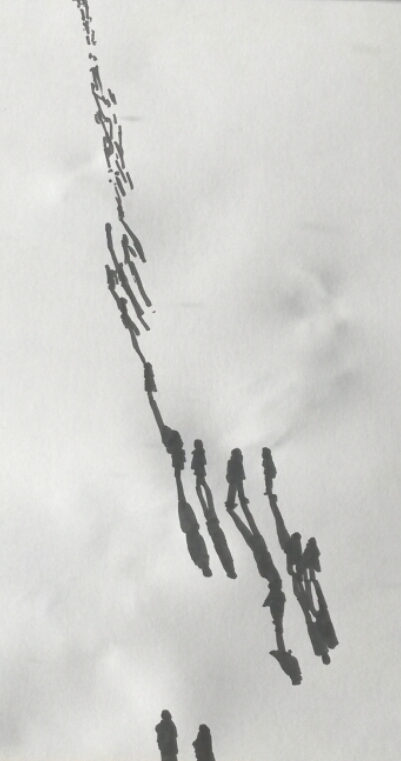
First of all I sat in a busy shopping centre where I could watch people walking to and from the exit and I tried to make quick sketches of them. My sketches were all static images with no sense of movement in them at all.

A5 sketchbook with black drawing pen
I then sat at my laptop and watched videos of busy street scenes. I tried drawing with water-soluble ink then added a little water and this helped a little, the blurred shadow implied a little movement. Also the use of linear perspective implies that the figures are moving from the foreground to the distance.

A3 sketch book with black soluble drawing pen
I thought about what the brief said about ‘making a drawing which is a record of the movement’. This made me think of photographs of moving cars where the head lights create light trails and these certainly imply movement. I looked at some images on my laptop and made a quick sketch of light trails.
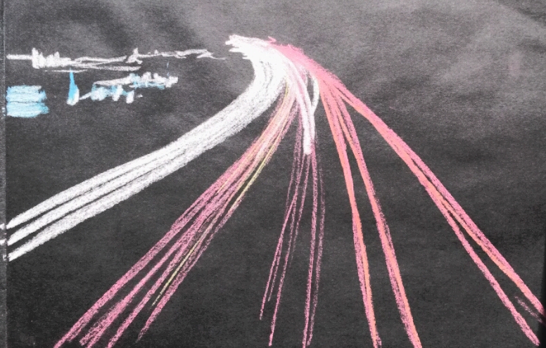
A4 black sketch book with soft pastels
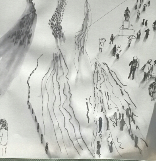
I thought some more about shadows and looked at some photos of crowds of people on-line. Joining the shadows together makes your eyes follow the line of people and this implies movement, although not at a fast pace.
A3 sketch book with black sharpie
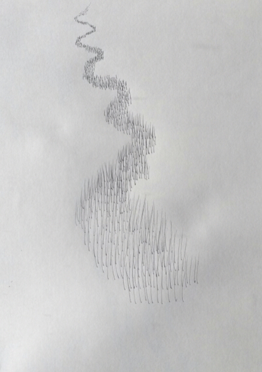
I played about in my sketch book some more, thinking about faster movement.
A3 sketch book, various drawing pens
I tried another with fine drawing pen.
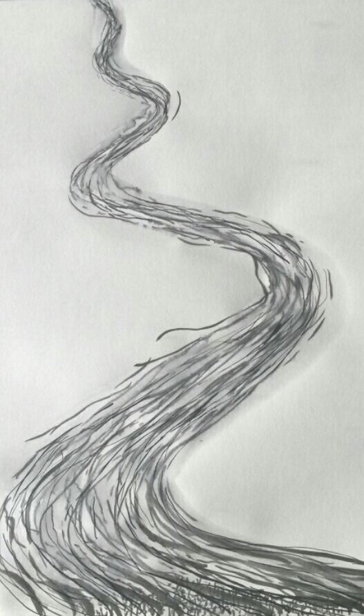
Finally I just went for a feeling of fast movement in a wandering line.
Reflection
The final piece does, I think, portray a sense of motion, not necessarily of people; it could be traffic or a river even. Looking at all the pieces together I think I prefer the one below, out of all of them.
It depicts people, and implies that they are walking. The two figures at the bottom cut off at the edge look as if they are walking into the composition. The scribbles at the top aren’t even definable as people but I think it still looks like a line moving forward. The white paper with no drawn ground etc makes it more abstract and the contrast between black and white adds drama. The more I look at it, the more I like it.
Make a drawing that relates to its environment in a way that creates an interesting dynamic between the artwork and the space around it. Think about ways that drawings could take part in a kind of dialogue with the space they inhabit. Text may be one way, or a drawn object in partnership with its real world equivalent.
Research for Project 3
I began by looking at the contemporary drawing exhibition held in Edinburgh On Line. I looked at Robert Rauschenberg’s Automobile Tire Print. 1. ‘Rauschenberg instructed fellow artist John Cage, an avant-garde composer, to drive his Model A Ford in a straight line through a pool of black house paint and down a long strip of paper. The result is a print in which tire tracks form a direct record of the car’s movement down the street. This work pioneered a new form of art-making, blending elements of performance with the tradition of the ready-made (artworks made of largely unmodified mass-manufactured objects) initiated by Marcel Duchamp in the 1910s.’
Next I looked at Edward Krasinski. 2. ‘Krasiński was a leading Polish Conceptual artist, known for his extensive use of blue lines of tape, cable, and other materials. This installation re-creates Krasiński’s contribution to the 1970 Tokyo Biennale. The works, as seen here, were exhibited for only the last three days of the month-long event, as they had been misdirected in their shipment from Poland and arrived late. The artist supplied a substitute work in the interim, transmitting the word blue five thousand times via telex (a precursor to the fax machine) and instructing the Biennale’s curators to display the telex tape on a pedestal. “My art just needed to get to Japan as quickly as possible,” he said. “Instead of the two-month sea voyage, it got there in seconds. It was delightful to think that when the telex in Warsaw was typing ‘BLUEBLUEBLUE’ the very same moment the tape appeared in Tokyo.”
These two artists have made the act of drawing, just as important, if not more important than the outcome. The making of the art has become a performance and demonstration of showmanship.
Malich’s wire works were conceived, he has said, as “the expression of a new space and the investigation of it. 3 ” Although he has never realized any of them on an architectural scale, that aim has been part of his project: at once cosmic and utilitarian, his sculptures of the 1960s were created as designs for utopian cities in some imaginary future. He continues to think of his later tied-wire constructions as models for large-scale outdoor projects shaped by forces of light, air, and water.
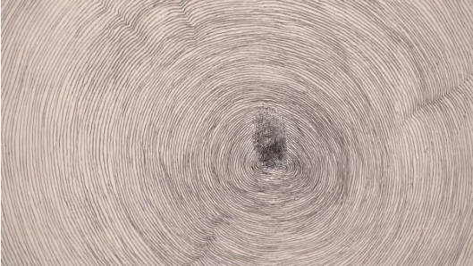
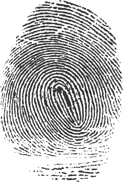
This drawing, which Penone made for On Line but conceived in 1995, began with the artist’s fingerprint on a sheet of paper. The pencil and ink lines, following those created by the inked ridges of skin, radiate outward, filling the paper then spilling over onto the walls of the gallery space, like the rings of a steadily growing tree. In an interview, of Propogazione, he said’ It is a piece that was born of the idea that fingertips have a design from deep within the universe on them. You can see it in the growth rings in trees…..I made a fingerprint using ink then I connected the lines in the fingerprint with a pencil, with graphite trying to continue the drawing….Drawing above all else is about line. The line is a mark, that is arranged on a surface. This makes it an intentional mark. Therefore, it becomes a human action. This is the most extraordinary thing about line, its such a simple gesture but its deliberate.’
Interestingly, I hadn’t heard of this artist or seen this artwork when I drew my ‘tree ring’ drawing for Project2 below, although his is in a much grander scale.
Reflection: Use the links below to find out more about Pierrette Bloch. why is she described as using ‘poor materials’ and what do you think her materials lend to her subject matter?
4.’ Like Soulages, Bloch has only used black for many years, but unlike his predominantly oil on canvas works that often swell to the heroic scale of Abstract Expressionism, Bloch has shown a penchant for humble materials and more extrapolated formats.’
I think the word ‘humble’, rather than poor, describes the materials Pierrette Bloch used. Horsehair, found wrapping paper and ink markings on board are all humble materials; they are not traditional media for art work and most people would discard them. It is the way they are put together that count. She is very much in control of how the work is seen. 5. ‘Bloch has workspace in her studio apartment on an upper floor of an old building in Paris’ 15th arrondissement. All of her exhibitions are meticulously planned in advance. Bloch builds small models based on the proportions of the given environment, and using miniature replicas of all of her work, determines the placement.’
To what extent would you say that Spider by Louise Bourgeois is a drawing?
I was very fortunate to have seen this work on an OCA Study Visit last year. Here is a link to what I wrote at the time;
https://annemacleod2013.wordpress.com/2014/03/13/study-visit-to-louise-bourgeois-exhibition/
The obvious description of this piece would be sculpture, however I can see why it could be viewed as a drawing. There are the obvious linear qualities, emphasised by the strong use of black. The enormous structure fills the space in the room, but the black flattens the image and it could almost be flat on a plane. The image is not of a room with a spider, but of a spider inhabiting a room. Incidently, Louise Bourgeois used the spiral motif a lot in her work, however she never fully explained the significance of it (see my study visit notes).
Project 3
This is such a new area for me, I debated long and hard where to start. I wanted to relate it to my parallel project. Some of the ideas I had were; use fax, something sitting on the empty chair, draw a welcome mat, speech bubbles coming from the furniture.
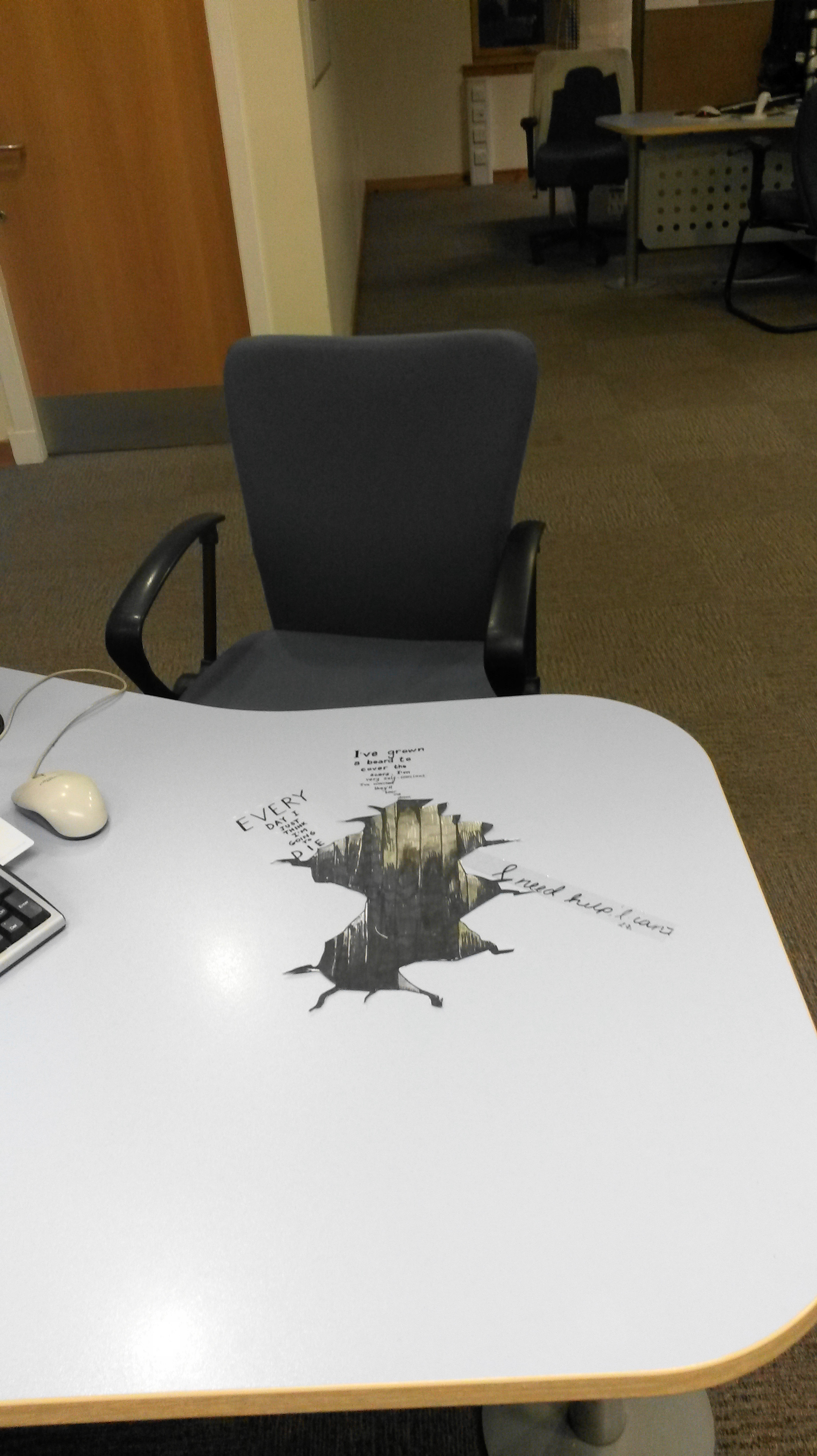
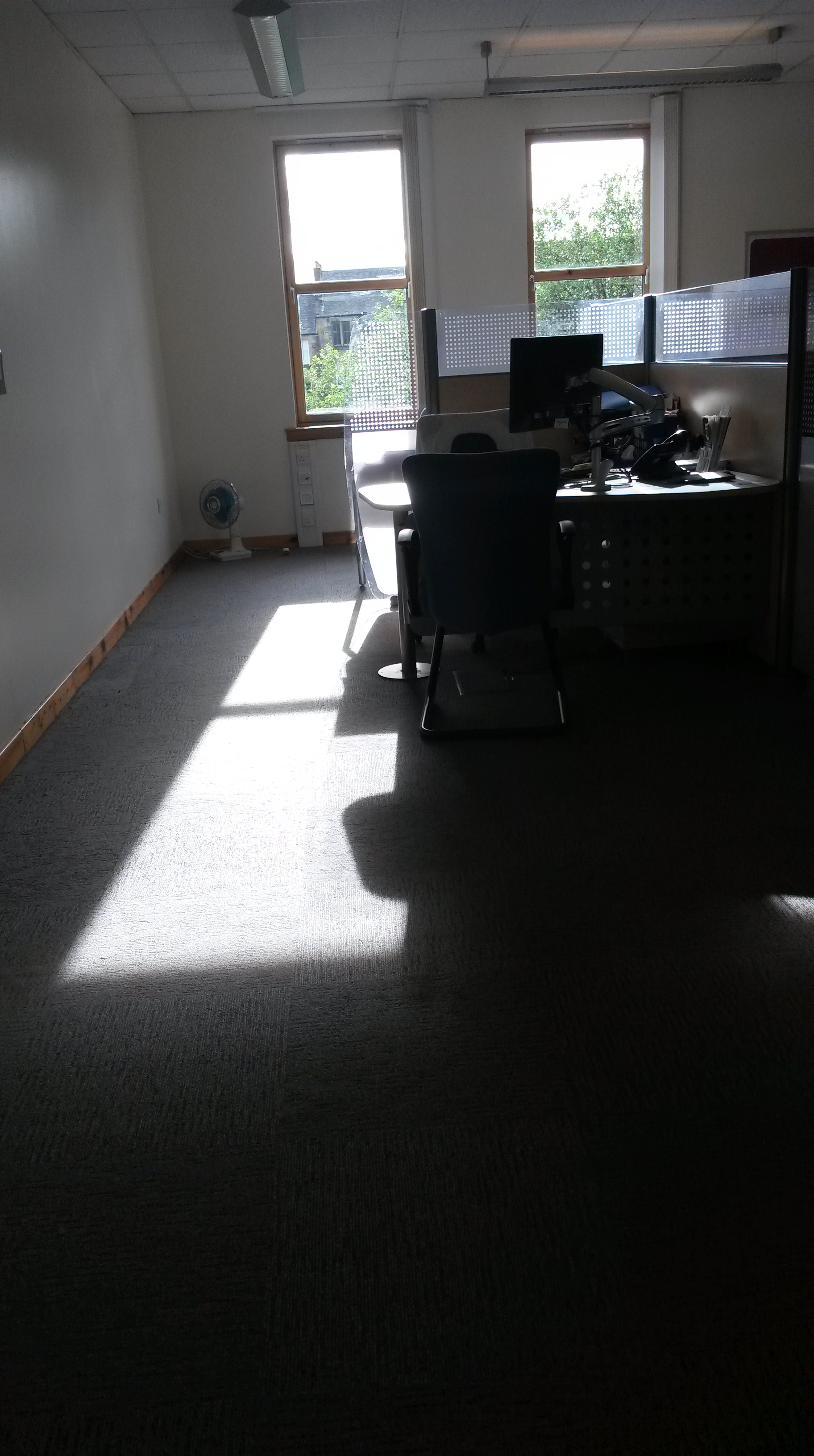
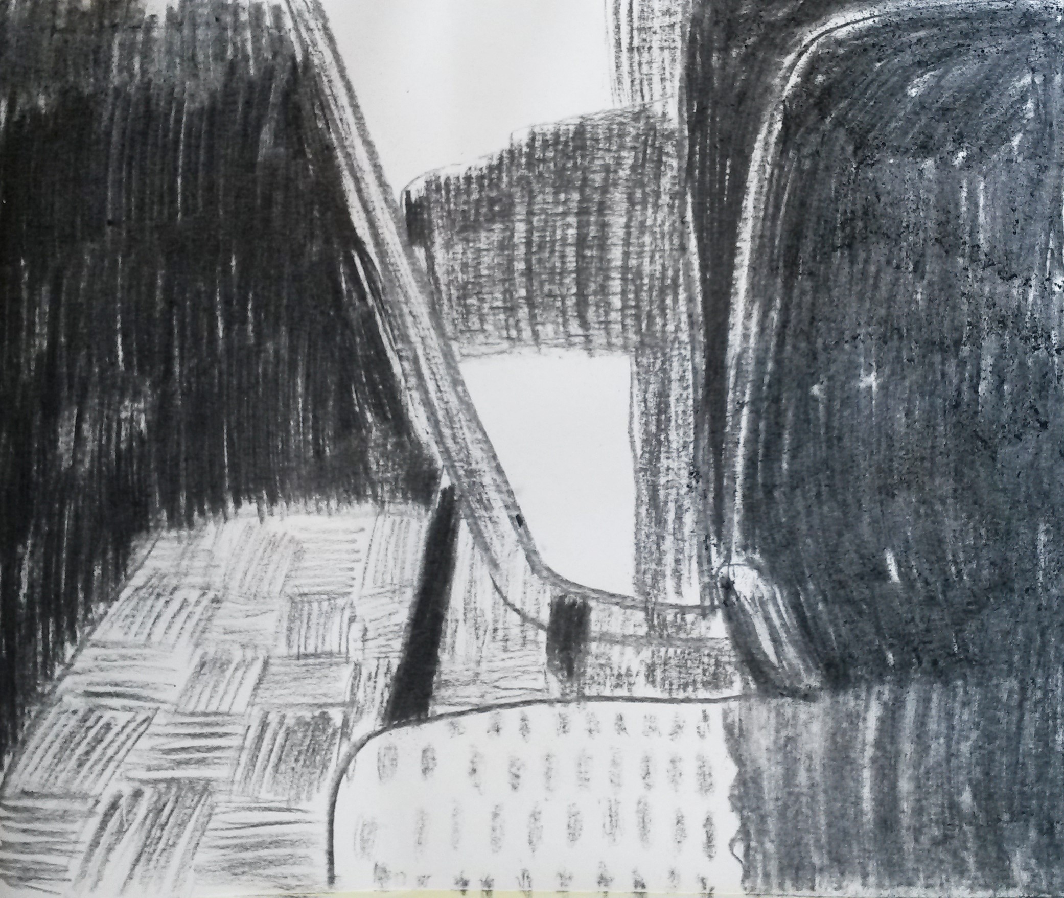
I looked at the artists suggested as reference, such as Kurt Wenner, and there was often an element of optical illusion , but which still incorporated the environment. Often these involved the viewer looking down. I tried to imagine how I could do this at work. The floor is carpeted and I couldn’t imagine being able to look down on the floor, and in addition it would need to be done on a large-scale on the floor, so I thought about how I could perhaps use my desk instead.
I had a look on YouTube, hoping to find a video which would show me how to do this and I found;
I gave it a go, but my first two attempts weren’t very successful. I was happier with my third attempt.
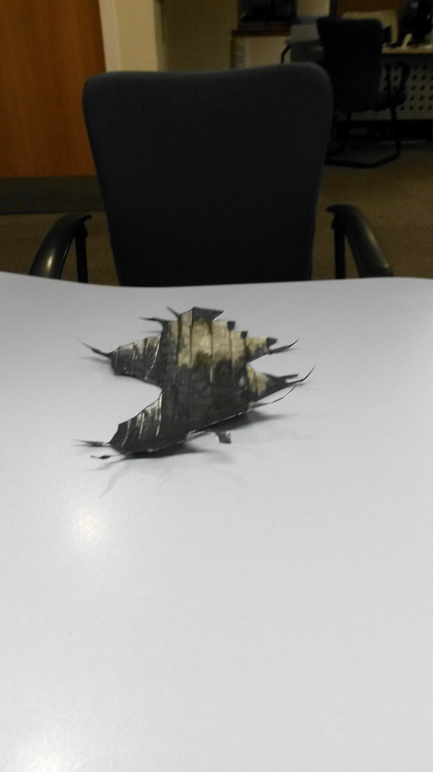
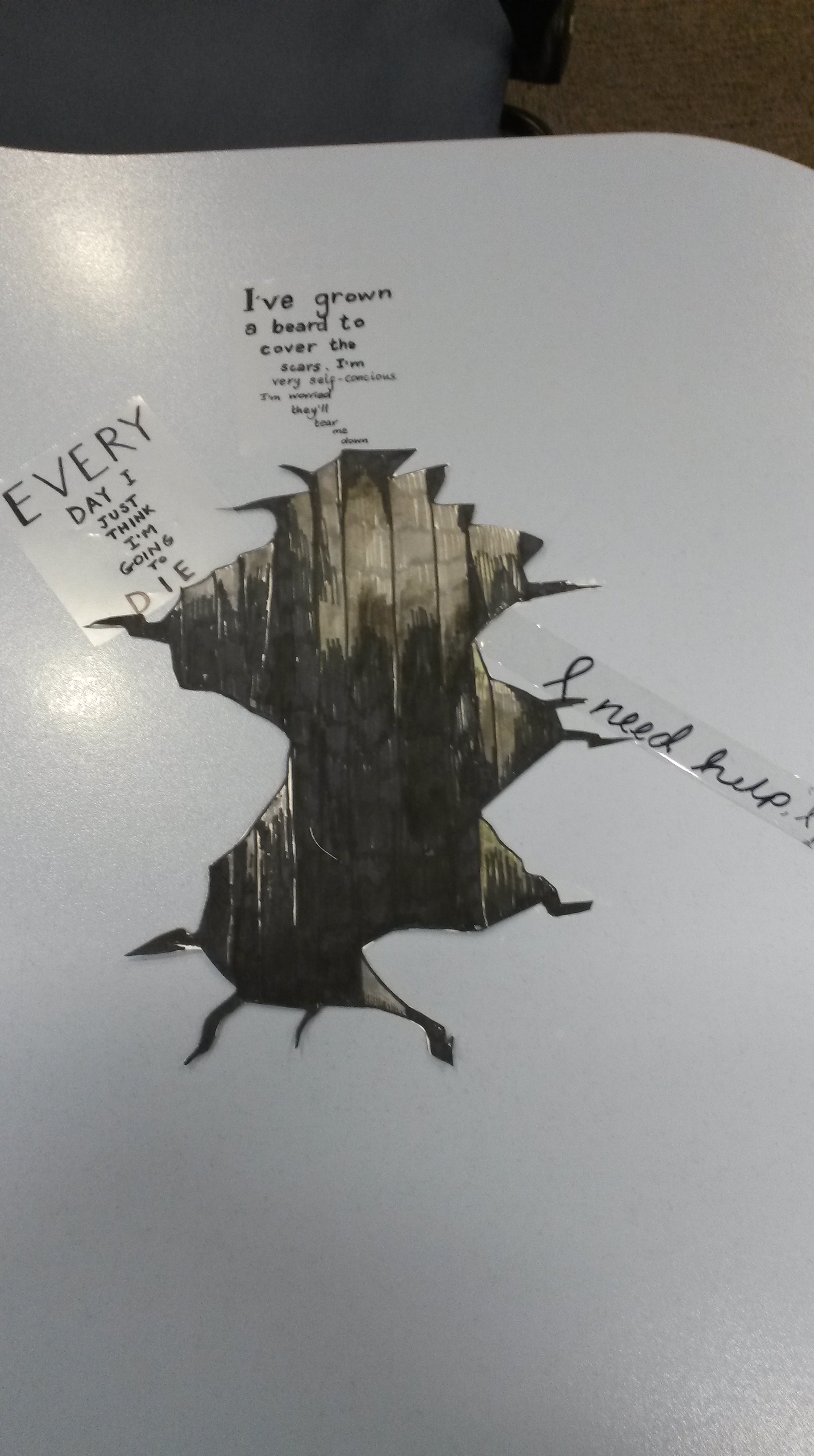
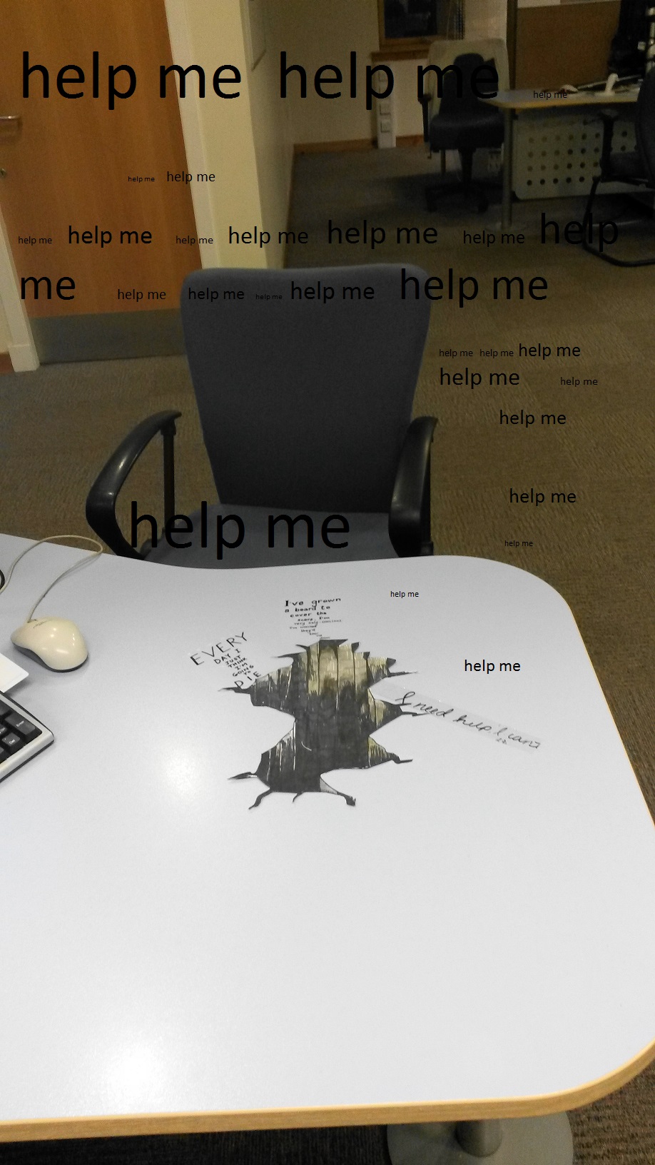
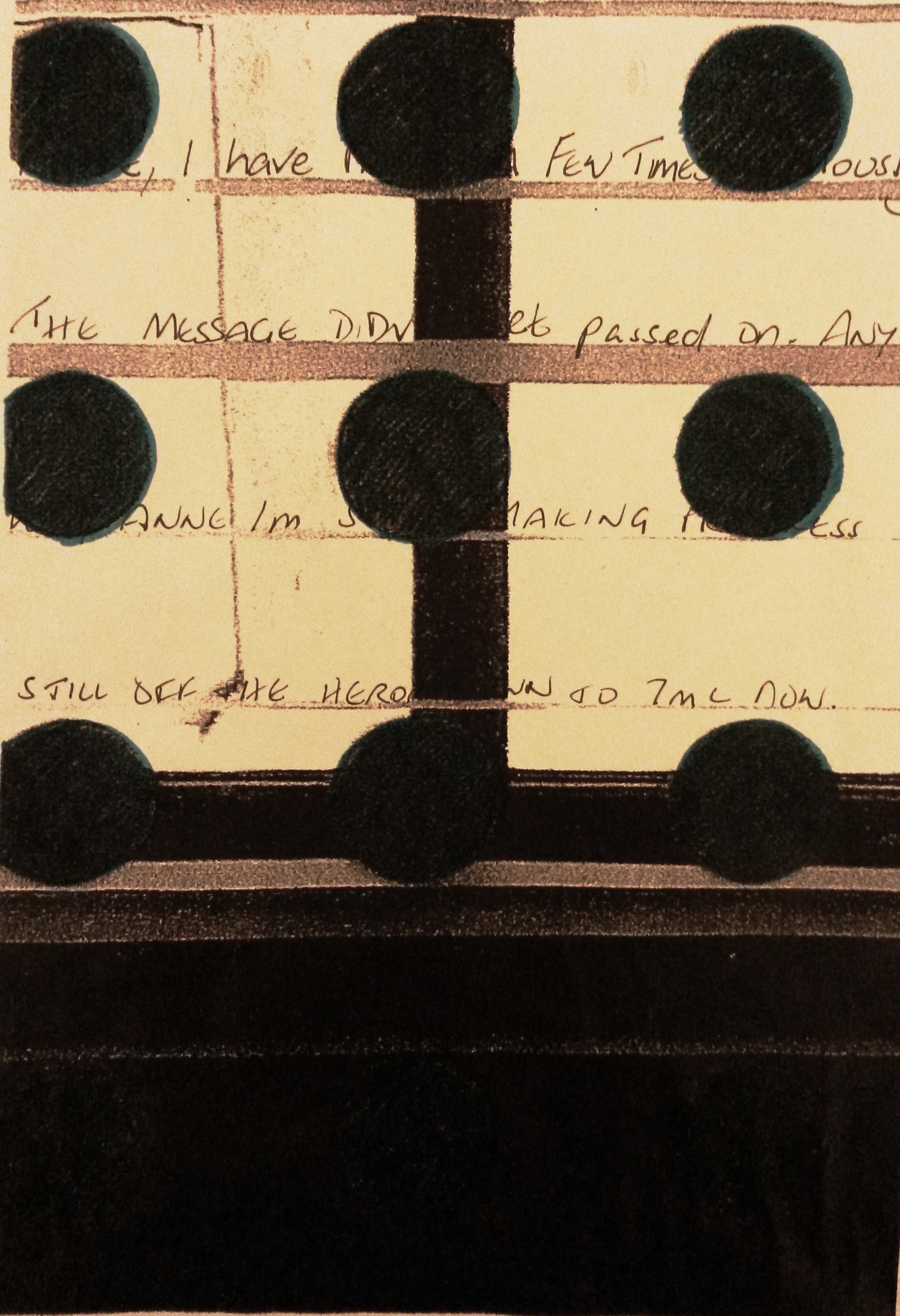
I decided that I would try to show the hole swallowing the dialogue that takes place at my desk. The hole would be a metaphor for me, absorbing the information I receive from my customers on a daily basis. I played about in my sketch book with different kinds of writing for the dialogue.
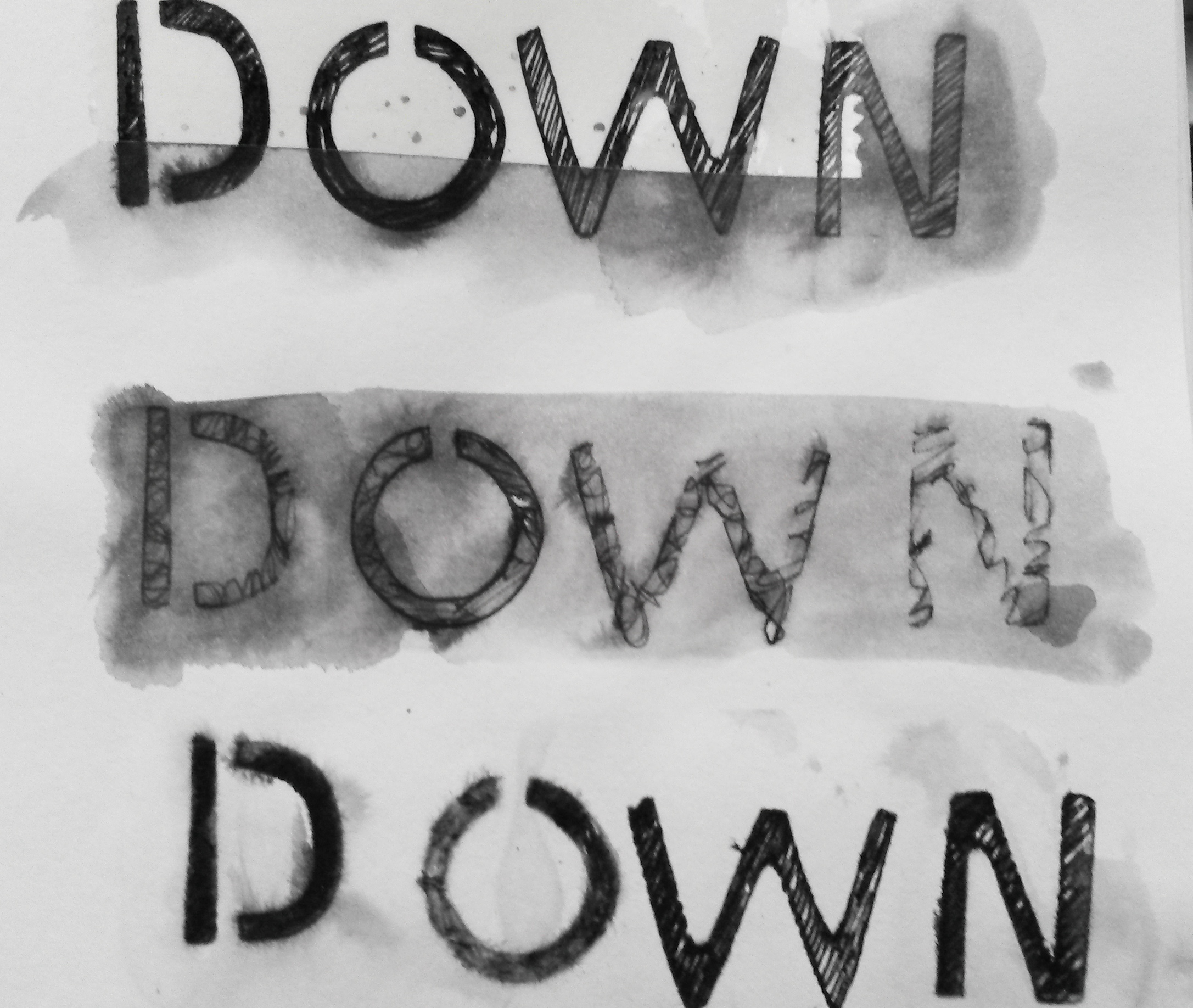
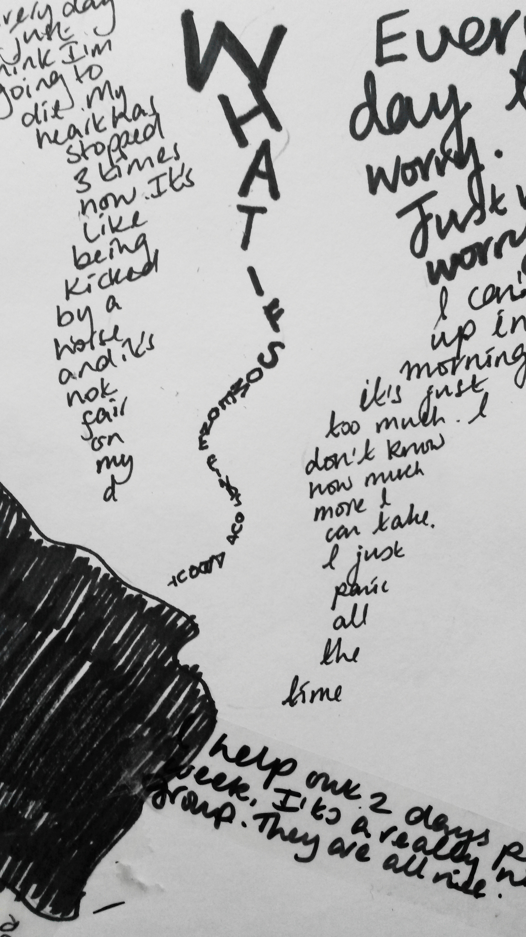
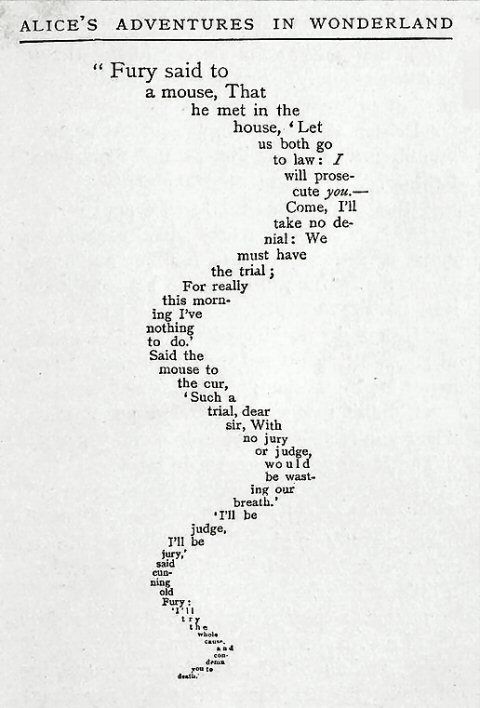
I was thinking of the poem ‘The Mouse’s Tale’, as it almost implies movement, like a snake weaving from side to side.

Part One
Take a walk in a place you know well and make five different small drawn interactions in the environment using only what you find around you and your own body and without damaging any plants or animals in the process. Try to do things which will affect the way a visitor to the space would perceive it, either by directing their gaze or by changing the qualities of the place.
When I first read this brief, I immediately thought about using the beautiful Autumn leaves that were all around. Unfortunately, the weather has taken a turn for the worst. The wind and constant rain have turned the beautiful golden leaves to mush. I’ve really struggled to come up with some other ideas, despite looking at artists like Andy Goldsworthy.
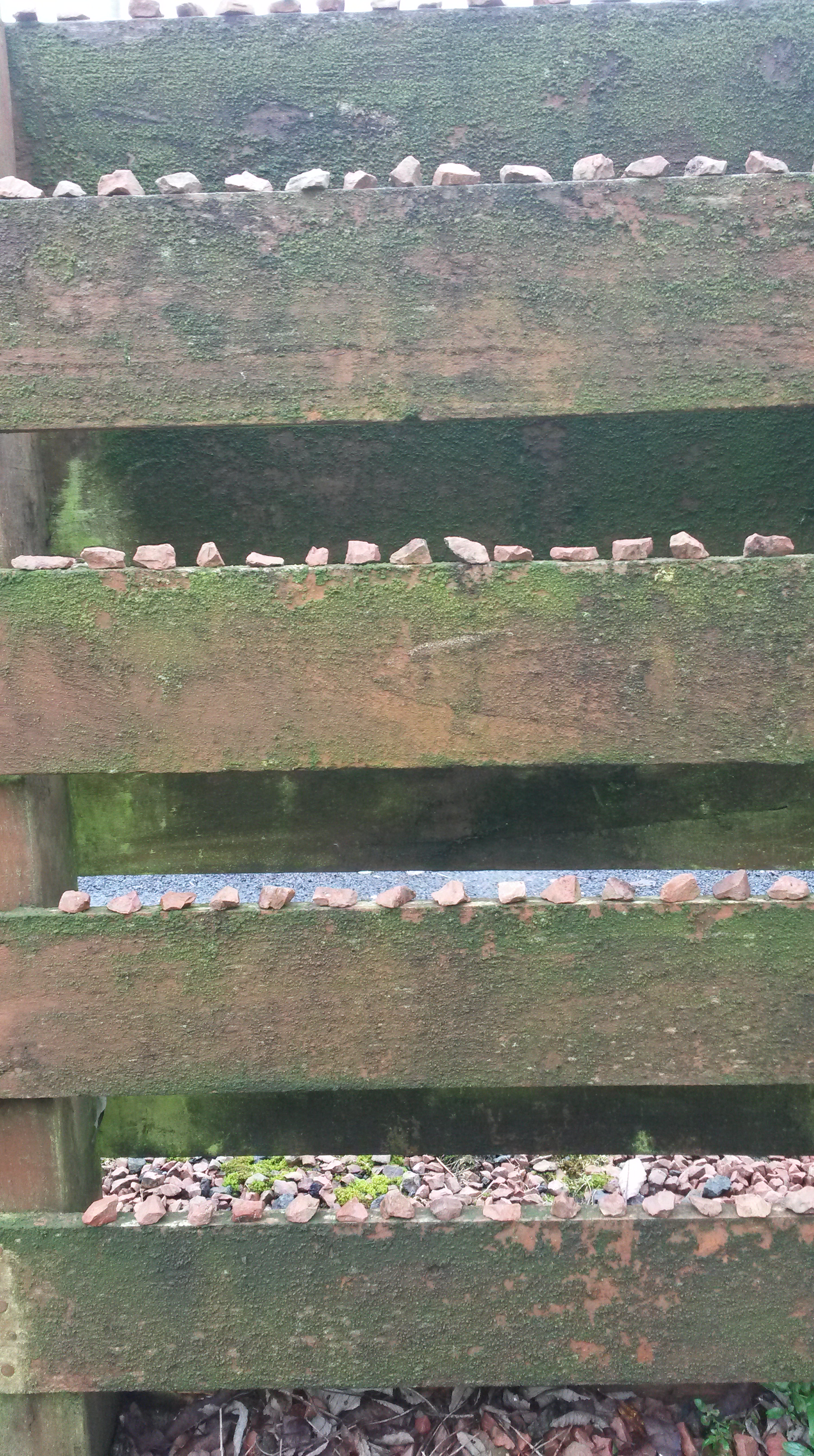
During the first day it hasn’t rained, I decided to take a different approach. I went in to my garden (a place I know well), and spent time just looking. I was looking for inspiration, and also looking for materials to make a drawing from. It is a small garden, so there weren’t limitless things to choose from. I started by taking a handful of small stones and began to place them on to the edge of the wooden fence. This made me think about repetition and order, such as the work of Pierrette Bloch. I put sixteen stones on each of the four rows.
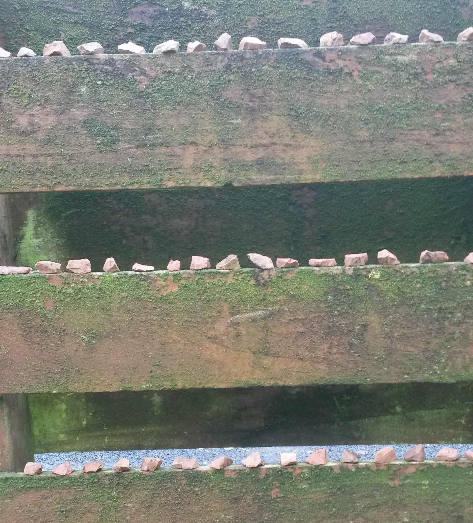
Next I looked around for some other materials to use. I found some twigs from my Willow tree and a piece of slate, that had presumably fallen off the roof. I had a kind of nest in mind, such as a bird would make from the twigs. To this I added the slate and some more stones. I positioned it on a red coloured step.
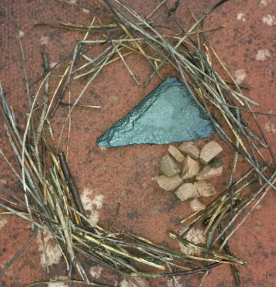
I felt it lacked something, so I looked around the garden and found some brightly coloured leaves.

I felt this was more successful than my first attempt.
Part Two
Following some discussion with my tutor, I decided to start again with this exercise, this time thinking about the content of my Parallel Project. ‘The place I knew well’ was the Jobcentre.
Again, I have difficulties with issues of confidentiality and Data Protection, so as a starting point I was thinking about hypothetical interventions I could make at my work place.
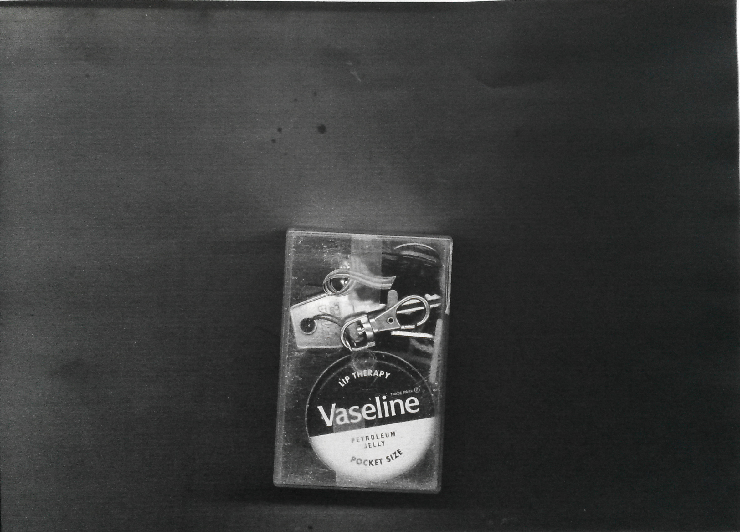
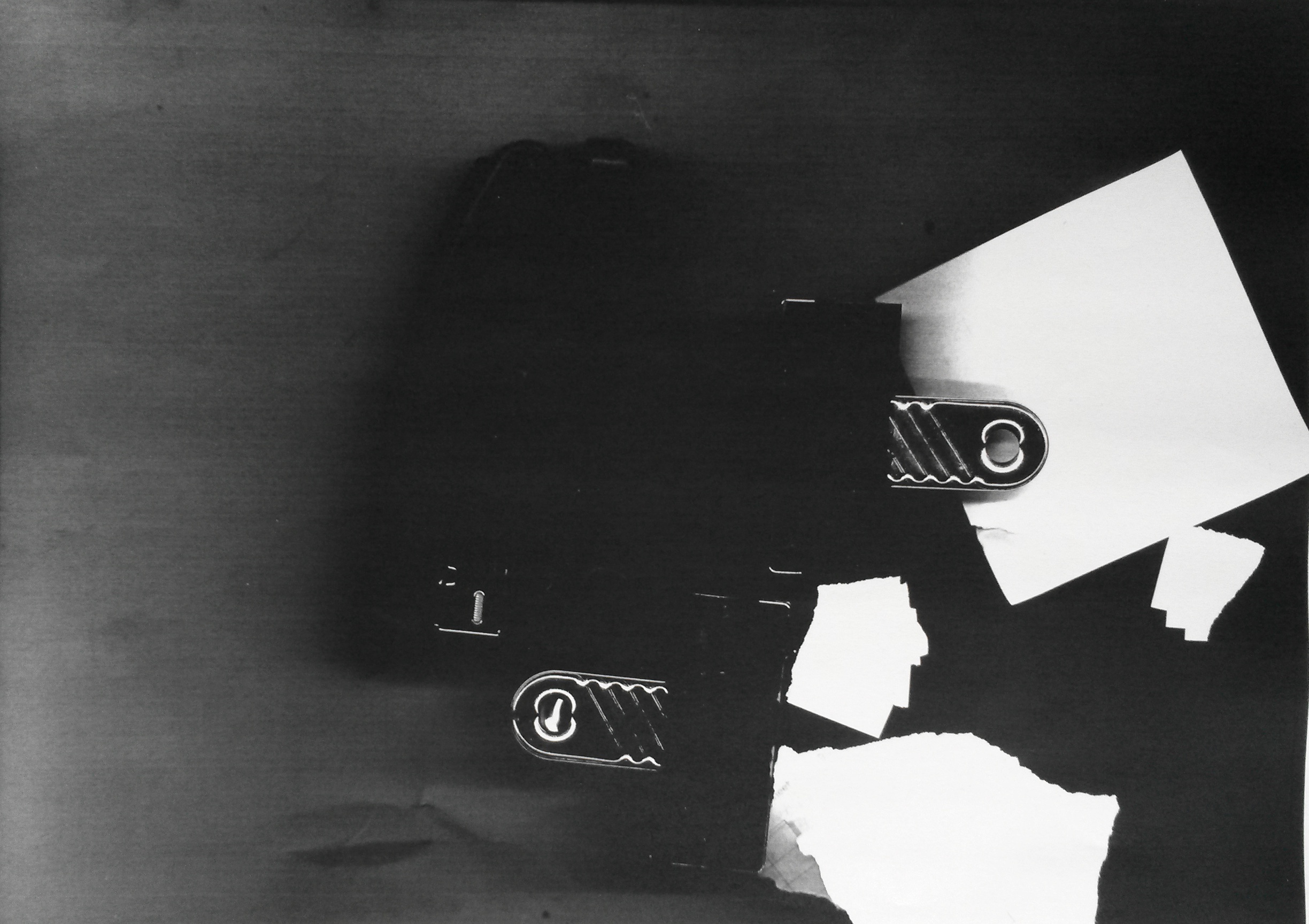
I tried using the photo copier as a media and photocopied things I found randomly on the desks nearby. I included myself, ‘using things found around you and your own body’, by photocopying my hand. I liked the resulting images. Because the items weren’t flat and the lid of the photo copier was raised allowing light to get in, it made the images very dark and interesting.
The copies were all made at the one time. I worked very quickly, so as not to be seen making the images, in order to avoid having to give an explanation. Because I was working quickly I was ‘thinking on my feet’, impulsively trying out different things.

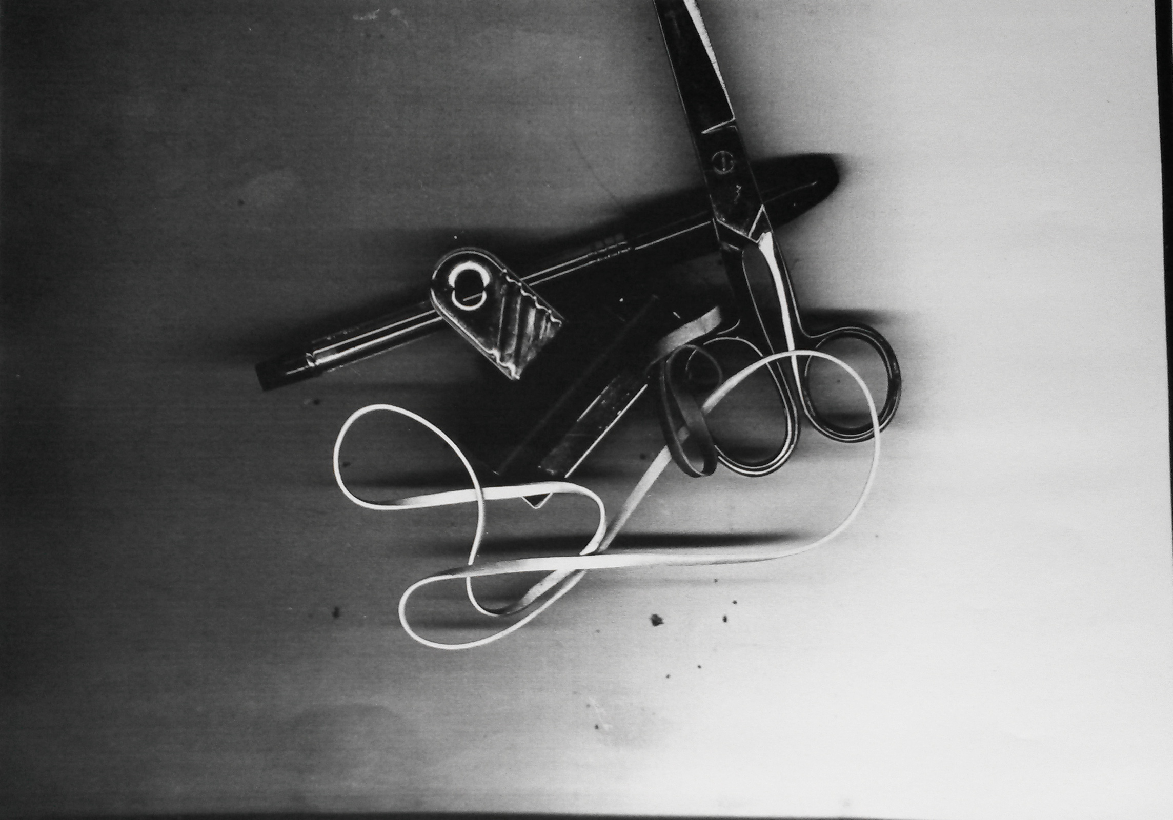
2. I then started looking around at the empty desks nearby and grabbed some random items; scissors, some rubber bands, a pen, and a bull-dog clip. I didn’t arrange the objects, but just plonked them down and copied them the way they were. Again, I like the dark and light contrasts and the shapes the objects make. The loops of the elastic bands mirror the ovals of the scissor handles, and the circular screw on the scissors mirrors the hole in the bull-dog clip. The straight lines of the pen, scissors, bull-dog clip and even the elastic band mirror each other. The cropped scissors lead your eye up out of the picture. It is a wonderful composition of random objects arranged randomly.
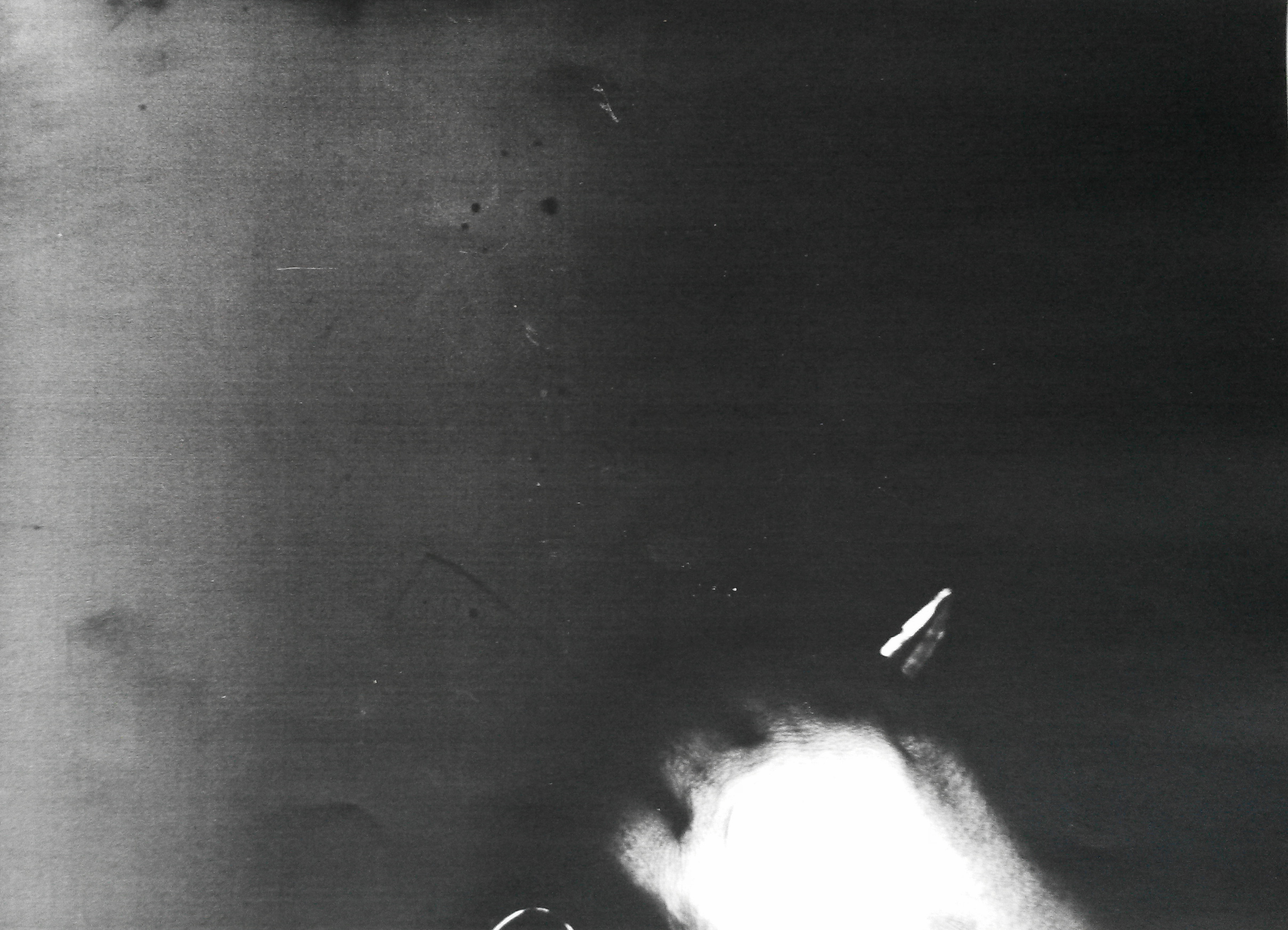
5. The last image is of my hand gripping scissors. My knuckles are pressed against the glass plate and my hand is cropped because, mistakenly I’ve placed it in the wrong place. I tried again and took a perfect picture of my hand gripping scissors, but discarded this, preferring the imperfection of the image above. It has abstract qualities, and I don’t think you would immediately know what it was without being told. The light has captured the creases in my skin and each end of the scissors. It’s quite a ghostly image and the back ground is black and mysterious. The holding of the scissors could be sinister, it could be a weapon and I find the image to be a little threatening. The cropping could imply movement off, or on to the picture plane.
Reflection
I’m reflecting on Part 2, as I consider the more successful of the two attempts. I’ve deviated quite a bit from the brief, because it was necessary because of the restrictions in place at my work, however I am satisfied with the outcome. I haven’t created a simulacrum, the objects are life-sized and I did not arrange them into a still life composition, but the image was created from the way they arranged themselves on the glass. The images could be arranged under glass, so in that regard, it may not be ‘site specific’. I think that viewers may consider it as art, in a way that they absolutely wouldn’t have with any of the hypothetical interventions listed above.
Emily Kame Kngwareye began painting on canvas in 1988 at the age of 80 and had painted around 3,000 canvases by the time she died aged 86. Herr story is an incredible one; find out about her life and work and reflect in your log on the importance of place and belonging for you in your own work. Can you think of any other artists who use place with such an immersive passion? You might like to reflect on the relationship between painting and drawing in her work.
Emily Kame Kngwarreye is one of Australia’s most significant contemporary artists. Emily was born at the beginning of the twentieth century and grew up in a remote desert area known as Utopia 230 kilometres north-east of Alice Springs, distant from the art world that sought her work.
Although Emily began to paint late in her life she was a prolific artist who often worked at a pace that belied her advanced age. It is estimated that she produced over 3000 paintings in the course of her eight-year painting career — an average of one painting per day.
For virtually two-thirds of her life she had only sporadic contact with the outside world. It was not until she was about 80 that she became, almost overnight, an artist of national and international standing.
Her remarkable work was inspired by her cultural life as an Anmatyerre elder, and her lifelong custodians of the women’s Dreaming sites in her clan Country, Alhalkere.
Whenever Emily was asked to explain her paintings, regardless of whether the images were a shimmering veil of dots, a field of ‘dump dump’ dots, raw stripes seared across the surface or elegant black lines, her answer was always the same:
Whole lot, that’s whole lot, Awelye (my Dreaming), Arlatyeye (pencil yam), Arkerrthe (mountain devil lizard), Ntange (grass seed), Tingu (Dreamtime pup), Ankerre (emu), Intekwe (favourite food of emus, a small plant), Atnwerle (green bean), and Kame (yam seed). That’s what I paint, whole lot. [1]
Until the success of her painting took off, she had not ventured from her homeland. It was all she had known for her 80 years. The subject matter she painted was all she had ever known and loved, everything from Nature, from the plants and creatures to the land itself. She had never known anything else. There has been much debate over what differentiates a drawing from a painting. I can understand why Kngwareye’s work has been included as reference in a drawing course because it is predominantly made by dots and lines, as opposed to a painting made by using tones and blocks of colour.
There have been many artists over the years whose art was influenced strongly by place. L S Lowry painted scenes of life in industrial districts of the North, in particular Salford and Pendlebury in Lancashire where he lived and worked for over 40 years. Claude Monet painted the water lilies in his garden in Giverny for over 20 years. John Belany attended Edinburgh College of Art in the 60s when Abstract Expressionism was in vogue, however against the advice of his tutors he painted in a figurative style. ‘He wanted his art to focus on the everyday life he knew, especially the fisherfolk and boats from Port Seton, Cockenzie and Eyemouth, the ports on the Firth of Forth where he grew up. It was the heroism of ordinary people that he wanted to celebrate in large, monumental paintings, some of which he displayed on the railings outside this very building on the Mound’.
Another artists who was strongly influenced by place was Scottish Artist Duncan Shanks. I visited an exhibition of his recently and you can access what I wrote about it here;
‘Working in harmony with nature in my notebooks has been an act of faith and an adventure which has taken me to and beyond the poetry of place on a personal odyssey’. (Shanks, 2015: 7).
‘ Duncan Shanks’s sketchbooks provide a distinctive insight into the artist’s changing interpretation of the landscape he has known and loved all his life. They also vividly illustrate his ambition to capture not just space and atmosphere, but the passage of time and life’s transience.’ (Shanks, 2015: 10).
The exhibition described how initially he used the sketches to work into paintings. In addition he used them as a teaching aid for his students at Glasgow School of Art where he taught from 1961 to 1979. When he retired in 1979 to paint full-time his use of sketchbooks increased dramatically; from 8 in the 1970s, to 26 in the 1980s. The exhibition had 106 sketchbooks containing 6500 drawings. ‘This was a direct outcome of his new, full-time commitment to painting and the growing importance of the sketchbooks as visual diaries of his daily thoughts and perambulations which were taking him further from home.’ (Shanks, 2015:12).
‘I have never had to travel far for inspiration. A need for solitude has attracted me to unpeopled places, where man’s intervention is least apparent, the haunts of dippers and goosander by the river, fox in the glen, hare on the hill-top and buzzard and hawk in the clouds above the thorn hedges of the valley.’ (Shanks, 2015:16).
I personally do not yet feel a strong influence of place and belonging. Through necessity I often sketch at home using family and surroundings as subject matter. In several of my courses I have often used the view from my house of a row of traditional cottages across from me, partly because of convenience but also because I like the effects the differing light has on the slate tiled roofs and white washed walls. It is a recurring subject for me, but not an obsession. I am drawn to certain subjects, trees for example, but not from a specific place. Perhaps the difference from my work and the artists I’ve looked at is that I’ve yet to find my own voice. It occurs to me that all of the artists I’ve looked at were driven by a sense of connection and belonging to a place and this has been the driving force behind their passion.
http://www.nma.gov.au/exhibitions/utopia_the_genius_of_emily_kame_kngwarreye/emily_kame_kngwarreye
http://www.nma.gov.au/exhibitions/utopia_the_genius_of_emily_kame_kngwarreye/emily_kame_kngwarreye
https://www.nationalgalleries.org/whatson/exhibitions/john-bellany/the-1960s
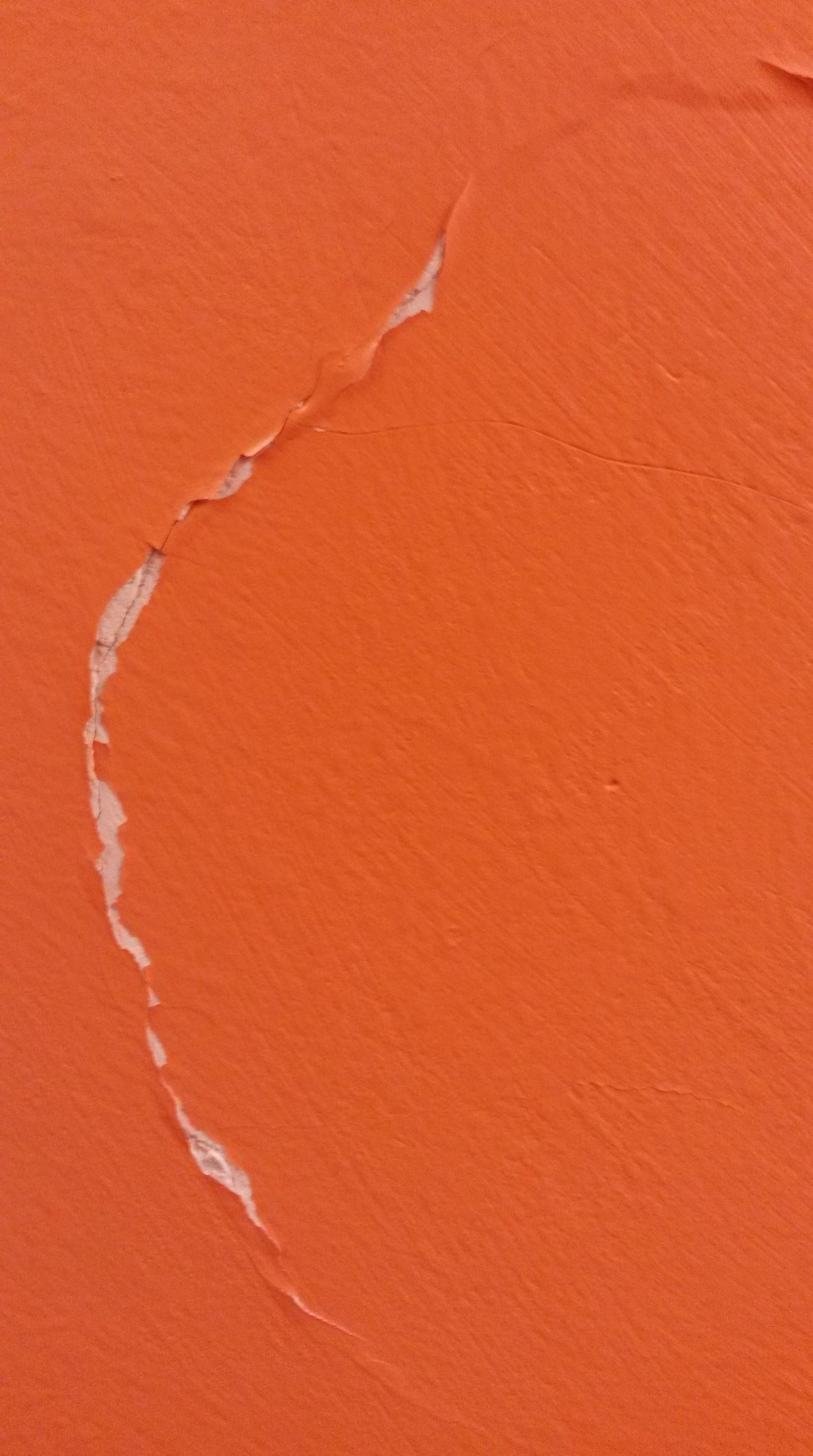
Look for natural processes that produce a drawing, for example the opening of the gills of a mushroom to release its spores, the dropping of lily pollen, animals scratching against trees or footprints in wet mud. Even the silhouette of tree branches against the sky can be read as a drawing. Collect photos and sketches of nature’s drawings. If you prefer, you can do the same thing for industrial or urban processes.
Part 1

Tree reflections on glass
My cat’s foot print after walking through charcoal
Tree silhouette
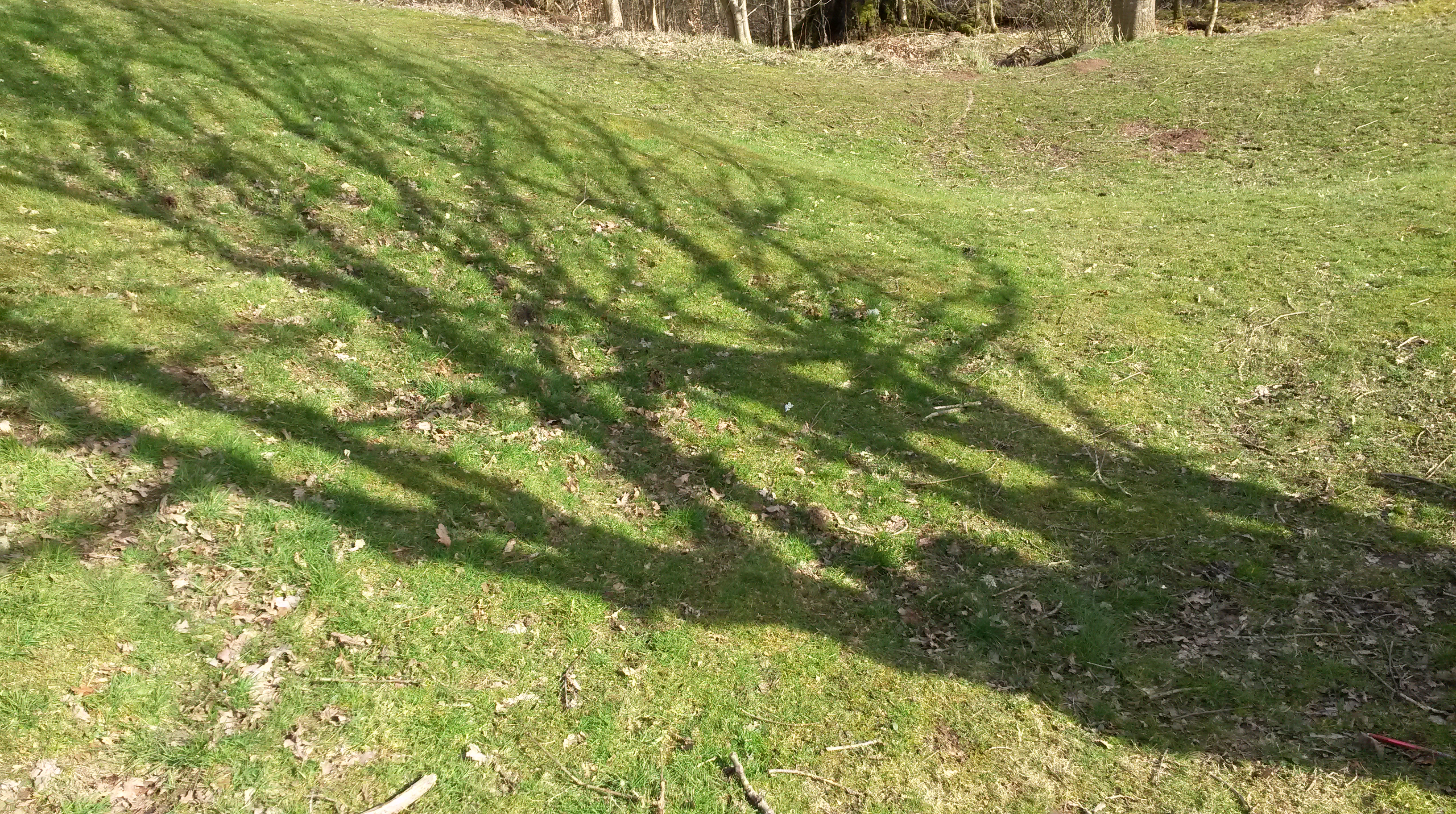
Tree shadows
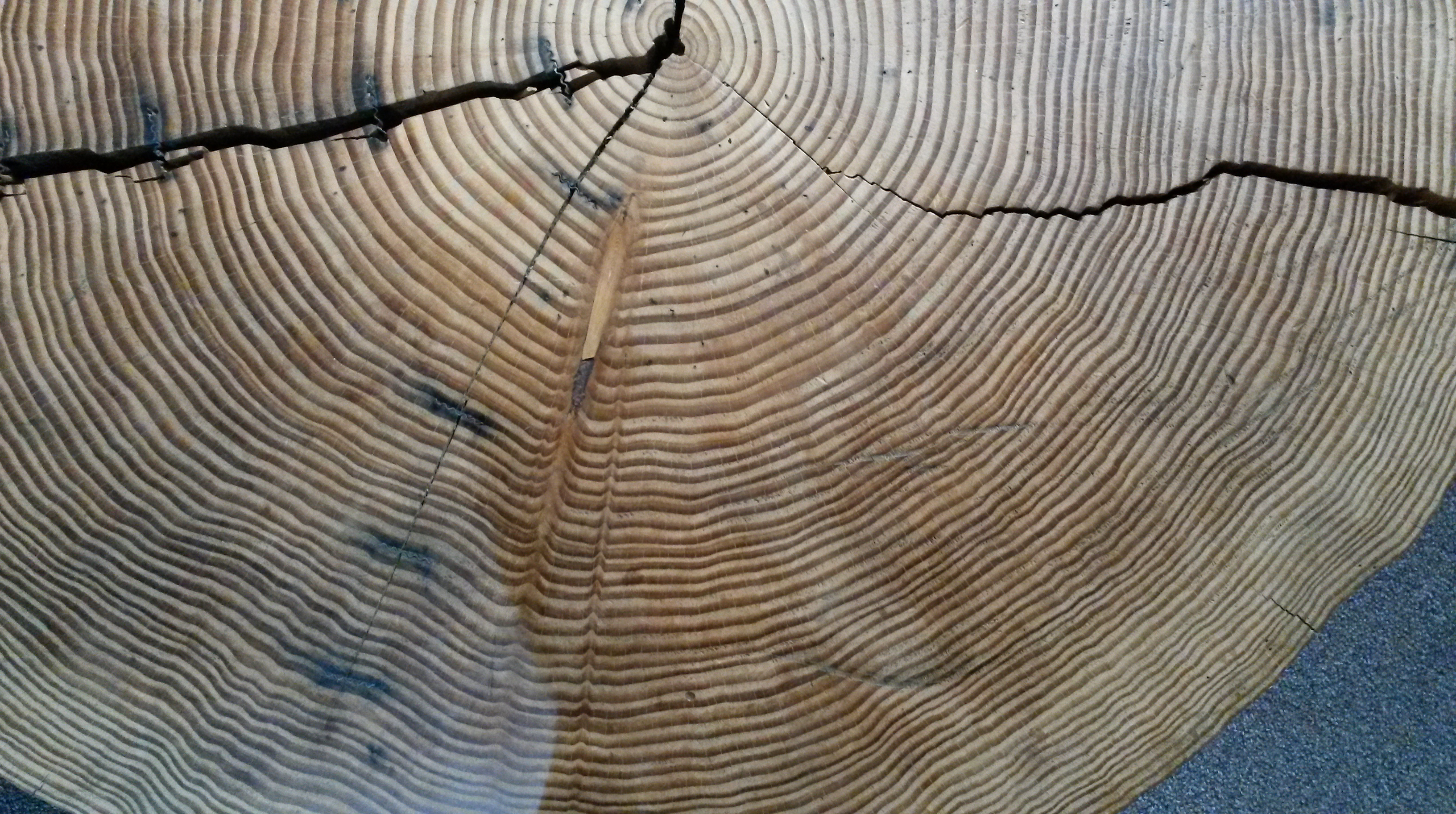
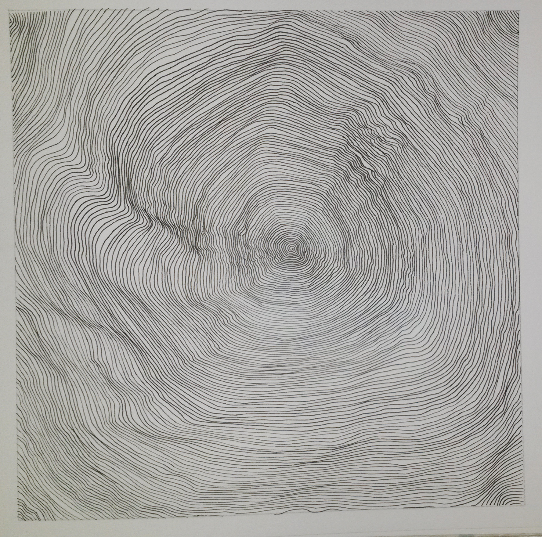
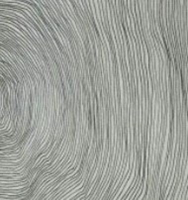
Cracks on tree rings
Subconsciously, I’ve focussed on trees; reflections of their form, negative space between the lines of the branches, shadows of the branches, and the linear qualities of the rings in the trunk, interacting with angular lines of cracks. This last image interests me the most.
Collect up all your found images and think about how you might use them either to inform your mark-making or as the starting point for a drawing.
The rings of the tree trunk remind me of finger prints; another natural found drawing.
This reminds me of some of the rose drawings I did for Assignment 2.
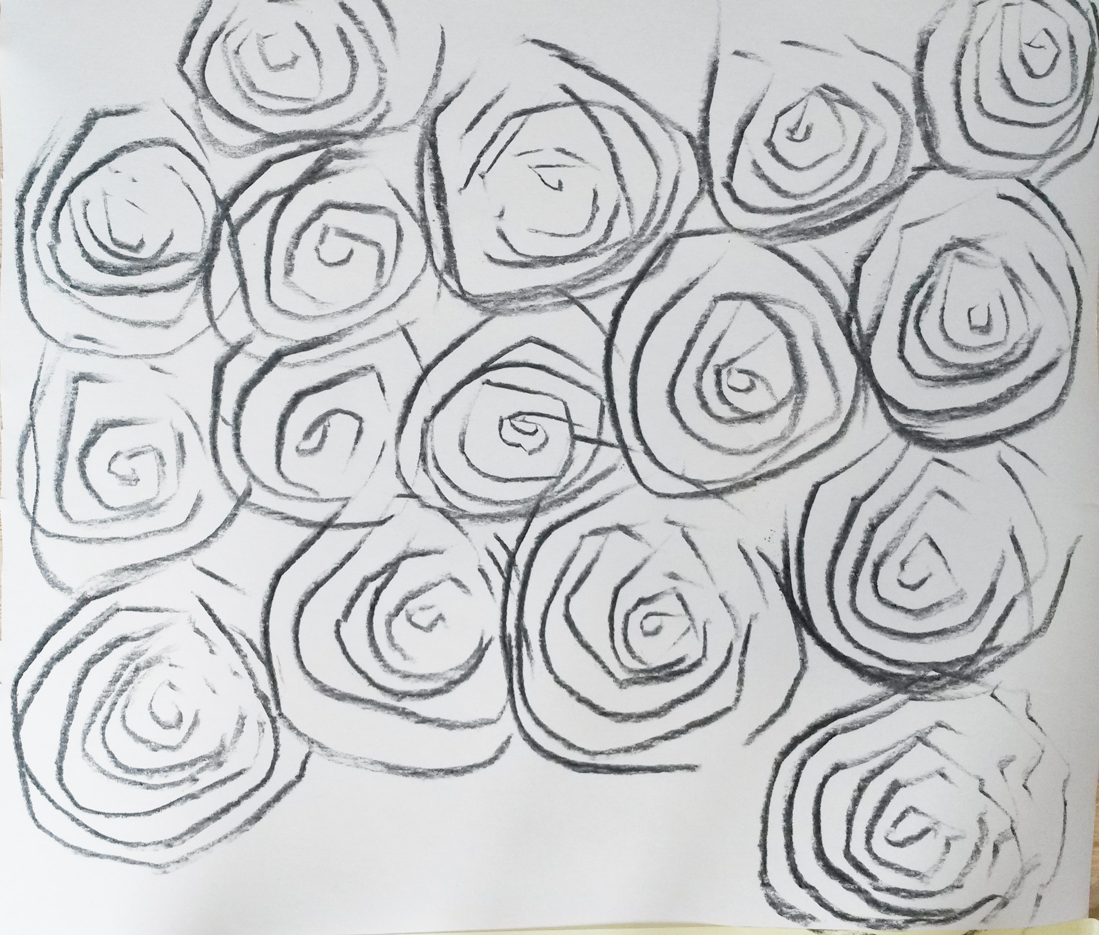
I’ve looked at other artists whose work looks as if it was inspired by concentric, or undulating lines, such as Daniel Zeller, Jill Baroff and David Connearn.
This inspired me to do my own spiral drawing. I’ve always doodled making spirals and enjoy the precise control and concentration needed.


http://www.galleryjoe.com/artists/baroff
http://www.patrickheide.com/artists.php?id=25&view=detail
Part 2
Following an enquiry with my Tutor I have decided to re-visit this exercise, focussing on my work place, the Jobcentre, with a view to this possibly feeding into my Parallel Project.
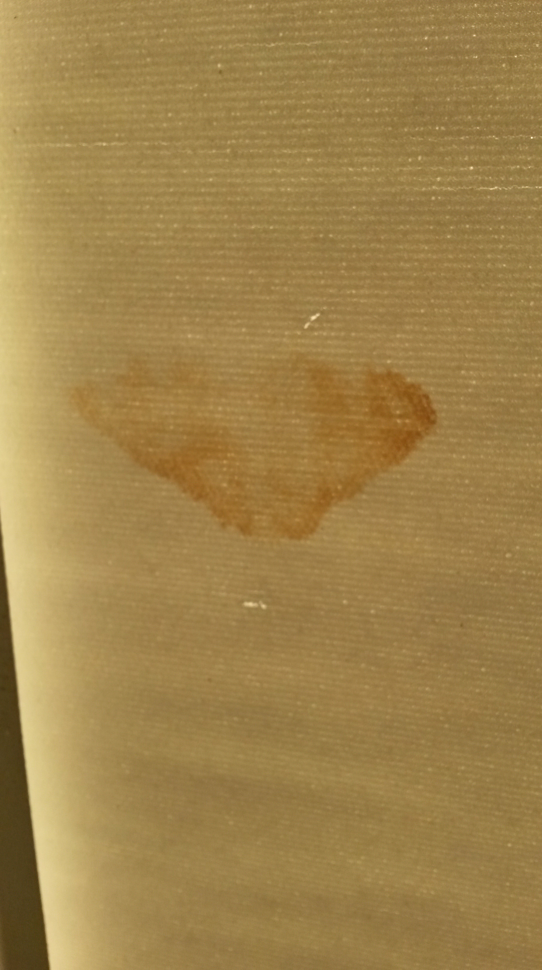
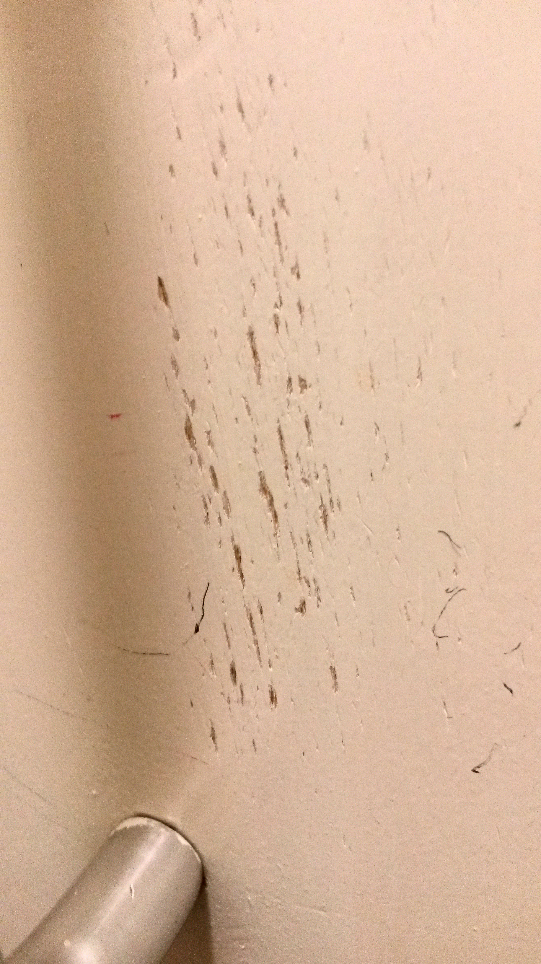
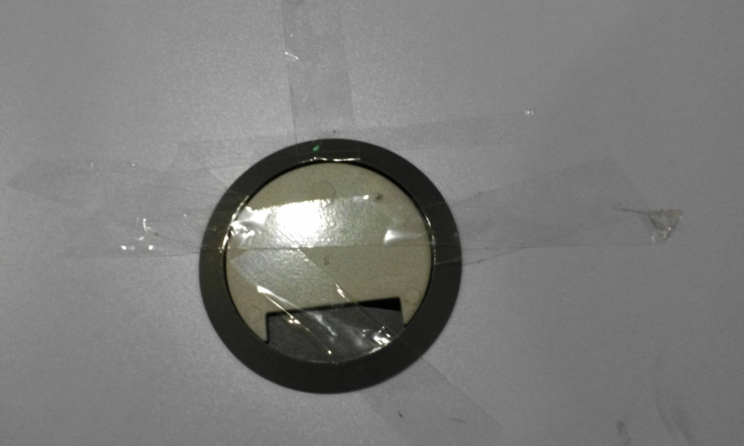
As part of my daily routine, I now have my eyes peeled, looking for found images; ‘drawings’; renderings, marks made unintentionally by the environment or my colleagues, or perhaps me. These are photographs of ‘drawings’ I have found so far.
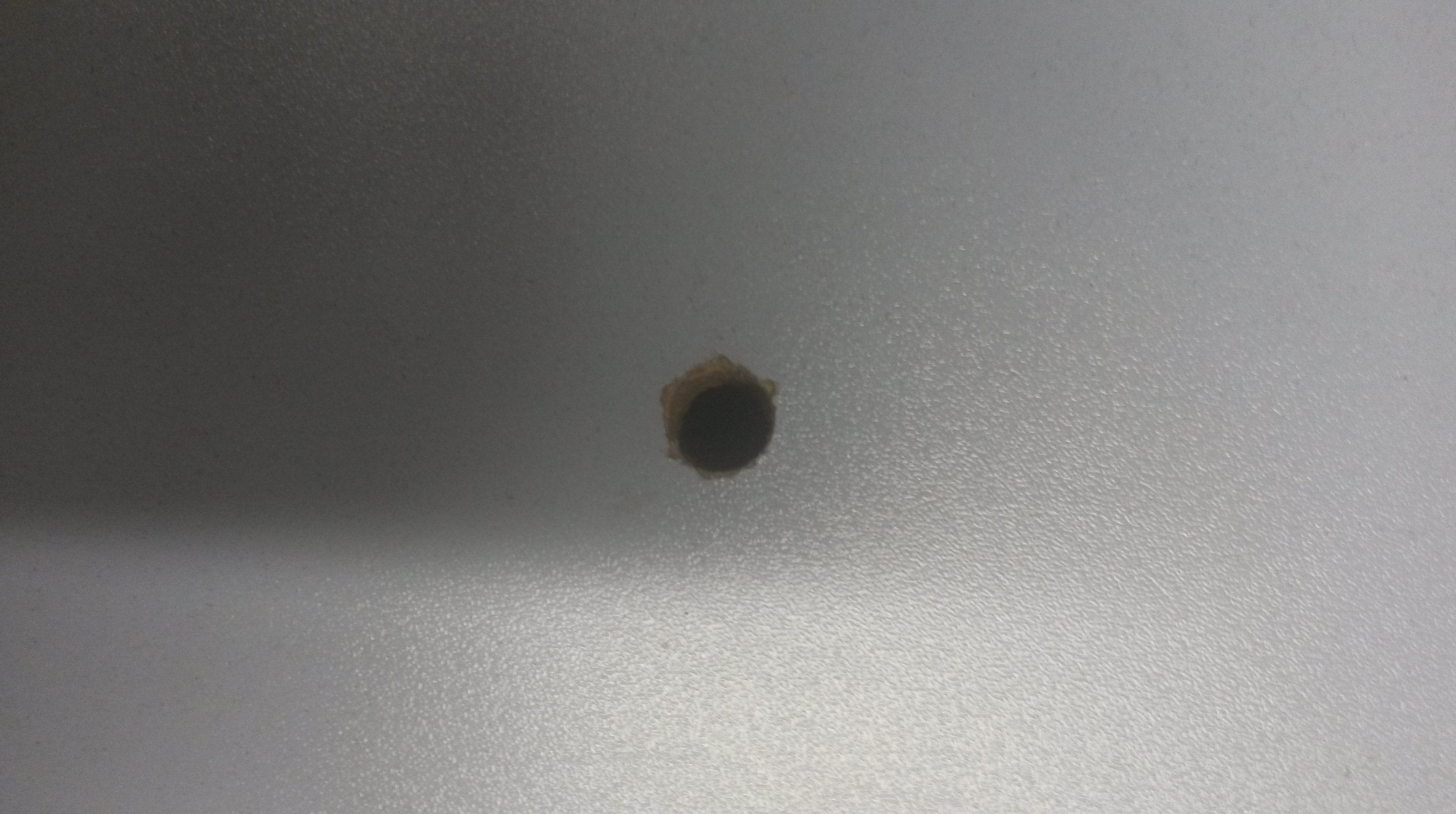
I hole drilled into a desk in the wrong place

The residue left by removing a sticky label
Another sticky label mark – these leave marks like maps
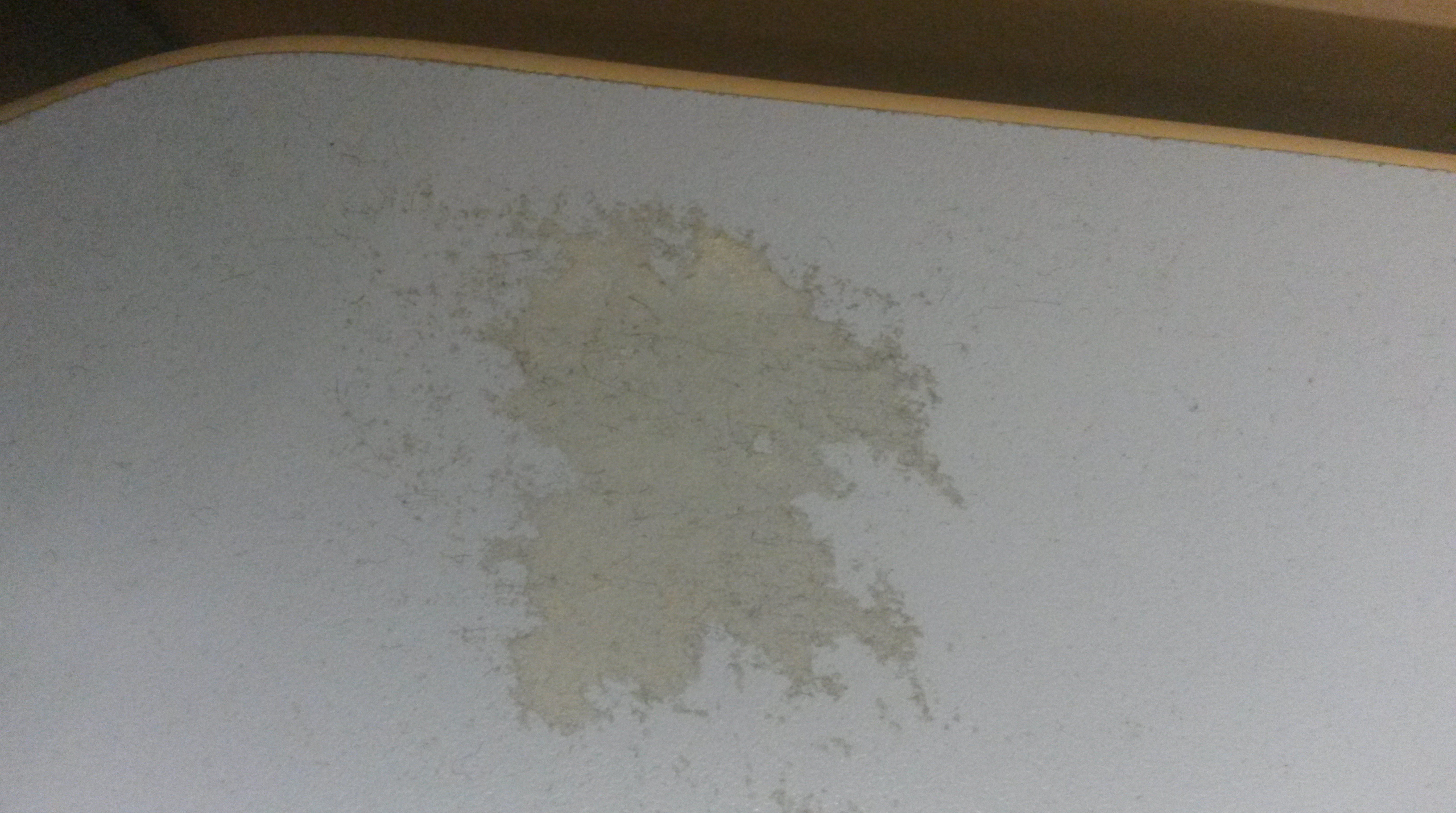
A water mark on the carpet where the air-conditioning was leaking
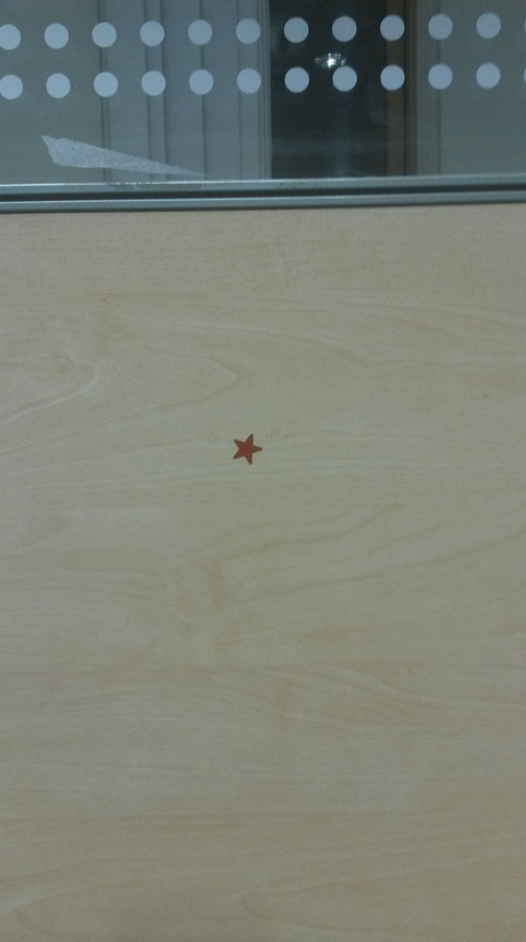
A red star sticker indicting that I have an alarm fitted to my desk
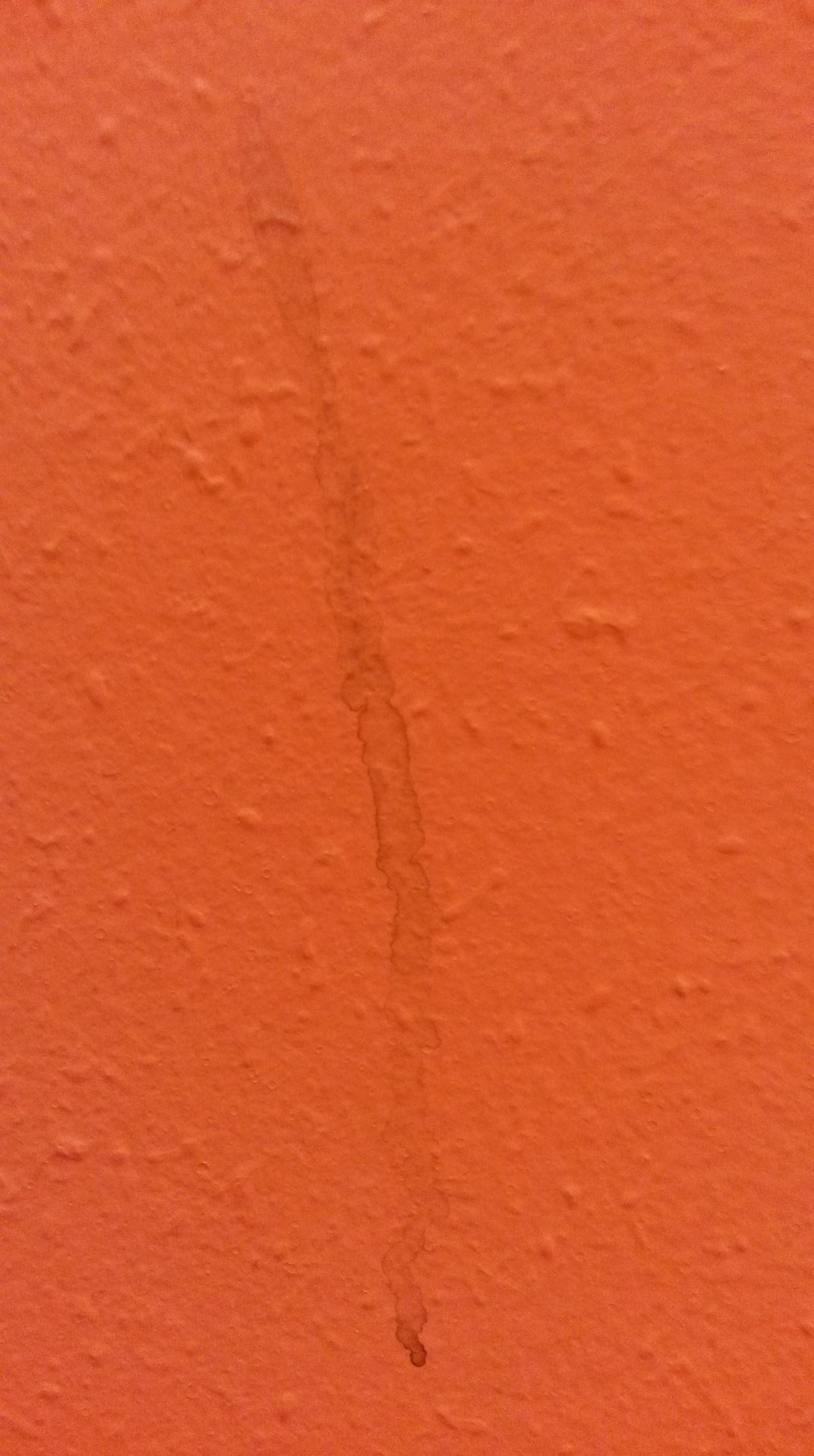
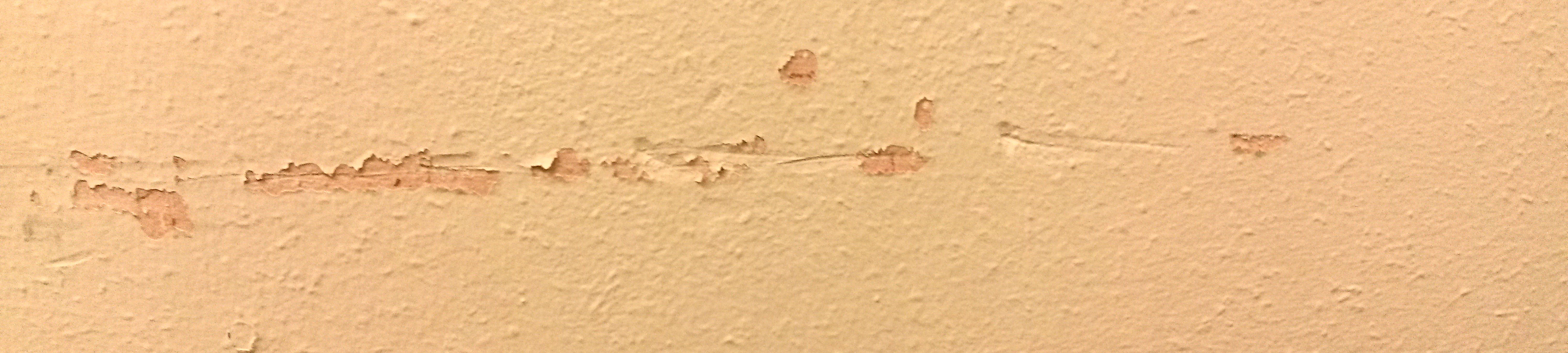
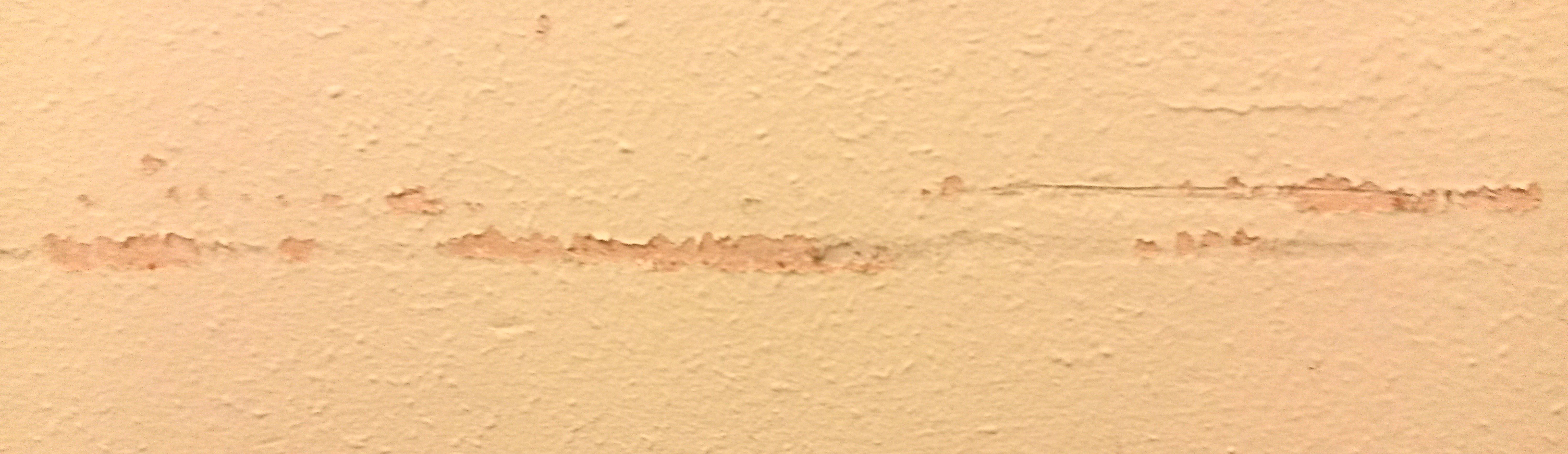
A tea? stain on the wall
A scrape on the wall (from moving furniture?)
A stain on a blind
Marks on the wall above the radiator
Sellotape on part of a desk
Without realising it, I have been doing this all along. These are some photos I had already take at work, before reaching this part of the course. I was drawn to the shadows cast by the dots on the Perspex dividers.
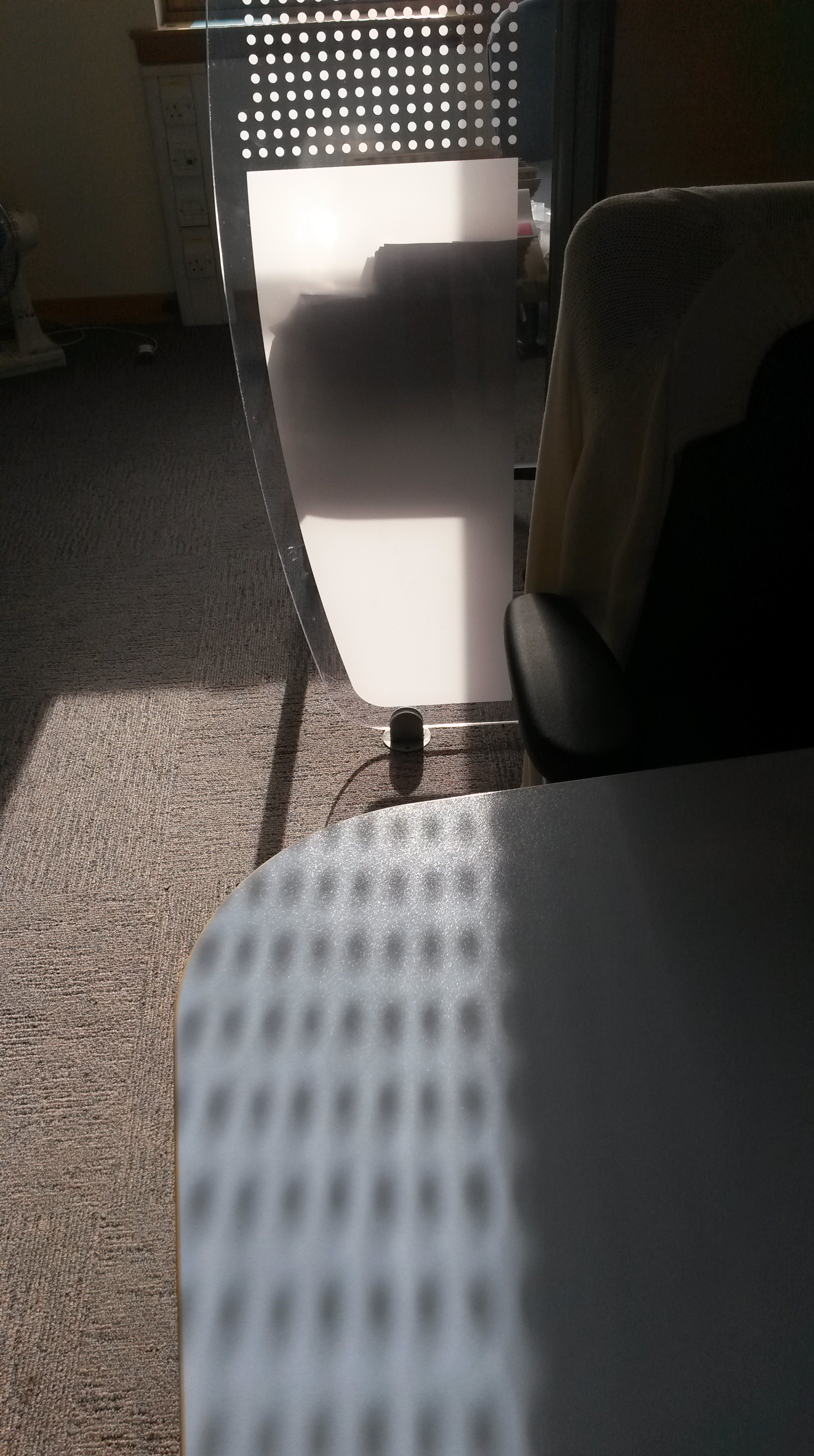
The dots, in particular, caught my eye, and the shadows they make when there’s strong sun light.
I used these ‘found’ drawings to influence these drawings;

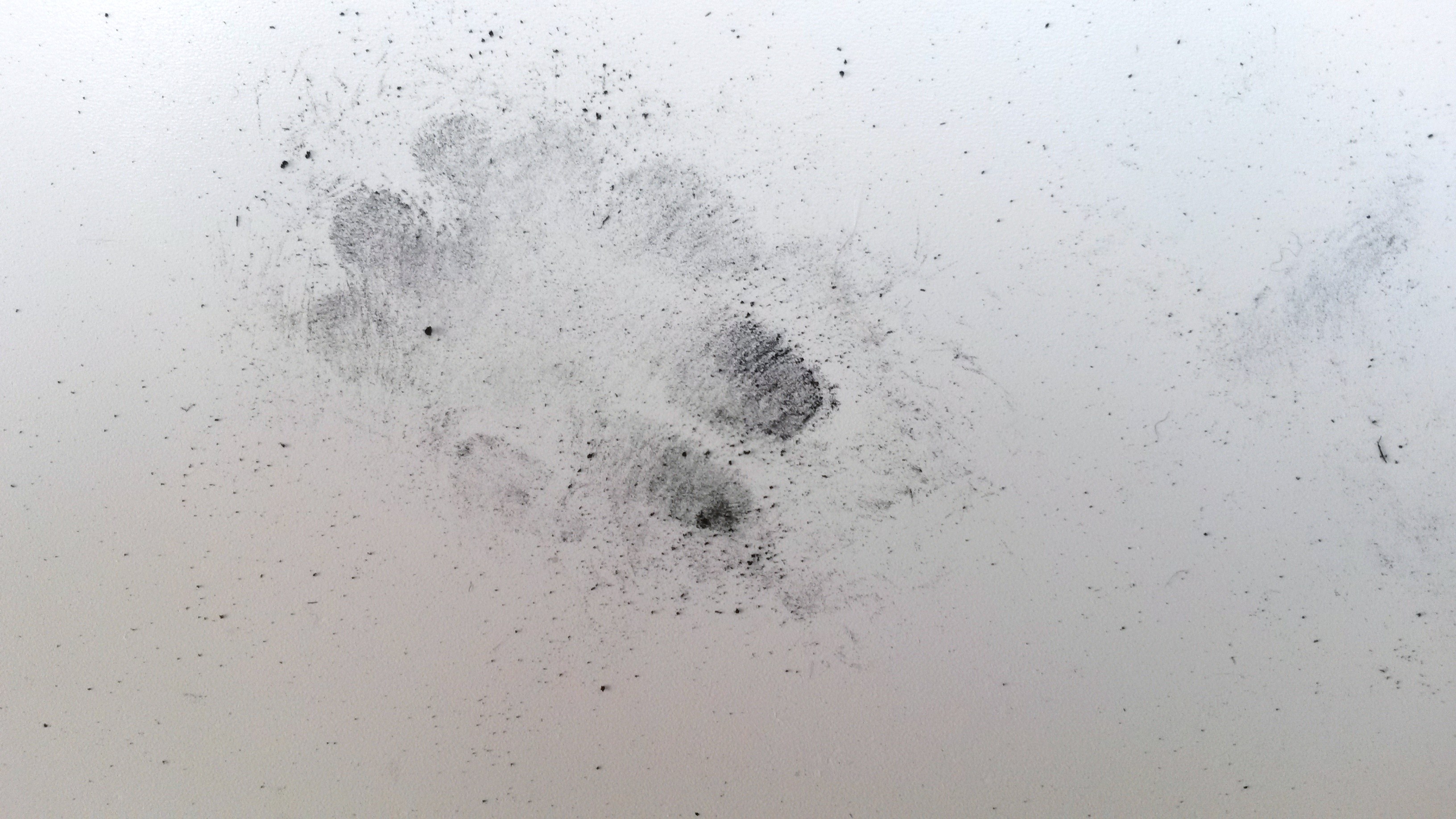
On reviewing the ‘found’ images, I really liked the sticky marks on the desks. I tried to replicate them and found the best way was to stick Sellotape to paper, then tear it off. It lifted some of the top layer of the paper off. To this, I rubbed a little charcoal dust.
Take 10 pieces of card and give them to friends. Ask them to write down a characteristic of someone in a novel or newspaper article in the first person. Ask them to choose something that might engender an emotional or physical response….As they read the statement out, try to change the way you use your materials to respond to the statement. Make angry, scared, joyful marks as prompted.
I decided to do a self-portrait for this exercise, mostly for convenience, but also because I was thinking about the research I’ve done on John Bellany and the self portraits he did in hospital following his liver transplant. These are very emotionally charged and he conveys the emotion he was feeling because he had survived the operation, when he had been convinced that he wouldn’t.
I am a little rusty at life drawing so decided to have a practice first.
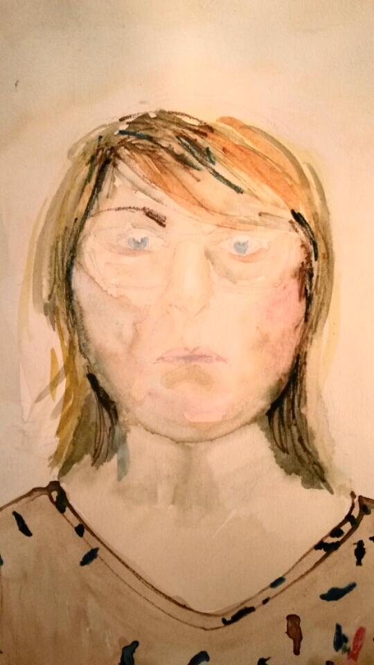
This was my first attempt, drawn with watercolour and watercolour pencil and using an easel. When I took it down from the easel I realised the proportions were way out. So I had another attempt.
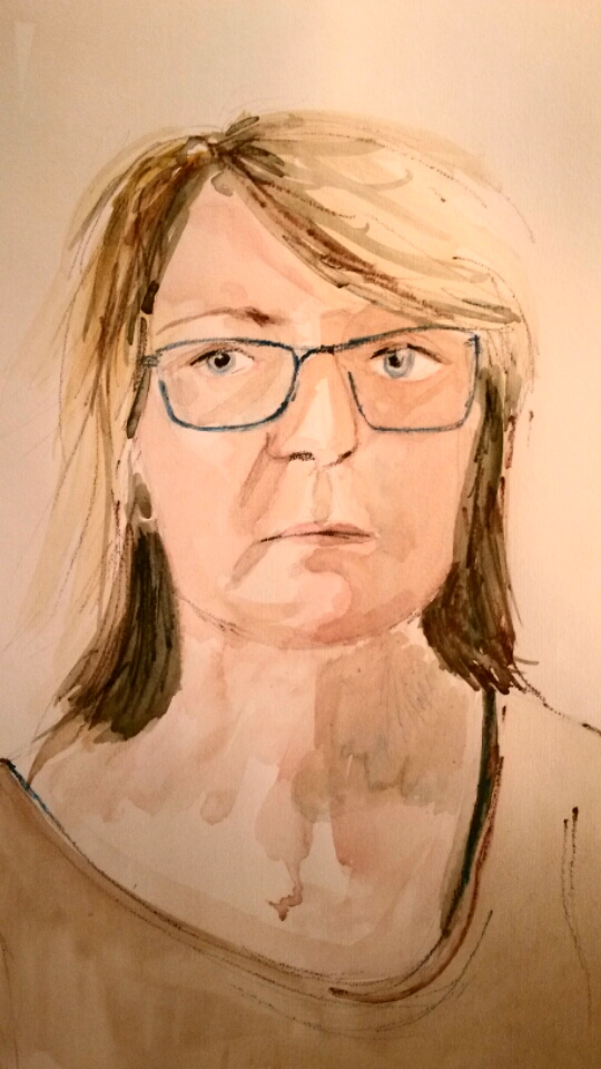
This was a little better, but I decided to try working from a photograph, so that I could concentrate on the mark making and not on the accuracy of the drawing.
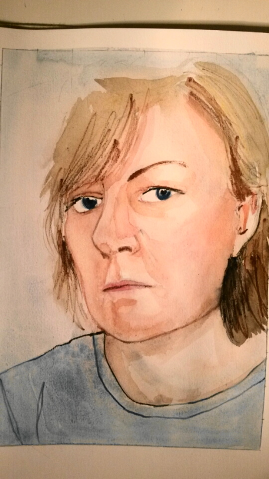
A3 sketchbook with watercolour and watercolour pencil
I thought this was a better starting point.
I had asked friends to email their little statements to my husband’s email address. He then printed them without showing me. I had them folded up and I began to draw another self-portrait using the photograph as before. Once I had pencilled in the basic drawing I looked at one of the statements. The first one read; ‘I am drunk and disorderly and I cannot take any more riddles. I killed someone today, I can kill you too.’
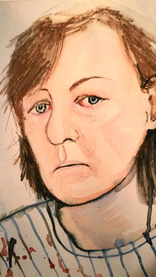
A3 sketchbook with watercolour and watercolour pencils
I used a lot of black in this drawing. I tried to made the gestures scribbly and loose. The striped t-shirt with blood spots was in homage to John Bellany. On reflection I think it has an air of despair, not madness to it.
The next statement was; ‘Even as a child, I had preferred night to day, had enjoyed sitting out in the yard after sunset, under the star-speckled sky listening to frogs and crickets. Darkness soothed.’
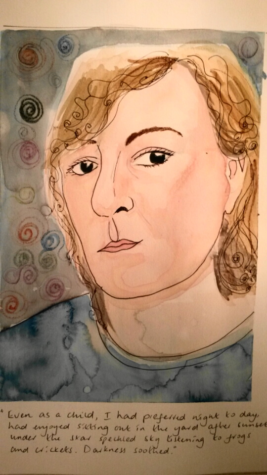
A3 sketchbook with watercolour and watercolour pencil
I tried to use scribbly curls and swirls when doing this drawing. I made the eyes very dark. I was aiming for an air of mystery.
When I began to reflect on the work I had made I felt the drawings were more an illustration of the statement. There wasn’t much physical response in the mark making. I felt I had become distracted by the concerns I had about life drawing. If time allows, I would like to re-visit this exercise and explore an emotional response further.
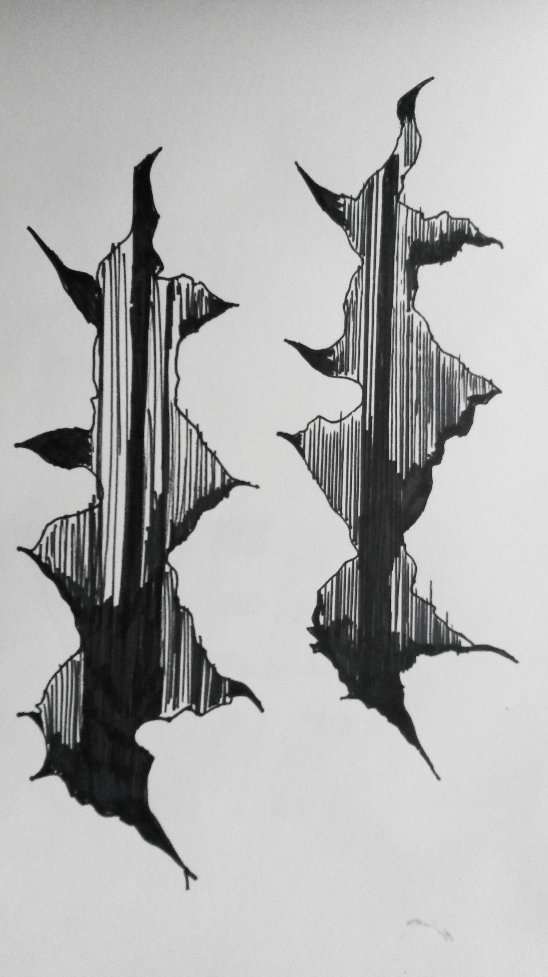
Find something which moves and attach a drawing medium to it so that it creates a drawing by itself…..Develop these automatic drawings using source material from your sketchbook or simply by responding to what you find as you experiment. Note carefully what happens when you shift the drawing from automatically produced marks to considered ones.
I didn’t have a clue where to start with this one. I began by twisting an elastic band round two pieces of charcoal until the tension was such that when I let it go, the charcoal twists round at speed, but the results were disappointing.
Next I tried attaching charcoal to the blades of a hand blender but when I switched it on the charcoal came flying off at high-speed and I was in danger of losing a finger.
I then tried attaching charcoal to my electric toothbrush, suspending it from a table over paper and the results were much better. I also found it helped to let it sway a little, like a pendulum. The vibration caused it to rotate in a circular motion, without any interference from me, so it kept moving round the paper for the two minutes until it switched itself off.
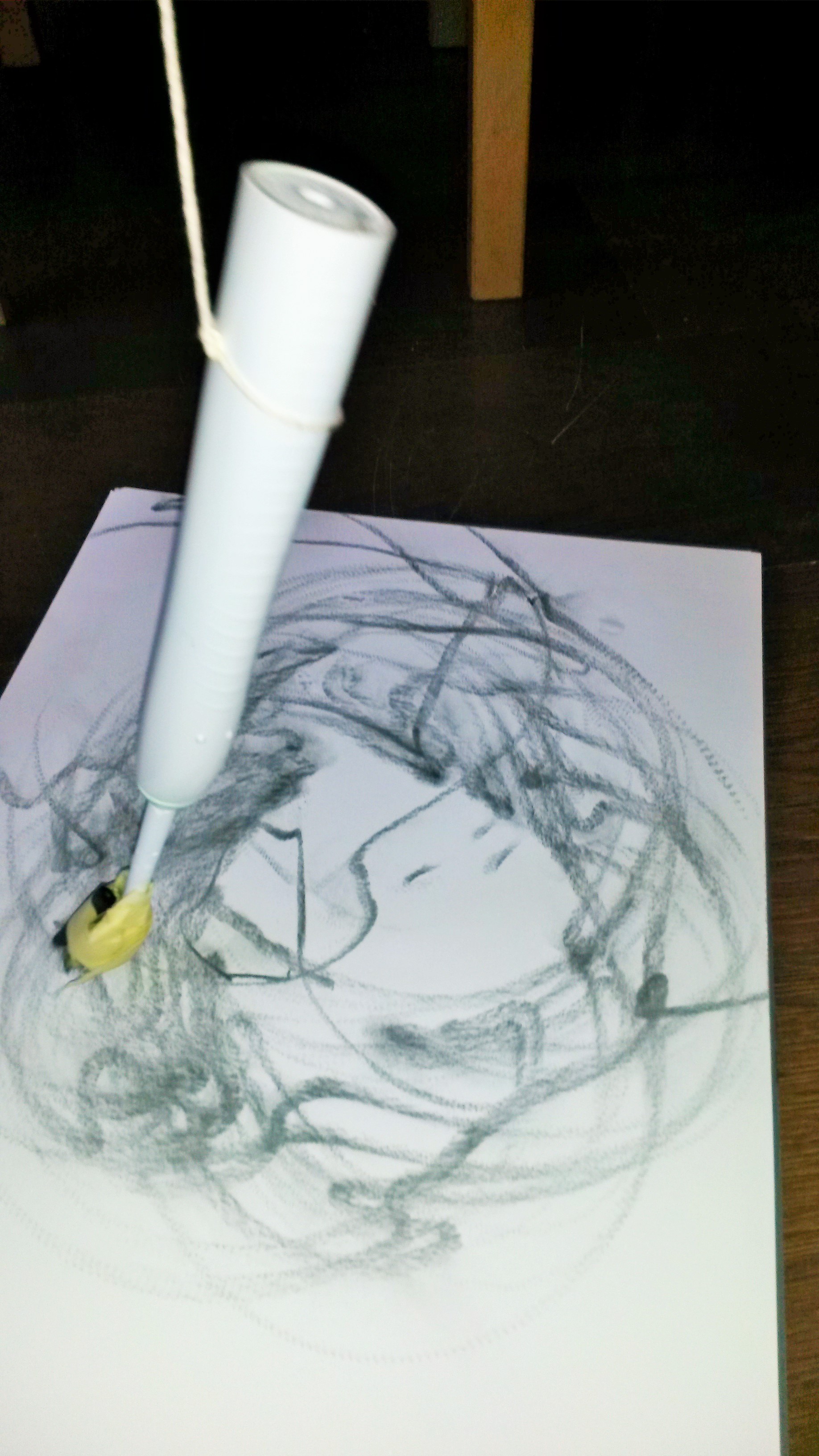
I was pleased with the result.

Charcoal on A3 paper
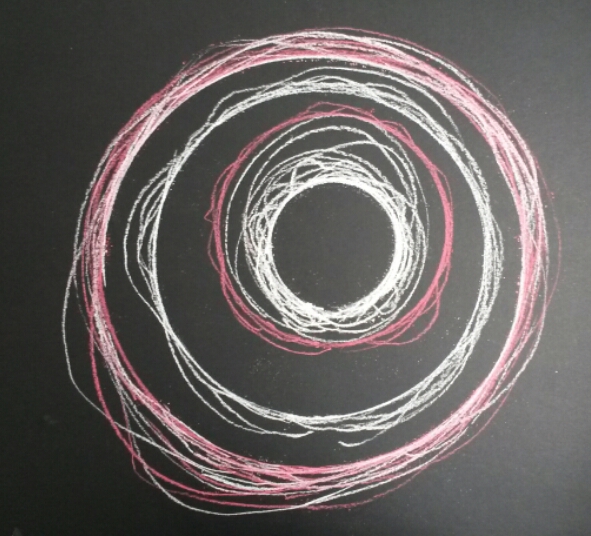
I tried the same process, this time using red and white pastel on black paper.
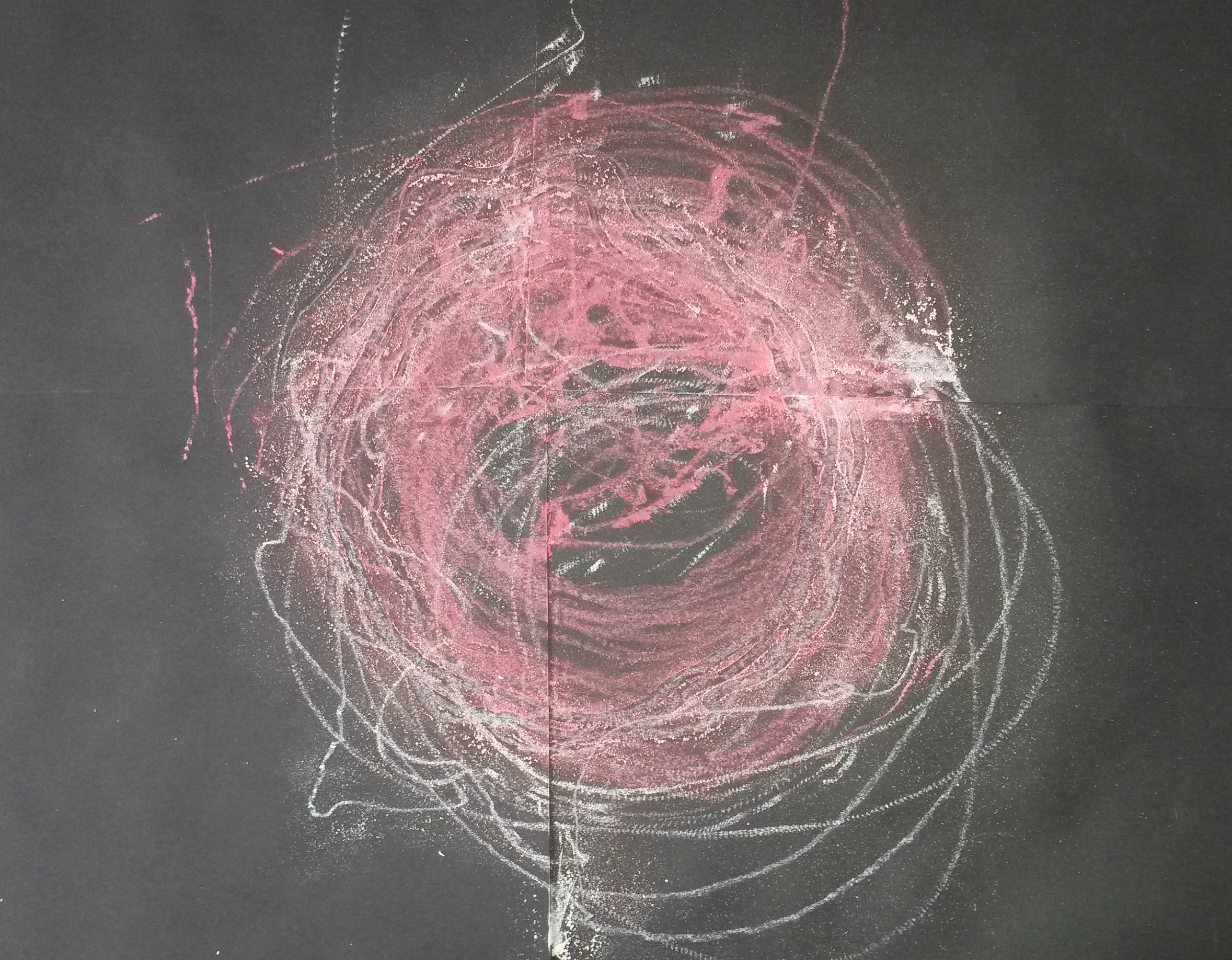
4 x A4 sheets of black paper with pastel
I like the outcome. I like the marks the circular motion has made, and the squiggles where it has gone its own way.
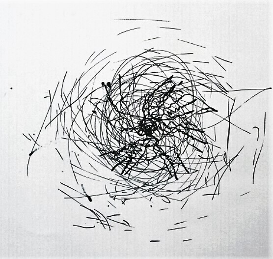
I tried using a black marker pen and the results were different, but equally as interesting. The weight of the marker as opposed to the light pastel, gave it more resistance and made the movements jerkier.
When making further attempts, my son came in and on observing the jerky movements as the pastel came into contact with the paper and the vibrations became louder, he observed “Oh it’s angry”. This made me smile as I thought of Rebecca Horn and her assertions; ‘My machines are not washing machines or cars. They have a human quality and they must change. They get nervous and must stop sometimes. If a machine stops, it doesn’t mean it’s broken. It’s just tired.’ (The Bastille Interviews 11:Paris 1993).

I found it interesting that, despite using the same ‘machine’, with the same method, i.e. the media attached to the machine, which is tied with string and attached to a table top, the results were often very different, and I found it hard to replicate a previous result. I think it depended on a number of things; how close the media was to the paper, i.e. whether it was resting lightly on it, or leaning heavily on it, whether there was any momentum making it go round, what resistance the media gave, e.g. the pastel was very responsive, leaving delicate marks, whereas the pen was quite clumsy and heavy in comparison.
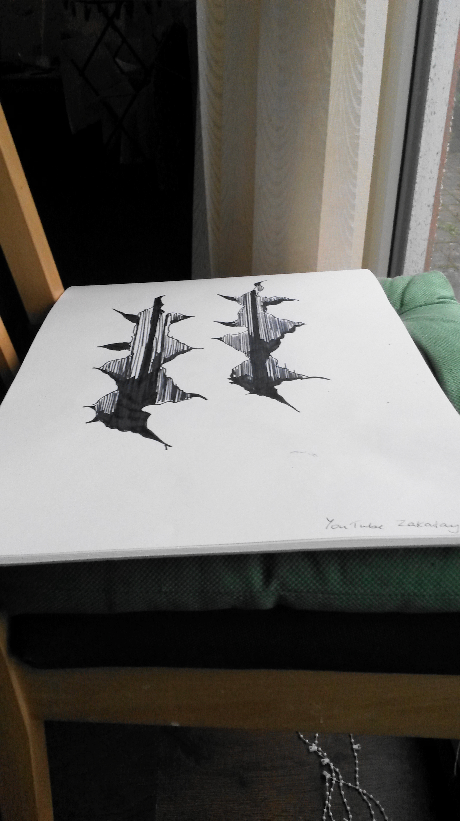
As a contrast, I tried to replicate the machine drawings by drawing them myself.
Because of the circular elements, I used a large plate, medium plate, bowl and cup as ‘templates’, as I knew I wouldn’t be able to draw circles freehand accurately. I used a charcoal stick and drew round each object, trying to vary the pressure and allowing my hand to slip and go wider than the plate etc. I found it extremely difficult to intentionally draw ‘accidently’. The result was interesting, but I much preferred the ‘machine’ drawing.