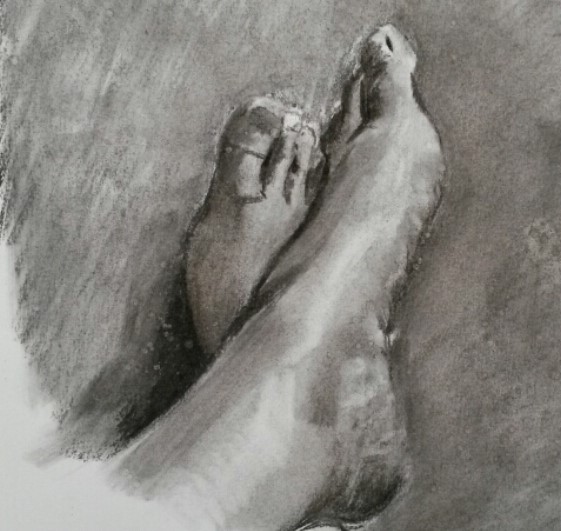
Set up a reasonably large still life, for example two or three chairs piled together. Make yourself some drawing tools by attaching pencils or pieces of charcoal to the ends of bamboo canes or similar. Place a large sheet of paper on the floor and try to draw your subject using these super-elongated pencils. You’ll have less control but you may find that little movements you make have big results as they are magnified by the canes. This will lead to a very sensitive responsive mark.
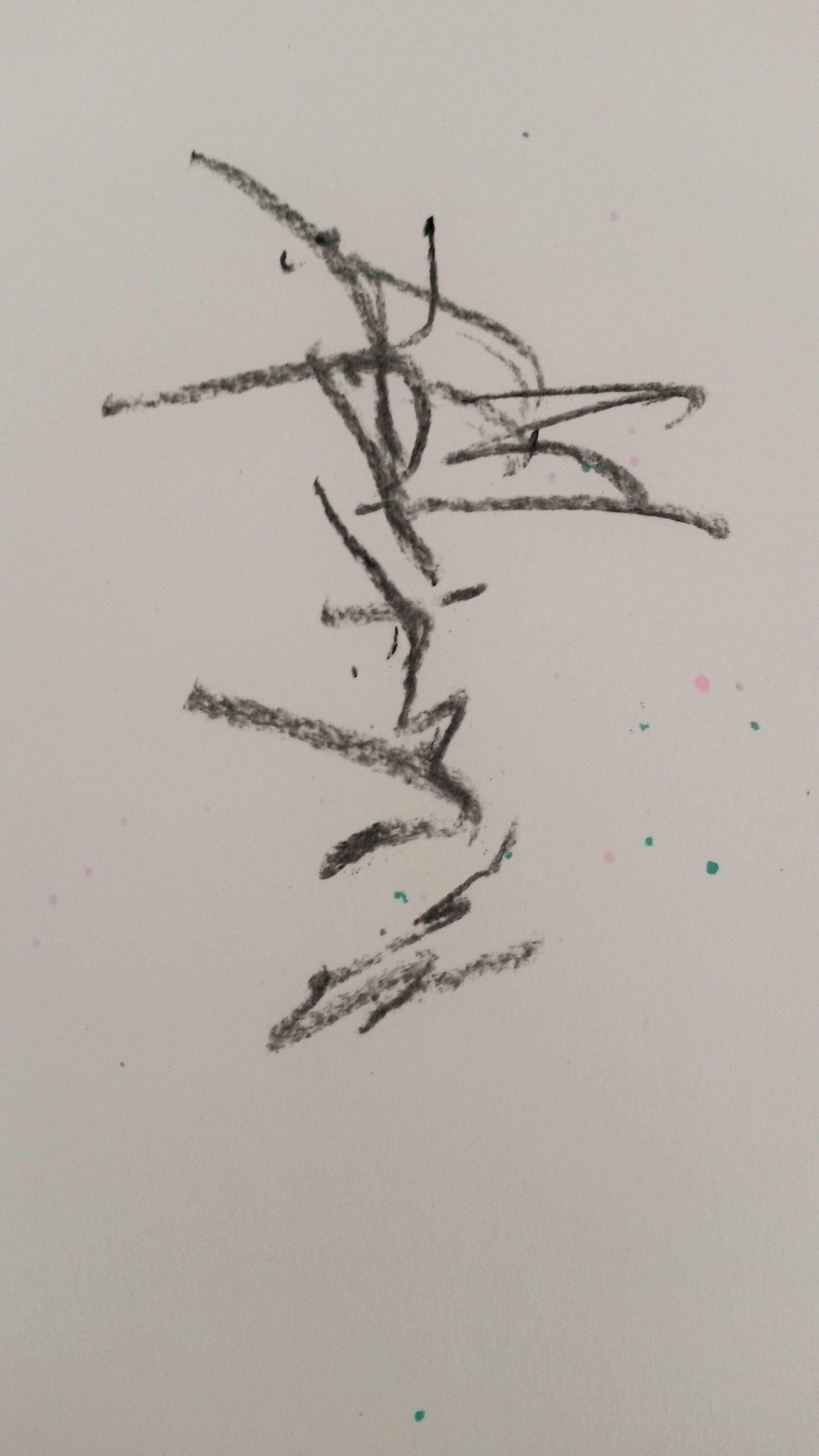
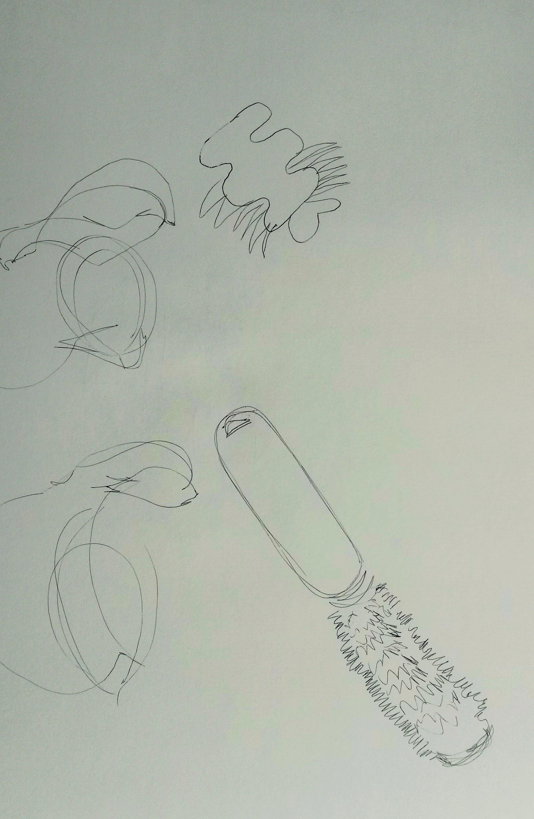
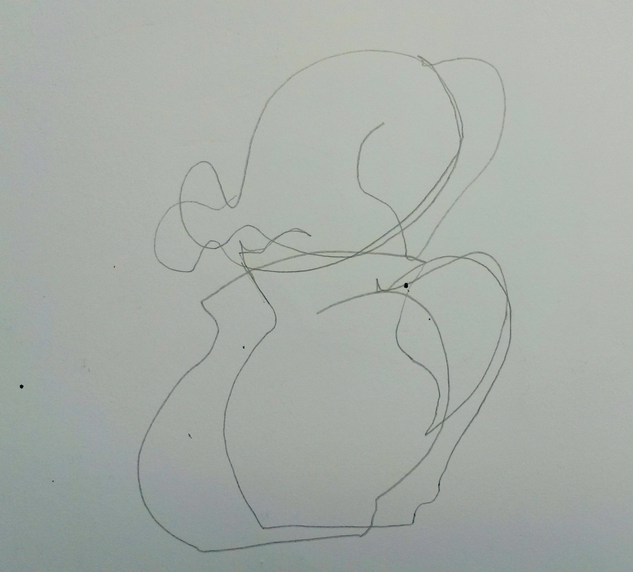
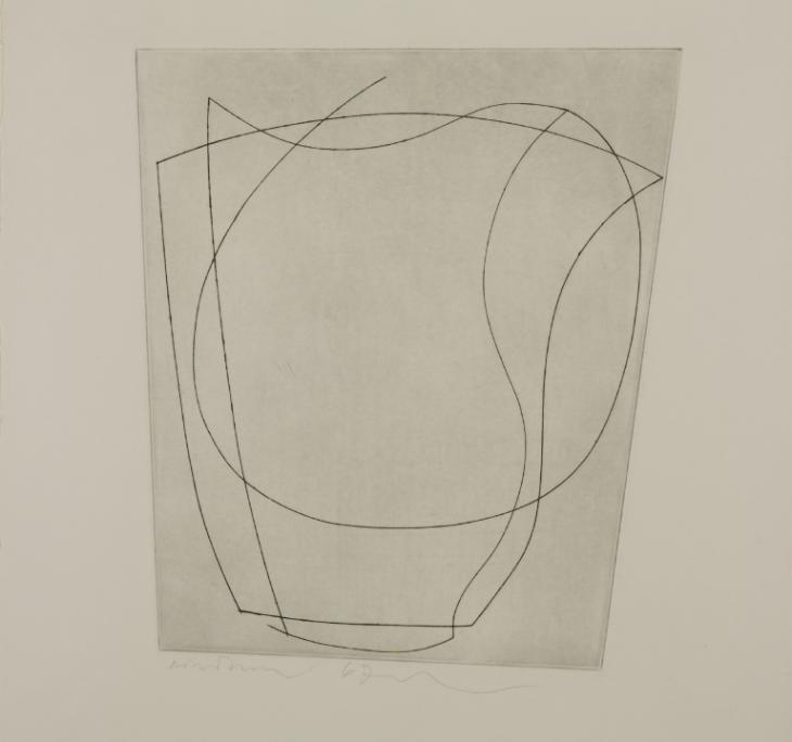
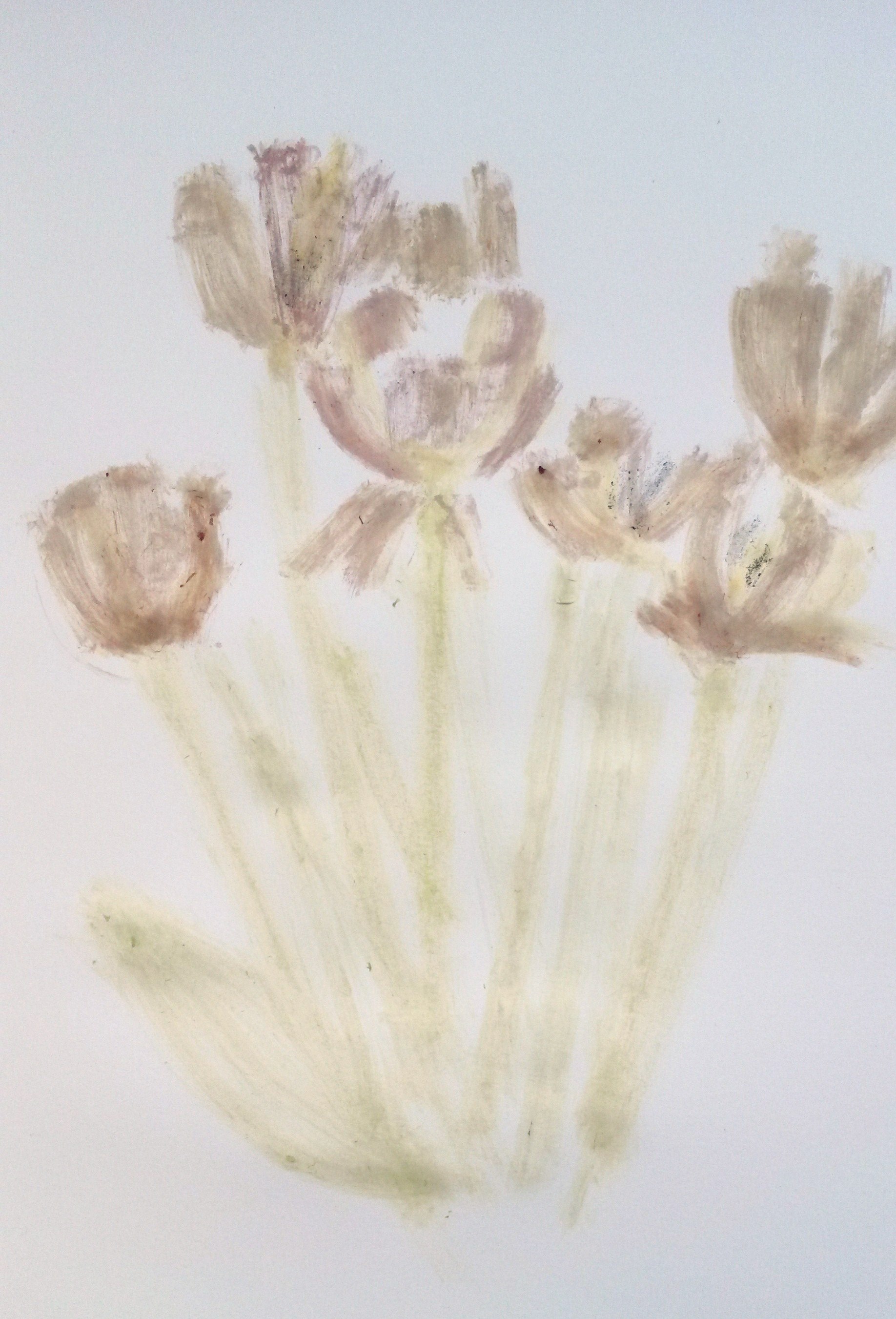
With my tutors words still in my ear from Assignment 2; ‘Look around you and find things to draw instead of setting up a still life’, I looked around and saw a large vase with drooping sun flowers. I attached a piece of charcoal to the bamboo cane, which was 125cm long and had a wee try out on a piece of white paper.
I only made a few marks and the charcoal was difficult to control, but the marks were interesting; a bit like calligraphy or Japanese symbols.
I knew I needed a large piece of paper to draw on and found a large sheet of cardboard. I didn’t move the vase but left it where it was. I drew the vase and the wall in the background. I found it difficult to draw the straight lines of the vase and get the angles of the skirting board right, because your focus is on trying to control the charcoal. I enjoyed doing the scribbly marks for the withering sunflower petals. The result was okay. I liked the strong confident lines of the stems of the flowers.
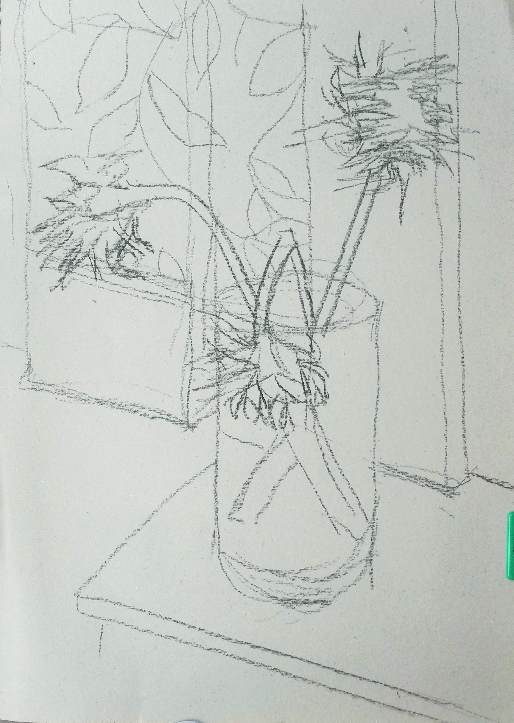
Charcoal on grey cardboard 45cm x 60cm
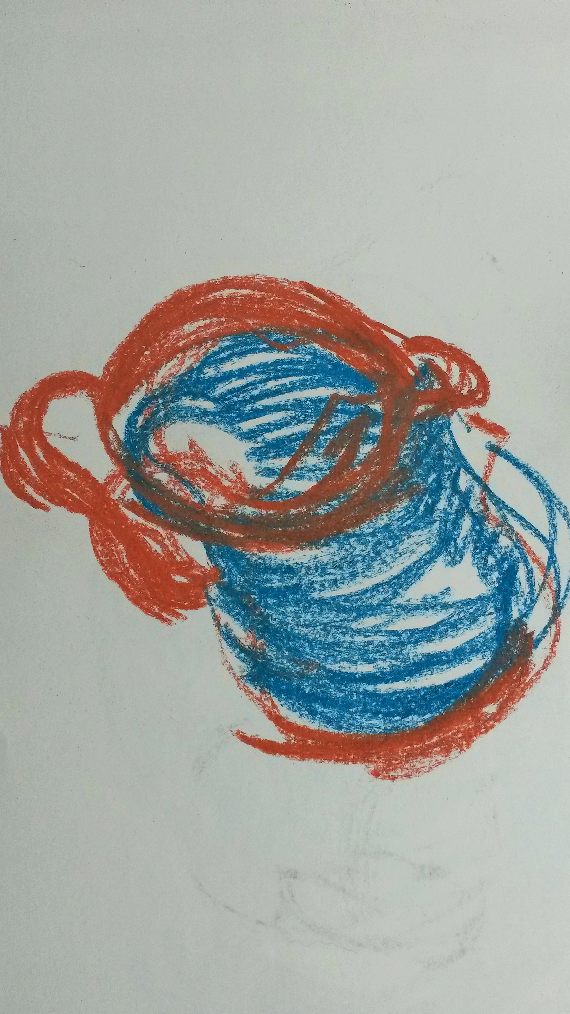
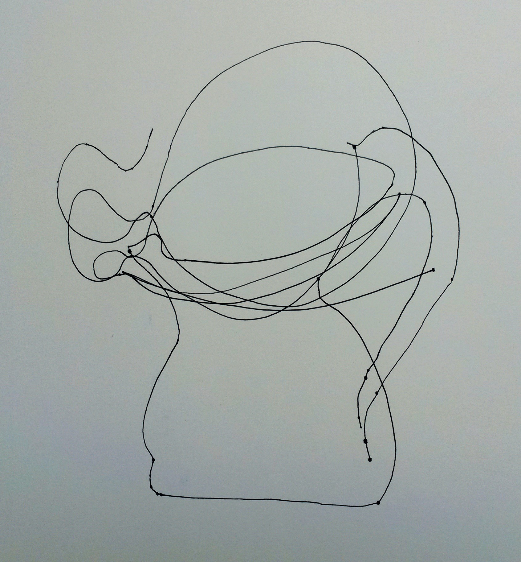
As a second stage, if you like to add colour, grab a handful of wax crayons, pastels or pens for each colour. Hold them with your fist and draw with them all at the same time.
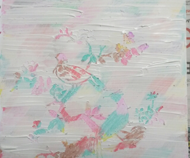
I used soft pastels. I don’t have a huge amount of colours, so used 3 for each colour, trying to be as loose as possible, and leaving the grey of the card board for the lighter tones.
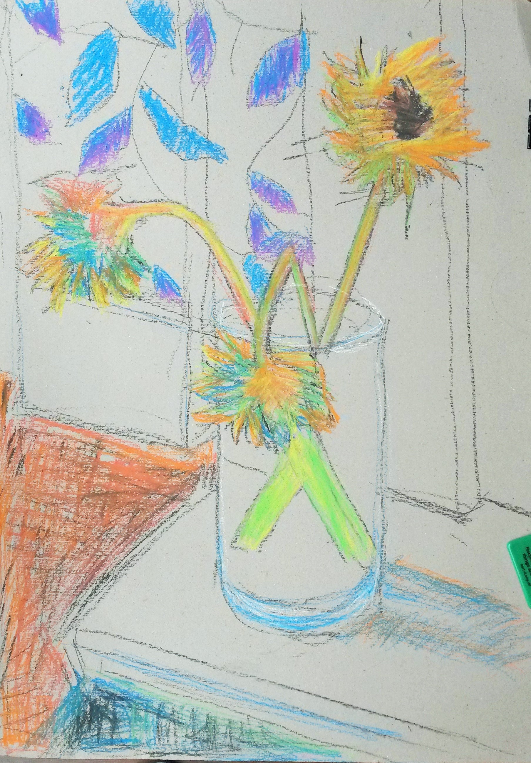
Charcoal & pastel 45cm x 60cm grey cardboard
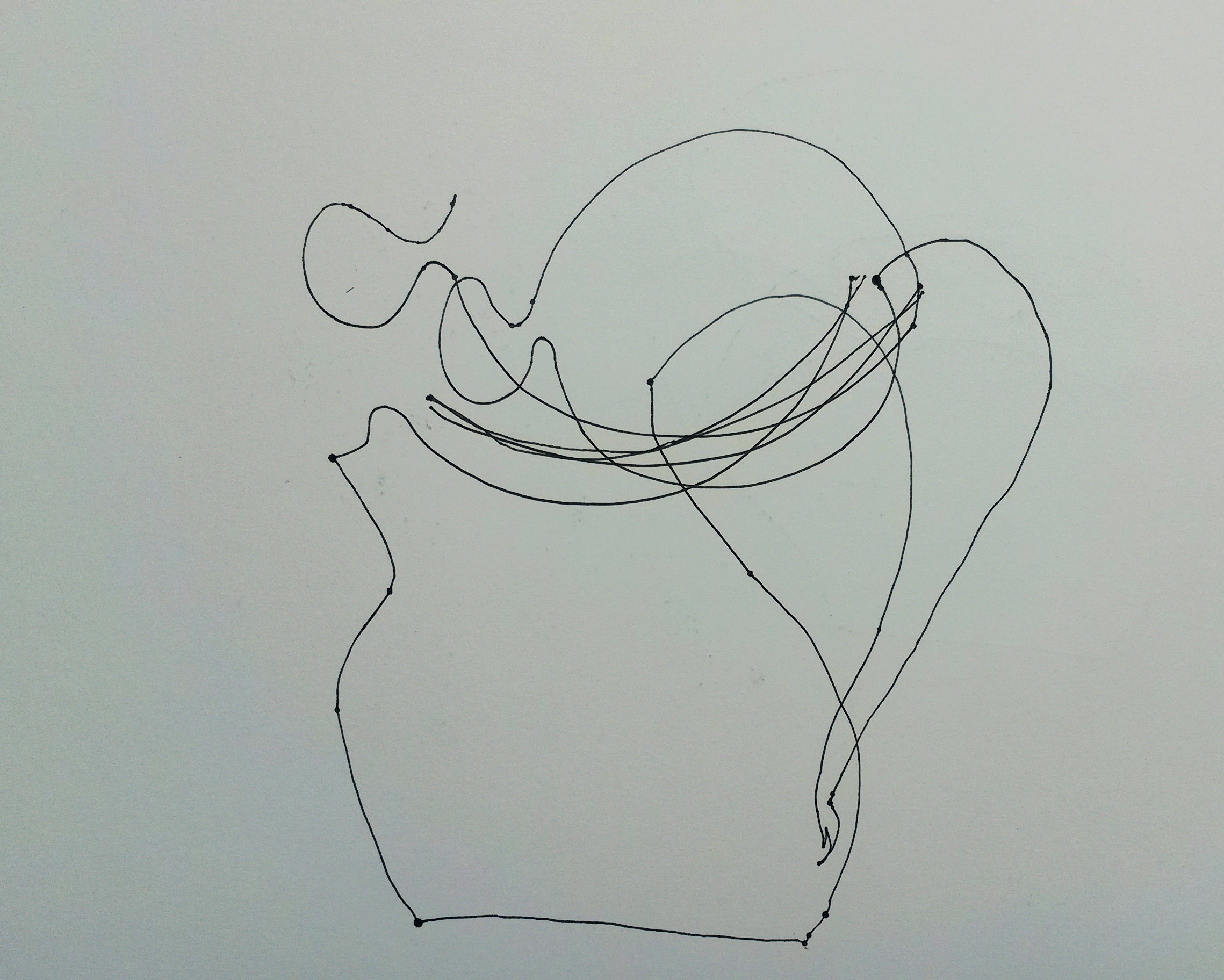
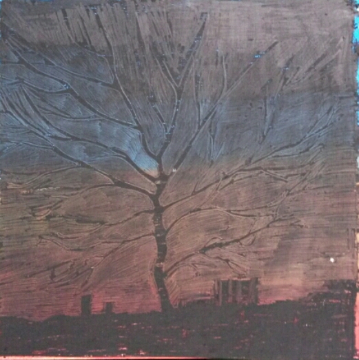
I made another attempt using an old paper sack to draw on. I used the same method with charcoal.

Charcoal on brown paper 40cm x 80cm
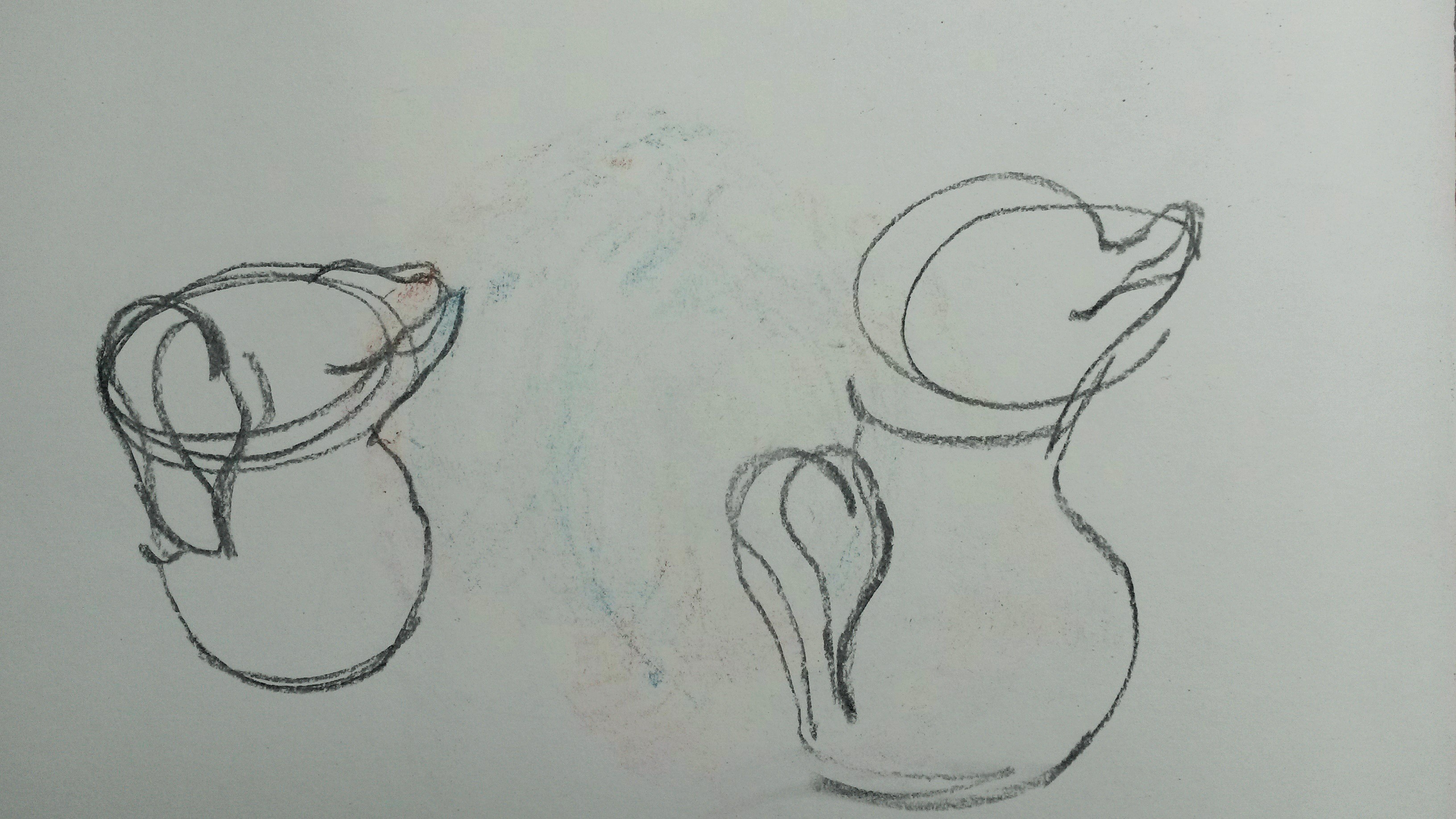
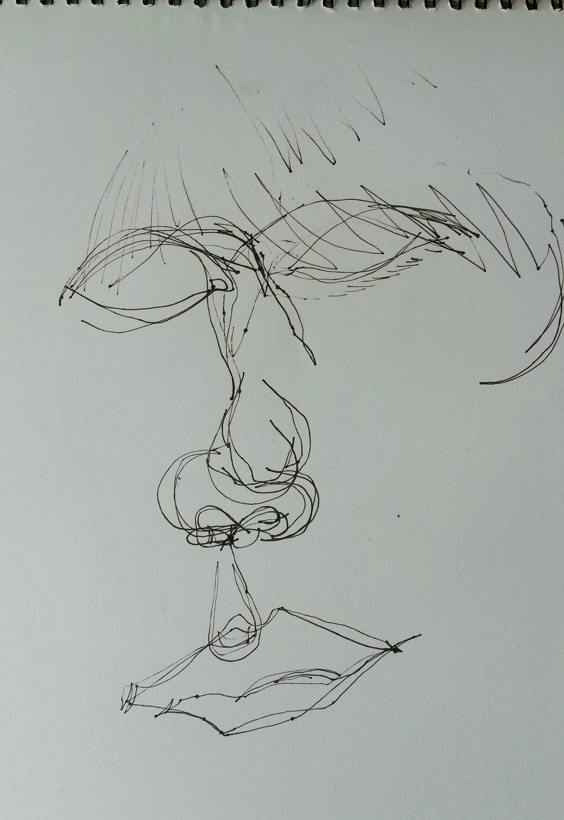
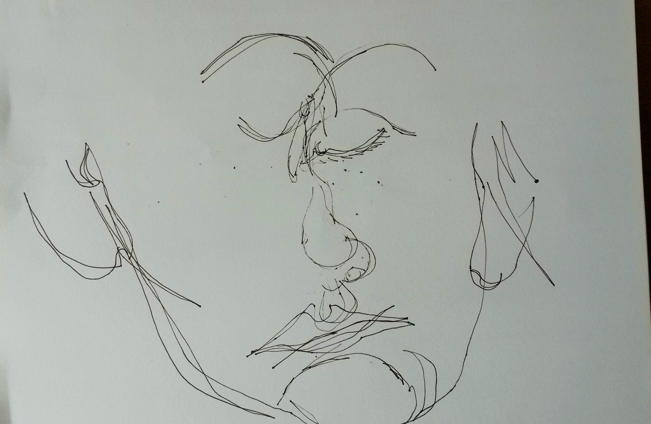
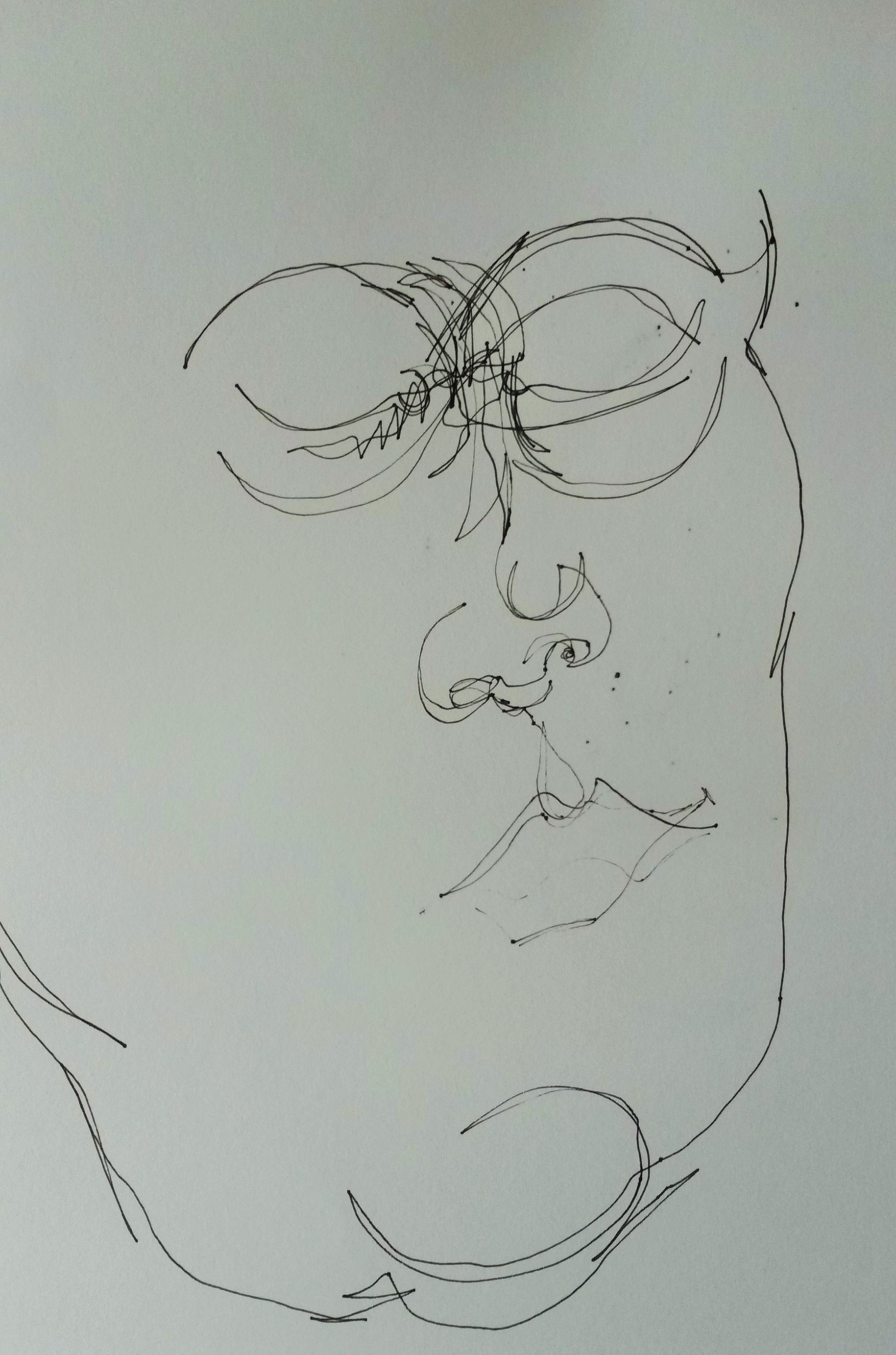
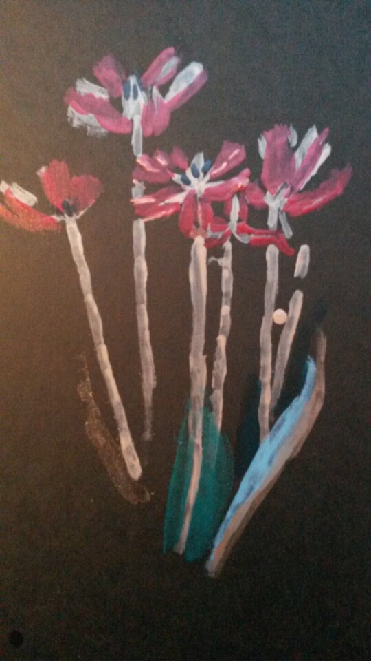
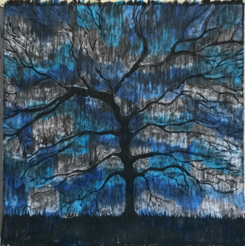
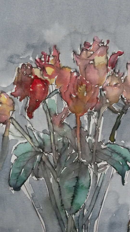
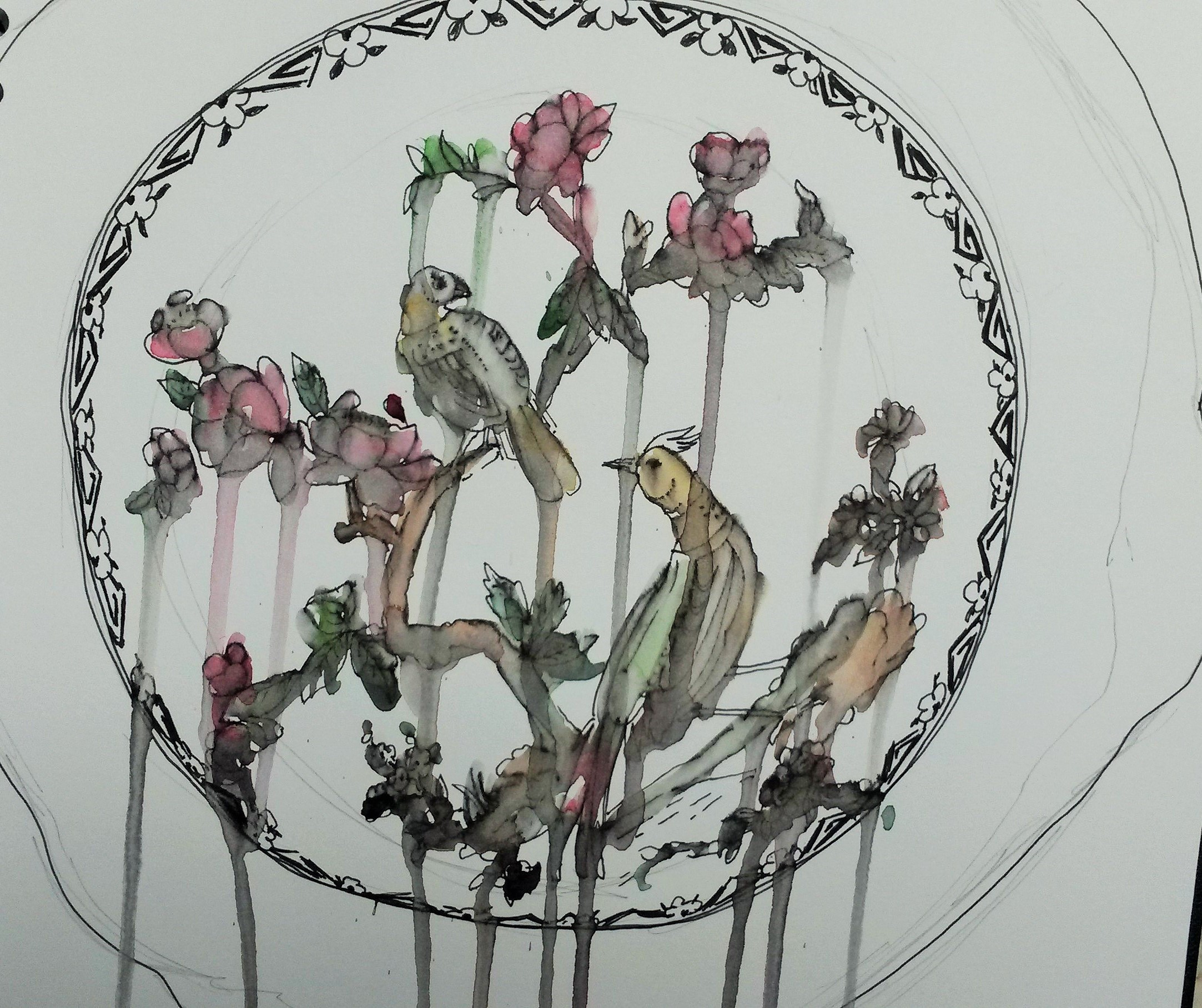
It occurred to me that I should experiment with the length of the stick, so I chopped it in half (about 65cm). Using the roses from the previous assignment as a reference I did the following;
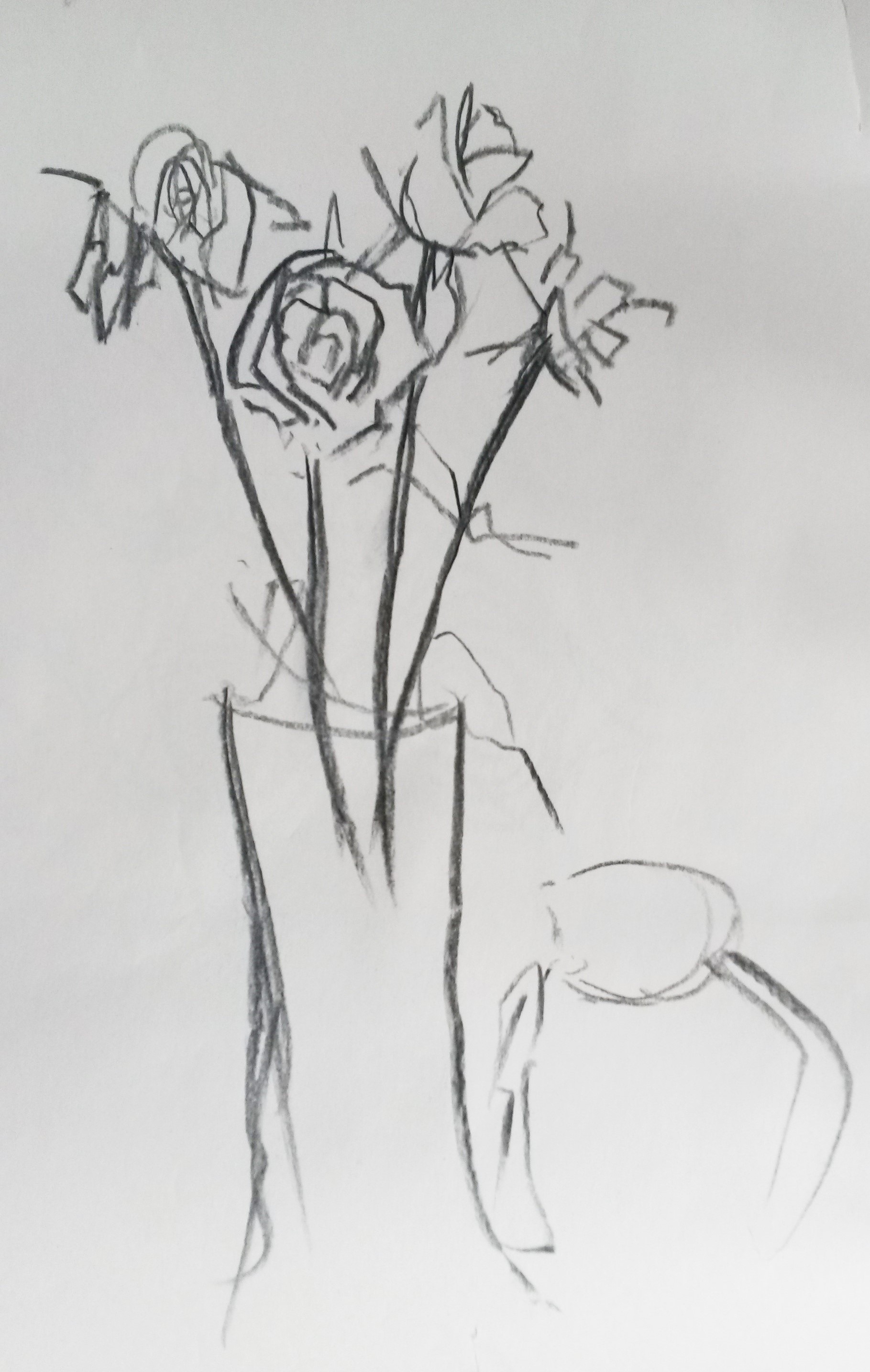
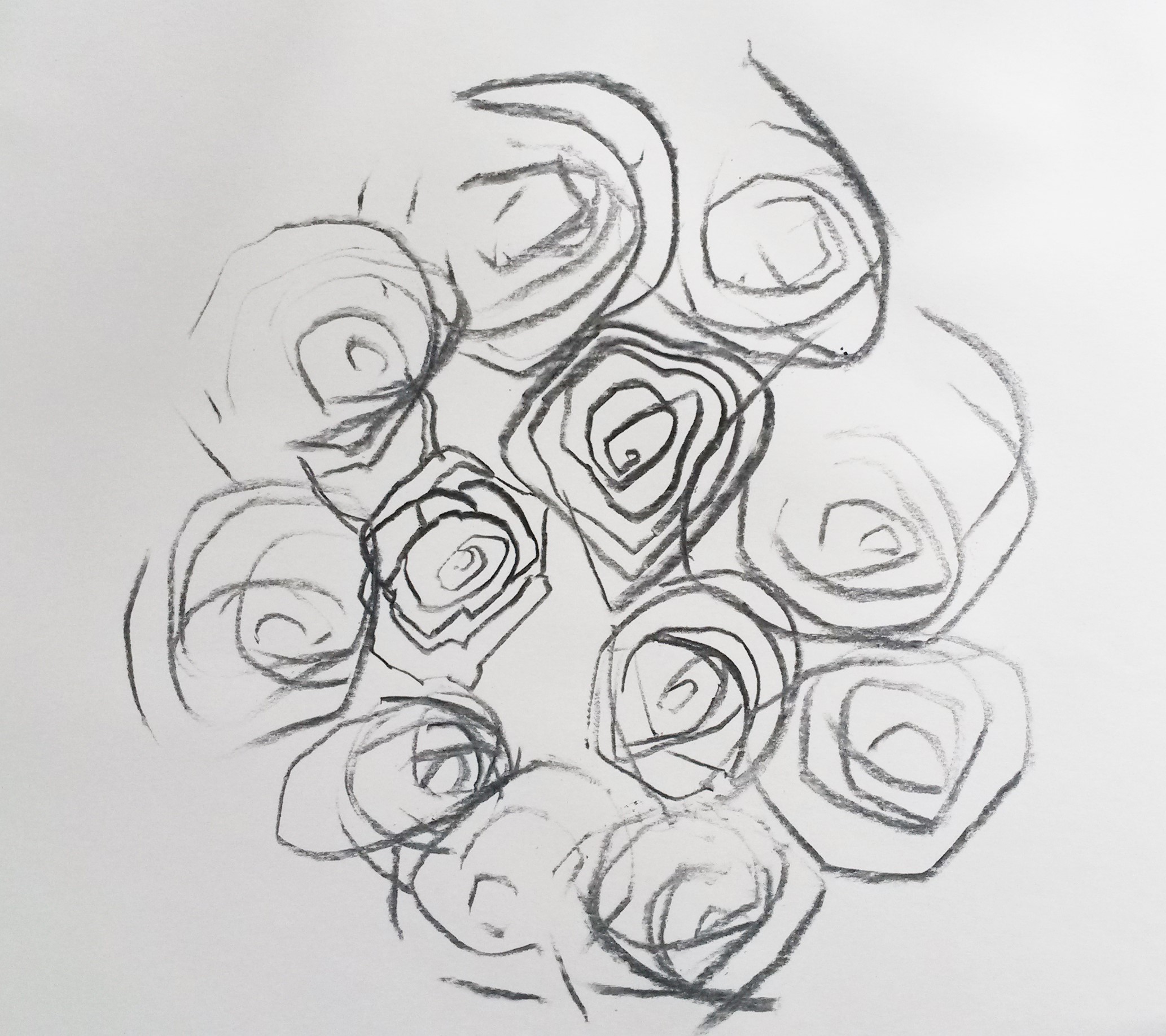
Charcoal on lining paper 45cm x 60cm
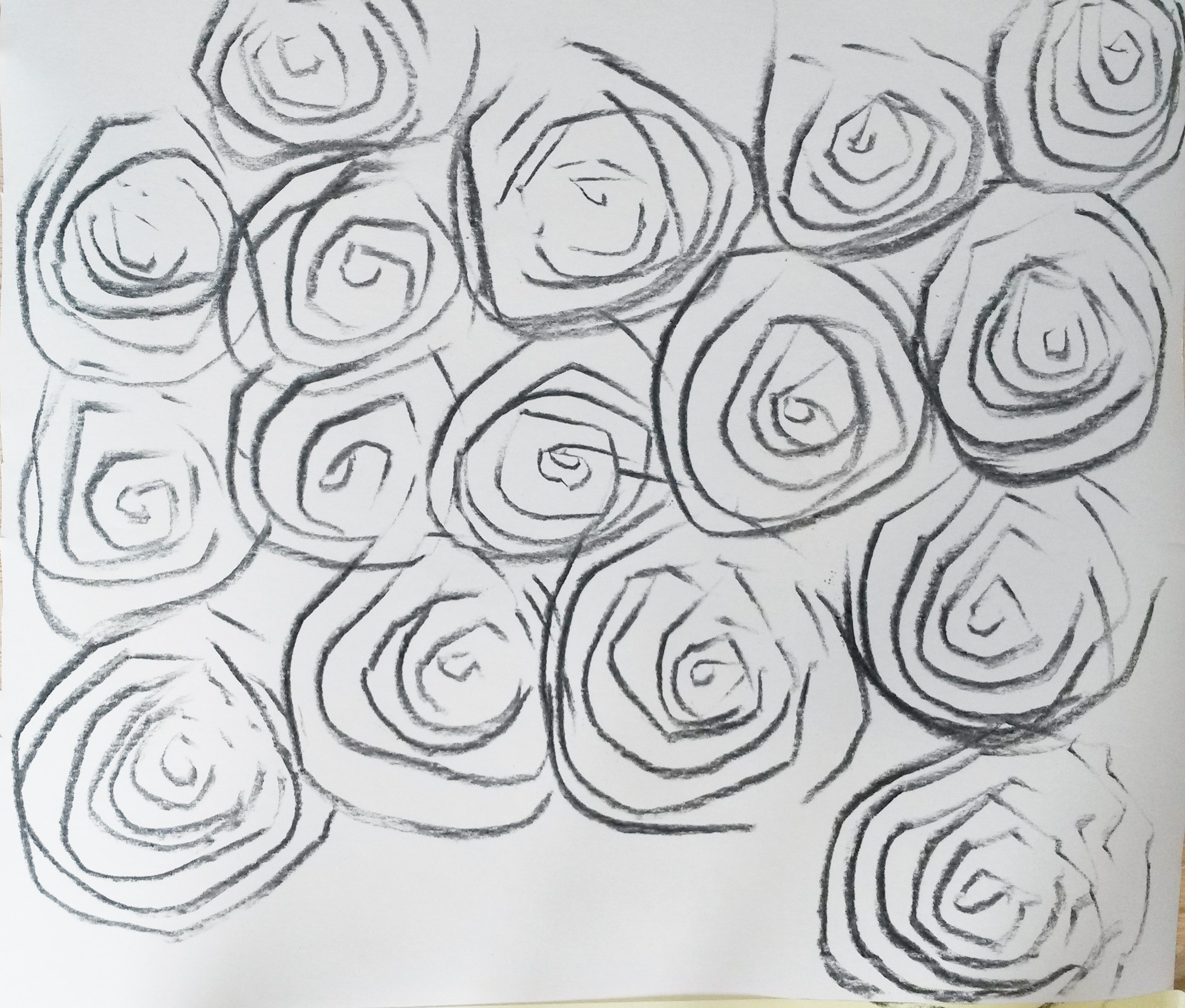
I stood to do these with the paper on the floor. The lack of control meant that some of the lines were bold and sweeping, whilst others were faint and barely there. I still managed to make strong, bold strokes.
Charcoal on lining paper 45cm x 60cm
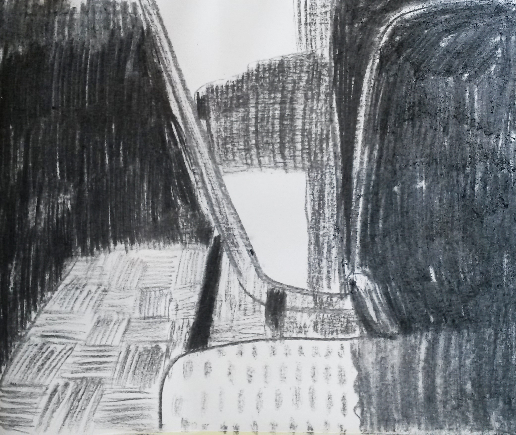
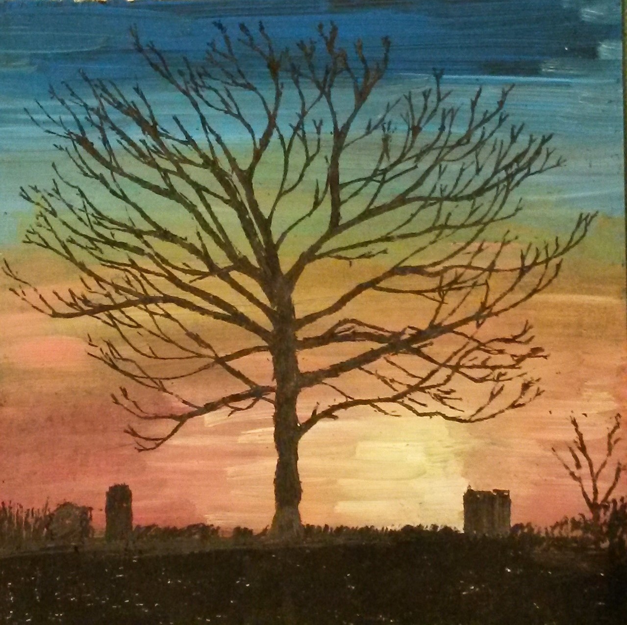
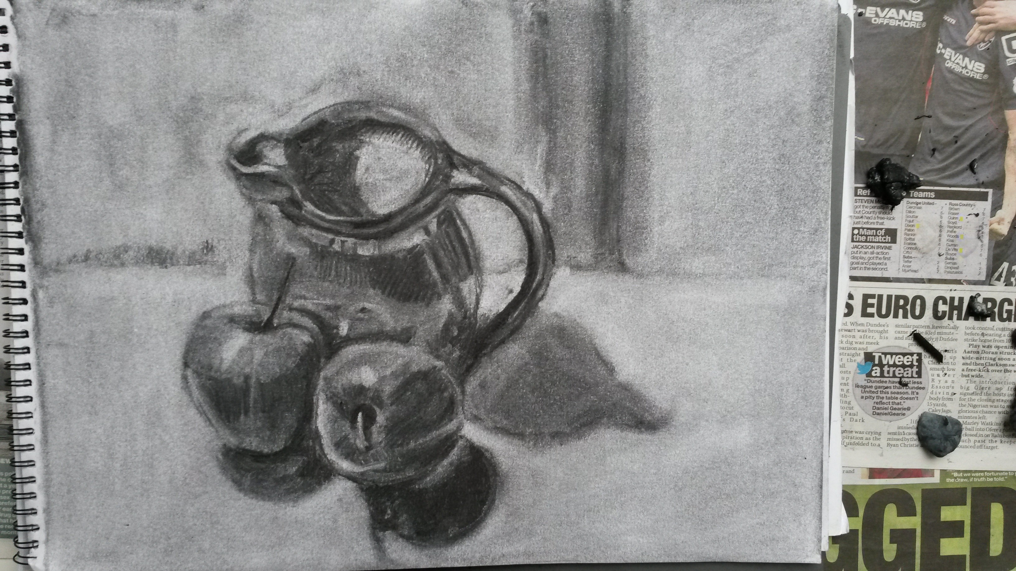
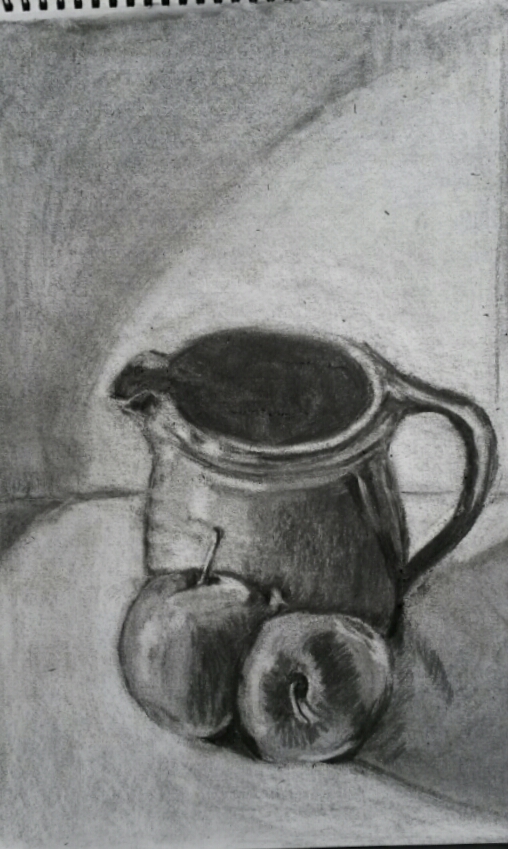
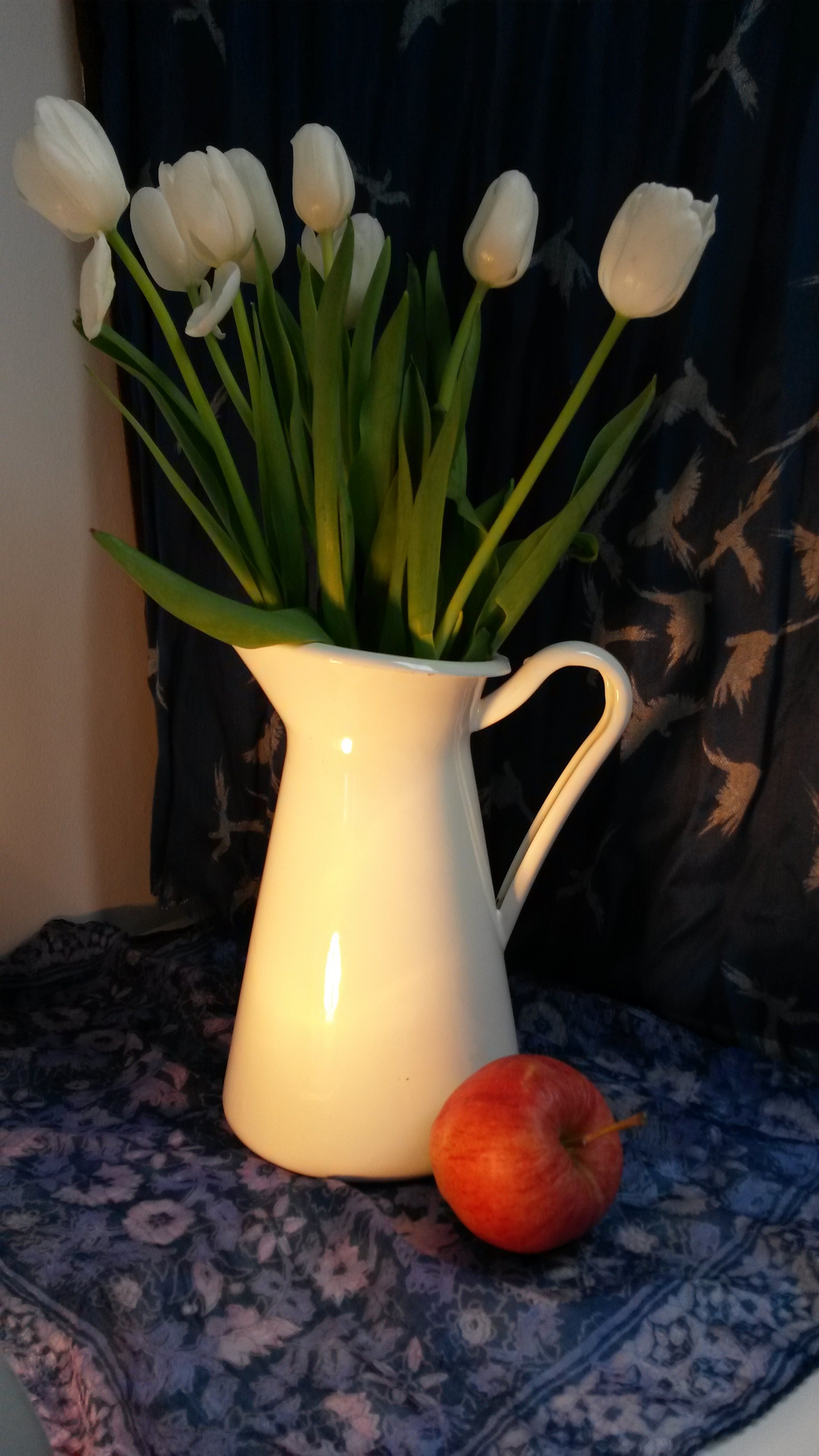
Again, following my tutor’s advice; ‘Try as much as possible, to link the exercises to the Parallel Project’, I did a further two drawings. I worked from photographs, cropped to make the compositions more interesting. I was attracted by the patterns, tones and shadows. The lack of control when using the charcoal on the cane, left no room for fussiness or precision but forced me to be decisive, resulting in some strong mark making, particularly in the dark shadows. I am pleased with the end result. It has a confidence to it, lacking in my previous work. It has an abstract feel and the use of the cane I feel, adds something. It is an interesting composition, which focusses on line, pattern and tone and is unconcerned with subject.
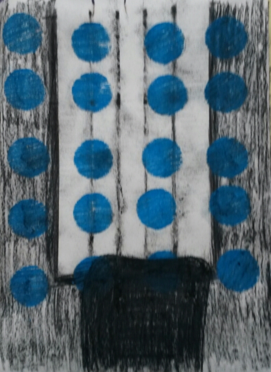
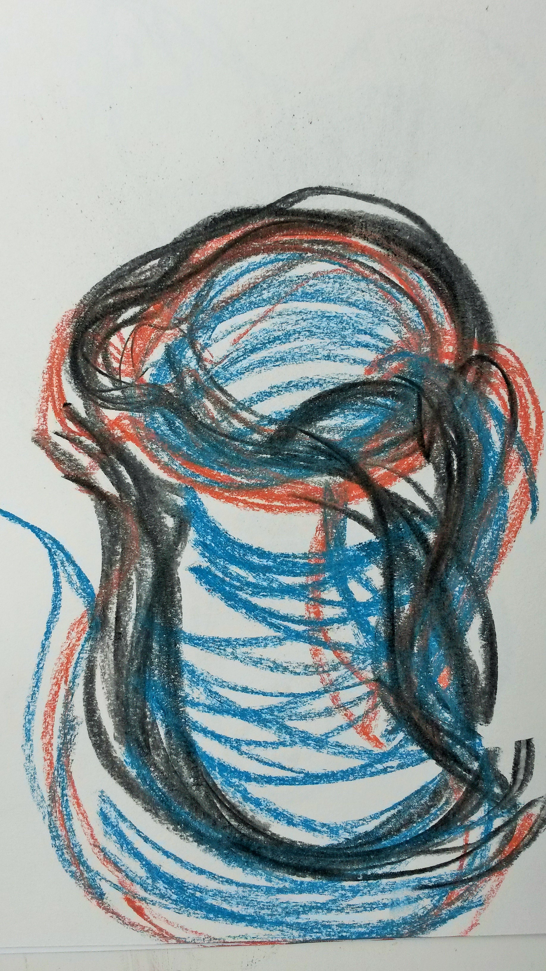
I began this drawing with the charcoal attached to the bamboo cane again, however I had no thick pieces of charcoal left, so taped several thin sticks together. I used thick pieces of masking tape for the vertical lines. I then drew with the charcoal. The thin pieces taped together gave a scribbly effect. Once I had removed the masking tape I made a circular template with card board and used blue pastel with this, trying to keep it slightly loose and imperfect. Changing the direction of the hatching kept it from looking too tidy. I then went over the chair shape in the foreground with black charcoal. I was pleased with elements from the finished piece; I really like the blue circles and straight vertical lines of the blinds, but I feel the composition needs more work and can be developed further.
Reflection: What happens when you break the relationship between your brain and the marks you make in this way? Are these simply bad drawings – or do they point the way to a kind of responsiveness within the act of mark-making which enables a more sensitive and ultimately more informative line? This is a loaded question, but respond with your own views and reflections based on what you’ve learned so far.
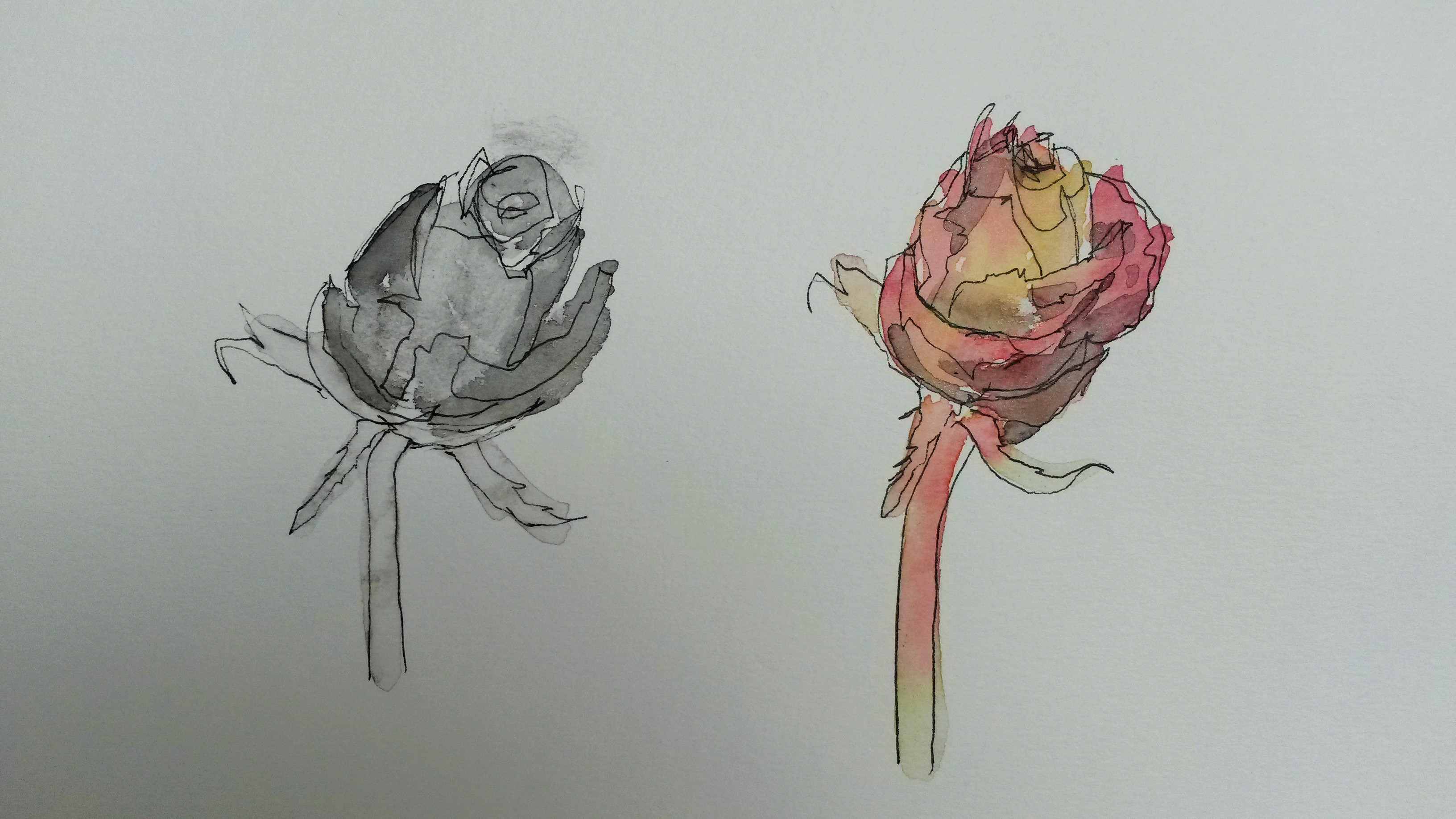
Placing a length of cane between the charcoal and your hand results in a loss of control and you automatically over compensate by using more force. Rather than be a hindrance, it brought a looseness to my drawings and gave them more of a ‘sketchy’ feel. I once saw the paint brushes of James McNeill Whistler at the Hunterian Art Gallery and these had exceptionally long handles, useful I would imagine, for the huge canvases he worked on, but in addition would add a looseness in the application of paint. The first drawing I did of the sunflowers, before I added colour, was more sensitively drawn because of the cane. It was more expressive and impressionistic. Using more force than you would usually exaggerates the line and in the page with the roses above I was able to get into a rhythm almost, when rendering the concentric circles.


