Category Archives: Part 1

Project 4: The human form

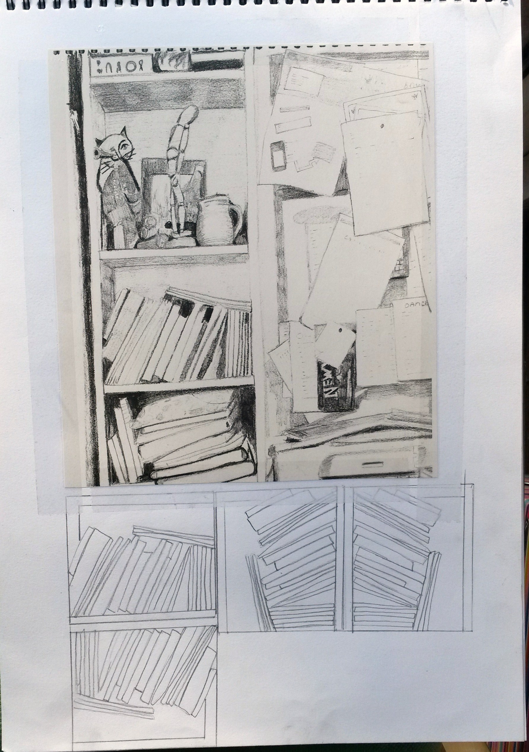
Make a drawing of two combined body parts.  This might be two feet crossed over, folded arms or a hand resting on a waist.  Look at the curves and the rhythms set up by those curves.  Look at the muscles and bones under the skin and the tension and energy they give.

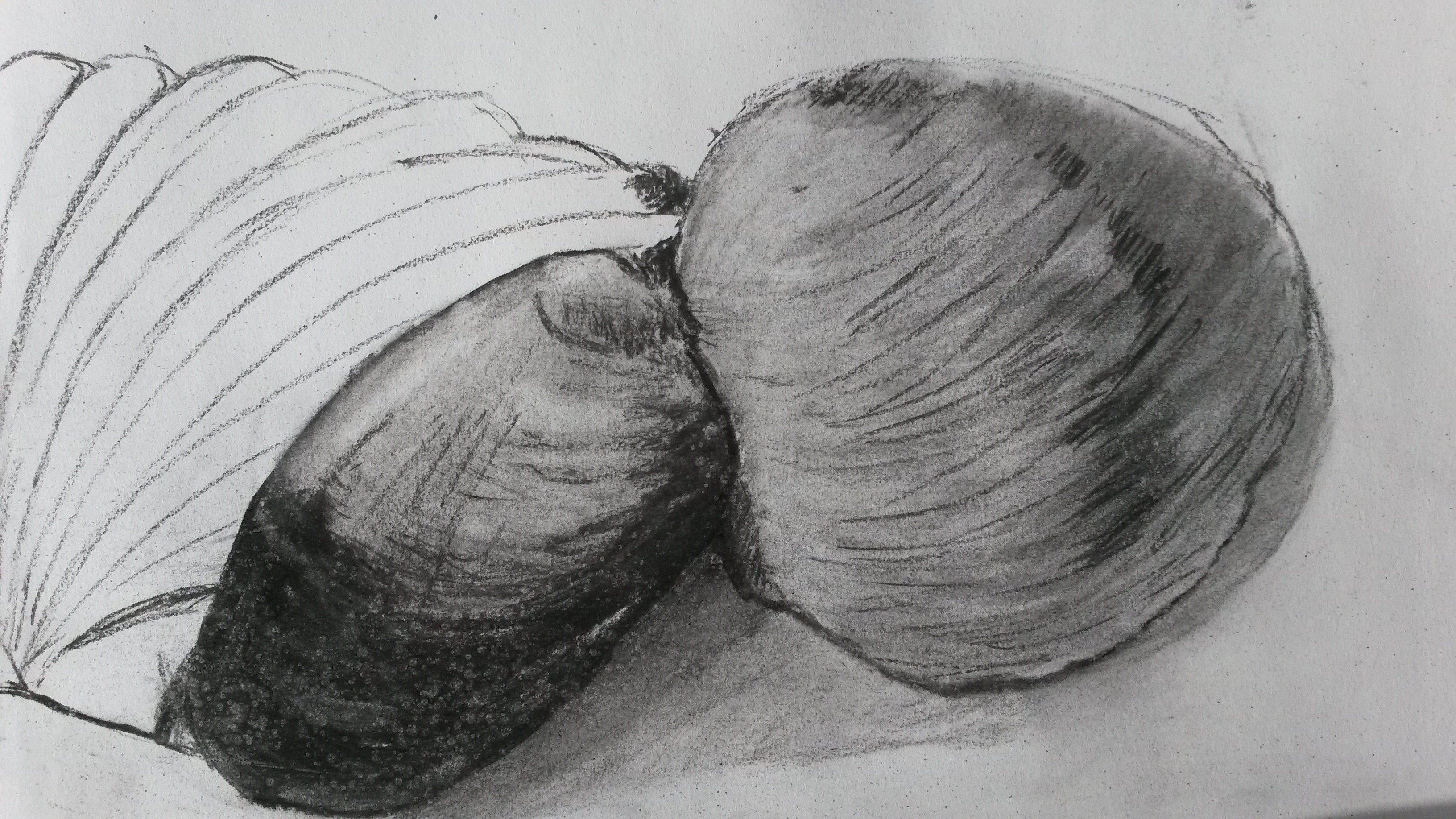
I decided, through lack of a model, to draw my own legs crossed at the ankles.  I set up a lamp to help add more dramatic tones.  I also put a white sheet of paper on the floor to take away any distraction from the flooring etc. 2015-03-02 19.59.55 (2) A3 charcoal drawing

Doing my first attempt, I felt a little rusty and thought about how it has been since I tried any life drawing.  I think I achieved good chiaroscuro, but the leg and foot don’t have very realistic form and you can’t see evidence of bone or muscle in the legs.  Originally, I had wanted to try other compositions, with crossed hands and arms, and I did get my daughter to take some photographs for me but I couldn’t get a good enough photograph, so I decided to carry on drawing my legs.
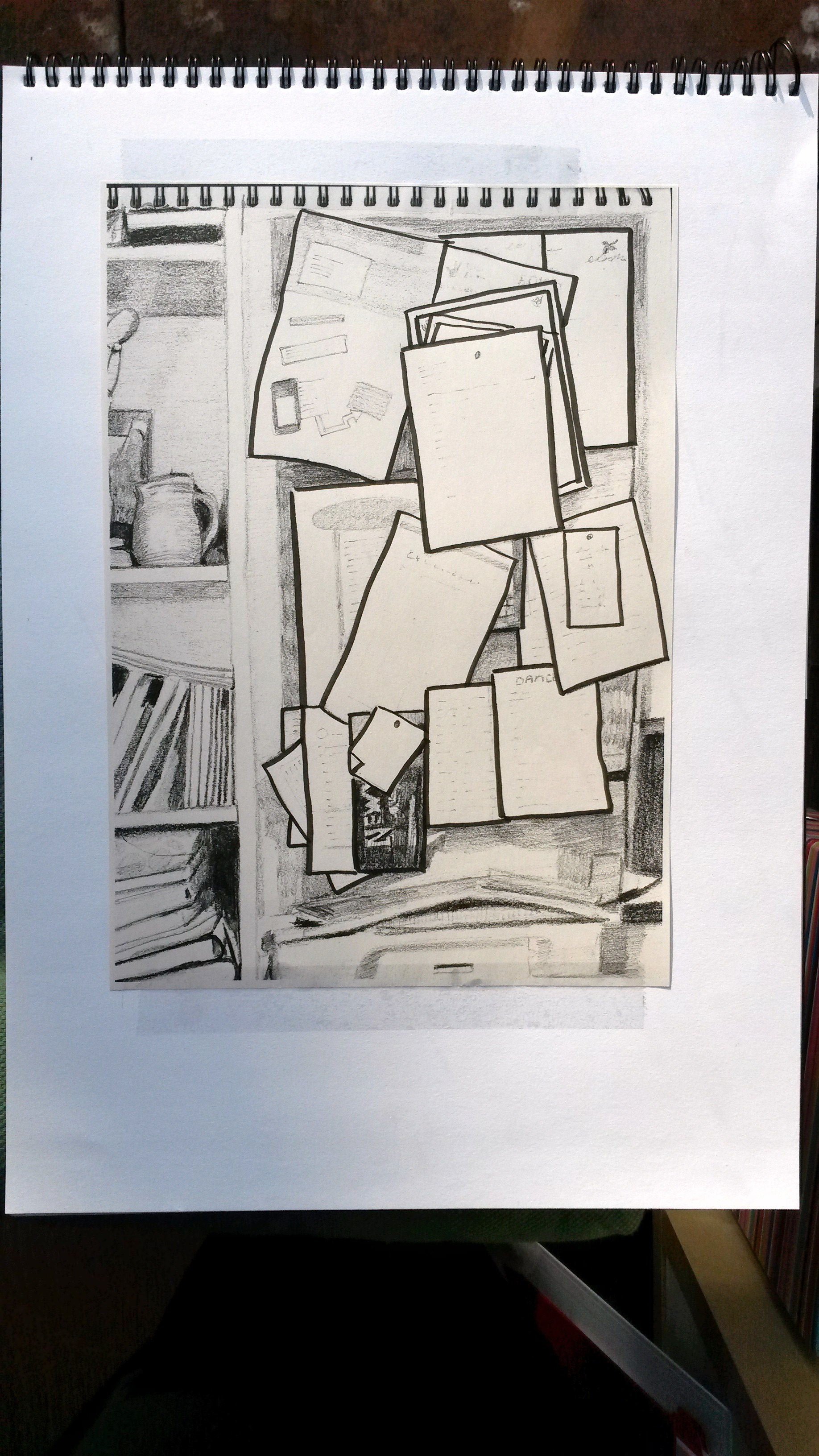
2015-03-02 19.58.48 (2)

A3 charcoal sketch

My second attempt was better,  there is better drawing of the muscle and bone.  I also tied using a putty rubber in this one for the lighter areas and I think this worked well.  The composition is much better too by making it a square, however the white paper showing the unfinished part lets it down.
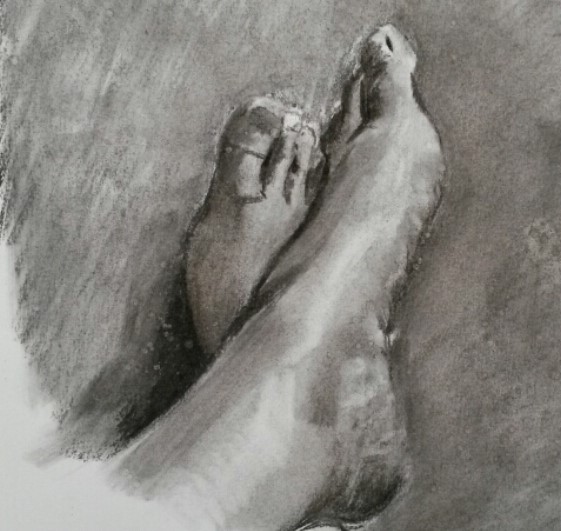
2015-03-02 19.56.12 (2)

A3 charcoal drawing

I did a third and final attempt and I think the proportions are better in this one, it has good form and somehow the skin looks more flesh like.  There is good use of chiaroscuro, my only criticism is the proportions of the toes are wrong and they appear too long.  Other than that, I’m happy with it.

Reflection:  How far does your drawing direct the viewers gaze?  Did you manage to retain the tension in the limbs – or do they seem a bit floppy and directionless?  Have you managed to add an extra dimension to what  could otherwise be a technical or academic exercise?

I think I have achieved a good composition and the viewer’s eyes are directed into the composition.  I think I could probably have experimented a bit more by perhaps including more of the legs and used foreshortening.  I think I did retain the tension in the limbs and I don’t think it looks simply like a technical exercise.

Project 3: Changing the scale

Find a handful of small objects, e.g. pebbles, shells, buttons, toys.  Cluster these objects together and focus in on a cropped area.  Experiment with using a frame for this.  Make a large drawing which gives the impression of a landscape view or architectural detail, using these objects as your source material.  Tiny pebbles can become enormous rocks, shells can become cliffs and sea caves….By cropping your subject you’ll ensure that the whole composition has power and energy. 

I started this project by gathering together some shells and stones and drawing them in a normal scale with charcoal.

20150301_151223 (2)

I then focussed in on one smaller area and drew this in charcoal.

20150301_151250

From there I focussed on one area of a shell and drew it, this time with soft pastels.  This wasn’t very exciting looking.

20150306_145124

From there I tried enlarging some stones.  I worked on A3 size cartridge paper with black Pitt pen initially, then worked up the tones and colours with soft pastels.  I haven’t worked very much with pastels, so I was surprised by how much I started to enjoy the process of looking for hues in the stones, which all just initially looked dull grey.  When it came to adding texture, I felt I wasn’t achieving this with pastel alone, so I decided to try some new Winsor and Newton Inks I had just bought in White, Gold metallic Bronze and Nut Brown.  I used a dip pen and used scribbles and dots to get the effect I wanted.  It was very effective.

20150306_142629

A3 size, pastel and coloured inks

This image still looks like stones, albeit large ones so I played about with the image digitally.

20150306_142629 (2)

20150306_142629 (3)2015-03-06 14.47.22

I think perhaps because my viewpoint is looking down I don’t think the scene could be mistaken for a landscape unless it is a bird’s-eye view, such as on Google Earth, and the cropped image could be mistaken for a view of a dessert, rocky beach, or Mars, or it could be a view looking forwards on to a sheer cliff face.

I enjoyed the process so much, I decided to do another.  Much to my children’s annoyance, I used some mini cookies for the subject this time.  I worked pretty much, in the same way.

20150309_114424

A3 sketch, pastel and coloured inks

Much like the stones I felt the cookies needed cropped, so played about with them digitally.

20150309_114445

20150309_114433

.

Reflection: This project further demonstrates the potential of composition and your own role in the process of constructing or working with a subject.  Do you feel differently now about selecting subject matter and developing composition?

I do feel differently about selecting subject matter.  I would never have chosen a tiny stone before, or a cookie for that matter.  I would never have concentrated on the texture of a biscuit or looking for hues of colour in a grey stone.  I also feel the use of mixed media, such as pastel and coloured inks together has worked well.  I feel that I would give anything a go.  If I were to attempt this exercise again I would think about working on a much larger scale than A3, perhaps A2 or A1.

Project 2; Using Space


Start by looking at the work of Elizabeth Blackadder

For your own still life, pin up coloured fabric or card onto a wall or door…..Gift bags or paper lanterns work well.  Enjoy the juxtaposition of bright colours and detail.  Make several drawings in colour, selecting areas and elements and refining to explore the composition.

I am fortunate in that I have been to a retrospective exhibition of Elizabeth Blackadder, however as I’ve written in the Research category, her still lifes, where areas are flattened with large areas of empty space, were my least favourite pieces.  I therefore decided to do exactly as asked in this exercise, in the hope that my understanding of the objective would increase as I progressed.

I pinned a large bright green tablecloth on to the wall, and to this I pinned small colourful gift bags.  I chose the table cloth because of the bright colour because I thought this would help push the focus on to the negative space between the bags.  The bags I chose were gold, green, red, blue and white, some with patterns.

I began with a drawing in felt tip pen of the whole composition.  It was done in the evening so the light source was above and this helped throw deep dark shadows underneath the bags.  unfortunately, the lovely light green pen I was using for the cloth ran out half way through the drawing, so I had to use coloured pencil instead.  When I’d finished I found that the dark tones for the shadows weren’t dark enough so I went over them with graphite pencil and then black ball point pen.

2015-03-09 12.20.28

Once finished I traced the whole composition and cropped it to make it a square composition.  I re did this in coloured pencil.

2015-03-09 12.10.39

I felt that this was still a composition where the focus was on the bags, not the back ground, so using the tracing paper again, I reversed the image and rotated it so that the edges of the bag were appearing in the corners of the square composition.  I coloured this with coloured ink.

2015-03-09 12.09.37

For the final piece, I kept this composition but made it larger; 33cm x 33cm and used rough watercolour paper and Winsor & Newton Drawing Ink.

20150301_151456 (4)

Reflection: Do you feel that you managed to instill energy or life into the whole drawing, or does it run out of steam towards the edges? 

I don’t feel that I’ve instilled energy or life into this drawing.  As stated in my research into Elizabeth Blackadder I feel I’m not appreciating her achievements in her innovative method of using space in her still lifes, therefore it’s difficult to emulate this. I think it’s been a useful exercise for me in the exploration of composition however, and another compositional drawing using objects that I would never have considered using before.

Project 1: Observational drawing

Find an inconspicuous area of a room or small area outdoors where several elements are juxtaposed.  Take photos and make sketches of cropped details.  Make several drawings, lines, repeat motifs, allow forms to come together in unusual ways.  Be as playful as possible with pattern, texture, form etc, whilst still being sensitive to what you are looking at.  You may find that photocopying your drawing, cutting it up and making a collage will help- or overlaying tracing paper to create repetitions of interesting lines and shapes.  As you progress you may find that parts of the subject which feature large in reality disappear completely in your drawing, while incidental patterns of shapes develop their own status.

I wandered round the house with my phone and took random photos, such as these;

20150105_13443520150105_13455120150105_134322

I intentionally chose subjects that I would normally never chose to paint or draw.  I also never tidied up first; I wanted the photos to show “warts and all”.  Of the photos I took, I immediately chose these;

20150105_13423420150105_134214I was drawn to the straight lines of the shelves and the repetition of the vertical lines of the books and folders.  I started to draw this area, initially intending it to be a line drawing, however I decided half way through to make it a tonal drawing, using HB, 2B and 6B pencils.

drawing 2 003

A3 pencil drawing

I photocopied this image and traced the shapes of the letters pinned on to the notice board.

drawing 2 020

drawing 2 021

I then coloured these abstract shapes using the colours of the folders on the shelf.  The result was interesting, but not one that I felt I could take further.

I then decided to focus on one of the shelf areas, where the books were all leaning to the side and there was repetition in the diagonal lines.

drawing 2 006

Photocopy of drawing and tracings

I decided to repeat this more times.  I went over the pencil with black felt tip.  I then coloured in random parts of the drawing with black pen, ensuring each “shelf” was different.

drawing 2 011

Tracing with black pen

This reminded me of black and white barcodes.  I then tried long horizontal areas.  The first “shelf” was 3.5 cm tall, and with the same Steadler black felt tip I drew in the “books” as a continuous line, making some slant.  I though this looked quite interesting, so I did a taller “shelf”, this time 4.5 cm.  When I was just over half way along, working in the same way with a continuous line, I thought it was looking dull and too repetitive, so I started adding thin lines using a fine black Pitt drawing pen.  I interspersed these with thick lines to add more variety.  I liked this, so added another shelf, 6 cm this time.  I added wavy lines, blocks of black and spaces this time.  Finally, the last shelf was 8 cm and had more of the thin and thick lines grouped together, finally becoming more barcode-like towards the end.

drawing 2 016 - Copy (2)

I really liked this last part and individual parts of it work well on their own, such as this part.

drawing 2 016 - Copy

Reflection; …Reflect on how far you’ve moved from your original subject.  Is your final drawing still of the object, or is it now more a drawing about the process of looking and being creative?

Reflect on whether you’ve made the best possible use of the space available to you.

I’m very pleased at how far I have come from the original subject.  My final drawing is an abstract image, and this is an are I’ve not explored much.  I think I followed the brief well “repeat motifs,…be as playful as possible with pattern”.  I think the monochrome works well.  I like the repetition of the lines and the contrast between the thick and thin lines.  I like the control and precision, and I also felt that I was working instinctively and that it was a very natural process.  A good start I think.