Category Archives: Part 2

Drawing with experimental media

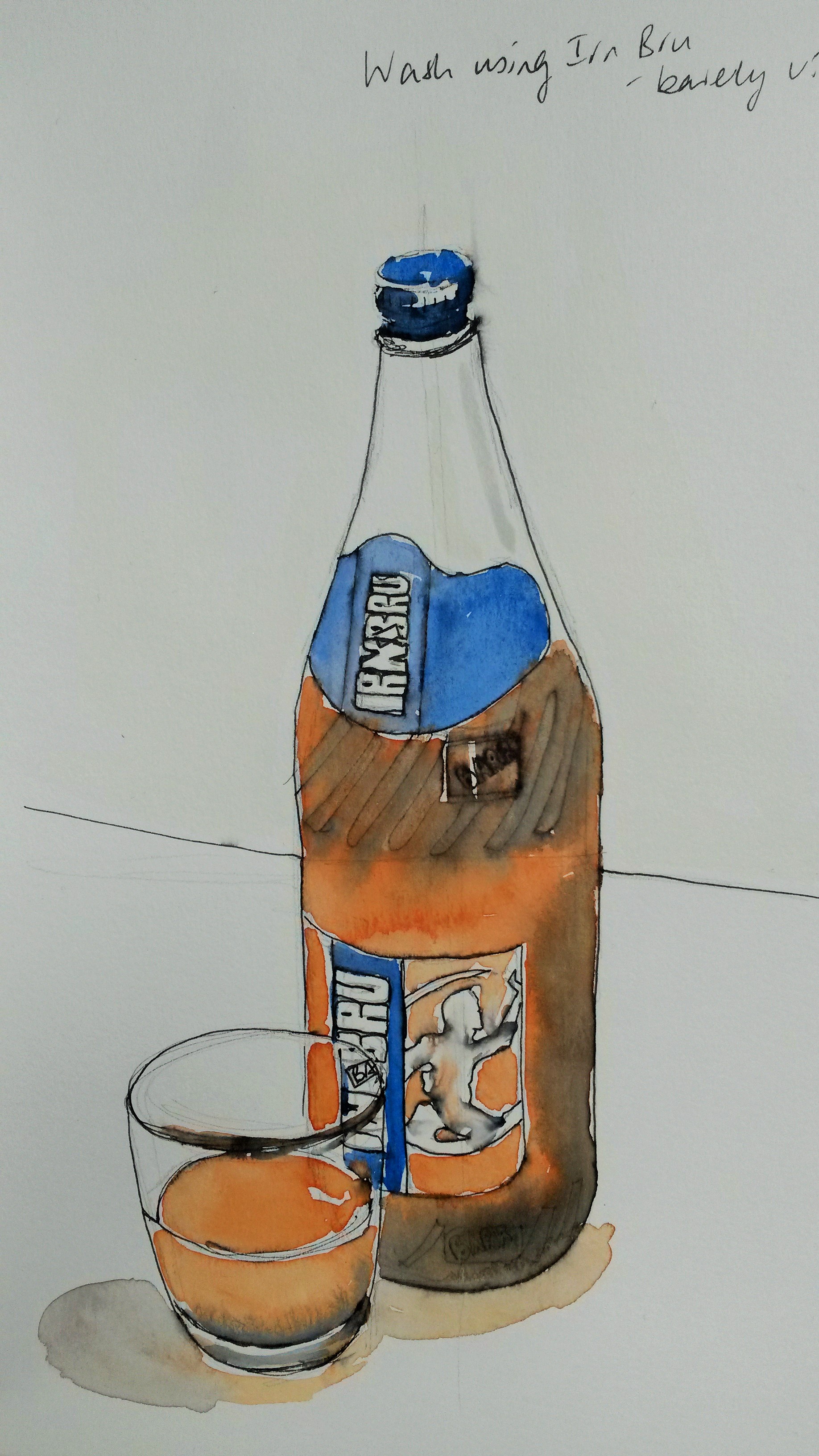
Over the next few weeks you’ll experiment extensively to build up your sensitivity to the properties of materials.  Use your sketchbook and supplementary sheets to collect information about materials and what you can use to draw with.  Push forward your experiments by using the new methods you discover to make fuller drawings.  Use a new technique randomly scribbling a square, for example can help you see it’s potential, but using it to complete a task pushes you to learn more actively by solving any problems you encounter along the way.

april 2015 613april 2015 612

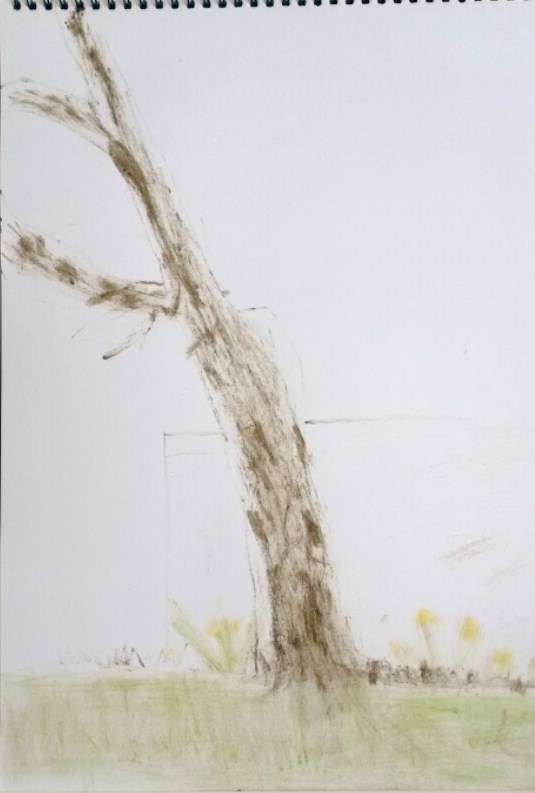
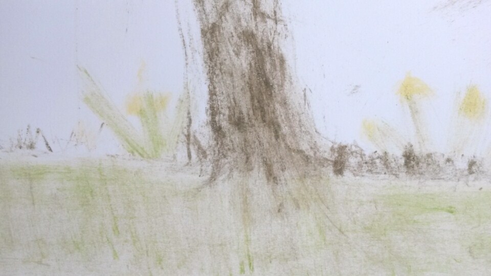
These drawings were done using a stick with mud for the tree,  rubbing daffodil petals on the paper for the flowers and rubbing blades of grass onto the paper for, well, the grass.  It was a lot of effort for very little result (as well as a lot of strange looks in the park).

april 2015 607

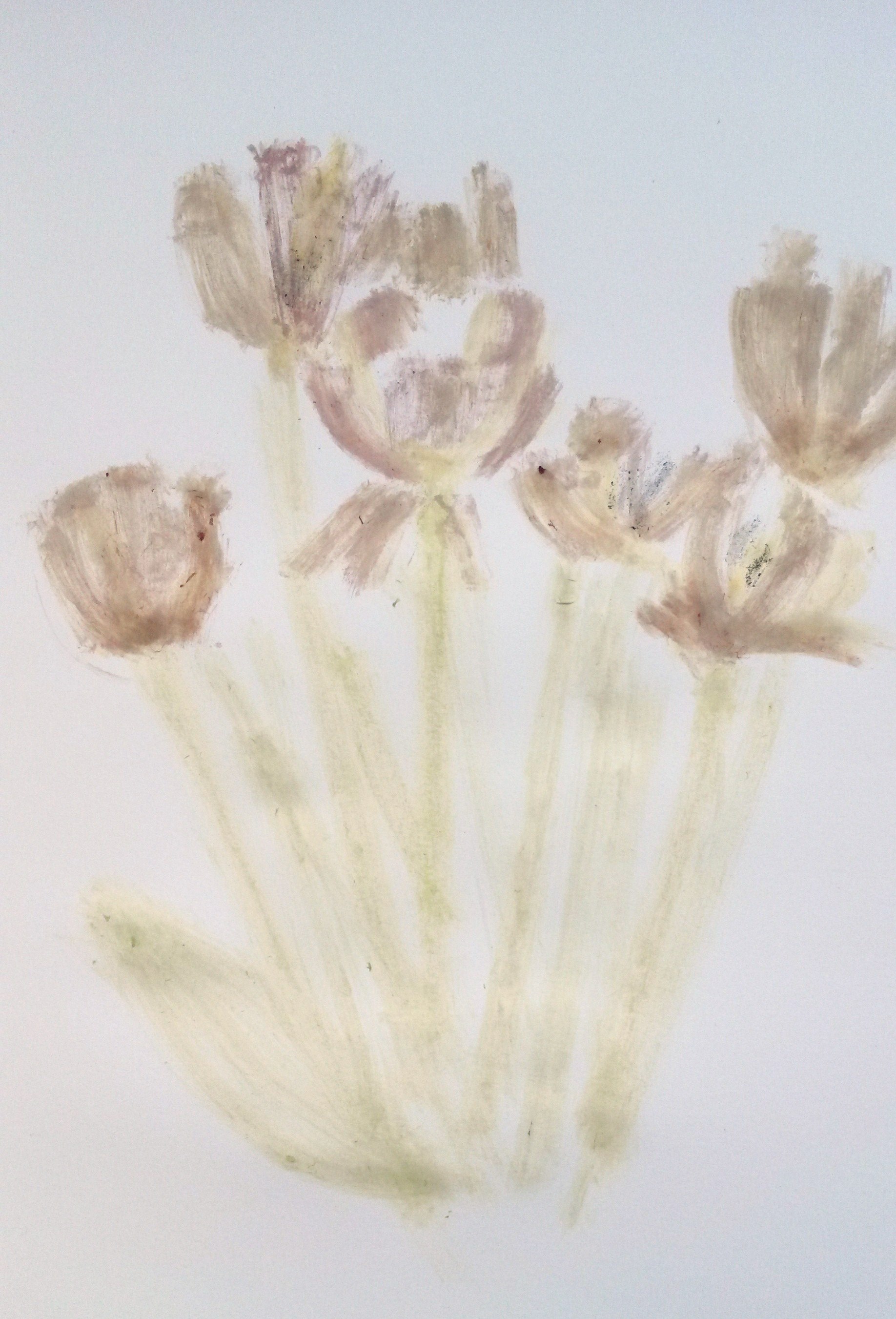
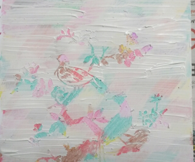
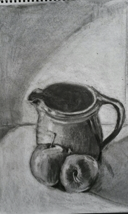
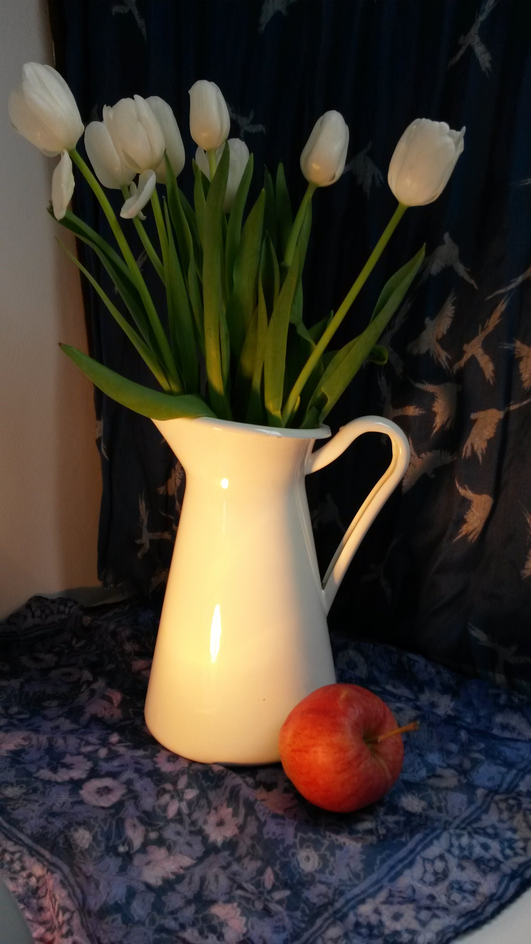
This was done in a similar way with tulip petals and leaves, with a similar, disappointing result.

april 2015 653

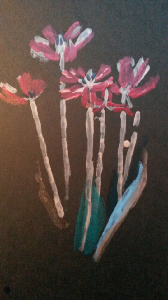
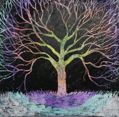
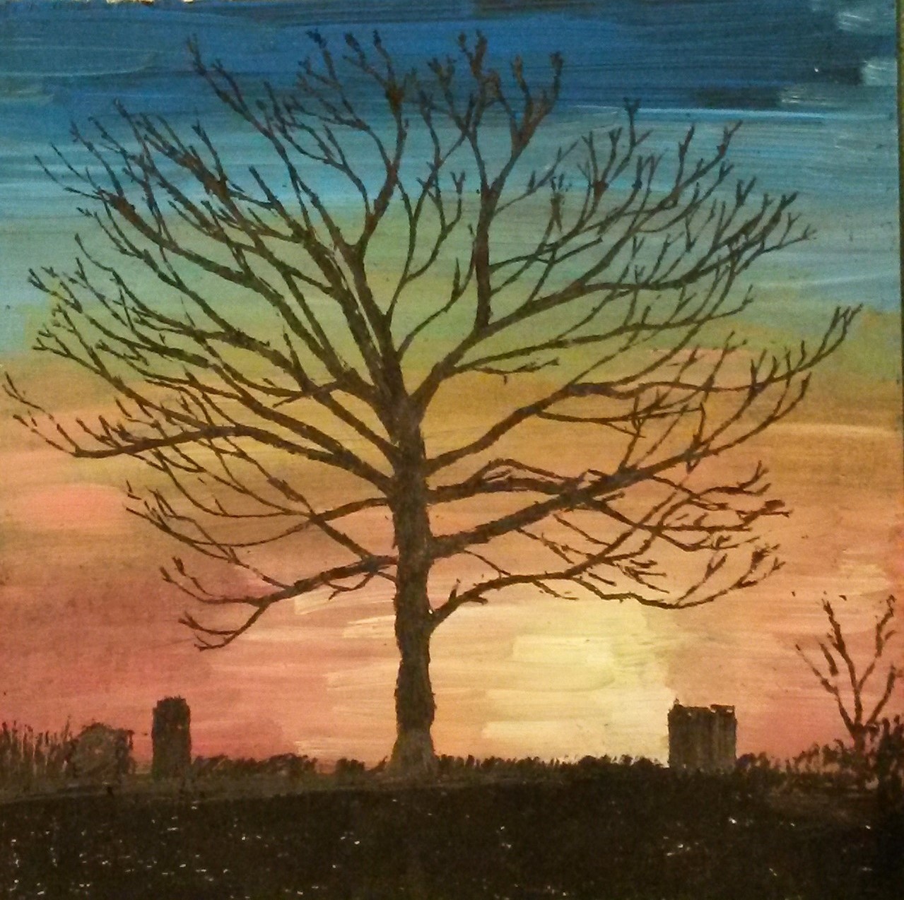
This was done using different coloured mail varnishes on black paper.  Quite a nice result and one I may try again.

2015-05-15 15.52.20

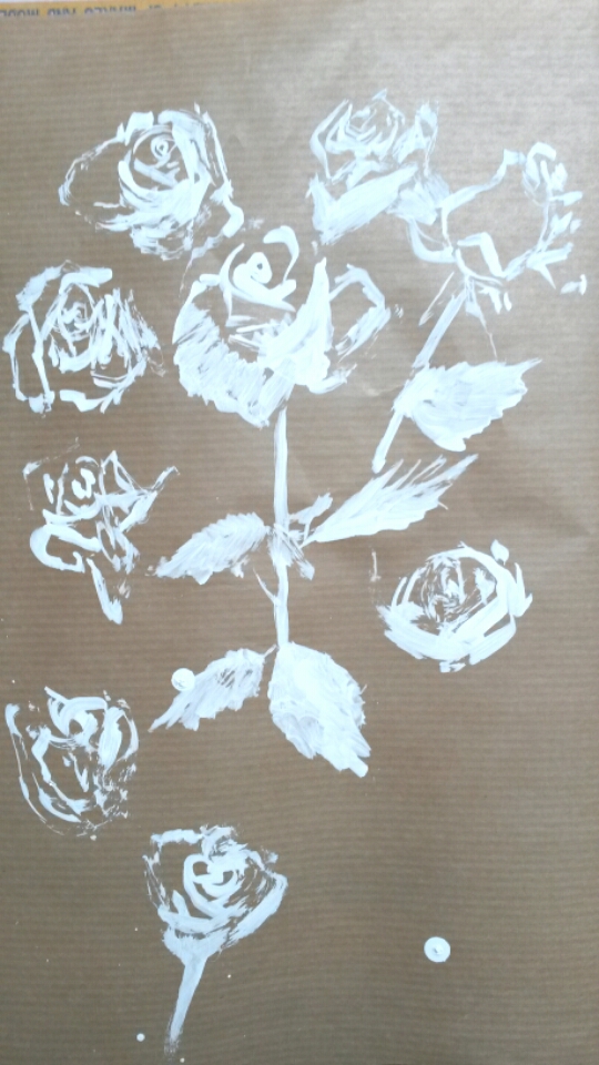
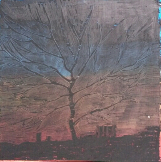
This was done with Typex correction fluid on brown parcel paper.

Aim: When you think of drawing, what’s the first thing that comes into your mind?  We might initially think of pencils and maybe a Renaissance masterpiece.  In fact pencils are quite a modern invention and most Renaissance drawings were done with a stick of silver and a pot of ink.  Your sketchbook should be filling up with drawings in a variety of media by now, but for this project you’ll extend that exploration even further. 

.

Contextual focus point: Cornelia Parker


Research the work of Cornelia Parker.  Make notes in your own words in response to the following:

What do you think Parker is trying to do in her piece Poison and Antidote Drawing (2010)?

Poison and Antidote Drawing is created using rattlesnake venom and black ink, anti-venom and white ink.  Parker often uses bits of her subject to make her art work.  Why do you think she does this?

‘ I’ve made poison and antidote drawings using snake venom from a rattlesnake farm in Texas mixed with black ink, and anti-venom with white ink, to make Rorschach blots.  The resulting drawings are a combination of ‘good and evil’.’ (Maslen and Southern, 2014:54)

She goes on to say ‘For me the concious part of making a drawing is deciding on a process, what the process then releases is something else.’

I think she has tried to create more than just a representation of an object, but instead the drawing is the object.  The title ‘Good and Evil’ itself conjures up a lot of ideas and the use of black and white ink emphasises this.  The positive and negative concepts are polar opposites of each other.

How do you think it feels to stand in the presence of art works that are constructed from original objects  of great cultural significance?  How does that differ from, say, standing in front of a painting of the same object?

Initially I thought it was a little self-indulgent.  I wonder if a drawing or painting should be a successful piece of art in its own right without there having to be an explanation of the process or of materials used.  I’ve pondered over this and decided the media and materials can give an art work a deeper meaning, which engages the viewer’s imagination and empowers and strengthens the artwork itself.

Bibliography

Maslen Mick and Southern Jack

(2014)

Drawing Projects; and exploration of the language of drawing

London

Black Dog Publishing

Project 2: Mark making materials

Build up a variety of surfaces using whatever comes to hand that has two differently coloured layers.  Make several drawings by scratching through the second layer.  You can use wax and acrylic paint, oil glazes on board, household paint on wood, varnish on metal.  Vary the scale of drawings depending on your support.  Choose a subject from your sketchbook or learning log and push through to make complete drawings, not just squares of texture with random marks.  That way you’ll really learn what the materials can do.

This immediately made me think of the pictures children make by covering a sheet of paper with coloured wax crayon, covering it all with black crayon, then scraping off the black, usually drawing fireworks.  So that is exactly what I did first.

2015-04-25 09.40.36

For my next one I was thinking that I would leave the circular area around the tree white, then have the surrounding area blue.  I had done a watercolour painting like this previously.  I used black oil pastel, instead of wax crayon to get better coverage.  Unfortunately the black oil pastel stained the white paper and scraping it only exacerbated the problem, so there is too little contrast between the black and the tree.

20150421_202916

For my next one I used white oil pastel and light and dark blue for a kind of sky effect, again using black oil pastel.

2015-04-27 16.58.14

I decided to try different media, so for the next one I covered the paper with different colours of acrylic paint.  Once dry I covered with black oils pastel and again scraped off.  This gave quite a subdued effect, as I think the black oil pastel stained the acrylic paint, but I think it gives a mysterious atmosphere to it.

2015-05-05 12.59.57

Next I covered the paper with black oil pastel the painted over it with acrylic paint, then scraping the paint to draw the tree.

20150506_213726

This worked really well, the strong colours of the acrylic contrast well with the black.

2015-05-15 15.53.21

This one was done with coloured wax crayons below and white acrylic paint on top, scraped off whist still slightly wet.

Part 2: Research point, mark making


Mark making may seem like play, but if you have any doubts about the validity of this kind of exercise, take a close look at some great masters of the past. … Many artists will have an old pot scourer, toothpick or hat pin in their tool box which they have learned over the years makes a certain kind of mark.  Next time you are in a gallery pay special attention to the variety of marks used and note your discoveries in your learning log… Try doing this with the drawings below.

Two thatched Cottages with Figures at the window, Rembrandt

I hadn’t used the zoom in facility on the Bridgeman site before, so this was quite interesting for me to try.  This is a line drawing using pen and brown ink.  The range of mark making in this drawing is quite amazing.  There is a wide range of thin and thick marks, all used with varying degrees of pressure and changing direction all the time.  The thatched roof, for example has quite strong, deliberate marks, all going in the one direction, with squiggles for the ends of the sheathes.  The wood of the barn has fine cross-hatching and the foreground has very loose lines describing the land.  Put all together it is a lively sketch, but which has substance and describes the scene wonderfully.

The Raising of Lazarus, Caravaggio

In contrast, this is a tonal drawing rendered using pen and brown india ink and black chalk on brown paper.  This has a fantastic depth to it and it is fascinating to examine up close enough to see it is all made up with lines.  The buildings in the back ground really appear to be in the distance by the use of aerial perspective, while the figures in the foreground really come forward, where the tones are stronger. Their clothes are drawn with fine lines all going in the direction of the folds and creases. The craggy face of the mountain behind them is described with contour lines and the detail in the foreground is described by the use of fine lines for the grass.

Looking at this has made me more aware of how marks are made and has made me want to get right up close to paintings and drawings in galleries.  For example on the OCA Study Visit to the Two Roberts Exhibition, several of the paintings had marks made which appeared to be scratched on.  An example of this is ‘Weaving Army Cloth’ by Robert Colquhoun.  In the book of the exhibition it says; ‘…themes of grief seemed to come naturally to Colquhoun.  The mustard-yellows, browns and greens established a feeling of anguish, a sense reinforced by the scoring and scratching of the paint surface.’ (Elliott, 2014:33).

The Two Roberts, Robert Colquhoun & Robert MacBryde, Patrick Elliott, National Galleries of Scotland 2014

Project 3: Narrative

Think of a person for whom you have strong feelings or hold a strong opinion.  Find an object or item of clothing that reminds you of that person.  Make a piece of artwork that uses the object to provide the imagery but uses the materials to give the viewer a sense of the person.  In effect, you’re making a portrait of a person as an item of clothing…..  Experiment widely and produce as many pieces as you need to until you arrive at something which you think fits.

When I read this, I immediately thought of my mother, who passed away last year.  I don’t have any of her clothing, but I have some belongings.  I decided to do a still life with some of her things that were normally at her bedside; a china bowel usually filled with boiled sweets, her watch, a vase of roses and a bottle of Irn Bru.  I decided to go off track from the brief slightly, and instead of describing my mother, I would try to describe my feelings towards her, i.e. grief, love, sadness etc.

I was thinking of doing a still life with things that remind me of my Mum.  I put a vase of roses next to a bottle of Irn Bru (which she was never without), and did a loose pen and wash sketch.  I wanted the colours to be sombre, so used Indigo in the back ground, and used lots of water so that the black ink of the drawing ran into the colours.

2015-05-16 16.15.122015-05-16 16.15.42

I struggled with the Irn Bru bottle a little, so had another go on its own this time.  I even tried a wash with Irn Bru, but disappointingly it disappeared completely.

20150519_080650

I’m also enjoying drawing the roses so have been experimenting with those too.

20150519_0806112015-05-19 11.24.39

The bowl was used by my mum as a sweetie bowl, so gave that a try too.

2015-05-26 19.26.36

I kept being drawn to the china bowl, as it reminds me so much of her, so I started another sketch of it on its own.

20150515_114800

This was done with a cheap black fibre tip that is water-soluble.

20150515_134801

To this I added watercolour washes with lots of water added, so that the paint ran down the paper.  I wanted to convey sadness and tears.  To test the success of this I posted it on the Facebook page OCA Sketchbooks and asked what mood or emotion it conveyed.   The responses I got were; sad, under the weather, sadness and lamenting, sad and gloomy, passage of time, very feminine + very emotionally depicted without over sentimentality, sad and lost, sadness, loss, faded memories and tears of grief, reminds me of Chinese or Japanese style, grief, inquiring, decorative, the runs are like tears and the colours are sombre so I immediately thought of weeping and sadness, you have conveyed the emotion in an effective (and affecting) way, sad, melancholy, weepy, really sad, nostalgia the sad kind. 

This is exactly what I was attempting, so I decided to leave it at that; one simple drawing of one object, rendered in such a way that it conveys my feelings towards the person it belonged to.


Project 1:Space, depth and volume

Method; Cover a whole sheet of paper with charcoal so that you have a blank black rectangle.  Make a drawing from a subject of your choice by drawing into the charcoal using a rubber or selection of rubbers.  When you’ve worked into the charcoal for about an hour using just a rubber (depending on how fast you work), go back to your charcoal and begin to redraw in darker tones using the side of the charcoal.  Continue in this way using the rubber as a white to the charcoal’s black and develop the drawing until you’re happy with it.  Try to avoid using outlines – instead use sweeps of the rubber or the side of the charcoal to build up patches of tone.  If you do use an outline, look at the two neighbouring tones, decide which is the darker and then blend the outline into that one.  Bear in mind that as you move along the object’s silhouette, the relationships might change and the outline might switch allegiance.

I have never tried this technique before.  I decided to set up a small still life with apples and a jug.  I used an A3 sketchbook and only had thin vine charcoal so I used it on it’s side to cover the page.  I found it difficult to draw without lines at first.  Similar to the way I found it difficult to paint the first time I did it without drawing an image first.  I did have to correct it a few times, which was easy as you just cover the mistake with charcoal.  Here is my first attempt.

april 2015 659

And here is my second;

april 2015 764

I was frustrated that I wasn’t getting any mid tones, just very dark or white, so I went on to You Tube and watched a tutorial, and quickly found that it was because I wasn’t blending the charcoal; just putting it on and taking it off again.

For my third attempt I set up a more challenging still life with a jug of white tulips, an apple and two patterned scarfs.

april 2015 758

I used a heavier weight of cartridge paper this time, and at first was a bit dismayed to realise it had a tooth to it, so the white came through when I put the charcoal on.  This time I blended the whole page of charcoal with a cotton wool pad.  I then took out the lightest areas with the putty rubber, again finding it tricky without drawing the whole composition in with lines.  I had to keep making corrections by covering it again in charcoal. I continued lifting out with the rubber and adding with the charcoal.  For the patterned scarfs I just simplified the design, implying shapes with the rubber.  I spent quite a long time on this and then left it to the next day to finish.  It is extremely messy work, and when I went to start the next day I found my cat had walked across the page!  Never one to miss an opportunity, I took some photos of her charcoal paw prints across the white desk to use in a later exercise; Found images.

I kept working, adding, taking away and correcting, and found it took a lot of patience to get a finished piece I was happy with.

april 2015 780

I am happy with this result and when I posted it on OCA Sketchbooks on Facebook, one of my fellow students commented that it had the look of a Scottish Colourists about it, which I was obviously pleased about.