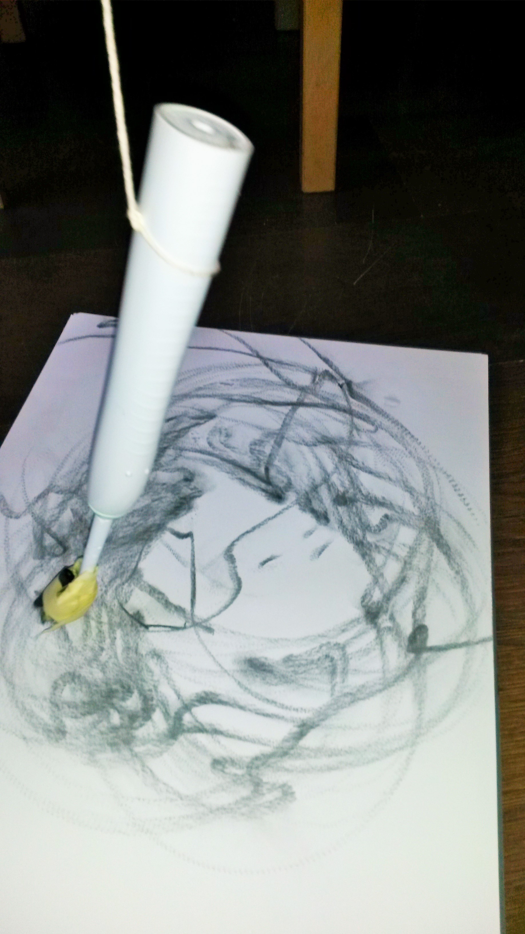
Take 10 pieces of card and give them to friends. Ask them to write down a characteristic of someone in a novel or newspaper article in the first person. Ask them to choose something that might engender an emotional or physical response….As they read the statement out, try to change the way you use your materials to respond to the statement. Make angry, scared, joyful marks as prompted.
I decided to do a self-portrait for this exercise, mostly for convenience, but also because I was thinking about the research I’ve done on John Bellany and the self portraits he did in hospital following his liver transplant. These are very emotionally charged and he conveys the emotion he was feeling because he had survived the operation, when he had been convinced that he wouldn’t.
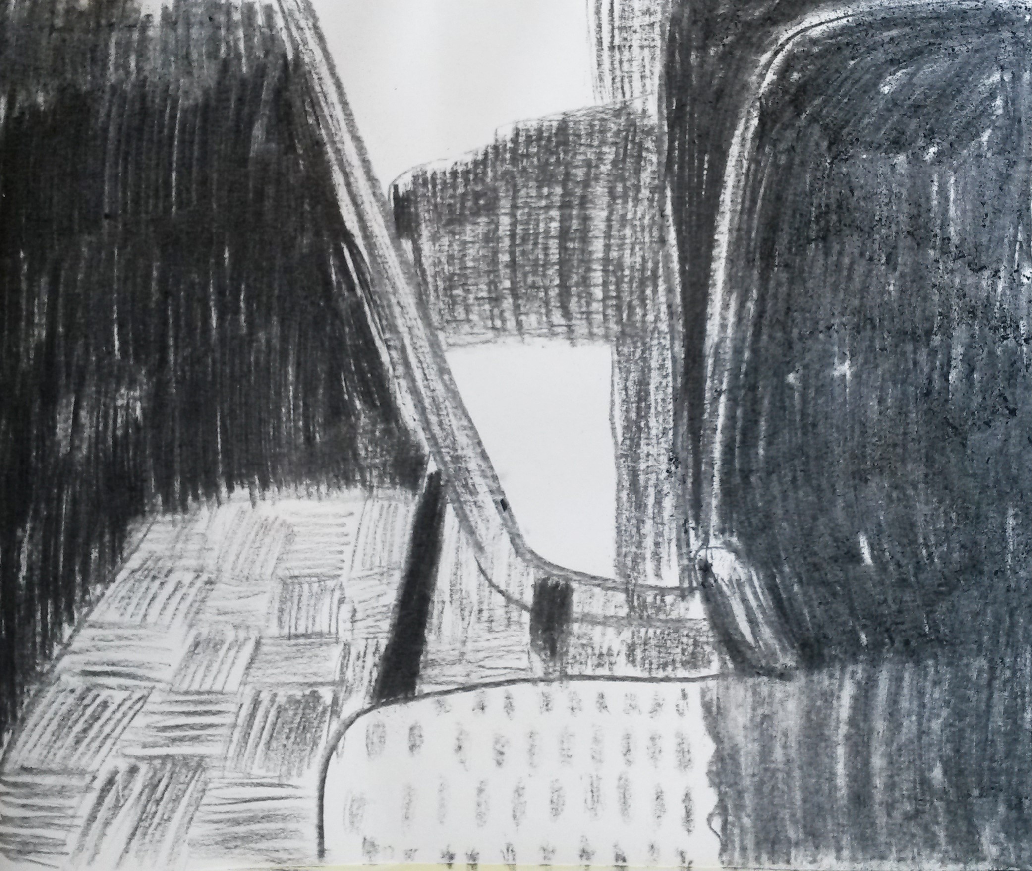
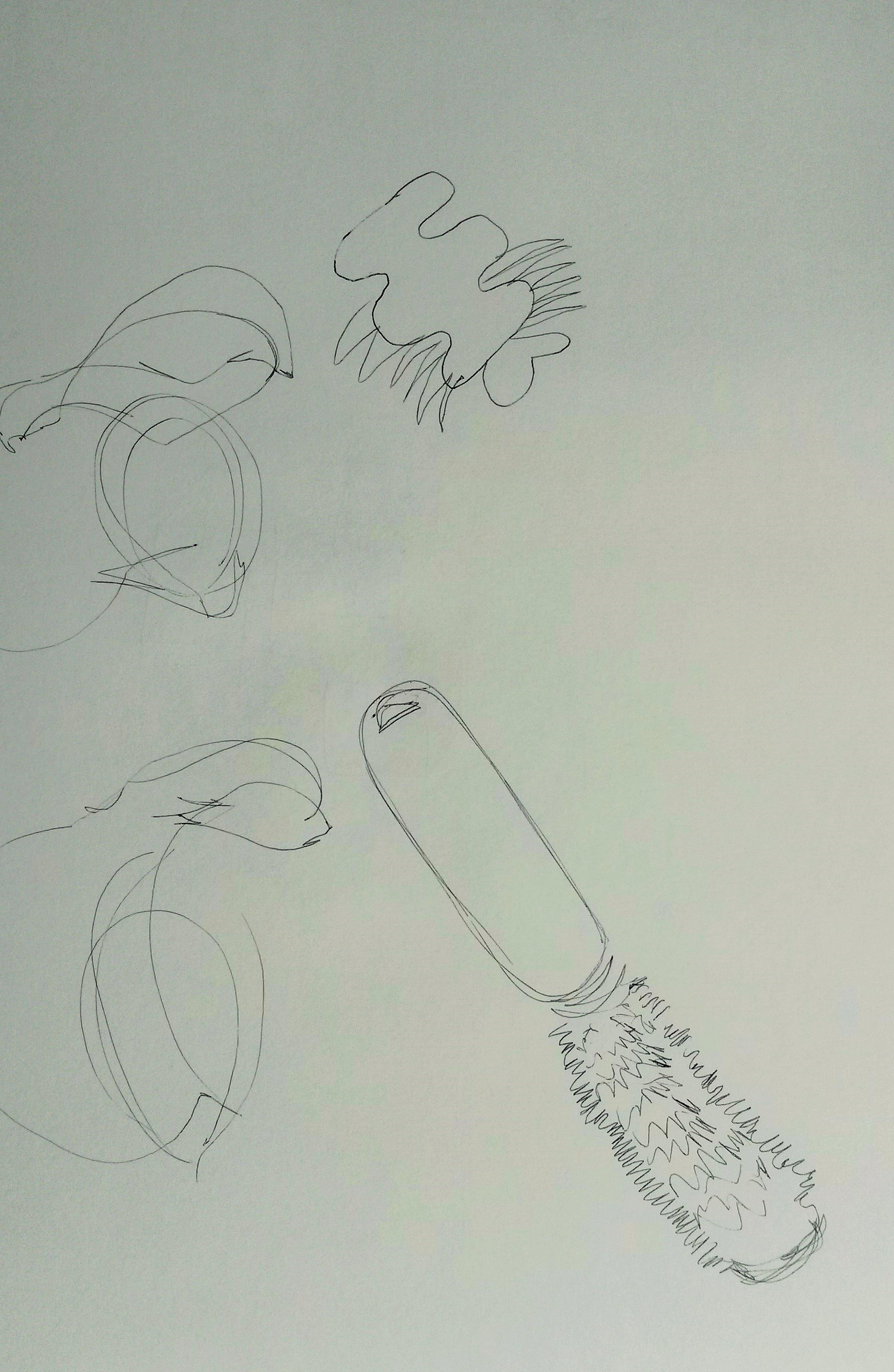
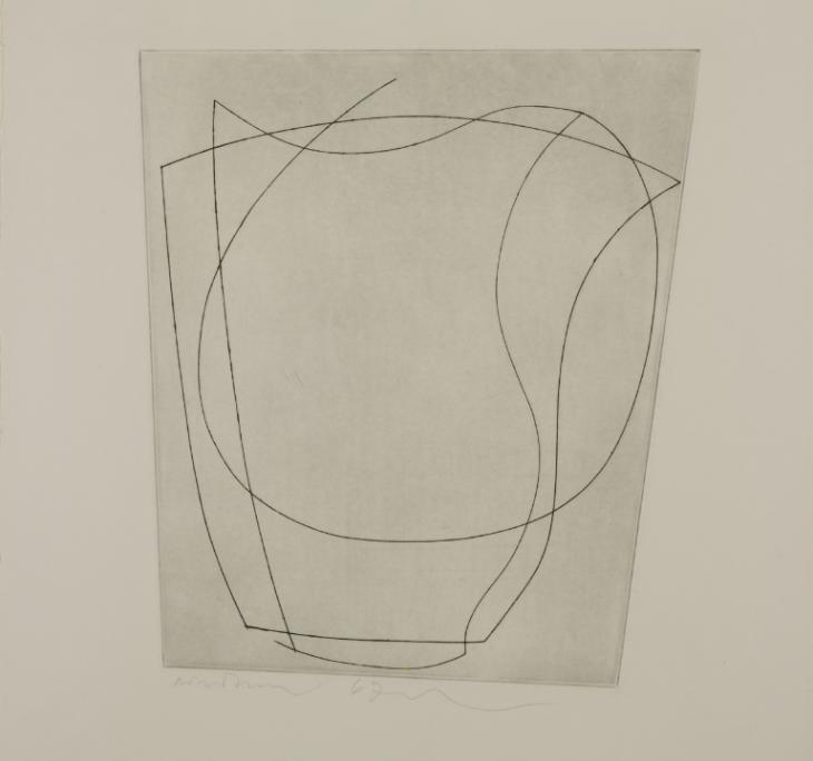
I am a little rusty at life drawing so decided to have a practice first.
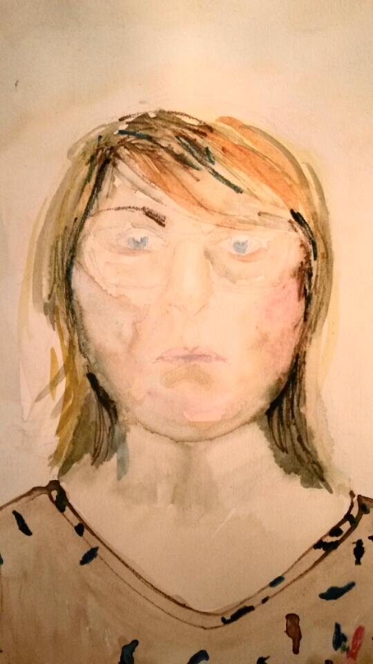
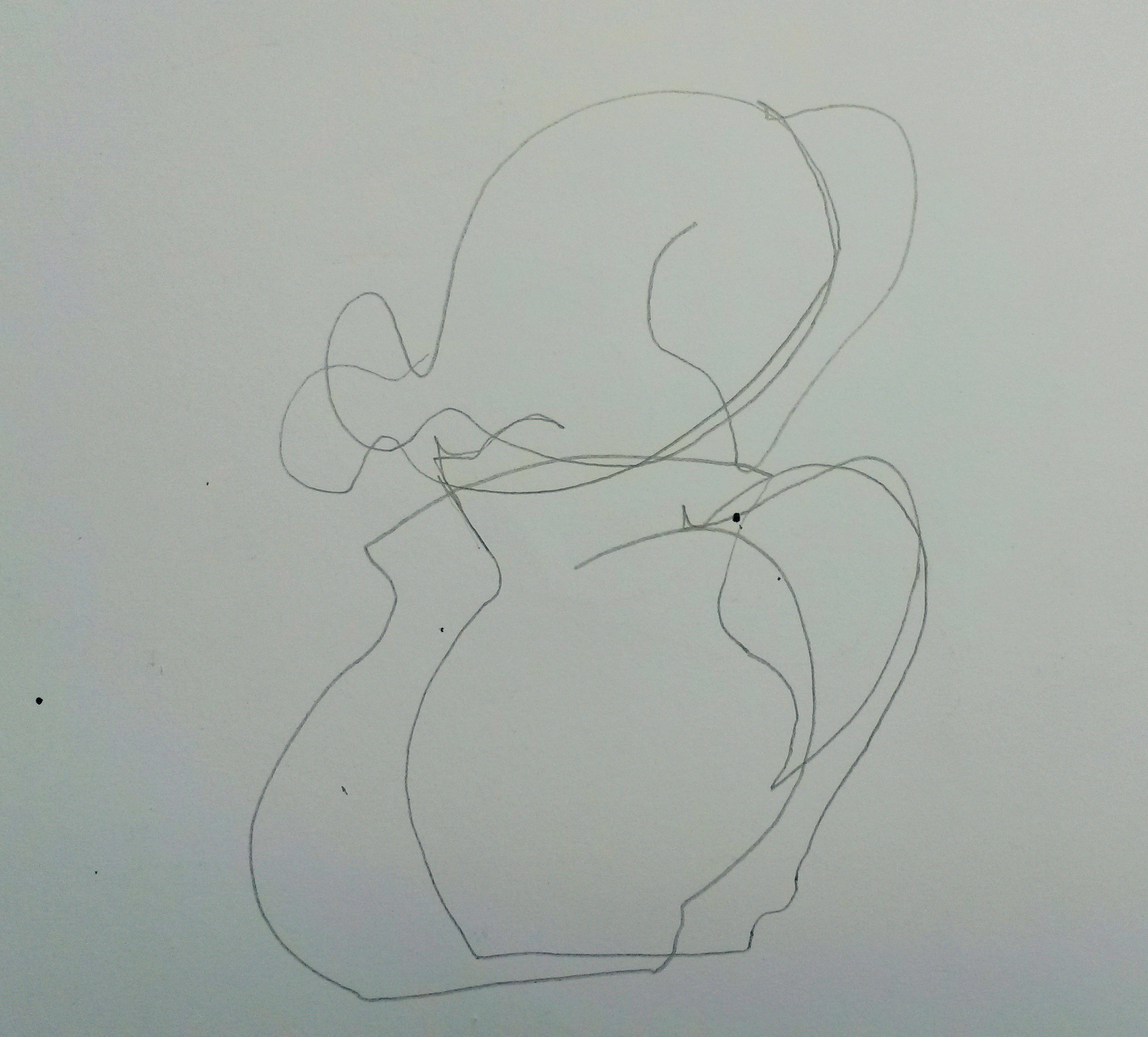
This was my first attempt, drawn with watercolour and watercolour pencil and using an easel. When I took it down from the easel I realised the proportions were way out. So I had another attempt.
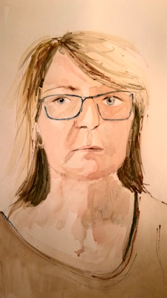
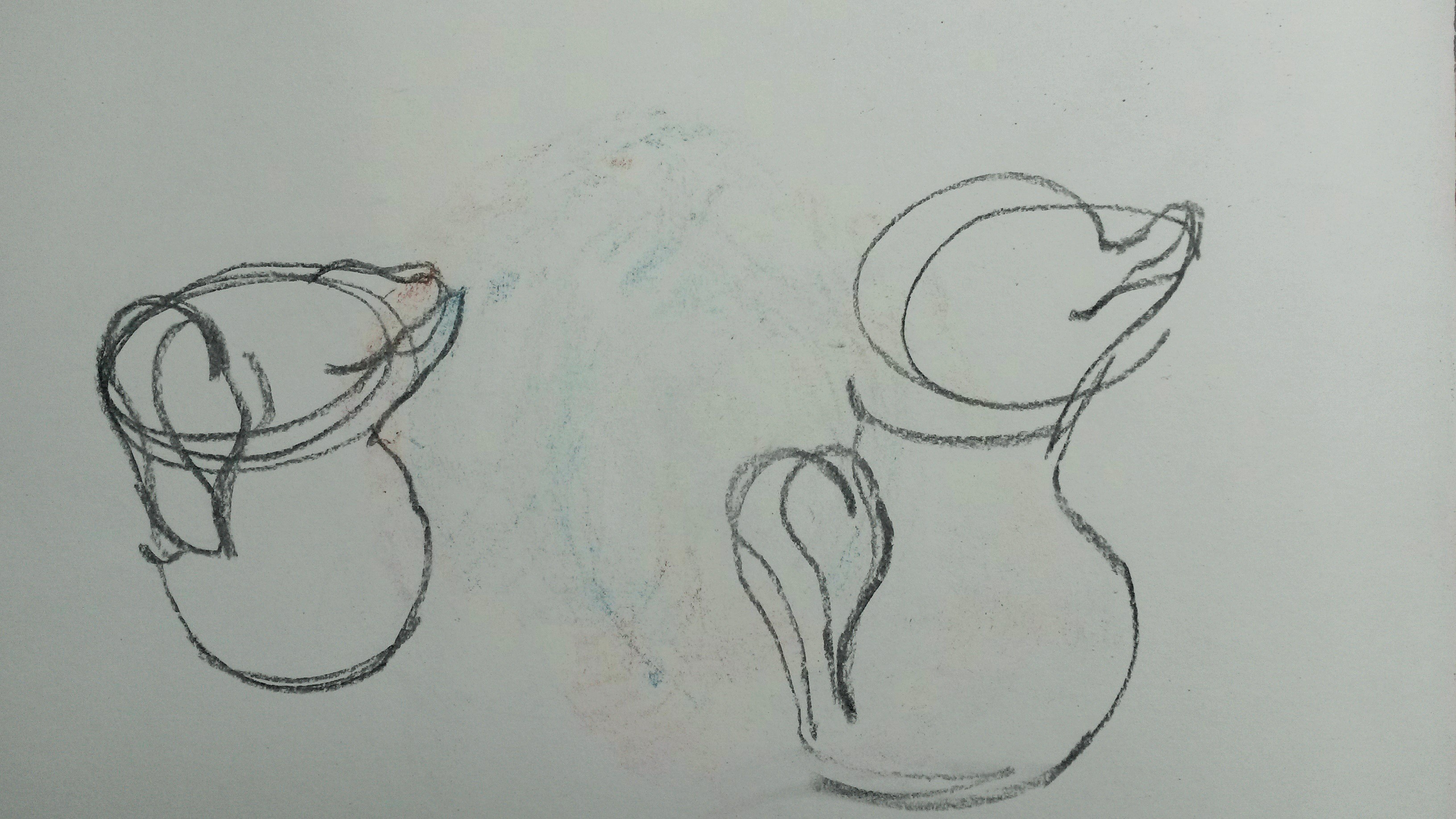
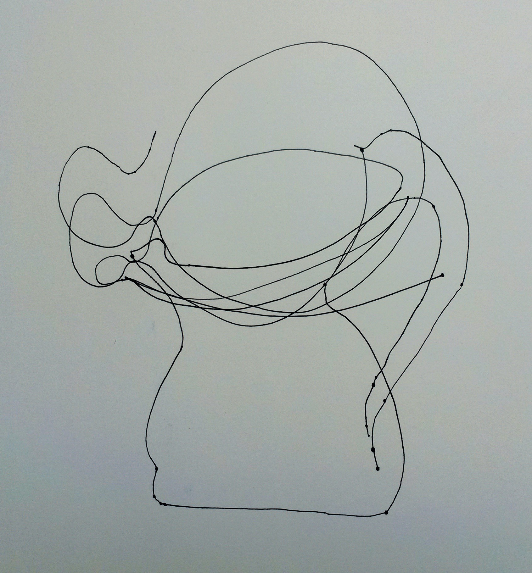
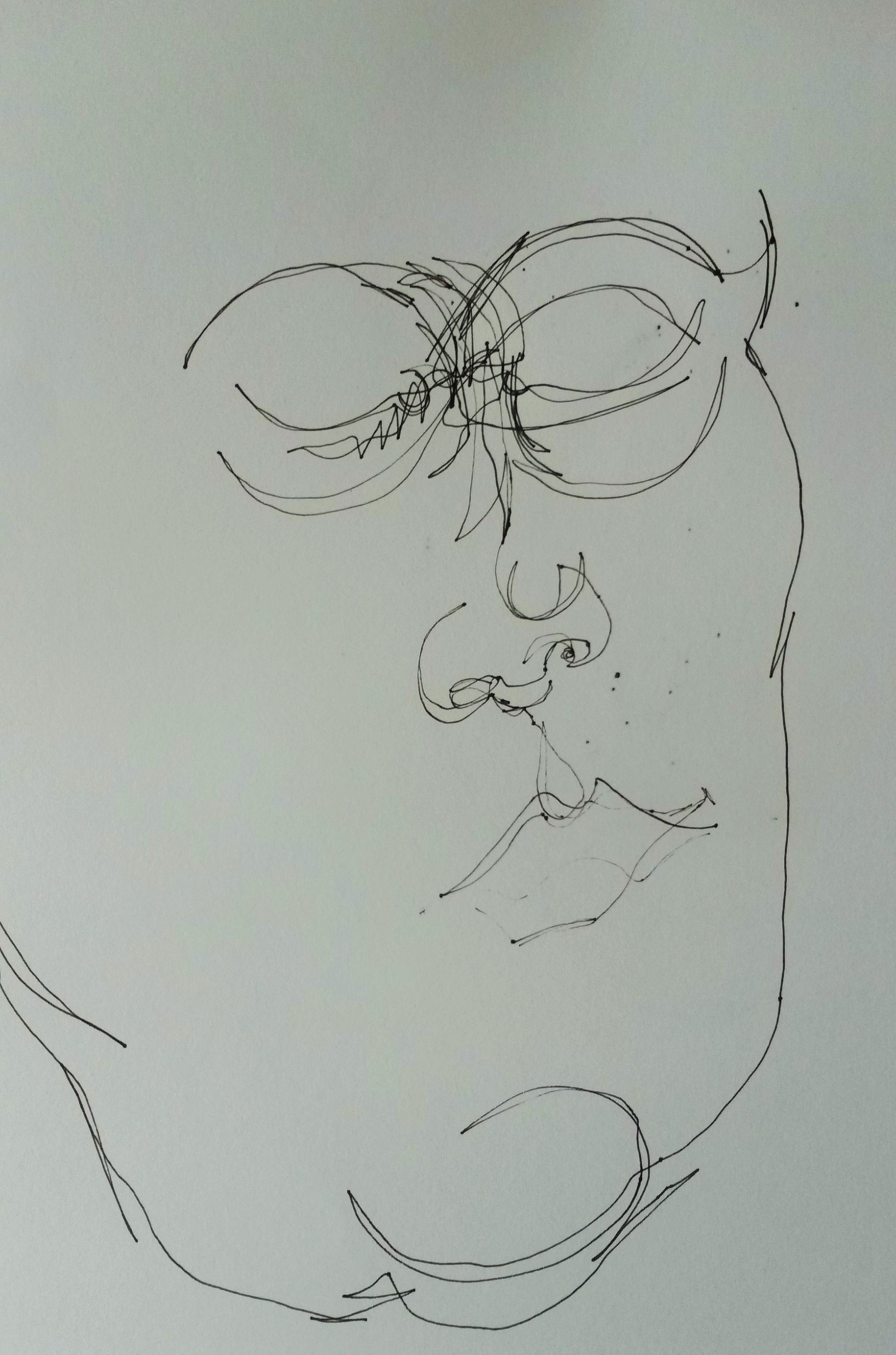
This was a little better, but I decided to try working from a photograph, so that I could concentrate on the mark making and not on the accuracy of the drawing.
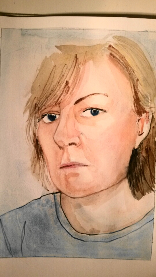
A3 sketchbook with watercolour and watercolour pencil
I thought this was a better starting point.
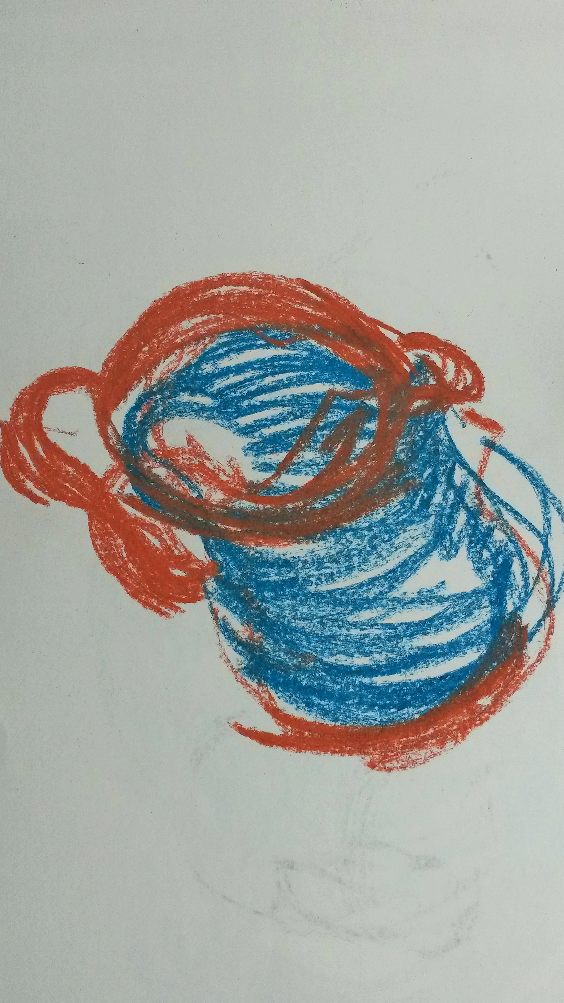
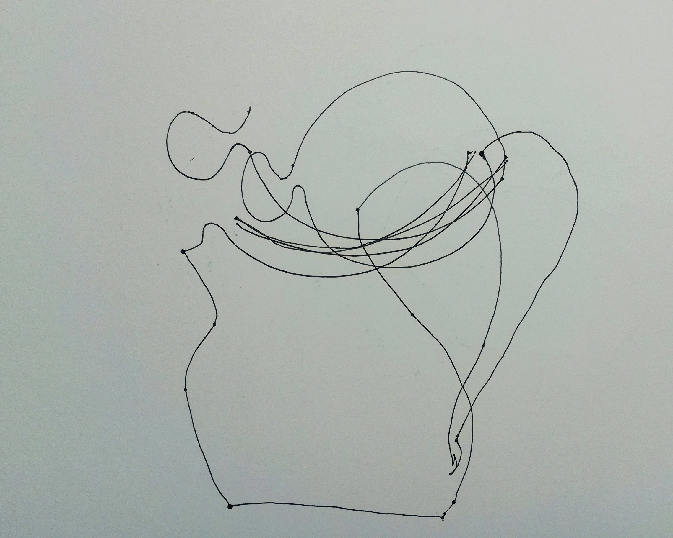
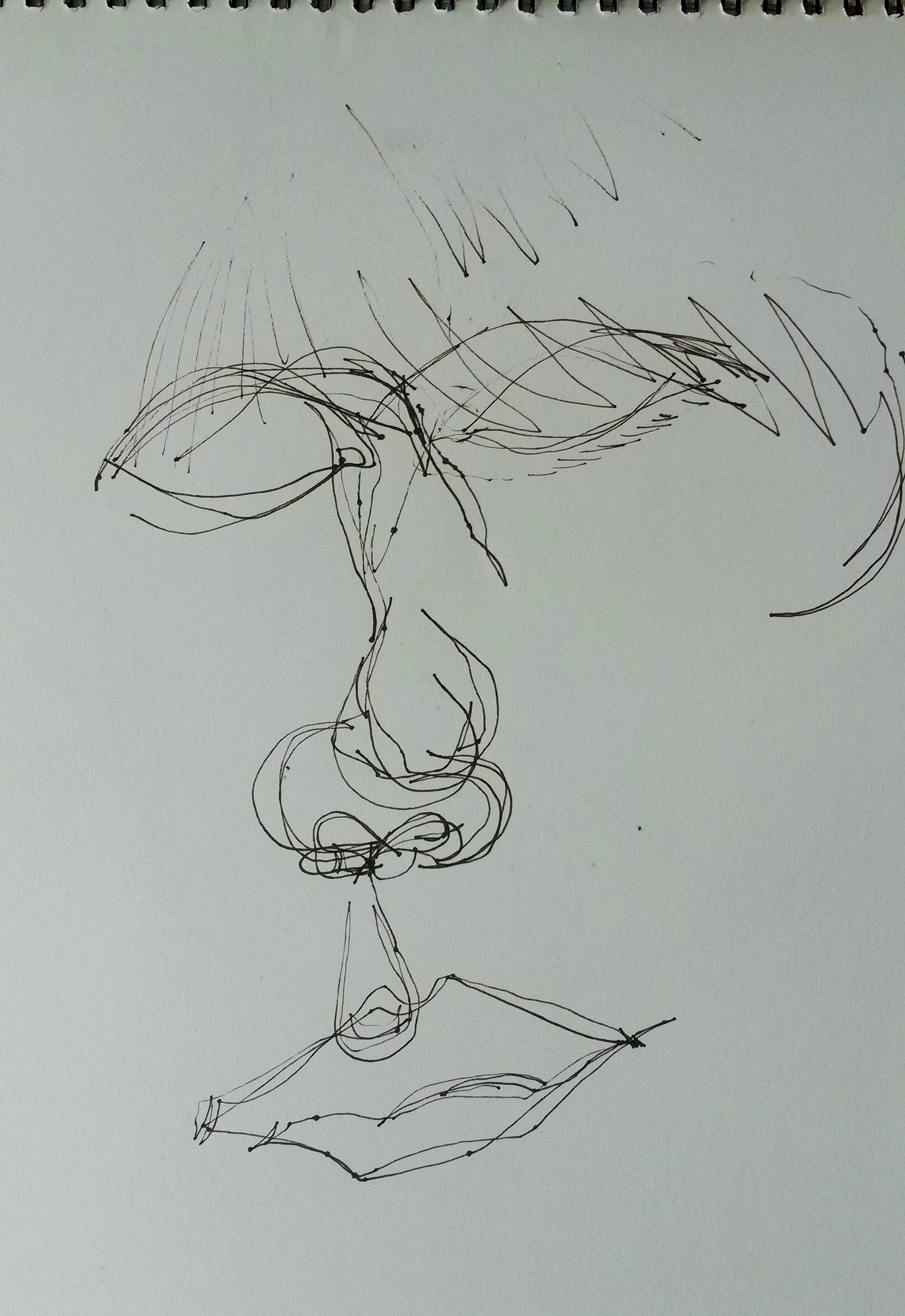
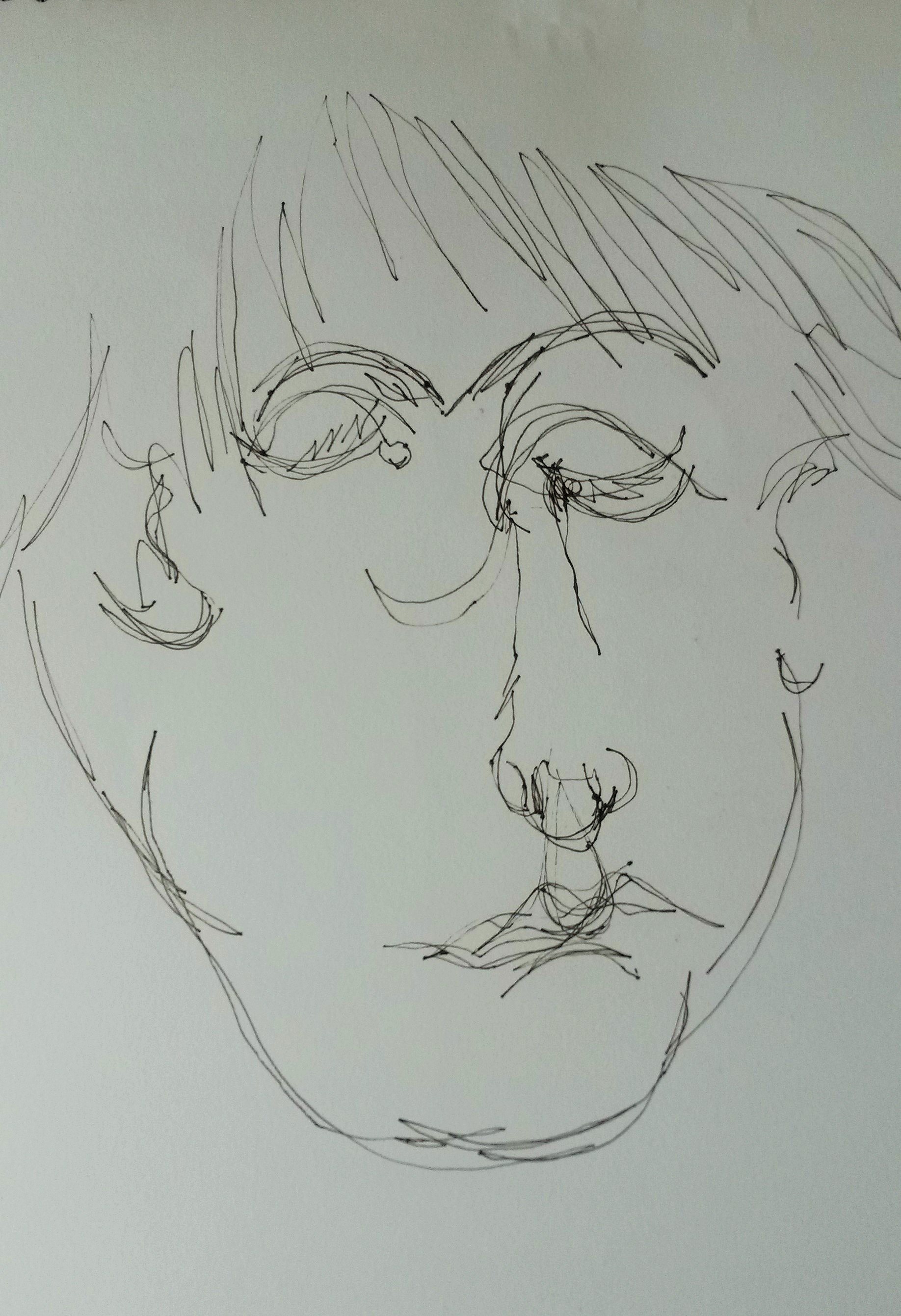
I had asked friends to email their little statements to my husband’s email address. He then printed them without showing me. I had them folded up and I began to draw another self-portrait using the photograph as before. Once I had pencilled in the basic drawing I looked at one of the statements. The first one read; ‘I am drunk and disorderly and I cannot take any more riddles. I killed someone today, I can kill you too.’
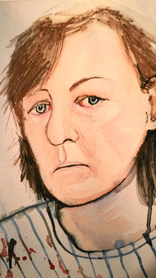
A3 sketchbook with watercolour and watercolour pencils
I used a lot of black in this drawing. I tried to made the gestures scribbly and loose. The striped t-shirt with blood spots was in homage to John Bellany. On reflection I think it has an air of despair, not madness to it.
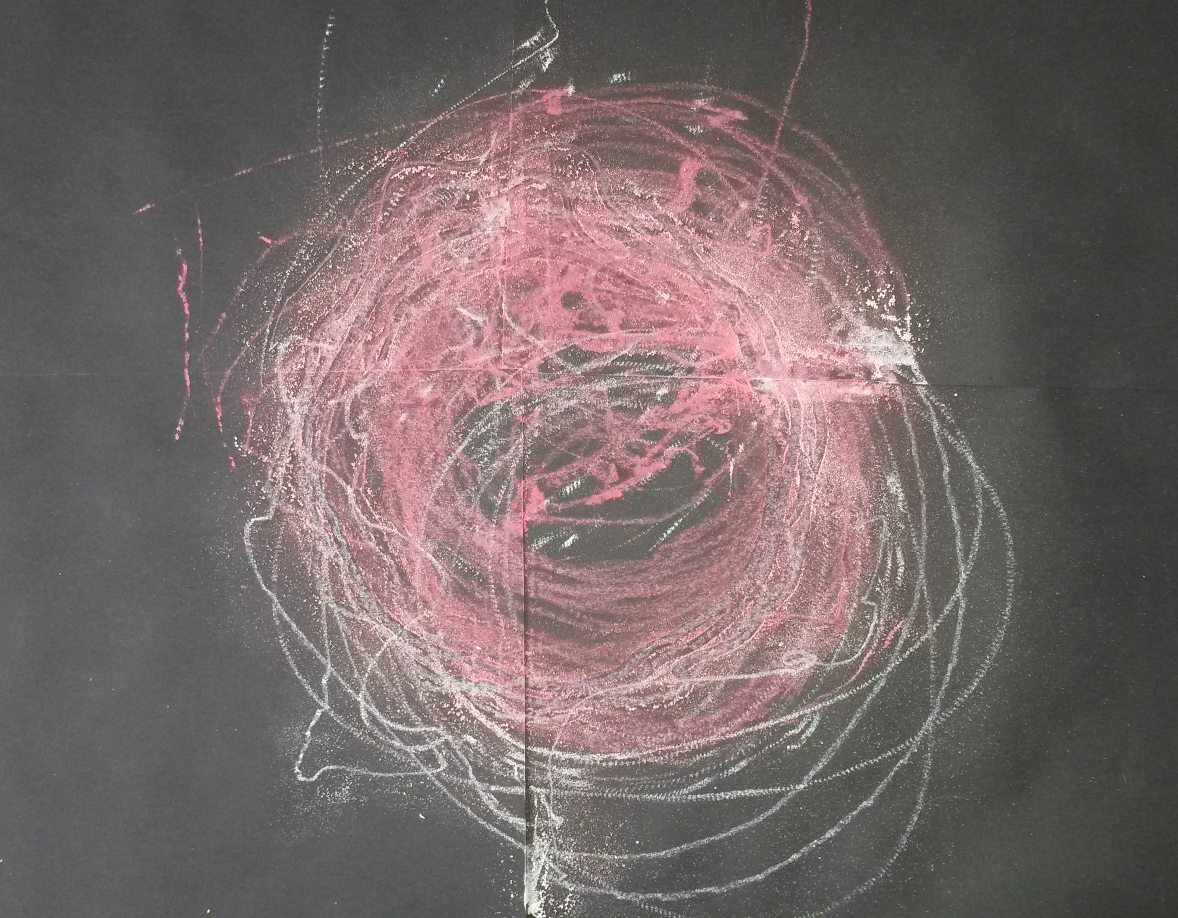
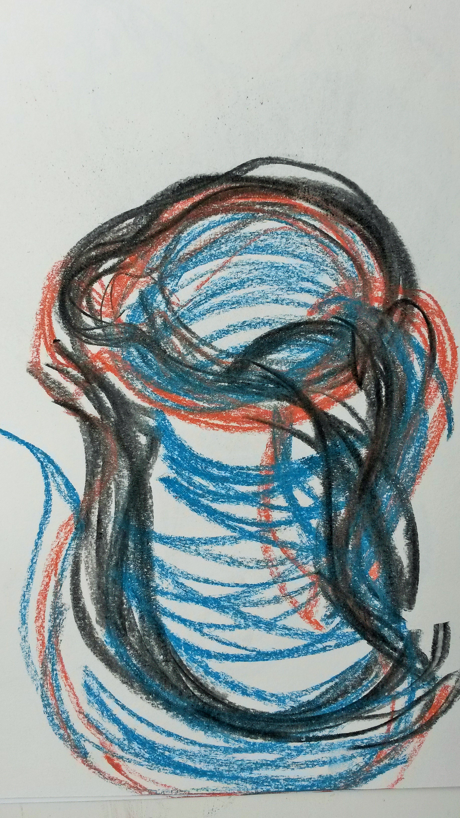
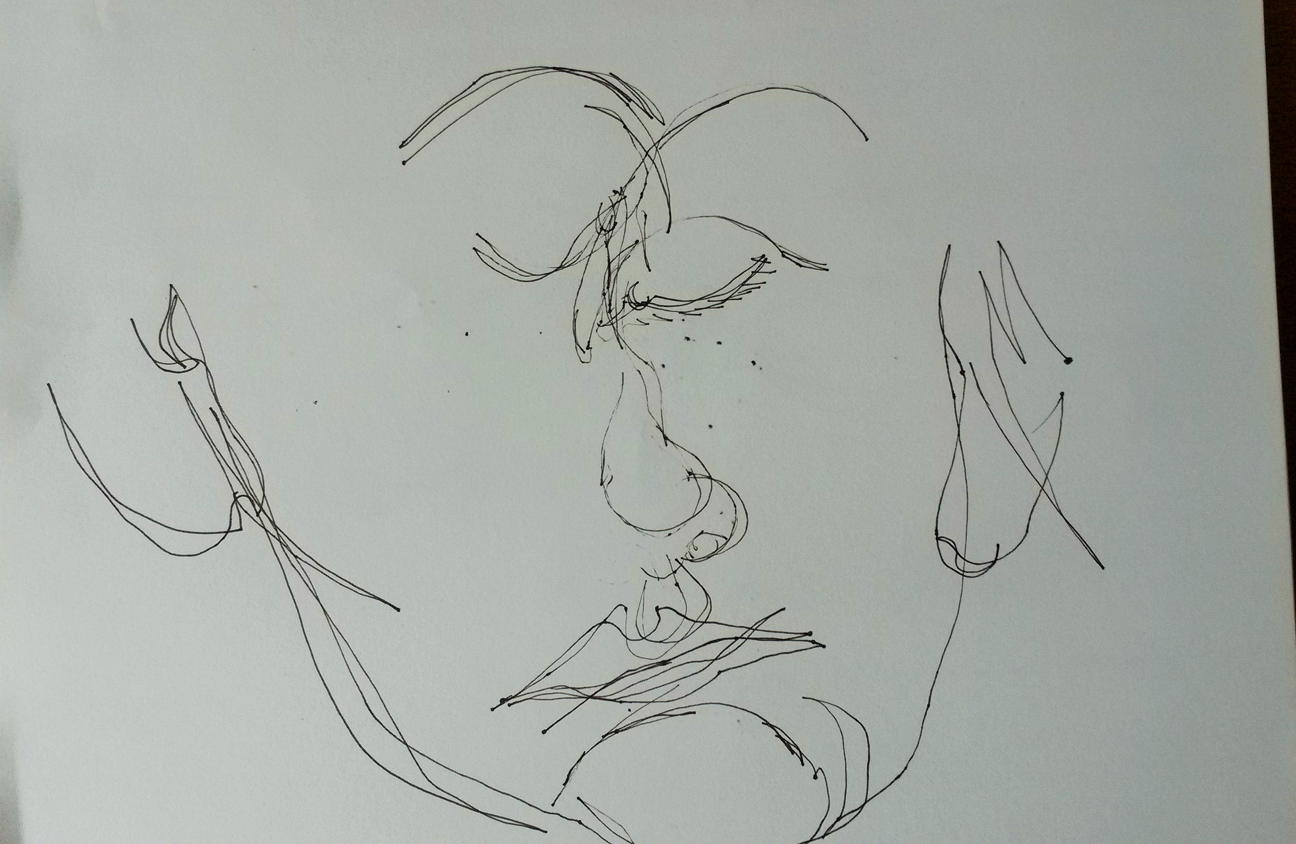
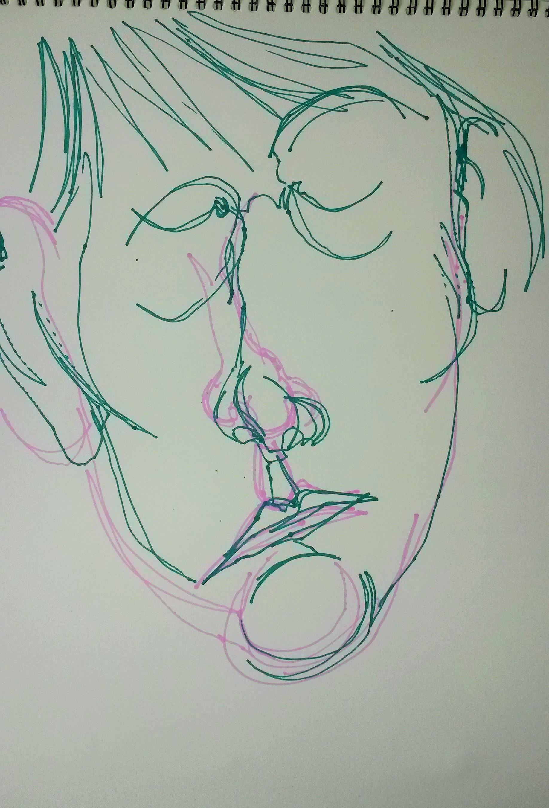
The next statement was; ‘Even as a child, I had preferred night to day, had enjoyed sitting out in the yard after sunset, under the star-speckled sky listening to frogs and crickets. Darkness soothed.’
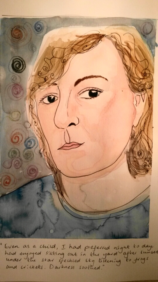
A3 sketchbook with watercolour and watercolour pencil
I tried to use scribbly curls and swirls when doing this drawing. I made the eyes very dark. I was aiming for an air of mystery.
When I began to reflect on the work I had made I felt the drawings were more an illustration of the statement. There wasn’t much physical response in the mark making. I felt I had become distracted by the concerns I had about life drawing. If time allows, I would like to re-visit this exercise and explore an emotional response further.