Category Archives: Part 4

Project 3: Installation

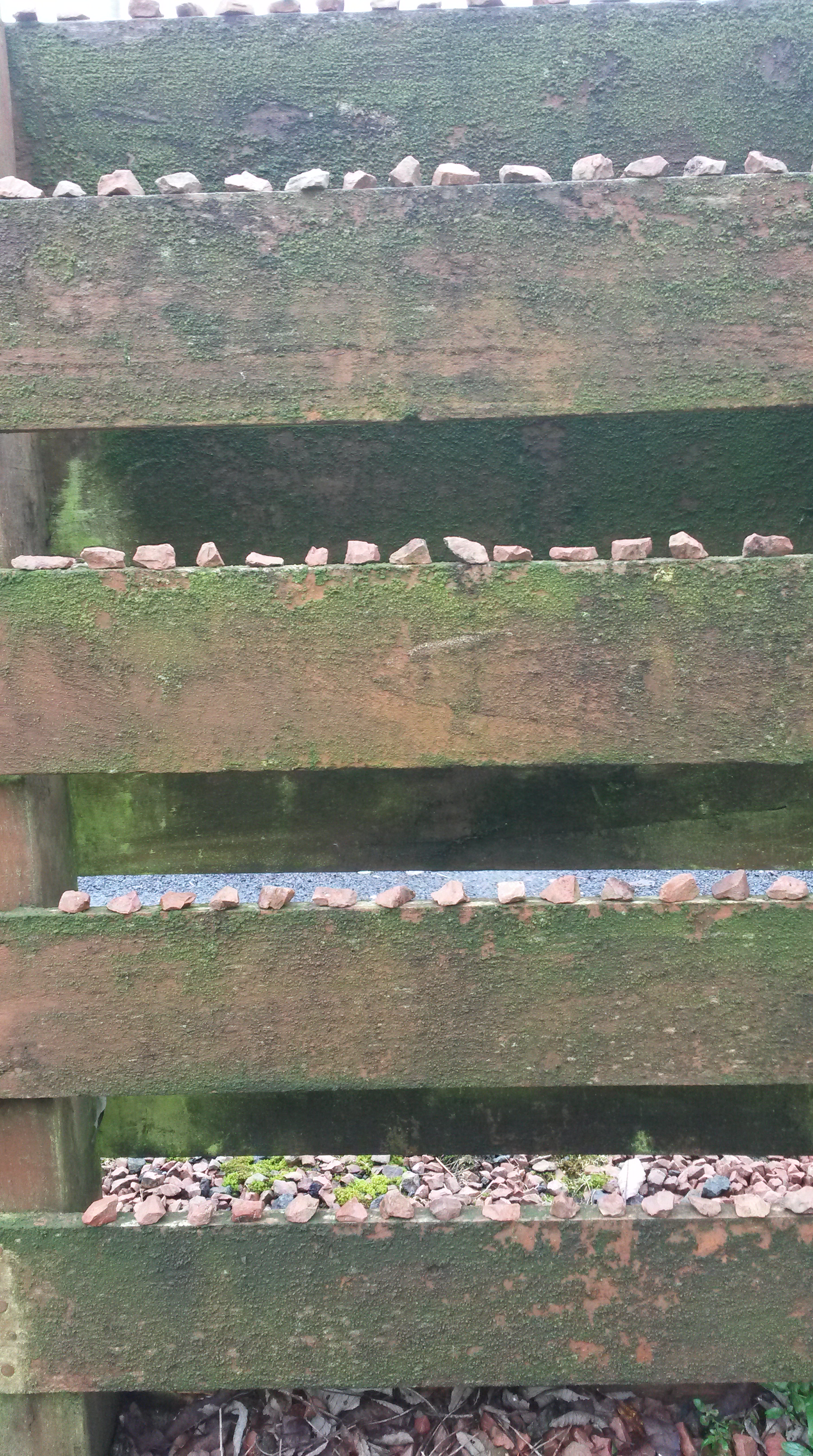
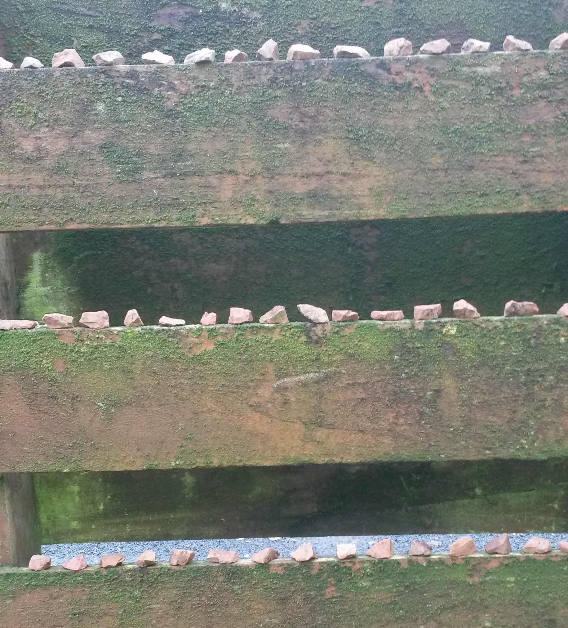
Make a drawing that relates to its environment in a way that creates an interesting dynamic between the artwork and the space around it.  Think about ways that drawings could take part in a kind of dialogue with the space they inhabit.  Text may be one way, or a drawn object in partnership with its real world equivalent.

Research for Project 3

I began by looking at the contemporary drawing exhibition held in Edinburgh On LineI looked at Robert Rauschenberg’s Automobile Tire Print.  1. ‘Rauschenberg instructed fellow artist John Cage, an avant-garde composer, to drive his Model A Ford in a straight line through a pool of black house paint and down a long strip of paper. The result is a print in which tire tracks form a direct record of the car’s movement down the street. This work pioneered a new form of art-making, blending elements of performance with the tradition of the ready-made (artworks made of largely unmodified mass-manufactured objects) initiated by Marcel Duchamp in the 1910s.’

Next I looked at Edward Krasinski. 2. ‘Krasiński was a leading Polish Conceptual artist, known for his extensive use of blue lines of tape, cable, and other materials. This installation re-creates Krasiński’s contribution to the 1970 Tokyo Biennale. The works, as seen here, were exhibited for only the last three days of the month-long event, as they had been misdirected in their shipment from Poland and arrived late. The artist supplied a substitute work in the interim, transmitting the word blue five thousand times via telex (a precursor to the fax machine) and instructing the Biennale’s curators to display the telex tape on a pedestal. “My art just needed to get to Japan as quickly as possible,” he said. “Instead of the two-month sea voyage, it got there in seconds. It was delightful to think that when the telex in Warsaw was typing ‘BLUEBLUEBLUE’ the very same moment the tape appeared in Tokyo.”

These two artists have made the act of drawing, just as important, if not more important than the outcome.  The making of the art has become a performance and demonstration of showmanship.

Malich’s wire works were conceived, he has said, as “the expression of a new space and the investigation of it.  3 ” Although he has never realized any of them on an architectural scale, that aim has been part of his project: at once cosmic and utilitarian, his sculptures of the 1960s were created as designs for utopian cities in some imaginary future. He continues to think of his later tied-wire constructions as models for large-scale outdoor projects shaped by forces of light, air, and water.

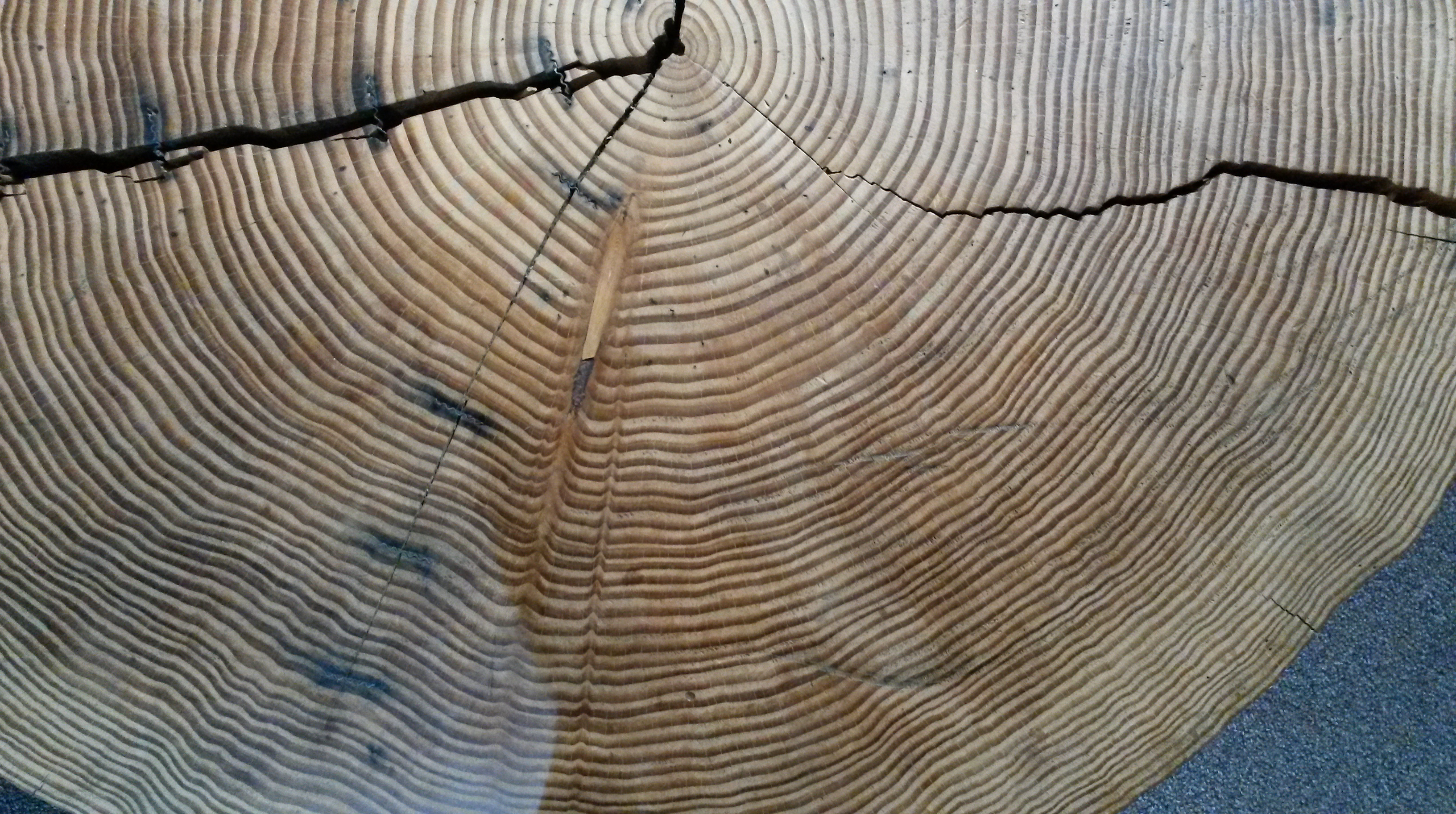
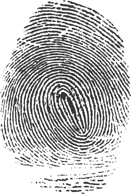
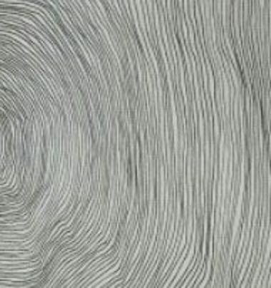
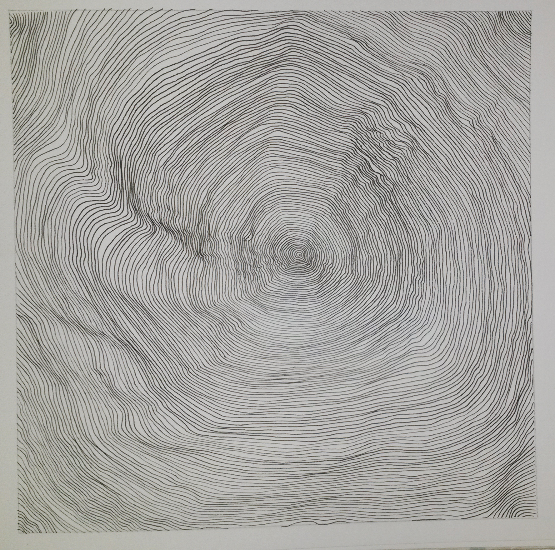
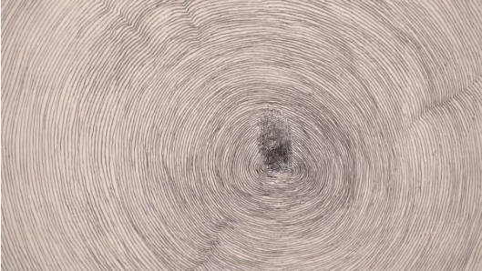
This drawing, which Penone made for On Line but conceived in 1995, began with the artist’s fingerprint on a sheet of paper. The pencil and ink lines, following those created by the inked ridges of skin, radiate outward, filling the paper then spilling over onto the walls of the gallery space, like the rings of a steadily growing tree.  In an interview, of Propogazione, he said’ It is a piece that was born of the idea that fingertips have a design from deep within the universe on them.  You can see it in the growth rings in trees…..I made a fingerprint using ink then I connected the lines in the fingerprint with a pencil, with graphite trying to continue the drawing….Drawing above all else is about line.  The line is a mark, that is arranged on a surface.  This makes it an intentional mark.  Therefore, it becomes a human action.  This is the most extraordinary thing about line, its such a simple gesture but its deliberate.’

Interestingly, I hadn’t heard of this artist or seen this artwork when I drew my ‘tree ring’ drawing for Project2 below, although his is in a much grander scale.

User comments

And here is Penone’s work;
giuseppe penone propogazione2
Detail of Giuseppe Penone, Propogazione 1994

Reflection: Use the links below to find out more about Pierrette Bloch.  why is she described as using ‘poor materials’ and what do you think her materials lend to her subject matter?

4.’ Like Soulages, Bloch has only used black for many years, but unlike his predominantly oil on canvas works that often swell to the heroic scale of Abstract Expressionism, Bloch has shown a penchant for humble materials and more extrapolated formats.’

I think the word ‘humble’, rather than poor, describes the materials Pierrette Bloch used.  Horsehair, found wrapping paper and ink markings on board are all humble materials; they are not traditional media for art work and most people would discard them.  It is the way they are put together that count.  She is very much in control of how the work is seen.  5. ‘Bloch has workspace in her studio apartment on an upper floor of an old building in Paris’ 15th arrondissement. All of her exhibitions are meticulously planned in advance. Bloch builds small models based on the proportions of the given environment, and using miniature replicas of all of her work, determines the placement.’

To what extent would you say that Spider by Louise Bourgeois is a drawing?

I was very fortunate to have seen this work on an OCA Study Visit last year.  Here is a link to what I wrote at the time;

https://annemacleod2013.wordpress.com/2014/03/13/study-visit-to-louise-bourgeois-exhibition/

The obvious description of this piece would be sculpture, however I can see why it could be viewed as a drawing.  There are the obvious linear qualities, emphasised by the strong use of black.  The enormous structure fills the space in the room, but the black flattens the image and it could almost be flat on a plane.  The image is not of a room with a spider, but of a spider inhabiting a room.  Incidently, Louise Bourgeois used the spiral motif a lot in her work, however she never fully explained the significance of it (see my study visit notes).

Project 3

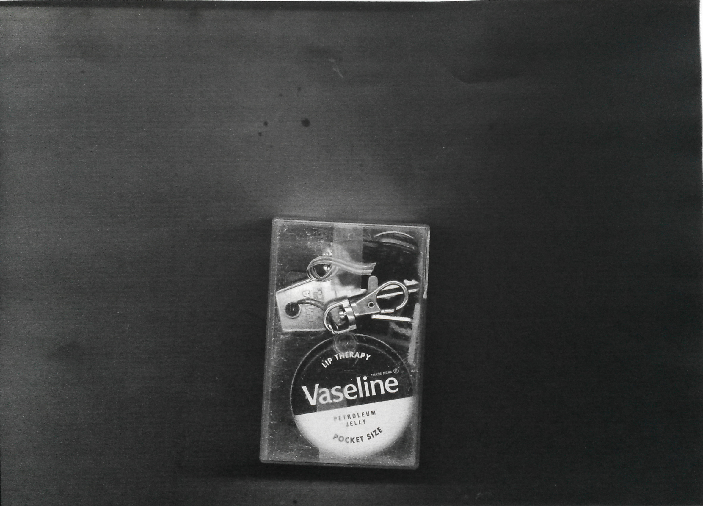
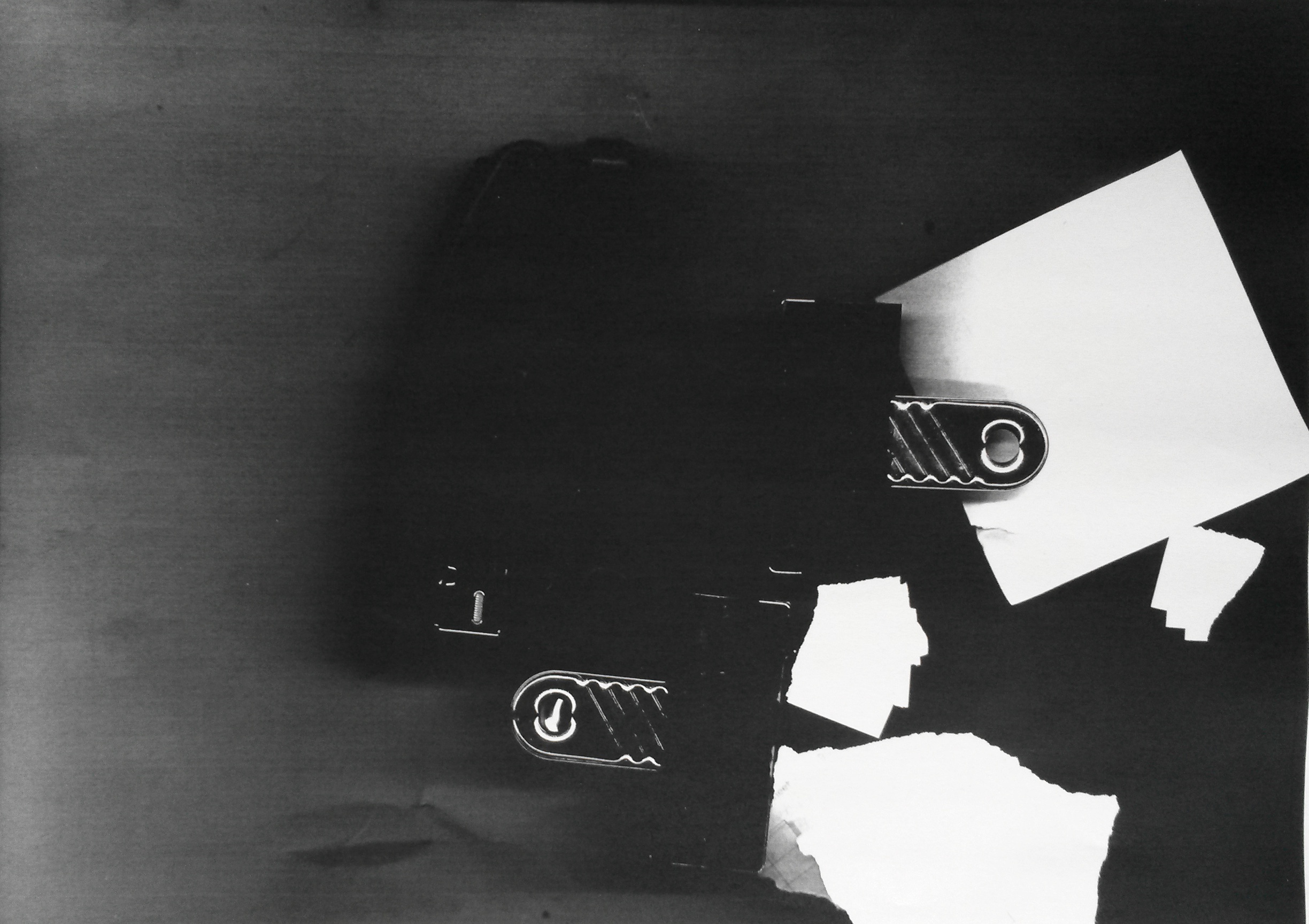
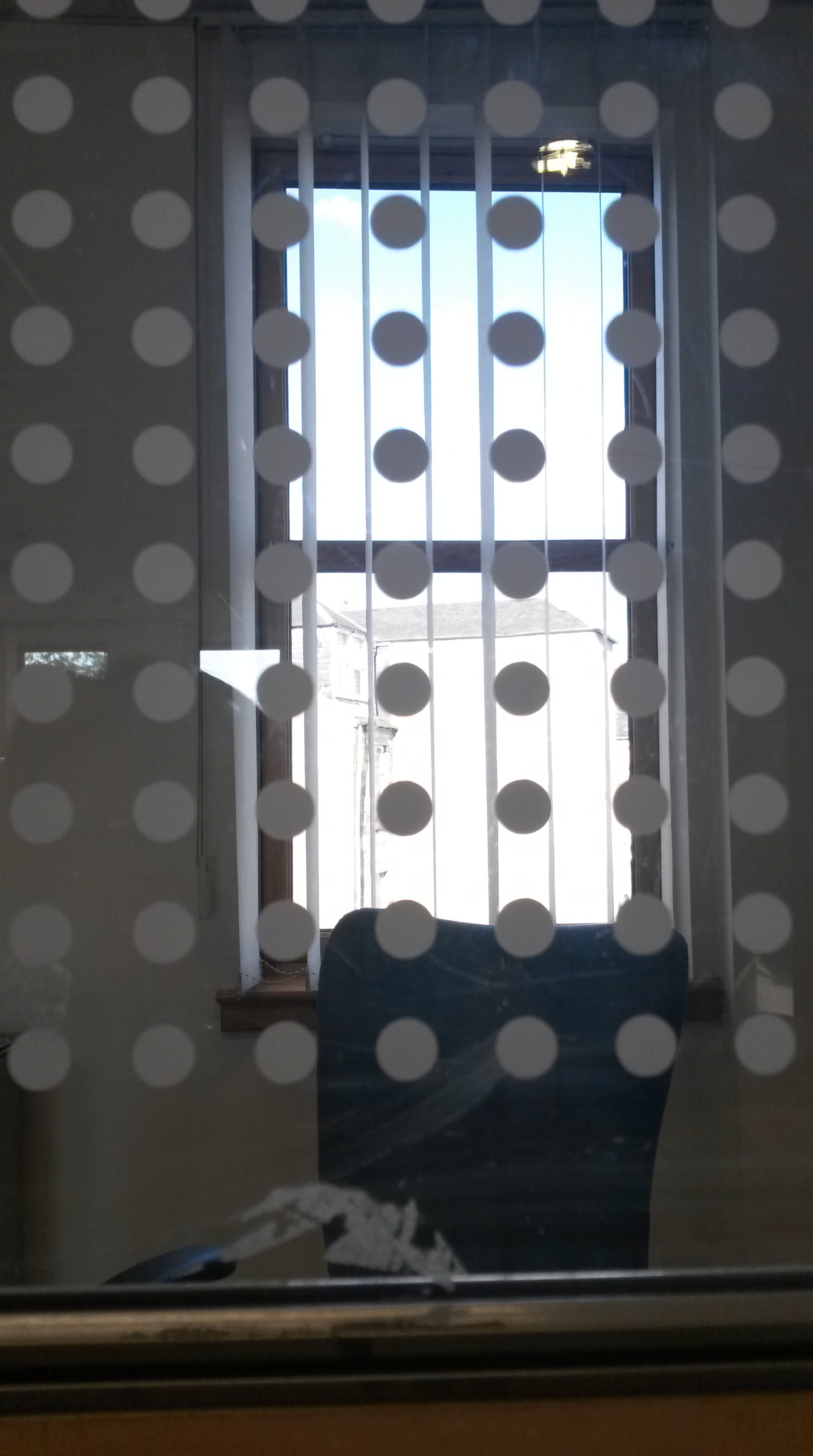
This is such a new area for me, I debated long and hard where to start.  I wanted to relate it to my parallel project.  Some of the ideas I had were; use fax, something sitting on the empty chair, draw a welcome mat, speech bubbles coming from the furniture.

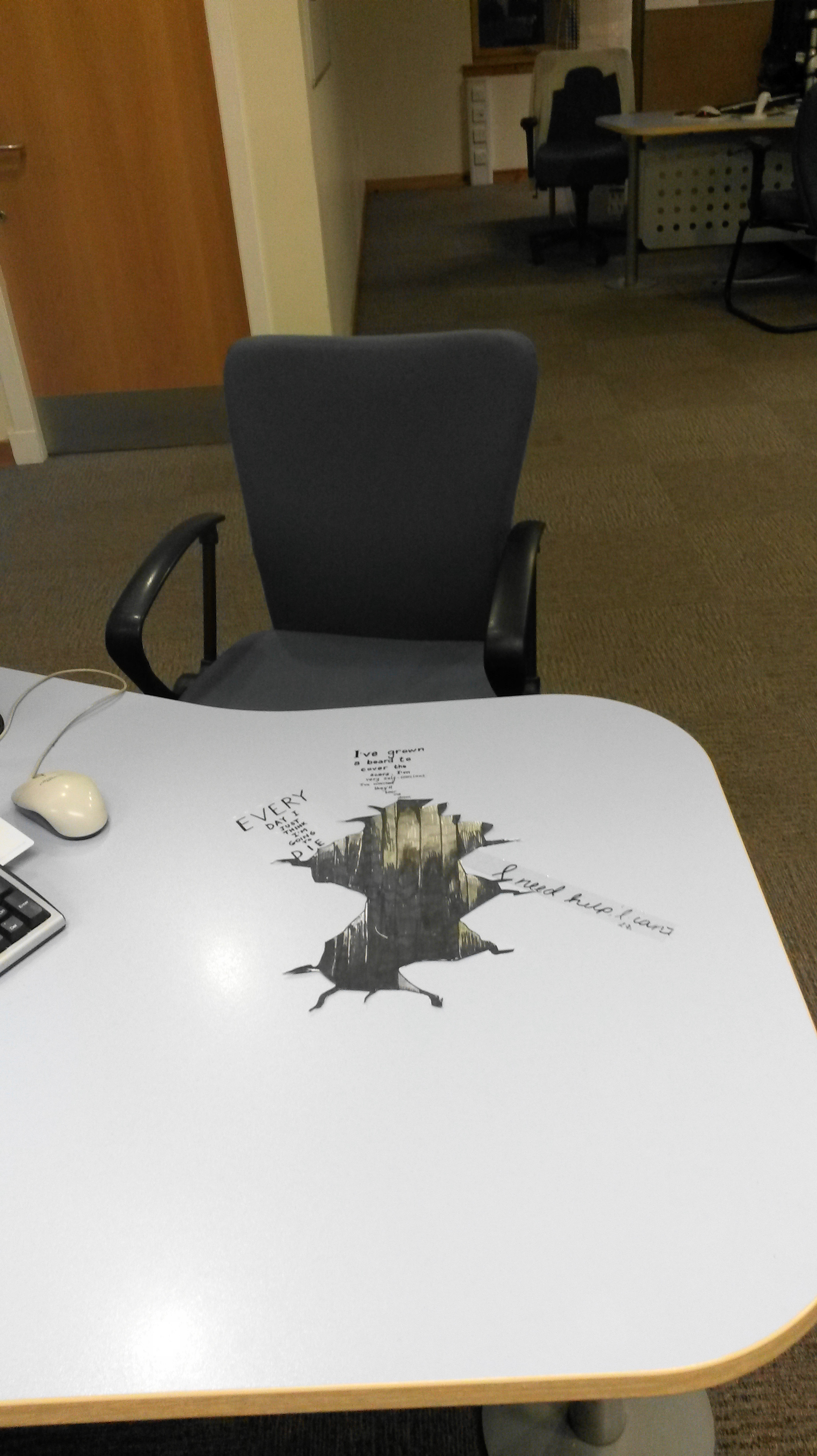
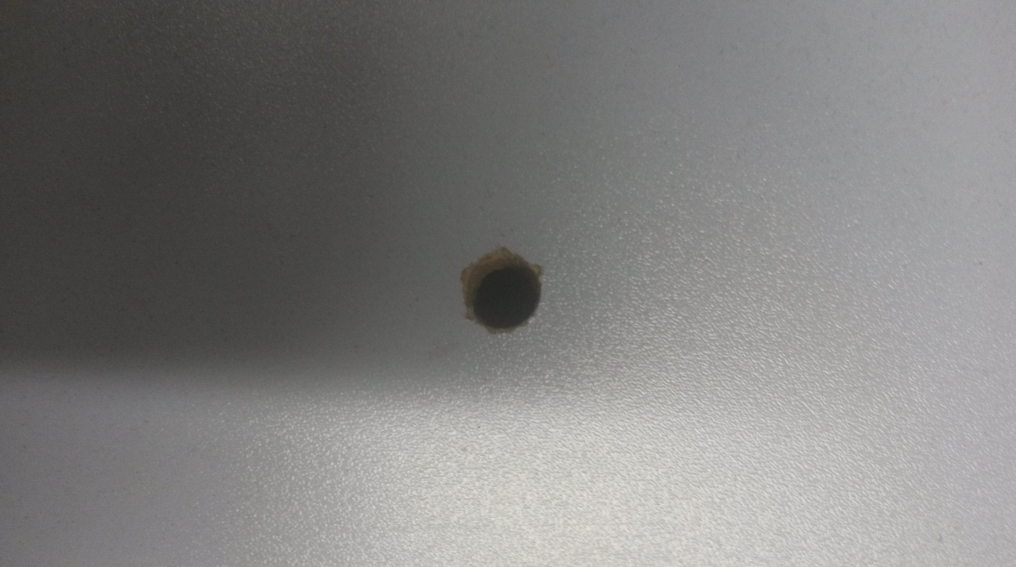
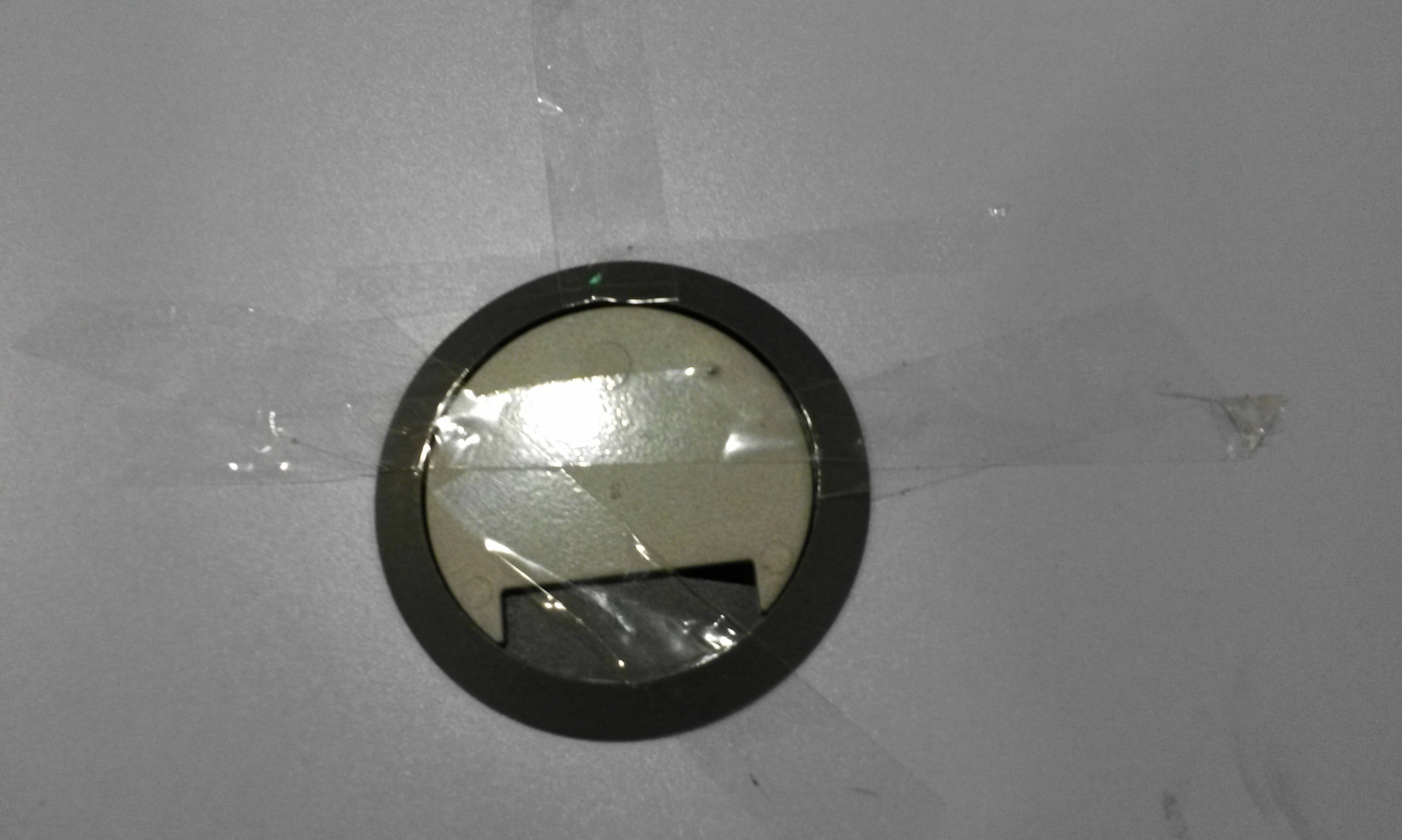
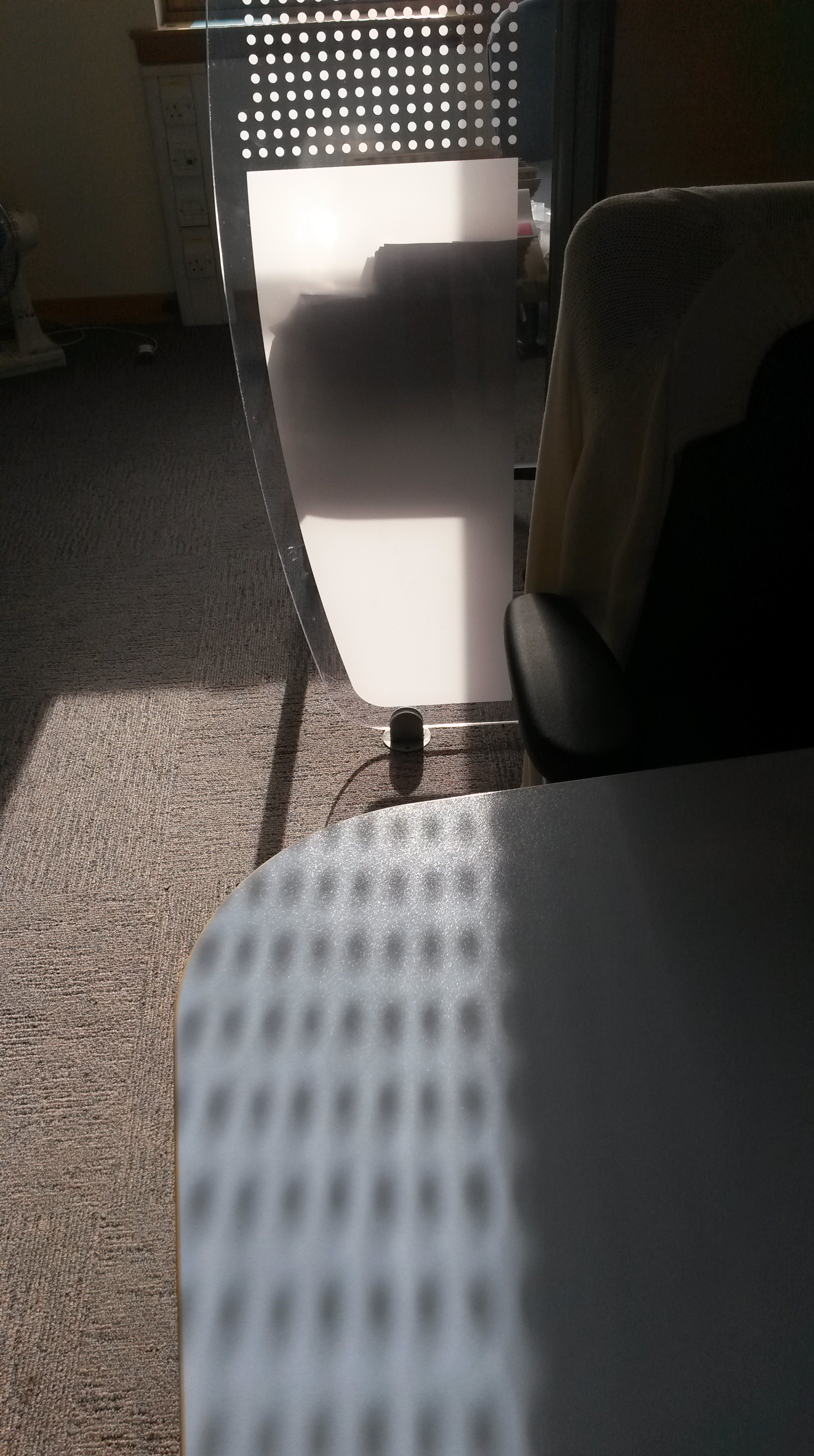
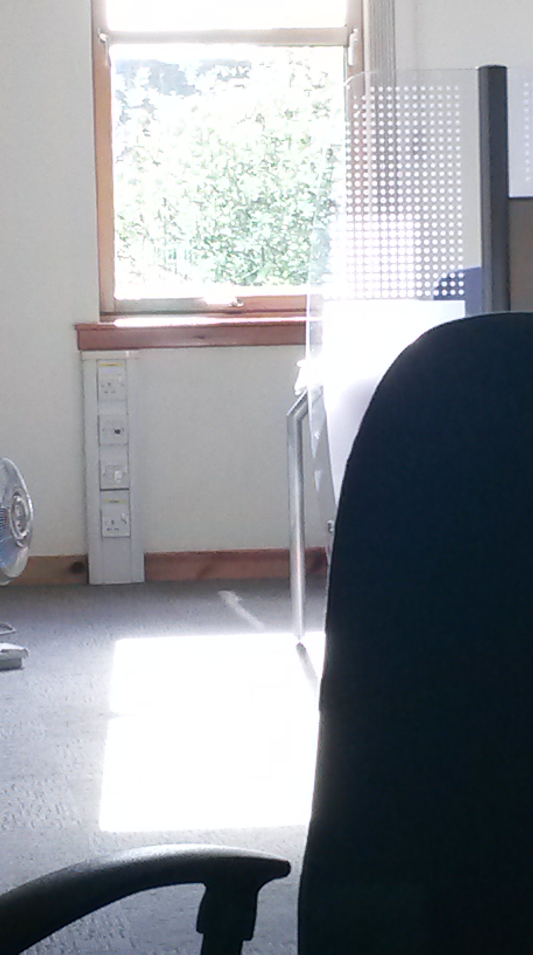
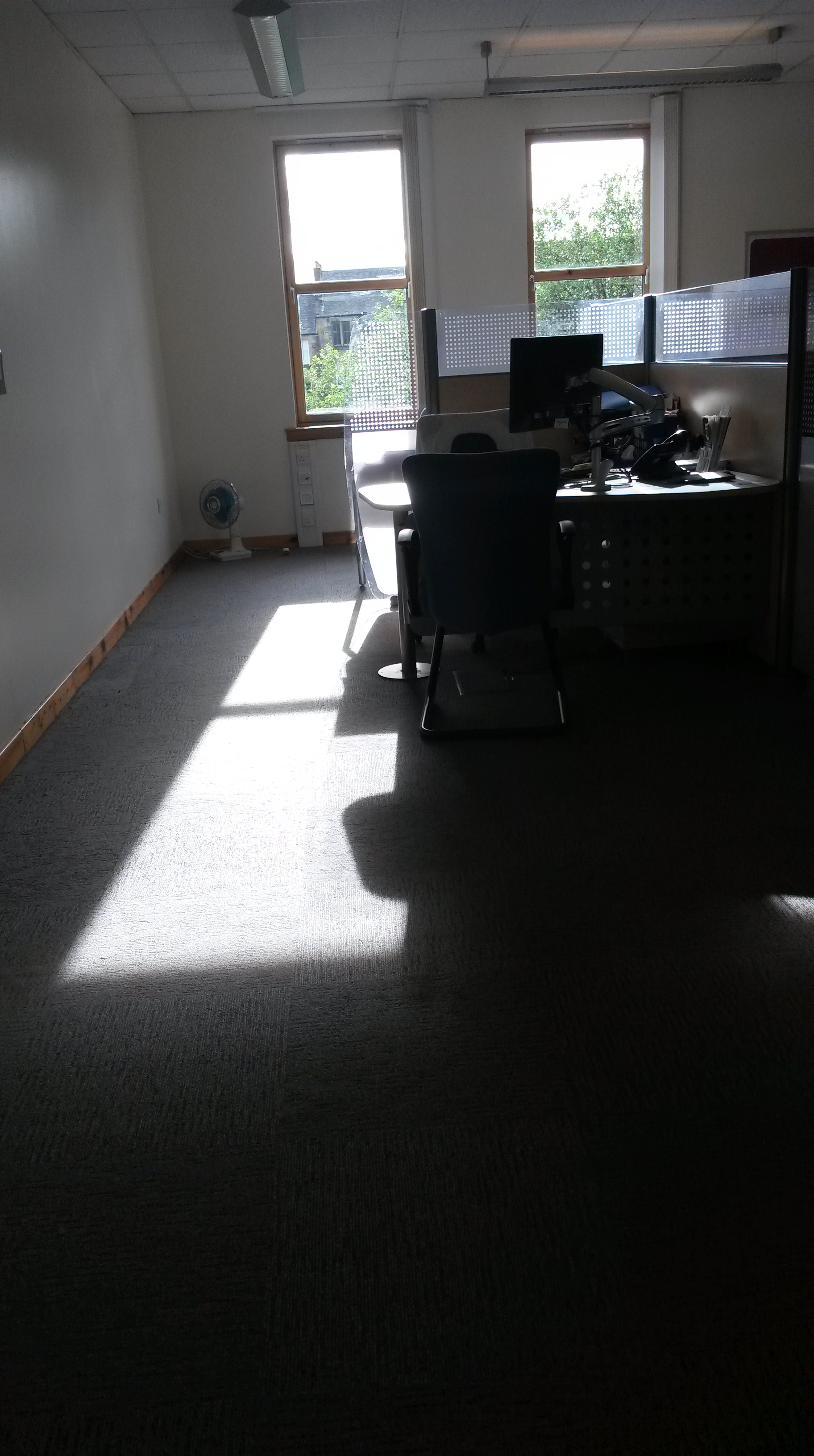
I looked at the artists suggested as reference, such as Kurt Wenner, and there was often an element of optical illusion , but which still incorporated the environment.  Often these involved the viewer looking down.  I tried to imagine how I could do this at work.  The floor is carpeted and I couldn’t imagine being able to look down on the floor, and in addition it would need to be done on a large-scale on the floor, so I thought about how I could perhaps use my desk instead.

I had a look on YouTube, hoping to find a video which would show me how to do this and I found;

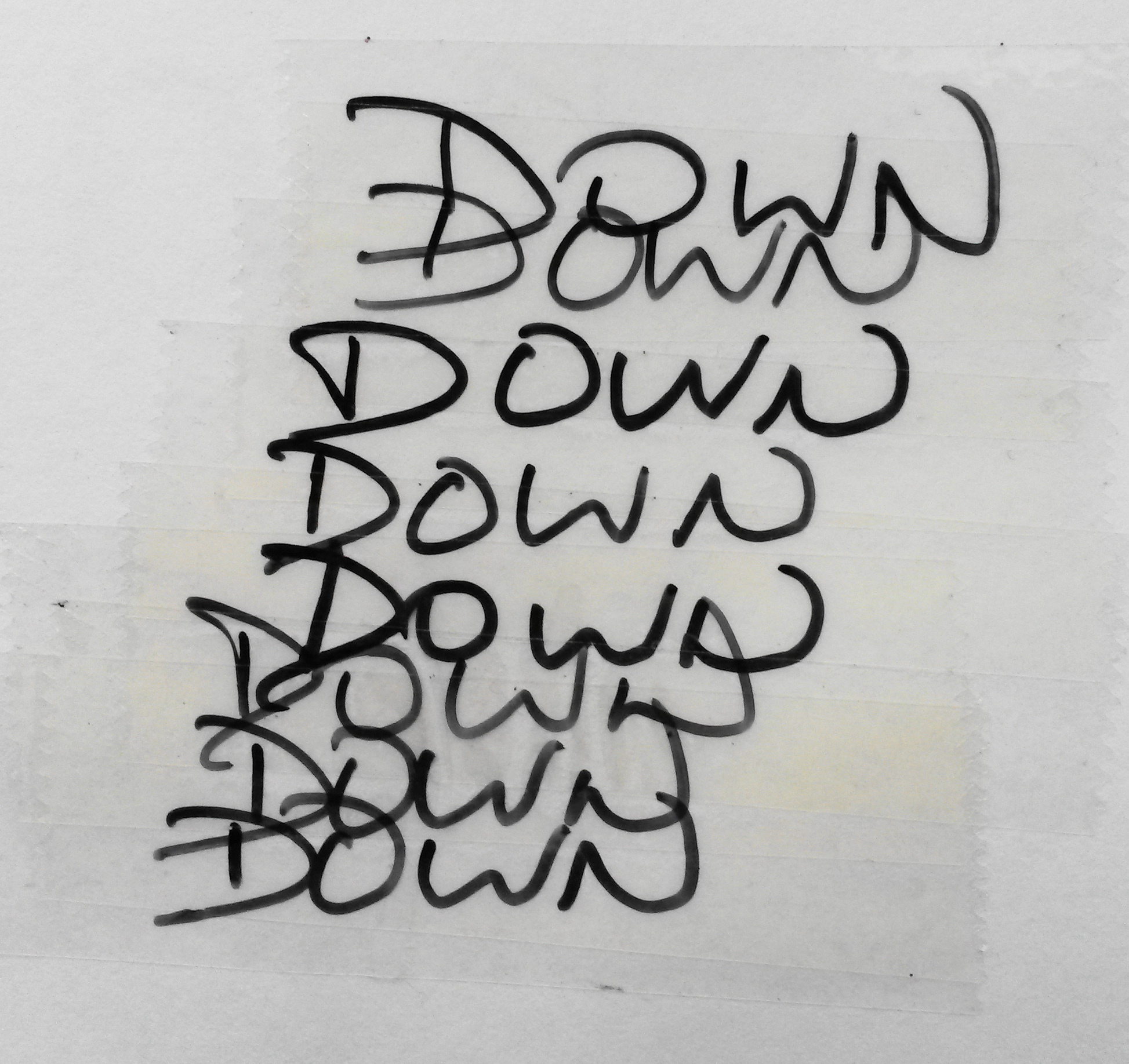
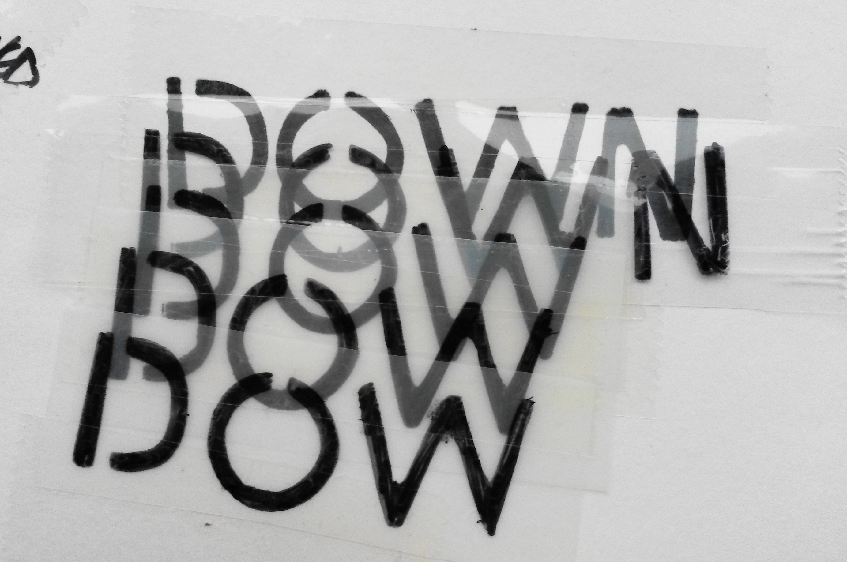
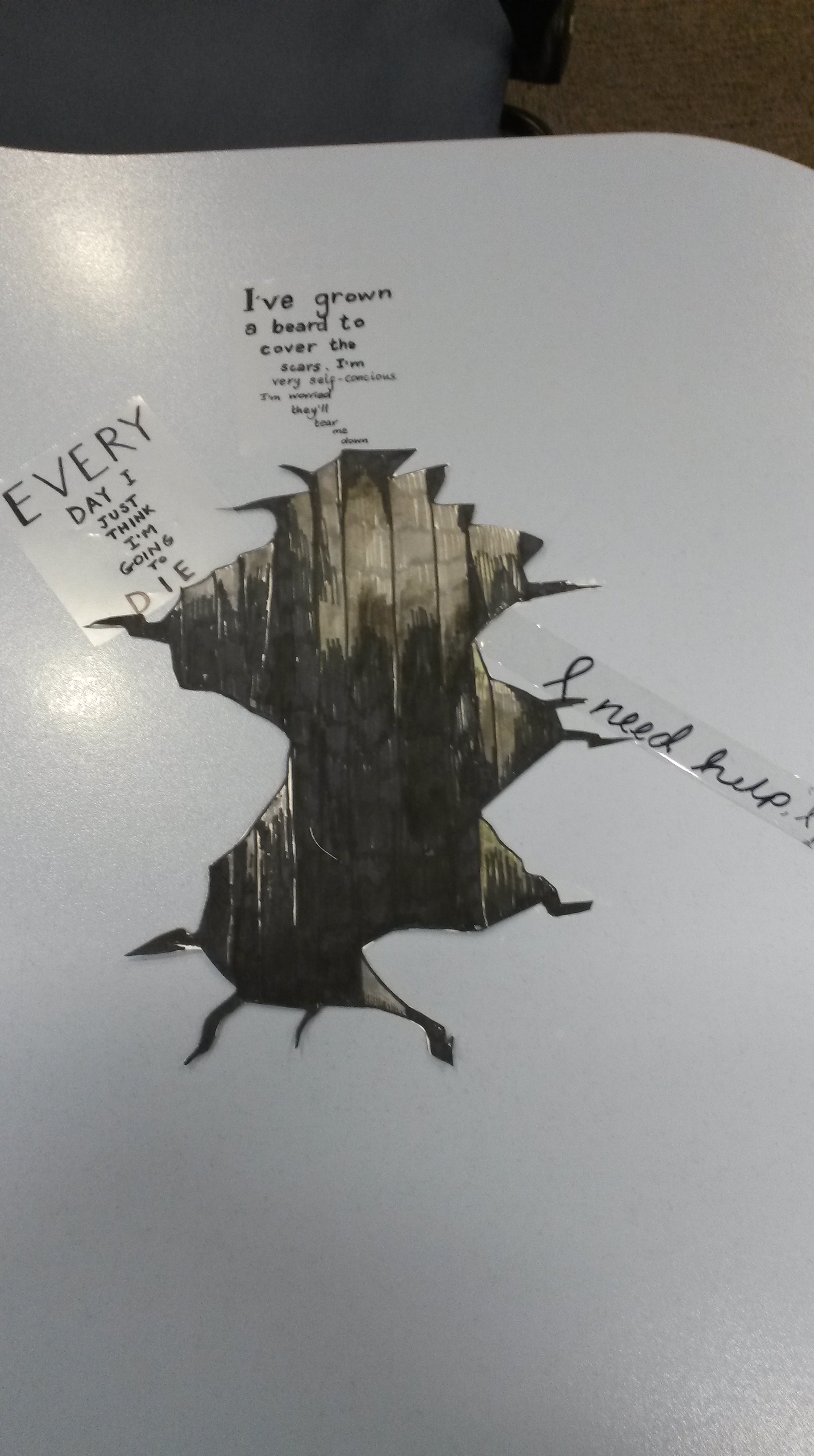
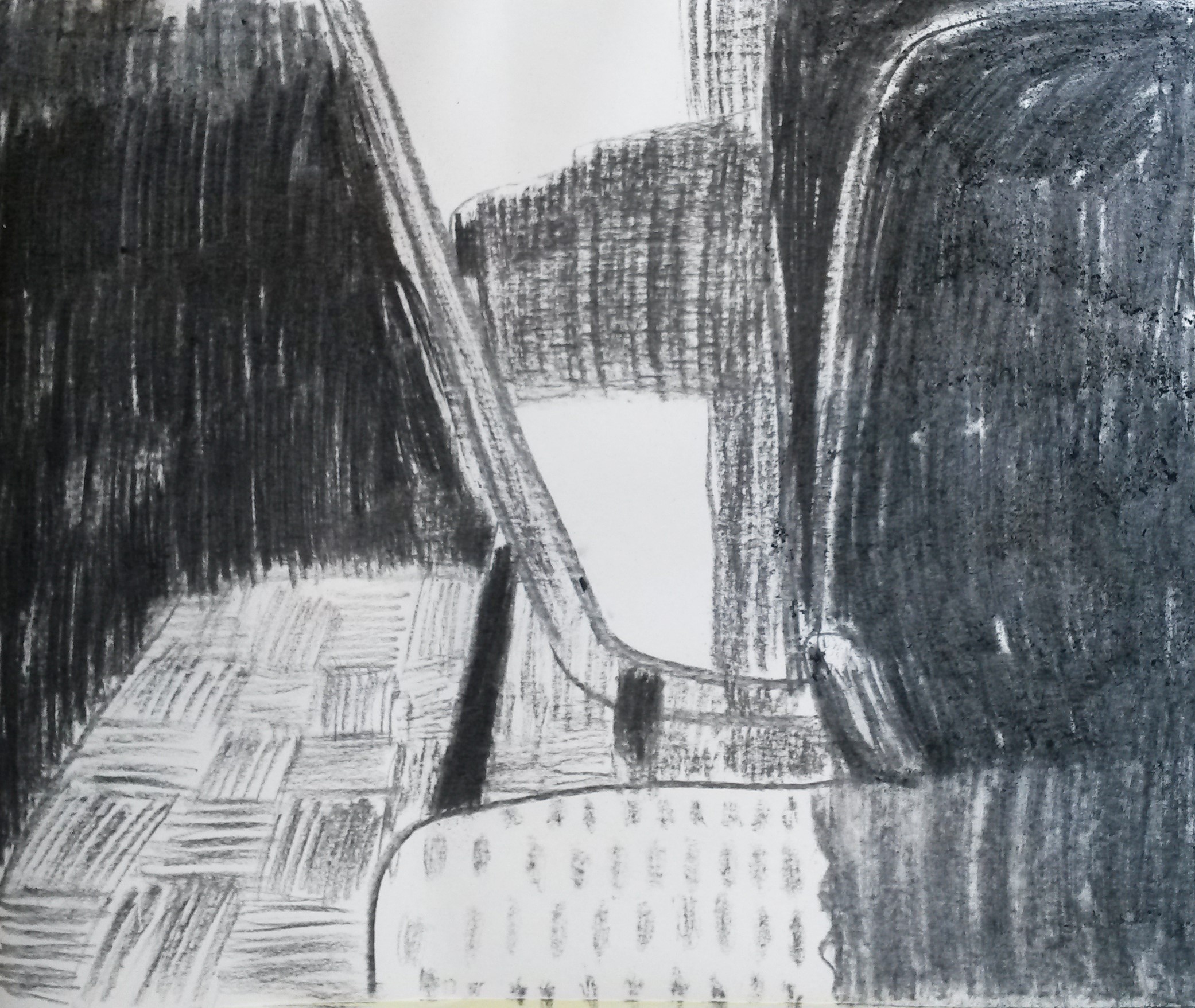
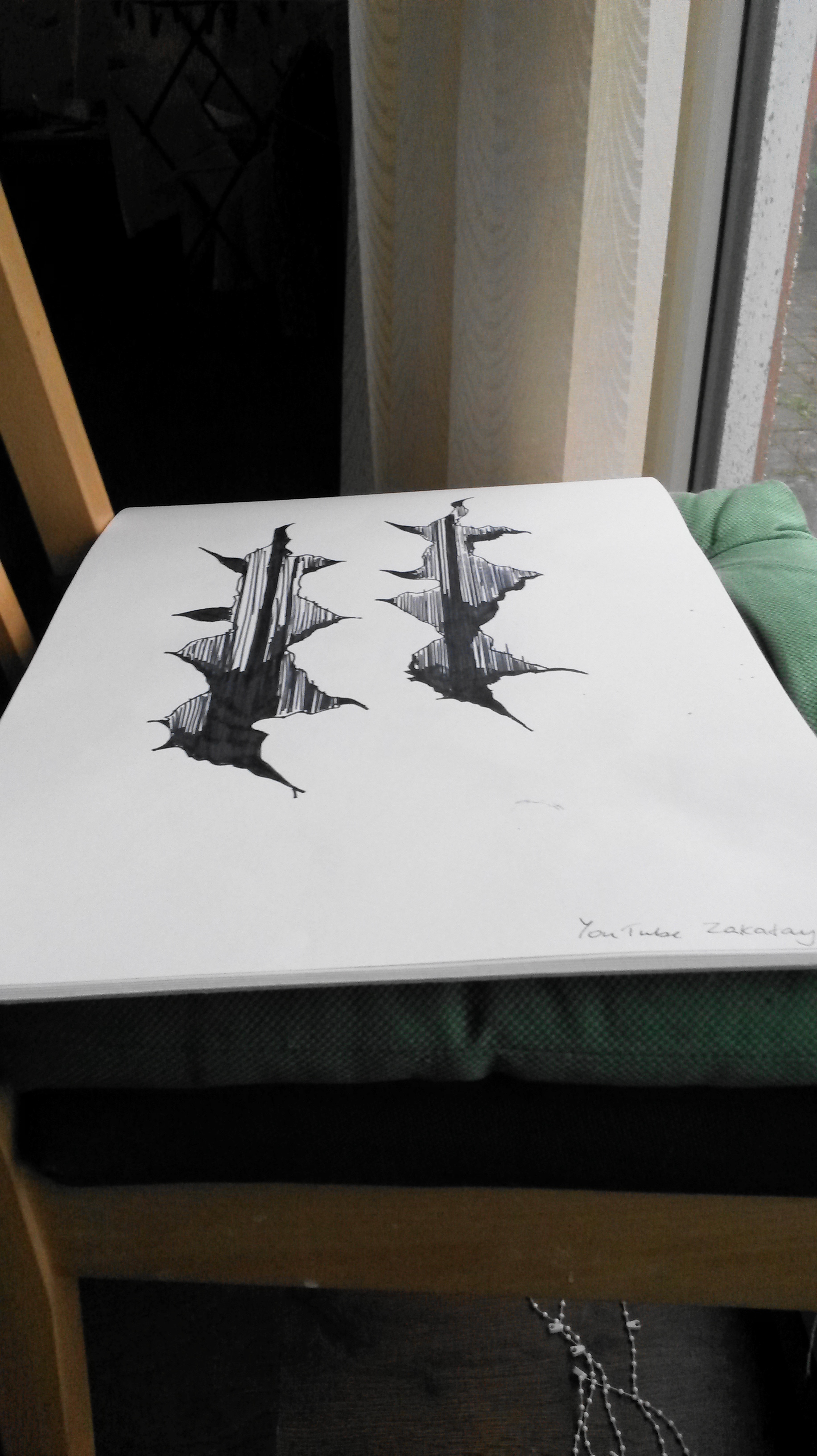
I gave it a go, but my first two attempts weren’t very successful.  I was happier with my third attempt.

User comments

User comments

My desk is blue, so I decided to cut the image out (the alternative would have been to colour the white paper to blend in with the blue desk).  I cut the image out and sat it on my desk.  Unfortunately the edges curled up and caused shadows which spoiled the effect.  I didn’t have any glue or anything at work to stick the drawing down.

User comments

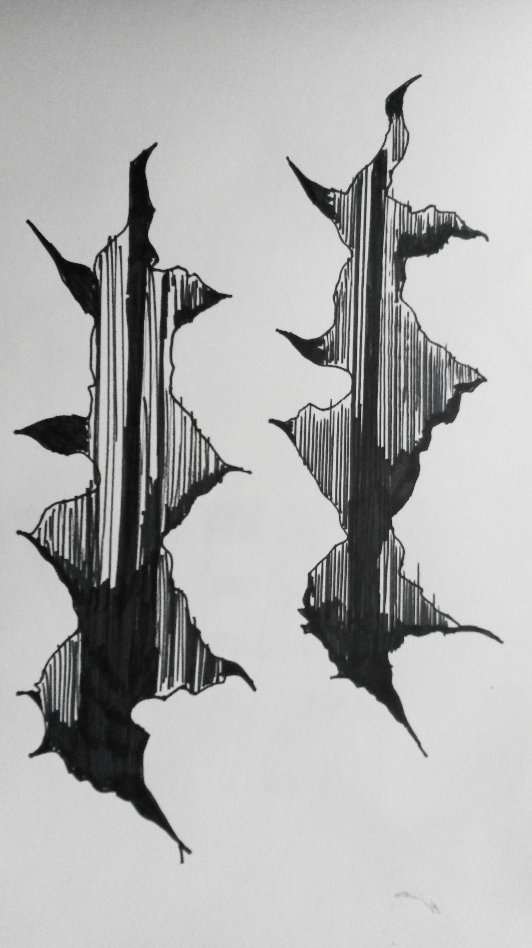
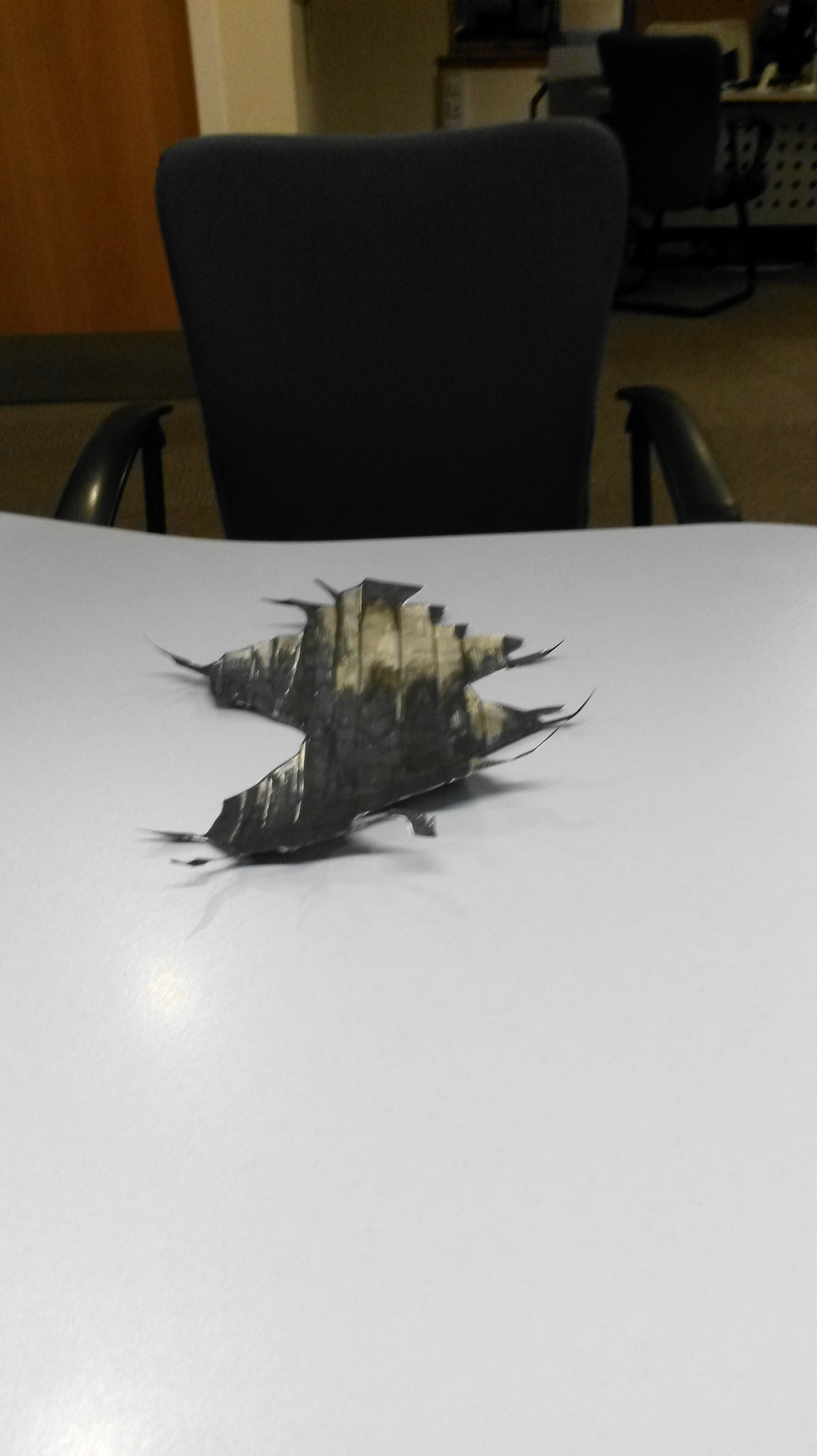
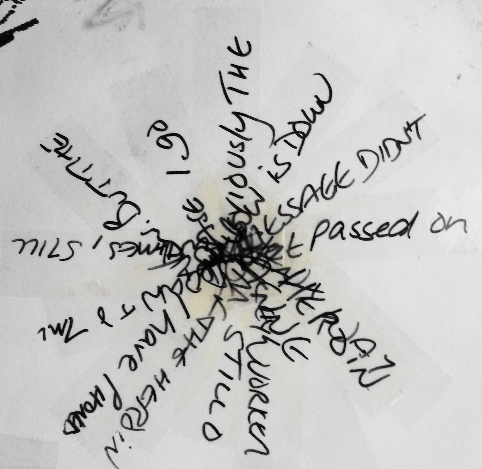
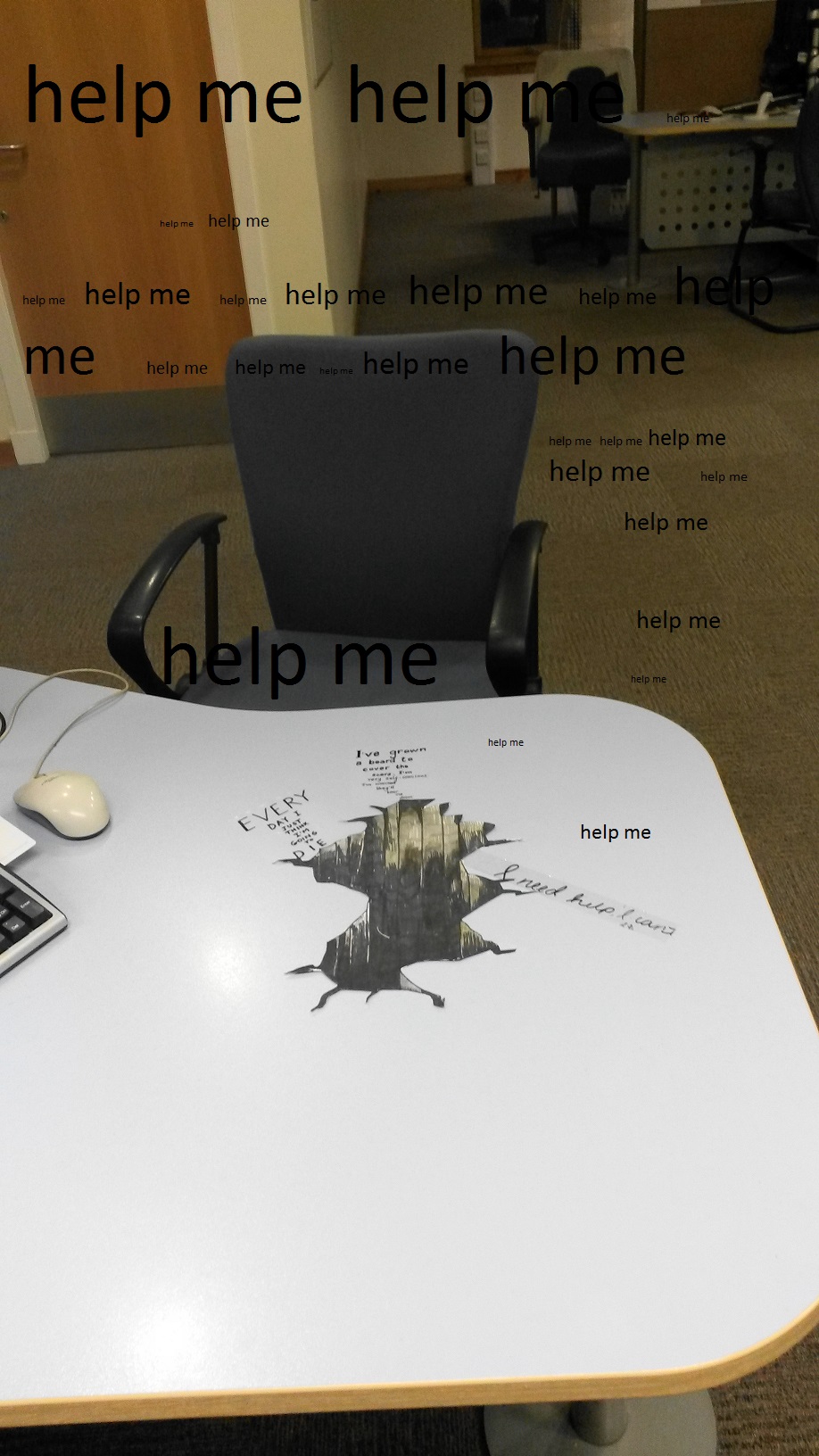
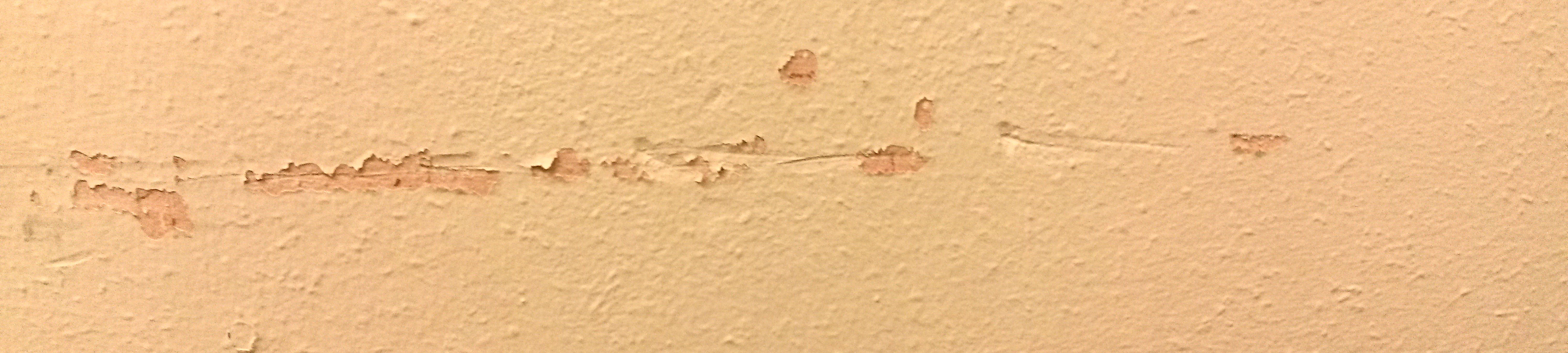
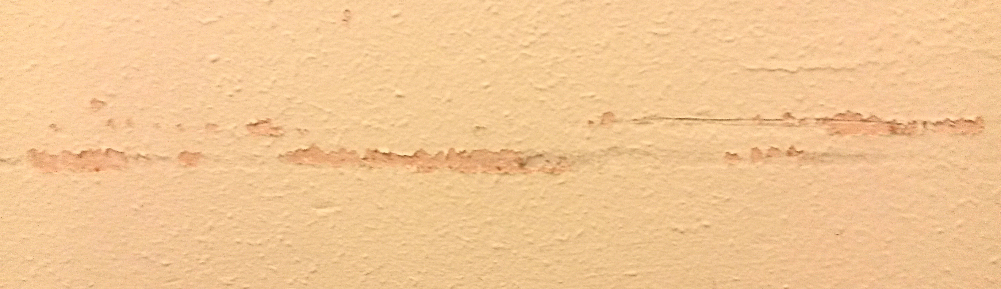
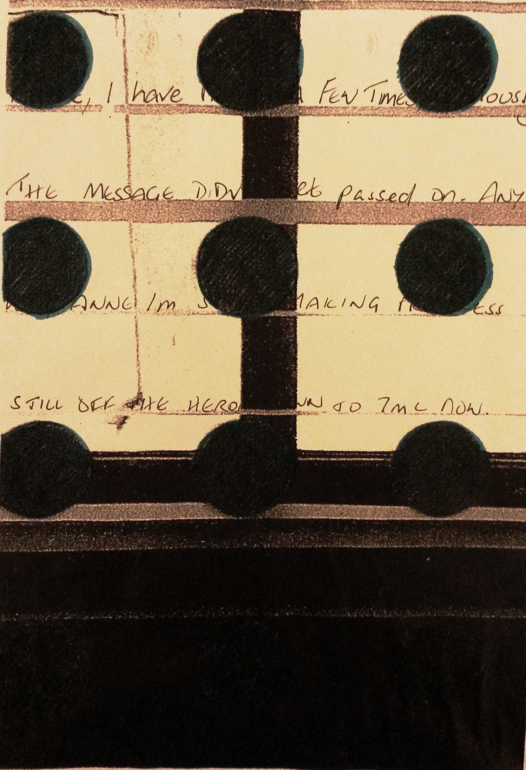
I decided that I would try to show the hole swallowing the dialogue that takes place at my desk.  The hole would be a metaphor for me, absorbing the information I receive from my customers on a daily basis.  I played about in my sketch book with different kinds of writing for the dialogue.

User comments

Water-soluble pen using a stencil
User comments

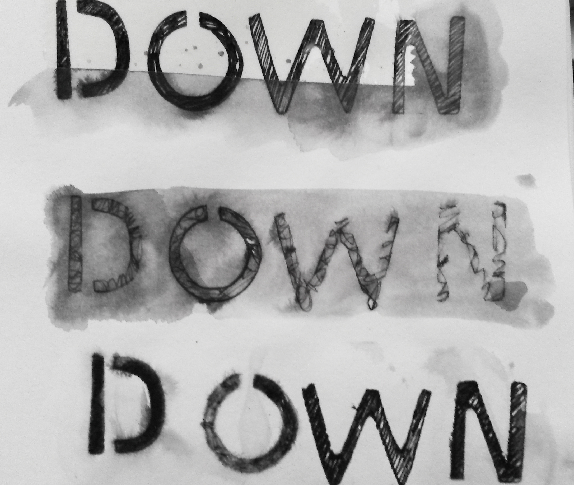
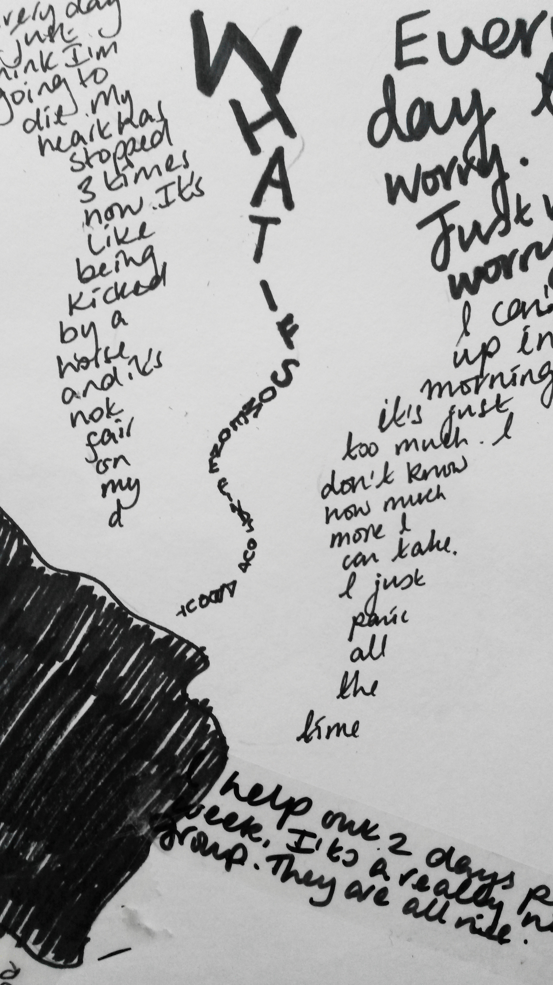
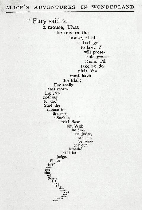
I was thinking of the poem ‘The Mouse’s Tale’, as it almost implies movement, like a snake weaving from side to side.

mouses tale


User comments

User comments

Stencil with charcoal

User comments

Black Sharpie written on Selotape then overlapped

User comments

Black Sharpie on Celophane

User comments

Black sharpie on Selotape overlapped to meet in the middle
For the final image, I glued the ‘hole’ onto my desk and placed the words beside it.

User comments

20160126_180215
Reflection
I think I have achieved a successful result in that I have achieved a trompe l’oeil effect.  The concept of a giant hole appearing swallowing the conversations up is an interesting one.  It feeds into my parallel project and the notion of conveying dialogue and recording what goes on in a place.  I have learned from the artists I’ve researched, such as Kurt Wenner and it is my first ever attempt at a achieving an effect like that.
If I were to do it again I would do it on a much grander scale, on a floor for example and I would either make the dialogue huge and dominating, or leave it out completely.  In my attempt, to get the effect of the optical illusion you need be a certain distance away from it, and at that distance you cannot see or read the dialogue, so it is a bit pointless.  With hindsight, although it alluded the Jobcentre, it didn’t need to be physically created there.
Rework
At the sugggestion of my tutor I have added text to my photograph.  I’ve added the text ‘help me’.  I’ve only used these words to keep it simple.  I don’t have great IT skills, but I think the text has added something to the image.  In the future I’d like to learn more skills as to how to play around with text in an image’ however for the time being I’m happy with this image.

User comments

Re-work, with text added
References
3. htp://www.moma.org/interactives/exhibitions/2010/online/#works/02/68

Project 2: Interacting with the environment parts1 & 2

Part One

Take a walk in a place you know well and make five different small drawn interactions in the environment using only what you find around you and your own body and without damaging any plants or animals in the process.  Try to do things which will affect the way a visitor to the space would perceive it, either by directing their gaze or by changing the qualities of the place.

When I first read this brief, I immediately thought about using the beautiful Autumn leaves that were all around.  Unfortunately, the weather has taken a turn for the worst.  The wind and constant rain have turned the beautiful golden leaves to mush.  I’ve really struggled to come up with some other ideas, despite looking at artists like Andy Goldsworthy.

During the first day it hasn’t rained, I decided to take a different approach.  I went in to my garden (a place I know well), and spent time just looking.  I was looking for inspiration, and also looking for materials to make a drawing from.  It is a small garden, so there weren’t limitless things to choose from.  I started by taking a handful of small stones and began to place them on to the edge of the wooden fence.  This made me think about repetition and order, such as the work of Pierrette Bloch.  I put sixteen stones on each of the four rows.

20151204_115731

User comments

Next I looked around for some other materials to use.  I found some twigs from my Willow tree and a piece of slate, that had presumably fallen off the roof.  I had a kind of nest in mind, such as a bird would make from the twigs.  To this I added the slate and some more stones.  I positioned it on a red coloured step.

2015-12-04 12.36.13

I felt it lacked something, so I looked around the garden and found some brightly coloured leaves.

2015-12-04 12.35.42

I felt this was more successful than my first attempt.

Part Two

Following some discussion with my tutor, I decided to start again with this exercise, this time thinking about the content of my Parallel Project.  ‘The place I knew well’ was the Jobcentre.

Again, I have difficulties with issues of confidentiality and Data Protection, so as a starting point I was thinking about hypothetical interventions I could make at my work place.

  1. Make use of found objects, for example; pens, unused forms, used forms, mugs, cups, jackets, prints left at the printer, calendars, printer paper, sweets, keyboards, mouses, leaflets, cardigans, chairs, couches, tables, photographs, claimant’s ‘units’ (see below).
  2. Files are called ‘units’ and aren’t filed alphabetically, as you would normally expect, but by signing cycle, day and time.  These could be ‘re-organised’, by filing alphabetically, or by alternating colour, or randomly, which would could major disruption to staff, customers and probably result in disciplinary action for me if found out!  Chaos would ensue, but I don’t feel it would be right to inconvenience customers in this way, potentially causing delay in payment of their benefit.
  3. There are three fridges in the tea room, where food regularly goes missing.  What if I swapped the food into different fridges?  No real harm done just inconvenience and a wee bit of chaos and disruption.  Or put other people’s names on the food in the fridge, see how much of it I could eat myself, without being caught?
  4. Unplug cables from the back of the computer terminals.
  5. Park in someone’s car park space, or block the car park totally.
  6. Stick an out-of-order sign on the lift door and see how long it takes to work out it’s a hoax.
  7. Ask staff a question, ‘what does your job mean to you?’, ‘what is the Jobcentre?’, describe the Jobcentre in 3 words.
  8. Make images, such as those made I in the garden, but use found objects at work.
  9. Speak only in French.  Repeat everything anyone says, like you did as a child.
  10. ‘Prank’ some people, put someone’s stapler in jelly (like the prank in The Office).
  11. Swap letter keys on someone’s key board and do the wee IT trick, where you cause the image on the display to appear upside down.

I tried using the photo copier as a media and photocopied things I found randomly on the desks nearby.  I included myself, ‘using things found around you and your own body’, by photocopying my hand.  I liked the resulting images.  Because the items weren’t flat and the lid of the photo copier was raised allowing light to get in, it made the images very dark and interesting.

The copies were all made at the one time.  I worked very quickly, so as not to be seen making the images, in order to avoid having to give an explanation.  Because I was working quickly I was ‘thinking on my feet’, impulsively trying out different things.

User comments

  1. The first image I made was of my hand.  I placed the palm of my hand flat on the glass plate, thinking that the image would be of the top, like a photograph, but of course it was of the surface on the glass, i. e. the palm of my hand.  I like the image because it is cropped at the side going off the edge of the paper.  I like that there is a lot of negative space to the right of the hand and I like the scores and pen marks left when people have been photocopying with a pen still in their hand.  I like the tonal contrasts, the shadows in the creases on my skin and the shine from my rings.

User comments

2.  I then started looking around at the empty desks nearby and grabbed some random items; scissors, some rubber bands, a pen, and a bull-dog clip.  I didn’t arrange the objects, but just plonked them down and copied them the way they were.  Again, I like the dark and light contrasts and the shapes the objects make.  The loops of the elastic bands mirror the ovals of the scissor handles, and the circular screw on the scissors mirrors the hole in the bull-dog clip.  The straight lines of the pen, scissors, bull-dog clip and even the elastic band mirror each other.  The cropped scissors lead your eye up out of the picture.  It is a wonderful composition of random objects arranged randomly.

User comments

3.  Next was a little clear plastic box containing Vaseline, keys, a Breast Cancer Charity lapel pin, and treasury tags.  I photocopied it as it was, without rearranging anything.  Because the lid was raised by the box, and light was getting in, the image is very dark.  The image reminds me of the x-ray images you see at the airport when your luggage is scanned.

User comments

4.  Next is some bull-dog clips, a hole punch and some post it notes and torn paper.  Again, these items were just lying on a desk.  The torn paper is a common site because we are not allowed to put paper in a normal bin, it must go into the Confidential Waste Bin, of which there is only one, so rather than walk to it, quite often the paper will lie on a desk, causing more of a security risk than if it was placed immediately in a normal waste paper bin, ironically.  I like the ragged edges of the torn paper, the black edges of the hole punch and bull-dog clips blurring into each other, contrasting with the stark white of the paper and the delicate lines of the edges of the metal items.  The bull-dog clips mirror each other, like Yin and Yang.

User comments

5.  The last image is of my hand gripping scissors.  My knuckles are pressed against the glass plate and my hand is cropped because, mistakenly I’ve placed it in the wrong place.  I tried again and took a perfect picture of my hand gripping scissors, but discarded this, preferring the imperfection of the image above.  It has abstract qualities, and I don’t think you would immediately know what it was without being told.  The light has captured the creases in my skin and each end of the scissors.  It’s quite a ghostly image and the back ground is black and mysterious.  The holding of the scissors could be sinister, it could be a weapon and I find the image to be a little threatening.  The cropping could imply movement off, or on to the picture plane.

Reflection

I’m reflecting on Part 2, as I consider the more successful of the two attempts.  I’ve deviated quite a bit from the brief, because it was necessary because of the restrictions in place at my work, however I am satisfied with the outcome.  I haven’t created a simulacrum, the objects are life-sized and I did not arrange them into a still life composition, but the image was created from the way they arranged themselves on the glass. The images could be arranged under glass, so in that regard, it may not be ‘site specific’.  I think that viewers may consider it as art, in a way that they absolutely wouldn’t have with any of the hypothetical interventions listed above.


Contextual focus point: Emily Kngwarreye

Emily Kame Kngwareye began painting on canvas in 1988 at the age of 80 and had painted around 3,000 canvases by the time she died aged 86.  Herr story is an incredible one; find out about her life and work and reflect in your log on the importance of place and belonging for you in your own work.  Can you think of any other artists who use place with such an immersive passion?  You might like to reflect on the relationship between painting and drawing in her work.

Emily Kame Kngwarreye is one of Australia’s most significant contemporary artists. Emily was born at the beginning of the twentieth century and grew up in a remote desert area known as Utopia 230 kilometres north-east of Alice Springs, distant from the art world that sought her work.

Although Emily began to paint late in her life she was a prolific artist who often worked at a pace that belied her advanced age. It is estimated that she produced over 3000 paintings in the course of her eight-year painting career — an average of one painting per day.

For virtually two-thirds of her life she had only sporadic contact with the outside world. It was not until she was about 80 that she became, almost overnight, an artist of national and international standing.

Her remarkable work was inspired by her cultural life as an Anmatyerre elder, and her lifelong custodians of the women’s Dreaming sites in her clan Country, Alhalkere.

Whenever Emily was asked to explain her paintings, regardless of whether the images were a shimmering veil of dots, a field of ‘dump dump’ dots, raw stripes seared across the surface or elegant black lines, her answer was always the same:

Whole lot, that’s whole lot, Awelye (my Dreaming), Arlatyeye (pencil yam), Arkerrthe (mountain devil lizard), Ntange (grass seed), Tingu (Dreamtime pup), Ankerre (emu), Intekwe (favourite food of emus, a small plant), Atnwerle (green bean), and Kame (yam seed). That’s what I paint, whole lot. [1]

Until the success of her painting took off, she had not ventured from her homeland.  It was all she had known for her 80 years.  The subject matter she painted was all she had ever known and loved, everything from Nature, from the plants and creatures to the land itself.  She had never known anything else.  There has been much debate over what differentiates a drawing from a painting. I can understand why Kngwareye’s work has been included as reference in a drawing course because it is predominantly made by dots and lines, as opposed to a painting made by using tones and blocks of colour.

There have been many artists over the years whose art was influenced strongly by place.  L S Lowry painted scenes of life in industrial districts of the North, in particular Salford and Pendlebury in Lancashire where he lived and worked for over 40 years.  Claude Monet painted the water lilies in his garden in Giverny for over 20 years.  John Belany attended Edinburgh College of Art in the 60s when Abstract Expressionism was in vogue, however against the advice of his tutors he painted in a figurative style.  ‘He wanted his art to focus on the everyday life he knew, especially the fisherfolk and boats from Port Seton, Cockenzie and Eyemouth, the ports on the Firth of Forth where he grew up. It was the heroism of ordinary people that he wanted to celebrate in large, monumental paintings, some of which he displayed on the railings outside this very building on the Mound’.

Another artists who was strongly influenced by place was Scottish Artist Duncan Shanks.  I visited an exhibition of his recently and you can access what I wrote about it here;

https://annemacleoddrawing2.wordpress.com/2015/08/04/exhibition-visit-duncan-shanks-sketchbooks-the-poetry-of-place/

‘Working in harmony with nature in my notebooks has been an act of faith and an adventure which has taken me to and beyond the poetry of place on a personal odyssey’.  (Shanks, 2015: 7).

‘ Duncan Shanks’s sketchbooks provide a distinctive insight into the artist’s changing interpretation of the landscape he has known and loved all his life.  They also vividly illustrate his ambition to capture not just space and atmosphere, but the passage of time and life’s transience.’ (Shanks, 2015: 10).

The exhibition described how initially he used the sketches to work into paintings.  In addition he used them as a teaching aid for his students at Glasgow School of Art where he taught from 1961 to 1979.  When he retired in 1979 to paint full-time his use of sketchbooks increased dramatically; from 8 in the 1970s, to 26 in the 1980s.  The exhibition had 106 sketchbooks containing 6500 drawings.  ‘This was a direct outcome of his new, full-time commitment to painting and the growing importance of the sketchbooks as visual diaries of his daily thoughts and perambulations which were taking him further from home.’ (Shanks, 2015:12).

‘I have never had to travel far for inspiration.  A need for solitude has attracted me to unpeopled places, where man’s intervention is least apparent, the haunts of dippers and goosander by the river, fox in the glen, hare on the hill-top and buzzard and hawk in the clouds above the thorn hedges of the valley.’ (Shanks, 2015:16).

I personally do not yet feel a strong influence of place and belonging.  Through necessity I often sketch at home using family and surroundings as subject matter.  In several of my courses I have often used the view from my house of a row of traditional cottages across from me, partly because of convenience but also because I like the effects the differing light has on the slate tiled roofs and white washed walls.  It is a recurring subject for me, but not an obsession.  I am drawn to certain subjects, trees for example, but not from a specific place.  Perhaps the difference from my work and the artists I’ve looked at is that I’ve yet to find my own voice.  It occurs to me that all of the artists I’ve looked at were driven by a sense of connection and belonging to a place and this has been the driving force behind their passion.


http://www.nma.gov.au/exhibitions/utopia_the_genius_of_emily_kame_kngwarreye/emily_kame_kngwarreye

http://www.nma.gov.au/exhibitions/utopia_the_genius_of_emily_kame_kngwarreye/emily_kame_kngwarreye

https://www.nationalgalleries.org/whatson/exhibitions/john-bellany/the-1960s

Project 1: Found images Parts 1 & 2

Look for natural processes that produce a drawing, for example the opening of the gills of a mushroom to release its spores, the dropping of lily pollen, animals scratching against trees or footprints in wet mud.  Even the silhouette of tree branches against the sky can be read as a drawing.  Collect photos and sketches of nature’s drawings.  If you prefer, you can do the same thing for industrial or urban processes.

Part 1

20150722_08020320150722_080152

Tree reflections on glass

april 2015 774

My cat’s foot print after walking through charcoal


20150404_172134

Tree silhouette


 20150404_155927

Tree shadows

20150404_151425

Cracks on tree rings

Subconsciously, I’ve focussed on trees; reflections of their form, negative space between the lines of the branches, shadows of the branches, and the linear qualities of the rings in the trunk, interacting with angular lines of cracks.  This last image interests me the most.

Collect up all your found images and think about how you might use them either to inform your mark-making or as the starting point for a drawing.

The rings of the tree trunk remind me of finger prints; another natural found drawing.

fingerprint

This reminds me of some of the rose drawings I did for Assignment 2.

20150904_164407

I’ve looked at other artists whose work looks as if it was inspired by concentric, or undulating lines, such as Daniel Zeller, Jill Baroff and David Connearn.

This inspired me to do my own spiral drawing.  I’ve always doodled making spirals and enjoy the precise control and concentration needed.

User comments

10 x 10 inches black fineliner
I got a lot of positive feedback from my peers on an OCA Facebook Group;
And that is mesmerizing.
Takes years for the tree to grow its rings and so it seems appropriate that the artist needs some time to draw them…
This is a beautiful and inspirational piece of art
It almost seems hypnotic to look at
This is visually lovely and intellectually interesting. I see contour lines, 3D imaging slices, black hole, gravity etc etc
I tried another drawing, thinking about the grains in the wood this time.

User comments

                                A3 black fineliner
Without realising it, I’ve returned to where I started at Assignment 1; the black and white bar code drawings I did.
2015-12-02 22.01.09 - Copy
Close up of spiral
20150331_180032 (2)
Original barcode drawing

http://www.danielzeller.net/

http://www.galleryjoe.com/artists/baroff

http://www.patrickheide.com/artists.php?id=25&view=detail

Part 2

Following an enquiry with my Tutor I have decided to re-visit this exercise, focussing on my work place, the Jobcentre, with a view to this possibly feeding into my Parallel Project.

As part of my daily routine, I now have my eyes peeled, looking for found images; ‘drawings’; renderings, marks made unintentionally by the environment or my colleagues, or perhaps me.  These are photographs of ‘drawings’ I have found so far.

20151217_173340

I hole drilled into a desk in the wrong place

20151217_173334

The residue left by removing a sticky label

20151217_173153

Another sticky label mark – these leave marks like maps

20151217_173303

A water mark on the carpet where the air-conditioning was leaking

20151217_172859

A red star sticker indicting that I have an alarm fitted to my desk

20151214_120349

A tea? stain on the wall

20151214_120325

A scrape on the wall (from moving furniture?)

20151222_114753

A stain on a blind

20151222_090132

Marks on the wall above the radiator

User comments

The handle on the toilet door, marks and scores caused by someone still having their pen in their hand when opening it

User comments

Sellotape on part of a desk

User comments

User comments

Scrapes along the wall

Without realising it, I have been doing this all along.  These are some photos I had already take at work, before reaching this part of the course.  I was drawn to the shadows cast by the dots on the Perspex dividers.

20150901_17263920150810_17170120150528_18003920150528_180129

20150903_17585620150901_172522

The dots, in particular, caught my eye, and the shadows they make when there’s strong sun light.

I used these ‘found’ drawings to influence these drawings;

20150904_170743

2015-09-11 21.36.22

User comments


On reviewing the ‘found’ images, I really liked the sticky marks on the desks.  I tried to replicate them and found the best way was to stick Sellotape to paper, then tear it off.  It lifted some of the top layer of the paper off.  To this, I rubbed a little charcoal dust.