Category Archives: Research & Reflection

Research on Rebecca Horn’s drawing machines

I was not familiar with Rebecca Horn’s work before I started this research.  I began by watching some films of her performance pieces.  The first one I looked at was Rebecca Horn Performance 11, Pencil Mask 1973.’  She said of this; I called it a portrait drawn by the wind because it’s just a line that goes over the paper like a strong wind.’  Although I don’t know that I would call this a drawing machine per se, there is an element of randomness in having so many pencils moving all at the one time, however she has a certain amount of control as she moves her head.

Horn creates a machine to mimic the human act of painting in The Little Painting School Performs a Waterfall. Thirteen feet above the floor on a gallery wall, three fan-shaped paint brushes mounted on flexible metal arms slowly flutter down into cups filled with blue and green acrylic paint. After a few seconds of immersion they snap backward, spattering paint onto the wall, the ceiling, the floor, and onto canvases projected from the wall below. The brushes immediately resume their descent, and the cycle is repeated until each canvas is covered in paint. This kinetic work encourages reflection on our modern-day estrangement from nature, as the waterfall presented is not real, and the “school” that painted it is three mechanical brushes rather than the hand of an artist. No physical trace of a human being or nature can be found.

Horn’s installation-machines use engineering and technology to create repeating moments in time that offer a view of timelessness. In a world where intelligent machines threaten to become the new lords of life, Horn’s machines are vulnerable and human-centred. These are not toys; they are working models of our inner landscapes. They are only moving parts, but she has given them a soul.  I’m not sure that I hold with this opinion, there is no evidence of this other than what is reported.

Since the beginning of the 1970s, Rebecca Horn has been creating an oeuvre which constitutes an ever-growing flow of performances, films, sculptures, spatial installations, drawings and photographs. The essence of their imagery comes out of the tremendous precision of the physical and technical functionality she uses to stage her works each time within a particular space.

My machines are not washing machines or cars. They have a human quality and they must change. They get nervous and must stop sometimes. If a machine stops, it doesn’t mean it’s broken. It’s just tired. The tragic or melancholic aspect of machines is very important to me. I don’t want them to run forever. It’s part of their life that they must stop and faint.

Rebecca Horn, “The Bastille Interviews II, Paris 1993”


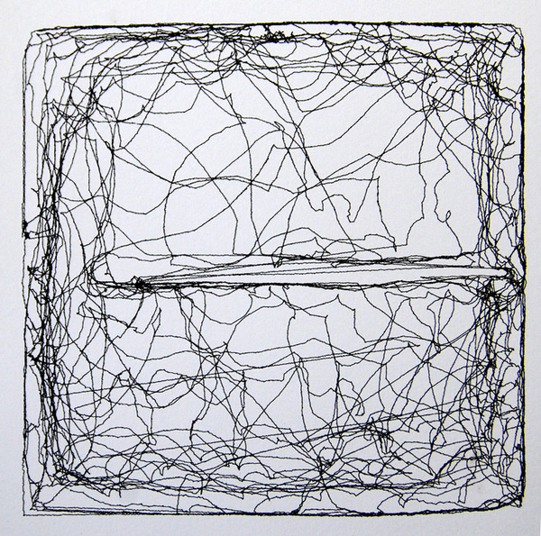
In contrast to Rebecca Horn’s drawing machines I looked at Harvey Moon, on the Creator’s Project Blog.  He is in no doubt that the machines have no human qualities or emotions.  He uses his skills as a Computer Programmer and sets algorithms which determine the movements of the pen, and thus the outcome, i.e. the drawing.

harvey moon3

The machines are created from motors and servos, while the drawings they create are defined by algorithms which determine the machine’s movements and gestures. For Moon the art isn’t necessarily the drawing that the machine produces, but rather the performance of the machine in the act of drawing. 

‘I had a real difficult time drawing since I was a kid, I always wanted to be able to render these images that were in my mind, so the drawing machine is a way for me to collaborate with a machine, and to create these works.’ 

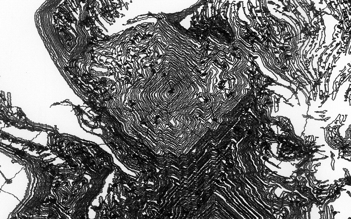
BUGS DRAW FOR ME; ‘I created a way for the drawing machine to produce work completely unaided by humans, and the way that I did this was to put a cricket in a box and have a camera track the location of the cricket in space, and as that cricket moved it would draw in real-time on the wall, so unknowingly the cricket was the artist creating the drawing over time.  But that was a complete lack of control on my part.  I produced the system for the drawing to work, then I let the bug roam wild to produce the work.’

harvey moon2

The Bug’s Drawing

Rebecca Horn’s drawing machines are more about the performance than the resulting drawing. They sit better in the genre of performance art and installation art and the process, in my opinion, is much more interesting than the result, i.e. the drawing.  In contrast, Harvey Moon’s machines produce drawings that are interesting to look at in their own right, without knowing that the artist was a machine.

harvey moon1

This is in contrast to an artist whose goal is to produce a painting or drawing, or sculpture.  It is not the process that is of interest, but the end result.  This may be interesting to bear in mind for Assignment 3 where it is the process that is of utmost importance, as the drawing has to be made to music.


http://www.artsconnected.org/resource/91369/the-little-painting-school-performs-a-waterfall

http://www.theguardian.com/artanddesign/2005/may/23/art

http://www.rebecca-horn.de/pages/biography.html

http://www.artnet.com/magazineus/features/kuspit/kuspit9-17-07.asp

http://thecreatorsproject.vice.com/en_uk/blog/harvey-moons-drawing-machines

Contextual focus point: Erased de Kooning

I watched an interview with Robert Rauschenberg.    Willem de Kooning was the most successful of the Abstract Expressionist painters.  Many young artists of the period were in awe of his painting and  drawing.  ‘Everyone was working like de Kooning except for me and they already didn’t take my art work seriously, which made my work even friendlier, because in no way could I be considered a competitor.  So I was no threat.  Well I love to draw, and as ridiculous as it may seem, I was trying to bring drawing into the ‘all whites’.  I kept making drawings myself and erasing them and that just looked like an erased Rauschenberg, or I mean it was nothing, so I figured out that it had to begin as art, so it had to be a de Kooning then, if it’s going to be an important piece.  You see how ridiculously you have to think, in order to make this work, so I bought a bottle of Jack Daniels and went up and knocked on his door, praying the whole time that he wouldn’t be home, and then that would be the work, but he was home, and after a few awkward moments I told him what I had in mind, and he said that he understood me, but he wasn’t for it and then I was hoping then he would refuse and that would be the work.  He couldn’t have made me feel more uncomfortable then, he took the painting he was working on off the easel, I don’t even know if he was doing this consciously, and put it against the already closed door….okay I want it to be something I’ll miss.  I said, ‘Please it doesn’t have to be that good.  I didn’t actually say this, but that was how I was feeling.  He said ‘I’m going to give you something that will be really difficult to erase, and I said, thank God, then that will be the work.  And then he gave me something that had charcoal, oil paint, pencil, crayon.  I spent a month erasing that little drawing.  and on the other side is another that isn’t erased, the documentation is built in.  They think it was a gesture, a protest against Abstract Expressionism, because you see it’s a very complicated story and I don’t think most people would think this way, so it is hard for them to think of that.  Or an act of destruction, vandalism is the other alternative.  And asked for you it is?  It’s poetry

This lead me to research the work that Rauschenberg was referring to as his ‘all whites’.

In the summer of 1951 Robert Rauschenberg created his revolutionary White Paintings at Black Mountain College, near Asheville, North Carolina. At a time when Abstract Expressionism was ascendant in New York, Rauschenberg’s uninflected all-white surfaces eliminated gesture and denied all possibility of narrative or external reference. In his radical reduction of content as well as in his conception of the works as a series of modular shaped geometric canvases, Rauschenberg can be seen as presaging Minimalism by a decade.

I think it was psychological, in the sense of what was there for him to but challenge the reigning master, even though he loved de Kooning and thought he was the greatest living artist, and then of course it created this great scandal, how could you erase this great masterpiece, not only did you presumable take something out of the history of art, but you also defaced property.

“By selecting de Kooning, Rauschenberg chose perhaps the most prominent painter among the Abstract Expressionists, and his act would be widely interpreted as a symbolically patricidal gesture. Cage compared Rauschenberg’s erasure with L.H.O.O.Q., a work Duchamp made by drawing a moustache on a postcard of the Mona Lisa. Like Duchamp’s gesture, Rauschenberg’s Erased de Kooning Drawing has been hailed as a landmark of postmodernism because of its subversive appropriation of another artist’s work, and it has also been understood as a rejection of the traditional practice of drawing as the foundation of painting.


My first thoughts on viewing the image online was that I was a bit underwhelmed.  It does arouse my curiosity and I feel frustration at not being able to see the original drawing.  There are some faint marks left, the paper isn’t totally blank and I found myself just staring at it trying to guess what had been there. I think it is an important part of art history.  Interestingly, I was more excited by the assertion from Ruschenberg that if de Kooning hadn’t been home, then ‘that would have been the work’, and then if he hadn’t agreed to giving him a drawing, ‘that would have been the work, and so on. That is a very interesting concept to me, and somehow I can understand it better that the erasure of the drawing.

http://pastexhibitions.guggenheim.org/singular_forms/highlights_1a.html

http://uk.phaidon.com/agenda/art/articles/2013/march/01/how-robert-rauschenberg-erased-a-willem-de-kooning-and-created-a-landmark-of-postmodernism/

John Bellany workshop at Glasgow Museums Resource Centre 30th Aug 2015

I was already familiar with John Bellany’s work as I went to an exhibition at the National Gallery Scotland in 2012.  I have the catalogue from it; ‘John Bellany, Keith Hartley with Alexander Moffat, John McEwen & Paul Bellany.  I was quite excited about the workshop as it is an opportunity to see the art work close up.  The Glasgow Museums Resource Centre stores over 4 million items from the Glasgow Art Galleries and Museums.

The first painting we looked at was The Fishers. This is a huge painting and it was fantastic being able to view it at close quarters.  It was painted in 1966, in a figurative style, which went against the current trend of painting in an abstract style. ‘When the fashion in art was for abstraction, and figurative art was presumed to have been swept away forever by the tide, not just of fashion, but of history, he stood up and painted monumental figurative pictures’ (Keith Hartley with Alexander Moffat, John McEwen & Paul Bellany, 2012:7).  In contrast, his peers were looking at Abstract Expressionism, and the work of action painters such as Jackson Pollock and Willem de Kooning, and colour field painters such as Mark Rothko.  ‘Significantly Bellany’s earliest artistic efforts were of his immediate environment – the fishing boats at Port Seton, his ancestors, Scotland, and beyond.’ (Hartley with Moffat, McEwen & Bellany, 2012:9).  He was painting what he saw every day; in other words he was being a Recorder.  As well as recording scenes familiar to him as the son of a fisherman, he used symbolism in his work.  ‘Boats as symbols of voyaging, of doom and tranquillity, as stages, as arks of sirens and omens, as bearers of cargoes of memory.’  (Hartley with Moffat, McEwen & Bellany, 2012:25.  The colours in the painting were very vivid with lots of blood-red and the fish guts in the foreground repulse the viewer.  The three figures, again a common theme, although looking at the viewer, do not engage with them, and almost seem to be challenging them.

Bridgeman; (c) Glasgow Museums; Supplied by The Public Catalogue Foundation

Bridgeman; (c) Glasgow Museums; Supplied by The Public Catalogue Foundation

  • Date painted: 1966
  • Oil on hardboard, 183.2 x 213.4 cm
  • Collection: Glasgow Museums
Bridgeman; (c) Glasgow Museums; Supplied by The Public Catalogue Foundation

Bridgeman; (c) Glasgow Museums; Supplied by The Public Catalogue Foundation

The next one we looked at was Scottish Gothic.  The name is reminiscent of American Gothic, but there the resemblance ends as there are three figures in John Bellany’s painting and only two in Grant Wood’s.  Here we can see the use of symbolism, where the central figure has a bird perched on his head.  ‘Another thing Beckmann was to teach Bellany was the use of symbolic attributes – people carrying fish, wearing masks, standing on stages.  As the years went by Bellany learnt to use symbols as a complex language, sending silent messages between the dramatis personae of his pictures’. (Hartley with Moffat, McEwen & Bellany, 2012:13).  

Next we looked at Dungness.  The figures in his paintings are generic and not modelled on anyone.  Although looking straight ahead, they do not engage with the viewer.  This painting was made following a visit to Germany where amongst other things, he saw the Concentration Camps, but also saw the Isenheim Alterpiece painted by Matthias Grunewald.

Next we saw Journey to the End of the Night; a triptych.  This is the title of a novel by Louis-Ferdinand Celine published in 1932, however there is no obvious connection to this.  It is a triptych (possibly inspired by the Isenheim Alterpiece). It is an image depicting sexuality, but there is no joy in it.  The figures in the back ground appear to be nun-like figures.  The lobster represents female sexuality and the women appears to be dressed in the striped clothing from the Concentration Camps.  ‘The second event to have a major impact on Bellany was his trip to East Germany in 1967….where he was emotionally and physically overwhelmed by a visit to the Buchenwald concentration camp’ (Hartley with Moffat, McEwen & Bellany, 2012:13).  

The next drawings were from the Addenbrooke’s Hospital period around 1988, when Bellany had a liver transplant which saved his life.  ‘In 1988 it became plain that Bellany’s liver was deteriorating so fast that he did not have much longer to live unless he had a transplant.  Against all the odds he was able to undergo the operation at Addenbrooke’s Hospital…..It was successful.  As soon as Bellany came round from the anaesthetic he could not believe he was still alive.  He asked for a pencil and paper and only after he was able to draw was he certain that he was alive.  Over the next few weeks as he grew stronger he drew the doctors and nurses looking after him, but above all he drew himself, a new Lazarus.’ (Hartley with Moffat, McEwen & Bellany, 2012:77).  He used pencil, red and black chalk and watercolour.  These are very honest, direct drawings and I found them quite moving.  The emotion he was feeling, the joy of being alive, comes through.  The eyes in particular, are captivating.  He exaggerates the almond shape and adds a lot of detail, and he really engages with the viewer, unlike in his previous paintings where the figures stare with hostility.

bellanyhospital3

Bellany,-Self-Portrait-(Addenbrookes)-Red-Chalk-1988-b

Self-Portrait 1988 John Bellany 1942-2013 Purchased 1990 http://www.tate.org.uk/art/work/T05735

Self-Portrait 1988 John Bellany 1942-2013 Purchased 1990 http://www.tate.org.uk/art/work/T05735


bellanyhospital2.png

I decided to make a quick study of this self-portrait, in an attempt to discover how he made it.  I drew mine with pencil first, then did a wet into wet wash with Cadmium Red and Indigo watercolour paint.  I used watercolour paint wet on dry on the face, and striped pyjamas, then defined it using watercolour pencils, wetting the lead before drawing with it.  The pyjamas are reminiscent of the striped clothing he saw at the Buchenwald Concentration Camp, and I’m quite sure the red splashes of blood are for artistic license.

User comments

User comments

Next we were shown some drawings which had never been on display to the public.  There were beautiful delicate etchings, mono prints and prints which looked as though they may have been intended to be bound into a book, as there was poetry and text included.

Next we were taken to the “Pickled ” room in the Resource Centre, where we had ten minutes to sketch one of the many jars containing all sorts of fish and other aquatic creatures.  I draw a jar of Chlorophthalmus Agassizi, which looked a little like sardines to me and I was attracted by the way they were all cramped together like sardines.  It made me think of Stress, like having too many thoughts crammed into your head at the one time.

Finally we were taken to a classroom where we did our own self-portrait and included our picked object in homage to John Bellany.  I managed a self-portrait alright, but it bore no relation to the colour and expressiveness of Bellany’s.  I became so focussed on trying to get something down, all thoughts of Bellany’s work went out of the window.  Only later did it occur to me that we were encouraged to use easels; something I normally would never do when painting in watercolours.  The expression and depth of emotion in his work has given me the idea to try to use this influence in the Emotion exercise.

2015-08-30 18.42.19

Part 3; Research point; Abstract Expressionism

Abstract expressionism is a post–World War 11 art movement American painting, developed in New York in the 1940s. It was the first specifically American movement to achieve international influence and put New York City at the center of the western art world, a role formerly filled by Paris. Although the term “abstract expressionism” was first applied to American art in 1946 by the art critic Robert Coates it had been first used in Germany in 1919 in the magazine Der Sturm regarding German Expressionism.  In the  United States lfred Barr was the first to use this term in 1929 in relation to works by Wassily Kandinsky.

I watched the film of Pollock by Hans Namuth.

It was interesting to hear him narrate whilst painting.  It was also interesting to watch him painting on glass.  There was an unheard rhythm, a flow and repetition, almost as though he was listening to silent music.  (This may be relevant to Assignment 3).   I have transcribed some of the dialogue that I found interesting.

I don’t work from drawings or coloured sketches.  My painting is direct….Having the canvas on the floor, I feel nearer, more a part of the painting…I can be in the painting, similar to the Indian Sand Painters of the West.  A method of painting that has a natural growth, has a need; I want to express my emotions, rather than illustrate them.  The technique is just a means of arriving at a statement….Because a painting has a life of its own, I try to let it live……I lost contact with my first painting on glass and started another one. 

Here, then, was an aspect of painting that still appeared to be unexplored – the handling of paint regardless of any ulterior motive or purpose….Jackson Pollock…becoming impatient of conventional methods, he put his canvas on the floor and dripped, poured or threw his paint to form surprising configurations.  He probably remembered stories of Chinese painters, who had used such unorthodox methods an also the practice of American Indians who make pictures in the sand for magic purposes.  The resulting tangle of lines satisfies two opposing standards of twentieth-century art: the longing for childlike simplicity and spontaneity…(E.H. Gombrich, 2011:602).

I think that the Abstract Expressionism work of artists such as Jackson Pollock, Mark Rothko and Willem de Kooning was an attempt to break away from the traditions of figurative painting.  Traditionally the art world had been dominated by European Art and Abstract Expressionism offered something new and exciting from America.

The modern was a highly contested area. This is the years where people were emerging from the shadows of the second world war and still trying to find the an appropriate artistic language for the time.  Chris Stephens, curator Tate

References

https://en.wikipedia.org/wiki/Abstract_expressionism

http://www.tate.org.uk/learn/online-resources/glossary/a/abstract-expressionism

Notes on Tutor Reports

This blog post has come about through conversations textile assessors had during the last assessment event. It was noted that frequently students did not use the advice given by their tutor in the feedback documentation. We saw instances of where if students had emended their work in line with the tutor feedback they could have achieved a higher mark at assessment. OCA students are in a unique position in that they regularly receive extensive written feedback during each unit (course) studied. The Tutor Report explains to the student where they are doing well and the places where improvements could be made. Often included are suggestions and pointers in how to develop both strengths and weaker areas. Giving the student the opportunity to make improvements to the assignment they have just completed.

I have put together a list of suggested ways OCA students can explore and pull apart their feedback forms to extract the information.

  • Firstly print out the Tutor Report document or enable the document to be annotated on your PC.
  • Read it carefully.
  • Read it again this time highlighting areas of importance. For example strengths, weaknesses and suggested changes.
  • Read it again this time alongside the assessment criteria noting down any language that suggests you are at a particular level. (Tutors use the assessment criteria to judge the kind of feedback you require)
  • Look at the Tutor Report with your notes along side the assignment it refers to.
  • Lay out your work looking for the places your tutor has indicated for change.
  • Make notes on what you see. Can you see what your tutor sees?
  • Make further notes on how you could go about meeting the suggestions made or making improvements to the assignment.
  • Talk the assignment and feedback over with another student (via Facebook or a student forum) or a friend/member of your family.
  • Make your changes to the assignment.
  • Reflect on how this process has helped you improve your assignment.
  • Place both the Tutor Report and your notes in your learning log.
  • Write up the changes you have made to the work and reflect upon the outcomes.

These are not hard and fast rules. My hope is that this list will offer guidance and a framework for you to effectively use your Tutor Reports.

If when you have gone through this process or something similar and you find there is something that still remains a mystery to you contact your tutor for clarification.

For further information on how to improve your work look out for OCA blog posts where tutors discuss specific students work. For example the audio piece with images about the work of Ruth Goury on the 13th July 2015. Here I discuss how Ruth has used the design process to achieve some exciting outcomes. While watching the item make notes that you can add to your learning log and use to improve or develop your own work.

Please add comments to this post on how you effectively use your Tutor Reports that you think other students may find helpful. If you are a tutor it would be great to have your voice in this conversation too : )

Rebecca Fairley. OCA Textile Course Leader, Tutor and Assessor

Exhibition visit Duncan Shanks Sketchbooks: The Poetry of Place


20150718_124955

I visited the Duncan Shanks Sketchbooks Exhibition : Poetry of Place, at the Hunterarian Gallery in Glasgow.  I had never heard of him before, as apparently he shuns publicity, and I probably wouldn’t have visited if it wasn’t for a friend who suggested it because he sketches in the South Lanarkshire area where she lives.

20150718_124948

“Working in harmony with nature in my notebooks has been an act of faith and an adventure which has taken me to and beyond the poetry of a place on a personal odyssey.”  Duncan Shanks 2014

When I saw the sketchbooks of Duncan Shanks, it was somewhat of a eureka moment for me.  All the exercises I’ve done so far for my OCA course, all my research of other artists, finally made sense when I saw his sketches.  So this is what is meant by knowing your subject inside out and using materials as second nature to bring it to life.  Absolutely stunning work; every sketch a stand alone piece of work, regardless of whether it was intended as a prelude to a finished piece of work or not.  There is a vibrancy to it and a liveliness, and whilst the sketches are figurative and describe the landscape perfectly, the colours he sees in the familiar countryside are surprising; bright oranges, pinks, reds and blues.  It is almost abstract, he simplifies shapes and patterns, however the image still remains true to nature.

20150718_12402920150718_12410320150718_12412720150718_12420920150718_12423920150718_12501020150718_12433220150718_125028

20150718_124118

20150718_124149

20150718_124216

20150718_124346

20150718_124337

“Painting, like nature, cannot be rushed and, working with landscape, I have learned to be patient.  It is a journey which doesn’t readily reveal it’s destination.”  Duncan Shanks


http://www.gla.ac.uk/hunterian/visit/exhibitions/focus/duncanshankssketchbooks/

Painting Demonstration by Carol Dewart

About Carol Dewart

Born – Scotland 1957, BA (Hons) in Drawing and Painting, Glasgow School of Art, 1981.  Winner of Emmy Sachs award / received a John and Mabel Craig Award. Postgraduate year, Drawing and Painting, Glasgow School of Art, 1982.  Awarded Travelling Scholarship.  During my time at Glasgow School of Art, I also studied Embroidery and Weaving for one year under the guidance of Chrissie White and Hannah Frew Patterson.  This has had a major influence on my work and, by integrating the use of various mediums, textiles and stitch work; my paintings strive to give a more textural observation of the landscape.  After Graduation, I stopped working for a time to raise a family, but I have now returned to full-time painting in Cardross, Argyll and Bute.  In 1998, I was commissioned by Dumbarton District Council to create a wall hanging and related paintings for the refurbishment of the Denny Civic Theatre, Dumbarton.  Member of the Paisley Art Institute and winner of the Concept Art Prize (Paisley Art Institute 2012).

Although this was a painting demonstration, I’ve included I’m including it in my Drawing blog because I was impressed by her sketchbooks, and the painting she did demonstrated good composition.

She had a square canvas, which she had already painted with black acrylic.  To this she added strips of masking tape for the tree trunks.  She then tore strips of newspaper which she taped to the canvas horizontally and used this so as to have a random uneven edge.  She was using Liquetix Acrylics because she likes the colours, but uses most makes.  Her colours were very bold; mauves, light green, light yellow, not natural to a landscape.  She added patches of pinks and turquoise.  She then removed the masking tape on the tree trunks and used the edge of a credit card mixed with 3 colours to add texture to them.  She said she was using the black background for demonstration purposes only because of the time restraints and normally she would spend a long time working up a back ground.  She worked on the whole of the painting.  Any colour added  would be balanced by adding to another area on the canvas.

2015-03-09 22.37.42

20150316_170356

My sketch of Carol’s painting

I was even more impressed with Carol’s sketchbooks.  They were full of colour and texture.  There was fabric, thread and wire, and I wondered if this was influenced by her studies in Textiles at Art college.  She said she uses felt tip pens a lot in her sketchbook for speed and convenience and this is something I would like to try myself.

20150309_200636


References

http://www.caroldewart.co.uk/a1-page.asp?ID=1548&page=3

Drawing with experimental media

Over the next few weeks you’ll experiment extensively to build up your sensitivity to the properties of materials.  Use your sketchbook and supplementary sheets to collect information about materials and what you can use to draw with.  Push forward your experiments by using the new methods you discover to make fuller drawings.  Use a new technique randomly scribbling a square, for example can help you see it’s potential, but using it to complete a task pushes you to learn more actively by solving any problems you encounter along the way.

april 2015 613april 2015 612

These drawings were done using a stick with mud for the tree,  rubbing daffodil petals on the paper for the flowers and rubbing blades of grass onto the paper for, well, the grass.  It was a lot of effort for very little result (as well as a lot of strange looks in the park).

april 2015 607

This was done in a similar way with tulip petals and leaves, with a similar, disappointing result.

april 2015 653

This was done using different coloured mail varnishes on black paper.  Quite a nice result and one I may try again.

2015-05-15 15.52.20

This was done with Typex correction fluid on brown parcel paper.

Aim: When you think of drawing, what’s the first thing that comes into your mind?  We might initially think of pencils and maybe a Renaissance masterpiece.  In fact pencils are quite a modern invention and most Renaissance drawings were done with a stick of silver and a pot of ink.  Your sketchbook should be filling up with drawings in a variety of media by now, but for this project you’ll extend that exploration even further. 

.

Contextual focus point: Cornelia Parker


Research the work of Cornelia Parker.  Make notes in your own words in response to the following:

What do you think Parker is trying to do in her piece Poison and Antidote Drawing (2010)?

Poison and Antidote Drawing is created using rattlesnake venom and black ink, anti-venom and white ink.  Parker often uses bits of her subject to make her art work.  Why do you think she does this?

‘ I’ve made poison and antidote drawings using snake venom from a rattlesnake farm in Texas mixed with black ink, and anti-venom with white ink, to make Rorschach blots.  The resulting drawings are a combination of ‘good and evil’.’ (Maslen and Southern, 2014:54)

She goes on to say ‘For me the concious part of making a drawing is deciding on a process, what the process then releases is something else.’

I think she has tried to create more than just a representation of an object, but instead the drawing is the object.  The title ‘Good and Evil’ itself conjures up a lot of ideas and the use of black and white ink emphasises this.  The positive and negative concepts are polar opposites of each other.

How do you think it feels to stand in the presence of art works that are constructed from original objects  of great cultural significance?  How does that differ from, say, standing in front of a painting of the same object?

Initially I thought it was a little self-indulgent.  I wonder if a drawing or painting should be a successful piece of art in its own right without there having to be an explanation of the process or of materials used.  I’ve pondered over this and decided the media and materials can give an art work a deeper meaning, which engages the viewer’s imagination and empowers and strengthens the artwork itself.

Bibliography

Maslen Mick and Southern Jack

(2014)

Drawing Projects; and exploration of the language of drawing

London

Black Dog Publishing

Part 2: Research point, mark making


Mark making may seem like play, but if you have any doubts about the validity of this kind of exercise, take a close look at some great masters of the past. … Many artists will have an old pot scourer, toothpick or hat pin in their tool box which they have learned over the years makes a certain kind of mark.  Next time you are in a gallery pay special attention to the variety of marks used and note your discoveries in your learning log… Try doing this with the drawings below.

Two thatched Cottages with Figures at the window, Rembrandt

I hadn’t used the zoom in facility on the Bridgeman site before, so this was quite interesting for me to try.  This is a line drawing using pen and brown ink.  The range of mark making in this drawing is quite amazing.  There is a wide range of thin and thick marks, all used with varying degrees of pressure and changing direction all the time.  The thatched roof, for example has quite strong, deliberate marks, all going in the one direction, with squiggles for the ends of the sheathes.  The wood of the barn has fine cross-hatching and the foreground has very loose lines describing the land.  Put all together it is a lively sketch, but which has substance and describes the scene wonderfully.

The Raising of Lazarus, Caravaggio

In contrast, this is a tonal drawing rendered using pen and brown india ink and black chalk on brown paper.  This has a fantastic depth to it and it is fascinating to examine up close enough to see it is all made up with lines.  The buildings in the back ground really appear to be in the distance by the use of aerial perspective, while the figures in the foreground really come forward, where the tones are stronger. Their clothes are drawn with fine lines all going in the direction of the folds and creases. The craggy face of the mountain behind them is described with contour lines and the detail in the foreground is described by the use of fine lines for the grass.

Looking at this has made me more aware of how marks are made and has made me want to get right up close to paintings and drawings in galleries.  For example on the OCA Study Visit to the Two Roberts Exhibition, several of the paintings had marks made which appeared to be scratched on.  An example of this is ‘Weaving Army Cloth’ by Robert Colquhoun.  In the book of the exhibition it says; ‘…themes of grief seemed to come naturally to Colquhoun.  The mustard-yellows, browns and greens established a feeling of anguish, a sense reinforced by the scoring and scratching of the paint surface.’ (Elliott, 2014:33).

The Two Roberts, Robert Colquhoun & Robert MacBryde, Patrick Elliott, National Galleries of Scotland 2014