Tutor Report Assignment 5

Student name   Anne McLeod       Student number 497519
Course/Unit Drawing 2 Assignment number 5
Type of tutorial (eg video/audio/ written) Written

Overall Comments
Thanks for submitting the latest set of work. I know that this portfolio has been a difficult submission but I think that you’re really getting somewhere. I read back my last report and your comments on it before writing this one and I hope that you feel more confident. There are tricky steps as you’re challenging yourself all the time and learning a lot. Your work is moving from representation to something more profound.
You are outside you comfort zone, but – trust me – the work has some really strong qualities. One advantage about working in a more speculative way is that each piece ought to throw up problems that need addressing, which gives the impetus to make new work in a way that a rounded-off or ‘complete’ work doesn’t. Stuff that is looking for something will always stumble across other stuff that’s fascinating and worth exploring.
In this report I haven’t separated out the ‘work’ from the learning log as they seem so closely linked. My main focus has been to try and help you recognise links that exist in your shelf directed parallel project work and the more ‘brief-driven’ exercises. You may not see the links as clearly as me (and perhaps I’m looking too hard to link everything), but there are connections. Your underlying ability to draw is fine and you shouldn’t worry on that score and you have potential to do well on the contextualisation and creativity elements of the course, but you need to push on a little. This won’t necessarily be easy, but it’s a journey worth making as the world will look more exciting and interesting once you’ve done it. I have also returned the draft of the critical review with notes on it and you should refer to that document too.

Feedback on assignment
Demonstration of technical and Visual Skills, Quality of Outcome, Demonstration of
Creativity
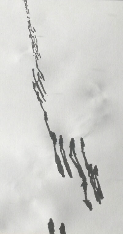
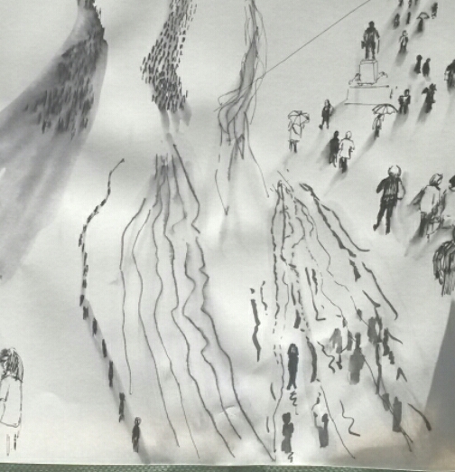
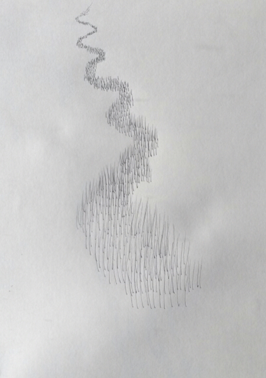
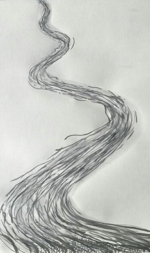
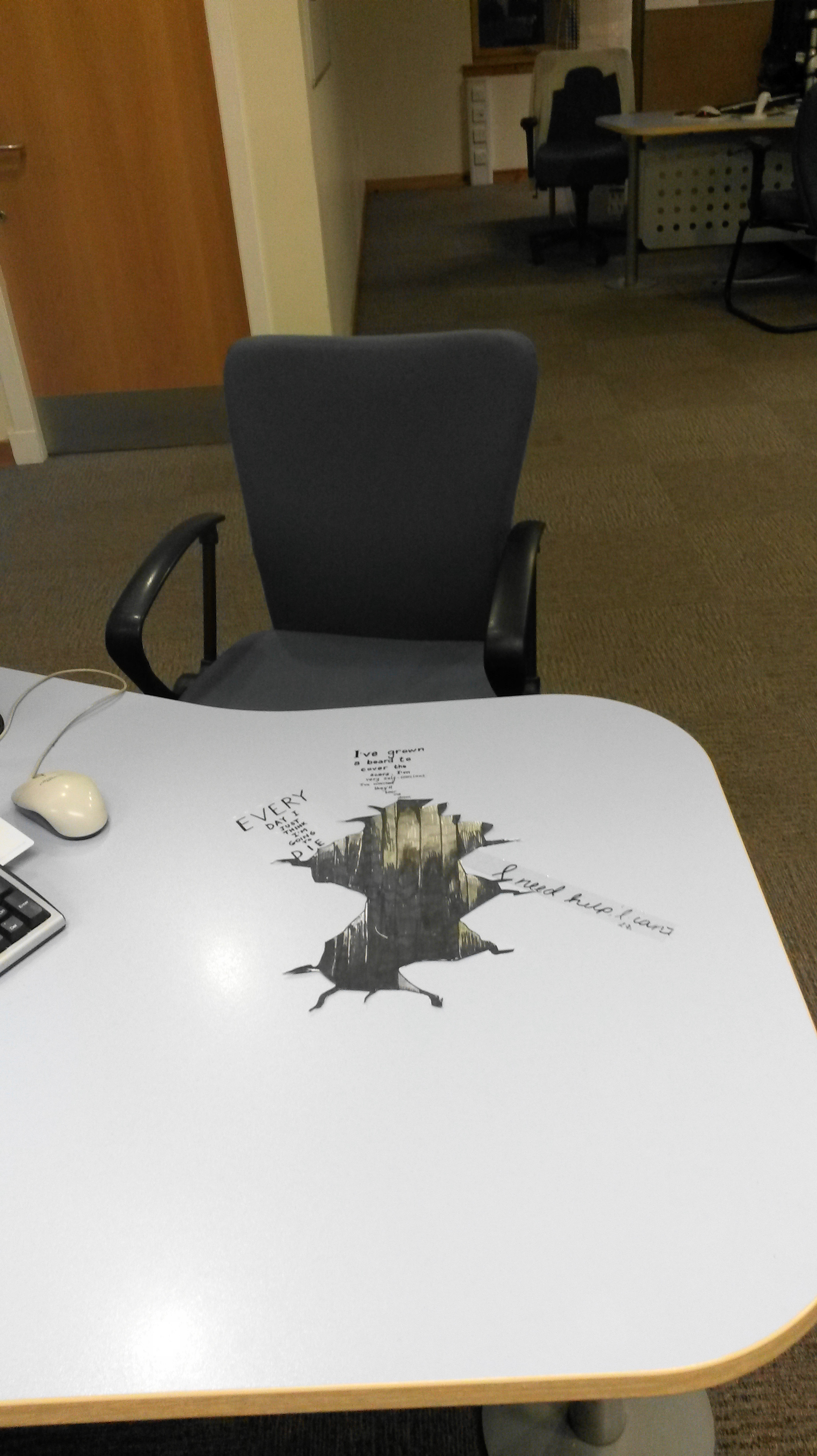
A Changing Scene. Well done for trying various approaches to this problem. I think that you preference for the drawing with the shadows is perfectly reasonable. Its composition is interesting and there’s a sense of time (and space) unfolding. I do think, however, that if the shopping centre drawing had been denser that something rich could have been made. You’ve stopped quite early in the process, I think, and not given it chance to breathe. You’re interested in your position as an artist as recorder, and I wonder if there wasn’t more mileage available to you here. You could, for example, have traced the routes people take through the shopping centre which would have conflated the car headlights idea with the observation. I do like the use of the water and the soluble ink and would be interested to see you push this technique further.
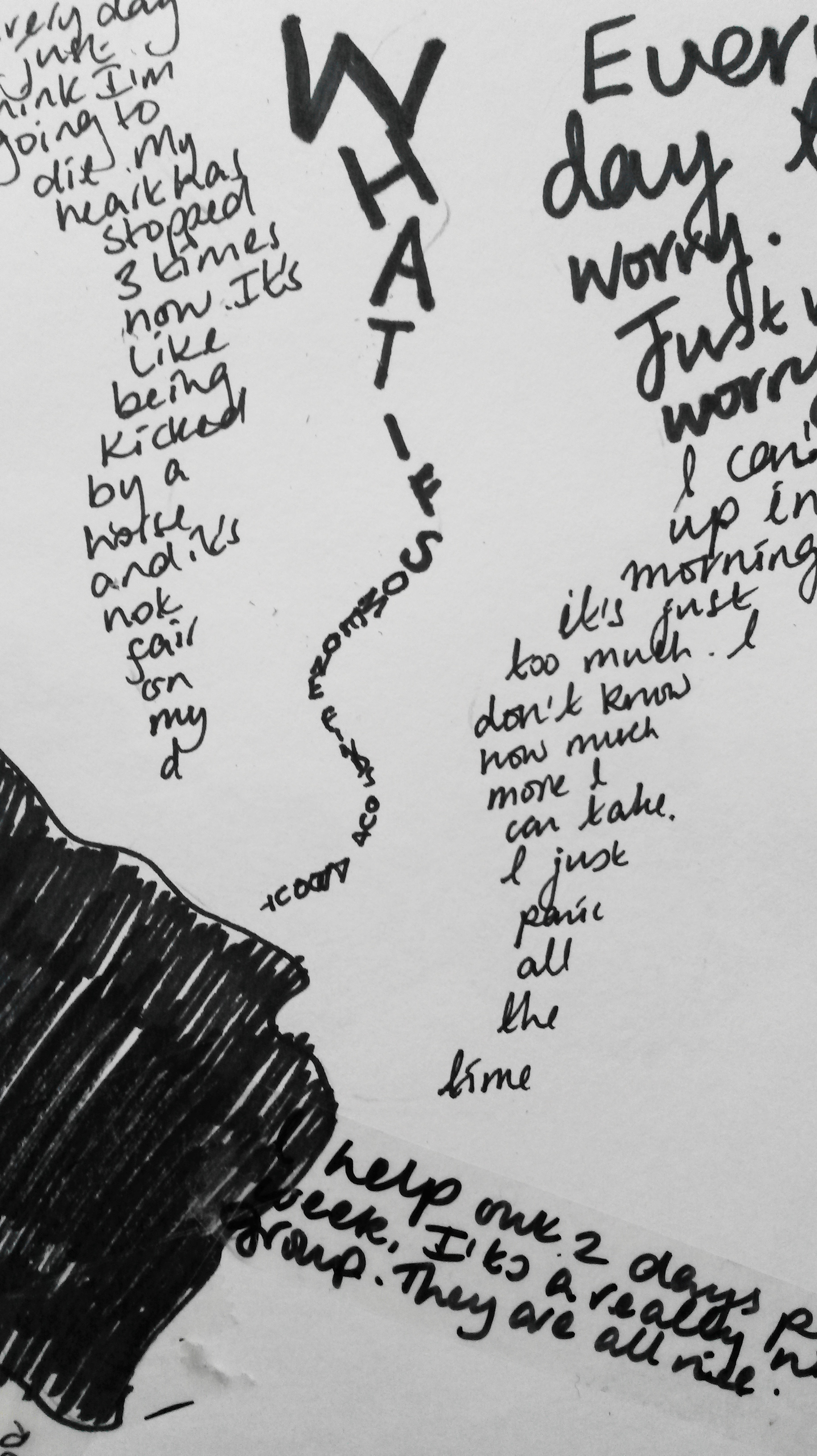
An Artist’s Book. You’ve looked at the work of the artists suggested but I really wanted to get your take on their work. In the section on Botticelli, you write that ‘the imagination used is amazing’ and I wanted to read how? Aside form the technical aspects (‘His draughtsmanship is perfect and the fine line drawing technique employed often implies movement of the characters so that you could almost be looking at an animation’), what moves or excites you in the work? What can you borrow or learn from it? In your summaries of the other artists there’s very little of your voice. You mostly quote from other sources and don’t agree / disagree with the statements. Although it’s tricky, I want you to bring something of your knowledge or opinion (which is informed by your education and practice) to bear on the subject.
You do establish a relationship with another artist’s work when you come to make your own book, which is great. The idea of using notes and ‘doodles’ made during phone
conversations is really strong and pulls on all sorts of strands in contemporary art. I know that you put this aside as you progressed but its something you should consider
reincorporating. Aside from Martin Wilner’s work there’s something of Cy Twombly’s interest in scribbles and (possibly) subconscious mark-making.
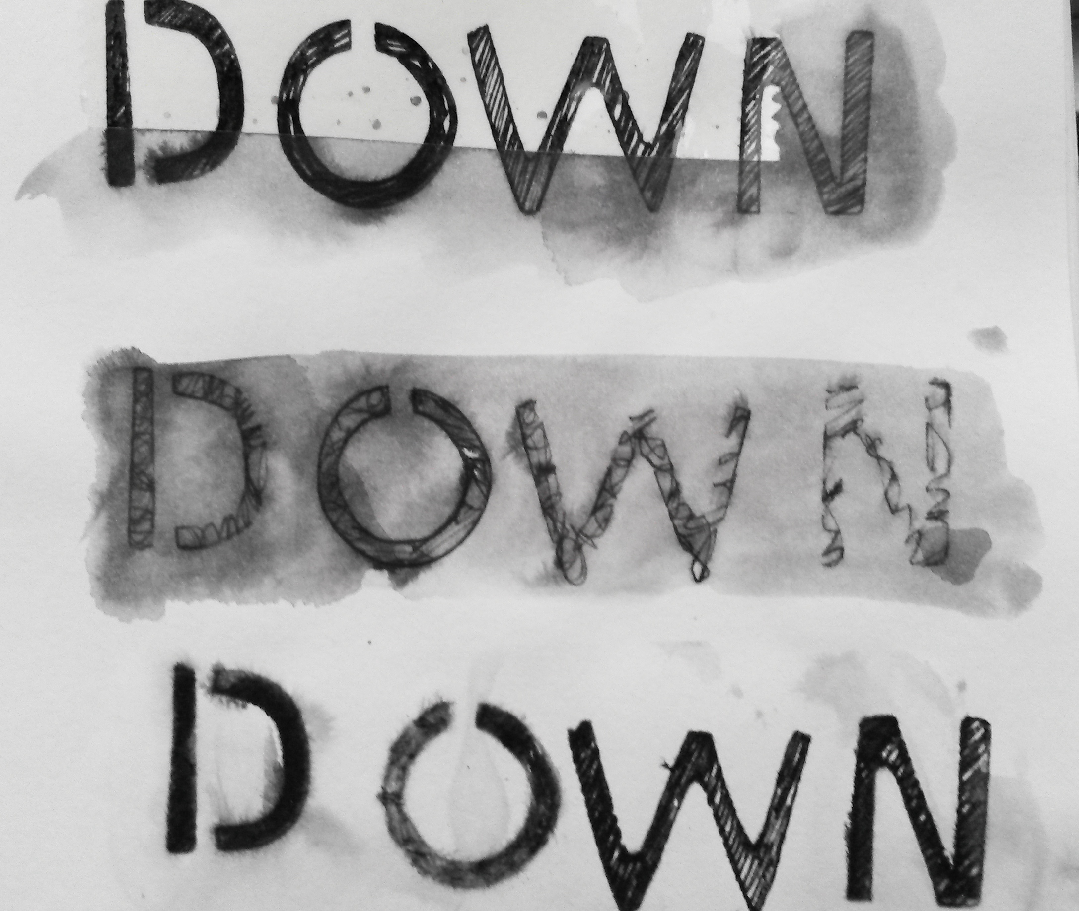
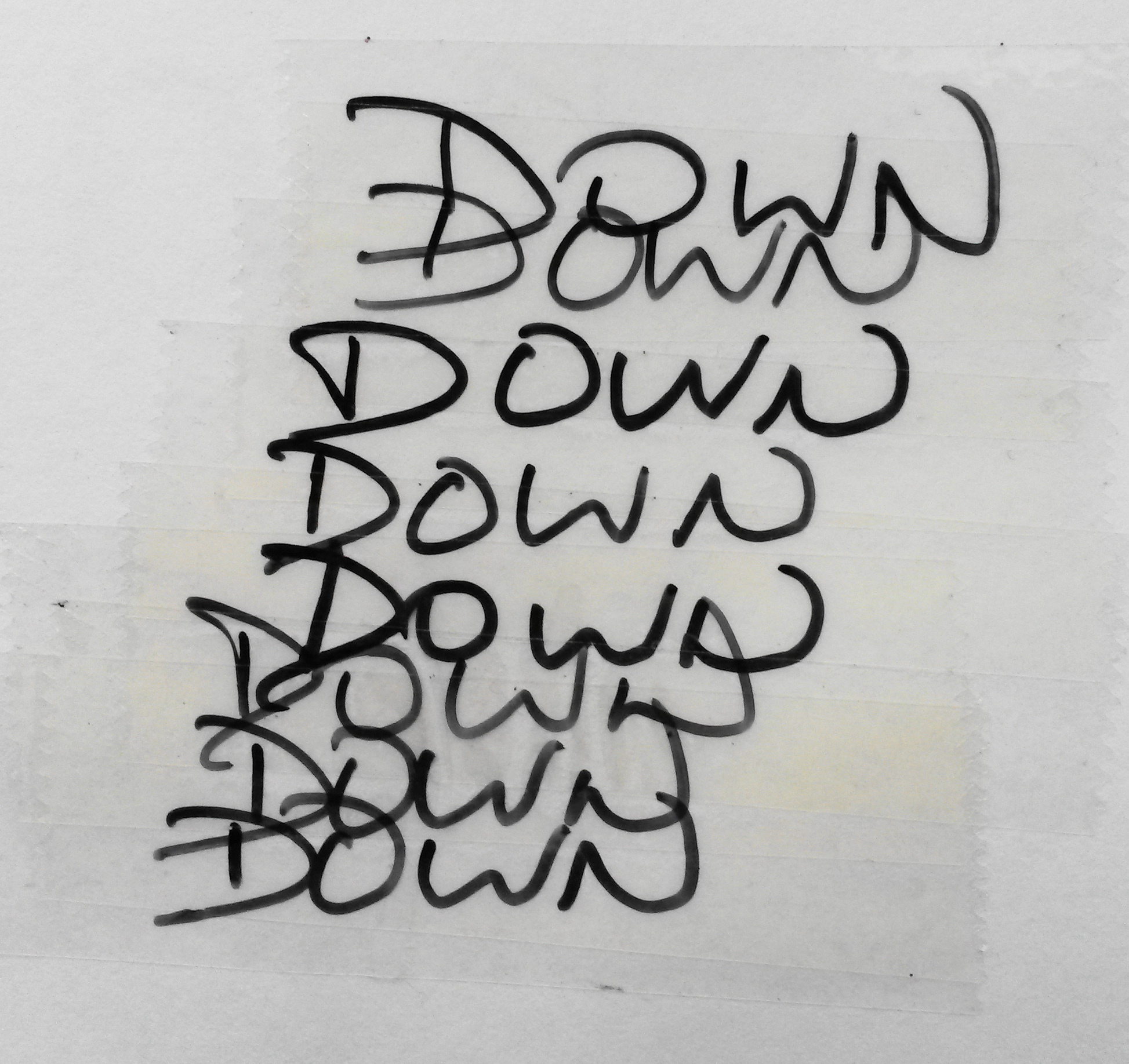
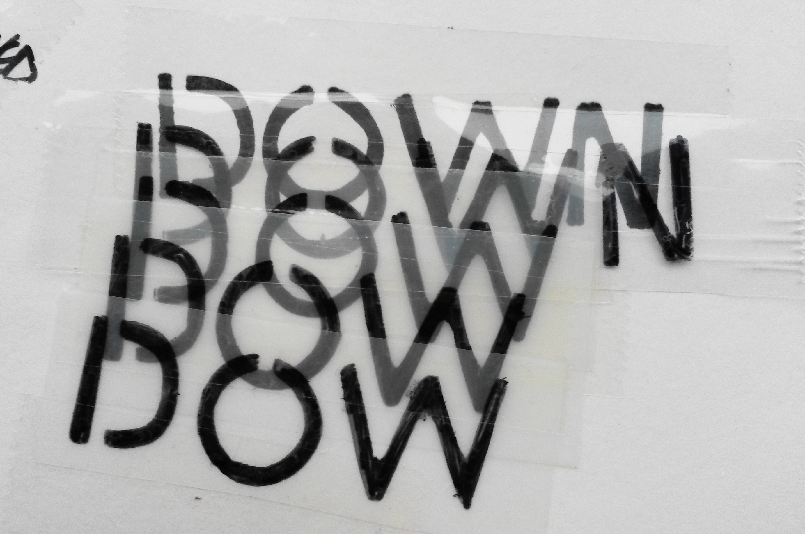
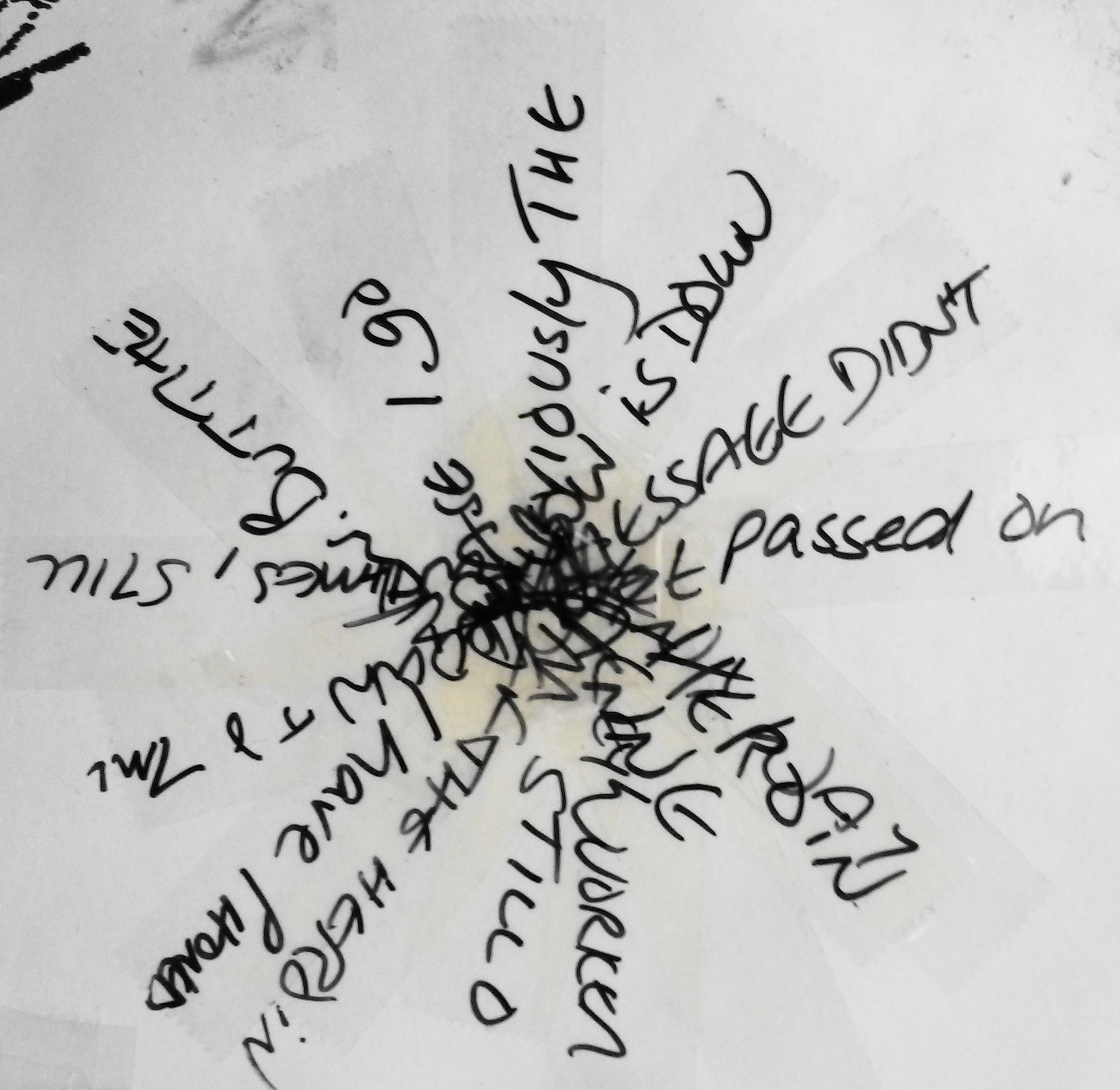
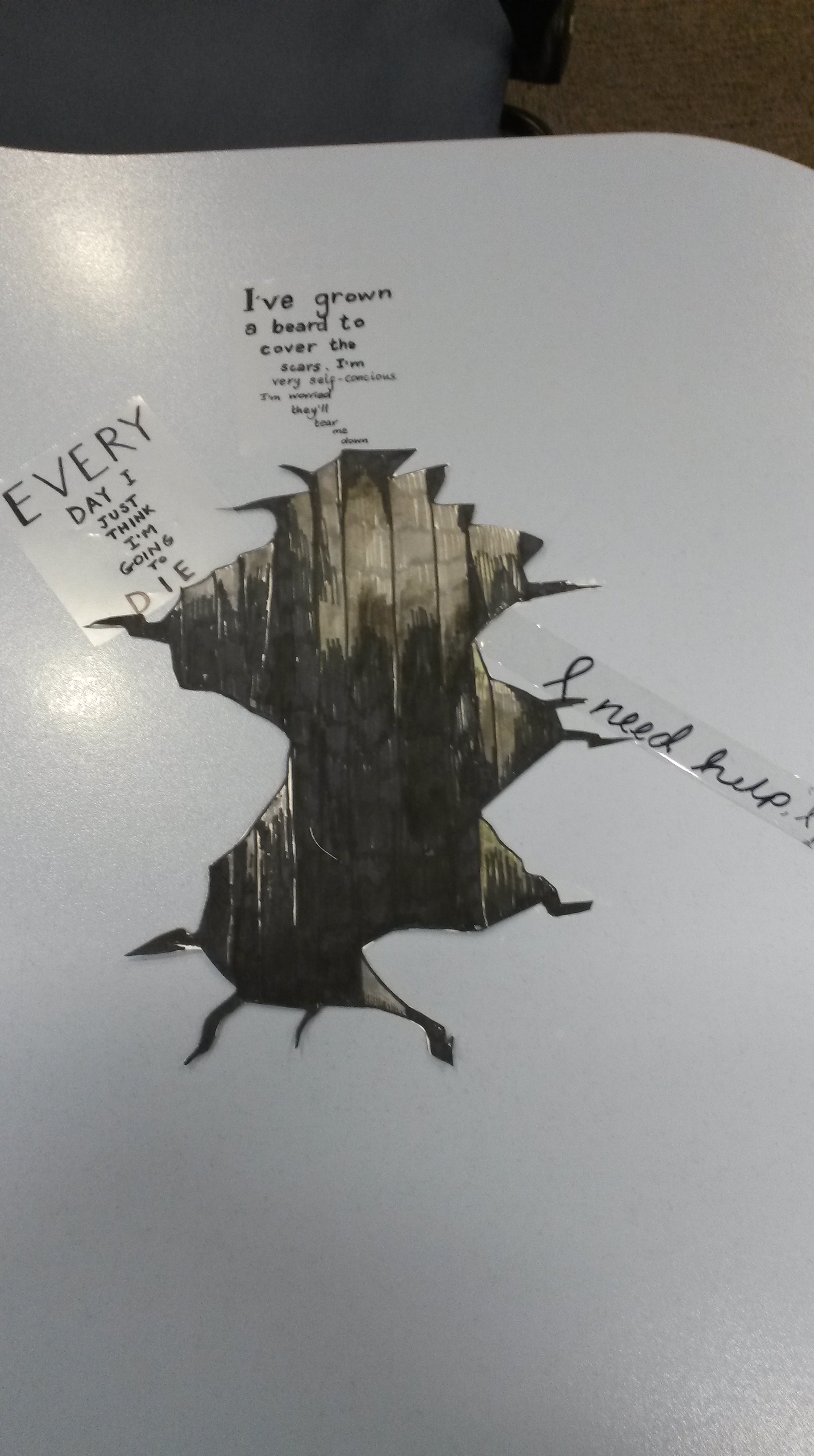
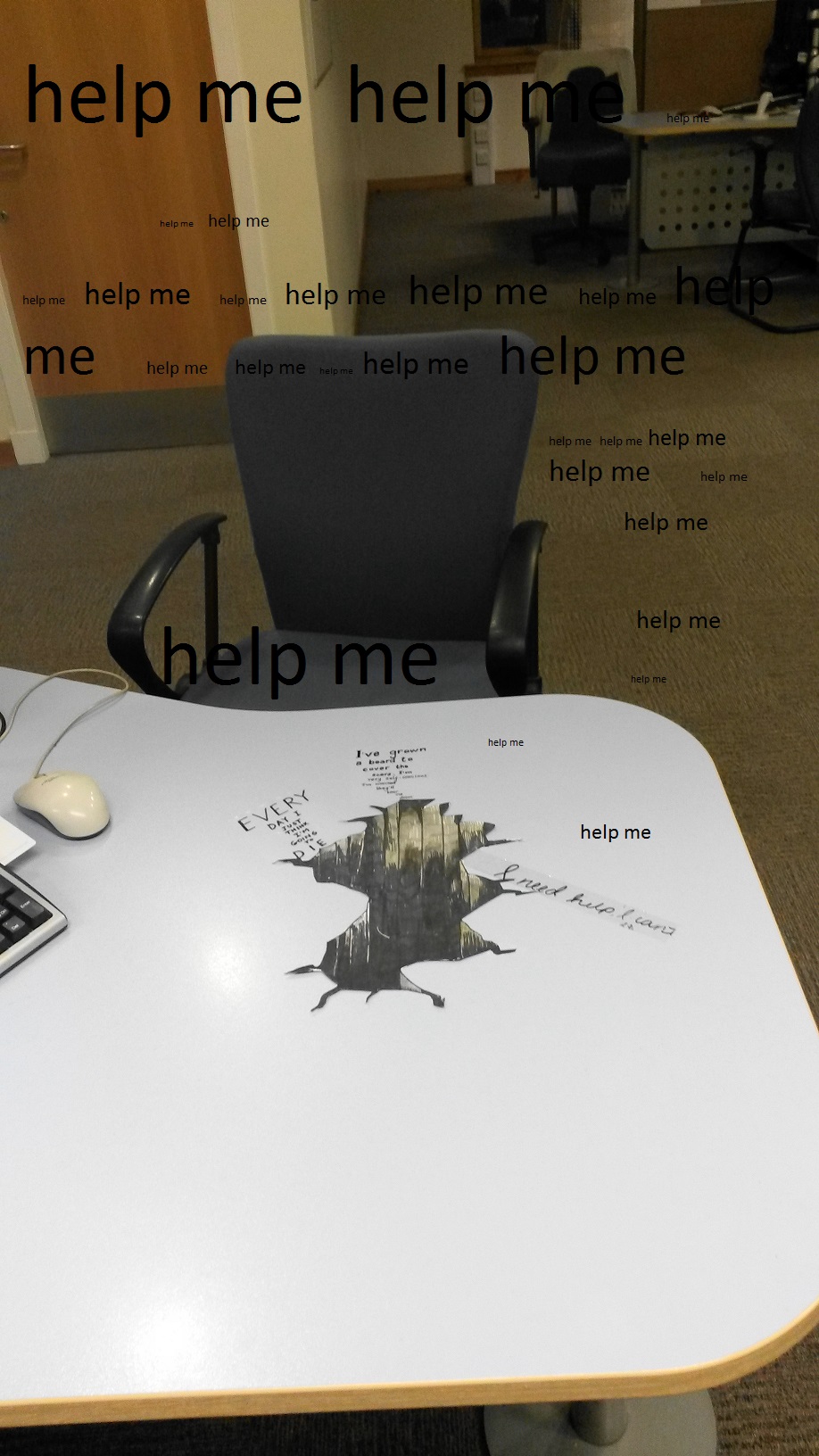
The pages of the book have a vibrant but evasive quality. Parts of the images shift into focus and others are obscured or tricky to read. The ambiguous orientation plays its part too. You managed to re-think what a book might be. It’s not narrative and the front and back (and in terms of a time-based project, this is important) is perhaps arbitrary or complex. I’d call this a success and though you’ve puled back from using all the material you considered you might want to return to the sheets to explore the form further. As I’ve already written, you could employ the technology of bureaucracy (photocopiers and scanners (which I mis-wrote as ‘sinners’ last time)) to fold elements of the work back into itself. Making copies of the pages and working into them again (and again, and again) might also reinforce the repetitive nature of bureaucratic systems. I really think that this little book has legs and ought to be pursued.
Don’t forget that you can layer the image with different colours in different sessions. You might also attach other bits of office paraphernalia to the main substrate. You cool for example staple stuff onto the pages or add posit-its (you actually mention this in your notes on my last report), or even rip or cut stuff out, or censor it. The key phrase in your reflection is:

If I were to do this exercise again I think I would try to include doodles and
sketches done unintentionally whilst listening on the phone and perhaps look
into what the subconscious meanings of these could be. Why not keep this going by adding this sort of material? I’m reluctant to say ‘start again’ as I think it would be better making this denser and more complex. The idea of doodling and then
analysing them is really very good as it makes your position as maker more problematic. You become a subject in your own work alongside the people you are quoting. Problematic is good. At the risk of blowing my own trumpet I have been collaborating with a friend on a series of books in which we work onto a pre-printed surface (also designed by us) in different ways to create a deliberately disorienting experience for the reader / viewer. The background includes photographs of a dense installation we made as well as material found online. It’s a ‘real’ collage on a digital one and each book will end up being unique:
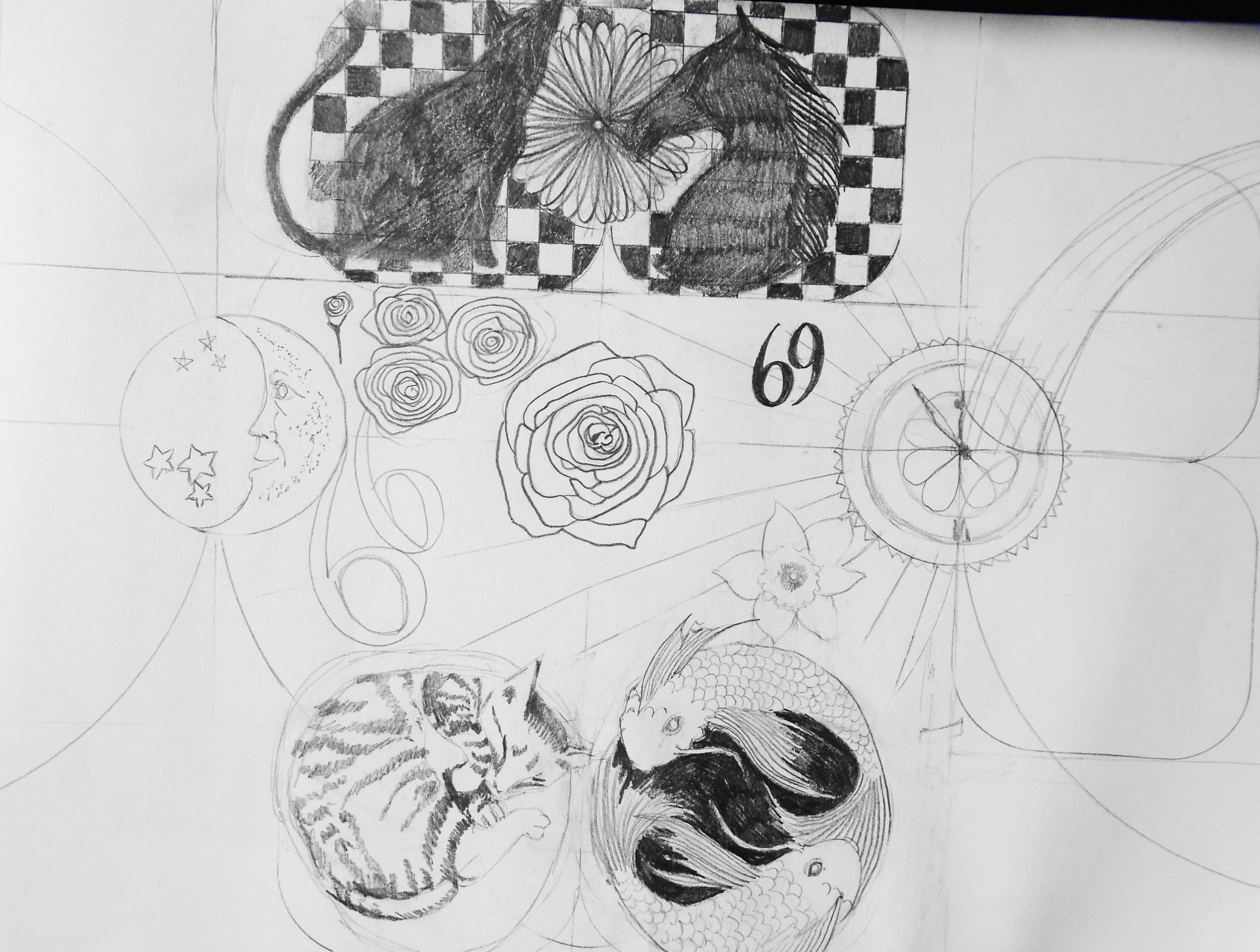
A Finer Focus.

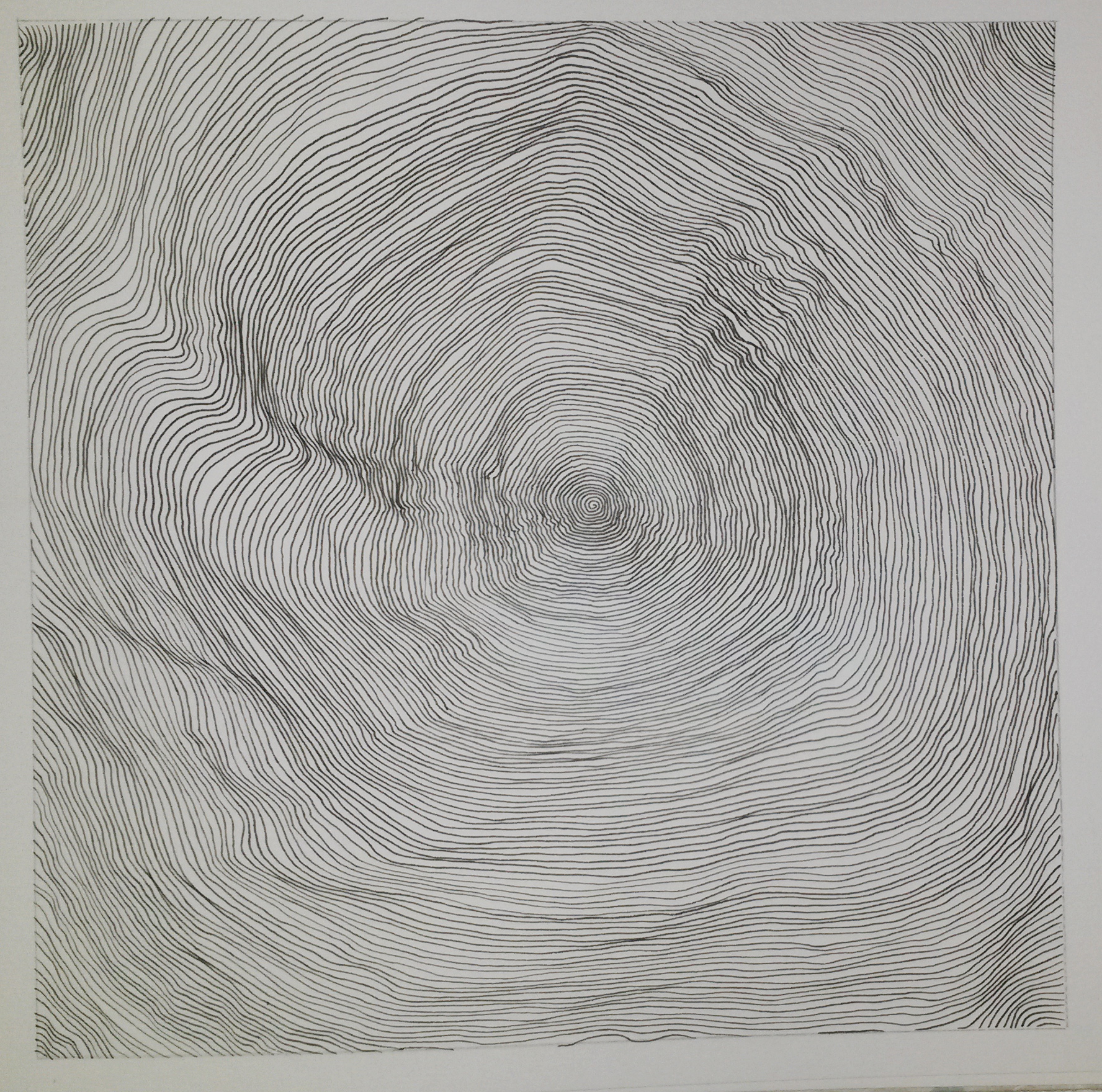
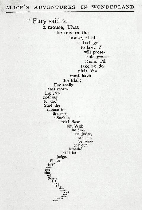
This is a good response (and a really solid drawing) to the brief and I’m glad you’ve thought about it in terms of your parallel project. In the light of the theme of the submission being ‘timelines’ I would be interested to know how it felt to work this way.
Making even a small drawing with such meticulous attention to detail can takes ages and you’ve implied as much in the text. How did it feel to make slow progress, but progress nonetheless? Is there something related to the speed of the bureaucratic machine here? Perhaps I’m over-stating it but the task of drawing something in this way of almost like the character in Franz Kafka’s Trial who goes round in circles trying to escape a legal system. The more you look, the more there is…
Also, the reflection on Stephen Walter’s drawings is very brief. What is it about having to get close to drawings to understand them? Is something lost even as the viewer reads more detail? More please, as I think you could get a greater insight into your own work by addressing these issues.
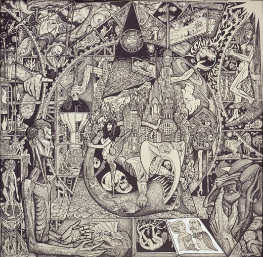
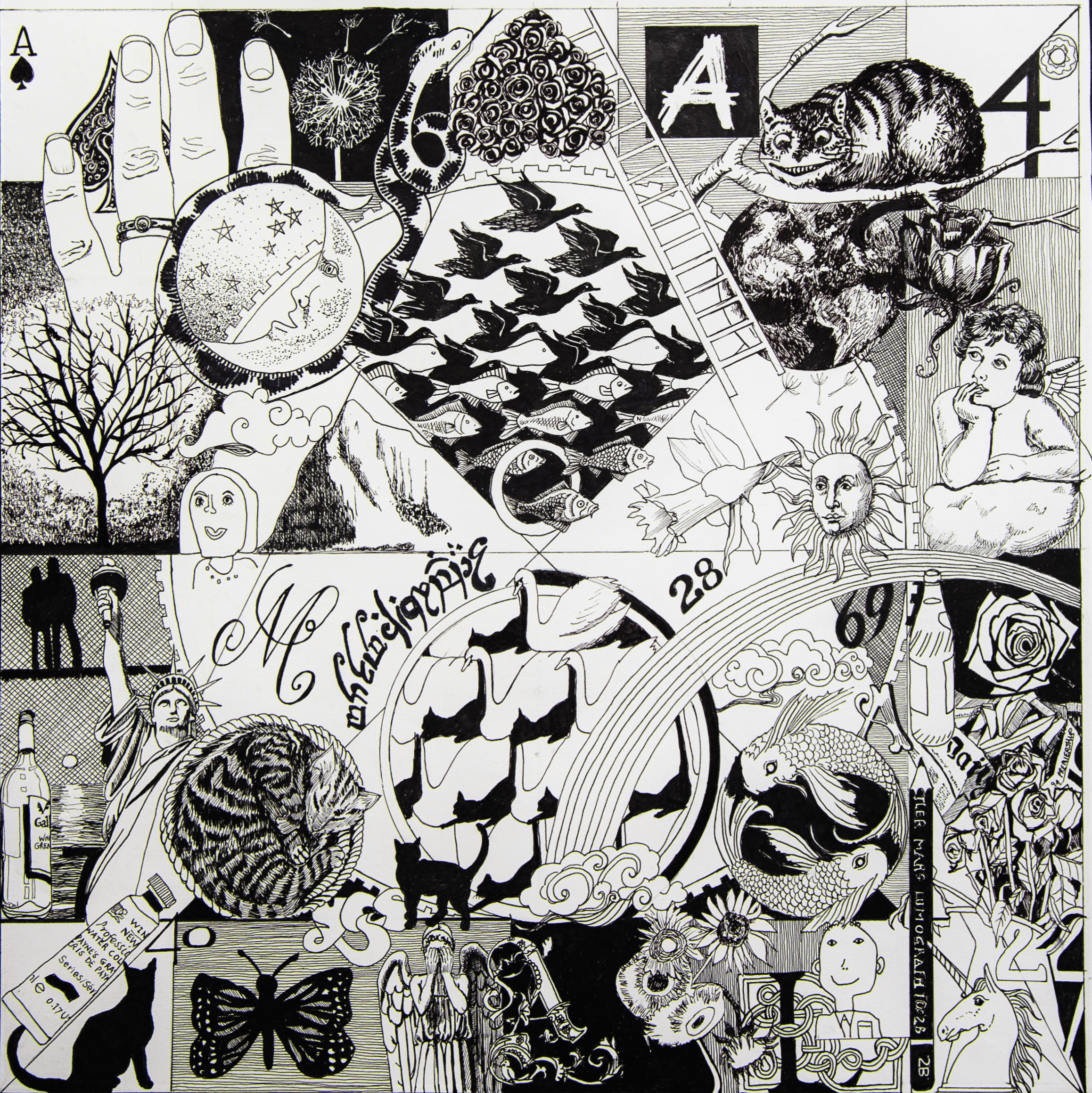
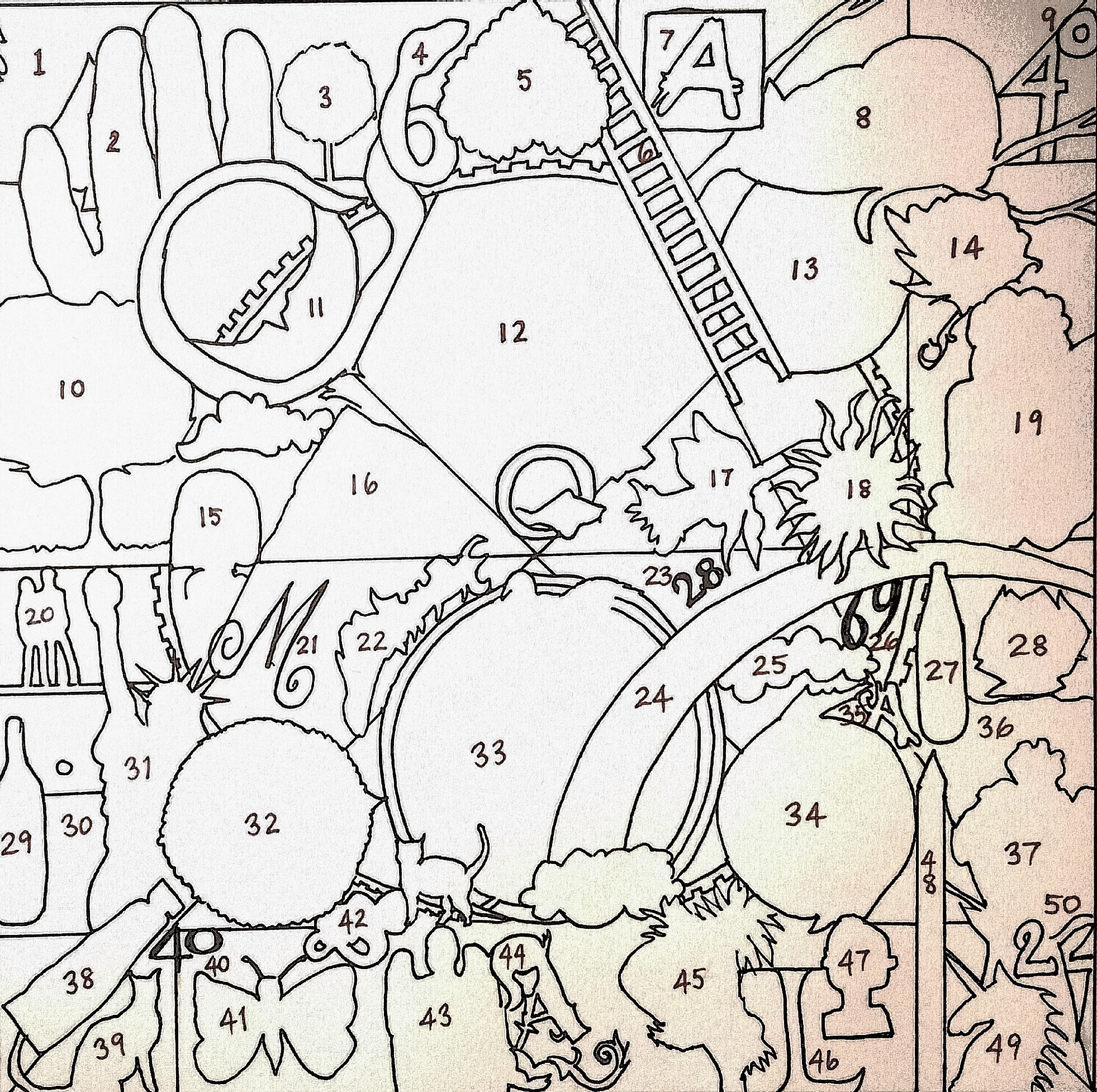
Time and the Viewer.

It’s here that you resolve – or explore – some of the issues raised in the other exercises. The text you’ve written is good and adds to the work, I think. The plain and
clear way you write about how colour and black and white work differently is  convincing and unpretentious, for example. Visually the piece relates not only to the precedents you mention but to the artist’s books you made, though all the elements are more ‘equal’ in status. The idea of time is very visibly encoded into its making, too. The reposted material from the OCA forum is a great inclusion as it shows how a work is ‘read’. It’s an obviously symbolic or allegorical piece and invites the viewer to speculate on meaning and connections and you see this played out in a very
clear way. Does this, I wonder, have a part to play in the piece itself? Is there room for some of this text to be incorporated? Perhaps also you could draw the key, like this:

This would provide a visual map rather than just a list and would extend it just a little further. On a side note, I’m interested in the YES logo and wonder if their work – detailed and technical, with a little bit of the ‘kitchen sink thrown in’ approach could be seen as an analogue of your approach? This isn’t as trivial as it seems. Often our work can be informed by other cultural interests? How might different artists approach cooking, for instance? Andy Warhol: a ready meal? David Hockney: something tasty and fresh, but improved from ingredients? Whereas a conceptual artist might follow a recipe meticulously.
The final comment – ‘In a sense, this could be viewed as the artist having power over the viewer and the ability to ‘steal’ their time’ – is interesting. Does the art work also steal time from the artists, demanding to be made in certain way.
All in all these are interesting projects and while they may seem fragmented and unrelated to (a) each other and (b) the parallel project, I think that connections can be made. I’d recommend drawing a mind-map that covers all the work made for Drawing Two to plot the links. This could be quite big and incorporate thumbnail sketches as well as writing (and be as dense in tis way as Faust in his Study). You could write a contextualising statement and include both in your submission. If foldable, like a map, it could be a artists book.
This is in line with the ‘reminder’ on p68 of the course:

Pointers for the next assignment
● Reflect on this feedback in your learning log and link it to the last report which still
has relevance here
● Think back over the course and try and eke out the links between things
● As an artist you are responsible for not only making your work but also recording its
making, especially in THIS context. How does that fit with the ‘artist as recorder’ idea?
Please inform me of how you would like your feedback for the next assignment. Written or video/audio? I’d really like to speak to you again a I think that at the end of this course you have made real progress, but lack a bit of confidence in its value or the objectivity to see how it might all be linked. A conversation would really help, I think.
If you decide to make some more work (and I hope you do) and rework the text a bit, we can talk about that.
I look forward to it.
Tutor name                     24th June

Next Assignment due ; 31st Aug 2016


Project 4: Time and the viewer

Make a drawing which forces the viewer to use time differently.  This may mean a drawing which takes time to make sense of, or a drawing that creates a feeling of a certain pace.  The drawing may need an investment of time by the viewer in some way.  A drawing is a record of the time you spent making it, but the viewer also spends time looking at it, perhaps seeking meaning, enjoying its beauty or marvelling at the artist’s skill.

For this exercise I tried to think of a piece of work that I had spent a long time looking at.   I thought again, about the Alisdair Gray Exhibition and decided to use one of his prints; Faust in His Study, 1958, 84 x 82 cm.  There is a lot of detail in it, and the images are juxtapositioned in a way that keeps your eye moving around the composition, as you try to make sense of it all.

Alasdair-Gray-Faust-in-His-Study-19581

                            Alistair Gray Faust in His Study, 1958

The original ‘Faust in his Study’ was painted by Rembrandt circa 1652. It shows a scholar transfixed by an orb of light that holds a secret code. In Gray’s version, all the knowledge of life and experience teems through this incredibly detailed work, intertwining symbols of death, love and human endeavour alongside what lies beyond our world.

I was also influenced by a painting called Universal Art by Joaquin Torres-Garcia in 1943.  Images of a man and a woman, the sun and moon, clocks houses, astrological signs and a Greek cross are arranged in a tight, grid-like pattern on the canvas.  These references to man, nature, civilisation, astrology and religion suggest that this work is about the fundamental elements of human existence. (Phaidon, 1996:464).

arte-universal-1943

I decided that I didn’t want my drawing to be as dark and disturbing as Gray’s.  I wanted to use geometrical shapes in a similar way to his and keep the image monochrome.  It’s hard to explain why, but I’ve found I’ve been drawn to black and white images throughout this course, right from the very beginning when I did the bar code drawings.  When colour is added to a drawing it often adds a dimension that wasn’t there before.  This can be used to advantage, such as the way Expressionists used it to evoke a mood or emotion, however a lack of colour can also be used to simplify, allowing the viewer to focus on line, shape and patterns without distraction.

I decided to make the drawing autobiographical, for ease, and to lessen the need for research.  I began making notes on things I could include, not quite a mind map, but along the same lines.

I needed a compositional structure, so I used items from my studio desk for the geometrical shapes; a plate for the large circle and water pots for the smaller ones and squares.  To that I began adding things from my list; a daffodil because I was born on St David’s day, my cat, the Pisces symbol etc.  I decided I didn’t like the composition of this drawing.  I didn’t like the rectangle composition and the semi circles at either side led your eye out of the composition (although Gray used this successfully).

DSC00378

I started again this time with a square composition.  I placed one large circle in the centre, quartered it diagonally and added four smaller circles.  I then added horizontal and vertical lines.  I drew everything in pencil initially.  I started with the Pisces symbol, added a rainbow, sun, moon and stars, as did Gray.  I began with fairly straightforward ideas; star sign, house numbers etc, but strangely it evolved to a deeper level, as more and more references to my late mother were added.  It started out as images relating to my life and moved on to become philosophical with ponderings about life and death.  Perhaps I was inadvertently influenced by Gray’s image more than I thought. It probably took me about 6 weeks to complete.  I seriously underestimated how long it would take, drawing everything in pencil first, moving things around the composition until I was happy, then drawing in pen.

annemacleoduni

Autobiographic black drawing pen

Here is a key to the references, working from top left to bottom right;

  1. Ace of Spades – the death card.
  2. My left hand, showing my wedding rings, representing my love for my husband.
  3. A dandelion clock, being blown to make a wish.
  4. A snake from Snakes and Ladders, representing bad luck, or set backs in life.
  5. An upside down rose wreath, which my siblings and I gave on my father’s funeral.
  6. A ladder from Snakes and Ladders, representing good fortune, or progress in life.
  7. The OCA logo, a huge part of my life.
  8. The Cheshire cat from Alice in Wonderland, representing imagination.
  9. 40 – previous house number.
  10. A tree painting I’ve done various versions of.
  11. A crescent moon and stars.
  12. M C Escher’s print Sea and Sky.
  13. The Earth.
  14. A drawing of a rose by my niece which was included on my mother’s funeral order of service.
  15. A self-portrait of my daughter Katy.
  16. Monte Monaco, Sicily, one of my favourite places.
  17. A daffodil as I was born on St David’s day.
  18. The sun.
  19. A cherub scrap from my childhood.
  20. The silhouette of my son and fiancée.
  21. M for my sister’s initial.
  22. Runes from my favourite book, Tolkien’s The Lord of the Rings.
  23. 28 – previous house number.
  24. A rainbow, a symbol of hope.
  25. Clouds, representing dreams ‘head in the clouds’.
  26. 69 – previous house number.
  27. Irn Bru bottle, always reminds me of my mother.
  28. A rose, a recurring symbol in my work, representing ‘love’.
  29. A bottle of wine.
  30. A sun setting over the sea. a favourite image.
  31. The Statue of Liberty, representing my friends and our adventures, as we’re just back from New York.
  32. My tabby cat Fudge.
  33. White swan, Black Cat; my homage to M.C. Escher.
  34. Two fishes; the Pisces symbol.
  35. A for my brother.
  36. A bag of chips wrapped in news paper; one of my first jobs was in a chippy.
  37. A jug of dead roses, representing loss.
  38. A tube of my favourite watercolour colour; Payne’s Gray.
  39. My previous black cat Slinky.
  40. Second number 40 – another previous house number.
  41. A butterfly drawing my daughter did for my mum’s funeral order of service.
  42. Yes, my favourite band.
  43. A Weeping Angel; a character from Dr Who, which represents fear to me.
  44. Initial A for my name.
  45. Van Goch’s Sunflowers.
  46. L for my other sister.
  47. A self-portrait of my youngest son.
  48. My trusty 2B drawing pencil.
  49. A unicorn chess piece, for no reason.
  50. 22 from Catch 22, another favourite book and also pertinent to life’s difficulties.

The number 50 is also relevant as I’ve just reached that milestone age.

I’ve taken so long with this drawing, as often happens; it’s hard to be objective about the outcome.  Parts of it work better than others.  I really like the bottom right corner.  All the pieces slot together like a jigsaw, and the lines of the unicorn’s horn and the pencil continue the lines of the composition, with the impression of layers.  The unicorn horn echoes the line of the spout of the jug, and the handle repeats the shape of the number two  The top right doesn’t work so well. The sketchy drawing in the Earth and the rose make the images hard to make out.  When I compare my drawing to Gray’s his is so much more sophisticated.  Each element in his is integrated into the whole, things go under over and through others.  Having a totally black background makes the white objects and people stand out more and having perspective at the bottom gives the whole thing a three dimensionality.

If I were to make a similar drawing again I would use a totally black back ground. I would decide on the theme from the out set.  I would try to integrate the individual elements more using Gray’s techniques of having elements over, under and through. On the whole, I found it to be a successful exercise, although I wouldn’t rush to do another one, given the time commitment involved.

Reflect on the time spent by the viewer and how it relates to what you do as an artist.

It generated a lot of interest and discussion at my local art group and people did genuinely spend time looking at it and trying to figure it all out.  People of a similar age to me could relate to the cherub scrap, and some commented that at first it appeared to be a random group of objects, however the more they looked, the more they could see connections.

In addition I posted photographs on an OCA Facebook page and asked for feedback.  Here are some of the responses;

This very much an autobiographical piece loaded with personal symbolism and significance.

I looked at the whole photo first & thought I was just going to give it a glance. After a quick once over though I started wondering if it were a self-portrait / autobiography which made me look longer & harder, curious as to which part meant and then discovering little images I didn’t notice before.

I found your composition fascinating! I specially love the cat and Swan patterns and the fish and bird patterns so beautifully drawn. The detail is exquisitely executed. I could gaze at this for hours but only spent ten minutes so far I’m sure I will look again when I’m next in Front of my computer.

It feels like a diary of your life, everything that is significant and meaningful the detail is amazing

The dense complexity forces the viewer to spend time looking. The random association (or is it) generates narrative reading which also slows down the consumption of the piece. Additionally, the detail literally and metaphorically illustrates the passage of time in its construction. For me a smorgasbord of cultural influences and inspiration while at the same time being inspirational

Overall I find the composition fascinating – an image of chaos but of a life where the chaos is ordered and somehow slots into place. The life has travelled and studied different influences and there are indications of frustration and joy too and also finding places to rest peacefully

I found myself looking around – as if looking at a room full of objects – just trying to make sense of it and wondering what your thought processes were

This is very interesting, I have looked at it for a few minutes and feel I will need to look again, maybe more than once. To me it depicts a personal journey through good and bad times with lots of interesting references

an amazing amount of work to produce a complex image – compositionally I find it unsettling because there doesn’t seem to be a main focal point to the piece – that may be a deliberate intention on your part – I think revisiting this over several minutes the daffodil has become a quiet spot for me which helps me go back and consider the other imagery – don’t know if this reflection is what you were looking for – but am in awe of you spending so much time and care on a work

A from oca with the the cat from Alice and an angel forces speculation to generate narrative or personal meaning. Duchamp says; ” The viewer completes the picture

For me my eye rests on the tessellations as I can see influence of escher and I am a fan of Jinny Beyer (quilter). I am also drawn at the same time to the hand on the left and the Cheshire cat to the right with the clear indication of OCA … a story of life and happiness. I also really love the curled up cat … peaceful and safe. The whole composition is one of chaos but organised chaos as if it is different pieces of a life all finding their place

I agree with _____ about the amazing amount of work. I find it fascinating – so many images, from popular culture, but presumably full of personal meaning too. Looks like a lifetime encapsulated into one image. I did spend just about 4-5 mins on it, but could look at it over and over – like one of those very complicated album covers by a psychedelic band – keep staring and you’ll see much more! Could almost be a ‘trippy’ game board

In a way the artist has control over the viewer, they have the capacity to intrigue, arouse curiosity and grab the viewer’s attention.  In a sense, this could be viewed as the artist having power over the viewer and the ability to ‘steal’ their time.

Rework

I was so proud of this drawing, that I got a friend who is a professional photographer to photograph it for me.  My local art group enjoyed watching me draw this.  They liked the concept and three members have made their own drawing about themselves.

My tutor thought that it would be easier to read my key, if I did a diagram, similar to the key of the Beatle’s Sergeant Pepper album cover.  And it would also look more professional.  So I did this key, which I may include as part of my assessment.

20160925_204547

  1. Ace of Spades – the death card.
  2. My left hand, showing my wedding rings, representing my love for my husband.
  3. A dandelion clock, being blown to make a wish.
  4. A snake from Snakes and Ladders, representing bad luck, or set backs in life.
  5. An upside down rose wreath, which my siblings and I gave on my father’s funeral.
  6. A ladder from Snakes and Ladders, representing good fortune, or progress in life.
  7. The OCA logo, a huge part of my life.
  8. The Cheshire cat from Alice in Wonderland, representing imagination.
  9. 40 – previous house number.
  10. A tree painting I’ve done various versions of.
  11. A crescent moon and stars.
  12. M C Escher’s print Sea and Sky.
  13. The Earth.
  14. A drawing of a rose by my niece which was included on my mother’s funeral order of service.
  15. A self-portrait of my daughter Katy.
  16. Monte Monaco, Sicily, one of my favourite places.
  17. A daffodil as I was born on St David’s day.
  18. The sun.
  19. A cherub scrap from my childhood.
  20. The silhouette of my son and fiancée.
  21. M for my sister’s initial.
  22. Runes from my favourite book, Tolkien’s The Lord of the Rings.
  23. 28 – previous house number.
  24. A rainbow, a symbol of hope.
  25. Clouds, representing dreams ‘head in the clouds’.
  26. 69 – previous house number.
  27. Irn Bru bottle, always reminds me of my mother.
  28. A rose, a recurring symbol in my work, representing ‘love’.
  29. A bottle of wine.
  30. A sunset; one of my favourite images.
  31. The Statue of Liberty, representing my friends and our adventures, as we’re just back from New York.
  32. My tabby cat Fudge.
  33. White swan, Black Cat; my homage to M.C. Escher.
  34. Two fishes; the Pisces symbol.
  35. A for my brother.
  36. A bag of chips wrapped in news paper; one of my first jobs was in a chippy.
  37. A jug of dead roses, representing loss.
  38. A tube of my favourite watercolour colour; Payne’s Gray.
  39. My previous black cat Slinky.
  40. Second number 40 – another previous house number.
  41. A butterfly drawing my daughter did for my mum’s funeral order of service.
  42. Yes, my favourite band.
  43. A Weeping Angel; a character from Dr Who, which represents fear to me.
  44. Initial A for my name.
  45. Van Goch’s Sunflowers.
  46. L for my other sister.
  47. A self-portrait of my youngest son.
  48. My trusty 2B drawing pencil.
  49. A unicorn chess piece, for no reason.
  50. 22 from Catch 22, another favourite book and also pertinent to life’s difficulties.

I agree it was a worthwhile exercise, and indeed, would probably cause the viewer to spend more time looking and interpreting, which fits the brief.


References

http://www.bbc.co.uk/programmes/articles/43Chdsg7qTVLdSmbGsHl7wz/alasdair-gray-at-80-seven-artworks

Project 3: A finer focus

Chose a subject which has a substantial number of detailed parts.  Think about whether these parts will be repeated (a plate of baked beans, for example)or all different (a hyper-realist drawing of pins and nails). 

I wanted the drawing to be relevant to the theme based on my working environment, so I decided to do a tonal drawing in pencil, using an enlarged photograph of paper clips for reference.  I chose paper clips because I didn’t want to work in colour.  I gridded up the photograph, and altered the composition from rectangular to square.  This was originally intended to be a study for a larger drawing, but I significantly underestimated how long it would take me to do.  I felt my tonal drawing may be a bit rusty, so I wanted to do a smaller piece first, intending to complete a larger more finished piece.

I drew the image in line then began adding the darker tones.  I quickly realised I had drawn the wire in the paper clips too thin and I had to correct the whole drawing as I went along.  I used 2B, 5B and 8B pencils and a putty rubber to lift out highlights.

2016-03-20 16.50.56

Tonal drawing in pencil 21 cm x 21 cm

In the end, my smaller drawing, intended as a study has become my final piece.  If I had more time I would complete another drawing, on a larger scale again.  I am happy with the outcome.  When I posted it on an OCA Facebook page the feedback was that it looked like a photograph and this was my intention.


Project 1: A changing scene

Drawing moving figures or a changing scene can be extremely challenging.  A large part of that challenge, however, is your own conception of the purpose.  By taking a step back from trying to pin the action down to a static conclusion, and instead making a drawing which is a record of the movement and action itself, we can begin to reflect on how to balance movement and form to create a dynamic image.

First of all I sat in a busy shopping centre where I could watch people walking to and from the exit and I tried to make quick sketches of them.  My sketches were all static images with no sense of movement in them at all.

2016-03-20 16.38.56

A5 sketchbook with black drawing pen

I then sat at my laptop and watched videos of busy street scenes.  I tried drawing with water-soluble ink then added a little water and this helped a little, the blurred shadow implied a little movement.  Also the use of linear perspective implies that the figures are moving from the foreground to the distance.

2016-03-20 16.48.20

A3 sketch book with black soluble drawing pen

I thought about what the brief said about ‘making a drawing which is a record of the movement’.  This made me think of photographs of moving cars where the head lights create light trails and these certainly imply movement.  I looked at some images on my laptop and made a quick sketch of light trails.

2016-03-20 16.40.28

A4 black sketch book with soft pastels

I thought some more about shadows and looked at some photos of crowds of people on-line.  Joining the shadows together makes your eyes follow the line of people and this implies movement, although not at a fast pace.

2016-03-20 16.47.22

A3 sketch book with black sharpie

I played about in my sketch book some more, thinking about faster movement.

2016-03-20 16.49.35

A3 sketch book, various drawing pens

I tried another with fine drawing pen.

2016-03-20 16.45.44

Finally I just went for a feeling of fast movement in a wandering line.

2016-03-20 16.43.40

Reflection

The final piece does, I think, portray a sense of motion, not necessarily of people; it could be traffic or a river even.  Looking at all the pieces together I think I prefer the one below, out of all of them.

2016-03-20 16.47.22

It depicts people, and implies that they are walking.  The two figures at the bottom cut off at the edge look as if they are walking into the composition.  The scribbles at the top aren’t even definable as people but I think it still looks like a line moving forward.  The white paper with no drawn ground etc makes it more abstract and the contrast between black and white adds drama.  The more I look at it, the more I like it.


Project 3: Installation

Make a drawing that relates to its environment in a way that creates an interesting dynamic between the artwork and the space around it.  Think about ways that drawings could take part in a kind of dialogue with the space they inhabit.  Text may be one way, or a drawn object in partnership with its real world equivalent.

Research for Project 3

I began by looking at the contemporary drawing exhibition held in Edinburgh On LineI looked at Robert Rauschenberg’s Automobile Tire Print.  1. ‘Rauschenberg instructed fellow artist John Cage, an avant-garde composer, to drive his Model A Ford in a straight line through a pool of black house paint and down a long strip of paper. The result is a print in which tire tracks form a direct record of the car’s movement down the street. This work pioneered a new form of art-making, blending elements of performance with the tradition of the ready-made (artworks made of largely unmodified mass-manufactured objects) initiated by Marcel Duchamp in the 1910s.’

Next I looked at Edward Krasinski. 2. ‘Krasiński was a leading Polish Conceptual artist, known for his extensive use of blue lines of tape, cable, and other materials. This installation re-creates Krasiński’s contribution to the 1970 Tokyo Biennale. The works, as seen here, were exhibited for only the last three days of the month-long event, as they had been misdirected in their shipment from Poland and arrived late. The artist supplied a substitute work in the interim, transmitting the word blue five thousand times via telex (a precursor to the fax machine) and instructing the Biennale’s curators to display the telex tape on a pedestal. “My art just needed to get to Japan as quickly as possible,” he said. “Instead of the two-month sea voyage, it got there in seconds. It was delightful to think that when the telex in Warsaw was typing ‘BLUEBLUEBLUE’ the very same moment the tape appeared in Tokyo.”

These two artists have made the act of drawing, just as important, if not more important than the outcome.  The making of the art has become a performance and demonstration of showmanship.

Malich’s wire works were conceived, he has said, as “the expression of a new space and the investigation of it.  3 ” Although he has never realized any of them on an architectural scale, that aim has been part of his project: at once cosmic and utilitarian, his sculptures of the 1960s were created as designs for utopian cities in some imaginary future. He continues to think of his later tied-wire constructions as models for large-scale outdoor projects shaped by forces of light, air, and water.

This drawing, which Penone made for On Line but conceived in 1995, began with the artist’s fingerprint on a sheet of paper. The pencil and ink lines, following those created by the inked ridges of skin, radiate outward, filling the paper then spilling over onto the walls of the gallery space, like the rings of a steadily growing tree.  In an interview, of Propogazione, he said’ It is a piece that was born of the idea that fingertips have a design from deep within the universe on them.  You can see it in the growth rings in trees…..I made a fingerprint using ink then I connected the lines in the fingerprint with a pencil, with graphite trying to continue the drawing….Drawing above all else is about line.  The line is a mark, that is arranged on a surface.  This makes it an intentional mark.  Therefore, it becomes a human action.  This is the most extraordinary thing about line, its such a simple gesture but its deliberate.’

Interestingly, I hadn’t heard of this artist or seen this artwork when I drew my ‘tree ring’ drawing for Project2 below, although his is in a much grander scale.

User comments

And here is Penone’s work;
giuseppe penone propogazione2
Detail of Giuseppe Penone, Propogazione 1994

Reflection: Use the links below to find out more about Pierrette Bloch.  why is she described as using ‘poor materials’ and what do you think her materials lend to her subject matter?

4.’ Like Soulages, Bloch has only used black for many years, but unlike his predominantly oil on canvas works that often swell to the heroic scale of Abstract Expressionism, Bloch has shown a penchant for humble materials and more extrapolated formats.’

I think the word ‘humble’, rather than poor, describes the materials Pierrette Bloch used.  Horsehair, found wrapping paper and ink markings on board are all humble materials; they are not traditional media for art work and most people would discard them.  It is the way they are put together that count.  She is very much in control of how the work is seen.  5. ‘Bloch has workspace in her studio apartment on an upper floor of an old building in Paris’ 15th arrondissement. All of her exhibitions are meticulously planned in advance. Bloch builds small models based on the proportions of the given environment, and using miniature replicas of all of her work, determines the placement.’

To what extent would you say that Spider by Louise Bourgeois is a drawing?

I was very fortunate to have seen this work on an OCA Study Visit last year.  Here is a link to what I wrote at the time;

https://annemacleod2013.wordpress.com/2014/03/13/study-visit-to-louise-bourgeois-exhibition/

The obvious description of this piece would be sculpture, however I can see why it could be viewed as a drawing.  There are the obvious linear qualities, emphasised by the strong use of black.  The enormous structure fills the space in the room, but the black flattens the image and it could almost be flat on a plane.  The image is not of a room with a spider, but of a spider inhabiting a room.  Incidently, Louise Bourgeois used the spiral motif a lot in her work, however she never fully explained the significance of it (see my study visit notes).

Project 3

This is such a new area for me, I debated long and hard where to start.  I wanted to relate it to my parallel project.  Some of the ideas I had were; use fax, something sitting on the empty chair, draw a welcome mat, speech bubbles coming from the furniture.

I looked at the artists suggested as reference, such as Kurt Wenner, and there was often an element of optical illusion , but which still incorporated the environment.  Often these involved the viewer looking down.  I tried to imagine how I could do this at work.  The floor is carpeted and I couldn’t imagine being able to look down on the floor, and in addition it would need to be done on a large-scale on the floor, so I thought about how I could perhaps use my desk instead.

I had a look on YouTube, hoping to find a video which would show me how to do this and I found;

I gave it a go, but my first two attempts weren’t very successful.  I was happier with my third attempt.

User comments

User comments

My desk is blue, so I decided to cut the image out (the alternative would have been to colour the white paper to blend in with the blue desk).  I cut the image out and sat it on my desk.  Unfortunately the edges curled up and caused shadows which spoiled the effect.  I didn’t have any glue or anything at work to stick the drawing down.

User comments

I decided that I would try to show the hole swallowing the dialogue that takes place at my desk.  The hole would be a metaphor for me, absorbing the information I receive from my customers on a daily basis.  I played about in my sketch book with different kinds of writing for the dialogue.

User comments

Water-soluble pen using a stencil
User comments

I was thinking of the poem ‘The Mouse’s Tale’, as it almost implies movement, like a snake weaving from side to side.

mouses tale


User comments

User comments

Stencil with charcoal

User comments

Black Sharpie written on Selotape then overlapped

User comments

Black Sharpie on Celophane

User comments

Black sharpie on Selotape overlapped to meet in the middle
For the final image, I glued the ‘hole’ onto my desk and placed the words beside it.

User comments

20160126_180215
Reflection
I think I have achieved a successful result in that I have achieved a trompe l’oeil effect.  The concept of a giant hole appearing swallowing the conversations up is an interesting one.  It feeds into my parallel project and the notion of conveying dialogue and recording what goes on in a place.  I have learned from the artists I’ve researched, such as Kurt Wenner and it is my first ever attempt at a achieving an effect like that.
If I were to do it again I would do it on a much grander scale, on a floor for example and I would either make the dialogue huge and dominating, or leave it out completely.  In my attempt, to get the effect of the optical illusion you need be a certain distance away from it, and at that distance you cannot see or read the dialogue, so it is a bit pointless.  With hindsight, although it alluded the Jobcentre, it didn’t need to be physically created there.
Rework
At the sugggestion of my tutor I have added text to my photograph.  I’ve added the text ‘help me’.  I’ve only used these words to keep it simple.  I don’t have great IT skills, but I think the text has added something to the image.  In the future I’d like to learn more skills as to how to play around with text in an image’ however for the time being I’m happy with this image.

User comments

Re-work, with text added
References
3. htp://www.moma.org/interactives/exhibitions/2010/online/#works/02/68