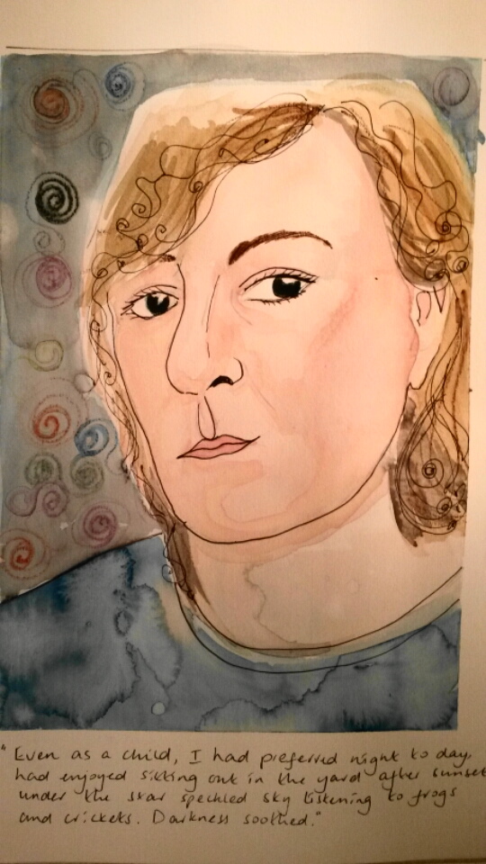
Project 2: Interacting with the environment parts1 & 2

Part One

Take a walk in a place you know well and make five different small drawn interactions in the environment using only what you find around you and your own body and without damaging any plants or animals in the process.  Try to do things which will affect the way a visitor to the space would perceive it, either by directing their gaze or by changing the qualities of the place.

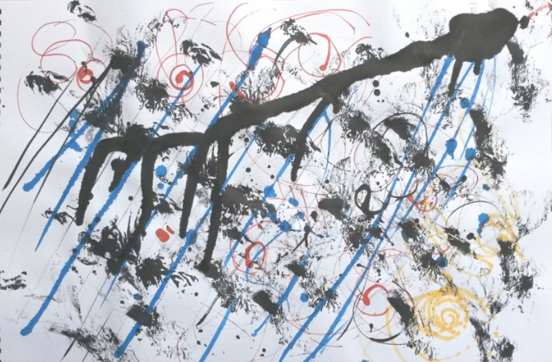
When I first read this brief, I immediately thought about using the beautiful Autumn leaves that were all around.  Unfortunately, the weather has taken a turn for the worst.  The wind and constant rain have turned the beautiful golden leaves to mush.  I’ve really struggled to come up with some other ideas, despite looking at artists like Andy Goldsworthy.

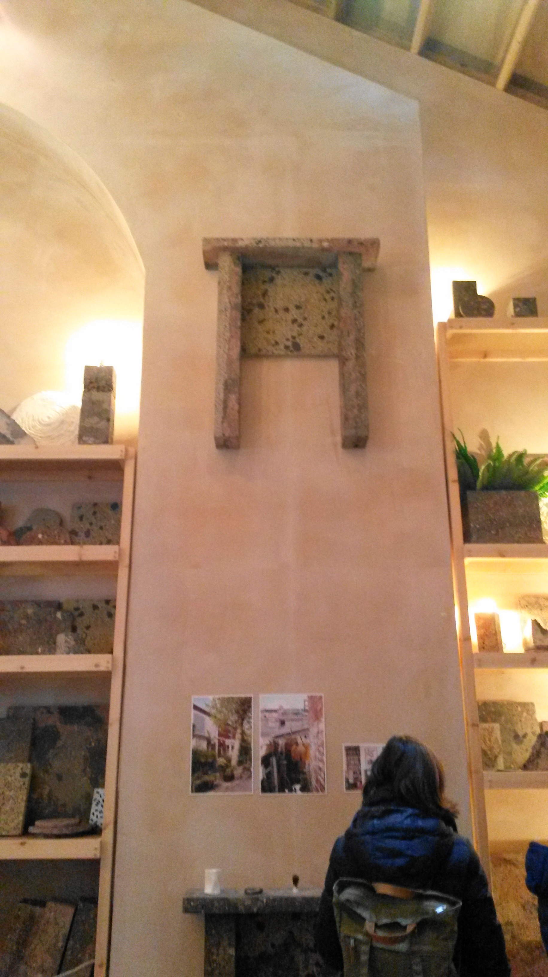
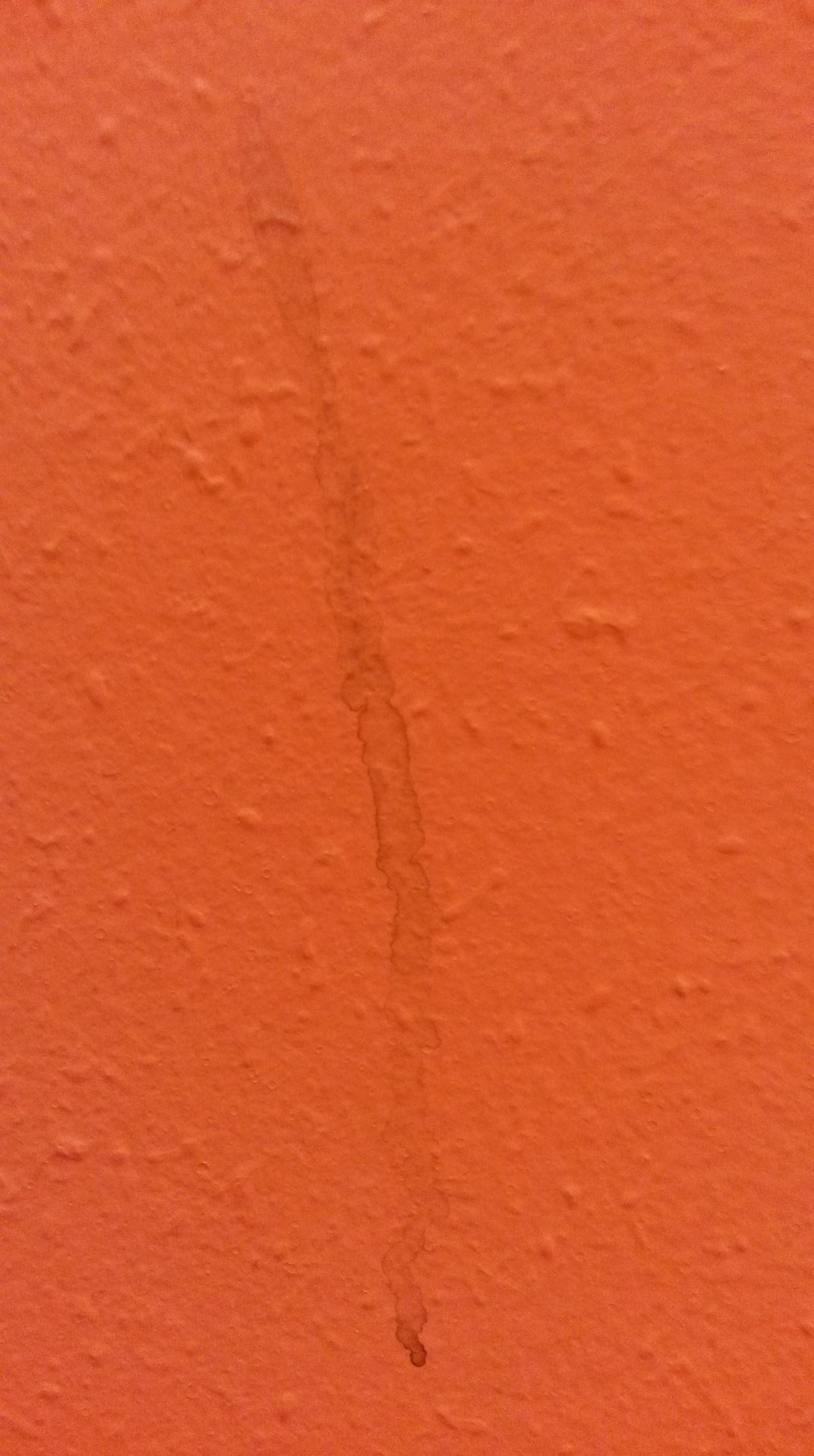
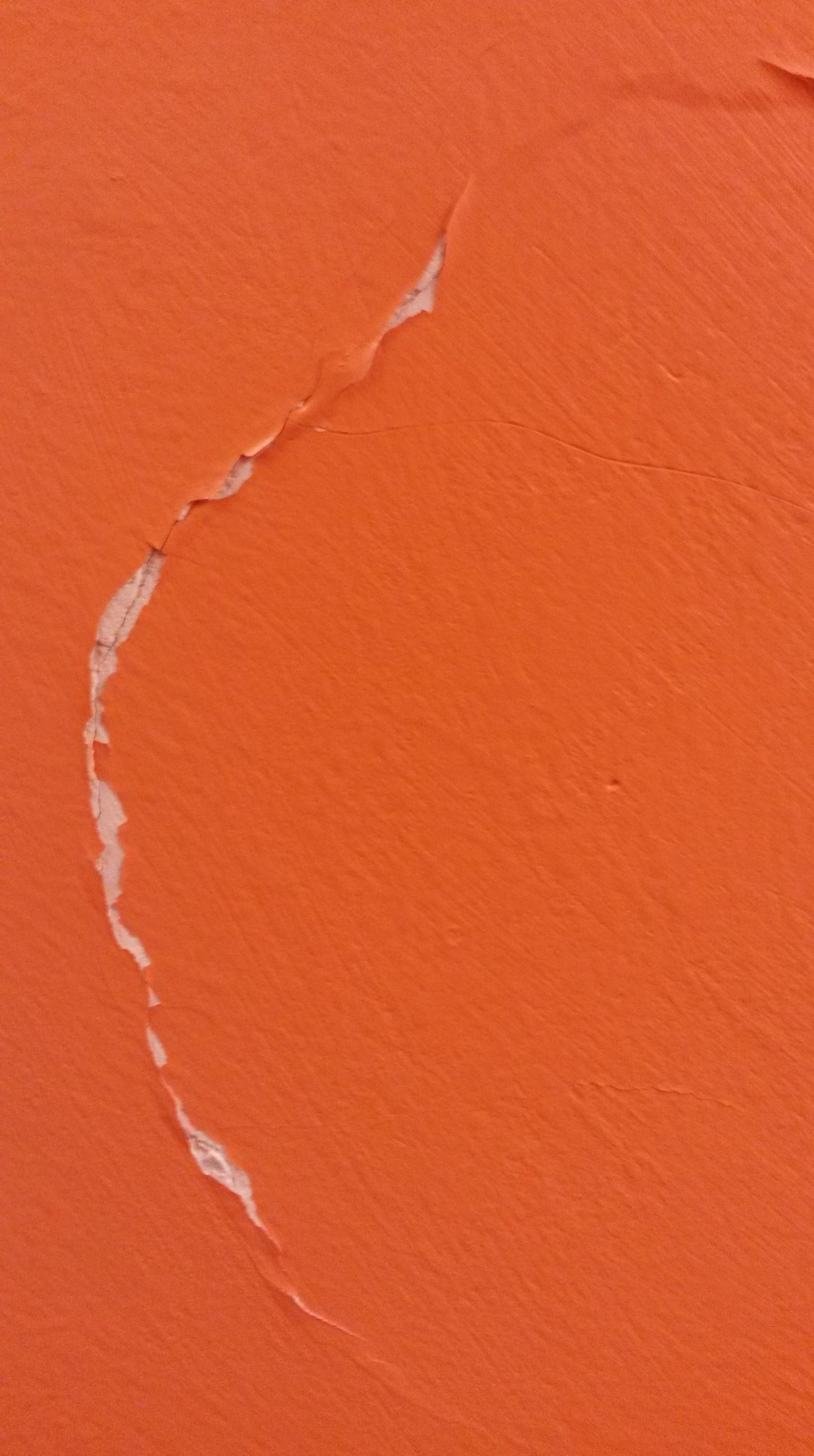
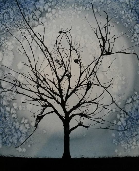
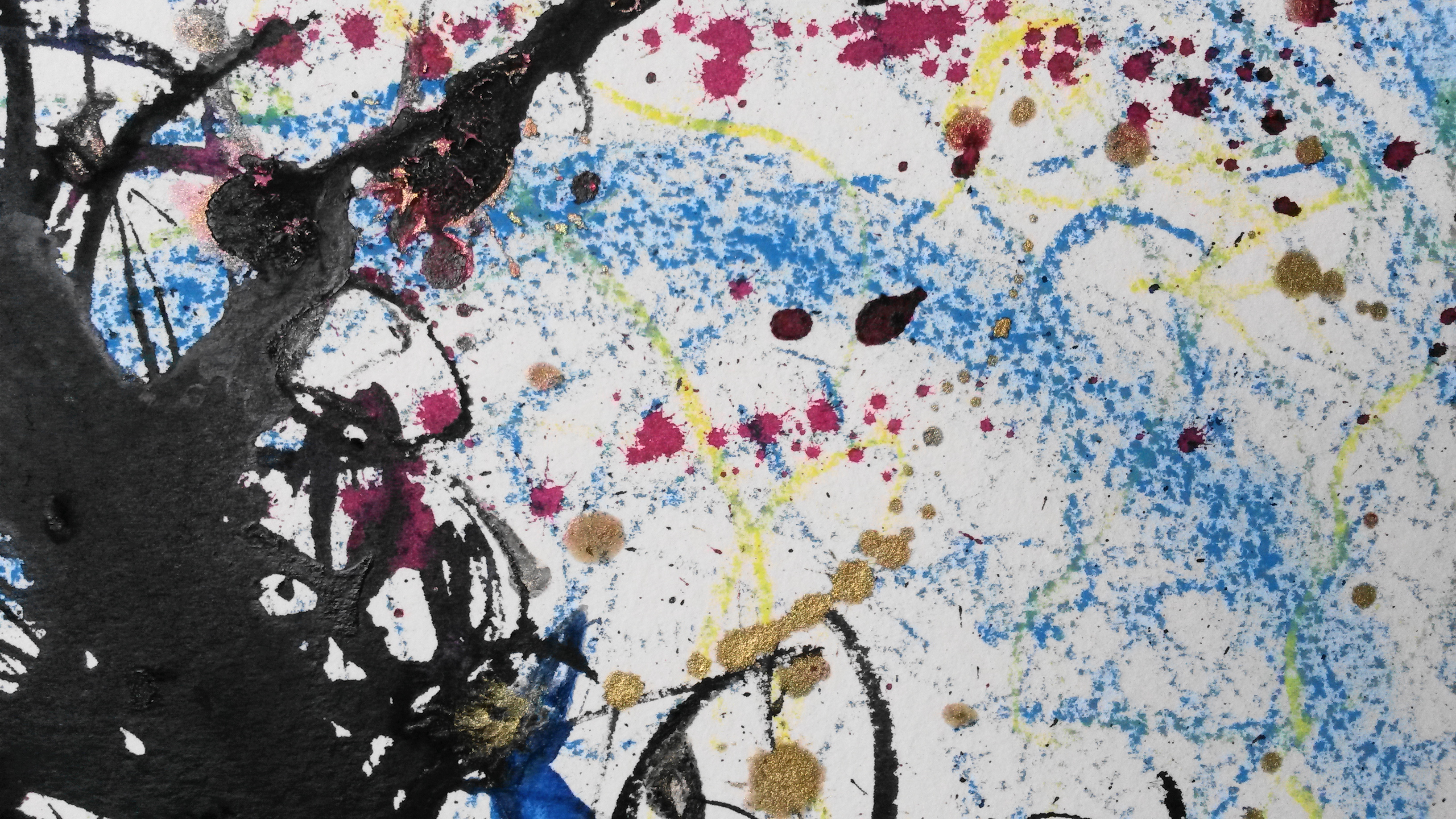
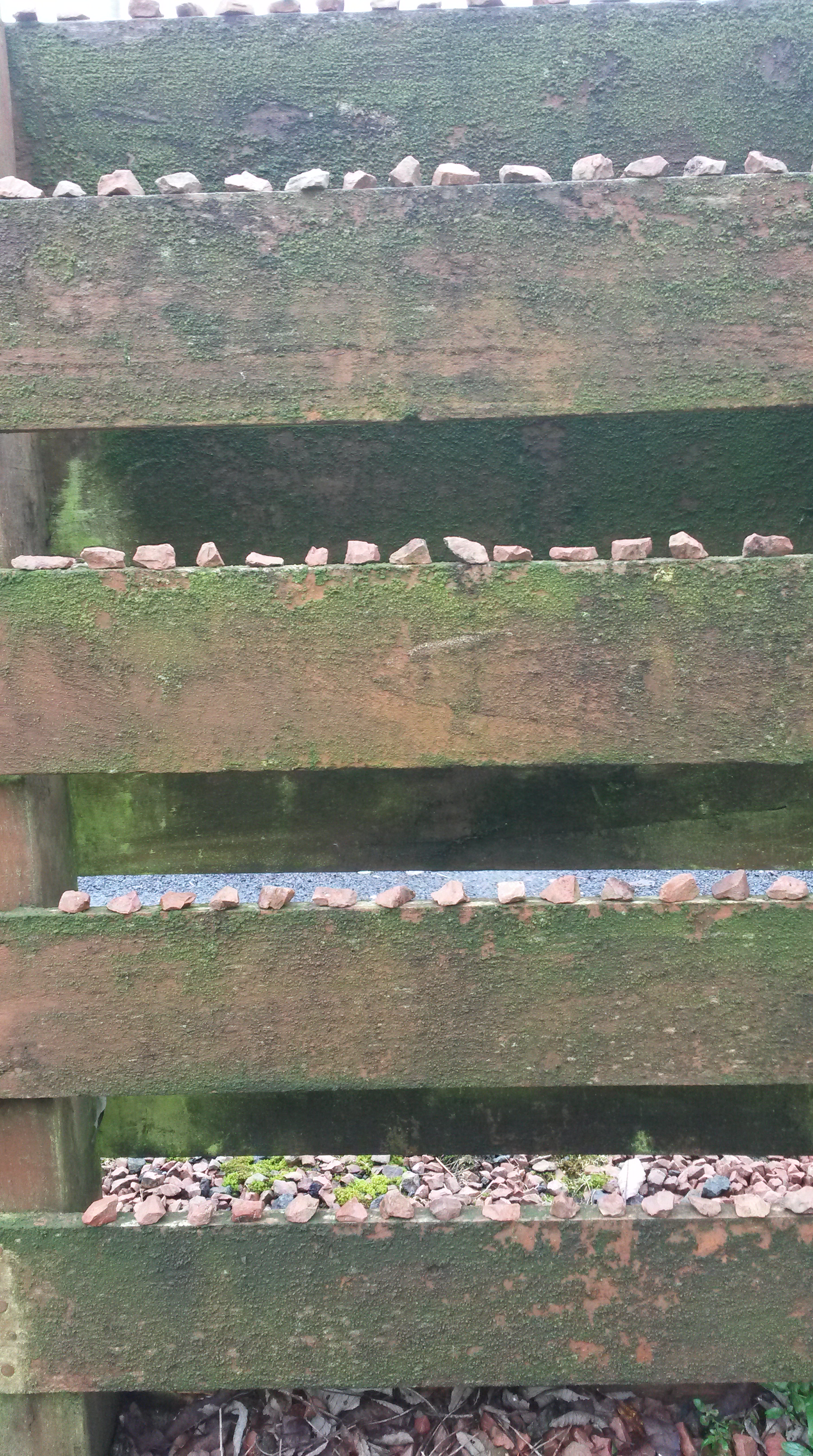
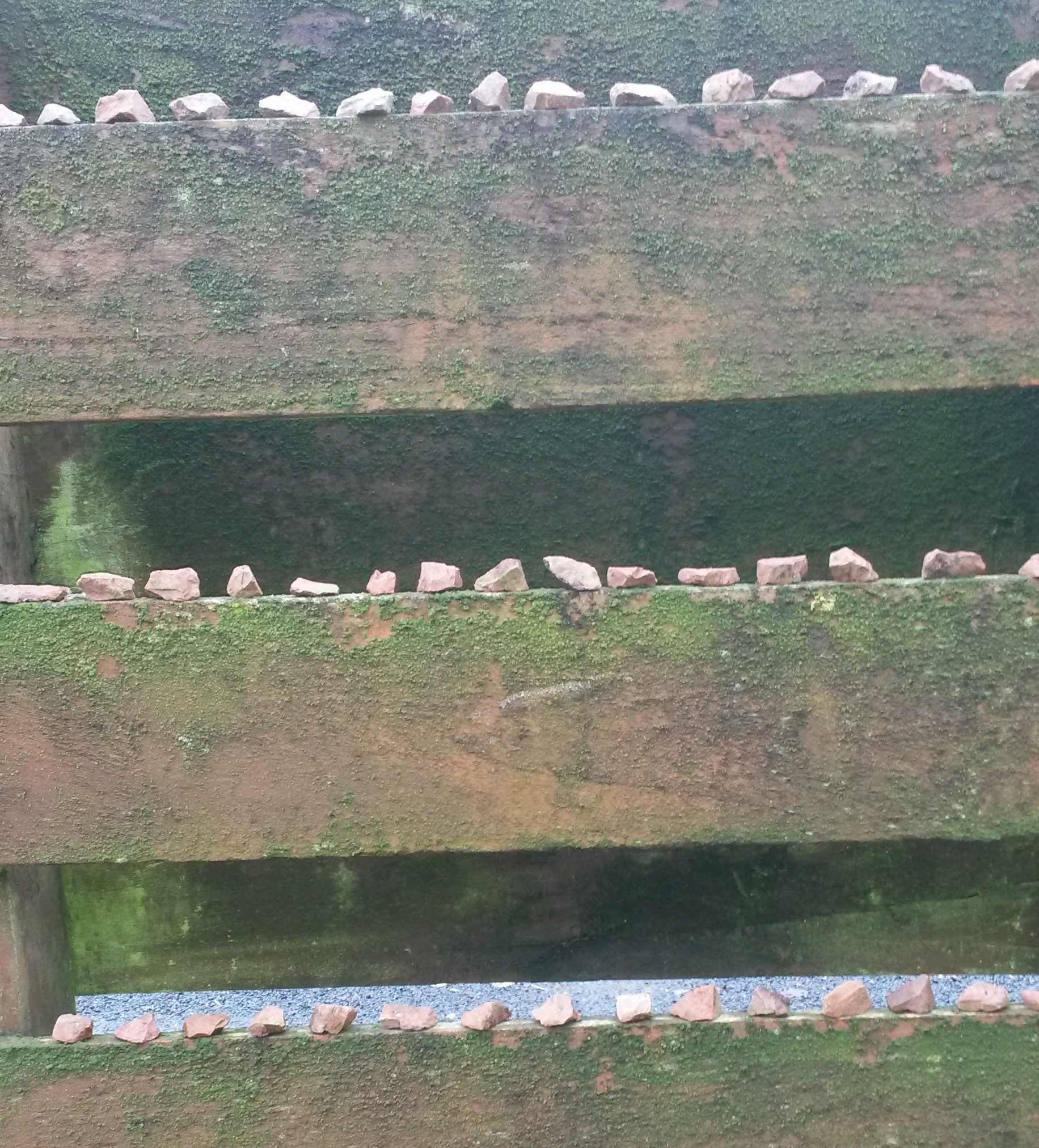
During the first day it hasn’t rained, I decided to take a different approach.  I went in to my garden (a place I know well), and spent time just looking.  I was looking for inspiration, and also looking for materials to make a drawing from.  It is a small garden, so there weren’t limitless things to choose from.  I started by taking a handful of small stones and began to place them on to the edge of the wooden fence.  This made me think about repetition and order, such as the work of Pierrette Bloch.  I put sixteen stones on each of the four rows.

20151204_115731

User comments

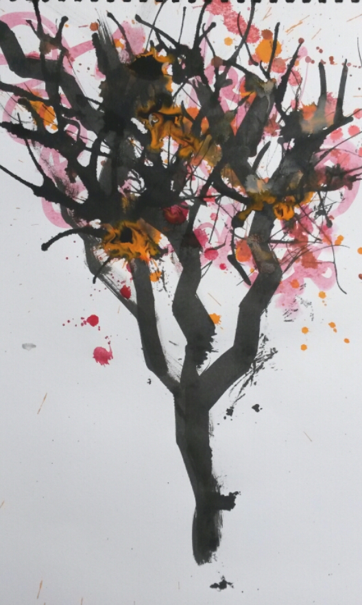
Next I looked around for some other materials to use.  I found some twigs from my Willow tree and a piece of slate, that had presumably fallen off the roof.  I had a kind of nest in mind, such as a bird would make from the twigs.  To this I added the slate and some more stones.  I positioned it on a red coloured step.

2015-12-04 12.36.13

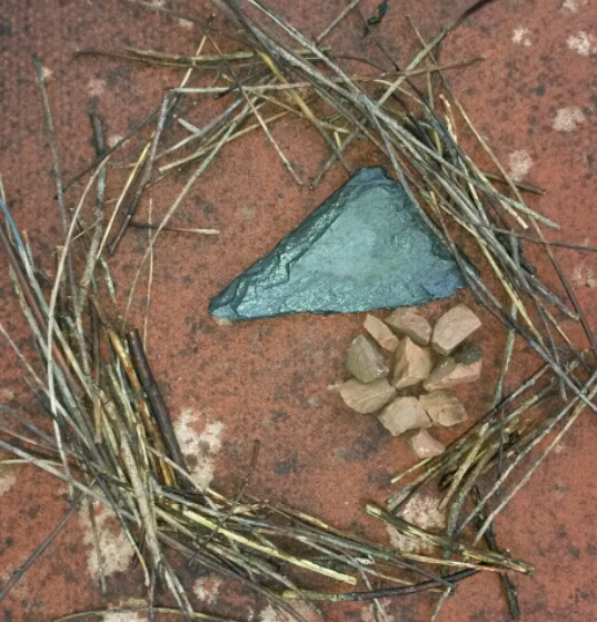
I felt it lacked something, so I looked around the garden and found some brightly coloured leaves.

2015-12-04 12.35.42

I felt this was more successful than my first attempt.

Part Two

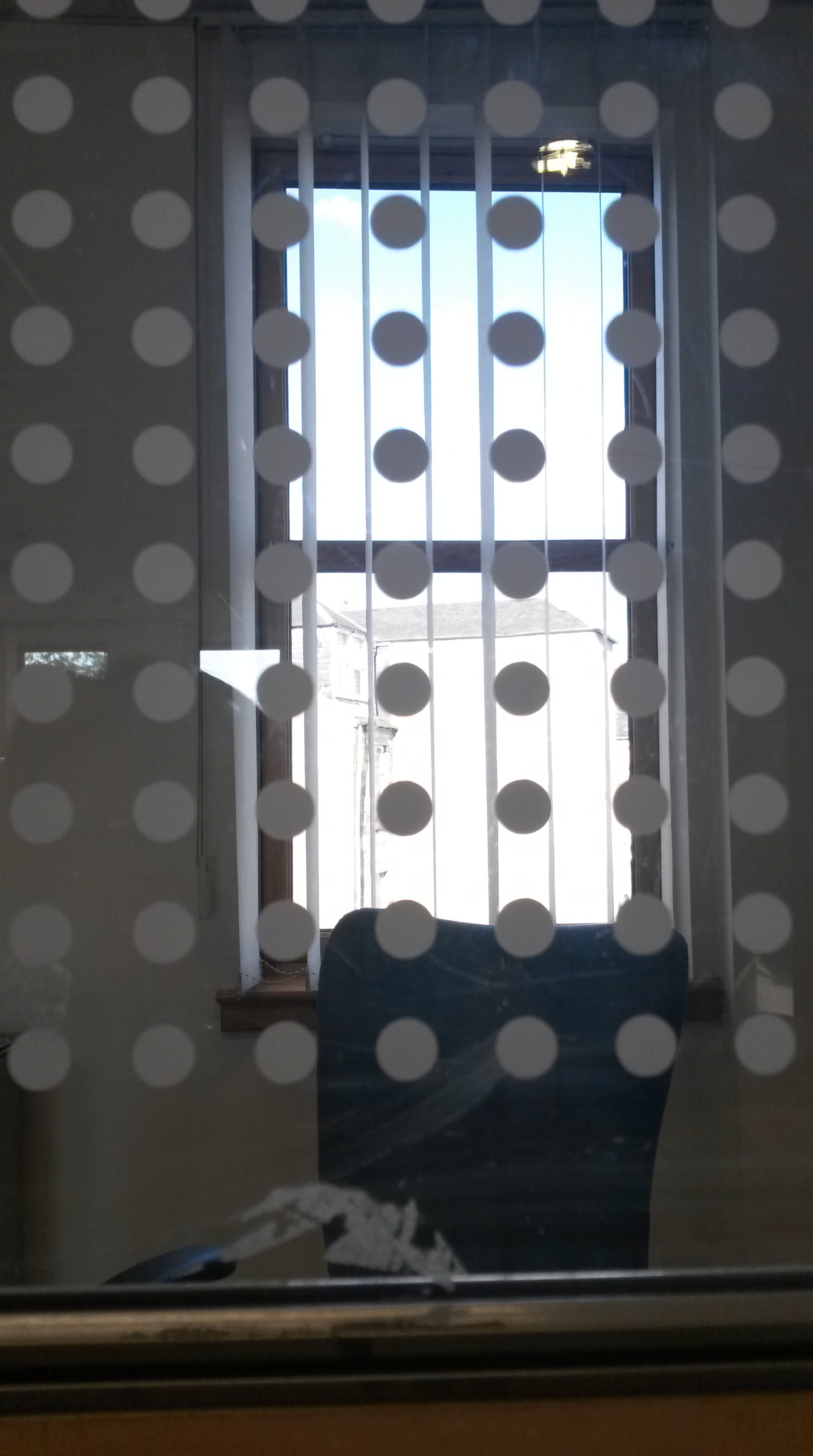
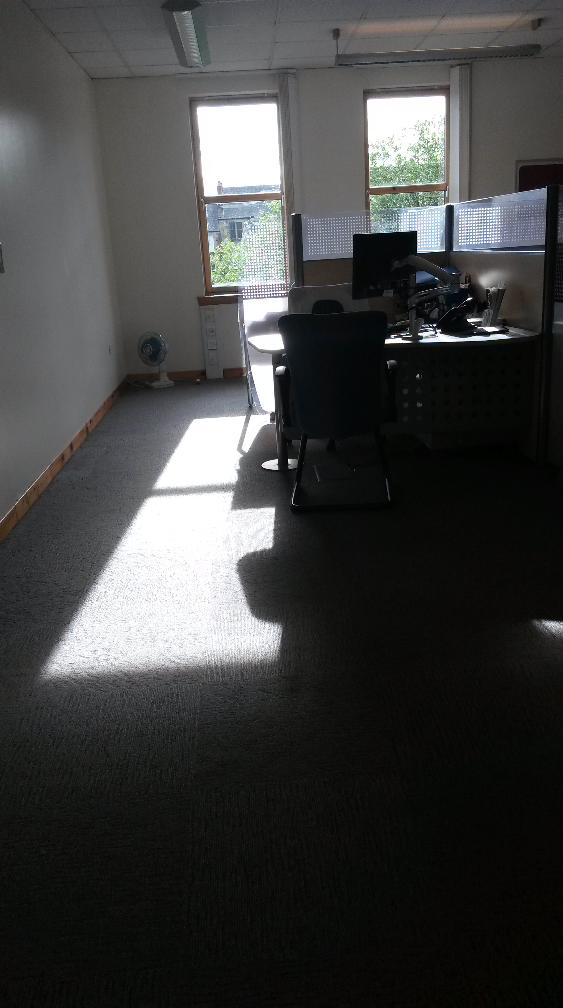
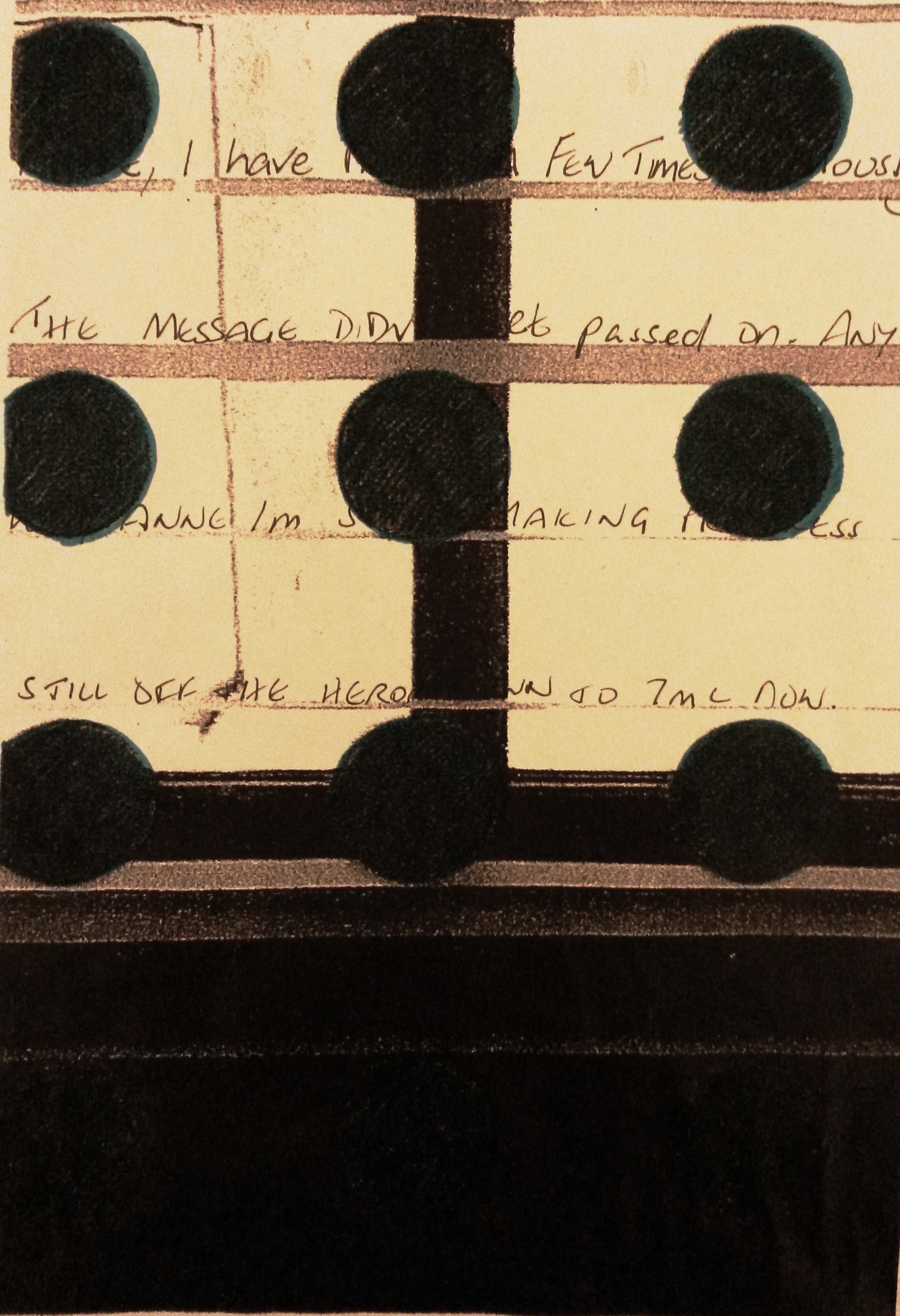
Following some discussion with my tutor, I decided to start again with this exercise, this time thinking about the content of my Parallel Project.  ‘The place I knew well’ was the Jobcentre.

Again, I have difficulties with issues of confidentiality and Data Protection, so as a starting point I was thinking about hypothetical interventions I could make at my work place.

  1. Make use of found objects, for example; pens, unused forms, used forms, mugs, cups, jackets, prints left at the printer, calendars, printer paper, sweets, keyboards, mouses, leaflets, cardigans, chairs, couches, tables, photographs, claimant’s ‘units’ (see below).
  2. Files are called ‘units’ and aren’t filed alphabetically, as you would normally expect, but by signing cycle, day and time.  These could be ‘re-organised’, by filing alphabetically, or by alternating colour, or randomly, which would could major disruption to staff, customers and probably result in disciplinary action for me if found out!  Chaos would ensue, but I don’t feel it would be right to inconvenience customers in this way, potentially causing delay in payment of their benefit.
  3. There are three fridges in the tea room, where food regularly goes missing.  What if I swapped the food into different fridges?  No real harm done just inconvenience and a wee bit of chaos and disruption.  Or put other people’s names on the food in the fridge, see how much of it I could eat myself, without being caught?
  4. Unplug cables from the back of the computer terminals.
  5. Park in someone’s car park space, or block the car park totally.
  6. Stick an out-of-order sign on the lift door and see how long it takes to work out it’s a hoax.
  7. Ask staff a question, ‘what does your job mean to you?’, ‘what is the Jobcentre?’, describe the Jobcentre in 3 words.
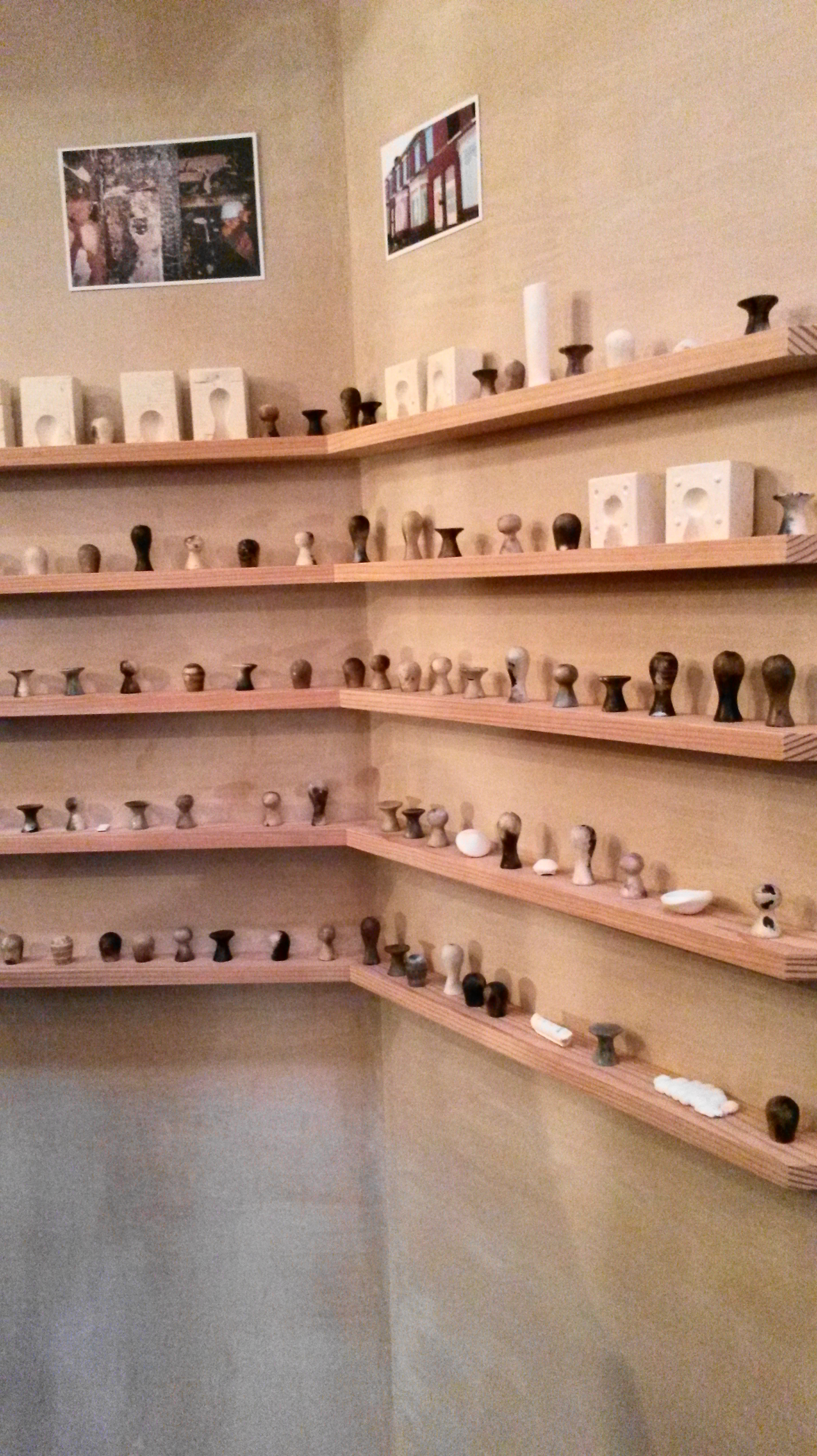
  8. Make images, such as those made I in the garden, but use found objects at work.
  9. Speak only in French.  Repeat everything anyone says, like you did as a child.
  10. ‘Prank’ some people, put someone’s stapler in jelly (like the prank in The Office).
  11. Swap letter keys on someone’s key board and do the wee IT trick, where you cause the image on the display to appear upside down.

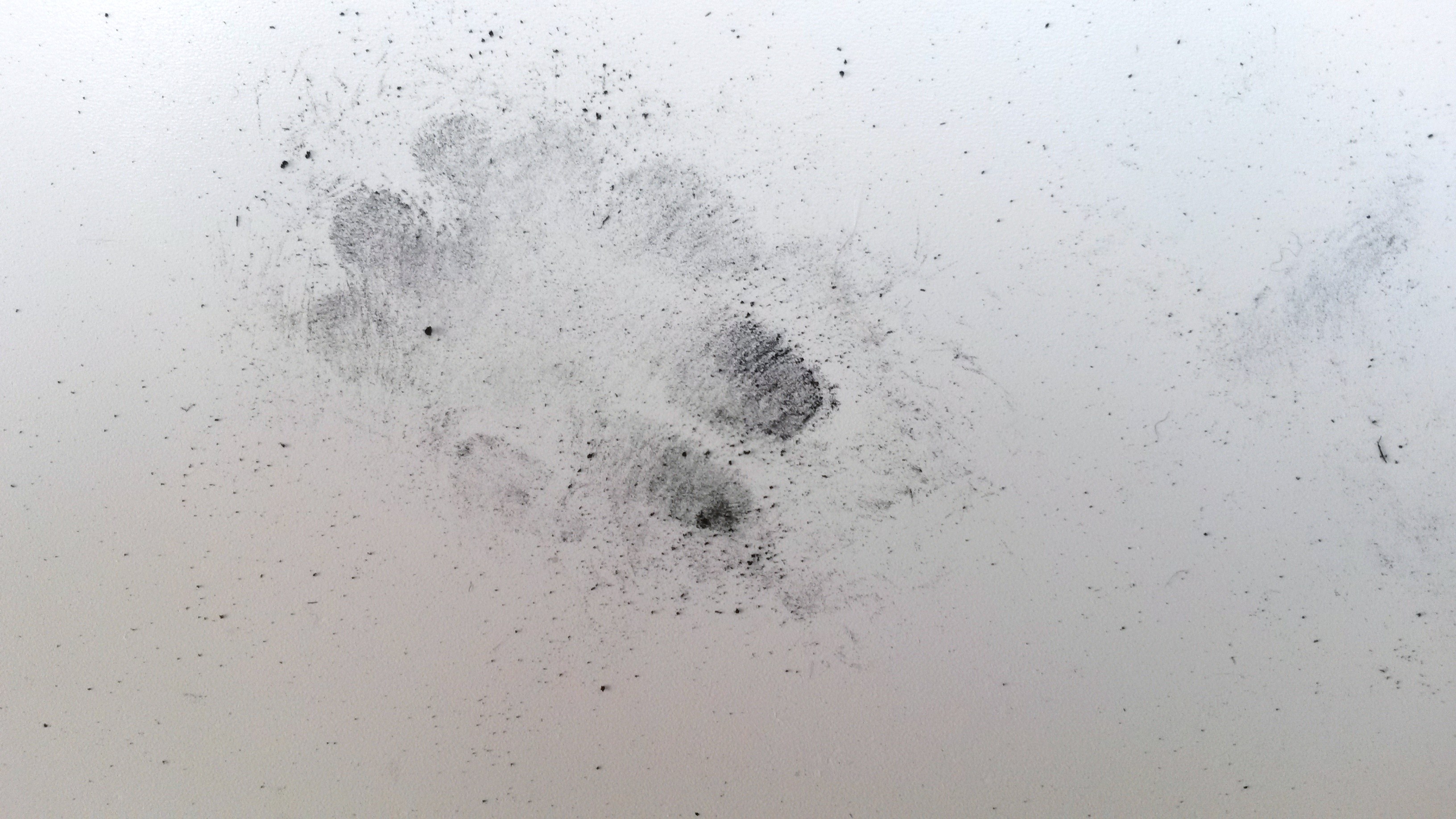
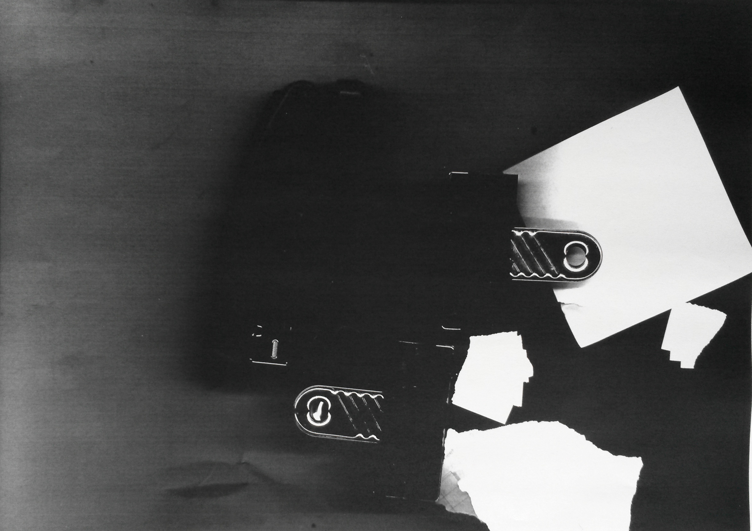
I tried using the photo copier as a media and photocopied things I found randomly on the desks nearby.  I included myself, ‘using things found around you and your own body’, by photocopying my hand.  I liked the resulting images.  Because the items weren’t flat and the lid of the photo copier was raised allowing light to get in, it made the images very dark and interesting.

The copies were all made at the one time.  I worked very quickly, so as not to be seen making the images, in order to avoid having to give an explanation.  Because I was working quickly I was ‘thinking on my feet’, impulsively trying out different things.

User comments

  1. The first image I made was of my hand.  I placed the palm of my hand flat on the glass plate, thinking that the image would be of the top, like a photograph, but of course it was of the surface on the glass, i. e. the palm of my hand.  I like the image because it is cropped at the side going off the edge of the paper.  I like that there is a lot of negative space to the right of the hand and I like the scores and pen marks left when people have been photocopying with a pen still in their hand.  I like the tonal contrasts, the shadows in the creases on my skin and the shine from my rings.

User comments

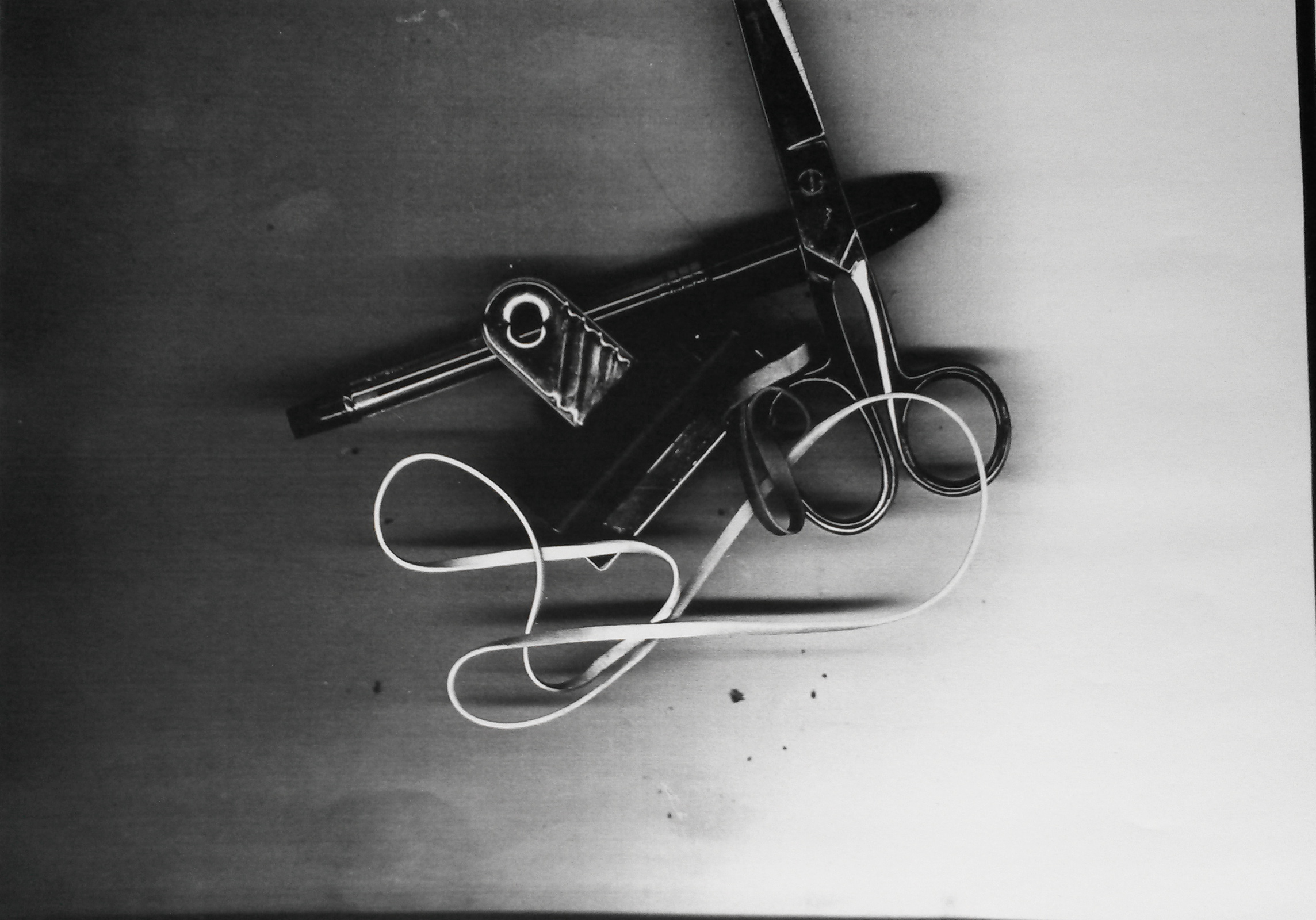
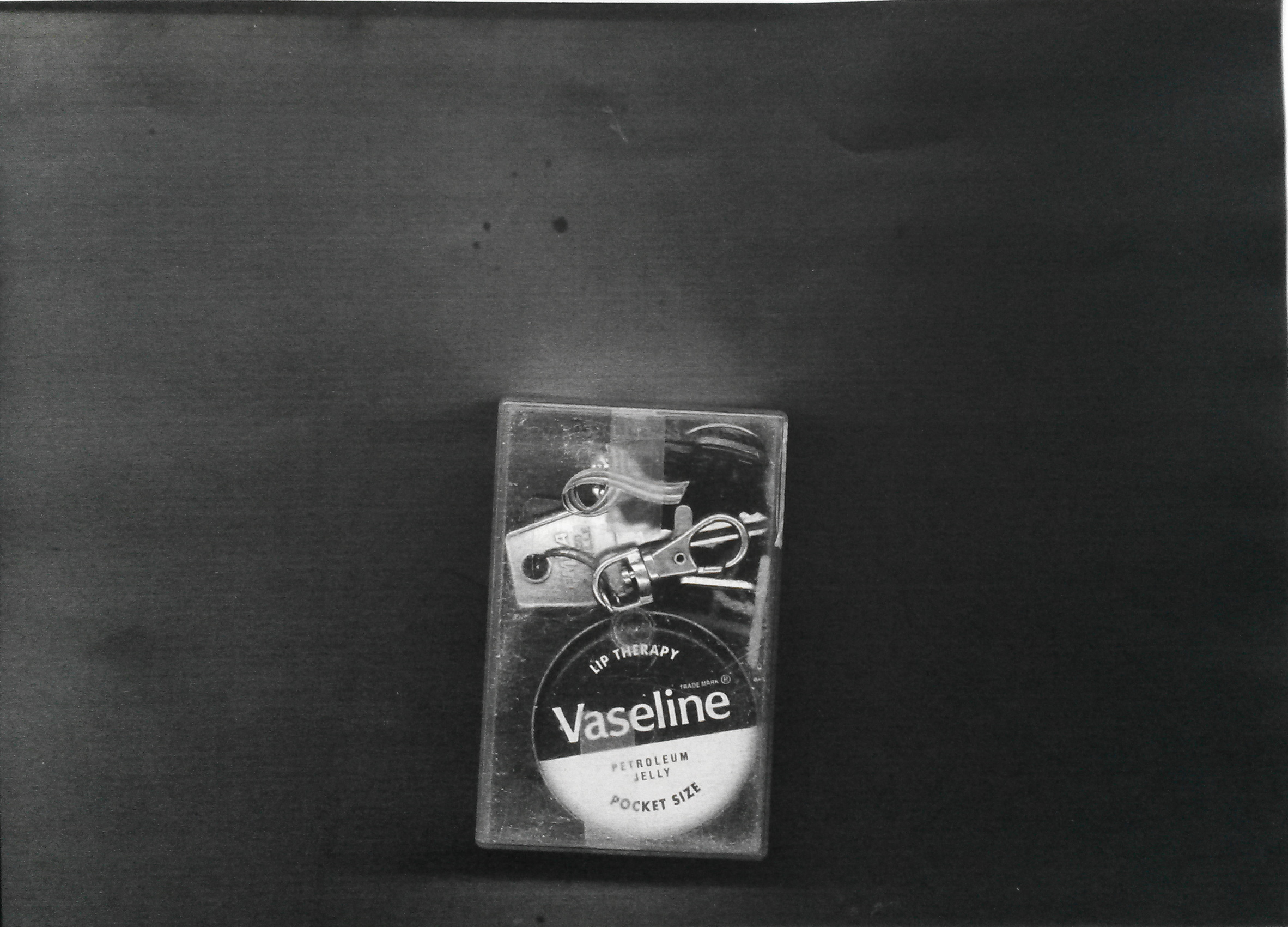
2.  I then started looking around at the empty desks nearby and grabbed some random items; scissors, some rubber bands, a pen, and a bull-dog clip.  I didn’t arrange the objects, but just plonked them down and copied them the way they were.  Again, I like the dark and light contrasts and the shapes the objects make.  The loops of the elastic bands mirror the ovals of the scissor handles, and the circular screw on the scissors mirrors the hole in the bull-dog clip.  The straight lines of the pen, scissors, bull-dog clip and even the elastic band mirror each other.  The cropped scissors lead your eye up out of the picture.  It is a wonderful composition of random objects arranged randomly.

User comments

3.  Next was a little clear plastic box containing Vaseline, keys, a Breast Cancer Charity lapel pin, and treasury tags.  I photocopied it as it was, without rearranging anything.  Because the lid was raised by the box, and light was getting in, the image is very dark.  The image reminds me of the x-ray images you see at the airport when your luggage is scanned.

User comments

4.  Next is some bull-dog clips, a hole punch and some post it notes and torn paper.  Again, these items were just lying on a desk.  The torn paper is a common site because we are not allowed to put paper in a normal bin, it must go into the Confidential Waste Bin, of which there is only one, so rather than walk to it, quite often the paper will lie on a desk, causing more of a security risk than if it was placed immediately in a normal waste paper bin, ironically.  I like the ragged edges of the torn paper, the black edges of the hole punch and bull-dog clips blurring into each other, contrasting with the stark white of the paper and the delicate lines of the edges of the metal items.  The bull-dog clips mirror each other, like Yin and Yang.

User comments

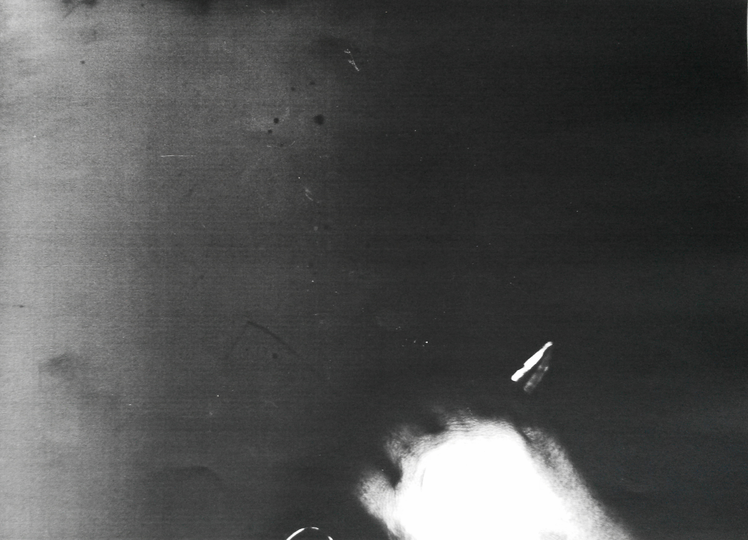
5.  The last image is of my hand gripping scissors.  My knuckles are pressed against the glass plate and my hand is cropped because, mistakenly I’ve placed it in the wrong place.  I tried again and took a perfect picture of my hand gripping scissors, but discarded this, preferring the imperfection of the image above.  It has abstract qualities, and I don’t think you would immediately know what it was without being told.  The light has captured the creases in my skin and each end of the scissors.  It’s quite a ghostly image and the back ground is black and mysterious.  The holding of the scissors could be sinister, it could be a weapon and I find the image to be a little threatening.  The cropping could imply movement off, or on to the picture plane.

Reflection

I’m reflecting on Part 2, as I consider the more successful of the two attempts.  I’ve deviated quite a bit from the brief, because it was necessary because of the restrictions in place at my work, however I am satisfied with the outcome.  I haven’t created a simulacrum, the objects are life-sized and I did not arrange them into a still life composition, but the image was created from the way they arranged themselves on the glass. The images could be arranged under glass, so in that regard, it may not be ‘site specific’.  I think that viewers may consider it as art, in a way that they absolutely wouldn’t have with any of the hypothetical interventions listed above.


What is art for?

The video I watched in preparation for my Study Visit to the Turner Prize,

reminded me of an OCA Blog Post I had read before.

http://weareoca.com/fine_art/what-is-art-for-2/ posted by Brian Eccleshall.

In the first video Alistair Hudson, Director of MMA (and part of the judging panel on the 2015 Turner Prize), talks about a ‘crisis’.  We need hospitals, but do we really need museums and galleries?  He states that visiting a museum is ‘Spectatorship’ and asks ‘What is the use of art in society? Why do we have it and what is it for?’

In part 2 he states that art needs to be part of society, it needs to be more useful.  At present we try to educate society about the importance of art in society, but he asks what if it is the other way around, what if what we do in society is the ‘programme’, what if art is what we do as citizens in the museum?  What if, as a citizen where our main goal is social development and to make the world a better place, what if we use art in that process?  In demonstrating and applying art in everyday life, a museum doesn’t become an island, but another civic building.  You will no longer be a spectator with the connoisseur acting as an intermediate.  Art is created out of how we use it, so art will be something we develop communally, we develop it as part of our daily lives.  ‘The language of usership comes from the digital culture, and a good analogy is YouTube, where the value of YouTube is not created necessarily by YouTube, it’s created by how it is used, it is created by people themselves, the user makes a video, uploads it, other users watch it, comment on it.  Similarly, could we create a museum which operates in the same way, where the value of the museum is created by all the sum activities of all its users?’

This is interesting, but I can’t help feeling he is concerned more about the future of museums, than what art is for, (although this is only part 2 of a series).  People already use YouTube and other social media sites such as Instagram and Facebook to share their art, although that is still spectatorship.

This post interest me because of my parallel project.  I am thinking about what my final piece of work for Assignment 6 can convey by way of invoking emotion and telling a story that couldn’t be conveyed by say a documentary, or by photographs.  An artist can be a ‘recorder’ and a story-teller and in that regards art is still ‘useful’ and relevant today.

OCA Study Visit Turner Prize 2015

I attended the OCA Study Visit to the Turner Prize 2015 at the Tramway in Glasgow on 9th Jan 2016 with tutor Wendy McMurdo.

This is the first time I’ve taken more than a passing interest in the Turner Prize;  I’ve seen articles in the newspaper and on television, but that’s been about it.  I decided to research its history before I went.

1 ‘Over the recent decades the Turner Prize has played a significant role in provoking debate about visual art and the growing public interest in contemporary British art in particular, and has become widely recognised as one of the most important and prestigious awards for the visual arts in Europe.  The Turner Prize is a contemporary art award set up in 1984 to celebrate new developments in contemporary art. It is awarded each year to ‘a British artist under fifty for an outstanding exhibition or other presentation of their work in the twelve months preceding.  Nominations are invited each year, and the prize is judged by an independent jury that changes annually.  The four shortlisted artists present works in a show normally held at Tate Britain before the winner is announced in December. Artists are not judged on their show at Tate. The decision is based on the work for which they were nominated.’

The exhibition

The study day began with a tour led by two curators. I learned that there have been several students from Glasgow School of Art nominated in previous years, and this is the first time it has been exhibited in Scotland, however none of the artists shortlisted this year were Scottish.

The information sent by OCA prior to the visit recommended that we watch the following film; https://vimeo.com/148607435  , in which Turner Prize Judge Alistair Hudson (Director of Mima) battles it out with artist Pavel Büchler in a discussion, Art: Useful or Useless?  I did watch this video, and on the whole it was interesting, however the discussion began to become a little pedantic to me, as they debated the meaning of the word ‘art’.  It did give me food for thought though.  I am familiar with the idea of a conceptual art, but I’m not sure if I believe that something is an artwork just because it’s labelled as such.  I wasn’t swayed by the argument put forward that Art should be useful.  I believe that if it does serve a purpose, such as the winning entry by Assemble, which worked with local residents in Granby to refurbish 10 houses in order to provide affordable housing, then that is a bonus and it is to be applauded but I don’t necessarily believe that the Artist should only seek out ‘worthy’ useful projects.  As a Contemporary Art award it isn’t surprising that is influenced by whatever is current and environmently friendly projects, affordable housing, recycling materials and social justice are all subjects current with public focus.  In addition, for me, art’s use can be to enrichen people’s lives, enhance their environment, educate and entertain.

Secondly, we were asked to read an article; http://conversations.e-flux.com/t/teleology-and-the-turner-prize-or-utility-the-new-conservatism/2936

This adds another dimension, where the winner of the Turner Prize isn’t a practicing artist at all, but instead is a group of 18 people from the fields of art, architecture and design.  This makes it apparent that the selection of the winner is very dependant on who is on the judging panel, which changes annually.  Some think it also adds a political slant to things.

I was very interested in attending this study visit, as I had hoped the experience would feed into my Critical Review in the parallel project, where I compare traditional drawing and representational art work to contemporary art and installation.

The first short listed artist was Nicole Werners with her Untitled Chair sculptures.  I had no clue on first viewing these what they represented.  It consisted of several tubular chairs with fur jackets draped over them.  The curator explained that the chairs were an adapted version of Marcel Breuer’s Cesca chair.  The lining of the vintage fur jackets are actually sewn around the chair so that the two become one and the purpose is to comment on a private claiming of a chair in a public space.

User comments

User comments

On the walls accompanying the chairs are ceramic sculptures which represent the posters you often see (more commonly in the USA) in colleges etc, where you tear off a portion at the bottom with a phone number etc on it.  This was a comment on a social phenomenon; the change of material from paper to ceramic transforms it into a more permanent fixture.

User comments

My overall opinion on viewing this was that it was quite an interesting concept once it was explained, but I wouldn’t have understood it without the explanation.  It seemed irrelevant to me that the jackets were vintage and the linings were hand sewn to match the fur.  For me, I had already seen photographs of the chairs before my visit, so I suppose in this regard it was a success as it captured the public’s attention, and this is one of the purposes of the Turner Prize; to raise the profile of contemporary art with the general public.

Next was Janice Kerbel, who wrote an operatic piece entitled DOUG, in the form of nine songs, written for six unaccompanied voices.  It was inspired by cartoon violence and explores the different ways in which an imaginary figure could meet his death, such as falling down a flight of stairs (‘Fall), to being struck by lightning (‘Strike).  Each song is designed to test the range of the vocals, stretching them from their highest to lowest notes.  Our tutor suggest we go to hear one of the pieces and we duly went along at 1:00pm and joined the small waiting audience.  There were six music stands at the front and at 1:00pm sharp the six singers came out and silently made their way to the stands.  They began gently humming for a minute or two then suddenly each singer sang one word, each a different word, in a different key, in a cacophony of sound.  Only one word was sung and then they bowed and walked off again.  It was quite a surreal experienced and the audience appeared bemused (as did a few of the singers).  The Exhibition Guide describes it thus; ‘Kerbel explores the possibilities of the written and spoken word to suggest material and visible states, giving form to impossible or imagined events.”  And “DOUG calls on the history of physical comedy, animated cartoons, narrative ballad and operatic librettos to imagine a new kind of compositional choreography.’

User comments

This was my first experience of this kind of art work.  I think I would have needed to see the whole performance in order to understand what it was trying to do.  All of the lyrics were written on the wall for viewers to read.  I did like the ‘poster’ on the wall, which recorded some of the words used and the size of the letters represented how loudly the word was sung and I wondered if I could use this idea when adding dialogue to the drawings in my parallel project.

User comments

One of the curators described a previous work of the artist, which also interested me.  Apparently, posing as an architecture student, she staked out a bank for 18 months,and based on this experience, she wrote book which detailed how the bank could be robbed.  I researched this further as it may be of use to me in the parallel project.

2 15 Lombard St. is a rigorously researched master plan of how to rob a particular bank in the City of London. By observing the daily routine in and around the bank, Kerbel reveals the most detailed security measures such as: the exact route and time of money transportation; the location of CCTV cameras in and around the bank along with precise floor plans that mark the building’s blind spots.  Kerbel’s meticulous plans include every possible detail required to commit the perfect crime. The ubiquitous fantasy of a bank robbery functions as a backdrop for Kerbel’s ‘play of subversion’. By surveying surveillance Kerbel shows how different systems are interrelated, forming a web of control. Kerbel’s aim is not simply to subvert but to emphasise the fact that the idea of absolute control and the fantasy of robbing a bank are interconnected and mutually sustaining.’

Next was Patterns by Bonnie Camplin.    This was an installation consisting of a study room/library containing books, leaflets, magazines etc all of which referenced beliefs and Mental Health.  The guide stated ‘An artwork that is also a research tool, Patterns centres around five video interviews in which individuals recall extraordinary experiences (from encounters with inter and extra-dimensional beings to systematic trauma-based mind-control techniques).’

There were screens with headphones in the centre of the room where you could watch the videos.  The literature round the room was annotated with remarks hand written by the artist and many of the items were original copies, however we were told we could pick things up to read.  In addition there was a photo copier, which the public were encouraged to use to copy any item of interest to them (although I never saw this happen).  The material was arranged in a specific way in order to form pattern-based relationships between different ideas.  The topics covered included the Occult, Alien Abduction, substance abuse and psychosis.

The final piece and winner of this year’s Turner Prize was Granby Workshop by AssembleAssemble is a collective of 18 members from the fields of art, design and architecture.  They assisted Granby Four Streets Community Land Trust to refurbish 10 boarded up houses in order to provide affordable housing for local residents which will remain in community ownership.  The exhibit consists of a show room displaying hand-made items such as mantelpieces, door knobs, furniture and fabrics.  The mantelpieces are cast using brick and rubble waste from the derelict houses.  Their catalogue states; ‘All products are manufactured using processes which embrace chance, so that each is unique, developing in the hands of the people making it.’  I was interested to see that during an interview with one of the Assemble, they commented that ‘The nomination (to the Turner Prize) created an uncomfortable feeling.’  This, I imagine is why we were given the link to the video Art; Useful or Useless.  I’m not convinced that I consider Granby Workshop to be a piece of art; yes there were artists involved in the collaboration, yes there is artistic skill involved in the design of the items for sale, yes it could be considered conceptual; the guide describes it thus; ‘Their practice seeks to address the typical disconnection between the public and the process by which places are made, working across the fields of art, architecture and design to create playful environments and spaces.’

User comments

I see this as a very successful and creative social enterprise.  I don’t see it as an artwork, but I can understand why it has won the Turner Prize; it is the first winning piece that cannot be defined as a fine art work, video or installation, therefore it is different from all previous winners, this causes controversy which keeps the public interested and it ticks all the boxes for ‘useful’ art, and it is a project with a social conscience, whilst remaining environmentally friendly.

User comments

A very worthwhile study visit, which I hope to use as reference in my parallel project.

2.http://www.theguardian.com/artanddesign/2010/may/12/artist-week-janice-       kerbel

https://www.bookworks.org.uk/node/74

http://granbyworkshop.co.uk/


Contextual focus point: Emily Kngwarreye

Emily Kame Kngwareye began painting on canvas in 1988 at the age of 80 and had painted around 3,000 canvases by the time she died aged 86.  Herr story is an incredible one; find out about her life and work and reflect in your log on the importance of place and belonging for you in your own work.  Can you think of any other artists who use place with such an immersive passion?  You might like to reflect on the relationship between painting and drawing in her work.

Emily Kame Kngwarreye is one of Australia’s most significant contemporary artists. Emily was born at the beginning of the twentieth century and grew up in a remote desert area known as Utopia 230 kilometres north-east of Alice Springs, distant from the art world that sought her work.

Although Emily began to paint late in her life she was a prolific artist who often worked at a pace that belied her advanced age. It is estimated that she produced over 3000 paintings in the course of her eight-year painting career — an average of one painting per day.

For virtually two-thirds of her life she had only sporadic contact with the outside world. It was not until she was about 80 that she became, almost overnight, an artist of national and international standing.

Her remarkable work was inspired by her cultural life as an Anmatyerre elder, and her lifelong custodians of the women’s Dreaming sites in her clan Country, Alhalkere.

Whenever Emily was asked to explain her paintings, regardless of whether the images were a shimmering veil of dots, a field of ‘dump dump’ dots, raw stripes seared across the surface or elegant black lines, her answer was always the same:

Whole lot, that’s whole lot, Awelye (my Dreaming), Arlatyeye (pencil yam), Arkerrthe (mountain devil lizard), Ntange (grass seed), Tingu (Dreamtime pup), Ankerre (emu), Intekwe (favourite food of emus, a small plant), Atnwerle (green bean), and Kame (yam seed). That’s what I paint, whole lot. [1]

Until the success of her painting took off, she had not ventured from her homeland.  It was all she had known for her 80 years.  The subject matter she painted was all she had ever known and loved, everything from Nature, from the plants and creatures to the land itself.  She had never known anything else.  There has been much debate over what differentiates a drawing from a painting. I can understand why Kngwareye’s work has been included as reference in a drawing course because it is predominantly made by dots and lines, as opposed to a painting made by using tones and blocks of colour.

There have been many artists over the years whose art was influenced strongly by place.  L S Lowry painted scenes of life in industrial districts of the North, in particular Salford and Pendlebury in Lancashire where he lived and worked for over 40 years.  Claude Monet painted the water lilies in his garden in Giverny for over 20 years.  John Belany attended Edinburgh College of Art in the 60s when Abstract Expressionism was in vogue, however against the advice of his tutors he painted in a figurative style.  ‘He wanted his art to focus on the everyday life he knew, especially the fisherfolk and boats from Port Seton, Cockenzie and Eyemouth, the ports on the Firth of Forth where he grew up. It was the heroism of ordinary people that he wanted to celebrate in large, monumental paintings, some of which he displayed on the railings outside this very building on the Mound’.

Another artists who was strongly influenced by place was Scottish Artist Duncan Shanks.  I visited an exhibition of his recently and you can access what I wrote about it here;

https://annemacleoddrawing2.wordpress.com/2015/08/04/exhibition-visit-duncan-shanks-sketchbooks-the-poetry-of-place/

‘Working in harmony with nature in my notebooks has been an act of faith and an adventure which has taken me to and beyond the poetry of place on a personal odyssey’.  (Shanks, 2015: 7).

‘ Duncan Shanks’s sketchbooks provide a distinctive insight into the artist’s changing interpretation of the landscape he has known and loved all his life.  They also vividly illustrate his ambition to capture not just space and atmosphere, but the passage of time and life’s transience.’ (Shanks, 2015: 10).

The exhibition described how initially he used the sketches to work into paintings.  In addition he used them as a teaching aid for his students at Glasgow School of Art where he taught from 1961 to 1979.  When he retired in 1979 to paint full-time his use of sketchbooks increased dramatically; from 8 in the 1970s, to 26 in the 1980s.  The exhibition had 106 sketchbooks containing 6500 drawings.  ‘This was a direct outcome of his new, full-time commitment to painting and the growing importance of the sketchbooks as visual diaries of his daily thoughts and perambulations which were taking him further from home.’ (Shanks, 2015:12).

‘I have never had to travel far for inspiration.  A need for solitude has attracted me to unpeopled places, where man’s intervention is least apparent, the haunts of dippers and goosander by the river, fox in the glen, hare on the hill-top and buzzard and hawk in the clouds above the thorn hedges of the valley.’ (Shanks, 2015:16).

I personally do not yet feel a strong influence of place and belonging.  Through necessity I often sketch at home using family and surroundings as subject matter.  In several of my courses I have often used the view from my house of a row of traditional cottages across from me, partly because of convenience but also because I like the effects the differing light has on the slate tiled roofs and white washed walls.  It is a recurring subject for me, but not an obsession.  I am drawn to certain subjects, trees for example, but not from a specific place.  Perhaps the difference from my work and the artists I’ve looked at is that I’ve yet to find my own voice.  It occurs to me that all of the artists I’ve looked at were driven by a sense of connection and belonging to a place and this has been the driving force behind their passion.


http://www.nma.gov.au/exhibitions/utopia_the_genius_of_emily_kame_kngwarreye/emily_kame_kngwarreye

http://www.nma.gov.au/exhibitions/utopia_the_genius_of_emily_kame_kngwarreye/emily_kame_kngwarreye

https://www.nationalgalleries.org/whatson/exhibitions/john-bellany/the-1960s

Project 1: Found images Parts 1 & 2

Look for natural processes that produce a drawing, for example the opening of the gills of a mushroom to release its spores, the dropping of lily pollen, animals scratching against trees or footprints in wet mud.  Even the silhouette of tree branches against the sky can be read as a drawing.  Collect photos and sketches of nature’s drawings.  If you prefer, you can do the same thing for industrial or urban processes.

Part 1

20150722_08020320150722_080152

Tree reflections on glass

april 2015 774

My cat’s foot print after walking through charcoal


20150404_172134

Tree silhouette


 20150404_155927

Tree shadows

20150404_151425

Cracks on tree rings

Subconsciously, I’ve focussed on trees; reflections of their form, negative space between the lines of the branches, shadows of the branches, and the linear qualities of the rings in the trunk, interacting with angular lines of cracks.  This last image interests me the most.

Collect up all your found images and think about how you might use them either to inform your mark-making or as the starting point for a drawing.

The rings of the tree trunk remind me of finger prints; another natural found drawing.

fingerprint

This reminds me of some of the rose drawings I did for Assignment 2.

20150904_164407

I’ve looked at other artists whose work looks as if it was inspired by concentric, or undulating lines, such as Daniel Zeller, Jill Baroff and David Connearn.

This inspired me to do my own spiral drawing.  I’ve always doodled making spirals and enjoy the precise control and concentration needed.

User comments

10 x 10 inches black fineliner
I got a lot of positive feedback from my peers on an OCA Facebook Group;
And that is mesmerizing.
Takes years for the tree to grow its rings and so it seems appropriate that the artist needs some time to draw them…
This is a beautiful and inspirational piece of art
It almost seems hypnotic to look at
This is visually lovely and intellectually interesting. I see contour lines, 3D imaging slices, black hole, gravity etc etc
I tried another drawing, thinking about the grains in the wood this time.

User comments

                                A3 black fineliner
Without realising it, I’ve returned to where I started at Assignment 1; the black and white bar code drawings I did.
2015-12-02 22.01.09 - Copy
Close up of spiral
20150331_180032 (2)
Original barcode drawing

http://www.danielzeller.net/

http://www.galleryjoe.com/artists/baroff

http://www.patrickheide.com/artists.php?id=25&view=detail

Part 2

Following an enquiry with my Tutor I have decided to re-visit this exercise, focussing on my work place, the Jobcentre, with a view to this possibly feeding into my Parallel Project.

As part of my daily routine, I now have my eyes peeled, looking for found images; ‘drawings’; renderings, marks made unintentionally by the environment or my colleagues, or perhaps me.  These are photographs of ‘drawings’ I have found so far.

20151217_173340

I hole drilled into a desk in the wrong place

20151217_173334

The residue left by removing a sticky label

20151217_173153

Another sticky label mark – these leave marks like maps

20151217_173303

A water mark on the carpet where the air-conditioning was leaking

20151217_172859

A red star sticker indicting that I have an alarm fitted to my desk

20151214_120349

A tea? stain on the wall

20151214_120325

A scrape on the wall (from moving furniture?)

20151222_114753

A stain on a blind

20151222_090132

Marks on the wall above the radiator

User comments

The handle on the toilet door, marks and scores caused by someone still having their pen in their hand when opening it

User comments

Sellotape on part of a desk

User comments

User comments

Scrapes along the wall

Without realising it, I have been doing this all along.  These are some photos I had already take at work, before reaching this part of the course.  I was drawn to the shadows cast by the dots on the Perspex dividers.

20150901_17263920150810_17170120150528_18003920150528_180129

20150903_17585620150901_172522

The dots, in particular, caught my eye, and the shadows they make when there’s strong sun light.

I used these ‘found’ drawings to influence these drawings;

20150904_170743

2015-09-11 21.36.22

User comments


On reviewing the ‘found’ images, I really liked the sticky marks on the desks.  I tried to replicate them and found the best way was to stick Sellotape to paper, then tear it off.  It lifted some of the top layer of the paper off.  To this, I rubbed a little charcoal dust.

My response to Tutor Report on Assignment 3

You say that after the third image on the blog you felt you were ‘getting somewhere’.  This is what you want to expand on.  Where are you getting?  What are the clues?  Which bits are really working?  Is it the process or the outcome?  Try and ask yourself ‘why?’ whenever you make a claim and find a way of backing it up  If necessary make comparisons between your works to make your point.  If you’re feeling ambitious compare your work to that of others.  I’d be interested to see you write about Twombly or Pollock after making these.

This is a fair point.  It’s these areas that I struggle with, and I know I need to try to identify what it is that I think I’ve achieved by being specific.

As the work progresses (And it’s good that you’ve kept at this and produced a lot of work) you’ve tried to collide abstraction and figuration in the ‘tree’ works. By the end you seem quite in control of the processes (good) but there are consequently fewer surprises.

This is true; I decided fairly early on to make a tree drawing, and perhaps as it was an interpretive drawing I should have been open to making different drawings and experimenting with whatever sprung to mind during the music.

The photographs of the details have potential. What is their status? (remember the digital / analogue or ‘in the flesh’ conversation we had?) Are these works in their own right or just documentation of some thing else? It would be good to read your thoughts on this sort of issue. It starts to get at something fundamental about this body of work.: where is the work? Is it the process, the object, or somewhere in between?
The answer might be that it skips around, never quite settling. the the object, or somewhere in between? 

This really interests me because I was quite excited when I looked at the close up photographs.  it did occur to me that they could be a work in themselves.  Again though, I need to reflect why I thought that and be specific.  I think it would help to perhaps look at another artists work who has done this.

Drawing Blind: These are good – especially the two lyrical black pen ones – and you’ve made progress. It would be good to see some of this approach filtering in to your normal practice.

This has also occurred to me.  Whilst making the blind drawings I observed that the lines were less hesitant and rendered more confidently than when I normally draw and it would be good to be able to harness this is some way, and again I need to practice this.

It’s good that you linked these to Nicholson, but I’d like to see the link explored more. It’s not just a superficial visual similarity, but something that deals fundamentally with the nature of the object in question. It gets at big ideas like truth and beauty.

It’s the ‘big ideas’ that I find daunting!  I really need to think about how to address this.

Your analysis of this work is based the making and not on what the work might evoke or ‘mean’. Try and speculate a bit on that,

This is an area I struggle with.  I can feel an emotional response to an image, but sometimes struggle to put it into words.  I was pleased with the ‘blue spot drawing’ but struggle to say what it is that pleases.  It’s back to trying to be specific

Perhaps gridding up one of the charcoal drawings and making a facsimile of, but painstakingly done, would be an interesting way to extend / collapse time.

This is an interesting idea because the drawing was made by the machine quite quickly and the marks are in some places controlled and in others quite accidental.  Gridding up a drawing would cause my marks to be precise and laboured and my drawing would take much longer to do.

An Emotional Response: I’m not sure that these work as well, but I like the approach It would be good to think of the works as having the statements as their titles. I don’t normally suggest that students worry about making ‘art’ or anything ‘meaningful’, but you might want to start pairing text with the visuals. Don’t try be poetic or even descriptive, but perhaps simply explain something a bit. Have a think. It might feed into your Parallel Project, especially if you pursue abstraction. The rupture or juxtaposition of plain words next to complex imagery can be interesting. Perhaps the text could even become part of the imagery.

I totally agree with the critique and recorded my thoughts as such, I my blog.  Had time allowed I would have had another go at this exercise.  The comment about text is interesting because I had already planned to try this out in the Parallel Project.  I bought some letereset for the text and have researched some artists who use text in their work.

By the way, I think the first attempt at a self-portrait is interesting as the face is nearly blank and reminiscent of John Bellany’s work.

Very interesting comment.  I was so focussed on technique and getting the proportions of my face correct that I never actually noticed how the drawing looked with no features.  That does evoke an emotional response; makes me think of a loss of identity, anonymity, a mask, dehumanization, a person lost.

This is, again, clear and well-thought out and, with regard to others artists’ work, very thorough. As before I’d like to see a bit more reflection on the effectiveness of the work (yours and others) and not just a technical description or appraisal. It’s a subtle difference, but it should help you situate the work in terms of your ambition for it.

I think I need clarification on what ‘effectiveness’ means.  Does it mean what was the artist’s/my intention, and was this met?

Plotting your work in relation to that of others (that is ‘contextualising’ it) is crucial. It’s what you get marks for, after all. You’ve come to some interesting and insightful conclusions in the ‘research / reflection’ part of the blog. It would be good to see some of that shown in amongst your own work.

For instance, when you made the video did you feel you were documenting a performance?
Try and apply this sort of thinking to what you’re doing a little bit more. 
On the ‘Erased DeKooning’ (which I love, by the way) you say that
Interestingly, I was more excited by the assertion from Rauschenberg that if de Kooning hadn’t been home, then ‘that would have been the work’, and then if he hadn’t agreed to giving him a drawing, ‘that would have been the work, and so on. That is a very interesting concept to me, and somehow I can understand it better that the erasure of the drawing.
I want to read about why you thought that would be interesting. It touches on a lot of Conceptual Art practice (inspired in part by Rauschenberg’s gesture).
On the whole the blog is very good. It would be good to see some ‘bleed’ between reflection on the work of others and your own work. You’re doing it, but I need to see it in writing. 

Most of the comments made in this report pertain to relating my own work to other artists, or contextualising.  This is the area I need to focus on in Part 4.  It is my intention to look at blogs of other students to see how that works in practice.  In addition I intend to address each point in this report and go back and make changes in my original reflections.

Positive critique is;

Thesis a difficult assignment but you’ve approached it with ambition and purpose. Well done. The intensity of the drawings is good.

As the work progresses (And it’s good that you’ve kept at this and produced a lot of work)

Drawing Blind: These are good – especially the two lyrical black pen ones – and you’ve made progress.

Mark Making: Throughout this exercise you move neatly from drawings that are simple observations to something more intriguing and well done for thinking of the parallel project while working on them.

The roses end up giving you a strong patterned work that borders on abstraction while referencing calligraphy / writing. Well done.

The drawing following the roses is intriguing. I like the ambiguity of the space and the way to recedes and flattens the subject. It starts to reads as a landscape but then suddenly snaps to being an interior detail. More please. This could be the first step in an interesting journey.

The ‘blue spot’ drawing is good, too. I like that you have to improvise and use lots of small pieces of charcoal

Drawing Machine: It’s good that you kept working at this until you doing that altering the variables made a difference to what was produced. By sticking with this you’ve inserted some deliberate authorship into what might seem to be accidental. Making hand-made version of them was a good move, too as it should help you incorporate some of the marks into your vocabulary.

This is, again, clear and well-thought out and, with regard to others artists’ work, very thorough.


On the whole the blog is very good.

This is very positive and encouraging.  I have a clearer idea of the areas I need to focus on when going forward to Part 4.


Tutor Report Assignment 3

Anne MacLeod       497519

Drawing2               Assignment 3

Overall Comments
This is an exploratory set of work. The exercises are radical and demand much of you. They are designed to make you leave ideas like technical expertise behind and to examine process as well as physicality and gesture. Sometimes students find this difficult or even silly, but you’ve embraced the work and pushed at each exercise to find out what they can offer.
There needs to be more analysis of what’s going on, but you’re getting there.
Feedback  on assignment  Demonstration of technical and Visual Skills, Quality of Outcome, Demonstration of Creativity 
Thesis a difficult assignment but you’ve approached it with ambition and purpose. Well done. The intensity of the drawings is good. You say after the third image on the blog that you felt you were ‘getting somewhere’. This is what want you to expand on. Where are you getting? What are the clues? Which bits of the work are really working? Is it the process or the outcome? Try and ask yourself ‘why?’ whenever you make a claim and find a way of backing it up. If necessary make comparisons between your works to make your point. If you’re feeling ambitious compare your work to that of others. I’d be interested to see you write about Twombly or Pollock after making these.
As the work progresses (And it’s good that you’ve kept at this and produced a lot of work) you’ve tried to collide abstraction and figuration in the ‘tree’ works. By the end you seem quite in control of the processes (good) but there are consequently fewer surprises.
The photographs of the details have potential. What is their status? (remember the digital / analogue or ‘in the flesh’ conversation we had?) Are these works in their own right or just documentation of some thing else? It would be good to read your thoughts on this sort of issue. It starts to get at something fundamental about this body of work.: where is the work?  Is it the process, the object, or somewhere in between?
The answer might be that it skips around, never quite settling.

Projects Demonstration of technical and Visual Skills, Demonstration of Creativity 
Drawing Blind: These are good – especially the two lyrical black pen ones – and you’ve made progress. It would be good to see some of this approach filtering in to your normal practice. It harnesses a new way of perceiving, less based on ‘seeing’ or what you know already. Defamiliarisation is quite a common approach to making at the moment and it stems from exercises like this. It’s good that you linked these to Nicholson, but I’d like to see the link explored more. It’s not just a superficial visual similarity, but something that deals fundamentally with the nature of the object in question. It gets at big ideas like truth and beauty.
Mark Making: Throughout this exercise you move neatly from drawings that are simple observations to something more intriguing and well done for thinking of the parallel project while working on them.
The roses end up giving you a strong patterned work that borders on abstraction while referencing calligraphy / writing. Well done.
The drawing following the roses is intriguing. I like the ambiguity of the space and the way to recedes and flattens the subject. It starts to reads as a landscape but then suddenly snaps to being an interior detail. More please. This could be the first step in an interesting journey. Think about how the different areas can be amplified (that is, detail becomes very detailed and large blank areas become very black or flat), anyhow scale might play a part in this kind of work. I can imagine this as the basis of a giant painting.
The ‘blue spot’ drawing is good, too. I like that you have to improvise and use lots of small pieces of charcoal. This is what a studio practice does: it pushes you to make things by engaging with difficulty to find solutions rather than freezing or waiting until conditions are perfect.
Your analysis of this work is based the making and not on what the work might evoke or ‘mean’. Try and speculate a bit on that,
Drawing Machine: It’s good that you kept working at this until you doing that altering the variables made a difference to what was produced. By sticking with this you’ve inserted some deliberate authorship into what might seem to be accidental. Making hand made version os them was a good move, too as it should help you incorporate some of the marks into your vocabulary. Perhaps gridding up one of the charcoal drawings and making a facsimile of, but painstakingly done, would be an interesting way to extend / collapse time.
An Emotional Response: I’m not sure that these work as well, but I like the approach It would be good to think of the works as having the statements as their titles. I don’t normally suggest that students worry about making ‘art’ or anything ‘meaningful’, but you might want to start pairing text with the visuals. Don’t try be poetic or even descriptive, but perhaps simply explain something a bit. Have a think. It might feed into your Parallel Project, especially if you pursue abstraction. The rupture or juxtaposition of plain words next to complex imagery can be interesting. Perhaps the text could even become part of the imagery.
By the way, I think the first attempt at a self-portrait is interesting as the face is nearly blank and reminiscent of John Bellany’s work.
Learning Logs or Blogs/Critical essays  Context 
This is, again, clear and well-thought out and, with regard to others artists’ work, very thorough. As before I’d like to see a bit more reflection on the effectiveness of the work (yours and others) and not just a technical description or appraisal. It’s a subtle difference, but it should help you situate the work in terms of your ambition for it.
Plotting your work in relation to that of others (that is ‘contextualising’ it) is crucial. It’s what you get marks for, after all. You’ve come to some interesting and insightful conclusions in the ‘research / reflection’ part of the blog. It would be good to see some of that shown in amongst your own work.
For instance, when you made the video did you feel you were documenting a performance?
Try and apply this sort of thinking to what you’re doing a little bit more.
On the ‘Erased DeKooning’ (which I love, by the way) you say that
Interestingly, I was more excited by the assertion from Rauschenberg that if de Kooning hadn’t been home, then ‘that would have been the work’, and then if he hadn’t agreed to giving him a drawing, ‘that would have been the work, and so on. That is a very interesting concept to me, and somehow I can understand it better that the erasure of the drawing.
I want to read about why you thought that would be interesting. It touches on a lot of Conceptual Art practice (inspired in part by Rauschenberg’s gesture).
On the whole the blog is very good. It would be good to see some ‘bleed’ between reflection on the work of others and your own work. You’re doing it, but I need to see it in writing.

Suggested reading/viewing  Context
On the whole this is fine. You visit galleries and write well about artists and their work.
If you become interested in process based work, have a look online at conceptual art from the 1960s and 70s. The stuff that gets called conceptual art these days isn’t really.  Start at the Wikipedia page and spread out from there: https://en.wikipedia.org/wiki/Conceptual_art
There’s a really good book in the excellent ‘art and ideas’ series by Tony Godfrey called Conceptual Art and published by Phaidon. A good library may have it. I don’t think you make this kind of work but some of your comments make me think you could apply some of the approaches within a more ‘hand-made’ context.
I can’t see anything (aside from the blue pot work’) from your parallel project. If I’ve missed it, send me a direct link, and I’ll add something to this report. I couldn’t see a specific section on the blog.
Pointers for the next assignment

• Keep your open mind open. It’s serving you well and there’s a palpable sense of someone discovering stuff through doing. Keep it up.

• Keep asking yourself ‘why?’ • Think how you can use work you’ve already made as raw material for the next section. This will add complexity to the submission and show that you can edit and select stuff that is rich.
I look forward to seeing what you come up with

Bryan Eccleshall  23/10/15

Next Assignment due Dec 2015

Project 4: An emotional response

Take 10 pieces of card and give them to friends.  Ask them to write down a characteristic of someone in a novel or newspaper article in the first person.  Ask them to choose something that might engender an emotional or physical response….As they read the statement out, try to change the way you use your materials to respond to the statement.  Make angry, scared, joyful marks as prompted.

I decided to do a self-portrait for this exercise, mostly for convenience, but also because I was thinking about the research I’ve done on John Bellany and the self portraits he did in hospital following his liver transplant.  These are very emotionally charged and he conveys the emotion he was feeling because he had survived the operation, when he had been convinced that he wouldn’t.

I am a little rusty at life drawing so decided to have a practice first.

2015-09-25 23.40.44

This was my first attempt, drawn with watercolour and watercolour pencil and using an easel.  When I took it down from the easel I realised the proportions were way out.  So I had another attempt.

2015-09-25 23.40.04

This was a little better, but I decided to try working from a photograph, so that I could concentrate on the mark making and not on the accuracy of the drawing.

2015-09-25 13.51.50

A3 sketchbook with watercolour and watercolour pencil

I thought this was a better starting point.

I had asked friends to email their little statements to my husband’s email address.  He then printed them without showing me.  I had them folded up and I began to draw another self-portrait using the photograph as before.  Once I had pencilled in the basic drawing I looked at one of the statements.  The first one read; ‘I am drunk and disorderly and I cannot take any more riddles.  I killed someone today, I can kill you too.’

2015-09-25 13.51.31

A3 sketchbook with watercolour and watercolour pencils

I used a lot of black in this drawing.  I tried to made the gestures scribbly and loose.  The striped t-shirt with blood spots was in homage to John Bellany.  On reflection I think it has an air of despair, not madness to it.

The next statement was; ‘Even as a child, I had preferred night to day, had enjoyed sitting out in the yard after sunset, under the star-speckled sky listening to frogs and crickets.  Darkness soothed.’

2015-09-25 13.51.13

A3 sketchbook with watercolour and watercolour pencil

I tried to use scribbly curls and swirls when doing this drawing.  I made the eyes very dark.  I was aiming for an air of mystery.

When I began to reflect on the work I had made I felt the drawings were more an illustration of the statement.  There wasn’t much physical response in the mark making.  I felt I had become distracted by the concerns I had about life drawing.  If time allows, I would like to re-visit this exercise and explore an emotional response further.

Assignment three

Select a piece of music (preferably classical or at least rhythmically complex) and allow your movements to be affected or generated by it whilst producing a drawing.  To begin with, generate your lines and marks solely in response to the music.  After the first hour, develop this further.  For example, you could introduce an observational element such as self-portraiture and begin to explore the interplay between gesture and representation.  Alternatively, you might decide to video yourself making the work to emphasis the performative nature of gesture. 

I don’t listen to a lot of classical music, so I first explored the classical music I had already on my iPod.  I tried drawing to Carmina Burana by Carl Orff, Grieg’s In the Hall of the Mountain King and Fingal’s Cave by Mendelssohn.  I settled on Prokofiev, Romeo and Juliet Op 64; Dance of the Knights because it had slow tempo and strong rhythm, I felt it was powerful and yet emotional and passionate.

I began with a pencil, just trying to respond to the music.  I ended up with lots of drawings like this;

2015-10-11 16.19.54

A3 sketchbook

It’s not much to look at but the exercise was worthwhile, as I felt I was really ‘tuning in’ and responding to the music.

2015-10-02 14.40.01

A3 marks with felt tip pen

Then I tried felt tip pens.  Perhaps the ‘drawing machine’s’ work was too fresh in my mind, as it was mostly circles that I produced.  I was feeling very frustrated at this time because I couldn’t picture anything when listening to the music.  I enjoyed listening to it and felt emotion but didn’t know how to translate this into a drawing.  The contrast between black and white has worked well for me so far in this course, so I decided to play about with some black ink.  The fluidity would respond better than a pen.  I also thought about the video I had watched of Jackson Pollock painting and I thought about the rhythm and flow in his gestures and movements.

2015-10-02 14.42.37

A3 black ink drawn with paintbrush handle

This was made by splashing black ink on the paper, then rendering marks with the wooden handle of a paint brush.  I felt I was getting somewhere.

2015-10-02 14.44.31

A3 black, blue, red and yellow ink

This one was created accidentally.  I had everything ready and set out when I accidentally knocked the bottle of black ink over and it ran all over the page.  This was quite exciting to watch and I decided to use this in the drawing.  The repeated black marks are the tissue I soaked the ink up with, being daubed onto the paper in time to the music.

2015-10-02 14.32.26

A3 black, blue, brown and gold ink

I used a similar process for this one, adding more colours to make it more interesting; sepia, blue, gold and pink.  The process reminded me of the work of Jackson Pollock.

2015-10-02 14.49.37

A3 coloured pastel and black ink


This was done by grabbing a fist of different coloured pastels and responding to the rhythm of the music.  Then I splattered some black ink on and drew into this with the handle of a paint brush.

2015-10-02 14.46.19

A3 black and blue ink

The music has a slow beat to it which reminds me of slow foot steps, but I didn’t like the thought of drawing with my feet, so dipped my hands in the ink instead and pressed down on the paper in time to the music.

When ‘exploring the interplay between gesture and representation’, I decided to experiment with the idea of drawing a tree.  I could imagine something organic growing, thrusting forth in time to the music.

2015-10-02 14.33.36

A3 black ink with watercolour

I made up little washes of watercolour and threw them on in time to the music.  I chose the colours with Autumn in mind, but on reflection I decided I didn’t want natural colours; it wasn’t a natural, realistic result I was aiming for, I think the process merits more mysterious, magical colours, such as blue and gold.  I also thought the colour in the watercolour washes wasn’t strong enough to compete with the black ink, so decided to use coloured inks in the next ones.

2015-10-02 14.37.51

A3 black ink

This was done only with black ink again, but with more concentration given to the rhythm of the music.  It is a lively sketch and has energy.

2015-10-02 14.35.45

A3 black ink and watercolour

This is a combination of the sketchy drawing of the previous attempt, with a little colour added to make it more interesting.

2015-10-10 15.45.38

A4 white, red and gold ink

I tried out a smaller sketch on black paper using white, pink and gold ink, but I much prefer the contrast of the black ink against the white paper.

The tree reminded me of a watercolour painting I had done previously.  I hadn’t consciously set out to do this.

starry night

Watercolour and salt, paint blown with a straw

The circle of the moon in the painting reminded me of the circle of the drawing machine, so I decided it would be fitting to let my machine contribute to the final assignment piece.  I used a large piece of rough watercolour paper (Saunders Waterford I think), and gave my machine some pale blue soft pastel.  It obliged by drawing me a lovely blue edged moon.  I set everything up in preparation; I had my inks ready, my straw (I used a straw in the watercolour painting to blow the paint to draw the branches, and decided to try this again) and I gathered some twigs from the willow tree in my garden to use instead of the paint brush handles.  I had arranged for my 10-year-old daughter to record me on my phone.  It began well, but as the drawing progressed and the twigs snapped as I was drawing with them and as I threw the inks at the paper my daughter’s nerves got the better of her and she kept giggling.

2015-10-10 15.43.39

50cm x 66cm black, blue, pink and gold ink with blue pastel

This was my first attempt at the final assignment piece.  I was reasonably pleased with it, but frustrated that I would need to do it all again in order to record it.

For the second attempt I got my husband to record it on a camcorder.  I got my machine to draw my moon again, and this time I got it also to draw on the ground at the bottom.

2015-10-11 12.29.00

50cm x 66cm black, blue, pink and gold ink with blue pastel

The photograph doesn’t do the colours in the finished piece justice so I took some zoomed in images, originally to show the colours better, however some of these work well in their own right and could be a series of abstract works on their own, without the original finished piece.  It is not even necessary to know it is a tree.

 The video of the making of the drawing can be viewed here; https://www.youtube.com/watch?v=UXmDTSkZ75A

User comments

User comments

User comments

User comments

20151011_122524

20151011_122517
2015-10-11 12.29.57
20151010_144403
Feedback from peers;
‘I can see dancing figures’.
‘There is a link with Pollock I feel too because the wet media is responsive.’
‘That responsiveness captures with vagaries of the hand and translates your response to the music with immediacy.’
‘I see wet and dry media.  The strokes read as conducting music transcribed onto the page.  Sound made visual..’
‘Love it.  All that energy and flamboyance.’
‘Lots of movement and energy…I’m getting strong deep rhythmic sounds and something maybe quite dark.’
‘Huge energy and dynamism.’
‘Very energetic and I love the palette.’
‘Yummy.  The gold accents butting up against the apparent violet/indigo mixes.  The light and dark reads as Notan.’
Demonstration of technical and visual skills
I tried several different media; pencil, felt tip and watercolour before settling on ink and pastels.  I recognised that I have knowledge and expertise in using wet media, not inks, but more specifically watercolour, and I tried to use this to my advantage.  Avoiding using natural, realistic colours makes the drawing more mysterious and other worldly and the colours bleeding into each other add to the excitement.  I also took advantage of my experiences in the previous assignment where I had drawn with rose stems and using twigs and sticks from the tree in my garden to render an image of a tree seems fitting.  In addition, the use of my ‘drawing machine’ to assist, was a risk, but one that paid off, I think.  The dry media, pastel on rough paper adds unexpected texture.  I am happy with the composition, it is interesting to look at; in some ways, abstract, but still recognisable as a tree.  The process of drawing to music has resulted in a dynamic image, there is movement and the tree could almost be dancing.  The cropped, close up images are quite exciting and could be a series in their own right, or a step in another direction completely.
Quality of Outcome
I am satisfied that the finished piece meets the criteria.  The application of the media was influenced by Jackson Pollock and the rhythm and flow he used, and to a certain extent Cornelia Parker, as I don’t think it would have worked  in the same way had I drawn with a brush or pen; the twigs rendered a less controlled mark.  My research into the work of Rebecca Horn helped me devise my own drawing machine, an assistant of sorts.  This said, if I were to do it again, I would experiment more with the marks of the pastel from the drawing machine, as I think the layering of the medium works well and could have been explored further.  I think I would also look at experimenting with the composition, perhaps trying out a square, as I think there could have been less foreground at the bottom.
Demonstration of Creativity
Experimentation was very much at the heart of this piece.  Only through listening closely to the music over and over again (I hear it in my sleep), and making marks in response to it, was I able to produce the work.  Exploring making a variety of marks with different medium helped me make decisions on the final outcome.  The introduction of marks made by my drawing machine added an element of randomness and removed some of my control. Recording the process to show others is a frightening concept to me.  My daughter’s laughter didn’t help and my husband’s total lack of comment after he filmed doesn’t help.  I feel vulnerable in the exposure, but also feel that it is necessary in order for me to develop as an artist, and I hope it has been a risk worth taking.
Context
On reflection I am amazed to be able to produce a drawing to music.  I had tried painting to music a couple of times in a previous course, but was never satisfied with the outcome.  I missed my assignment deadline twice, purely because I just couldn’t decide how to proceed. What was at the time a challenging process has with hind sight been extremely worthwhile. I hope it will encourage me to be less reserved, more experimental and more importantly, enjoy the process in future.

Research on Rebecca Horn’s drawing machines

I was not familiar with Rebecca Horn’s work before I started this research.  I began by watching some films of her performance pieces.  The first one I looked at was Rebecca Horn Performance 11, Pencil Mask 1973.’  She said of this; I called it a portrait drawn by the wind because it’s just a line that goes over the paper like a strong wind.’  Although I don’t know that I would call this a drawing machine per se, there is an element of randomness in having so many pencils moving all at the one time, however she has a certain amount of control as she moves her head.

Horn creates a machine to mimic the human act of painting in The Little Painting School Performs a Waterfall. Thirteen feet above the floor on a gallery wall, three fan-shaped paint brushes mounted on flexible metal arms slowly flutter down into cups filled with blue and green acrylic paint. After a few seconds of immersion they snap backward, spattering paint onto the wall, the ceiling, the floor, and onto canvases projected from the wall below. The brushes immediately resume their descent, and the cycle is repeated until each canvas is covered in paint. This kinetic work encourages reflection on our modern-day estrangement from nature, as the waterfall presented is not real, and the “school” that painted it is three mechanical brushes rather than the hand of an artist. No physical trace of a human being or nature can be found.

Horn’s installation-machines use engineering and technology to create repeating moments in time that offer a view of timelessness. In a world where intelligent machines threaten to become the new lords of life, Horn’s machines are vulnerable and human-centred. These are not toys; they are working models of our inner landscapes. They are only moving parts, but she has given them a soul.  I’m not sure that I hold with this opinion, there is no evidence of this other than what is reported.

Since the beginning of the 1970s, Rebecca Horn has been creating an oeuvre which constitutes an ever-growing flow of performances, films, sculptures, spatial installations, drawings and photographs. The essence of their imagery comes out of the tremendous precision of the physical and technical functionality she uses to stage her works each time within a particular space.

My machines are not washing machines or cars. They have a human quality and they must change. They get nervous and must stop sometimes. If a machine stops, it doesn’t mean it’s broken. It’s just tired. The tragic or melancholic aspect of machines is very important to me. I don’t want them to run forever. It’s part of their life that they must stop and faint.

Rebecca Horn, “The Bastille Interviews II, Paris 1993”


In contrast to Rebecca Horn’s drawing machines I looked at Harvey Moon, on the Creator’s Project Blog.  He is in no doubt that the machines have no human qualities or emotions.  He uses his skills as a Computer Programmer and sets algorithms which determine the movements of the pen, and thus the outcome, i.e. the drawing.

harvey moon3

The machines are created from motors and servos, while the drawings they create are defined by algorithms which determine the machine’s movements and gestures. For Moon the art isn’t necessarily the drawing that the machine produces, but rather the performance of the machine in the act of drawing. 

‘I had a real difficult time drawing since I was a kid, I always wanted to be able to render these images that were in my mind, so the drawing machine is a way for me to collaborate with a machine, and to create these works.’ 

BUGS DRAW FOR ME; ‘I created a way for the drawing machine to produce work completely unaided by humans, and the way that I did this was to put a cricket in a box and have a camera track the location of the cricket in space, and as that cricket moved it would draw in real-time on the wall, so unknowingly the cricket was the artist creating the drawing over time.  But that was a complete lack of control on my part.  I produced the system for the drawing to work, then I let the bug roam wild to produce the work.’

harvey moon2

The Bug’s Drawing

Rebecca Horn’s drawing machines are more about the performance than the resulting drawing. They sit better in the genre of performance art and installation art and the process, in my opinion, is much more interesting than the result, i.e. the drawing.  In contrast, Harvey Moon’s machines produce drawings that are interesting to look at in their own right, without knowing that the artist was a machine.

harvey moon1

This is in contrast to an artist whose goal is to produce a painting or drawing, or sculpture.  It is not the process that is of interest, but the end result.  This may be interesting to bear in mind for Assignment 3 where it is the process that is of utmost importance, as the drawing has to be made to music.


http://www.artsconnected.org/resource/91369/the-little-painting-school-performs-a-waterfall

http://www.theguardian.com/artanddesign/2005/may/23/art

http://www.rebecca-horn.de/pages/biography.html

http://www.artnet.com/magazineus/features/kuspit/kuspit9-17-07.asp

http://thecreatorsproject.vice.com/en_uk/blog/harvey-moons-drawing-machines