Contextual focus point: Erased de Kooning

I watched an interview with Robert Rauschenberg.    Willem de Kooning was the most successful of the Abstract Expressionist painters.  Many young artists of the period were in awe of his painting and  drawing.  ‘Everyone was working like de Kooning except for me and they already didn’t take my art work seriously, which made my work even friendlier, because in no way could I be considered a competitor.  So I was no threat.  Well I love to draw, and as ridiculous as it may seem, I was trying to bring drawing into the ‘all whites’.  I kept making drawings myself and erasing them and that just looked like an erased Rauschenberg, or I mean it was nothing, so I figured out that it had to begin as art, so it had to be a de Kooning then, if it’s going to be an important piece.  You see how ridiculously you have to think, in order to make this work, so I bought a bottle of Jack Daniels and went up and knocked on his door, praying the whole time that he wouldn’t be home, and then that would be the work, but he was home, and after a few awkward moments I told him what I had in mind, and he said that he understood me, but he wasn’t for it and then I was hoping then he would refuse and that would be the work.  He couldn’t have made me feel more uncomfortable then, he took the painting he was working on off the easel, I don’t even know if he was doing this consciously, and put it against the already closed door….okay I want it to be something I’ll miss.  I said, ‘Please it doesn’t have to be that good.  I didn’t actually say this, but that was how I was feeling.  He said ‘I’m going to give you something that will be really difficult to erase, and I said, thank God, then that will be the work.  And then he gave me something that had charcoal, oil paint, pencil, crayon.  I spent a month erasing that little drawing.  and on the other side is another that isn’t erased, the documentation is built in.  They think it was a gesture, a protest against Abstract Expressionism, because you see it’s a very complicated story and I don’t think most people would think this way, so it is hard for them to think of that.  Or an act of destruction, vandalism is the other alternative.  And asked for you it is?  It’s poetry

This lead me to research the work that Rauschenberg was referring to as his ‘all whites’.

In the summer of 1951 Robert Rauschenberg created his revolutionary White Paintings at Black Mountain College, near Asheville, North Carolina. At a time when Abstract Expressionism was ascendant in New York, Rauschenberg’s uninflected all-white surfaces eliminated gesture and denied all possibility of narrative or external reference. In his radical reduction of content as well as in his conception of the works as a series of modular shaped geometric canvases, Rauschenberg can be seen as presaging Minimalism by a decade.

I think it was psychological, in the sense of what was there for him to but challenge the reigning master, even though he loved de Kooning and thought he was the greatest living artist, and then of course it created this great scandal, how could you erase this great masterpiece, not only did you presumable take something out of the history of art, but you also defaced property.

“By selecting de Kooning, Rauschenberg chose perhaps the most prominent painter among the Abstract Expressionists, and his act would be widely interpreted as a symbolically patricidal gesture. Cage compared Rauschenberg’s erasure with L.H.O.O.Q., a work Duchamp made by drawing a moustache on a postcard of the Mona Lisa. Like Duchamp’s gesture, Rauschenberg’s Erased de Kooning Drawing has been hailed as a landmark of postmodernism because of its subversive appropriation of another artist’s work, and it has also been understood as a rejection of the traditional practice of drawing as the foundation of painting.


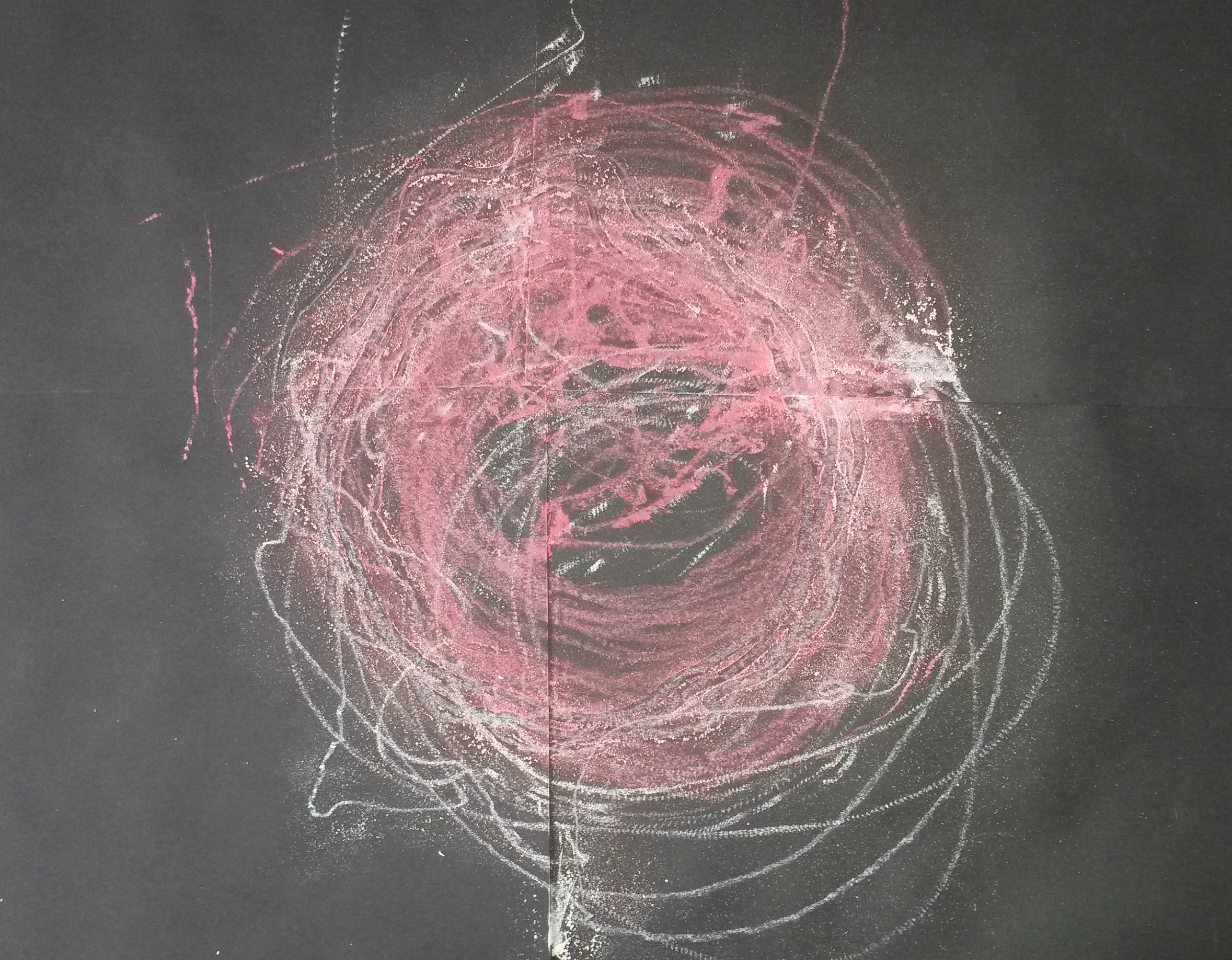
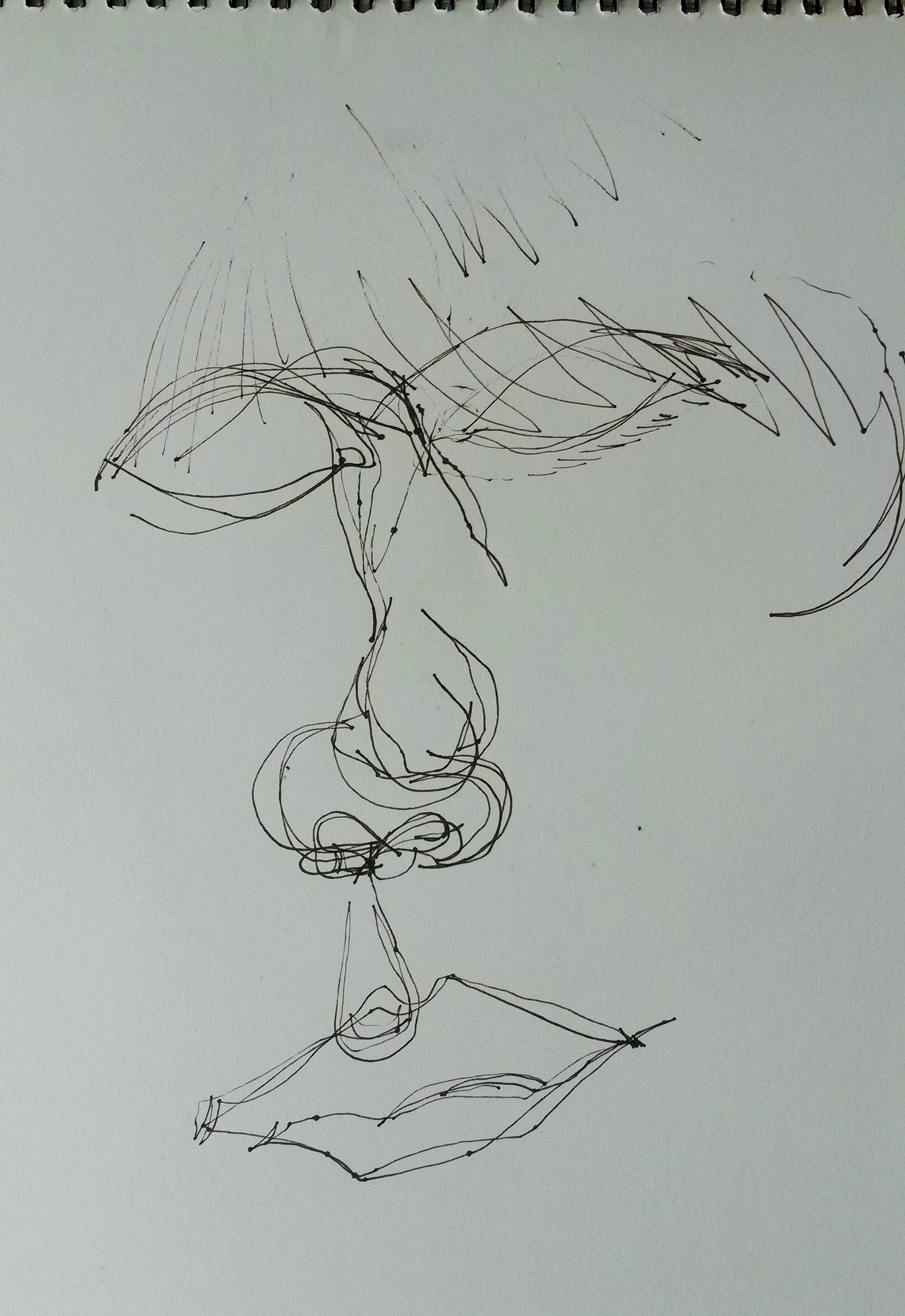
My first thoughts on viewing the image online was that I was a bit underwhelmed.  It does arouse my curiosity and I feel frustration at not being able to see the original drawing.  There are some faint marks left, the paper isn’t totally blank and I found myself just staring at it trying to guess what had been there. I think it is an important part of art history.  Interestingly, I was more excited by the assertion from Ruschenberg that if de Kooning hadn’t been home, then ‘that would have been the work’, and then if he hadn’t agreed to giving him a drawing, ‘that would have been the work, and so on. That is a very interesting concept to me, and somehow I can understand it better that the erasure of the drawing.

http://pastexhibitions.guggenheim.org/singular_forms/highlights_1a.html

http://uk.phaidon.com/agenda/art/articles/2013/march/01/how-robert-rauschenberg-erased-a-willem-de-kooning-and-created-a-landmark-of-postmodernism/

John Bellany workshop at Glasgow Museums Resource Centre 30th Aug 2015

I was already familiar with John Bellany’s work as I went to an exhibition at the National Gallery Scotland in 2012.  I have the catalogue from it; ‘John Bellany, Keith Hartley with Alexander Moffat, John McEwen & Paul Bellany.  I was quite excited about the workshop as it is an opportunity to see the art work close up.  The Glasgow Museums Resource Centre stores over 4 million items from the Glasgow Art Galleries and Museums.

The first painting we looked at was The Fishers. This is a huge painting and it was fantastic being able to view it at close quarters.  It was painted in 1966, in a figurative style, which went against the current trend of painting in an abstract style. ‘When the fashion in art was for abstraction, and figurative art was presumed to have been swept away forever by the tide, not just of fashion, but of history, he stood up and painted monumental figurative pictures’ (Keith Hartley with Alexander Moffat, John McEwen & Paul Bellany, 2012:7).  In contrast, his peers were looking at Abstract Expressionism, and the work of action painters such as Jackson Pollock and Willem de Kooning, and colour field painters such as Mark Rothko.  ‘Significantly Bellany’s earliest artistic efforts were of his immediate environment – the fishing boats at Port Seton, his ancestors, Scotland, and beyond.’ (Hartley with Moffat, McEwen & Bellany, 2012:9).  He was painting what he saw every day; in other words he was being a Recorder.  As well as recording scenes familiar to him as the son of a fisherman, he used symbolism in his work.  ‘Boats as symbols of voyaging, of doom and tranquillity, as stages, as arks of sirens and omens, as bearers of cargoes of memory.’  (Hartley with Moffat, McEwen & Bellany, 2012:25.  The colours in the painting were very vivid with lots of blood-red and the fish guts in the foreground repulse the viewer.  The three figures, again a common theme, although looking at the viewer, do not engage with them, and almost seem to be challenging them.

Bridgeman; (c) Glasgow Museums; Supplied by The Public Catalogue Foundation

Bridgeman; (c) Glasgow Museums; Supplied by The Public Catalogue Foundation

  • Date painted: 1966
  • Oil on hardboard, 183.2 x 213.4 cm
  • Collection: Glasgow Museums
Bridgeman; (c) Glasgow Museums; Supplied by The Public Catalogue Foundation

Bridgeman; (c) Glasgow Museums; Supplied by The Public Catalogue Foundation

The next one we looked at was Scottish Gothic.  The name is reminiscent of American Gothic, but there the resemblance ends as there are three figures in John Bellany’s painting and only two in Grant Wood’s.  Here we can see the use of symbolism, where the central figure has a bird perched on his head.  ‘Another thing Beckmann was to teach Bellany was the use of symbolic attributes – people carrying fish, wearing masks, standing on stages.  As the years went by Bellany learnt to use symbols as a complex language, sending silent messages between the dramatis personae of his pictures’. (Hartley with Moffat, McEwen & Bellany, 2012:13).  

Next we looked at Dungness.  The figures in his paintings are generic and not modelled on anyone.  Although looking straight ahead, they do not engage with the viewer.  This painting was made following a visit to Germany where amongst other things, he saw the Concentration Camps, but also saw the Isenheim Alterpiece painted by Matthias Grunewald.

Next we saw Journey to the End of the Night; a triptych.  This is the title of a novel by Louis-Ferdinand Celine published in 1932, however there is no obvious connection to this.  It is a triptych (possibly inspired by the Isenheim Alterpiece). It is an image depicting sexuality, but there is no joy in it.  The figures in the back ground appear to be nun-like figures.  The lobster represents female sexuality and the women appears to be dressed in the striped clothing from the Concentration Camps.  ‘The second event to have a major impact on Bellany was his trip to East Germany in 1967….where he was emotionally and physically overwhelmed by a visit to the Buchenwald concentration camp’ (Hartley with Moffat, McEwen & Bellany, 2012:13).  

The next drawings were from the Addenbrooke’s Hospital period around 1988, when Bellany had a liver transplant which saved his life.  ‘In 1988 it became plain that Bellany’s liver was deteriorating so fast that he did not have much longer to live unless he had a transplant.  Against all the odds he was able to undergo the operation at Addenbrooke’s Hospital…..It was successful.  As soon as Bellany came round from the anaesthetic he could not believe he was still alive.  He asked for a pencil and paper and only after he was able to draw was he certain that he was alive.  Over the next few weeks as he grew stronger he drew the doctors and nurses looking after him, but above all he drew himself, a new Lazarus.’ (Hartley with Moffat, McEwen & Bellany, 2012:77).  He used pencil, red and black chalk and watercolour.  These are very honest, direct drawings and I found them quite moving.  The emotion he was feeling, the joy of being alive, comes through.  The eyes in particular, are captivating.  He exaggerates the almond shape and adds a lot of detail, and he really engages with the viewer, unlike in his previous paintings where the figures stare with hostility.

bellanyhospital3

Bellany,-Self-Portrait-(Addenbrookes)-Red-Chalk-1988-b

Self-Portrait 1988 John Bellany 1942-2013 Purchased 1990 http://www.tate.org.uk/art/work/T05735

Self-Portrait 1988 John Bellany 1942-2013 Purchased 1990 http://www.tate.org.uk/art/work/T05735


bellanyhospital2.png

I decided to make a quick study of this self-portrait, in an attempt to discover how he made it.  I drew mine with pencil first, then did a wet into wet wash with Cadmium Red and Indigo watercolour paint.  I used watercolour paint wet on dry on the face, and striped pyjamas, then defined it using watercolour pencils, wetting the lead before drawing with it.  The pyjamas are reminiscent of the striped clothing he saw at the Buchenwald Concentration Camp, and I’m quite sure the red splashes of blood are for artistic license.

User comments

User comments

Next we were shown some drawings which had never been on display to the public.  There were beautiful delicate etchings, mono prints and prints which looked as though they may have been intended to be bound into a book, as there was poetry and text included.

Next we were taken to the “Pickled ” room in the Resource Centre, where we had ten minutes to sketch one of the many jars containing all sorts of fish and other aquatic creatures.  I draw a jar of Chlorophthalmus Agassizi, which looked a little like sardines to me and I was attracted by the way they were all cramped together like sardines.  It made me think of Stress, like having too many thoughts crammed into your head at the one time.

Finally we were taken to a classroom where we did our own self-portrait and included our picked object in homage to John Bellany.  I managed a self-portrait alright, but it bore no relation to the colour and expressiveness of Bellany’s.  I became so focussed on trying to get something down, all thoughts of Bellany’s work went out of the window.  Only later did it occur to me that we were encouraged to use easels; something I normally would never do when painting in watercolours.  The expression and depth of emotion in his work has given me the idea to try to use this influence in the Emotion exercise.

2015-08-30 18.42.19

Project 3: Drawing ‘machines’

Find something which moves and attach a drawing medium to it so that it creates a drawing by itself…..Develop these automatic drawings using source material from your sketchbook or simply by responding to what you find as you experiment.  Note carefully what happens when you shift the drawing from automatically produced marks to considered ones.

I didn’t have a clue where to start with this one.  I began by twisting an elastic band round two pieces of charcoal until the tension was such that when I let it go, the charcoal twists round at speed, but the results were disappointing.

Next I tried attaching charcoal to the blades of a hand blender but when I switched it on the charcoal came flying off at high-speed and I was in danger of losing a finger.

I then tried attaching charcoal to my electric toothbrush, suspending it from a table over paper and the results were much better.  I also found it helped to let it sway a little, like a pendulum. The vibration caused it to rotate in a circular motion, without any interference from me, so it kept moving round the paper for the two minutes until it switched itself off.


20150814_135104

I was pleased with the result.

20150814_142313 (2)

Charcoal on A3 paper

I tried the same process, this time using red and white pastel on black paper.

20150814_142124 (2)

4 x A4 sheets of black paper with pastel

I like the outcome.  I like the marks the circular motion has made, and the squiggles where it has gone its own way.

I tried using a black marker pen and the results were different, but equally as interesting.  The weight of the marker as opposed to the light pastel, gave it more resistance and made the movements jerkier.

2015-08-21 22.54.21


When making further attempts, my son came in and on observing the jerky movements as the pastel came into contact with the paper and the vibrations became louder, he observed “Oh it’s angry”.  This made me smile as I thought of Rebecca Horn and her assertions; ‘My machines are not washing machines or cars.  They have a human quality and they must change.  They get nervous and must stop sometimes.  If a machine stops, it doesn’t mean it’s broken.  It’s just tired.’ (The Bastille Interviews 11:Paris 1993).

20150831_163238

I found it interesting that, despite using the same ‘machine’, with the same method, i.e. the media attached to the machine, which is tied with string and attached to a table top, the results were often very different, and I found it hard to replicate a previous result.  I think it depended on a number of things; how close the media was to the paper, i.e. whether it was resting lightly on it, or leaning heavily on it, whether there was any momentum making it go round, what resistance the media gave, e.g. the pastel was very responsive, leaving delicate marks, whereas the pen was quite clumsy and heavy in comparison.

As a contrast, I tried to replicate the machine drawings by drawing them myself.

Because of the circular elements, I used a large plate, medium plate, bowl and cup as ‘templates’, as I knew I wouldn’t be able to draw circles freehand accurately.  I used a charcoal stick and drew round each object, trying to vary the pressure and allowing my hand to slip and go wider than the plate etc.  I found it extremely difficult to intentionally draw ‘accidently’.  The result was interesting, but I much preferred the ‘machine’ drawing.

User comments

I had a go at a coloured pastel drawing too.

Part 3; Research point; Abstract Expressionism

Abstract expressionism is a post–World War 11 art movement American painting, developed in New York in the 1940s. It was the first specifically American movement to achieve international influence and put New York City at the center of the western art world, a role formerly filled by Paris. Although the term “abstract expressionism” was first applied to American art in 1946 by the art critic Robert Coates it had been first used in Germany in 1919 in the magazine Der Sturm regarding German Expressionism.  In the  United States lfred Barr was the first to use this term in 1929 in relation to works by Wassily Kandinsky.

I watched the film of Pollock by Hans Namuth.

It was interesting to hear him narrate whilst painting.  It was also interesting to watch him painting on glass.  There was an unheard rhythm, a flow and repetition, almost as though he was listening to silent music.  (This may be relevant to Assignment 3).   I have transcribed some of the dialogue that I found interesting.

I don’t work from drawings or coloured sketches.  My painting is direct….Having the canvas on the floor, I feel nearer, more a part of the painting…I can be in the painting, similar to the Indian Sand Painters of the West.  A method of painting that has a natural growth, has a need; I want to express my emotions, rather than illustrate them.  The technique is just a means of arriving at a statement….Because a painting has a life of its own, I try to let it live……I lost contact with my first painting on glass and started another one. 

Here, then, was an aspect of painting that still appeared to be unexplored – the handling of paint regardless of any ulterior motive or purpose….Jackson Pollock…becoming impatient of conventional methods, he put his canvas on the floor and dripped, poured or threw his paint to form surprising configurations.  He probably remembered stories of Chinese painters, who had used such unorthodox methods an also the practice of American Indians who make pictures in the sand for magic purposes.  The resulting tangle of lines satisfies two opposing standards of twentieth-century art: the longing for childlike simplicity and spontaneity…(E.H. Gombrich, 2011:602).

I think that the Abstract Expressionism work of artists such as Jackson Pollock, Mark Rothko and Willem de Kooning was an attempt to break away from the traditions of figurative painting.  Traditionally the art world had been dominated by European Art and Abstract Expressionism offered something new and exciting from America.

The modern was a highly contested area. This is the years where people were emerging from the shadows of the second world war and still trying to find the an appropriate artistic language for the time.  Chris Stephens, curator Tate

References

https://en.wikipedia.org/wiki/Abstract_expressionism

http://www.tate.org.uk/learn/online-resources/glossary/a/abstract-expressionism

Project 2: Experiments with mark making

Set up a reasonably large still life, for example two or three chairs piled together.  Make yourself some drawing tools by attaching pencils or pieces of charcoal to the ends of bamboo canes or similar.  Place a large sheet of paper on the floor and try to draw your subject using these super-elongated pencils.  You’ll have less control but you may find that little movements you make have big results as they are magnified by the canes.  This will lead to a very sensitive responsive mark. 

With my tutors words still in my ear from Assignment 2; ‘Look around you and find things to draw instead of setting up a still life’, I looked around and saw a large vase with drooping sun flowers.  I attached a piece of charcoal to the bamboo cane, which was 125cm long and had a wee try out on a piece of white paper.

I only made a few marks and the charcoal was difficult to control, but the marks were interesting; a bit like calligraphy or Japanese symbols.

20150814_131720 (3)

I knew I needed a large piece of paper to draw on and found a large sheet of cardboard.  I didn’t move the vase but left it where it was.  I drew the vase and the wall in the background.  I found it difficult to draw the straight lines of the vase and get the angles of the skirting board right, because your focus is on trying to control the charcoal.  I enjoyed doing the scribbly marks for the withering sunflower petals.  The result was okay.  I liked the strong confident lines of the stems of the flowers.

20150814_114148

Charcoal on grey cardboard 45cm x 60cm

As a second stage, if you like to add colour, grab a handful of wax crayons, pastels or pens for each colour.  Hold them with your fist and draw with them all at the same time. 

I used soft pastels.  I don’t have a huge amount of colours, so used 3 for each colour, trying to be as loose as possible, and leaving the grey of the card board for the lighter tones.

20150814_120336

Charcoal & pastel 45cm x 60cm grey cardboard

I made another attempt using an old paper sack to draw on.  I used the same method with charcoal.

20150831_153851

Charcoal on brown paper 40cm x 80cm

It occurred to me that I should experiment with the length of the stick, so I chopped it in half (about 65cm).  Using the roses from the previous assignment as a reference I did the following;

20150904_16374520150904_163718

20150904_164407

Charcoal on lining paper 45cm x 60cm

I stood to do these with the paper on the floor.  The lack of control meant that some of the lines were bold and sweeping, whilst others were faint and barely there.  I still managed to make strong, bold strokes.

20150904_170743

Charcoal on lining paper 45cm x 60cm

Again, following my tutor’s advice; ‘Try as much as possible, to link the exercises to the Parallel Project’, I did a further two drawings.  I worked from photographs, cropped to make the compositions more interesting.  I was attracted by the patterns, tones and shadows.  The lack of control when using the charcoal on the cane, left no room for fussiness or precision but forced me to be decisive, resulting in some strong mark making, particularly in the dark shadows.  I am pleased with the end result.  It has a confidence to it, lacking in my previous work.  It has an abstract feel and the use of the cane I feel, adds something.  It is an interesting composition, which focusses on line, pattern and tone and is unconcerned with subject.

2015-09-11 21.36.22

I began this drawing with the charcoal attached to the bamboo cane again, however I had no thick pieces of charcoal left, so taped several thin sticks together.  I used thick pieces of masking tape for the vertical lines.  I then drew with the charcoal.  The thin pieces taped together gave a scribbly effect.  Once I had removed the masking tape I made a circular template with card board and used blue pastel with this, trying to keep it slightly loose and imperfect.  Changing the direction of the hatching kept it from looking too tidy.  I then went over the chair shape in the foreground with black charcoal.  I was pleased with elements from the finished piece; I really like the blue circles and straight vertical lines of the blinds, but I feel the composition needs more work and can be developed further.

Reflection: What happens when you break the relationship between your brain and the marks you make in this way?  Are these simply bad drawings – or do they point the way to a kind of responsiveness within the act of mark-making which enables a more sensitive and ultimately more informative line?  This is a loaded question, but respond with your own views and reflections based on what you’ve learned so far.

Placing a length of cane between the charcoal and your hand results in a loss of control and you automatically over compensate by using more force.  Rather than be a hindrance, it brought a looseness to my drawings and gave them more of a ‘sketchy’ feel.  I once saw the paint brushes of James McNeill Whistler at the Hunterian Art Gallery and these had exceptionally long handles, useful I would imagine, for the huge canvases he worked on, but in addition would add a looseness in the application of paint.  The first drawing I did of the sunflowers, before I added colour, was more sensitively drawn because of the cane.  It was more expressive and impressionistic.  Using more force than you would usually exaggerates the line and in the page with the roses above I was able to get into a rhythm almost, when rendering the concentric circles.


Project 1: Drawing blind

Choose a smallish object you know well, preferably something with a fairly distinctive shape….Reach out for your object and feel it; as you do this, make a record of what you feel on your sketch pad with your pencil….Make several studies until you feel that you’ve arrived at something interesting.

I had a look around the room and decided to try drawing a hair brush and hair clip.  The results were disappointing, I think because the shape is so familiar, I don’t think I was drawing what I felt, but what I knew a brush looked like.

20150805_121604

Pencil in A3 sketchbook

Next I tried a small jug.  First I tried using pencil as the brief suggested.   The results were better I think, because I was trying to record the shape I felt, rather than how I knew the jug looked.

20150805_121557

Pencil in A3 sketchbook

20150805_121549

Charcoal in A3 sketchbook

20150805_12154420150805_121519

20150805_121535

Soft pastels in A3 sketchbook

On looking at these, I could see that I was still drawing the vase from memory, and not from touch.  So I sat with it in my hands for a good 15, 20 minutes, just running my hands over the surface and feeling the curves of the handle, neck and base and the smooth cold surface of the ceramic. Once I had examined it thoroughly by touch I then tried drawing it again in pencil.

20150805_121441

Pencil in A3 sketchbook

I was more pleased with this result; it seemed to be a more honest rendition.  My pencil lines were more assured.  Working from two planes, i.e. drawing the circle of the neck from above and the profile from the side describes the jug more honestly than my previous attempts.

Next I tried using black drawing pen as it gives a stronger, confident and more defined line with less room for hesitancy.

20150805_121424

20150805_121433

Black Pitt pen in A3 sketchbook

To a certain extent, these remind me of the Cubists, or Ben Nicholson’s etchings.


three goblets 1967 Ben Nicholson OM 1894-1982 Purchased 1976 http://www.tate.org.uk/art/work/P07204

three goblets 1967 Ben Nicholson

Rafael 1967 Ben Nicholson OM 1894-1982 Presented by the artist 1968 http://www.tate.org.uk/art/work/P02015

Rafael 1967 Ben Nicholson


Following the suggestion of ‘Drawing Projects’ I decided to try a self-portrait by touch only and the results were interesting.

“Your drawing should show a sensitive response to touch and contain a range of interesting felt marks.  What is important in this drawing is the synchronised route of communication being made between the two hands, and the transfer and coding of one sort of information (touch), into another (visible marks).” (Maslen and Southern, 2014:88)

20150814_142837

20150814_142826

20150814_142719

20150814_142729

Black Pitt pen in A3 sketchbook 

20150814_142423

The attempt above was done using two colours of felt pen and was interesting because I did it first in green then picked up the pink, looked at the paper and positioned the pen on the nose where I’d started with the green, then closed my eyes.  The pink lines are in the same position as the green, despite having my eyes shut.

Reflection: How far were you recording the sensation and the act of touching, and how far were you trying to use touch as a replacement for sight? 

It was initially very difficult for me to draw from the sensation of touch only.  I automatically reverted to drawing from memory.  Touch can give an idea of shape and form, but your finger tips can only touch one area of an object at a time, and it is difficult to gauge where one part is in relation to another.  You also have no idea of colour or tone.  One advantage however, is that to compensate for the lack of information, the hand that is holding the media to record the sensations of the other, becomes very sensitive in its endeavour to form an image with very little information.  The results can be economic, but effective.  The resulting drawing is almost a distilled image, where a rendition of the shape and form are explained satisfactorily, without the unnecessary details such as colour.


My response to tutorial on Assignment2

Having been disappointed in having to wait 6 weeks for a Tutor Report on Assignment 2, only to be told I was having a change of tutor, I was very relieved to have contact from Brian Eccleshall very quickly, and thought it was a good idea when he suggested using Skype.  He arranged this very quickly, and this helped to get my motivation back on track.  I hadn’t started Part 3 whilst waiting on the tutor report.

I was very impressed that Brian had looked at my work on my blog before the tutorial and had made some notes.

I was encouraged by his assertion that I needn’t worry about my drawing skills.

Project 1 Exercise for space, Depth and Volume

I was slightly disappointed in his comment about working from ‘contrived’ still lives because I am enjoying the fact I now have my own studio to work in.  I have set up a ‘still life area’ with a back drop to drape material over and have lots of vases lying around.  Having vases of roses around helped me experiment with the studies for Assignment 2.  Having said that, I totally understand where he was coming from and that using ‘found’ groups of objects can be more interesting.  If I felt strongly that I wanted to work from a still life I would still do so and would explain why I wanted to do it in my blog.

Project 2 Mark Making Materials

I was interested in his comments on the Mark-making materials exercise because the two versions that he was most interested in were ones that I liked too.  His comments made me realise that perhaps I’m not trusting my own instincts, and instead thinking about what would be most pleasing to others.

Project 3 Narrative

I was pleased with Brian’s response to these exercises.  He really got the emotion I was feeling when completing them and his comments about not setting up still lives made sense.  The items I was sketching were put together authentically, as they had been on my mother’s bedside table.  The unusual inclusion of the Irn Bru bottle made it different or quirky, and therefore more interesting than a conventional still life.

Research

I was very interested in Brian’s comments about the research I’ve done because I’ve always recorded it in my learning log in the same manner and no other tutor has commented, I suspect only because Brian is much more thorough in his review on my blog.  It’s good to have constructive criticism and a steer on how it should be done.  I will review this area and edit it.

Assignment 2

Brian began by asking me what my own thoughts were on my final piece for Assignment 2.  When I answered that I wasn’t convinced I had the best outcome and preferred some of the black and white drawings and he agreed with me, in a way having what you suspect confirmed by another is reassuring.  My gut instinct was that I could have had a better outcome.  I need to trust this instinct in future and not be swayed from it.  I think I’m still trying to come up with a final piece that others will like, i.e. the final piece where I used watercolour and ink and printing etc, I thought appeared more finished or polished that a black and white drawing.  If time allows I may have another go, or try what Brian suggested with collage etc.

Parallel Project

Brian’s suggestions for the way forward for the Parallel Project were very exciting.  He had an endless stream of ideas.  I felt encouraged by his enthusiasm and more confident about tackling it.

All in all the tutorial was a very positive experience.


Skype Tutorial on Assignment 2

Brian began by saying; you can draw, that’s a solid foundation you can build on but there’s always work to do.

If the exercises don’t excite you, don’t be afraid to ‘push it around’.  For the exercise on drawing machines it can be a toy, human body etc, at level 2 you need to be trusted to find your on way of looking at the world.

Project 1 Exercise for space, Depth and Volume; you’ve handled the medium pretty well, good drawing and use of tone.  Drawing in this way forces you to edit.  You set up still lives a lot, there is nothing wrong with this but also try to find subjects to draw that are all ready there, things that you come across and are less in control of.  Go out into the world, you cannot control the environment in the same way.  Look at shoes left at the door etc.

Project 2 Mark Making Materials; I’m captivated by the second one, it has a dark, gloomy atmosphere.  It has an interesting composition and there is a subtlety to it.  I like that you reversed what you had done in the first one, ie black tree instead of black background.  Does it look better in reproduction than in real life?  Me – yes, a bit.  That is quite common.  It has really quite a haunting silhouette.

I also like the one where you used acrylic paint.  It is less showy and more brooding and seductive.  Start breaking the rules and making mistakes, you’re quite experimental, keep that up.  You’ve got permission to try different things; try it, if it doesn’t work it doesn’t matter, there is no obligation for everything to be good.

Project 3 Narrative

The results from this exercise were quite moving.  I liked the drawing of the Irn Bru, in some respects this is what I meant by not setting up a still life, but using things already there instead.  It is a nice drawing, I like the paint effects and the use of the white paper.  The drawing of the humbugs is a sweet little study.  Recording different stages of a drawing is useful, Matisse did this and sometimes the final painting looked nothing like the photographs of the different stages.  I found the sensitive subject quite moving.  You’ve really achieved something with the humbug drawing, it’s really neat, unpretentious – it’s a good example of the advice – don’t think about art, don’t try to make art, you don’t need to make a grand statement.  Drawing 1 is all about enquiry, finding out about different medium, Drawing 2 is finding all about drawing.  I like the white paper that you’ve left, there is an interesting tension between the drawing and the space.

Research

Something obviously chimed with you when viewing Duncan Shanks work.  Steal his ideas, borrow ideas, the level you are at in education, the idea is to learn.  I do drawings of other people’s works.  Look at composition, materials, mark making, use the format.  Looking at the photograph of Duncan Shanks’ sketch book with the Cow Parsley flower drawing on the left page and a painting including the flower on the right, you might decide to use this to do a diptych.  If something excites you, use it.  When you write about other artists, you write a little about what they do, then you can sometimes be a bit dismissive.  You don’t need to like the artist’s work that you are looking at, you only need to write about it.  If you don’t like it, go into more detail about why, e.g. “I was unconvinced by his use of….., although colourful, this didn’t work for me because…..”, do more digging and be more analytical.  The easiest way to do this is to compare two artists, e.g. John Pyper draws landscapes…., which is different from David Hockney, who uses colour….  Or compare with and relate to your own work.  You may want to review your research again and edit it.  You given your opinion on the use of digital work, we are all digital artists; we paint, we photograph the painting and post it on-line where others view it digitally.  Try to find something positive to say about something you are reviewing, don’t be dismissive, or too gushy.  I’ve written about artists I don’t like, but by the time I’ve researched them and written about them – I like them.  Grayson Perry said he wanted to put up signs in galleries saying ‘You don’t need to like it’.  If you like flowers, look at botanical studies, such as those of John Ruskin.  Georgia O’Keefe is having an exhibition next year in London.  It’s difficult to see her work in the UK.  She does massive paintings and uses a zoomed in quality.

Assignment 2

Your studies are really interesting.  There is some really interesting mark making and a few quite nice gestures, there is a rhythm and energy.  In the first drawing there is something really quite bold, quite free, you’re not over thinking, just making art.  I really like the pattern on the cloth, it adds interesting detail and texture.  In some of the exercises you try a few things then settle quite quickly on what you’re going to do.  For the assignment you have been much more experimental and your work is better for that.  The black and white drawing of the five roses has a graphic, almost Japanese quality.  It is a nice piece of work on its own.  Was it a conscious decision to use calligraphic marks, almost a written painting.  There is real clout in there.  Likewise, in the drawing with the grey wash, the subject matter is not arranged, it’s just lying there.  There is an interesting use of negative space and the composition goes off the edge of the paper.  There is lots of intuition going on in your sketches, you’ve not tied yourself to any medium, there are lots of black ink, you’ve not tied yourself to any style.  There is some really rich stuff going on.  Brian asked me how happy I was with the final piece.  I answered that I wasn’t sure;  I wasn’t convinced I had the best outcome, when I looked back over the sketches I had done.  I liked the black and white drawings I had done, but had not developed them further.  Brian answered that it was ok to feel that way and that it was a sign that I was trying to propel myself forward.  He suggested that I play about with it; photo shop it, cut it up and collage with it, and draw over it.  When I pointed out I had changed the image on photo shop he commented that I was a digital artist!

Brian commented that he liked the photograph with the newspaper, pencil and rubber and other paraphernalia in the back ground and found it interesting.  I replied that this wasn’t intentional, I was just in a hurry when posting on my blog.  Brian said that accidents can be exciting, art happens, take notice of the world.  Start to contextualize your own work, which will come from looking at artists that are relevant.

Parallel Project

Brian advised me to look at a blog post he had done on D2 student Sarah Euston, who had scored 78%.  She had grabbed hold of her subject and milked it for all it was worth.  She focussed on a place, where she later found out Cornelia Parker had worked.  Her assignment piece was a film of her painting onto glass then smashing it at the end.  It was quite high concept, but it’s up to you how far you want to travel.  She also integrated a lot of the exercises into it, once she had decided on her subject she based the exercises on it.  The critical review should relate to the contextual study and should be relevant to the parallel project.  Compare and contrast, for example if starting with the work of Alistair Gray, look at his approach as opposed to mine, what is different, as opposed to a recording or CCTV surveillance?  What does a drawing give you?

Also what about the restrictions and obligations I have to clients, not just in not naming them, but also without showing them?  How do you make work when you’re not allowed to make work?  There is an interesting set of constraints.  Think about what it is to observe, not just appearance, but you are privy to their personal lives, but honour bound not to discuss, you carry that around with you.  Also the bureaucracy, a client becomes a clerk of their own life, and needs to record their own efforts.  For the critical review, record how I first encountered it, who did I compare the work to?  E.g. someone more abstract in approach.  Think about institutions that structure people’s lives and impact on their routine.  Think about daily project, e.g. 4 month diary, narrative or drawing.  You could focus on 3, or 4 people only and record, or do a drawing of what you have for lunch that day, or a drawing of the weather that day.  Set up a process or a routine and at the end I will guarantee that the outcome won’t be what you expect.  What are still lives around the office, what is just lying there, or think about how a court reporter records what happens when only allowed to draw from memory.   The procedure could reflect the bureaucracy of the place.  Don’t waste time thinking about it, just set up a structure and work on it.  What about Stations of the Cross?  In a diary of a client, when he gets a job, his pages are left blank.

I also really like the dots on the screens.  I’ve written that I would normally concentrate on people, but I had to wait until the office was closed, so what else is interesting to look at.  I also like the reflections; these can reflect what I’m doing.  What do dots make you think of, e.g. Damian Hirst.  The critical review should be an informed commentary.  Don’t be afraid to try different things, you can always pull back.  The Job Centre, I would imagine, can be a real gritty place.  Look at other ‘non places’ in geography, I. e. no one lives there, other examples would be petrol stations, air ports etc.  The client doesn’t have a choice he has to go there.  Working over a space of 4 or 5 months could build up a lot of work, what shifts over that time?


Notes on Tutor Reports

This blog post has come about through conversations textile assessors had during the last assessment event. It was noted that frequently students did not use the advice given by their tutor in the feedback documentation. We saw instances of where if students had emended their work in line with the tutor feedback they could have achieved a higher mark at assessment. OCA students are in a unique position in that they regularly receive extensive written feedback during each unit (course) studied. The Tutor Report explains to the student where they are doing well and the places where improvements could be made. Often included are suggestions and pointers in how to develop both strengths and weaker areas. Giving the student the opportunity to make improvements to the assignment they have just completed.

I have put together a list of suggested ways OCA students can explore and pull apart their feedback forms to extract the information.

  • Firstly print out the Tutor Report document or enable the document to be annotated on your PC.
  • Read it carefully.
  • Read it again this time highlighting areas of importance. For example strengths, weaknesses and suggested changes.
  • Read it again this time alongside the assessment criteria noting down any language that suggests you are at a particular level. (Tutors use the assessment criteria to judge the kind of feedback you require)
  • Look at the Tutor Report with your notes along side the assignment it refers to.
  • Lay out your work looking for the places your tutor has indicated for change.
  • Make notes on what you see. Can you see what your tutor sees?
  • Make further notes on how you could go about meeting the suggestions made or making improvements to the assignment.
  • Talk the assignment and feedback over with another student (via Facebook or a student forum) or a friend/member of your family.
  • Make your changes to the assignment.
  • Reflect on how this process has helped you improve your assignment.
  • Place both the Tutor Report and your notes in your learning log.
  • Write up the changes you have made to the work and reflect upon the outcomes.

These are not hard and fast rules. My hope is that this list will offer guidance and a framework for you to effectively use your Tutor Reports.

If when you have gone through this process or something similar and you find there is something that still remains a mystery to you contact your tutor for clarification.

For further information on how to improve your work look out for OCA blog posts where tutors discuss specific students work. For example the audio piece with images about the work of Ruth Goury on the 13th July 2015. Here I discuss how Ruth has used the design process to achieve some exciting outcomes. While watching the item make notes that you can add to your learning log and use to improve or develop your own work.

Please add comments to this post on how you effectively use your Tutor Reports that you think other students may find helpful. If you are a tutor it would be great to have your voice in this conversation too : )

Rebecca Fairley. OCA Textile Course Leader, Tutor and Assessor

Tutor Report Assignment 2

Tutor report

Overall Comments

Thanks for speaking with me about your transfer to me and about your second

submission. As discussed this report will be more note-like than the longer

narrative reports. You have a copy of the conversation so please feel free to revisit

that.

You’ve made a solid start to the course, There’s some good experimentation going

on, especially in the last piece.

We talked about the Critical Review and Parallel Project. I recommend that you

start work on these sooner rather than later as they are crucial to you building up a

practice, rather than an ‘exercise’ oriented approach to work.

We talked a bit about the tension between the handmade work and the digital. You

needn’t pursue it, but it’s interesting that work make by hand is often seen online.

How does this change the work? Can the digital be folded into the handmade?

Select one of the statements below:

I understand your aim is to go for the Painting Degree and that you plan to submit your

work for assessment at the end of this course. From the work you have shown in this

assignment, and providing you commit yourself to the course, I suggest that you are

likely to be successful in the assessment.

Feedback on assignment

Demonstration of technical and Visual Skills, Quality of Outcome, Demonstration of

Creativity

Lots of interesting experimentation, but based on solid observation.  The result might not be as satisfying as you’d hoped, but there’s some really good work en route to it.

  • Photoshopping is a good idea.  Think about how you might print these off and them back into the drawings. Collage? Repetition?

Sketchbooks

Demonstration of technical and Visual Skills, Demonstration of Creativity

• Try and notice existing ‘Still Life’ arrangements. You do this a bit with the ‘narrative’ set of work but keep an eye out for interesting stuff.  this could include stuff you incorporate in the Parallel Project.

• Think, too, about the accidental bits of the world that impinge on your blog

photographs. This might include materials that don’t work properly together.

• The ‘narrative’ images are good. You’re working loosely and discovering

interesting calligraphic marks.

  • Taken alongside the final assignment there is some strong work here.  Keep playing with composition and marks.

Learning Logs or Blogs/Critical essays

Context

• When writing about artists and their work, analyse more. Find something to be

positive about even if you don’t like the work.

• Use compare and contrast technique to help unlock useful insights.

• Compare your work or approach to another artist: helps with contextualisation.

Parallel Project / Critical Review

You think that you’re going base the project on your workplace.

• Think about an ongoing visual diary that plays with the constraints of your job.

You could submit a book or series of books. Perhaps a ’work’ format might also

be appropriate. Powerpoint?

The Critical Review is to help you contextualise your practice. Look out for

relevant artists and think how they can help you explain your position.

Suggested reading/viewing

Context

we didn’t talk about this, but the Reading List has some useful stuff in it.  If you find artists whose work you like, feel free to incorporate it into your blog. You do this anyway, but it needn’t just be the art you see in the flesh.

If you stick with flowers, look at Georgia O’Keefe (1887-1986)

http://tate.org.uk/whats-on/tate-modern/exhibition/georgia-okeefe

You might also look at more botanical illustrations. Less composed or ‘artistic’ but

that can be an interesting way to present work.  John Ruskin (1819-1900):

Sigrid Muller(born 1962) came second in last year’s Jerwood Prize with

this image (http://www.artwales.com/artists-detail-mtg-en.php?artistID=38):

John Piper (1902–1992), for his bold colour and approach to materials:


Pointers for the next assignment

In a way a lot of the work included in this submission relates to what comes next.

The inky line drawings, especially. Think about what it feels like to have and ache

when drawing.

The machines exercise can be pushed a bit. Try using a paintbrush on a long stick of bamboo to make large flower drawings perhaps.

Look through the artists you like and see what you can borrow / steal. Colours,

compositions, marks.  By the time you’ve processed it, it will be different.

You have real potential to explore as your basic drawing skills are good. Don’t

worry on that score. They way to succeed on Drawing 2 is to listen to the work and

to pursue interesting lines of enquiry. If you can turn the exercises into something

useful for the Parallel Project, then do so. This will help develop your voice and, in

turn, your practice.

If you need more time, let me know.

Tutor name Bryan Eccleshall

Date 9/8/15

Next assignment due 13/9/15