Category Archives: Exhibitions & Books

Bibliography

The following is a list of books I used for the majority of reference, although I did read many others not included;

The Amazing World of M C Escher. The National Galleries of Scotland.  Edinburgh.  2015

Art Since 1960.  New Edition, Archer, Michael.  Thames & Hudson world of art.  London. 2012

Drawing Now. Between the Lines of Contemporary Art. TRACEY. I B Taurus.  New York.  2007

Drawing Now: Eight Propositions, Hoptman, Laura.  The Museum of Modern Art, New York.  2002

Drawing Projects.  Maslen, Mick and Southern, Jack. Black Dog Publishing. London. 2014

Gombrich, E H (2011) The Story of Art, 16 Edition. London: Phaidon Press Ltd

‘John Bellany, Keith Hartley with Alexander Moffat, John McEwen & Paul Bellany.  National Galleries of Scotland 2012

Modern Art.  Flame Tree Publishing. London 2005

The Poetry of Place, Duncan Shanks sketch books and the Upper Clyde, Freight Books.  2015

The Two Roberts, Robert Colquhoun and Robert MacBryde, Elliott, Patrick.  National Galleries of Scotland.  Edinburgh. 2014

The 20th Century Art Book.  Phaidon 1996


M C Esher exhibition

Last year I went to see The Amazing World of M.C. Escher at the Scottish National Gallery of Modern Art.

About the Exhibition

M.C. Escher is one of the great conundrums of modern art. He is an artist whose work is as instantly recognisable as anything by Salvador Dalí, yet his name means little to a British audience. Escher was never affiliated to any group, rarely travelling far from his modest home in the Dutch town of Baarn, and focusing exclusively on graphic art. He was a one-man art movement who created some of the most famous and popular images in modern art, yet he remains a complete enigma.

This exhibition features over 100 prints and drawings spanning his whole career, and is drawn in its entirety from the Geemeentemuseum in The Hague, in the Netherlands, which holds an almost complete set of Escher’s prints. It is also mounted in collaboration with the Escher in Het Paleis, a museum of Escher’s work which opened in the centre of The Hague in 2002.

I have always liked the work of Escher.  I like the precision and perfection of it and I learned at the exhibition that this was in part because his brother was a Mathematician and helped him work out the exact calculations for the reflections on the spheres etc. In addition his father had very exacting standards and would point out any flaws in his work and suggest he did it again.

I particularly admire his Metamorposis 1 where the negative spaces between fish gradually morph into black swans.

I included his drawing in my Time and the Viewer drawing.

cropped-annemacleoduni1.jpg

Time and the Viewer black drawing pen

cropped-annemacleoduni12.jpg

Time and the Viewer

My homage to Escher; black cats morphing into white swans.

References

https://www.nationalgalleries.org/whatson/on-now-coming-soon/the-amazing-world-of-m-c-escher/about-the-exhibition-23618

Adrian Wiszniewski demonstration

Adrian Wiszniewski was born in Glasgow in 1958 and trained at Glasgow School of Art from 1979 to 1983. He was a leading figure in the revival of figurative painting in a group known as the New Glasgow Boys.

Adrian Wiszniewski RSA, HonFRIAS, HRSW (b.1958) creates work characterised by a strong drawing element and fertile imagination. Populated with contemplative figures set in vividly coloured Arcadian landscapes, his paintings are rich with symbolic, political and philosophical depths.

I have attended a demonstration by Adrian Wisznieski at Paisley Artists before.  This one was particularly memorable to me, precisely because it appeared to have been completely unmemorable to him; he arrived half an hour late and seemed to be completely unprepared.

He had brought his sketchbooks with him though, and this was particularly interesting because he told us he was starting to develop an interest in landscape drawing that he had never had before, as a result of securing a Creative Scotland Grant for a trip to New Zealand.

User comments

Adrian Wiszniewski


User comments

Adrian Wiszniewski

User comments

Adrian Wiszniewski


User comments

Adrian Wiszniewski


User comments

Adrian Wiszniewski

User comments

Adrian Wiszniewski

User comments

Adrian Wiszniewski

He said that he was not much of a Painter, he preferred to draw.  When he starts to draw, he has no intention of how the drawing will look.  He will start out with a large sheet of paper, often taped to a wall.  He will begin in the middle of the paper by drawing an eye, for example, then will start to fill the sheet.  He makes marks, like a piece of music, adds different layers, has repetition, and won’t know what it’s going to be about until the last stroke.  He was influenced by Van Gogh, his work is full of energy.  He trusts his subconscious mind; it’s almost like an archaeological dig, drawing to uncover what the picture is about.

He always has a sketchbook with him, but seldom works from what is in front of him, preferring to work from his imagination.  He showed us some drawings he made recently on a train journey.

User comments

Adrian Wiszniewski

User comments

Adrian Wiszniewski

User comments

Adrian Wiszniewski

Here he is drawing at the demonstration;

User comments

Adrian Wiszniewski

And here is the drawing;

User comments

Adrian Wiszniewski

I found him to be fascinating to listen to.  He has eclectic interests and seemed to jump from one subject to another.  He said the trick was to stay interested in what you are doing, if he stops being interested he will move on to different media and has used Perspex, stained glass and fluorescent light.  I liked that his work was under pinned by drawing, and he wasn’t interested in ‘art speak’, as he called it, as he thought an artists should at least be able to draw.


http://www.openeyegallery.co.uk/artists/adrian-wiszniewski/?p=artist-details/adrian-wiszniewski/


What is art for?

The video I watched in preparation for my Study Visit to the Turner Prize,

reminded me of an OCA Blog Post I had read before.

http://weareoca.com/fine_art/what-is-art-for-2/ posted by Brian Eccleshall.

In the first video Alistair Hudson, Director of MMA (and part of the judging panel on the 2015 Turner Prize), talks about a ‘crisis’.  We need hospitals, but do we really need museums and galleries?  He states that visiting a museum is ‘Spectatorship’ and asks ‘What is the use of art in society? Why do we have it and what is it for?’

In part 2 he states that art needs to be part of society, it needs to be more useful.  At present we try to educate society about the importance of art in society, but he asks what if it is the other way around, what if what we do in society is the ‘programme’, what if art is what we do as citizens in the museum?  What if, as a citizen where our main goal is social development and to make the world a better place, what if we use art in that process?  In demonstrating and applying art in everyday life, a museum doesn’t become an island, but another civic building.  You will no longer be a spectator with the connoisseur acting as an intermediate.  Art is created out of how we use it, so art will be something we develop communally, we develop it as part of our daily lives.  ‘The language of usership comes from the digital culture, and a good analogy is YouTube, where the value of YouTube is not created necessarily by YouTube, it’s created by how it is used, it is created by people themselves, the user makes a video, uploads it, other users watch it, comment on it.  Similarly, could we create a museum which operates in the same way, where the value of the museum is created by all the sum activities of all its users?’

This is interesting, but I can’t help feeling he is concerned more about the future of museums, than what art is for, (although this is only part 2 of a series).  People already use YouTube and other social media sites such as Instagram and Facebook to share their art, although that is still spectatorship.

This post interest me because of my parallel project.  I am thinking about what my final piece of work for Assignment 6 can convey by way of invoking emotion and telling a story that couldn’t be conveyed by say a documentary, or by photographs.  An artist can be a ‘recorder’ and a story-teller and in that regards art is still ‘useful’ and relevant today.

OCA Study Visit Turner Prize 2015

I attended the OCA Study Visit to the Turner Prize 2015 at the Tramway in Glasgow on 9th Jan 2016 with tutor Wendy McMurdo.

This is the first time I’ve taken more than a passing interest in the Turner Prize;  I’ve seen articles in the newspaper and on television, but that’s been about it.  I decided to research its history before I went.

1 ‘Over the recent decades the Turner Prize has played a significant role in provoking debate about visual art and the growing public interest in contemporary British art in particular, and has become widely recognised as one of the most important and prestigious awards for the visual arts in Europe.  The Turner Prize is a contemporary art award set up in 1984 to celebrate new developments in contemporary art. It is awarded each year to ‘a British artist under fifty for an outstanding exhibition or other presentation of their work in the twelve months preceding.  Nominations are invited each year, and the prize is judged by an independent jury that changes annually.  The four shortlisted artists present works in a show normally held at Tate Britain before the winner is announced in December. Artists are not judged on their show at Tate. The decision is based on the work for which they were nominated.’

The exhibition

The study day began with a tour led by two curators. I learned that there have been several students from Glasgow School of Art nominated in previous years, and this is the first time it has been exhibited in Scotland, however none of the artists shortlisted this year were Scottish.

The information sent by OCA prior to the visit recommended that we watch the following film; https://vimeo.com/148607435  , in which Turner Prize Judge Alistair Hudson (Director of Mima) battles it out with artist Pavel Büchler in a discussion, Art: Useful or Useless?  I did watch this video, and on the whole it was interesting, however the discussion began to become a little pedantic to me, as they debated the meaning of the word ‘art’.  It did give me food for thought though.  I am familiar with the idea of a conceptual art, but I’m not sure if I believe that something is an artwork just because it’s labelled as such.  I wasn’t swayed by the argument put forward that Art should be useful.  I believe that if it does serve a purpose, such as the winning entry by Assemble, which worked with local residents in Granby to refurbish 10 houses in order to provide affordable housing, then that is a bonus and it is to be applauded but I don’t necessarily believe that the Artist should only seek out ‘worthy’ useful projects.  As a Contemporary Art award it isn’t surprising that is influenced by whatever is current and environmently friendly projects, affordable housing, recycling materials and social justice are all subjects current with public focus.  In addition, for me, art’s use can be to enrichen people’s lives, enhance their environment, educate and entertain.

Secondly, we were asked to read an article; http://conversations.e-flux.com/t/teleology-and-the-turner-prize-or-utility-the-new-conservatism/2936

This adds another dimension, where the winner of the Turner Prize isn’t a practicing artist at all, but instead is a group of 18 people from the fields of art, architecture and design.  This makes it apparent that the selection of the winner is very dependant on who is on the judging panel, which changes annually.  Some think it also adds a political slant to things.

I was very interested in attending this study visit, as I had hoped the experience would feed into my Critical Review in the parallel project, where I compare traditional drawing and representational art work to contemporary art and installation.

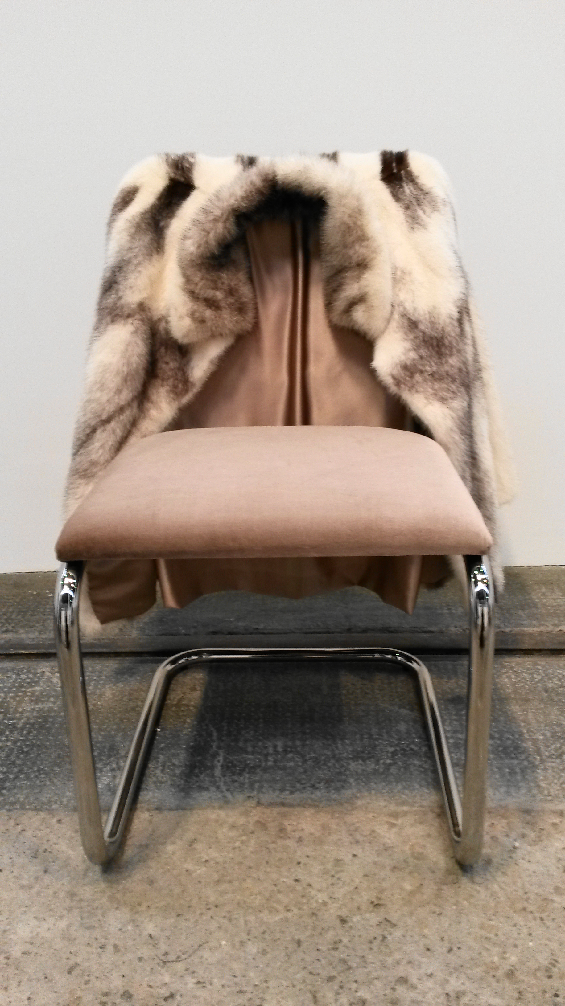
The first short listed artist was Nicole Werners with her Untitled Chair sculptures.  I had no clue on first viewing these what they represented.  It consisted of several tubular chairs with fur jackets draped over them.  The curator explained that the chairs were an adapted version of Marcel Breuer’s Cesca chair.  The lining of the vintage fur jackets are actually sewn around the chair so that the two become one and the purpose is to comment on a private claiming of a chair in a public space.

User comments

User comments

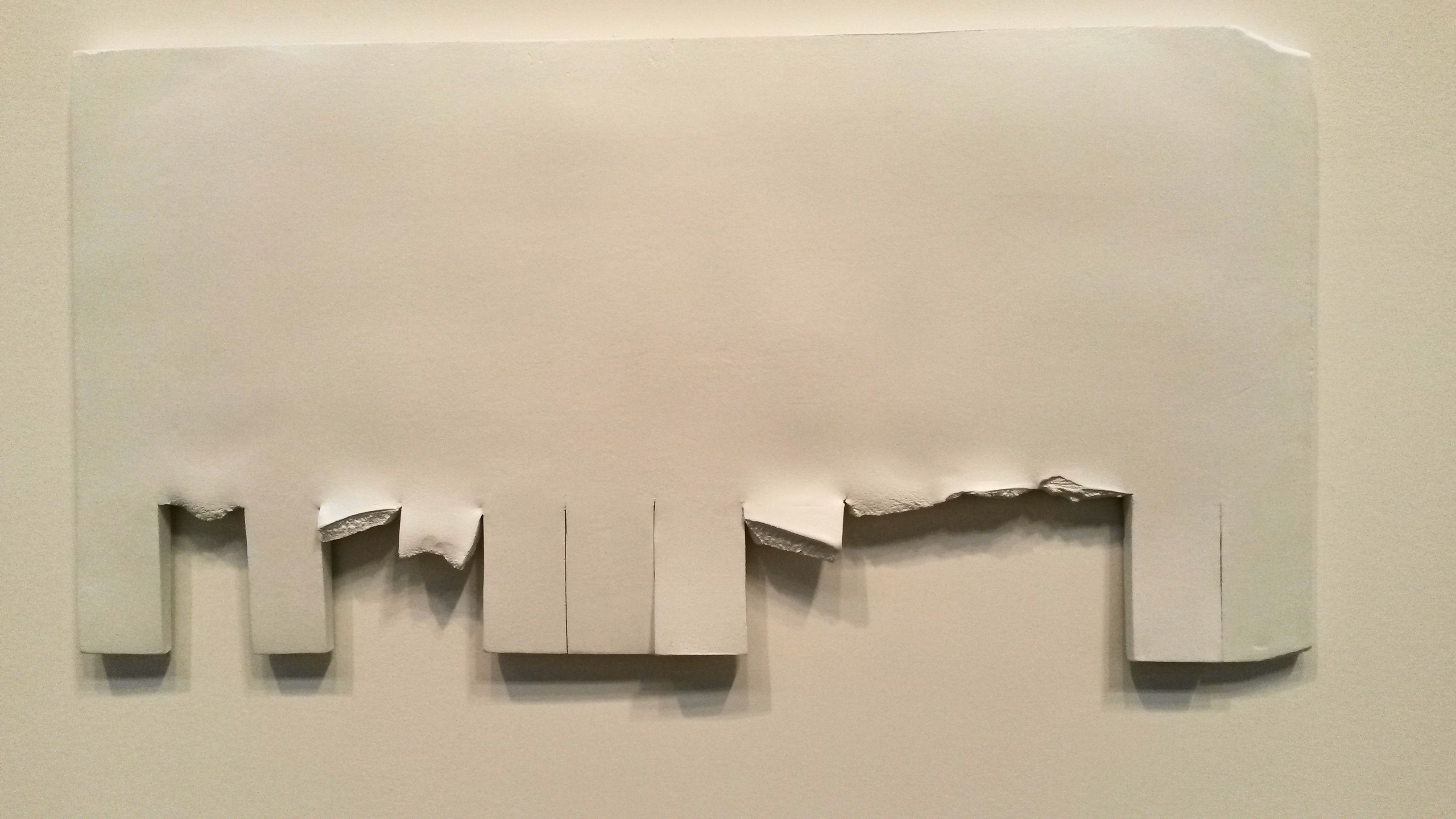
On the walls accompanying the chairs are ceramic sculptures which represent the posters you often see (more commonly in the USA) in colleges etc, where you tear off a portion at the bottom with a phone number etc on it.  This was a comment on a social phenomenon; the change of material from paper to ceramic transforms it into a more permanent fixture.

User comments

My overall opinion on viewing this was that it was quite an interesting concept once it was explained, but I wouldn’t have understood it without the explanation.  It seemed irrelevant to me that the jackets were vintage and the linings were hand sewn to match the fur.  For me, I had already seen photographs of the chairs before my visit, so I suppose in this regard it was a success as it captured the public’s attention, and this is one of the purposes of the Turner Prize; to raise the profile of contemporary art with the general public.

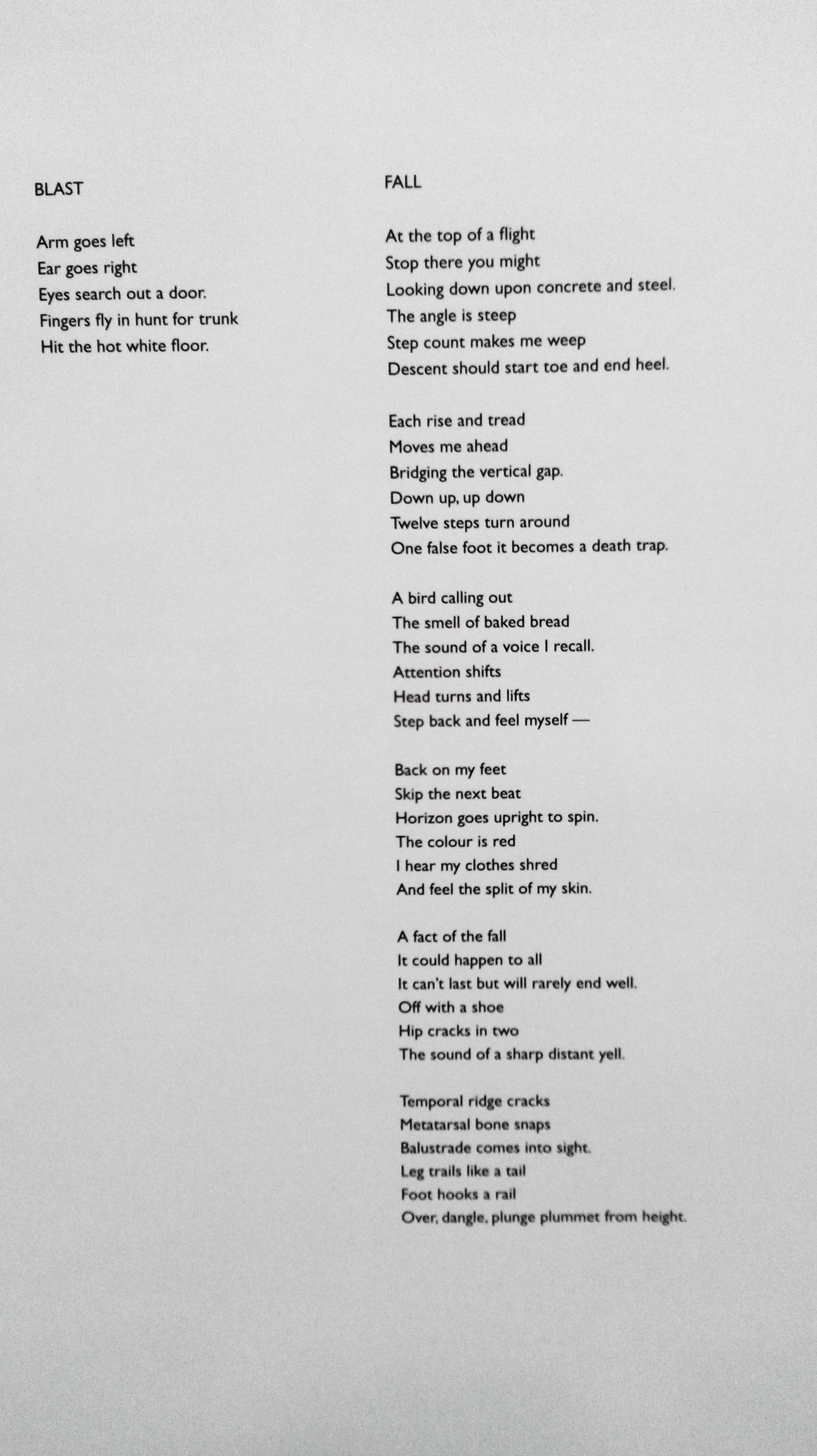
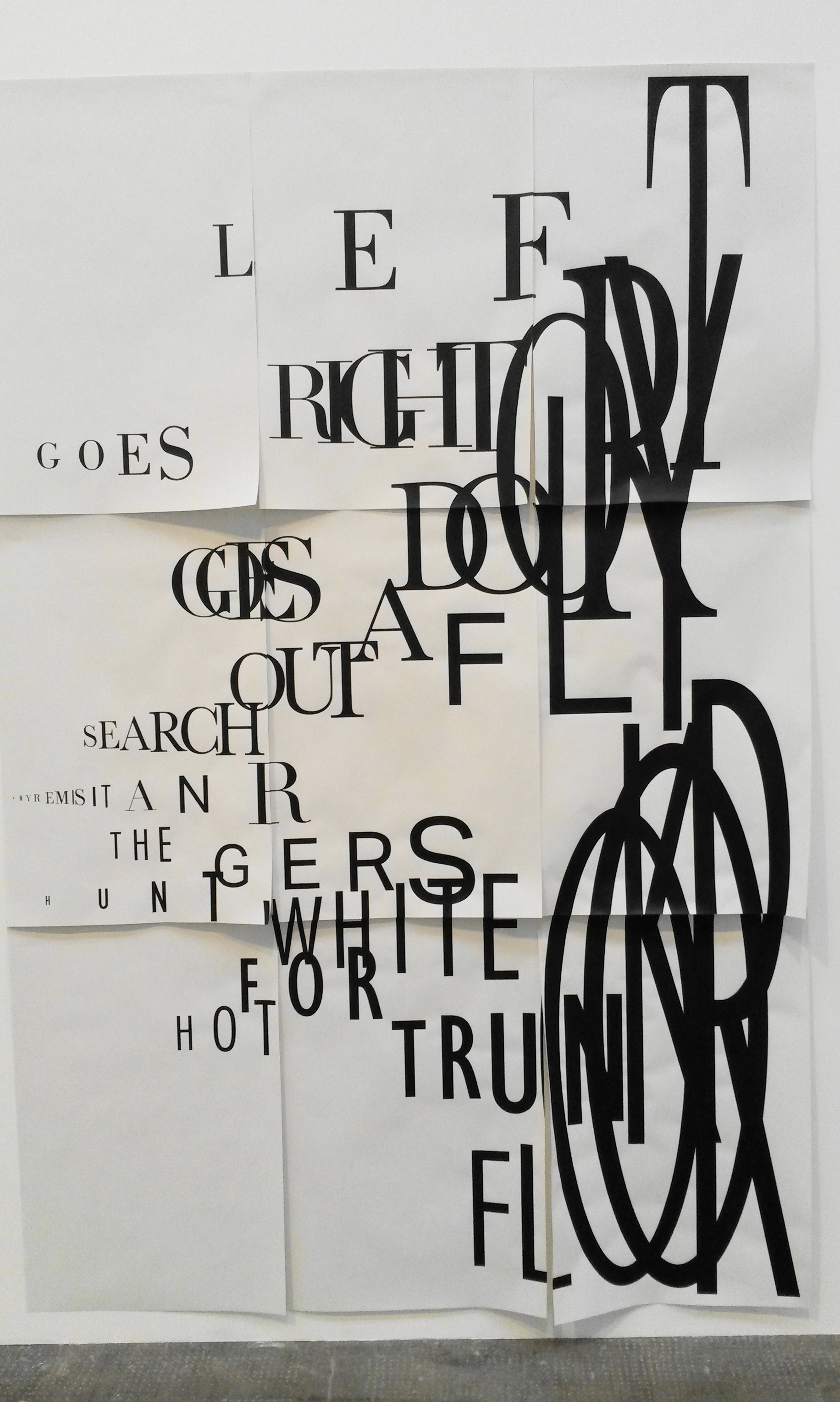
Next was Janice Kerbel, who wrote an operatic piece entitled DOUG, in the form of nine songs, written for six unaccompanied voices.  It was inspired by cartoon violence and explores the different ways in which an imaginary figure could meet his death, such as falling down a flight of stairs (‘Fall), to being struck by lightning (‘Strike).  Each song is designed to test the range of the vocals, stretching them from their highest to lowest notes.  Our tutor suggest we go to hear one of the pieces and we duly went along at 1:00pm and joined the small waiting audience.  There were six music stands at the front and at 1:00pm sharp the six singers came out and silently made their way to the stands.  They began gently humming for a minute or two then suddenly each singer sang one word, each a different word, in a different key, in a cacophony of sound.  Only one word was sung and then they bowed and walked off again.  It was quite a surreal experienced and the audience appeared bemused (as did a few of the singers).  The Exhibition Guide describes it thus; ‘Kerbel explores the possibilities of the written and spoken word to suggest material and visible states, giving form to impossible or imagined events.”  And “DOUG calls on the history of physical comedy, animated cartoons, narrative ballad and operatic librettos to imagine a new kind of compositional choreography.’

User comments

This was my first experience of this kind of art work.  I think I would have needed to see the whole performance in order to understand what it was trying to do.  All of the lyrics were written on the wall for viewers to read.  I did like the ‘poster’ on the wall, which recorded some of the words used and the size of the letters represented how loudly the word was sung and I wondered if I could use this idea when adding dialogue to the drawings in my parallel project.

User comments

One of the curators described a previous work of the artist, which also interested me.  Apparently, posing as an architecture student, she staked out a bank for 18 months,and based on this experience, she wrote book which detailed how the bank could be robbed.  I researched this further as it may be of use to me in the parallel project.

2 15 Lombard St. is a rigorously researched master plan of how to rob a particular bank in the City of London. By observing the daily routine in and around the bank, Kerbel reveals the most detailed security measures such as: the exact route and time of money transportation; the location of CCTV cameras in and around the bank along with precise floor plans that mark the building’s blind spots.  Kerbel’s meticulous plans include every possible detail required to commit the perfect crime. The ubiquitous fantasy of a bank robbery functions as a backdrop for Kerbel’s ‘play of subversion’. By surveying surveillance Kerbel shows how different systems are interrelated, forming a web of control. Kerbel’s aim is not simply to subvert but to emphasise the fact that the idea of absolute control and the fantasy of robbing a bank are interconnected and mutually sustaining.’

Next was Patterns by Bonnie Camplin.    This was an installation consisting of a study room/library containing books, leaflets, magazines etc all of which referenced beliefs and Mental Health.  The guide stated ‘An artwork that is also a research tool, Patterns centres around five video interviews in which individuals recall extraordinary experiences (from encounters with inter and extra-dimensional beings to systematic trauma-based mind-control techniques).’

There were screens with headphones in the centre of the room where you could watch the videos.  The literature round the room was annotated with remarks hand written by the artist and many of the items were original copies, however we were told we could pick things up to read.  In addition there was a photo copier, which the public were encouraged to use to copy any item of interest to them (although I never saw this happen).  The material was arranged in a specific way in order to form pattern-based relationships between different ideas.  The topics covered included the Occult, Alien Abduction, substance abuse and psychosis.

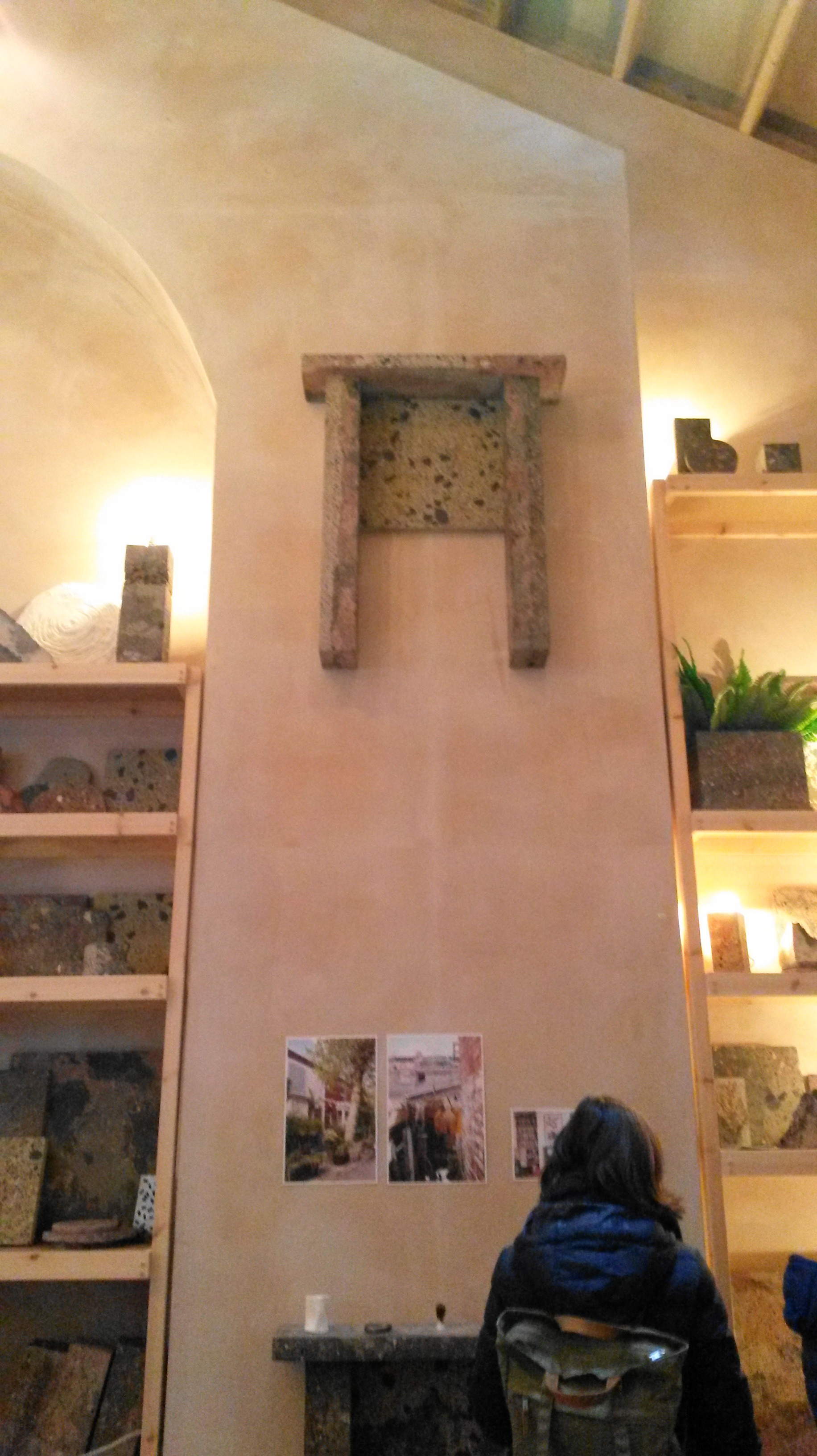
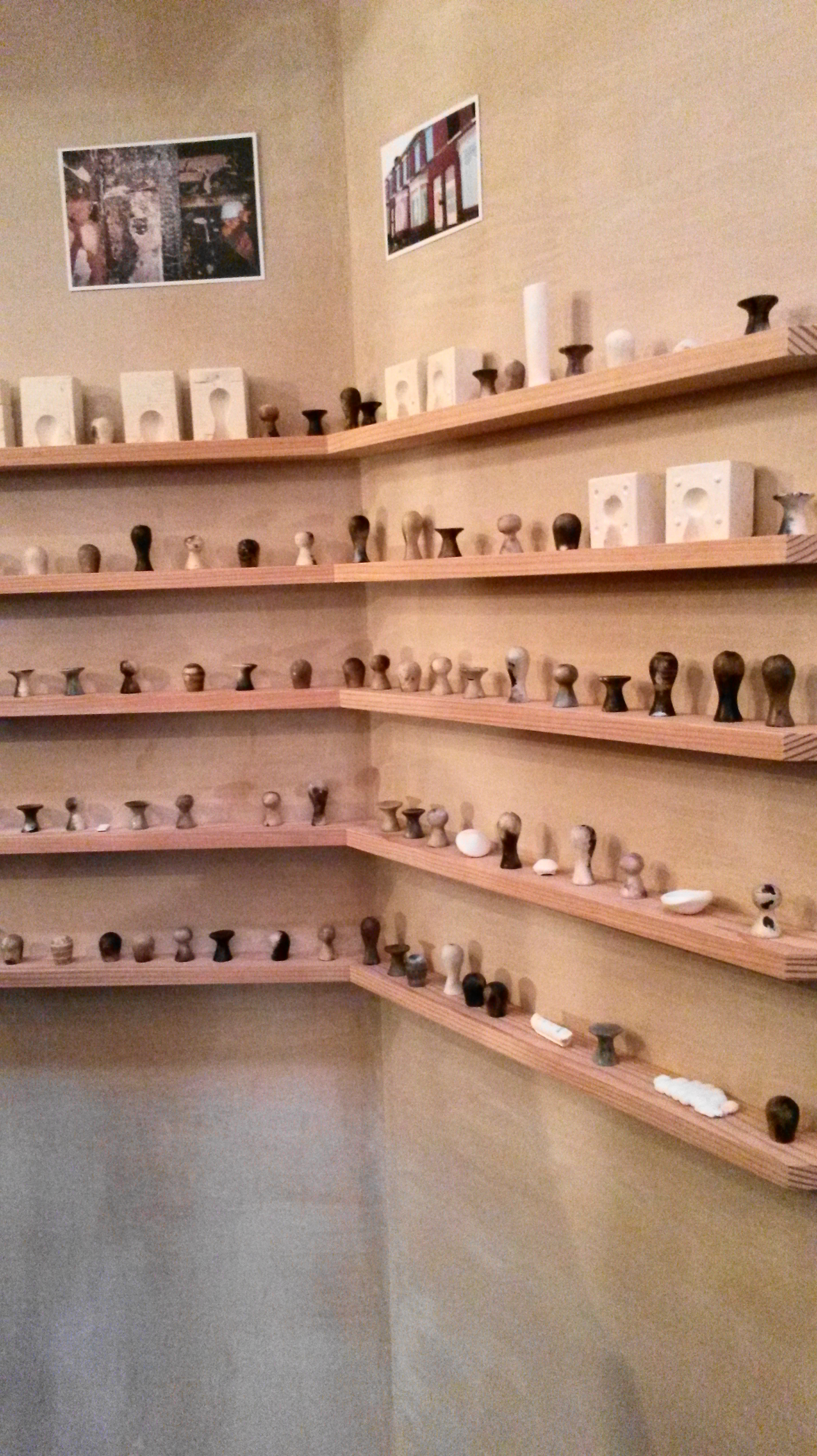
The final piece and winner of this year’s Turner Prize was Granby Workshop by AssembleAssemble is a collective of 18 members from the fields of art, design and architecture.  They assisted Granby Four Streets Community Land Trust to refurbish 10 boarded up houses in order to provide affordable housing for local residents which will remain in community ownership.  The exhibit consists of a show room displaying hand-made items such as mantelpieces, door knobs, furniture and fabrics.  The mantelpieces are cast using brick and rubble waste from the derelict houses.  Their catalogue states; ‘All products are manufactured using processes which embrace chance, so that each is unique, developing in the hands of the people making it.’  I was interested to see that during an interview with one of the Assemble, they commented that ‘The nomination (to the Turner Prize) created an uncomfortable feeling.’  This, I imagine is why we were given the link to the video Art; Useful or Useless.  I’m not convinced that I consider Granby Workshop to be a piece of art; yes there were artists involved in the collaboration, yes there is artistic skill involved in the design of the items for sale, yes it could be considered conceptual; the guide describes it thus; ‘Their practice seeks to address the typical disconnection between the public and the process by which places are made, working across the fields of art, architecture and design to create playful environments and spaces.’

User comments

I see this as a very successful and creative social enterprise.  I don’t see it as an artwork, but I can understand why it has won the Turner Prize; it is the first winning piece that cannot be defined as a fine art work, video or installation, therefore it is different from all previous winners, this causes controversy which keeps the public interested and it ticks all the boxes for ‘useful’ art, and it is a project with a social conscience, whilst remaining environmentally friendly.

User comments

A very worthwhile study visit, which I hope to use as reference in my parallel project.

2.http://www.theguardian.com/artanddesign/2010/may/12/artist-week-janice-       kerbel

https://www.bookworks.org.uk/node/74

http://granbyworkshop.co.uk/


John Bellany workshop at Glasgow Museums Resource Centre 30th Aug 2015

I was already familiar with John Bellany’s work as I went to an exhibition at the National Gallery Scotland in 2012.  I have the catalogue from it; ‘John Bellany, Keith Hartley with Alexander Moffat, John McEwen & Paul Bellany.  I was quite excited about the workshop as it is an opportunity to see the art work close up.  The Glasgow Museums Resource Centre stores over 4 million items from the Glasgow Art Galleries and Museums.

The first painting we looked at was The Fishers. This is a huge painting and it was fantastic being able to view it at close quarters.  It was painted in 1966, in a figurative style, which went against the current trend of painting in an abstract style. ‘When the fashion in art was for abstraction, and figurative art was presumed to have been swept away forever by the tide, not just of fashion, but of history, he stood up and painted monumental figurative pictures’ (Keith Hartley with Alexander Moffat, John McEwen & Paul Bellany, 2012:7).  In contrast, his peers were looking at Abstract Expressionism, and the work of action painters such as Jackson Pollock and Willem de Kooning, and colour field painters such as Mark Rothko.  ‘Significantly Bellany’s earliest artistic efforts were of his immediate environment – the fishing boats at Port Seton, his ancestors, Scotland, and beyond.’ (Hartley with Moffat, McEwen & Bellany, 2012:9).  He was painting what he saw every day; in other words he was being a Recorder.  As well as recording scenes familiar to him as the son of a fisherman, he used symbolism in his work.  ‘Boats as symbols of voyaging, of doom and tranquillity, as stages, as arks of sirens and omens, as bearers of cargoes of memory.’  (Hartley with Moffat, McEwen & Bellany, 2012:25.  The colours in the painting were very vivid with lots of blood-red and the fish guts in the foreground repulse the viewer.  The three figures, again a common theme, although looking at the viewer, do not engage with them, and almost seem to be challenging them.

Bridgeman; (c) Glasgow Museums; Supplied by The Public Catalogue Foundation

Bridgeman; (c) Glasgow Museums; Supplied by The Public Catalogue Foundation

  • Date painted: 1966
  • Oil on hardboard, 183.2 x 213.4 cm
  • Collection: Glasgow Museums
Bridgeman; (c) Glasgow Museums; Supplied by The Public Catalogue Foundation

Bridgeman; (c) Glasgow Museums; Supplied by The Public Catalogue Foundation

The next one we looked at was Scottish Gothic.  The name is reminiscent of American Gothic, but there the resemblance ends as there are three figures in John Bellany’s painting and only two in Grant Wood’s.  Here we can see the use of symbolism, where the central figure has a bird perched on his head.  ‘Another thing Beckmann was to teach Bellany was the use of symbolic attributes – people carrying fish, wearing masks, standing on stages.  As the years went by Bellany learnt to use symbols as a complex language, sending silent messages between the dramatis personae of his pictures’. (Hartley with Moffat, McEwen & Bellany, 2012:13).  

Next we looked at Dungness.  The figures in his paintings are generic and not modelled on anyone.  Although looking straight ahead, they do not engage with the viewer.  This painting was made following a visit to Germany where amongst other things, he saw the Concentration Camps, but also saw the Isenheim Alterpiece painted by Matthias Grunewald.

Next we saw Journey to the End of the Night; a triptych.  This is the title of a novel by Louis-Ferdinand Celine published in 1932, however there is no obvious connection to this.  It is a triptych (possibly inspired by the Isenheim Alterpiece). It is an image depicting sexuality, but there is no joy in it.  The figures in the back ground appear to be nun-like figures.  The lobster represents female sexuality and the women appears to be dressed in the striped clothing from the Concentration Camps.  ‘The second event to have a major impact on Bellany was his trip to East Germany in 1967….where he was emotionally and physically overwhelmed by a visit to the Buchenwald concentration camp’ (Hartley with Moffat, McEwen & Bellany, 2012:13).  

The next drawings were from the Addenbrooke’s Hospital period around 1988, when Bellany had a liver transplant which saved his life.  ‘In 1988 it became plain that Bellany’s liver was deteriorating so fast that he did not have much longer to live unless he had a transplant.  Against all the odds he was able to undergo the operation at Addenbrooke’s Hospital…..It was successful.  As soon as Bellany came round from the anaesthetic he could not believe he was still alive.  He asked for a pencil and paper and only after he was able to draw was he certain that he was alive.  Over the next few weeks as he grew stronger he drew the doctors and nurses looking after him, but above all he drew himself, a new Lazarus.’ (Hartley with Moffat, McEwen & Bellany, 2012:77).  He used pencil, red and black chalk and watercolour.  These are very honest, direct drawings and I found them quite moving.  The emotion he was feeling, the joy of being alive, comes through.  The eyes in particular, are captivating.  He exaggerates the almond shape and adds a lot of detail, and he really engages with the viewer, unlike in his previous paintings where the figures stare with hostility.

bellanyhospital3

Bellany,-Self-Portrait-(Addenbrookes)-Red-Chalk-1988-b

Self-Portrait 1988 John Bellany 1942-2013 Purchased 1990 http://www.tate.org.uk/art/work/T05735

Self-Portrait 1988 John Bellany 1942-2013 Purchased 1990 http://www.tate.org.uk/art/work/T05735


bellanyhospital2.png

I decided to make a quick study of this self-portrait, in an attempt to discover how he made it.  I drew mine with pencil first, then did a wet into wet wash with Cadmium Red and Indigo watercolour paint.  I used watercolour paint wet on dry on the face, and striped pyjamas, then defined it using watercolour pencils, wetting the lead before drawing with it.  The pyjamas are reminiscent of the striped clothing he saw at the Buchenwald Concentration Camp, and I’m quite sure the red splashes of blood are for artistic license.

User comments

User comments

Next we were shown some drawings which had never been on display to the public.  There were beautiful delicate etchings, mono prints and prints which looked as though they may have been intended to be bound into a book, as there was poetry and text included.

Next we were taken to the “Pickled ” room in the Resource Centre, where we had ten minutes to sketch one of the many jars containing all sorts of fish and other aquatic creatures.  I draw a jar of Chlorophthalmus Agassizi, which looked a little like sardines to me and I was attracted by the way they were all cramped together like sardines.  It made me think of Stress, like having too many thoughts crammed into your head at the one time.

Finally we were taken to a classroom where we did our own self-portrait and included our picked object in homage to John Bellany.  I managed a self-portrait alright, but it bore no relation to the colour and expressiveness of Bellany’s.  I became so focussed on trying to get something down, all thoughts of Bellany’s work went out of the window.  Only later did it occur to me that we were encouraged to use easels; something I normally would never do when painting in watercolours.  The expression and depth of emotion in his work has given me the idea to try to use this influence in the Emotion exercise.

2015-08-30 18.42.19

Exhibition visit Duncan Shanks Sketchbooks: The Poetry of Place


20150718_124955

I visited the Duncan Shanks Sketchbooks Exhibition : Poetry of Place, at the Hunterarian Gallery in Glasgow.  I had never heard of him before, as apparently he shuns publicity, and I probably wouldn’t have visited if it wasn’t for a friend who suggested it because he sketches in the South Lanarkshire area where she lives.

20150718_124948

“Working in harmony with nature in my notebooks has been an act of faith and an adventure which has taken me to and beyond the poetry of a place on a personal odyssey.”  Duncan Shanks 2014

When I saw the sketchbooks of Duncan Shanks, it was somewhat of a eureka moment for me.  All the exercises I’ve done so far for my OCA course, all my research of other artists, finally made sense when I saw his sketches.  So this is what is meant by knowing your subject inside out and using materials as second nature to bring it to life.  Absolutely stunning work; every sketch a stand alone piece of work, regardless of whether it was intended as a prelude to a finished piece of work or not.  There is a vibrancy to it and a liveliness, and whilst the sketches are figurative and describe the landscape perfectly, the colours he sees in the familiar countryside are surprising; bright oranges, pinks, reds and blues.  It is almost abstract, he simplifies shapes and patterns, however the image still remains true to nature.

20150718_12402920150718_12410320150718_12412720150718_12420920150718_12423920150718_12501020150718_12433220150718_125028

20150718_124118

20150718_124149

20150718_124216

20150718_124346

20150718_124337

“Painting, like nature, cannot be rushed and, working with landscape, I have learned to be patient.  It is a journey which doesn’t readily reveal it’s destination.”  Duncan Shanks


http://www.gla.ac.uk/hunterian/visit/exhibitions/focus/duncanshankssketchbooks/

OCA Study Visit Scottish National Gallery of Modern Art 8th May 2015

This was to be a visit to the Roy Lichtenstein exhibition, however due to flooding the gallery was unfortunately closed, therefore we decided to head to Gallery 2 instead, where myself and another student decided to see the Two Roberts Exhibition, while another student and our tutor Olivia Irvine visited other rooms in the gallery.

Robert MacBryde was born in Maybole in Ayrshire in 1913, Colquhoun in Kilmarnock in 1914. From poor, working-class backgrounds, they met at Glasgow School of Art in 1933, and soon became lovers.  In 1941 they moved to London where they became part of the celebrated Soho set that included artists such as Bacon, Keith Vaughan and John Craxton, and the poets Dylan Thomas and George Barker. Colquhoun specialised in figure painting, MacBryde in still-life. Hard drinking, volatile and uncompromising, their lives were as passionate and compelling as their art.

The Lefevre Gallery on Bond Street held a string of successful shows of their work; the Museum of Modern Art in New York and the Tate acquired paintings. By 1950 they were among the most famous artists working in Britain. But as abstraction became the dominant force in European art in the late 1950s, and as their drinking increased, so their popularity suffered. Colquhoun died penniless in 1962, aged just 47; MacBryde was knocked over by a car and died in 1966. Few artists have catapulted to celebrity or descended into obscurity so swiftly: their remarkable careers lasted scarcely twenty years.

The first thing that I was struck by was the similarity between Colquhoun’s and MacByde’s paintings; in everything from the colours, subjects and style.  As I progressed through the exhibition I began to be aware of small differences, such as the texture in MacBryde’s paintings through use of brush strokes.  I wasn’t initially taken by the paintings, particularly the colours in the early works (again, both used the same colours), however the later works were more appealing to me.  I was interested to read that the dark shapes in the foreground were the shadows of people standing in front of it and this was often repeated.  I bought the guide book of the exhibition, so plan further research on these two interesting characters.

We headed for the National Gallery and stopped briefly at St Mary’s Cathedral to look at a painting The Presence by A E Borthwick and the Paolozzi windows.

polozzi 2

paolozzi3

paolozzi window1


We then went to the National Gallery to see the Royal Scottish Academy (RSA) Exhibition. Olivia was very familiar with the members and it was good to get an insight from her about their work.  I was most taken by the work of Michael Sandle Mount St Helens.  It was difficult to tell the medium, although there was some wet into wet, there was also definite strokes, so I thought it was perhaps ink, however researching it on-line I see that it was actually watercolour, part of a series of four, each 97cm x 147cm completed in the 1980s.  The scale was impressive and the image was powerful, and had a strong three-dimentionality about it, similar to the way that another sculptor; Henry Moore’s are.  The artist’s handwriting stated it was taken from newspaper photographs.

micaelsandle

20150508_15270120150508_152706

20150508_15261820150508_152656

I was inspired by the scale the power of the images aided by the monochrome, and yet there was a delicacy; gorgeous wet into wet, layers, mixed media, energy and life.  More and more on my Drawing Course I have been drawn by black and white, e.g. my barcode pictures, ink flowers drawings and assignment 6 figures, and this painting inspires me to be bolder, perhaps trying watercolours in monochrome in a similar way.

 Refs;

http://en.wikipedia.org/wiki/Robert_Colquhoun

https://www.nationalgalleries.org/whatson/on-now-coming-soon/the-two-roberts-robert-colquhoun-and-robert-macbryde/

http://www.royalscottishacademy.org/pages/exhibition_frame.asp?id=440

Mixed Media Demonstration Liz Myhill

Liz Myhill trained in Print Making at Dundee and as well as making art, currently works as a freelance Illustrator.

Liz explained that she uses mixed media to describe “Place, narrative and atmosphere”.  She first started using mixed media in an attempt to get rid of the white of the paper as quickly as possible.  She began the demonstration by showing us a selection of the media she regards as her basic kit; a box of watercolours which were very messy, (however she explained she preferred them that way and often started a painting using a wash mixed for a previous painting), System 3 acrylics, sometimes used with texture gel, modelling paste, glaze or self levelling gel, pastels for sketching outdoors, and watercolour pencils for tightening up paintings.  To this she applies tissue paper, “found papers” and other hand-made paper.

Dec 2014 261

For the first demonstration she did a landscape with a square composition.  She began by gluing tissue paper to the board, then covered this with watercolour.  She added handmade paper then drew on top of this with an oil bar.  She then added handmade paper for the sky and used diluted pvc glue for the white clouds.

20150301_151934

A sketch of one of her paintings

soft-morning-light lizmyhill

Liz Myhill “Soft Morning Light”

While this was drying she showed us a mono print she was working on.

Monoprint; A form of printmaking where the image can only be made once, unlike most printmaking which allows for multiple originals.

To do this she used acrylic with print making medium added on top of Perspex sheet.  She said you could use glass, plastic or even a poly pocket.  You can draw on to this with a pencil or your finger, or use the creases on tissue paper to add texture.

Dec 2014 263

Liz makes her own paper.  She said that she used a lot of tissue paper in her degree work, however discovered much later on that it isn’t light fast.  She finds her own hand-made paper is much more light fast and retains it’s colour better.  She likes to experiment with layers; print on top of paint, paint on top of paper etc.

Dec 2014 256

Following her graduation she had a residency in India, where she learned the hard way the limitations of printing, where you can’t travel with a lot of heavy equipment.  She only had basic chemicals and the use of an old tin bath, but also found she didn’t want to work with toxic materials.

She prefers to work on mountboard, which she seals with household floor varnish first. She likes to mix painting with printing because it is then a unique image, whereas prints come out identical to each other.

Dec 2014 257

Collagraphy (sometimes spelled collography) is a printmaking process in which materials are applied to a rigid substrate (such as paper board or wood. The word is derived from the Greek word koll or kolla, meaning glue and graph, meaning the activity of drawing.

During her stay in India she filled her sketchbooks with found things such as saris, sweet wrappers and flowers.  She found that collographs could incorporate all these things.

nawalgarh-sketchbook-iii

Narwalgarh Sketchbook iii

through-the-arches2

Through the Arches, Liz Myhill


She showed us a sketchbook containing a drawing of a man in the middle of a dessert wearing crisp white clothes.  She developed this into a print by photocopying it onto acetate, which was then copied digitally onto polycarbonate.  Photocopying allows you to change the dimensions and move things around.  If an image needs something extra, she will go ahead, pushing all the time for the result she wants.  That is what she did with the sketch, used collage, added handmade paper, lino cut, added text and photo etching.  She took inspiration from the bustling market place, crumbling buildings, murals, white washed walls and adverts.  She uses self levelling gel, which causes paint to granulate and acts as a resist.  She uses Windsor and Newton white ink on top, wetting an area first, then allowing the ink to run into the creases on the paper.  Once dry she added soft pastels to the sky.  To define the result she uses watercolour pencils.

I found her creative process very inspiring; she pushed an idea to its limits, what started as a sketch would be added to, become a print, a painting a design in a never-ending process. She added tissue paper for texture, used a scribe to scrape marks and modelling paste for relief.

She said to worked with “spectacular mistakes, instead of safe results”, and have fun on a wonderful, explorative journey.

I was enthralled by this artist because she is the first person I’ve seen who pushed a subject on and who had so many creative processes.  I’d like to try using collage and print in an experimental way in my Drawing Course.
References

http://www.tate.org.uk/learn/online-resources/glossary/m/monoprint

http://en.wikipedia.org/wiki/Collagraphy

Visit to Alasdair Gray Exhibition “From the Personal to the Universal”

Alasdair%20Gray%20updated%20rotator

 Today I went to the Kelvingrove Art Gallery to see the Alasdair Gray Exhibition “From the Personal to the Universal”.  I went because I thought it would be useful for my Drawing Course, and also because I remembered seeing an exhibition of his in 2012 and I really liked his style of drawing people.

Alasdair Gray (born 28 December 1934) is a Scottish writer and artist. His most acclaimed work is his first novel, Lanark, published in 1981 and written over a period of almost 30 years. It is now regarded as a classic, and was described by The Guardian as “one of the landmarks of 20th-century fiction.  Gray’s works combine elements of realism, fantasy and science fiction, plus clever use of typography and his own illustrations. 

It was Alasdair Gray’s portraits that I enjoyed seeing the most and was most drawn to.  He drew them on a large scale, often using brown parcel paper (because he said it was cheap).  He used a variety of media; ink, pencil, watercolour, acrylic, oil, typex and crayon.  The figures were drawn in line only with no tone added, often leaving the brown paper untouched for the skin tone.  In contrast, the clothes were coloured, or hatched to show form.  This contrast is very striking.  He said “I felt free enough to use a thick nibbed fountain pen and the outline varied with the angle of the stroke.  Hatching I kept for garments; I liked the contrast.”

His style of drawing figures may have been influenced by his illustrative work.

In 1977, Elspeth King, the curator of the People’s Palace, was concerned that the museum didn’t have any artworks depicting Glasgow’s people and places beyond the early 20th century. She commissioned Alasdair Gray to become the city’s “artist recorder”, documenting contemporary Glasgow in visual form.

In his year on the job he produced around 33 works for the Palace of typical or well-known Glaswegians going about their daily lives, as well as buildings and street scenes and together these form a portrait of Glasgow at that time.

The pictures provide a unique insight into a period when much of the old industrial Glasgow was being demolished. The exhibition is interesting both for fans of Gray’s work and for its snapshot of Glasgow life in 1977, seen through his eyes.

I think perhaps I may have been viewing the paintings with some nostalgia, as I grew up in the seventies.  A fellow viewer at the exhibition commented that the style reminded him of the illustrations in the book “The Joy of Sex”, which made me smile.  I was also reminded of my art teacher in High School showing me figure drawings in coloured pencil by David Hockney.

More recently I’ve seen figure drawings, also simplified and pared down by Kevin Atkin, a competitor on the series Sky Portrait Artist of the Year.

kevin atkin

 Kevin Atkin, competitor in sky Portrait Artist of the Year

I did some very quick sketches of some of these portraits.  This was a little daunting as the exhibition was very busy and there were a lot of people about.  Despite this, I chose a quietish corner and worked in Faber-Castell Pitt artist pen in dark sepia in a small pocket sized sketchbook.  Whilst sketching, I discovered that some of the hair in the portraits was drawn with continuous line.  Drawing in pen makes you really look and think quickly before committing to the drawing; there is no room for correction in the way that you can use an eraser when working in pencil.  A girl came up behind me to watch.  I suppose it was a testament to my increasing confidence that I didn’t just stop and walk away (as I would have in the past).  The reward for this was her commenting “Wow, you’re as good as him.  I’m impressed”.

2015-02-23 13.51.102015-02-23 13.51.50 (2)


20150301_152019

Some of my sketches

I came away feeling that I’d like to try this style of portrait for myself.

Later I began to think more about what was gained by Alasdair Gray becoming the “City Recorder”.  What did he achieve in his paintings that wouldn’t be captured by a photographer etc?  The city buildings would be recorded more accurately, probably, by a skilled photographer.  One of the portraits was of a young girl, “Frances Gordon, Glasgow Teenager” and surrounding her portrait was a collection  of items from her hand bag; a bus ticket, a ticket stub for her first pop concert etc.  This is reminiscent of the current trend of collecting “found” items, and paints more of a picture of her life, interests and personality than a photograph ever could.

(c) Glasgow Museums; Supplied by The Public Catalogue Foundation

Frances Gordon, Glasgow Teenager 1977

Alisdair Gray’s City Recorder portraits have a sensitivity in them that it would be difficult to capture in a photograph.  His people are “real”, many of them engage with the viewer, looking straight into their eyes.  His way of simplifying a scene, pairing it back, makes it easy for the viewer to read and understand.  Similar to the way in which a war artist captures the emotion and pain of combat in a way that a news report or photograph does not.

gray bbcnews

Fidelma Cook (b.1953), in the BBC News Gallery


References

http://en.wikipedia.org/wiki/Alasdair_Gray

http://www.culture24.org.uk/art/art367154