Category Archives: Research & Reflection

Part 2 Research Point


The artists below all make work which both creates and denies three dimensions at the same time.  Take a look at their websites then make notes in your learning log about these artists, your response to their work and how their work relates to what you’ve been attempting in this project.

Angela Eames : http://www.angela eames.com

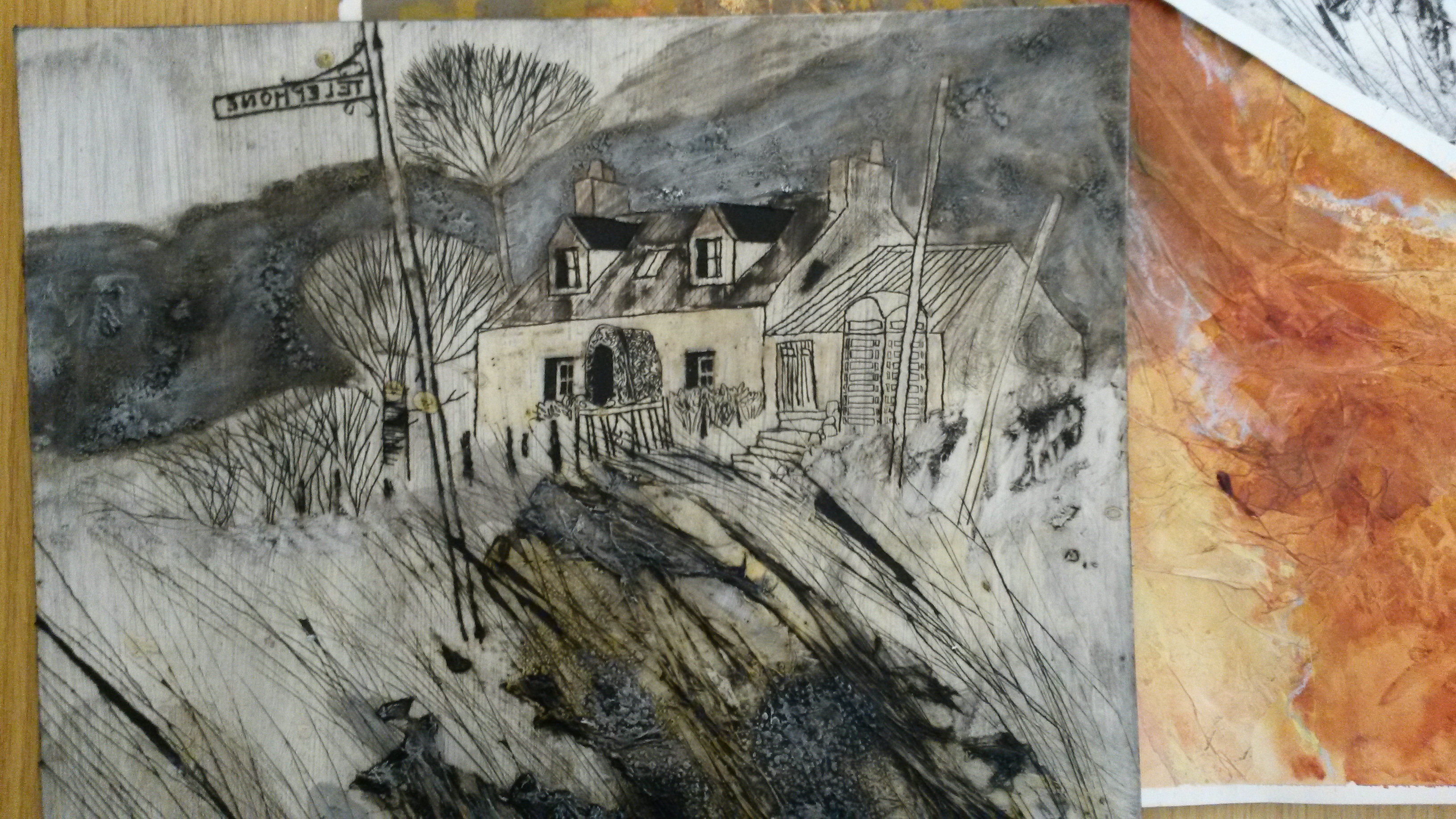
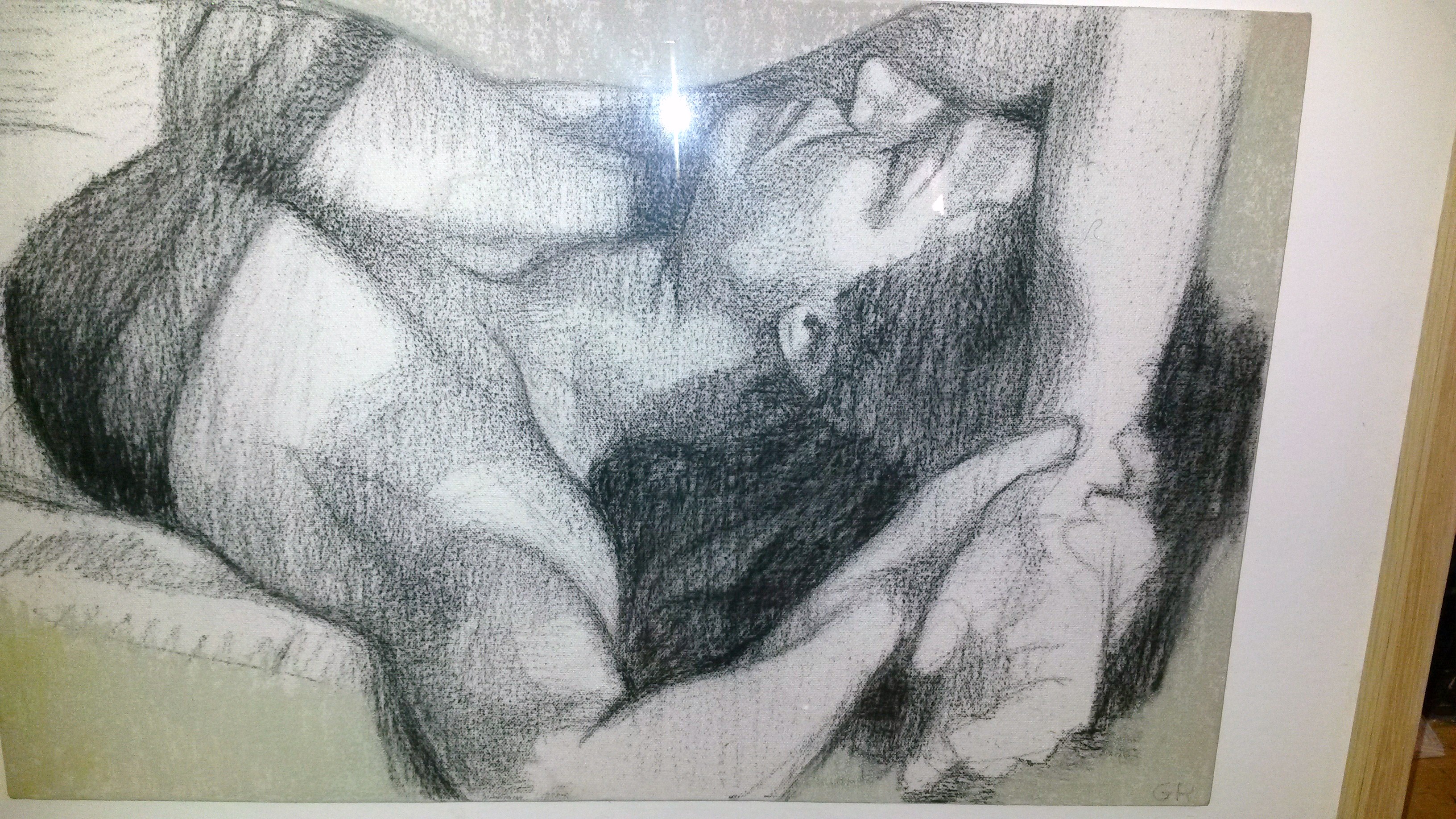
The Fleshscape series reminds me of the exercise in Part 1; Project 4 The Human Form, where you had to devise a composition overlapping limbs.  She has zoomed in close up to parts of the human body, resulting in compositions not at first recognizable as the human body.

Other series, such as Dimensions, combine conventional drawings, for example scribbles with a biro and digital technology, such as 3d photography.  This helps to explore form, in a way not possible through conventional observation.  It challenges the viewer to make sense of the ‘hybrid’ image.

Other work, such as the Veil Series involve virtually building 3 dimensional structures, creating ambiguous images.

I think my conclusion on looking at the work of Angela Eames is that media can consist of anything you like.  It can be a drawing, in the traditional sense, or a digital drawing, it can be a photographic image or any variation or combination.  I think the important part is the outcome; is it interesting, does it engage the viewer, does it make you think, does it stir memories, is it pleasing to look at, or does it capture attention.

My response to it is that it doesn’t engage me.  The use of digital technology is interesting, but to me the results are too clinical and almost illustrative.

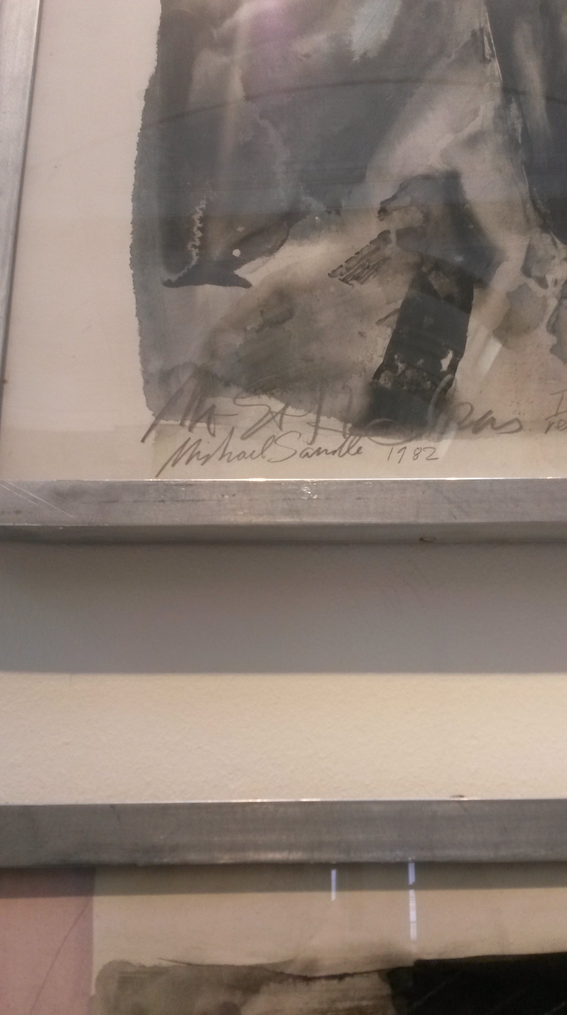
Michael Borremans: http://www.zeno-x.com/artists/michael_borremans.htm

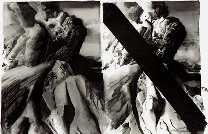
Michael Borremans uses traditional media, such as oil on canvas and pencil on paper, and watercolour, in a traditional manner.  It is his subjects that grab the attention by being unconventional.  Examples of the subjects painted are figurative paintings where the person is in an unusual pose, such as a boy with sticks up his nose, figures chopped in half in the middle, the human body becomes an inanimate object, but is otherwise realistic looking.  In addition he uses framed LCD screens showing short film sequences.  The images appear a bit like a puzzle, where the viewer is trying to work out what’s happening and the scenes are often surreal.

My response to his work is that I can really appreciate the technical painting and drawing skills that he has.  I particularly like the oil paintings on canvas, which remind me of the old Masters, however the subjects leave me cold.  They do grab your interest, but for me, not long enough to want to keep looking.

Jim Shaw: http://www.simonleegallery.com/Artists/Jim_Shaw/Selected_Works

The work of American artist Jim Shaw is very contemporary.  The materials he uses are very innovative; everything from conventional materials such as oil pencil, acrylic, collage, ink, wood, resin, airbrush, digital print, enamel, the list goes on.  The combinations he uses are interesting together; oil paint with digital print for example, and the various substrates used add another dimension; oil on shaped wood, cardboard tubes, ragboard on plywood and linen etc.

As far as my response to his work goes; it ranges from awe at the complexity of the composition and detail in Blake/Boring, to total incomprehension of work such as Dream Object (“A room with waves of meat frozen crashed in the corner). I think the artist’s aim is to be provocative and is seeking originality, however it doesn’t engage me.

I think all three artists are endeavouring to combine traditional drawing as we think of it, with for example, graphite on paper and innovative materials and images.  Every subject has been done to death over the years and creating something new and fresh is becoming increasingly harder to do.  These artists are seeking new ways to say something original about how they view the world.


OCA Study Visit Scottish National Gallery of Modern Art 8th May 2015

This was to be a visit to the Roy Lichtenstein exhibition, however due to flooding the gallery was unfortunately closed, therefore we decided to head to Gallery 2 instead, where myself and another student decided to see the Two Roberts Exhibition, while another student and our tutor Olivia Irvine visited other rooms in the gallery.

Robert MacBryde was born in Maybole in Ayrshire in 1913, Colquhoun in Kilmarnock in 1914. From poor, working-class backgrounds, they met at Glasgow School of Art in 1933, and soon became lovers.  In 1941 they moved to London where they became part of the celebrated Soho set that included artists such as Bacon, Keith Vaughan and John Craxton, and the poets Dylan Thomas and George Barker. Colquhoun specialised in figure painting, MacBryde in still-life. Hard drinking, volatile and uncompromising, their lives were as passionate and compelling as their art.

The Lefevre Gallery on Bond Street held a string of successful shows of their work; the Museum of Modern Art in New York and the Tate acquired paintings. By 1950 they were among the most famous artists working in Britain. But as abstraction became the dominant force in European art in the late 1950s, and as their drinking increased, so their popularity suffered. Colquhoun died penniless in 1962, aged just 47; MacBryde was knocked over by a car and died in 1966. Few artists have catapulted to celebrity or descended into obscurity so swiftly: their remarkable careers lasted scarcely twenty years.

The first thing that I was struck by was the similarity between Colquhoun’s and MacByde’s paintings; in everything from the colours, subjects and style.  As I progressed through the exhibition I began to be aware of small differences, such as the texture in MacBryde’s paintings through use of brush strokes.  I wasn’t initially taken by the paintings, particularly the colours in the early works (again, both used the same colours), however the later works were more appealing to me.  I was interested to read that the dark shapes in the foreground were the shadows of people standing in front of it and this was often repeated.  I bought the guide book of the exhibition, so plan further research on these two interesting characters.

We headed for the National Gallery and stopped briefly at St Mary’s Cathedral to look at a painting The Presence by A E Borthwick and the Paolozzi windows.

polozzi 2

paolozzi3

paolozzi window1


We then went to the National Gallery to see the Royal Scottish Academy (RSA) Exhibition. Olivia was very familiar with the members and it was good to get an insight from her about their work.  I was most taken by the work of Michael Sandle Mount St Helens.  It was difficult to tell the medium, although there was some wet into wet, there was also definite strokes, so I thought it was perhaps ink, however researching it on-line I see that it was actually watercolour, part of a series of four, each 97cm x 147cm completed in the 1980s.  The scale was impressive and the image was powerful, and had a strong three-dimentionality about it, similar to the way that another sculptor; Henry Moore’s are.  The artist’s handwriting stated it was taken from newspaper photographs.

micaelsandle

20150508_15270120150508_152706

20150508_15261820150508_152656

I was inspired by the scale the power of the images aided by the monochrome, and yet there was a delicacy; gorgeous wet into wet, layers, mixed media, energy and life.  More and more on my Drawing Course I have been drawn by black and white, e.g. my barcode pictures, ink flowers drawings and assignment 6 figures, and this painting inspires me to be bolder, perhaps trying watercolours in monochrome in a similar way.

 Refs;

http://en.wikipedia.org/wiki/Robert_Colquhoun

https://www.nationalgalleries.org/whatson/on-now-coming-soon/the-two-roberts-robert-colquhoun-and-robert-macbryde/

http://www.royalscottishacademy.org/pages/exhibition_frame.asp?id=440

Henri Matisse

Look at the work of Henri Matisse…What are the similarities and differences between Matisse and Blackadder?  Which artist do you feel more affinity with?  Consider making a second piece in response to Matisse’s more sophisticated use of space and pattern.

The similarities between Matisse and Blackadder are I think, that they aren’t concerned by a subject in a painting, and distinguishing it from a background, but view the composition as a whole with all parts having the same importance.  I think I’m drawn more to the work of Matisse.  I was fortunate last year to go to an exhibition where there reproductions of his “Cut outs”.  I wasn’t familiar with these, although the Blue Nude 11 figure was instantly recognisable.

I will return to this when time allows, to consider another attempt at the gift bag exercise.

Contextual focus point: Prunella Clough Tate Archive

I’ve not been successful in viewing any of Prunella Clough’s work in the flesh, so unfortunately all research has been looking at images on line.

I looked at Wire Tangle 11.  I’ve decided to look at it and decide what it says to me and how it may have been done, before I research what others have written.   It is a large piece; 101cm x 127cm and is painted with oil on canvas.  It literally looks like tangled wire.  It makes an interesting composition and the large “tangle” on the right leads eye round the whole drawing.  The back ground could be Frottage of a wooden structure.  The yellow diagonal lines are curious and so different from “the wire”, I’m not sure what to think.

I’ve read that she was fascinated by Post War industrial landscapes and the materials found there, such concrete, corrugated metal and the subject of this painting; tangled wire.  But the paintings aren’t figurative representations, but abstractions of these.  She was interested in patterns and forms of things which were man-made, and things that have served their purpose and been discarded.

Part 1 Research; Elizabeth Blackadder

When I first read that I was to research Elizabeth Blackadder I was quite excited because I went to a retrospective exhibition of hers  at the Scottish National Gallery in September 2011.  “Great”, I thought, “I’ll dig out my notes from then”.  Unfortunately, these were of no help whatsoever, as I’ve waxed lyrical about all of her work, except for her still lives.  I recall that at the time I really enjoyed the exhibition, however I didn’t really understand her still lives.  I bought several postcards, including a still life; one of “Chinese Still Life with Arum Lilies”, painted in 1982.  I’ve written in my learning log at the time “I’ve included this because I dislike it, and moreover, don’t understand it; therefore this is an attempt to discover why she has chosen to paint it in this way.  My thoughts are that it appears to be a random collection of objects, painted in a way that gives them the appearance of being flat and without form.  There doesn’t appear to be any attempt at constructing a composition, and your eye wanders around the painting, not knowing where to go next.  The diagonal lines at the bottom right side are distracting and serve no apparent purpose.  The viewer appears to be looking down onto a table top; however the objects appear to be side on.”

In an effort to understand it I’ve recorded the following, taken from http://www.exploreart.com; “Her flowers and still life have broken from the traditional organisation of space to create a carefully composed arrangement of the objects against a flattened background, which is brought parallel to the picture plane.  In this way the eye is allowed to concentrate upon the quality of the painting and the details without distraction from three dimensional backgrounds.  The arrangement of the flowers or objects plays a major part in the compositions, and there is always a visual excitement when her three- dimensional objects meet her two dimensional space.” 

1980s she visited Japan on a number of occasions and many of her paintings at the time showed the influence of these trips.  First visiting in 1985 and returning the following year, Blackadder’s interest in Eastern techniques and subject matter was realised in a series of vibrant oils and watercolours shown at the Mercury Gallery in 1991. Her desire to avoid the technical vibrancy of Tokyo took Blackadder to the Zen gardens of Kyoto; in many ways, her work depicts the principles of Zen which give paramount importance to the idea of empty space. Blackadder also traveled to the United States of America.  Souvenirs of her travels would appear in many of her paintings.

2015-03-20 19.21.29

 So, in the spirit of looking at this painting again, with a fresh pair of eyes and a little information on what Elizabeth Blackadder’s interests and influences were at that time, here goes;  I now see an innovative approach to a traditional subject.  Special care and attention have been taken in choosing which objects to paint, which colours to choose and where to place them.  Instead of the traditional grouping of three objects together, there are pairs; two lilies, two boxes, two pairs of circular objects, two little chickens and other objects not the same, but placed together due to a similarity in shape, e.g. the bird and the coloured wrapped sweet.  These objects are lovingly depicted and are possible cherished souvenirs of her travels abroad.  We know she travelled to Japan at this time, and she may have been influenced by Zen gardens, where the focus is on open spaces.  The items are lined up, almost as if on parade, but because they are small in size, they don’t dominate the composition, but instead become part of the table top, almost like part of a design on a patterned cloth.

I’ve found through looking at this painting again, I have a better understanding of Elizabeth Blackadder’s composition in still life.

http://en.wikipedia.org/wiki/Elizabeth_Blackadder

Mixed Media Demonstration Liz Myhill

Liz Myhill trained in Print Making at Dundee and as well as making art, currently works as a freelance Illustrator.

Liz explained that she uses mixed media to describe “Place, narrative and atmosphere”.  She first started using mixed media in an attempt to get rid of the white of the paper as quickly as possible.  She began the demonstration by showing us a selection of the media she regards as her basic kit; a box of watercolours which were very messy, (however she explained she preferred them that way and often started a painting using a wash mixed for a previous painting), System 3 acrylics, sometimes used with texture gel, modelling paste, glaze or self levelling gel, pastels for sketching outdoors, and watercolour pencils for tightening up paintings.  To this she applies tissue paper, “found papers” and other hand-made paper.

Dec 2014 261

For the first demonstration she did a landscape with a square composition.  She began by gluing tissue paper to the board, then covered this with watercolour.  She added handmade paper then drew on top of this with an oil bar.  She then added handmade paper for the sky and used diluted pvc glue for the white clouds.

20150301_151934

A sketch of one of her paintings

soft-morning-light lizmyhill

Liz Myhill “Soft Morning Light”

While this was drying she showed us a mono print she was working on.

Monoprint; A form of printmaking where the image can only be made once, unlike most printmaking which allows for multiple originals.

To do this she used acrylic with print making medium added on top of Perspex sheet.  She said you could use glass, plastic or even a poly pocket.  You can draw on to this with a pencil or your finger, or use the creases on tissue paper to add texture.

Dec 2014 263

Liz makes her own paper.  She said that she used a lot of tissue paper in her degree work, however discovered much later on that it isn’t light fast.  She finds her own hand-made paper is much more light fast and retains it’s colour better.  She likes to experiment with layers; print on top of paint, paint on top of paper etc.

Dec 2014 256

Following her graduation she had a residency in India, where she learned the hard way the limitations of printing, where you can’t travel with a lot of heavy equipment.  She only had basic chemicals and the use of an old tin bath, but also found she didn’t want to work with toxic materials.

She prefers to work on mountboard, which she seals with household floor varnish first. She likes to mix painting with printing because it is then a unique image, whereas prints come out identical to each other.

Dec 2014 257

Collagraphy (sometimes spelled collography) is a printmaking process in which materials are applied to a rigid substrate (such as paper board or wood. The word is derived from the Greek word koll or kolla, meaning glue and graph, meaning the activity of drawing.

During her stay in India she filled her sketchbooks with found things such as saris, sweet wrappers and flowers.  She found that collographs could incorporate all these things.

nawalgarh-sketchbook-iii

Narwalgarh Sketchbook iii

through-the-arches2

Through the Arches, Liz Myhill


She showed us a sketchbook containing a drawing of a man in the middle of a dessert wearing crisp white clothes.  She developed this into a print by photocopying it onto acetate, which was then copied digitally onto polycarbonate.  Photocopying allows you to change the dimensions and move things around.  If an image needs something extra, she will go ahead, pushing all the time for the result she wants.  That is what she did with the sketch, used collage, added handmade paper, lino cut, added text and photo etching.  She took inspiration from the bustling market place, crumbling buildings, murals, white washed walls and adverts.  She uses self levelling gel, which causes paint to granulate and acts as a resist.  She uses Windsor and Newton white ink on top, wetting an area first, then allowing the ink to run into the creases on the paper.  Once dry she added soft pastels to the sky.  To define the result she uses watercolour pencils.

I found her creative process very inspiring; she pushed an idea to its limits, what started as a sketch would be added to, become a print, a painting a design in a never-ending process. She added tissue paper for texture, used a scribe to scrape marks and modelling paste for relief.

She said to worked with “spectacular mistakes, instead of safe results”, and have fun on a wonderful, explorative journey.

I was enthralled by this artist because she is the first person I’ve seen who pushed a subject on and who had so many creative processes.  I’d like to try using collage and print in an experimental way in my Drawing Course.
References

http://www.tate.org.uk/learn/online-resources/glossary/m/monoprint

http://en.wikipedia.org/wiki/Collagraphy

Visit to Alasdair Gray Exhibition “From the Personal to the Universal”

Alasdair%20Gray%20updated%20rotator

 Today I went to the Kelvingrove Art Gallery to see the Alasdair Gray Exhibition “From the Personal to the Universal”.  I went because I thought it would be useful for my Drawing Course, and also because I remembered seeing an exhibition of his in 2012 and I really liked his style of drawing people.

Alasdair Gray (born 28 December 1934) is a Scottish writer and artist. His most acclaimed work is his first novel, Lanark, published in 1981 and written over a period of almost 30 years. It is now regarded as a classic, and was described by The Guardian as “one of the landmarks of 20th-century fiction.  Gray’s works combine elements of realism, fantasy and science fiction, plus clever use of typography and his own illustrations. 

It was Alasdair Gray’s portraits that I enjoyed seeing the most and was most drawn to.  He drew them on a large scale, often using brown parcel paper (because he said it was cheap).  He used a variety of media; ink, pencil, watercolour, acrylic, oil, typex and crayon.  The figures were drawn in line only with no tone added, often leaving the brown paper untouched for the skin tone.  In contrast, the clothes were coloured, or hatched to show form.  This contrast is very striking.  He said “I felt free enough to use a thick nibbed fountain pen and the outline varied with the angle of the stroke.  Hatching I kept for garments; I liked the contrast.”

His style of drawing figures may have been influenced by his illustrative work.

In 1977, Elspeth King, the curator of the People’s Palace, was concerned that the museum didn’t have any artworks depicting Glasgow’s people and places beyond the early 20th century. She commissioned Alasdair Gray to become the city’s “artist recorder”, documenting contemporary Glasgow in visual form.

In his year on the job he produced around 33 works for the Palace of typical or well-known Glaswegians going about their daily lives, as well as buildings and street scenes and together these form a portrait of Glasgow at that time.

The pictures provide a unique insight into a period when much of the old industrial Glasgow was being demolished. The exhibition is interesting both for fans of Gray’s work and for its snapshot of Glasgow life in 1977, seen through his eyes.

I think perhaps I may have been viewing the paintings with some nostalgia, as I grew up in the seventies.  A fellow viewer at the exhibition commented that the style reminded him of the illustrations in the book “The Joy of Sex”, which made me smile.  I was also reminded of my art teacher in High School showing me figure drawings in coloured pencil by David Hockney.

More recently I’ve seen figure drawings, also simplified and pared down by Kevin Atkin, a competitor on the series Sky Portrait Artist of the Year.

kevin atkin

 Kevin Atkin, competitor in sky Portrait Artist of the Year

I did some very quick sketches of some of these portraits.  This was a little daunting as the exhibition was very busy and there were a lot of people about.  Despite this, I chose a quietish corner and worked in Faber-Castell Pitt artist pen in dark sepia in a small pocket sized sketchbook.  Whilst sketching, I discovered that some of the hair in the portraits was drawn with continuous line.  Drawing in pen makes you really look and think quickly before committing to the drawing; there is no room for correction in the way that you can use an eraser when working in pencil.  A girl came up behind me to watch.  I suppose it was a testament to my increasing confidence that I didn’t just stop and walk away (as I would have in the past).  The reward for this was her commenting “Wow, you’re as good as him.  I’m impressed”.

2015-02-23 13.51.102015-02-23 13.51.50 (2)


20150301_152019

Some of my sketches

I came away feeling that I’d like to try this style of portrait for myself.

Later I began to think more about what was gained by Alasdair Gray becoming the “City Recorder”.  What did he achieve in his paintings that wouldn’t be captured by a photographer etc?  The city buildings would be recorded more accurately, probably, by a skilled photographer.  One of the portraits was of a young girl, “Frances Gordon, Glasgow Teenager” and surrounding her portrait was a collection  of items from her hand bag; a bus ticket, a ticket stub for her first pop concert etc.  This is reminiscent of the current trend of collecting “found” items, and paints more of a picture of her life, interests and personality than a photograph ever could.

(c) Glasgow Museums; Supplied by The Public Catalogue Foundation

Frances Gordon, Glasgow Teenager 1977

Alisdair Gray’s City Recorder portraits have a sensitivity in them that it would be difficult to capture in a photograph.  His people are “real”, many of them engage with the viewer, looking straight into their eyes.  His way of simplifying a scene, pairing it back, makes it easy for the viewer to read and understand.  Similar to the way in which a war artist captures the emotion and pain of combat in a way that a news report or photograph does not.

gray bbcnews

Fidelma Cook (b.1953), in the BBC News Gallery


References

http://en.wikipedia.org/wiki/Alasdair_Gray

http://www.culture24.org.uk/art/art367154

Portrait Demonstration by Gareth Reid

I watched a demonstration at Paisley Artists by Gareth Reid.

Gareth Reid is a graduate of Glasgow School of Art and Florence Academy of Art and is currently Visiting Lecturer in Drawing, and Portraiture Tutor at Glasgow School of Art.

He has shown on five occasions at the BP Portrait Award in the National Portrait Gallery in London, and in 2007 won the BP Travel Award. Having travelled to Finland, he gave talks on his work in the National Gallery of Scotland, Edinburgh and the National Portrait Gallery. His work has been published by the NPG.

Gareth also took part in Series 2 of Sky Arts Portrait Artist of the Year.

I was quite excited when I realised the artist had appeared on Sky Arts Portrait Artist of the Year, as I really enjoyed watching this.  He stood very close to his model, with the paper of an A3 hard-backed sketch book, supported vertically on a studio easel.  He started off very lightly, drawing loose geometric lines to establish the structure of the head.  He held the charcoal pencil very loosely about 3 inches from the tip.  He said to work on the image as a whole; not on small individual parts.  When he had too many loose lines he defined them with an eraser.

He said to take special care measuring the distance between the shadow under the eye and the nostril, as it is a lot shorter than people imagine, and it is this error that causes people to elongate faces.  Measuring also helps with getting a likeness in a portrait.

neilston exhibition 125


He said to be flexible when drawing a portrait; things can change, the person can move etc, and keep changing anything that isn’t correct.  He constantly checked the drawing in a mirror, as this makes mistakes jump out at you.   All parts of the face have equal importance to make a solid, believable head.

He said he always encourages students to slow down at the first stage, and to make sure the basic drawing is correct before polishing it.

He said to draw hair not hairs.  Focus on volume and shapes, and break it into areas of tonal shapes which lock together.  The whites of the eyes are often dark because they are in shadow because of the overhang of the eye brows.

The end stage is to unify the image and more vigorous lines can be used towards the end.

neilston exhibition 128

He showed us some finished pieces done in completely the same manner, although they were done on canvas board primed first and with a touch of soft pastel added for colour.

neilston exhibition 126

We couldn’t resist the opportunity to ask him about his experience of taking part on sky Arts Portrait Artist of the Year.  He said that overall it had been a very enjoyable experience.  He has a “process” that he follows when doing a portrait, pretty much what he was demonstrating to us, and for that reason he did not panic during the competition, whereas he could see other artists struggling to complete their portraits in the 4 hours timescale.  He also practiced really hard before the competition.

Other artist, he  worked purely from photographs taken on their ipads, and didn’t spend much time looking at the live model.  They also used squaring up apps, and he didn’t “think there was much draughtsmanship involved”.  Others appeared to throw a lot of paint around the canvas (for dramatic effect?) for the cameras but the finished painting was very tight.

1. http://garethreidportraits.com/page3.htm